
A cool evening, a fresh page, and a small decision that sets the whole mood. Do you want maple red, muted olive, weathered gold, or the dusky plum that makes a page feel like late October instead of a generic fall theme?
That first choice is fun. The frustrating part comes later if the page is printed on flimsy paper, the line art is too tight for markers, or the download looks clean on screen and muddy once you start coloring. I have learned to judge fall coloring pages by more than the artwork itself. Paper quality, line weight, file format, and spacing all affect whether your pencils layer smoothly or your alcohol markers bleed past the edges.
Good fall coloring pages for adults are everywhere. Good options for the tools you use are not. Some are best for a quiet pencil session with shaded leaves and soft pumpkins. Others work better with brush markers, gel pens, or mixed media accents.
This guide focuses on the choices that make a visible difference: where to find pages worth printing or buying, what paper holds up better, which autumn palettes give you range beyond orange and brown, and a few techniques that help finished pages look richer without adding much time. If you like to plan before committing ink, tools like ColorBestie can also help you test color combinations ahead of time, which saves a lot of second-guessing on detailed pages.
1. Monday Mandala
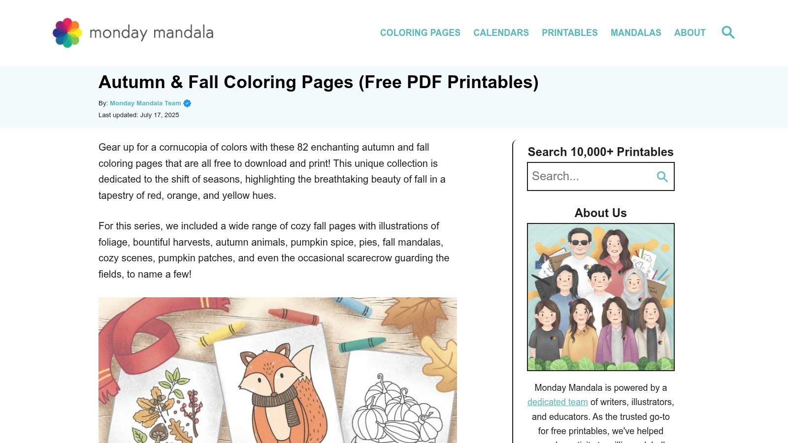
A rainy Tuesday night is exactly when Monday Mandala earns its spot. You want something autumn-themed, printable in two minutes, and forgiving enough that a test page does not feel wasted. Monday Mandala's fall collection fits that job well.
The big advantage is range. You can print a simple leaf cluster, a fox, a pumpkin page, or a busier decorative design from one library, which makes it useful when your energy changes from day to day. The trade-off is style consistency. Some pages feel polished and clearly adult-friendly, while a few drift into cute territory, so it pays to preview before you print.
Why it works well for casual autumn sessions
Monday Mandala is one of the better places to experiment with tools, not just pages. Free printables remove a lot of pressure, so I use them for marker tests, pencil layering practice, and palette planning before I touch a nicer book page.
- Best for practice with real payoff: You can test shadow placement, glazing, or a new brown family without worrying about ruining a favorite book.
- Printer-friendly files: The pages usually behave well on standard US Letter paper, which saves time if you color at home.
- Mixed difficulty level: Quick acorn or leaf pages suit a short session. Denser designs give you more room for blending and texture.
- Style varies: If you prefer a strictly refined look, expect to skip a few options.
Practical rule: Print two copies of any design you seriously like. Use one for swatches and color notes. Keep the second clean for the finished page.
This collection also works well for palette planning because the subjects are familiar. A pumpkin or leaf page lets you compare a classic rust, gold, and olive scheme against something moodier like plum, moss, and smoked teal. If you want to test that kind of color direction before you commit ink, a palette generator for marker-friendly autumn combinations can save paper and prevent muddy blends.
Paper choice matters here. If you are using alcohol markers, plain copy paper is fine for a trial run but weak for a final piece because bleed-through and feathering show up fast. For the better result, print on a smoother heavyweight paper that still feeds cleanly through your home printer. Colored pencil is more forgiving, but you will get richer fall texture from pages with enough tooth to hold a few light layers.
Monday Mandala is not the place I go for the most dramatic, gallery-style autumn artwork. It is one of the first places I recommend for easy access, broad variety, and low-stakes practice that still produces pages worth finishing.
2. Chromopia
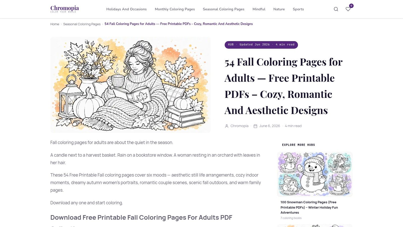
Chromopia's fall coloring pages for adults feels more curated than broad. The pages skew toward portraits, still lifes, romantic scenes, and scenic pieces that reward patient layering. If your biggest complaint with free printables is that too many feel kiddie or novelty-driven, this collection fixes that fast.
The appeal here is mood. These are pages for slow coloring, not quick fill-in sessions. I'd reach for Chromopia when I want to spend time building a background glow, deepening folds in fabric, or giving leaves more than one pass of color.
Best use case
The site gives enough print guidance that you can get a reliable result on US Letter or A4 without much trial and error. That matters more than people think, because a beautiful page can turn awkward if it scales badly or loses line clarity in print.
A useful pairing here is a digital planning step before you commit to your markers. If you want help testing a muted, nontraditional autumn scheme, ColorBestie's palette generator for marker-friendly harmony is handy for planning combinations like deep olive, dusty mauve, weathered denim, and amber instead of default pumpkin tones.
Some fall pages want contrast. Others want atmosphere. Chromopia is better when atmosphere is the goal.
The trade-off is variety. You won't get as many cute motifs or pattern-heavy pages, and that's intentional. For adult colorists who want a cohesive grown-up aesthetic, that limitation helps.
One broader market signal supports why this kind of collection lands well right now. The global adult coloring book market was valued at $1.8 billion in 2025 and is projected to reach $3.2 billion by 2034, growing at a 6.6% CAGR, according to DataIntelo's adult coloring book market report. The wellness angle is a big reason, and pages with a slower, more reflective feel fit that demand naturally.
3. OpenToColor
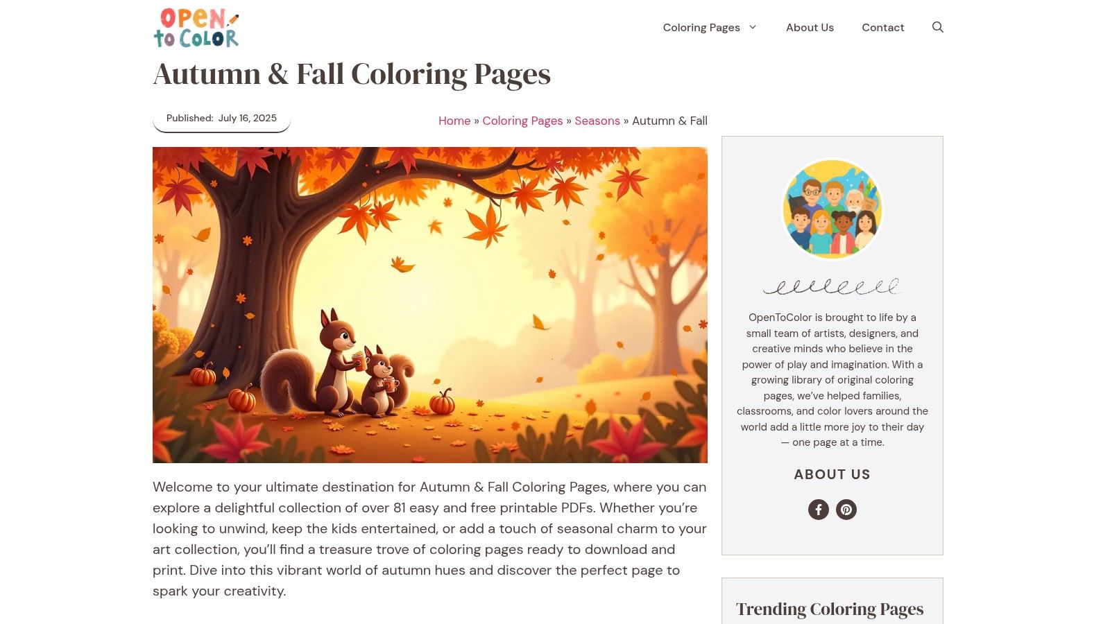
OpenToColor's autumn and fall collection is a browsing site in the best and worst sense. There's a lot to choose from, and individual PDF access is quick, but the adult pages sit alongside simpler content, so selection takes a little patience. Once you start filtering mentally for leaf mandalas, realistic scenes, and fuller compositions, there's plenty worth printing.
This is a strong option if you like sampling styles before settling on one. I often recommend it to colorists who are still figuring out whether they prefer botanical detail, woodland scenes, or decorative seasonal motifs.
What to print first
Start with single focal point pages before jumping into busy scenes. A wreath, cluster of leaves, or squirrel-and-foliage composition gives you enough room to practice blending without committing to a massive background.
- For marker users: Pick pages with larger enclosed shapes first. They're easier to blend cleanly.
- For pencil users: More detailed pages hold up better because layering and texture matter more than broad coverage.
- For mixed media: Print on heavier paper if you plan to combine alcohol markers with colored pencil shading.
This site also works nicely as a warm-up source. Use it to test seasonal palettes like burnt sienna with muted teal, or olive with oxblood and cream. That kind of experimentation matters because many hobbyists want mood-led palettes, but most printable content still centers on literal autumn imagery rather than emotional color stories.
The downside is simple. You do have to hunt a bit. If that annoys you, go with a more tightly curated site. If you enjoy exploring, OpenToColor has enough variety to keep your fall folder full.
4. SuperColoring
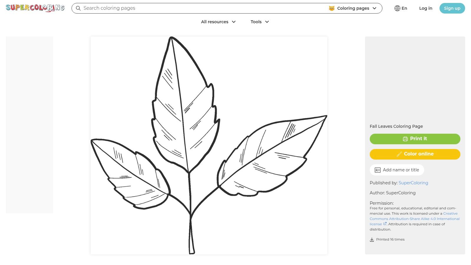
You print a cozy autumn page, pull out your favorite markers, and realize halfway through the first maple leaf that your shadows are patchy and your color transitions look harsh. SuperColoring's leaf archive is one of the best places to fix that before you commit to a full scene.
What makes it useful is the subject matter. Leaves give you curved edges, visible vein structure, overlap, and natural value changes in a small space. That is exactly the kind of practice that carries over to pumpkins, mushrooms, scarves, tree canopies, and woodland backgrounds.
I use pages like this as technique sheets, not just finished art. A single leaf lets you test how three oranges blend, whether an olive shadow reads rich or dirty, and how much darker your stem area needs to be before the form feels believable.
Where it shines
Leaf pages are great for controlled repetition. You can color the same shape several times with different palettes and learn something from each pass. Try a realistic set with ochre, rust, and deep brown, then a moodier version with muted teal, burgundy, and cream.
If you use alcohol markers, paper matters as much as the page design. Home printer paper usually forces faster decisions and can make blends grab at the edges. Heavier stock gives you a little more working time. If you are still deciding which marker line to use for practice pages versus nicer books, ColorBestie's marker comparison tool for popular brands helps you sort through the trade-offs.
There is also a practical gap this archive helps address. Fall coloring content often focuses on finished line art, while many adult colorists still need simple pages for value control, layering, and seasonal palette testing. SuperColoring fills that practice role well, even if it does not teach grayscale methods on its own.
Try this on a leaf page first, then repeat it on a second copy with one color family changed:
- Base layer: Cover the whole leaf with your lightest tone.
- Midtone placement: Add the medium shade along the center vein, under overlaps, and where the leaf curls inward.
- Shadow anchor: Keep the darkest color tight to the stem, deepest folds, and any tucked-under edges.
- Pencil finish: Add colored pencil on top after the marker dries if you want crisper veins or a dry, textured look.
The limitation is obvious. You are not coming here for cottages, candles, or full cozy compositions. You come here to build cleaner technique, test autumn palettes, and plan color choices before you move to a page that matters more.
5. ColorIt
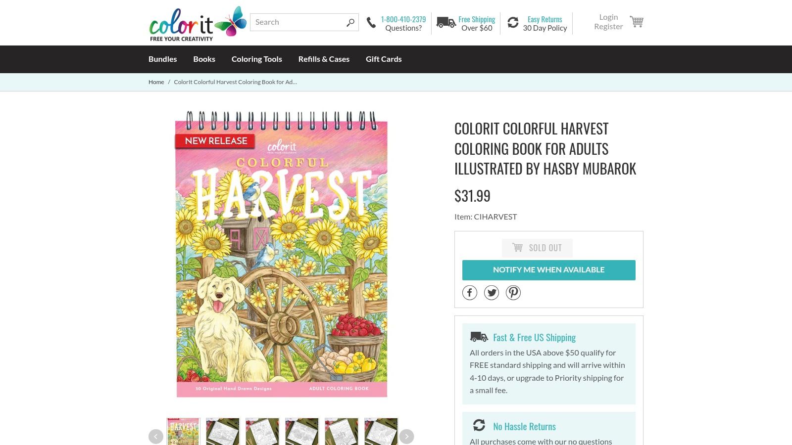
When free printables start feeling flimsy, ColorIt's Colorful Harvest book is the upgrade. The thick paper, lay-flat spiral binding, blotter sheet, and perforated pages solve several common annoyances at once. You can color comfortably, protect the next page, and remove a finished piece without wrestling the spine.
This kind of format matters most if you use alcohol markers often. Better paper doesn't magically stop bleed-through, but it changes how ink sits, spreads, and layers. That can be the difference between a crisp acorn cap and a fuzzy one.
Marker behavior on better paper
Paper changes your technique more than many sets do. On a better book page, you can usually work a little slower, especially on medium-sized areas. On thin paper, hesitation tends to leave darker edges and streaks because the ink grabs fast.
If you're deciding between marker lines, ColorBestie's marker comparison tool for popular brands helps when you're trying to choose what to use on a premium book versus a home-printed page.
- Best fit: Colorists who want a dedicated autumn book and use markers or gel pens regularly.
- Big advantage: Spiral binding is underrated. It makes longer sessions easier on your wrist.
- Watch for: It's a paid product, and availability can change.
One practical note. Don't waste premium pages on untested palettes. Swatch on the blotter sheet or a separate scrap first, especially if you're trying dusky fall combinations like plum and olive, navy and rust, or sepia and sage.
As a seasonal category, fall is already highly visible in hobby coloring. The verified brief notes that seasonal themes like autumn rank among the top purchased categories on major platforms, which tracks with why a dedicated fall book from a specialty publisher feels like such an easy buy for enthusiasts.
6. Dover Publications
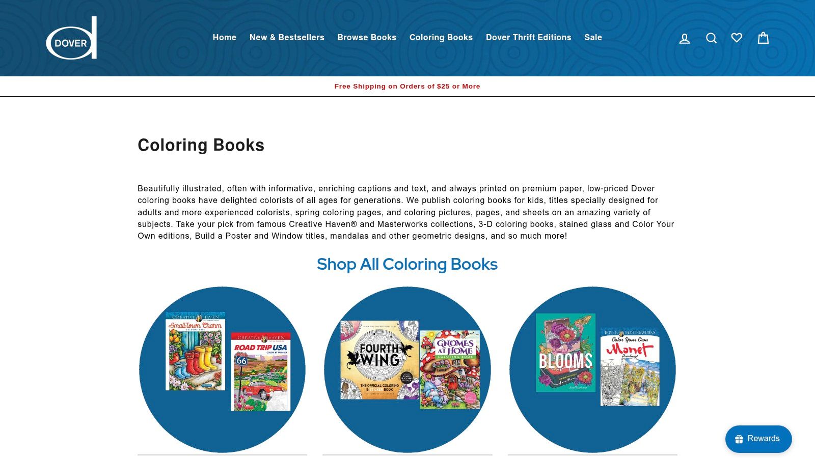
Dover Publications' coloring catalog is the reliable bookstore choice. If you've bought Creative Haven before, you already know the appeal. Adult-oriented line art, single-sided pages in many titles, perforations, and a pretty predictable house style. It's not flashy, but it's dependable.
For fall coloring pages for adults, Dover is strong because it doesn't force you into one interpretation of the season. You can lean harvest, Halloween-adjacent, botanical, rustic, or Thanksgiving without leaving the same publisher ecosystem.
A reliable book-buying strategy
Instead of trying to find one perfect all-in-one autumn volume, I'd use Dover as a mix-and-match source. Pick one title for scenery and one for patterns or botanicals. That gives you variety without the chaos of random marketplace shopping.
If you color often, dependable paper and predictable line art beat novelty almost every time.
Paper quality is good enough, but I still treat Dover as “marker with caution” rather than fully marker-optimized. A blotter sheet is smart, and if you know your marker tends to flood, use a lighter touch. If you're switching between budget and premium alcohol marker brands, ColorBestie's DecoTime to Ohuhu converter can be useful for finding close equivalents before you build a full autumn palette.
The trade-off is fragmentation. Fall artwork is spread across several titles instead of one complete seasonal book. For some people that's annoying. For others, it's the whole advantage because you can tailor your shelf to exactly the kind of autumn imagery you enjoy.
7. Jade Summer
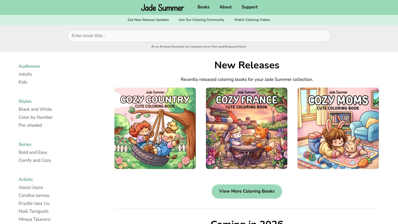
A lot of fall pages look great until the marker hits the paper. Then the fiddly details crowd your blends, dark colors overtake the line art, and the page starts feeling busier than you wanted. Jade Summer avoids that problem better than most because the line work is usually bold, clean, and easy to read under alcohol marker.
That makes a real difference on autumn pages. Pumpkins, plaid scarves, leaves, mugs, and woodland details all benefit from outlines that can hold warm, saturated color. You get smoother coverage, cleaner edges, and less of that patchy look that shows up when a page is too intricate for the tools you're using.
The digital-plus-paperback format is the main reason I recommend Jade Summer to adult colorists building a practical fall setup.
Why the digital option earns a spot in your toolkit
Printable pages give you control over the one variable publishers rarely get exactly right. Paper. If you use alcohol markers, you can print on a stock that handles layering better. If you prefer pencils, you can choose a surface with more tooth. If you want to test two autumn palettes, one muted and rustic, one bright and harvest-heavy, you can print the same page twice and compare the result instead of guessing.
That flexibility pairs well with planning tools. Before I commit to deep oranges, olive greens, burgundy, and golden browns, I like to map the palette first, especially on pages with repeated elements. An AI color planner like ColorBestie is useful for that early decision stage because it helps you sort out which colors should dominate, which ones should stay in support, and where a dark accent will keep the page from going flat.
Jade Summer also suits colorists who value a satisfying finish over extreme detail. The pages often feel cozy and graphic, which is a strong match for fall themes. You can finish a page in one or two sessions and still feel like you made something polished.
A few trade-offs matter:
- Strong choice for markers: Heavier outlines and larger shapes are easier to fill cleanly.
- Excellent for palette testing: Digital files let you reprint and try different autumn color stories.
- Less ideal for detail hunters: If you want tiny botanical realism or very intricate backgrounds, some titles may feel too simple.
- Buying can vary by title: Depending on the book, you may need to purchase through a separate marketplace.
If your best fall coloring sessions involve warm palettes, reliable marker coverage, and pages you'll want to print again next season, Jade Summer is a smart pick.
7-Item Comparison: Fall Coloring Pages for Adults
| Item | 🔄 Implementation Complexity | ⚡ Resource Requirements | ⭐ Expected Outcomes | 💡 Ideal Use Cases | 📊 Key Advantages |
|---|---|---|---|---|---|
| Monday Mandala, Autumn & Fall Collection | Low, one-click PDFs, print-ready; mixed difficulty levels | Minimal, home printer and basic supplies | Relaxing warm-ups; approachable results for short sessions | Session warm-ups; testing color combos and simple techniques | Large free library, regularly updated, consistent line quality |
| Chromopia, Fall Coloring Pages for Adults | Low, curated adult-only set with print guidance | Minimal–moderate, printer + good paper for detailed work | High-quality, atmospheric finished pages for mindful coloring | Slow, detailed coloring to practice mood/lighting | Cohesive adult aesthetic; clear print/size guidance |
| OpenToColor, Autumn & Fall Coloring Pages | Low, fast click-to-download workflow but mixed content | Minimal, time to filter; standard printing supplies | Broad sampling outcomes from quick to longer sessions | Variety seekers; build custom mini “fall books” | Large selection with quick access to many styles |
| SuperColoring, Leaves / Fall Leaves Archive | Low–Medium, huge archive requiring curation | Moderate, print many pages; ideal for marker practice | Strong technical improvement on gradients, veins, blends | Technique drills for markers; side-by-side color tests | 1,500+ leaf pages; online preview; excellent for practice |
| ColorIt, Colorful Harvest (adult coloring book) | Medium, purchased physical product optimized for markers | Higher, paid book, thick paper, blotter sheet recommended | Professional, frame-ready results with minimal bleed | Premium marker sessions; gift-ready finished pieces | Spiral/perforated format, marker-friendly paper, premium feel |
| Dover Publications, Creative Haven Seasonal / Autumn Titles | Low–Medium, multiple titles to browse and buy | Moderate, affordable purchase; use blotter/cardstock | Consistent, dependable results across seasonal themes | Budget-friendly seasonal collections; steady supply | Reputable publisher, single-sided/perforated options, predictable specs |
| Jade Summer, Autumn Coloring Book (digital + paperback) | Low–Medium, instant digital or paperback purchase; large files possible | Moderate, buy digital to reprint on heavy paper if desired | Marker-friendly outcomes with bold line weights | Reprint favorites; experiment with sizes; greeting cards | Bold, clean lines; digital option for flexible reprinting; active community |
Start Coloring Your Cozy Autumn Masterpiece
The best fall coloring pages for adults aren't always the fanciest ones. They're the pages that suit your tools, your mood, and the kind of session you want tonight. Sometimes that means a free printable leaf from SuperColoring so you can practice blends. Sometimes it means a premium spiral-bound ColorIt book because you want a smooth, comfortable marker session without setup or paper guesswork.
If you're new to seasonal coloring, start simple. Pick one free printable collection like Monday Mandala or Chromopia, print a few different page styles, and notice what you enjoy most. Maybe it's botanicals. Maybe it's cozy interiors. Maybe it's bold, easy shapes from Jade Summer that let you focus entirely on palette and shading. Your favorite format will tell you a lot about what to buy next.
For tools, keep the approach practical. Alcohol markers work beautifully for fall because they handle layered warmth so well, but paper matters. Better paper usually gives you cleaner blends and fewer surprises. If you're using thinner pages, protect the sheet underneath and avoid overworking the same area. For color choices, don't feel locked into classic harvest shades. Some of the prettiest autumn results come from muted olives, smoky mauves, stormy blues, sepias, and soft creams.
That mood-first approach is worth exploring because fall coloring has moved well beyond pumpkins and maple leaves. The season invites atmosphere. Candlelight shadows, foggy woods, old book covers, warm knit textures, weathered wood, moonlit skies. Those themes often look richer when your palette is planned before the marker touches paper.
That's the part many colorists skip, and it's where the whole process gets easier. Choose a page that fits your energy, test a palette that feels like your version of autumn, and give yourself room to experiment. The goal isn't perfection. It's a page you enjoy coloring and love looking at when you're done. Happy coloring.
If you want help choosing marker-friendly autumn palettes before you commit ink to paper, ColorBestie is a useful companion. You can preview color ideas, explore mood-based themes, compare marker lines, and get a clearer plan for cozy fall pages without guessing your way through the first layer.