You've got the line art open, your markers are uncapped or your brush tool is ready, and somehow the hardest part still isn't the coloring. It's deciding where to begin without wrecking a drawing you already like.
That's a normal place to be. A lot of artists don't struggle because they lack taste. They struggle because coloring line art asks you to juggle cleanup, palette choices, flat fills, light, blending, and finishing choices all at once. Once we separate those jobs, the process gets much calmer.
This is the workflow I teach when someone wants clean marker results, solid digital habits, or a hybrid setup that moves between both. If you've ever wanted to sketch traditionally, test color ideas digitally, then return to paper with more confidence, this approach fits that rhythm well.
The Foundation Preparing Your Line Art
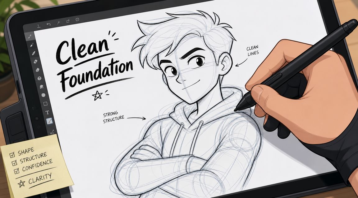
Good coloring starts before color. If the drawing is hard to read in black and white, adding beautiful hues won't rescue it.
Why clean contours matter
A useful reminder comes from an Ohio State University report on line drawings and visual recognition. In that study, researchers removed up to 75% of the pixels in a line drawing and people still identified the scene better than chance. When long contours stayed intact, accuracy was about 60%. That tells us something practical. Continuous edges carry a lot of the meaning.
For coloring, that means your first job is preserving the silhouette, the major folds, and the boundaries between forms. Hair against skin. Jacket against shirt. Foreground object against background. If those edges are crisp, viewers can read the picture before you add a single shadow.
Practical rule: If your line art looks weak at thumbnail size, fix the drawing before you build the palette.
How to prep scanned traditional art
If you inked on paper, scanning often adds gray fuzz, uneven blacks, and tiny dust marks. Those defects don't seem dramatic until you start filling color and see halos around every shape.
I like this cleanup order:
- Scan for line clarity first. You want the ink to hold together, especially in tapered strokes and small details like eyelashes or fabric seams.
- Darken the line layer. The workflow described in Graphixly's colored line art tutorial recommends adjusting brightness and contrast or levels before converting brightness to opacity. That matters because semi-transparent gray lines are much harder to recolor cleanly later.
- Remove specks and accidental gaps. A small eraser and a hard round brush do most of this work.
- Convert the cleaned lines into a workable layer. Once the line art is isolated, keep it untouched as your master copy.
Here's the part people skip. Zoom out often. A scan can look clean at 300% and still feel patchy at normal viewing size because line weight is inconsistent across the page.
How to prep digital native line art
Digital-native line art usually avoids scanner noise, but it has its own traps. The big ones are wobbly curves, accidental line overlap, and too many similar line weights.
A cleaner digital workflow looks like this:
- Use a dedicated line layer. Don't sketch, ink, and shade on the same layer if you want easy edits.
- Correct shape before detail. Fix the jawline, sleeve edge, or hand silhouette before worrying about tiny texture marks.
- Use vector layers when your software allows it. They make line width and curve cleanup much easier.
- Close important shapes. Open gaps near hairlines, collars, or accessories can turn flatting into a mess.
If you're learning how to color line art, your line layer should feel boringly reliable. That's a compliment.
A quick test helps. Fill the background with a loud temporary color, then inspect the drawing for leaks, broken boundaries, and muddy anti-aliased edges. If the structure survives that test, you're ready for color.
Your Color Story Choosing a Winning Palette
Palette paralysis is real. You look at a rack of Ohuhu or Copic markers, love all of them, and suddenly none of them seem right together.
The fix is simple. Stop thinking in isolated swatches and start thinking in relationships.

Build a palette that can actually shade
Basic harmony ideas still help. Complementary schemes create tension. Analogous palettes feel calm. Triadic choices feel lively and graphic. But when we color line art, harmony alone isn't enough. We also need colors that can carry form.
I suggest building around small groups:
- Skin group: one light, one mid-tone, one shadow
- Hair group: base, dark accent, highlight option
- Clothing group: dominant local color, shadow version, contrast color
- Accent group: eyes, accessories, trim, props
That's true whether you work with markers or digital brushes. Marker artists feel this quickly because a single pretty pink isn't a palette. You need the pink that fills the area, the pink that turns the form, and the pink or neighboring tone that deepens the shadow.
A good question is, “Can this palette handle light?” If the answer is no, the piece will look flat no matter how attractive the base hues are.
Use digital previews to test before committing
Hybrid workflows save time. If you've got a traditional sketch or a clean digital line drawing, you can test moods before you touch the final paper piece. One option is the ColorBestie palette generator, which lets you upload line art and generate marker-style color ideas based on themes such as mood, style, lighting, and genre. That kind of preview is useful when you know the feeling you want but haven't locked the exact combinations yet.
I like this method for marker planning:
- Start with the subject. Ask what material each part should feel like. Denim, metal, warm skin, dyed hair, cloudy sky.
- Choose the emotional temperature. Cozy, dramatic, cheerful, eerie, dreamy.
- Preview a few directions digitally. Keep the one that supports the drawing, not just the one with the loudest colors.
- Translate the preview into real marker families. Pull your closest alcohol marker matches before you begin.
Here's a short demo format that can help if you like seeing a tool in action before trying it yourself.
A winning palette doesn't just look nice in a row. It gives every major area somewhere to go in light, mid-tone, and shadow.
If you're working traditionally, make a tiny test card before the final piece. Put your chosen skin, hair, fabric, and background colors next to each other and check whether one area overpowers the rest. That minute of testing can prevent the most common marker regret, which is discovering too late that every color is competing at the same intensity.
Laying Down Flats The Base Color Layer
You've picked a palette you like, opened the file, and now the page looks oddly serious. This is the stage where many artists get impatient and want to jump straight to shadows. I get it. Flats can feel like taping off a wall before painting a room. Still, that prep work is what gives the final piece its clean, confident look.
Flats are the base colors that assign each area its home. Skin gets its color. Hair gets its color. Fabric, props, and background each get their own clear shape. Once those shapes are clean, every later decision becomes easier because you can edit one part without disturbing the rest.
Flats also work like a coloring map. In digital art, they give you clean selection zones to return to for shading, highlights, and line color edits. As noted earlier in Graphixly's guide, a careful setup with protected line work and separate color layers makes repainting and corrections much easier, especially if you want line color to shift with each local area instead of staying pure black.
A clean digital setup
My usual stack stays simple because simple is fast to read at a glance:
- Top layer: line art
- Under it: flat colors
- Above or clipped to flats: shadows, highlights, texture, special effects
If your software has strong selection tools, let them do the repetitive work. Use the magic wand or lasso to capture an area, expand the selection slightly if needed, then fill on the flats layer. For artists who like to test the mood before committing, this theme preview tool for coloring ideas is useful for checking whether the piece wants a soft pastel direction, muted earth tones, or something darker and more cinematic.
One habit matters more than any brush setting. Keep your flats separate from your rendering. If you paint shadows directly into the base color too soon, every revision gets slower, and fixing the problem you have becomes harder than it needs to be.
The marker version of flats
Traditional flatting asks for the same thinking, even though the paper won't give you layers to hide and reveal. We still separate the job in our head. First we place the local color. Then we build form. Then we add accents.
That hybrid mindset helps a lot if you switch between markers and digital. Marker artists often learn control through stroke direction, edge discipline, and planning ahead. Digital artists often learn control through selections, masks, and layer order. Put those together, and you get faster, cleaner results in both mediums.
A few habits make marker flats look more even:
- Match the nib to the shape. Use the broad side for open areas and the narrower edge near small contours.
- Keep your stroke direction consistent. A patch filled in several directions usually shows more streaking.
- Approach edges with a plan. If your ink and paper are predictable, you can carry the color right to the boundary. If they are not, leave a tiny gap and close it carefully.
- Give the marker a moment to dry. Fresh ink often looks blotchy before it settles.
Flat color should feel calm and organized. A messy base layer gives every later step more problems to solve.
If you work in both traditional and digital, here's the useful overlap. Digital flats teach you to divide the image into editable regions. Marker flats teach you to commit with intention and respect the edge of every shape. Together, those skills build speed without making the artwork feel rushed.
Bringing It to Life with Shading and Light
Most coloring problems that feel mysterious are lighting problems. The good news is that you don't need advanced rendering tricks to fix them. You need one believable light source and the discipline to follow it.
A line drawing already gives you form clues. As noted in a PMC review on line drawings and visual perception, artists use contour cues to depict folds, occlusion, and texture, and visual science has long treated line drawings as compact structure for shape and depth. Your shading works best when it supports those contour cues instead of fighting them.
Pick one light source and obey it
Choose where the light is coming from before you place your first shadow. Top left is a classic choice because it reads clearly and feels natural to many viewers, but any direction works if you stay consistent.
Then ask three questions of every form:
- What faces the light?
- What turns away from the light?
- What gets blocked by another form?
That third question is where depth really appears. Cast shadows under bangs, beneath a chin, under sleeves, and where one object overlaps another do a lot of visual work.
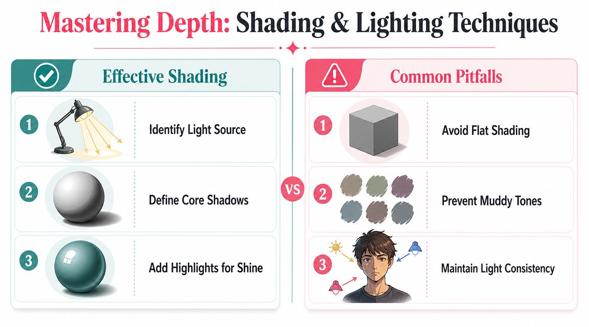
Start with the shadows you can explain. If you can't say why the shadow is there, don't place it yet.
For digital art, a Multiply layer often gives you a clean place to test shadows without harming the flats. For markers, choose the shadow color before you touch the paper. It should relate to the base color rather than looking like a random darker stripe.
Choose hard or soft shading on purpose
Not every drawing wants the same kind of shadow edge.
Cel shading uses hard-edged shadow shapes. It's great for comics, manga, animation-inspired work, and bold graphic illustrations. You decide on a clear boundary and fill it confidently.
Soft shading uses gradual transitions. It suits round cheeks, fabric folds, clouds, skin, and more naturalistic rendering. The edge melts instead of snapping.
A simple way to decide:
| Style choice | Best for | Main visual effect |
|---|---|---|
| Cel shading | Comics, stylized characters, strong design | Clean, punchy form |
| Soft shading | Realism, gentle portraits, organic materials | Smooth volume and atmosphere |
A lot of artists mix the two. Hard shadows under structural overlaps, softer transitions on broad curved surfaces. That combination often feels polished because it mirrors how we perceive form. Some edges are crisp. Others fade.
If your piece still looks flat after shading, the issue usually isn't “not enough rendering.” It's that the shadows aren't grouped clearly enough to describe the planes of the form.
The Magic of Blending for Markers and Digital
Blending is where marker artists and digital artists are doing the same job with different tools. In both cases, you're controlling the transition from one value or hue to another.
That's why skills transfer surprisingly well between mediums. If you understand why a cheek turns softly into shadow or why a metal edge wants a sharper shift, you can use that idea with alcohol ink or a soft brush.
What blending is supposed to do
Blending isn't mandatory everywhere. Sometimes a crisp edge is the stronger choice. Blend when a surface curves, when light falls off gradually, or when you want the eye to move smoothly.
People often over-blend because they're trying to hide uncertainty. That usually removes structure instead of improving it. The better question is, “What kind of transition does this material need?”
For example:
- Skin usually benefits from gentler transitions
- Cotton fabric can swing between soft folds and sharper creases
- Hair often looks better with grouped strands than endless smoothing
- Metal or glossy plastic usually needs firmer contrast
Blending techniques compared
Here's the side-by-side version I wish every beginner got early on. If you're shopping sets or trying to understand how marker families differ, a marker comparison tool for art supplies can also help you line up options before you commit to a workflow.
| Technique | Alcohol Markers | Digital Tools |
|---|---|---|
| Feathering | Flick the darker color into the lighter area, then overlap with the lighter marker to soften the join | Use a textured or tapered brush with short strokes that overlap from dark into light |
| Tip-to-tip transfer | Pick up a little dark ink on a lighter marker tip for a temporary transitional color | Sample a midpoint color and paint the bridge value manually |
| Colorless blender | Pushes or softens ink, lifts small mistakes, and can soften edges in selected spots | Use an eraser with low opacity, a blend brush, or transparency control to soften selected edges |
| Layered passes | Build the gradient with repeated light applications instead of one soaked area | Paint on separate low-opacity passes using soft brushes or clipping masks |
| Airy soft blend | Harder with markers alone, but possible in broad areas with careful overlap | Airbrush or soft round brush creates quick controlled gradients |
| Painterly transition | Achieved through visible stroke direction and marker overlap | Smudge tool or textured blending brushes create brush-led transitions |
A few marker-specific notes matter. Keep the paper from getting oversaturated, especially in small areas. Too much ink too quickly can blur the edge you were trying to preserve. Also, test combinations on scrap paper because some blends look cleaner in theory than they do on your actual stock.
Digital artists run into a parallel problem. If every edge gets smudged, the drawing turns rubbery. Keep some transitions sharp so the soft ones feel intentional.
Blending works when it supports form. It fails when it erases the planes you worked hard to establish.
If you use both mediums, try this exercise. Make a simple sphere, cylinder, and folded ribbon with markers first. Then repeat them digitally. You'll notice the same decisions showing up in both versions: where the core shadow sits, where the reflected light stops, and which edge should stay crisp.
Troubleshooting and Advanced Finishing Touches
When a piece feels off, the cause usually comes from one of three places: palette, values, or edge control. I like to treat this like checking a drawing under three different lamps. One shows color harmony, one shows light and form, and one shows whether the shapes still feel clean. Once you know which lamp reveals the problem, the fix becomes much simpler.
Fix the problem you have
If your colors look muddy, start by checking how many hues are sharing the same space. Mud often shows up when we keep layering unrelated colors, soften transitions too far, or use shadow colors that drain the life out of the palette. With markers and digital brushes alike, more passes do not always mean more richness. Sometimes they just cloud the decision.
Bleeding needs a different fix. For traditional work, check the paper, the amount of ink on the nib, and whether you are returning to an area before it has settled. Small shapes like eyes, fingers, jewelry, and hair spikes behave like tiny cups. They fill fast, and once they do, the edge spreads before you can catch it.
If the image feels flat, test the values before changing the hues. Convert a digital copy to grayscale, or step back from the traditional piece and squint until the details blur. If everything sits in the same middle zone, the forms will read like cutouts instead of solid objects.
Here is the short version I use at my desk:
- Muddy result: simplify the palette and stop blending sooner
- Streaky base layer: use more even passes and match the nib to the shape
- Weak focal point: increase contrast in the area you want viewers to notice first
- Messy edges: repair boundaries before adding more rendering
- Unconvincing depth: strengthen cast shadows where forms overlap
Colored line art as a finishing move
One of the fastest ways to improve a finished piece is to recolor the line art after the flats are established. The method described in Clip Studio Tips on coloring line art is to finish flat colors first, then recolor the line layer to match local materials using locked transparency, often with a darker blend mode such as Linear Burn. The goal is simple: keep the drawing readable while making the lines feel like part of the painting.
Black line art can sit on top of a piece like a sheet of clear plastic. Colored lines tuck it back into the form. Hair lines can shift toward a deeper hair tone. Skin lines can warm slightly. Fabric lines can borrow the local color so the outline supports the material instead of competing with it.
Traditional artists can borrow the same idea. You might print or ink with a softer tone, glaze over printed lines with colored pencil, or place darker local marker accents near line-heavy areas so the black does not feel stranded. This is one of those places where the bridge between marker habits and digital workflow becomes very useful. You can test line colors digitally first, then carry the same choice into your marker rendering with much more confidence.
Darker and less saturated usually works better than lighter and louder when you tint line art.
Restraint matters here. You do not need to recolor every line. Often the cleanest result comes from tinting interior lines while keeping the outer silhouette darker, which preserves clarity and still gives the piece a more polished finish.
If you want to test those choices before committing to final marker strokes, ColorBestie fits neatly into a hybrid workflow. You can upload line art, preview marker-style color directions, and use that draft like a planning sheet before you touch your Ohuhu, Copic, Prismacolor, or digital brush set.
