
You sit down with a fresh page, uncapped markers, and a head full of ideas. Then the weird part happens. Every color looks pretty on its own, but together they suddenly feel risky. Do you pick the dusty pink or the peach? Should the leaves stay yellow-green or lean blue-green? Why does one set of swatches feel calm and polished while another turns muddy before you've even started?
That's the moment most hobby colorists are asking, what is color harmony. Not in an art-school, technical way. In a real way. In the middle of a coloring page, a manga panel, or a cozy floral illustration, when you want your choices to feel intentional instead of random.
If you use alcohol markers, this gets even trickier. Ink blends. Paper shifts the look. Caps don't always match the final stroke. And if you own markers from Ohuhu, Copic, Prismacolor, or another brand, translating a palette idea into the markers already in your case can feel like half the battle.
The Quest for the Perfect Palette
A lot of colorists think the problem is that they “aren't good with color.” Usually that isn't true. Instead, the problem is that too many beautiful options show up at once, and nothing tells you which ones belong together.
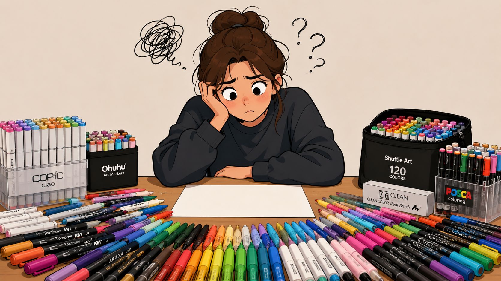
You might have a case full of warm grays, soft violets, juicy greens, skin tones, and dramatic blues. Each marker feels full of possibility. But when you start choosing for one project, all that possibility can turn into hesitation. A mushroom cottage page wants charm. A fashion sketch wants polish. A comic scene wants clear mood and focus. The same marker set can do all of that, but not all at once.
That's where color harmony helps. It isn't a strict rulebook that tells you there's only one correct answer. It's more like a guide that helps you narrow the field and make choices that support each other.
Practical rule: Harmony means your colors feel like they belong in the same conversation.
For hobbyists, that matters because coloring should feel relaxing, not like a test. If you've ever picked one marker, then a second, then a third, and suddenly wondered why the page feels noisy, you've already felt the absence of harmony. And if you've ever stumbled into a small set of colors that looked effortlessly right together, you've already seen harmony working.
One easy way to start is by building a palette before you touch the paper. A tool like the ColorBestie Palette Generator can help you test combinations first, so you're choosing with intention instead of guessing marker by marker.
The good news is that color harmony isn't reserved for naturally gifted artists. It's a learnable skill. Once you understand what makes colors feel related, calm, lively, bold, or balanced, picking palettes gets much less stressful and a lot more fun.
Decoding the Color Wheel Your Foundational Tool
The color wheel looks simple, but it carries a lot of useful information. If you've ever wondered why certain combinations feel smooth while others feel loud, the wheel is usually where the answer starts.
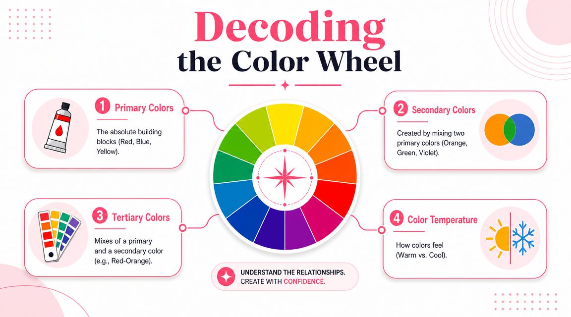
Meet the color families
Think of the wheel like a family map.
Primary colors are the basic relatives. In traditional art teaching, those are red, blue, and yellow. They're treated as the core building blocks.
Secondary colors come from mixing two primaries. Orange, green, and violet live here.
Tertiary colors are the in-between colors, like red-orange or blue-green. These are often the shades marker artists reach for most, because they feel nuanced and natural.
That family structure matters because nearby relatives usually cooperate more easily. Colors next to each other on the wheel often feel smoother together. Colors across from each other create stronger tension and energy.
A second thing the wheel shows is temperature. Reds, oranges, and many yellows tend to read as warm. Blues, blue-greens, and many violets tend to read as cool. Even within one hue, you can get a warmer or cooler version. A yellow-green can feel fresh and sunny, while a blue-green can feel shaded and calm.
Here's a quick visual explainer to reinforce the idea:
The three parts of any color
When beginners ask what is color harmony, they often focus only on hue. Hue is important, but it isn't the whole story.
- Hue is the color's name. Red, green, blue, violet.
- Saturation is the color's intensity. A bright cherry red is more saturated than a muted dusty rose.
- Value or brightness is how light or dark it appears. Pale lavender and deep plum may share a hue family, but their values are very different.
For marker artists, this explains a common frustration. You can choose “the right colors” in theory and still get a result that feels off if the values are too similar or the saturation levels fight each other.
A harmonious palette often shares some kind of relationship, not just in hue, but in lightness and intensity too.
Why harmony isn't random
Color harmony may feel subjective, but it isn't pure guesswork. A foundational statistical study found that 21 subjects rated 144 color pairs on a 1-to-7 scale, where 1 meant harmonizing and 7 meant clashing. The researchers found that a two-dimensional solution explained 83.1% of the variability in the transformed data, and they identified hue, value (brightness), and “pleasantness” as major factors in judgment. They also concluded that harmonious combinations generally involve similarity in those attributes, as described in the University of Dayton color harmony study.
That matters because it gives you a solid footing. Your eye isn't reacting randomly. When a palette feels unified, there are often real, repeatable relationships behind that feeling.
The Classic Color Harmony Recipes
A color harmony scheme is a recipe for choosing colors that already have a relationship on the wheel. For a marker artist, that saves you from pulling six beautiful markers that somehow fight each other once they hit the page.
Recipes are useful because they narrow your choices before you start blending.
Color Harmony Schemes at a Glance
| Scheme | How It Works | Creates a Feeling Of | Best For Coloring |
|---|---|---|---|
| Analogous | Uses colors that sit next to each other on the wheel | Calm, gentle, unified | Florals, landscapes, cozy book pages |
| Complementary | Uses colors opposite each other on the wheel | Bold, lively, dramatic | Focal points, comics, eye-catching details |
| Split-complementary | Uses one main color plus the two neighbors of its complement | Energetic but easier to control than direct complements | Character outfits, playful scenes |
| Triadic | Uses three colors spaced around the wheel | Balanced variety, cheerful movement | Kids' art, fantasy scenes, stylized illustrations |
| Monochromatic | Uses one hue in different values and saturations | Elegant, controlled, soothing | Practice pages, portraits, tonal studies |
How each scheme feels on the page
Analogous palettes are a gentle starting point. If you color a leafy garden scene with yellow-green, green, and blue-green, the page usually feels connected right away because the hues are close relatives. With alcohol markers, this scheme is also forgiving. Neighboring colors often blend more smoothly, so you get fewer harsh transitions.
Complementary palettes create tension in a good way. Blue against orange. Red against green. Violet against yellow. These pairs pull the eye because they are far apart on the wheel, which makes them useful for focal points. If you want a character, flower, or outfit detail to stand out, a complementary accent can do that fast.
A helpful way to control that contrast is to let one color lead and use its opposite in smaller doses. For example, a mostly teal page with touches of coral usually feels more polished than a 50-50 split.
Split-complementary palettes soften the pressure. You pick one main hue, then use the two colors beside its opposite. If blue is your main color, red-orange and yellow-orange give you contrast without the hard visual push of straight orange. Many hobby colorists like this scheme because it feels lively but still manageable.
Triadic palettes give you more variety. They use three colors spaced around the wheel, so the result can feel playful and balanced at the same time. This is handy for pages with lots of separate elements, like candy shops, fantasy creatures, or busy patterned spreads. The trick is the same one marker artists keep coming back to. Choose one color to dominate, let another support it, and save the third for accents.
Monochromatic palettes teach control. You stay inside one hue family and change the value and saturation instead. That might mean pale pink, mid-tone rose, deep berry, and a dusty muted version of the same family. If you are practicing alcohol marker shading, this scheme helps you focus on blend groups, shadows, and depth without also solving a hue puzzle.
Before you commit ink to paper, it helps to compare a few schemes side by side. A quick test in a theme preview tool for palette ideas can show you whether your page wants calm neighbors, bold opposites, or a quieter single-family look.
If a page feels chaotic, the problem is often color distribution, not the harmony recipe itself.
One strong habit can improve almost every palette. Pick a lead singer.
Your dominant hue sets the mood. Supporting colors back it up. Accent colors get the spotlight for a moment, then step away. That simple hierarchy makes color harmony much easier to apply in real coloring sessions, especially when your marker case is full of tempting options.
Beyond the Formulas Temperature Contrast and Balance
A harmony formula is like a cake recipe. It gives you structure, but the final result still depends on how you handle the ingredients. Two colorists can both choose an analogous palette and end up with pages that feel completely different because one keeps everything soft and close in value, while the other adds sharper contrast and a warmer focal point.
Temperature changes the story
Color temperature affects mood fast. A page colored with coral, butter yellow, and peach feels friendly and close. The same page in blue violet, slate, and icy aqua feels quieter and more distant.
Temperature also helps describe space, which is especially useful with alcohol markers because you can suggest depth without heavy line work or advanced shading. Warm reds, oranges, and yellow-greens usually come forward. Cool blues, blue-greens, and violets usually sit back. If your floral bouquet looks crowded, warming the front petals and cooling the leaves behind them can separate the layers with very little effort.
A simple rule helps. Start with one temperature family as your base, then use a small touch of the opposite temperature only where you want attention.
Contrast gives the eye somewhere to rest and somewhere to focus
Harmony does not mean sameness. If every marker on the page sits in the same middle range, the result can feel foggy even when the colors technically belong together.
Value contrast fixes that. Light areas act like breathing room. Dark areas act like anchors. Your eye needs both.
This matters a lot with alcohol markers because cap colors can be deceptive. Two markers may look different in the barrel and still dry to nearly the same lightness. A quick check with a marker comparison tool for swatches and value differences can save you from choosing three “different” colors that merge into one flat patch on paper.
Some palettes are quiet in hue but strong because their lights and darks are clearly separated.
Balance keeps one area from stealing all the weight
Balance is the part many hobby colorists feel without being able to name. A page can use lovely colors and still seem off, a bit like a room where all the furniture got pushed to one side.
Too much similarity makes a page sleepy. Too many equal-intensity colors make it busy. Balance lives in the middle. You want enough repetition that the colors feel related, and enough variation that the page still has movement.
For marker work, the easiest fix is to assign jobs to your colors instead of giving every marker the same role:
- Choose one dominant color to carry most of the page.
- Use one supporting color to reinforce the mood or separate major shapes.
- Keep one accent color for tiny moments of contrast or sparkle.
If you know the 60 30 10 idea, this is the same basic principle. It is not a rule to obey with a ruler. It is a practical way to stop five attractive markers from competing for first place.
That small shift matters. Color harmony stops feeling like a chart on a screen and starts working like a real decision-making tool in your marker case.
From Theory to Ink Practical Steps for Marker Artists
Digital palettes are tidy. Marker work is not. Ink spreads, layers shift, and paper changes the final result. That's why many colorists understand harmony in theory but still struggle when they move to real supplies.
Why marker artists need a real-world workflow
A practical source on color harmony in real materials) notes a gap that hobby artists feel all the time. Many explanations stop at pleasing wheel-based combinations like complementary or analogous schemes, while real design work also deals with matching colors across technologies and substrates. It also points out that tint, tone, saturation, chroma, and luminosity affect whether colors still feel harmonious in the final object or print.
That's exactly the marker challenge. A digital peach and a physical peach marker are not always the same experience. Layering may mute one color, intensify another, or push a blend warmer than expected.
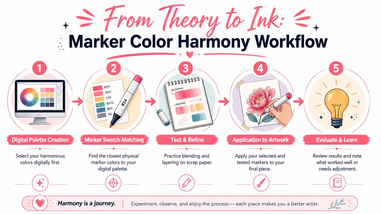
A simple five-step process
Start with the mood, not the marker case.
Decide whether the page should feel cozy, dreamy, dramatic, fresh, vintage, or playful. Mood narrows your options faster than swatch-hoarding does.Build a small digital palette first.
Keep it tight. A handful of colors is easier to control than chasing every pretty marker you own. One option is ColorBestie's marker comparison workflow tools, which help translate digital planning into brand-specific marker choices.Match to the markers you own.
Many hobbyists move too quickly past this point. Don't assume the nearest cap color is the closest match. Check your swatch chart. If you use Ohuhu, Copic, Prismacolor, or mixed brands, compare the laid-down color.Test on scrap paper from the same pad or a similar sheet.
Alcohol markers can look cleaner, duller, warmer, or softer depending on the paper. Make a mini test with your intended combinations before touching the final page.Adjust before the final pass.
If your accent color steals too much attention, mute it. If the palette looks sleepy, increase value contrast rather than adding random new hues. Small edits usually work better than full palette resets.
A few marker-specific habits help even more:
- Swatch by family: Group warm reds, cool reds, muted greens, and grays together so comparison is easier.
- Keep a light, medium, dark option: Even a simple palette feels richer when each major area has a value path.
- Use neutral markers carefully: Grays and browns can unify a page, but too much can flatten the sparkle if the subject needs brightness.
For alcohol marker artists, harmony is less about memorizing theory and more about creating a repeatable workflow that survives contact with real ink.
Common Color Harmony Mistakes and How to Fix Them
Most color mistakes aren't signs that you lack talent. They're signs that your eye is learning. That's a good thing.
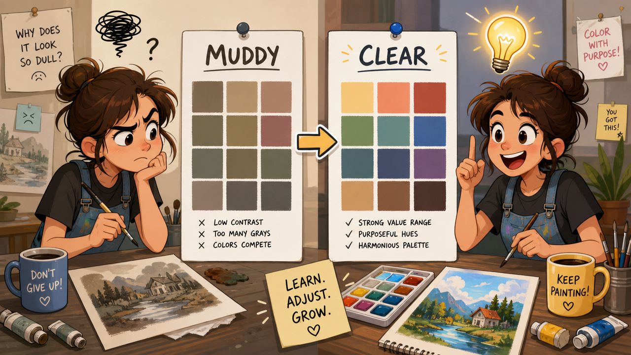
Using too many unrelated colors
This usually happens when every object gets its own exciting choice. A teal mushroom, coral flowers, purple shadows, lime leaves, pink sky, and golden path can each be lovely alone. Together, they may compete.
Try this instead. Choose a smaller family and repeat it across the page. Let some areas share undertones. Repetition is one of the fastest ways to create unity.
Forgetting value
Sometimes a palette isn't muddy. It's flat. If everything lives in a similar middle range, the page can feel blurry even when the hues are fine.
Try this instead. Squint at your swatches. If they all seem close in lightness, add one noticeably darker marker and one lighter one. Value often fixes what people assume is a hue problem.
Treating formulas like laws
This one surprises beginners. They learn a scheme, then cling to it so tightly that the result feels stiff. A page can be technically analogous and still feel lifeless.
A recent line of research described in the arXiv paper on hue-dependent color preference reports that color preferences are highly hue dependent, which means there isn't one universal rule that makes every pairing harmonious. The paper also suggests that harmony may reflect an ecological pattern rather than an arbitrary design convention.
That's freeing. It means your eye still matters. A formula can guide you, but it can't replace looking.
When a palette almost works, don't throw it out immediately. Shift one hue, darken one area, or soften one accent first.
The fix is often smaller than you think.
Your Harmonious Coloring Journey Begins Now
Color harmony isn't a mysterious gift some artists have and others don't. It's a skill you build by noticing relationships. Which hues support each other. Which values create focus. Which temperatures shape the mood you want.
If you remember only a few things, remember these. The color wheel is your map. Classic schemes are your starter recipes. Value and temperature matter as much as hue. And marker artists need to test palettes in practice, not just admire them on a screen.
You also don't need to master everything at once. Try one low-pressure exercise at a time:
- Color a flower page with an analogous palette using only neighboring hues.
- Make one monochromatic mini study with light, medium, and dark versions of a single color family.
- Take a favorite photo and pull a small palette from it before matching it to your markers.
- Use one dominant color plus one accent and notice how much calmer the page feels.
That's how your eye gets stronger. Not through perfect theory memorization, but through repeated, relaxed practice.
If you want a simple way to plan marker-friendly palettes before you commit ink to paper, ColorBestie lets you preview color ideas, explore theme-based directions, and translate palette choices into popular alcohol marker brands.
Drafted with Outrank tool

