
You finish a marker piece at your desk and it looks perfect. The skin tones feel soft, the shadows look clean, and your warm gray blend finally behaves. Then you carry it into the kitchen, or snap a photo with your phone, and suddenly the whole thing feels wrong. Reds shift orange. Neutral grays lean blue. The paper itself doesn't even look white anymore.
That mismatch usually isn't your markers. It's the light.
If you've ever asked what is color temperature, the simple answer is this: it's the color cast of the light around your artwork. Once you understand that, a lot of frustrating art moments start making sense. You can choose a better lamp, pick marker colors with more confidence, and photograph finished pieces so they look closer to what you made.
Why Your Artwork Looks Different in Photos
A lot of marker artists have the same story. You color under a cozy desk lamp at night, feel great about the result, and then the next morning your piece looks like it belongs to someone else. The peach skin tone is now too yellow. The cool gray background looks slightly green. Your phone photo makes everything flatter than it felt in person.
That happens because light isn't neutral just because we call it “white.” Every light source has its own tint. A warm lamp can push your page toward yellow or orange. Daylight from a cloudy window can push things cooler and bluer. Your markers didn't change. The light hitting them changed, so your eyes and camera read the colors differently.
This matters for artists for the same reason it matters in any visual work. Consistency changes how people experience what you make. If you care about presentation, this article on why on-brand imagery makes a real difference in SEO shows how visual consistency affects the way images are perceived online too.
Your artwork can be correct and still look wrong under the wrong light.
Marker ink is especially sensitive to this because layering creates subtle color relationships. When the room light shifts, those small relationships shift with it. That's why color temperature isn't just a photography term. For hobbyists using Copic, Ohuhu, Prismacolor, or similar alcohol markers, it's part of everyday color judgment.
Understanding the Kelvin Scale for Artists
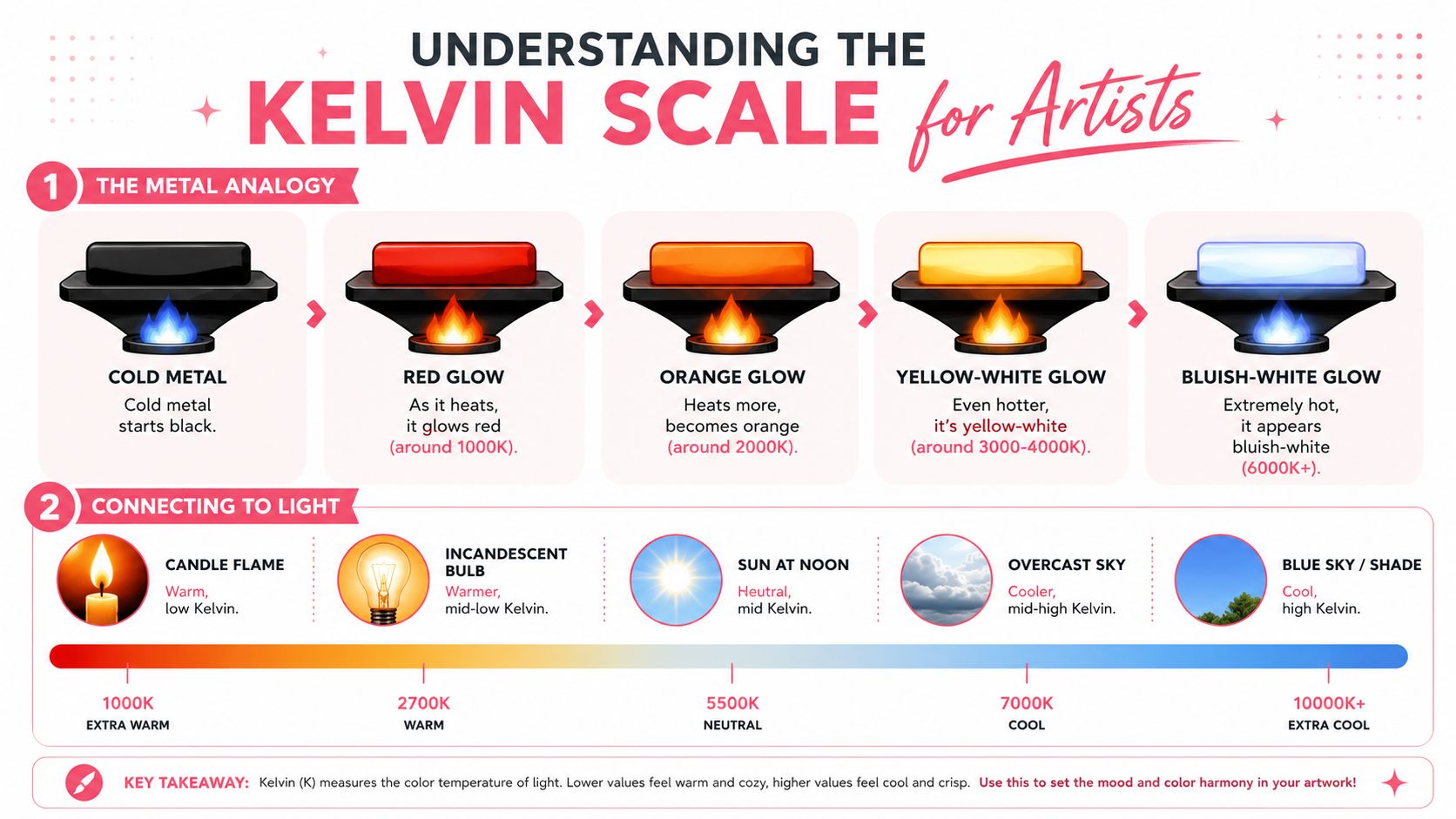
Color temperature is the scientific way we describe the color of light. It's measured in Kelvin (K), and the idea comes from how an ideal black body radiator would glow as it heats up, as described in the Wikipedia explanation of color temperature.
A simple art-friendly way to picture it is a piece of metal in a forge. When it starts heating, it glows red. Hotter, it turns orange. Hotter still, it becomes yellow-white, and at extreme heat it shifts toward blue-white. That's where the scale comes from.
Why the numbers feel backward
This is a common point of confusion.
In everyday speech, “warm” sounds like it should have a higher number. But on the Kelvin scale, lower values look warmer and higher values look cooler. Light in the 2000K to 3500K range appears warm, with yellowish or reddish tones. Light in the 5000K to 6500K range appears cool, with a more neutral or bluish-white look, based on the same Wikipedia reference on color temperature.
Easy memory trick: campfire light is warm-looking and low on the scale. Clear sky light is cool-looking and high on the scale.
That's the key idea most artists need first. Lower Kelvin equals a cozy lamp, candle, or amber glow. Higher Kelvin equals daylight, overcast brightness, or blue shade light.
What CCT means on modern bulbs
If you shop for desk lamps, you'll often see CCT, which stands for Correlated Color Temperature. That term matters because many modern light sources, especially LEDs and fluorescents, don't behave like perfect heated metal. Industry uses CCT to describe the blackbody temperature that most closely matches how that light looks to us, as explained by RP Photonics in its overview of color temperature and CCT.
For marker artists, you don't need to memorize the physics. You just need to know that when a bulb says 2700K, 3500K, or 5000K, it's telling you the color cast of the light you'll color under.
That label is practical. It helps you predict whether your marker swatches will lean golden, balanced, or crisp and cool before you ever open the cap.
How Light Affects Your Marker Colors
Marker color is never seen in isolation. You're always seeing ink plus paper plus surrounding light. That's why the same Copic warm gray can look soft and elegant at one desk, then muddy under another lamp.
What warm light does to marker ink
Warm indoor lighting tends to flatter warm families and distort cool ones. Under a cozy lamp, yellows often feel richer, browns feel deeper, and warm reds can look inviting. But cool grays, blue violets, and subtle blue-greens may lose clarity.
Cooler daylight does the opposite. It can make clean blues and cool shadows feel sharper, but it may drain warmth from oranges, pink beiges, and golden blends. If you've ever wondered why your sunset palette looked lively at night and strangely flat the next day, that's color temperature doing its job.
For close-up creative work, a middle ground often feels better. Emerging 2025 to 2026 human-centric lighting research says 4000K neutral light reduces eye strain by 34% compared to 3000K warm light during prolonged close-up tasks such as marker coloring, according to Alcon Lighting's color temperature guide.
Neutral light often gives you the fairest read of your palette. It doesn't overly butter up warm colors or chill down cool ones.
If you're comparing shades before buying more markers, a side-by-side tool like the ColorBestie Marker Comparison tool can help you narrow choices before you test them under your own lamp.
Common light sources and their color temperature
Some reference points help a lot when you're trying to diagnose your workspace.
| Light Source | Approximate Color Temperature (K) |
|---|---|
| Tungsten incandescent light | 3200K |
| Early morning or late afternoon sunlight | 4400K to 4500K |
| Fluorescent lighting | 5000K |
| Daylight baseline used in lighting design | 5200K |
| Midday sunlight | 5600K |
| Overcast day | 5800K |
| Deep shade or partly cloudy conditions | 8000K to 9000K |
Those benchmark values come from the lighting reference examples in this video on color temperature and white balance.
Here's the practical takeaway for a marker desk:
- If your lamp feels amber: your cool grays may look duller than they really are.
- If your setup is window-heavy: changing weather can change your color judgment during the same session.
- If you want consistency: pick one main coloring light and stick with it when swatching, blending, and reviewing finished work.
Get Perfect Photos with White Balance
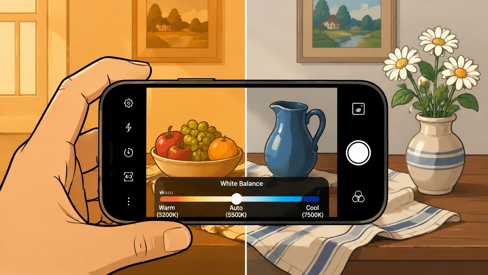
Your camera has the same problem your eyes do. It has to decide what “white” means in the light around your page. That decision is called white balance.
A simple way to think about white balance
If you photograph a drawing under tungsten light, your paper may look yellow unless the camera compensates. If you shoot in deep shade, the paper may look blue unless the camera warms the image back up.
Photographers use a few anchor points constantly. Tungsten incandescent light sits around 3200K, midday sun around 5600K, and deep shade can rise to 8000K to 9000K, based on the same white balance reference video used by artists and photographers. Those numbers matter because they tell you what kind of correction your camera may need.
A phone usually guesses automatically, and sometimes it guesses well. But marker art can fool it, especially if your page contains lots of one dominant color. A mostly pink portrait or blue background can push auto settings in odd directions.
A quick phone workflow
Try this the next time you post your art:
- Use one main light source. Don't mix a warm desk lamp with cool window light if you can avoid it.
- Include some white paper in the frame. Your camera needs a reference.
- Tap the white area before shooting. Many phones use that tap to help with focus and exposure, and it can improve color decisions too.
- Check for a Pro or Manual mode. If your camera app lets you choose Kelvin, start near the light you're using and adjust until the paper looks like real paper.
- Make a tiny edit after shooting. If the page still looks too blue or too yellow, nudge warmth or temperature in a photo app until your image matches the original piece.
A quick visual demo helps this click:
White balance is your camera asking, “What counts as neutral here?” Give it a clear answer, and the rest of the colors usually fall into place.
Simulating Light with Your Marker Palettes
Color temperature isn't only a problem to solve. It's also a mood tool.
When you choose markers, you're not just choosing local color. You're also choosing the feeling of the light inside the scene. In this context, warm grays, cool grays, muted blues, and golden yellows start behaving like lighting decisions instead of random swatches.

Building warm scenes with marker choices
If you want a cozy, lamp-lit, golden-hour, or café-at-sunset feeling, push your palette warmer than real life.
That usually means:
- Leaning into warm grays instead of neutral grays for shadows
- Choosing yellowed highlights instead of stark white
- Softening reds with peach, coral, or light brown
- Keeping contrast gentle so the scene feels lit, not harshly spotlighted
A wooden table under warm light won't just look brown. It may reflect honey, amber, or orange undertones. Skin may shift peachier. White clothing may need cream or ivory shadows instead of blue-gray ones.
Building cool scenes without making them dull
Cool scenes need more than “add blue.” If every shadow turns plain blue-gray, the art can lose life.
Try a cooler temperature mood by mixing:
- Cool grays for structure
- Blue-violets or muted teals for atmosphere
- Selective warm accents so the image still has a focal point
- Cleaner contrast to suggest crisp air or daylight
This is especially useful for moonlit scenes, rainy windows, winter backgrounds, and manga-style interiors with screen glow.
In professional color-critical work, even small lighting changes matter. CCT deviations are typically acceptable within ±150 K for general illumination, but color-critical applications need tighter control at ±50 K, according to RP Photonics on color temperature tolerance. Marker artists can feel that sensitivity too. A small change in lighting can make a warm gray family look more neutral, or make a skin palette drift warmer than intended.
If you want to test mood before you commit expensive ink, a digital planning tool like the ColorBestie Palette Generator can help you preview harmonious combinations first.
Making Light and Color Work for You
Color temperature sounds technical at first, but the useful version is simple. It's the color of the light around your art, measured in Kelvin, and it changes how your markers look.
Once you notice it, a lot of confusion clears up. Your grays weren't “off.” Your lamp was warm. Your photo wasn't “bad.” Your phone guessed the wrong white balance. Your cozy scene wasn't flat. It just needed a palette that matched the kind of light you wanted to suggest.
Good marker choices come from seeing clearly first, then styling intentionally.
That's what makes this concept so helpful for hobbyists. You don't need a studio. You just need a more reliable desk light, a little awareness when you photograph your work, and the confidence to use warm or cool marker families on purpose.
Try one small experiment this week. Swatch the same three markers under two different lights, then photograph both versions. You'll learn more from that than from memorizing terms. Once your eye sees the shift, choosing your next marker gets much easier.
If you want a low-pressure way to plan palettes before you ink the page, ColorBestie is a cozy companion for marker artists. You can preview color ideas, explore lighting moods, compare marker-friendly options, and turn black-and-white sketches into inspiration that feels easier to translate into real Copic, Ohuhu, Prismacolor, and similar marker sets.
