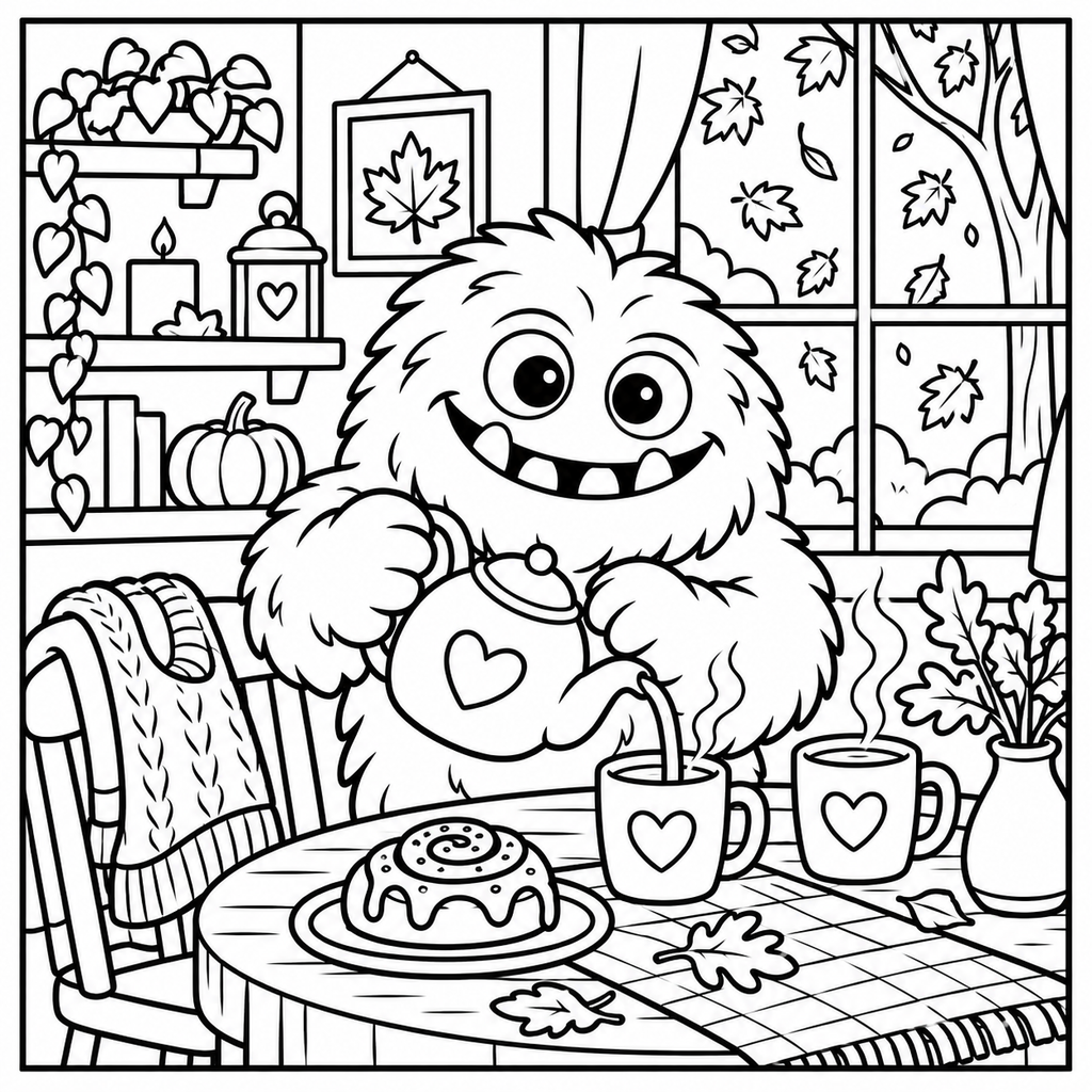
Fuzzy Hygge coloring book inspo for soft, cozy scenes.
Start a Fuzzy Hygge page with warm neutrals and a little space for one playful color. Build a calm scene with a small palette, then add as much detail as you enjoy.
Our own ColorBestie practice artwork with a generated color preview. Not a page from the featured book. Get this free practice page →
Fuzzy Hygge and Vivi Tinta coloring books
Vivi Tinta's official catalog includes Fuzzy Hygge, Fuzzy Friends and seasonal titles. Fuzzy Hygge: Spooky Fuzzy is also listed by Penguin Random House under Clarkson Potter. Check the exact title when looking for inspiration; similar names can refer to different books or editions.
Look at your page's largest shapes and choose a light color for the background before concentrating on tiny details. If there are several characters or objects, a shared neutral and a repeated accent can make the whole scene feel connected.
Use warm neutrals without making everything brown
Separate your neutral colors by lightness: cream for the background, biscuit for a middle tone and cocoa for a few deep details. Add a muted green or dusty pink to stop the page feeling like one large warm shape.
Keep two neighboring objects different in value. A light character reads clearly against a slightly darker chair, even if both use warm colors. Repeating the same shadow color across small areas ties the scene together without requiring a large collection of pens.
Give soft characters a little dimension
Use a pale base and place a small shadow where one shape sits in front of another. You can suggest softness with a few short pencil strokes or small marker touches instead of drawing texture over every surface.
Test the shadow beside the base before adding it to your page. Two colors that look close on screen can dry quite differently on paper. With pencils, build gradually; with markers, let a layer dry and keep the lightest area free of repeated ink.
For a warm everyday scene, use the biscuit-and-rose recipe below. For a seasonal page, keep the same cream and brown, then replace the pink with muted pumpkin and the green with lavender. One or two changes can create a different atmosphere without making the page difficult to manage.
You can also photograph your own page and use ColorBestie to explore a generated color direction. Treat the result as inspiration and choose your physical supplies separately. For another cute-scene starting point, compare the Cozy Cuties and Cozy Friends guides.
Start with five colors and repeat them across your page. These are original ColorBestie palette suggestions, not official book palettes or verified marker-code lists.
Biscuit and rose
Cream#F7EBD6
Biscuit#D0B08B
Dusty pink#D1A0A8
Moss#A0AE91
Cocoa#846A58
Use cream for the background or light fur, biscuit for a second neutral area and dusty pink for one main accessory. Moss adds a quiet cool balance. Reserve cocoa for overlaps and small details so the soft colors stay visible.
Gentle spooky evening
Moon cream#F0E6CF
Muted pumpkin#D5A071
Hazy lavender#B7A7C6
Gray green#99A99C
Dusk#74667F
Keep moon cream near the focal point, pumpkin on a warm object and lavender on the surrounding cool areas. Gray green makes a gentle second neutral. Use dusk in small shadow shapes rather than filling the background completely.
Fuzzy Hygge is associated with Vivi Tinta. Use the official artist catalog and the publisher listing below to check the particular title and edition you want.
Where can I find Fuzzy Hygge coloring book inspo?
The original palettes here offer warm everyday and gentle spooky directions. Adapt the color placement to your page, or explore a color preview of your own permitted upload in ColorBestie.
Do I need a large alcohol marker set?
No. A pale neutral, two main colors, an accent and a shadow are enough for a starting palette. Pencils can work too. Test supplies on the relevant paper and protect the sheet underneath if using markers.