
What makes one animal coloring page a pleasure with alcohol markers, while another turns into feathered edges, cramped shadows, and flat color? In practice, the answer usually has less to do with the animal itself and more to do with the drawing: clean contours, enough open space for blending, and forms that still read clearly after you add two or three marker values.
Animal pages are everywhere, but they are not interchangeable. Some are built for quick crayon fills on thin paper. Others hold up well on cardstock, tolerate layering, and give you enough shape information to suggest fur, feathers, scales, or water without grinding the nib into tiny details. That distinction is important because the same lion, owl, or dolphin can color beautifully or fight you the whole way depending on line weight and page design.
I judge these libraries the way I judge any printable for marker work. First, I look at line art quality. Then I look at how well the page will print on heavier paper, whether the black outlines are likely to smear under alcohol ink, and whether the subject leaves room for believable palettes beyond the usual brown-and-beige defaults. If you want help testing palettes before you print, a digital color planning tool for coloring pages can save paper and marker ink.
Crayola is a useful benchmark here because its plant and animal pages are designed for a wide age range, which usually means clearer shapes and manageable detail (Crayola plants and animals collection). The list below focuses on sources I would pull from for marker sessions, with the trade-offs that matter most: paper compatibility, bleed control, line spacing, and the kinds of palettes that suit each style of animal art.
1. SuperColoring
SuperColoring is the library I'd open first if I wanted range fast. It covers pets, wildlife, marine life, insects, birds, reptiles, and biome-style categories well enough that you can usually find three versions of the same animal mood: simple, cartooned, and more detailed.
The main strength for marker users is volume plus consistency. The page layouts are usually print-ready, and the outlines are often dark enough that light alcohol-marker overlap won't visually erase the drawing. The downside is style variation. Some pages are clean and spacious, others feel busy or slightly clip-art-like.
What works best with markers
For broad animal categories like lions, wolves, dolphins, parrots, and turtles, SuperColoring is good for testing palettes before you commit to a final page. If you use ColorBestie to preview marker-style combinations first, this site gives you plenty of base drawings worth testing.
Use smoother paper only if you're printing a single page at a time and placing a bleed sheet underneath. For home printers, I prefer a heavier matte stock over standard copier paper because many of these outlines deserve at least two-tone shading.
- Best fit: Mammals, birds, sea life, and beginner-to-intermediate marker studies.
- Less ideal: Hyper-detailed fur rendering or pages where you want a polished adult-coloring-book finish.
- Palette idea: Try warm gray plus soft tan for wolves, blue gray plus muted teal for dolphins, and olive plus yellow green for turtles.
Practical rule: When the art style is mixed, test one small section first. Animal pages with inconsistent line weight can look flat if you apply full-page saturation too early.
I also like SuperColoring for bulk printing practice sheets. If you're teaching kids and adults together, it's one of the easier places to find the same subject in multiple complexity levels.
2. Crayola
Crayola Animals is cleaner than most free libraries. That matters more than people think. When I print animal pages for markers, I don't want to fight faint lines, awkward cropping, or crowded ads before I even get to the paper tray.
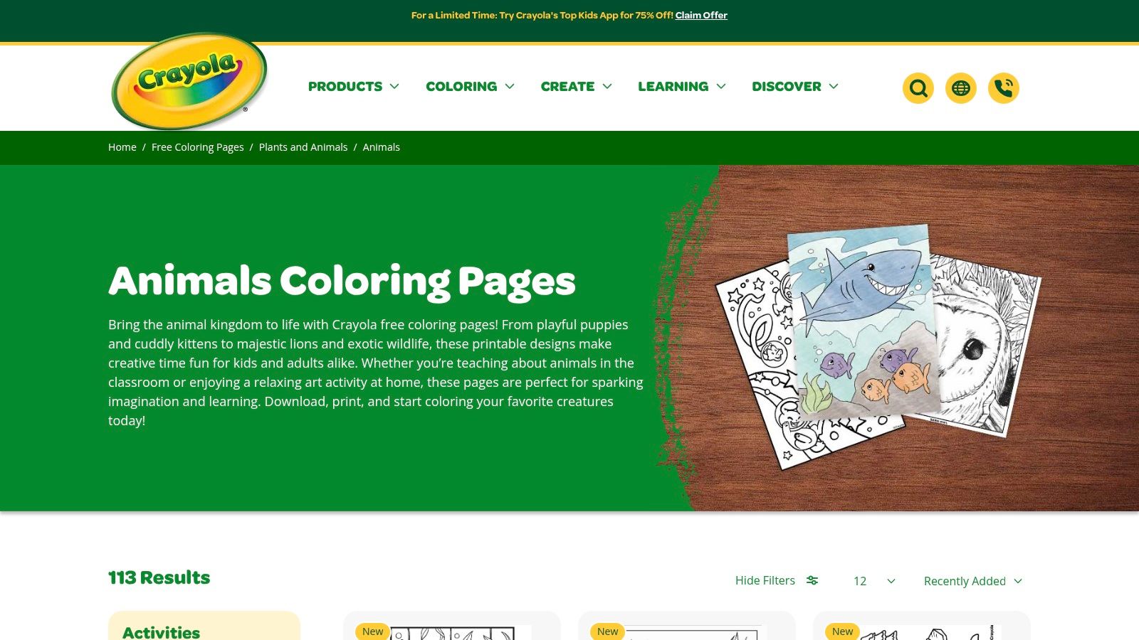
The site's animal content feels curated instead of dumped into a giant archive. That means fewer dead-end searches and fewer pages that look technically printable but color poorly. The library isn't as deep as larger directories, but the average page quality is steadier.
Best use case for paper and blending
Crayola pages are ideal when you want broad zones, simple contour separation, and enough negative space to let markers breathe. That aligns with a wider pattern in animal-themed coloring resources: simple line structure and broad age accessibility tend to make pages more practical for digital-to-print use and marker workflows, especially when users need clear contour separation and marker-safe spacing.
For paper, I'd use heavier stock if you plan to do any alcohol blending at all. Water-based markers also behave well here, and that flexibility makes Crayola useful for households where not everyone is using the same tools.
- Best fit: Younger colorists, shared family sessions, and quick marker studies.
- What doesn't work as well: Textured realism. If you want layered fur patterns or feather micro-detail, the art is often too simple.
- Palette idea: Arctic animals look good with cool grays, pale lavender shadows, and a restrained ice-blue accent. Jungle animals can handle brighter greens and warm browns without the page turning chaotic.
Clean outlines help more than detail does. On a simple tiger page, two oranges and one shadow brown usually look better than six competing marker tones.
Crayola is also a smart choice if you're printing for repeated use. The pages don't demand perfection, so they're easy to revisit with a different palette later.
3. National Geographic Kids – Animal Coloring Pages
National Geographic Kids animal coloring pages sit in a useful middle ground. They're more education-forward than entertainment archives, but they still feel accessible enough for casual coloring.
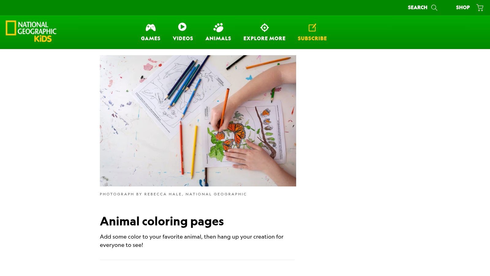
If you like coloring pages animals that connect to habitats, classes, or themed learning, this is one of the better picks. A–Z style animal sets make it easier to build your own category studies, like savanna mammals, ocean species, or rainforest birds. The catalog is smaller than a mega-library, and navigation can take a little patience, but the educational framing is strong.
Where it shines for marker artists
These pages work well when you want clean shapes for species recognition without overcommitting to realism. Younger artists can keep it flat. Older colorists can add stylized shadow, cast light, and texture without needing microscopic nib control.
For paper choice, standard home cardstock is enough for most designs because the line art usually leaves decent open spaces. I wouldn't use ultra-wet blending here. Light layering and controlled edge darkening are a better match.
- Best fit: School tie-ins, animal alphabet themes, habitat units, and beginner marker shading.
- Weak point: If you want a library you can browse for hours, this won't replace a giant archive.
- Palette idea: For safari animals, use sandy beige, yellow ochre, and warm gray. For tropical birds, limit yourself to one bright focal color and build the rest from softened greens or blue grays.
One thing I like about education-first pages is that they nudge you toward believable simplification. You don't need every feather. You need clear feather groups and smart color blocking.
4. HelloKids
HelloKids animal coloring pages are useful when you want flexibility more than polish. You can print pages or color in the browser, which makes it handy for testing whether a design is even worth putting on paper.
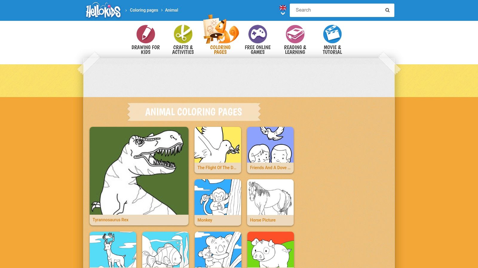
Most of the art is simple and aimed at younger users. That's the limitation, but it's also the appeal. If you need uncomplicated animals with large fill zones, HelloKids gives you pages that are forgiving with broad chisel nibs and beginner blending.
Digital preview first, print second
This is one of the few resources where the digital option changes the workflow. If you're unsure whether a page has enough open space for alcohol markers, try rough color placement on screen first. It's a fast way to avoid printing a design that will only frustrate you.
The ad-supported experience isn't elegant, and adult colorists may find the artwork too child-focused for standalone use. Still, these pages make good warm-up sheets, especially for testing skin-adjacent neutrals, animal browns, and sea palettes.
- Best fit: Kids, beginners, group activities, and low-pressure marker practice.
- Not great for: Display-worthy finished pieces with advanced texture work.
- Palette idea: Sea animals do well with aqua, turquoise, soft coral, and a single deep navy accent. Farm animals look best with restrained creams, pink-beige, and muted barn reds rather than fully saturated primaries.
If a page is very simple, push color harmony harder. Simpler line art can handle more intentional palette styling because the drawing itself isn't carrying all the visual interest.
HelloKids isn't where I'd go for a final adult-coloring session, but it's useful for low-stakes practice and quick wins.
5. Twisty Noodle
Twisty Noodle is built for teachers and parents, and that shows immediately. The customizable text fields are the reason to use it. You can change titles, captions, and sometimes font choices before printing, which is more valuable than it sounds if you're making species sheets, handwriting pages, or therapy-friendly prompts.
The art style is bold and young. For advanced colorists, that can feel limiting. For marker users, bold is often good news. Thick outlines stop pages from collapsing when alcohol ink spreads a little wider than expected.
Why simple doesn't mean useless
Twisty Noodle works best when you treat it as a color-planning or teaching tool, not as a prestige coloring library. The animal pages usually have large enclosed areas, and that makes them ideal for broad nib practice, controlled gradients, and clean edge work.
I'd print these on paper that can tolerate a bit of bleed but doesn't need to be premium. Because the designs are K–2 oriented, subtle five-layer rendering usually isn't the point. Flat fills plus one shadow tone are enough.
- Best fit: Young learners, occupational therapy settings, classrooms, and alphabet-animal practice.
- Downside: Adult colorists looking for intricate wildlife art won't stay here long.
- Palette idea: Use high-contrast but softened combinations. Try light golden fur with a cocoa shadow for bears, grass green plus darker olive for frogs, and pale gray with rosy inner-ear accents for rabbits.
What I appreciate about Twisty Noodle is how little guesswork it creates. You know what the page wants from you. Big shapes, direct color, clear readability. That's a strength, not a flaw, when you're teaching someone how to control markers.
6. Coloring Nature
Coloring Nature is where I'd send anyone who wants less cartoon energy and more biology. The site leans into realistic animal illustrations, habitats, and science-linked topics, which makes it far more useful for believable wildlife palettes than many general printable sites.
This is also where marker planning becomes more interesting. A lot of existing animal-page coverage stays broad and kid-oriented, but hobbyists using alcohol markers usually need help with practical questions like realistic fur, feather, scale, and ocean palettes, plus how to keep results believable without forcing strict realism. That's the key gap in the current market, especially for people planning colors before they print.
Better for realism, better for controlled layering
Coloring Nature's line work supports restrained, species-aware shading. I wouldn't flood these pages with heavy saturation unless you're printing on sturdy paper. They respond better to deliberate passes, especially around wings, fur direction, and habitat edges.
If you want help building a believable palette before touching the page, a tool like the ColorBestie palette generator can help you map warm and cool relationships before you start blending. That's especially useful for animals that look dull when colored with one-note browns.
- Best fit: Nature clubs, realistic wildlife studies, and adult colorists who prefer believable anatomy.
- Less ideal: Very young kids who need oversized enclosed spaces.
- Palette idea: Owls look stronger with layered warm grays and muted umber than with pure brown. Reef fish can handle stylized teal, coral, and violet as long as one neutral anchors the page.
Realistic pages don't require literal color. They require believable color relationships.
This is one of the better resources for anyone who wants their finished animal page to feel observed rather than just filled in.
7. U.S. Fish & Wildlife Service – Coloring Pages
Need animal pages that teach as well as color well? The U.S. Fish & Wildlife Service collection is one I use for native species work, especially when I want pages tied to real habitats instead of generic cartoon animals.
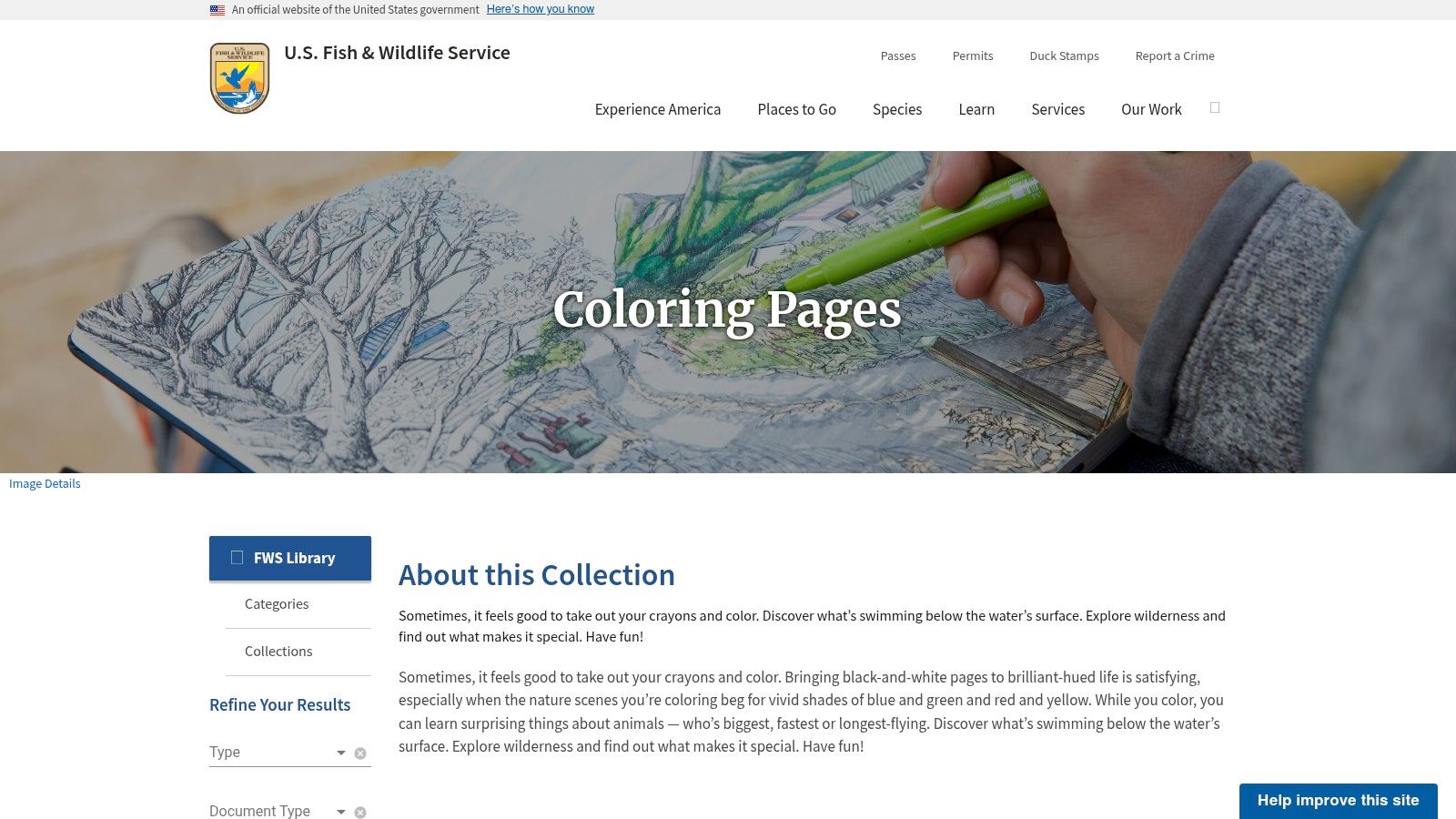
The line art quality is mixed, so selection matters more here than with polished commercial libraries. Some pages print cleanly and handle marker layering well. Others read more like classroom handouts, with tighter shapes or simpler outlines that are better for pencils than broad alcohol marker fills.
That trade-off is still useful. If you color for homeschool units, nature centers, scout activities, or regional wildlife lessons, these pages often match the subject better than entertainment-first libraries.
Strong for habitat-based color choices
I treat this collection as a reference-friendly folder, not a binge-print source. The best pages have clear silhouette separation, enough open space for controlled shading, and recognizable species details around wings, fins, beaks, or tail markings. Those are the sheets worth printing on smoother marker paper or lightweight cardstock. If the line art looks cramped, switch to colored pencil or use alcohol markers only for flat base layers.
Paper choice matters here because many people will print these at home on standard copy stock. That stock can feather fast with juicy brush tips. I get better results with 28 lb paper or marker-friendly paper, plus a bleed sheet underneath. Fine and medium nibs usually suit these pages better than broad chisel passes.
Color choices should stay grounded in place. Woodland mammals work well with bark brown, warm gray, muted rust, and a soft moss green in the background. Wetland birds usually look stronger with blue gray, muted cream, olive reeds, and one sharp accent on the beak or eye ring. For desert reptiles, try sandstone, dusty sage, pale ochre, and a cool shadow gray instead of high-saturation green.
- Best fit: Native wildlife study, conservation programs, and classroom or homeschool coloring with a species focus.
- Watch for: Uneven illustration style across the library. Preview before printing if you care about marker performance.
- Marker tip: Use lighter base coats first. Many of these pages benefit from controlled shadow placement, not heavy blending.
- Palette idea: River and marsh scenes hold together well with olive, slate blue, driftwood brown, and one clean pop of orange or yellow.
I like this resource most when the goal is observation. It pushes you to notice regional color shifts, seasonal plumage, and habitat cues, which usually leads to better pages than coloring every animal with the same stock palette.
8. Ranger Rick (National Wildlife Federation) – Free Animal Coloring Pages
Ranger Rick free animal coloring pages are a solid middle option for people who want wildlife themes without the institutional look of government resources. The pages often land between cute and realistic, which is a good place to be if you're coloring with kids but still want artwork that doesn't feel disposable.
The collection is species-indexed, so it's easy to search by animal rather than by broad category. That saves time if you're hunting for something specific like a fox, sea turtle, or aardvark. The biggest friction point is access. Some freebies are straightforward, while others may involve a subscriber login or email step.
Where these pages fit in a marker setup
Ranger Rick pages usually work well for moderate stylization. That means you can lean realistic on the base colors, then add a more playful accent palette for backgrounds, leaves, shells, or sky. I like that flexibility because strict realism can make some animal pages feel stiff.
For paper, choose something a notch above standard office stock if you're using alcohol markers. The art often deserves a smoother fill than school paper can support.
- Best fit: Wildlife themes for families, scouts, and casual adult colorists.
- Weak point: The catalog is curated, so you won't get the endless breadth of giant free archives.
- Palette idea: Foxes benefit from rust, peach-beige, and cool gray shadows. Sea turtles look good with olive shell tones, soft sea greens, and sandy neutral backgrounds.
These pages reward restraint. One or two good shadows and a controlled background usually look better than trying to force a fully rendered illustration.
9. World Wildlife Fund (WWF) – Animal Coloring Pages/Book
WWF animal coloring materials feel more like conservation handouts and downloadable booklets than an endless printable database. That's a good thing if you want a themed packet instead of one-off pages.
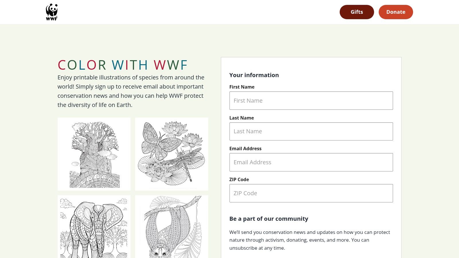
The biggest strength here is global species framing. Many free animal page hubs skew generic. WWF's materials can nudge you toward broader biodiversity topics, which makes them useful for classes or for colorists who enjoy pairing a page with a little species context. The drawback is that access may involve a form or email gate, and the catalog is curated rather than exhaustive.
Strong choice for themed packets
These pages work best when you print a small set and keep your palette consistent across all of them. That gives the final group a cohesive look and keeps the learning side of the activity intact.
I'd treat WWF pages as booklet pages first and single masterpieces second. Use dependable, repeatable marker combinations instead of elaborate blending experiments.
- Best fit: Conservation units, global species themes, and family or classroom packet printing.
- Not ideal for: Endless browsing or niche animal searches.
- Palette idea: For pandas, don't stop at black and white. Add cool gray transitions and a soft mossy green environment. For marine wildlife, build from turquoise, blue gray, and a restrained sandy neutral.
One useful habit with WWF pages is background simplification. Let the animal carry the page, and keep environmental color support subtle so the educational focus stays clear.
10. Dover Publications – Animal Coloring (books + free samples)
Dover animal coloring books are the most polished option on this list, even if most of the full collection is paid. If you're an adult colorist who cares about line quality, Dover is one of the safer bets because the illustrations are built to be colored, not just posted online as free printables.
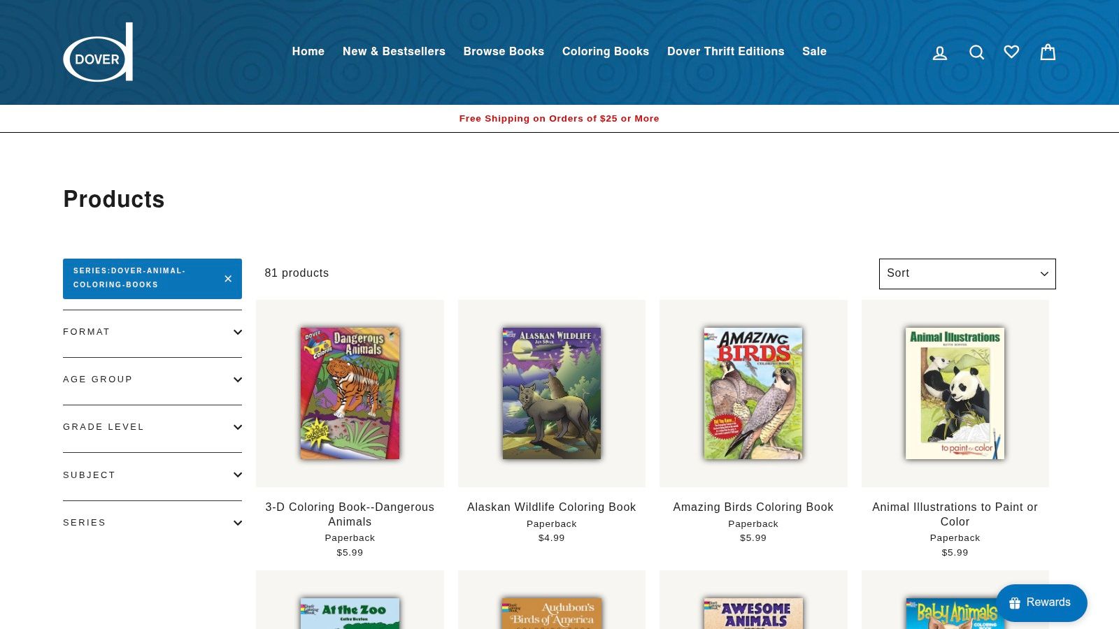
The free sample angle is useful for marker testing. You can print a page, learn how the line work behaves with your set, and decide whether the full book matches your style. That's especially helpful if you're comparing brush nib control, color overlap, or how different marker brands handle dense detail.
Best option for advanced marker users
Dover pages usually give you stronger line confidence than most free sites. Fine details are placed more intentionally, which means advanced alcohol-marker users can add layered shadows without the page becoming visually noisy.
If you're trying to compare marker behavior before committing to a dense animal page, the ColorBestie marker comparison tool is useful for planning around brand differences. That matters more with Dover-style artwork because small detail areas expose every mismatch in blending and saturation.
- Best fit: Adult colorists, polished finished pieces, and high-detail animal artwork.
- Downside: Full collections are paid, and free pages are limited.
- Palette idea: Big cats respond well to layered golds, muted orange-browns, and deep sepia shadows. Birds of prey often look better with controlled warm grays and selective rust accents than with overly saturated browns.
On detailed line art, fewer marker families usually means a cleaner finish. Pick a dominant temperature and stay disciplined.
If you want coloring pages animals that feel closer to a real coloring-book session than a casual printable, Dover is the strongest choice here.
Top 10 Animal Coloring Pages, Quick Comparison
| Platform | Core focus | Quality ★ | Key features ✨ / 🏆 | Audience 👥 | Price / Value 💰 |
|---|---|---|---|---|---|
| SuperColoring | Massive printable animal pages, multiple complexity levels | ★★★★ | ✨ Huge catalog, fine categories, print-ready outlines 🏆 | 👥 Parents, teachers, bulk printers | 💰 Free (ad-supported) |
| Crayola (Animals) | Curated kid-safe pages, seasonal/theme sets | ★★★★ | ✨ Trusted brand, clean prints, classroom-ready 🏆 | 👥 Families, early educators | 💰 Free / brand resources |
| National Geographic Kids | Education-first A–Z animal packs with facts | ★★★★ | ✨ Fact sheets + habitat tie‑ins, classroom-friendly 🏆 | 👥 Teachers, nature clubs | 💰 Free |
| HelloKids (Animal Pages) | Printables + in-browser digital coloring tool | ★★★ | ✨ Online coloring tool, many sub-categories | 👥 Young children, digital colorists | 💰 Free (ad-supported) |
| Twisty Noodle (Animals) | Customizable printables for lessons & handwriting | ★★★ | ✨ Custom text/fonts, save favorites 🏆 | 👥 K–2 teachers, therapists, parents | 💰 Free (account/ads for some features) |
| Coloring Nature | Realistic nature & habitat-focused illustrations | ★★★★ | ✨ Science-aligned plates, habitat collections 🏆 | 👥 Scouts, classrooms, realism seekers | 💰 Free (smaller catalog) |
| U.S. Fish & Wildlife – Coloring Pages | Govt. wildlife pages with conservation messaging | ★★★★ | ✨ Public-domain resources, species spotlights 🏆 | 👥 Park programs, educators | 💰 Free |
| Ranger Rick (NWF) | Wildlife printables tied to NWF programs | ★★★★ | ✨ Species-indexed pages, easy previews | 👥 Families, conservation educators | 💰 Free (some downloads require signup) |
| World Wildlife Fund (WWF) | Downloadable species booklets + conservation tie‑ins | ★★★★ | ✨ Curated packs, global species focus 🏆 | 👥 Classrooms, conservation programs | 💰 Free / gated downloads |
| Dover Publications – Animal Coloring | Professionally illustrated books + free samplers | ★★★★★ | ✨ High-detail line art for adults, publisher samplers 🏆 | 👥 Adult colorists, advanced hobbyists | 💰 Paid books; free samplers via email |
Final Thoughts
What makes one animal coloring library work better than another once markers hit the page?
The deciding factor is usually not price. It is line art quality, how well the page prints on the paper you use, and whether the subject gives you enough shape separation to shade with alcohol markers without muddying the result. A huge free archive sounds useful, but in practice I get better finished pages from cleaner drawings with clear borders and enough open space for layering.
Each library in this list has a different strength. SuperColoring is useful for volume and variety. Crayola is reliable for quick, clean prints with younger colorists. Coloring Nature and the conservation-focused collections are stronger picks for natural palettes and habitat-based coloring choices. Dover is still the easiest recommendation for marker artists who want polished line work and a page that can handle more deliberate blending, shadow placement, and edge control.
Printing choices matter just as much as the download. Whenever possible, print on heavier paper than standard office stock. For alcohol markers, I prefer smooth paper that keeps lines crisp and slows feathering, even if it means slightly less saturation than marker paper pads. Keep a bleed sheet underneath every page. Print duplicates for any design with a lot of fur or feather texture, because the second copy gives you room to test shadow families, blender use, and how dark you want the final pass.
Animal subjects also reward restraint. Fur reads better in grouped sections than in hundreds of tiny strokes. Feathers look cleaner when you establish the large value shapes first and add only a few directional accents. Scales usually need selective contrast, not every scale outlined with a darker marker.
Color palette choices separate a flat page from a convincing one. Browns need a cool counterweight. Jungle animals usually improve with olive, moss, and one dusty warm neutral instead of bright green everywhere. Arctic pages look stronger with blue gray shadows and a small warm accent in the beak, eye, or background. Ocean animals benefit from a limited range of blue-green markers anchored by a sand, stone, or driftwood neutral so the whole page does not collapse into one temperature.
That is also why animal pages stay useful across skill levels. A beginner can get a clean result with flat fills and one shadow tone. A more experienced colorist can use the same printable to practice lost edges, reflected light, desaturated shadow mixes, and simple backgrounds that support the animal instead of competing with it.
If you want better results, choose fewer pages and choose them more carefully. Match the library to your style, print on paper your markers can handle, and build a palette before you start. This approach turns free printables into pages you will want to finish. If you like planning before you print, ColorBestie can help you preview marker-friendly color ideas on black-and-white animal artwork, a useful feature for deciding between realistic and stylized color directions.