
A blank ceramic bowl can look full of promise until you have to decide what goes on it. Should you repeat a small motif around the rim, fill the center with flowers, or keep the design simple enough that the bowl still feels usable? Then there's the marker palette. The colors that look good in their cases may behave very differently on a smooth ceramic surface.
These painting ceramic bowls ideas pair each design with a practical way to plan the pattern, preview colors, choose a marker technique, and judge the project's difficulty. You'll find quick prompts for a first attempt, along with options for artists who enjoy detailed repetition or careful line work.
ColorBestie can help before you commit ink. Upload a black-and-white sketch or reference image, choose a theme, compare marker-style color previews, and test several directions before touching the bowl. Its previews are inspiration, not a substitute for a ceramic test, so check whether your bowl is bisque, glazed, or already finished, and try your markers on a practice tile first. If the bowl will hold food, treat safety as a separate technical question from decoration.
1. Mandala Pattern Painting
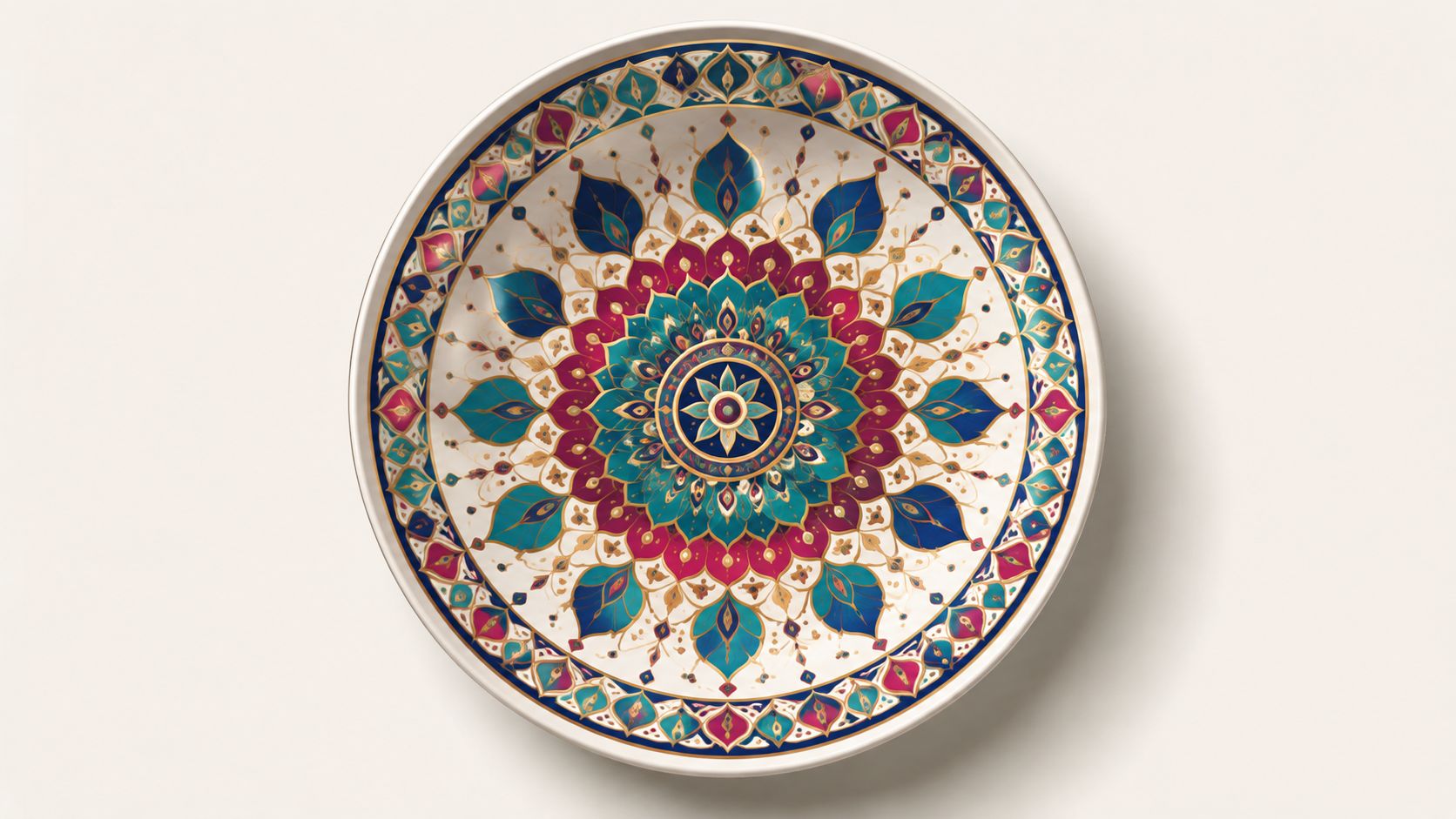
A mandala gives the bowl's round shape a natural job. The pattern begins at a central point and expands through repeated petals, dots, arcs, diamonds, or leaf-like shapes. From above, the finished bowl can feel balanced and intentional because each section relates to the others.
For a first mandala, sketch a small center circle and divide the surrounding area into equal wedges. You don't need a mathematically perfect grid. Light pencil marks, a ruler, and a simple repeating unit are enough to keep the pattern steady. Start with the center and work outward, allowing each completed ring to guide the next.
Color planning matters more here than adding lots of detail. Use ColorBestie's Palette Generator to select four to six harmonious colors from your marker collection, then try a Mood theme for a calm, meditative direction. A traditional jewel-tone bowl might combine blue, magenta, and gold accents, while a softer boho design could use muted terracotta, cream, and dusty green.
Practical rule: Test every chosen alcohol marker on a ceramic tile before you begin. Smooth surfaces can change the appearance, spread, or drying behavior of ink.
Skill level and project prompt
Skill level: Intermediate, especially if you want dense symmetry.
Quick prompt: Draw a small flower in the center, repeat teardrop petals around it, and finish the rim with alternating dots. Leave the bowl's inner base mostly unpainted if the piece may be used near food. Decorative painting and functional dinnerware require different safety decisions, particularly when a design reaches the interior or lip.
2. Botanical and Floral Motifs
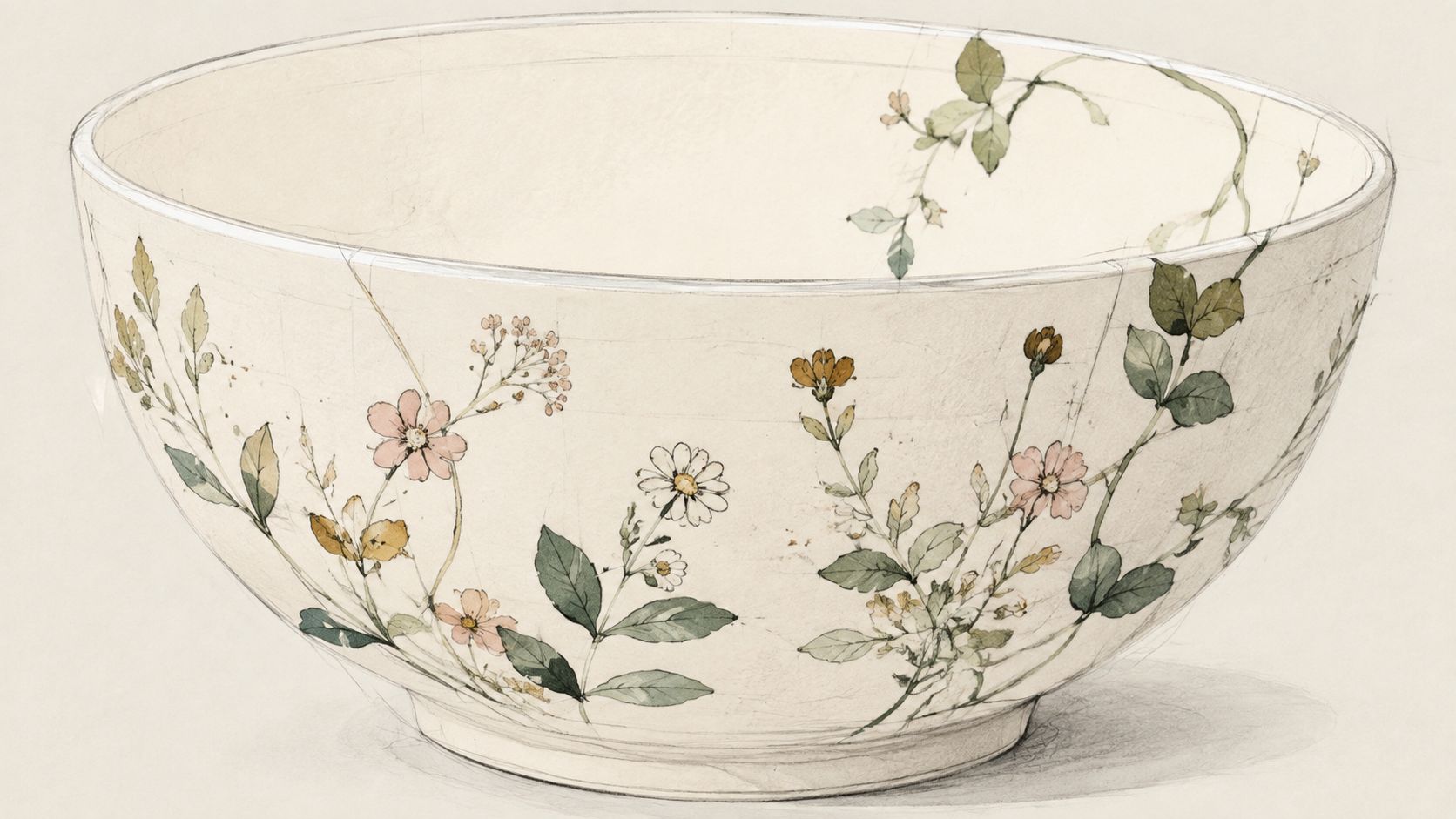
A botanical bowl can look delicate or dramatic, depending on the plants and palette you choose. Curving stems, leaves, flowers, vines, and seed heads work well because they can follow the bowl's circumference without forcing every area into strict symmetry.
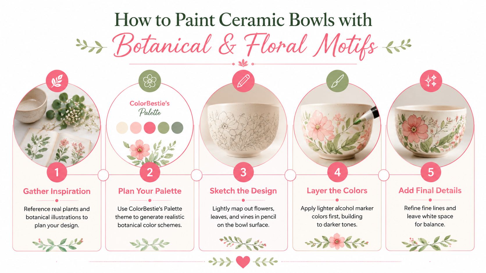
Begin with a reference image of a real plant or a botanical illustration. Sketch the largest shapes first, such as a flower head or broad leaf, then add stems and smaller details. This keeps the design readable from a distance. Leave areas of the ceramic visible around the motifs, since white space gives the eye somewhere to rest and prevents the interior from feeling crowded.
Light colors should go down first. Add pale greens, yellows, or blush tones before placing darker veins, outlines, and shadow shapes. Alcohol markers can create attractive layered color, but they can also become muddy when too many hues overlap. A limited palette usually gives a hand-painted bowl a more unified appearance.
For realistic plant colors, use ColorBestie's Theme Preview to compare Palette and Lighting directions. A sunny garden theme might suit yellow flowers and fresh green leaves, while a moody forest treatment could shift the same sketch toward deep blue-green, burgundy, and muted violet.
Skill level and project prompt
Skill level: Beginner to intermediate.
Quick prompt: Paint a loose ring of wildflowers around the outside wall, using three flower shapes and two leaf shapes. Keep the center plain, then add fine stems only after the larger color areas have dried.
3. Watercolor-Style Wet Blending
Alcohol markers can suggest a watercolor mood when you let neighboring colors overlap while they're still workable. The result isn't the same as fired ceramic glaze, but it can create soft transitions, luminous patches, and loose abstract movement on a decorative bowl.
Choose a simple composition before blending. A sunset can move from warm yellow into orange, pink, and violet. An abstract bowl might use broad curved bands that follow the form. Keep the palette restrained. Three to five colors are enough to show a clear transition without producing a dull mixture.
Work in small areas and move quickly. Lay down the lighter color, add the neighboring shade while the first is still active, and soften the meeting point with a colorless blender if your marker system supports one. On a non-absorbent surface, ink may sit on top rather than sinking in, so the blend can remain wet-looking for longer or move unexpectedly. That's why a ceramic practice tile is essential.
A preview can help you judge the emotional direction before you paint. ColorBestie's Style theme can suggest an impressionistic arrangement, while Mood can help you compare vibrant, pastel, or earthy versions of the same sketch.
A simple process
- Clean the surface: Remove dust and oils, then let the bowl dry completely.
- Transfer the composition: Use a light pencil outline or a simple freehand map.
- Place the lightest color: Keep the first layer thin and controlled.
- Overlap the next shade: Blend only where the transition needs softness.
- Protect the design appropriately: Follow the marker manufacturer's instructions and don't assume a decorative finish is suitable for food contact.
For a visual process reference, watch this ceramic marker painting demonstration after testing the technique on scrap ceramic.
Skill level: Intermediate.
Quick prompt: Paint a loose evening sky around the outside of the bowl, leaving a slim unpainted band at the rim. Add a single dark branch silhouette after the gradient has settled.
4. Geometric and Abstract Line Art
Geometric decoration suits a modern bowl because it relies on decisions you can measure. Lines, triangles, arches, checkerboard panels, and repeating blocks can turn a plain vessel into something that feels Art Deco, Scandinavian, or graphic and contemporary.
Start by deciding whether the pattern will wrap around the whole bowl or occupy one intentional section. A full wrap needs consistent spacing, while a single panel lets you focus on clean edges. Use a ruler, flexible measuring tape, stencil, or paper template where the curve makes straight-line planning difficult. Lightly map the design in pencil before reaching for a marker.
Fine-tip alcohol markers work best for narrow outlines and small geometric details. If you're filling larger shapes, use a broader nib and keep the edges deliberate. A black-and-cream design with one yellow accent can look more refined than a crowded rainbow palette. Monochromatic variations also work well, especially when the bowl's form supplies the visual interest.
Skill level and project prompt
Skill level: Beginner for simple blocks, intermediate for a continuous wrap.
Quick prompt: Divide the outside wall into repeating vertical panels. Fill one triangle in each panel with a single accent color, leaving the remaining shapes white. This creates rhythm without requiring a complicated illustration.
Use ColorBestie's Style theme to preview a modern palette before you start. Compare the sketch with two to four colors, then check whether the darkest line color overwhelms the bowl's base. If the design is intended only as decoration, you have more freedom. If it's intended for food use, keep unverified marker decoration away from food-contact surfaces.
5. Ombré and Gradient Coloring
An ombré bowl depends on a controlled sequence rather than a complex drawing. The color can move from pale blue at the rim to deep navy near the base, from orange through pink into violet, or through several values of one hue. The bowl's curved wall naturally helps the transition read as a continuous surface.
Choose the direction first. A vertical gradient follows the bowl from top to bottom, while a horizontal band wraps around it. A radial gradient can move from the center outward, though that approach becomes harder to control inside a curved form. Mark the color order on a scrap sheet so you won't have to make decisions while working.
ColorBestie's Palette Generator can help you explore related marker shades before you begin. Select colors you own, then use the Marker Comparison tool to check whether two neighboring shades are distinct enough. A gradient needs visible steps, but the differences shouldn't be so abrupt that the result looks striped.
Work light to dark
Lay down the lightest color first, then overlap the next shade slightly into its edge. Continue toward the darkest tone. Don't saturate the whole surface at once. Build gradually, because heavy application can make later blending less predictable on ceramic.
A smooth gradient starts with color order, not frantic blending.
Skill level: Beginner to intermediate.
Quick prompt: Create an ocean-themed exterior that fades from pale aqua at the rim to deep blue near the lower curve. Add a few simple white wave marks only after the main color transition is dry and stable.
Test the complete sequence on a spare ceramic tile. The tile will show whether your markers overlap cleanly, whether the darkest shade dominates, and whether the bowl's surface causes the ink to bead or move. If the bowl is glazed, follow the product's curing and sealing instructions precisely. Decorative air-dry finishes shouldn't be treated as food-safe just because the label uses broad language such as “non-toxic.”
6. Zentangle and Meditative Doodle Patterns
Zentangle-inspired decoration gives you a flexible way to fill a bowl without drawing one large recognizable image. Start with a few sections, then populate each area with repeated marks such as spirals, scallops, checkerboards, petals, waves, or dots. The design grows through small decisions, which makes it approachable when a blank surface feels intimidating.
A black-and-white pattern can be striking on its own. Add color selectively to a few sections if you want contrast without losing the calm, graphic quality. Two to four hues are usually enough for a restrained result. Leave some shapes uncolored so the ceramic base becomes part of the composition rather than treating every gap as a problem.
Use a fine-point marker for tight spaces and work in small sections. Allow adjacent areas to dry before placing a saturated color next to them, especially if the surface doesn't absorb ink quickly. If you're new to this style, repeat a basic pattern several times before trying a more intricate variation.
Skill level and project prompt
Skill level: Beginner for simple doodles, intermediate for dense fills.
Quick prompt: Draw five irregular sections around the outside of the bowl. Fill each section with a different repeating pattern, then color only the central shapes in alternating blue and green.
ColorBestie's Marker Comparison can help you choose shades that remain visibly different at small scale. Preview the same line-art design with a contemplative Mood palette and a stronger contrast palette. Pick the version that still leaves visual breathing room.
This style also works well as a mandala and doodle combination. Keep the center symmetrical, then allow the outer sections to become more spontaneous. That balance gives beginners a clear starting point without demanding perfect repetition across the entire bowl.
7. Cultural and Ethnic Pattern Designs
Pattern traditions can give a ceramic bowl a strong sense of place, but they deserve more care than copying an attractive motif. Research the origin, context, and meaning of the pattern you're using. Museum collections, cultural art books, and educational resources can help you distinguish a meaningful reference from a design that has been stripped from its original context.
Moroccan tile-inspired geometry, henna-like line work, Japanese wave motifs, Southwestern forms, African textile-inspired marks, and Asian decorative themes all offer different structures and color relationships. Treat them as starting points for study, not as interchangeable visual decoration. Avoid presenting a copied sacred, ceremonial, or community-specific symbol as your own invention.
Skill level and project prompt
Skill level: Intermediate.
Quick prompt: Choose one researched pattern family and adapt its repeated shapes to the bowl's outer wall. Use a restrained palette based on your reference, then add a plain border to separate the pattern from the rim.
ColorBestie's Genre theme can help you compare broad visual directions, while a palette preview can show whether your available markers can approximate the colors you've selected. Don't let the preview replace research. It's a planning aid for color relationships, not a source of cultural meaning or authenticity.
Before painting, make a small paper mock-up. Try the pattern as a narrow band, a central panel, and a full exterior wrap. The mock-up will show which layout respects the bowl's shape and which one makes the design feel crowded. If you share or sell the finished piece, describe your source and adaptation accurately.
8. Negative Space and Silhouette Art
Negative-space designs are often the quickest way to make a bowl look intentional. Instead of covering the surface, you paint a bold silhouette and let the ceramic remain visible around it. Birds, cats, deer, mountains, treelines, moons, and abstract profiles all work because their outer shape carries most of the visual message.
Choose an image that remains recognizable when reduced to a simple outline. A complicated photograph may lose its character once internal details disappear. Lightly sketch the silhouette, then check its position from several angles. On a round bowl, a design can look balanced from one viewpoint and oddly compressed from another.
Use one to three strong colors that contrast with the ceramic base. A dark forest line beneath a warm sky band can suggest a scene, while a single blue bird can create a quieter result. ColorBestie's contrast-focused previews can help you decide whether the silhouette stands apart from the background before you apply marker.
Skill level and project prompt
Skill level: Beginner.
Quick prompt: Paint a simple mountain range around the exterior, leaving the peaks white and adding one solid dark treeline below. Keep generous unpainted space above the design.
Fill the silhouette with steady strokes rather than repeatedly scrubbing the same area. Add only a few interior marks, such as feather lines or tree trunks, after the main shape is complete. This approach keeps the design bold and reduces the chance of muddy edges.
If the bowl is meant for food, place the artwork on the outside wall or another non-contact area unless the specific paint, curing process, and finish are certified for that use. Food-safety guidance emphasizes that labels such as “non-toxic” alone don't establish suitability for contact with food.
Comparison of 8 Ceramic Bowl Painting Ideas
| Style | Complexity 🔄 | Resources & Materials ⚡ | Expected Outcome ⭐ / 📊 | Ideal Use Cases 📊 | Key Advantages & Tips 💡 |
|---|---|---|---|---|---|
| Mandala Pattern Painting | High, steady hand, careful planning | Moderate, alcohol markers (Copic/Prismacolor), pencil, symmetry guides | High ⭐, visually striking, meditative symmetry | Decorative/boho bowls, wellness gifts, display pieces | Therapeutic process; start center → outward, map lightly in pencil, test markers |
| Botanical & Floral Motifs | Medium, fine line work, botanical accuracy | Moderate, alcohol markers, plant references, ColorBestie palettes | High ⭐, timeless, naturalistic, good blending | Rustic/modern home décor, functional ware, gift items | Layer light→dark, leave white space, use references for accuracy |
| Watercolor-Style Wet Blending | High, timing and blending skill required | High, premium markers (Copic/Prismacolor), blender, practice tiles | High ⭐, painterly, gallery-quality luminous effects | Contemporary art bowls, expressive gallery pieces | Use 3–5 colors, work quickly before drying, test blends first |
| Geometric & Abstract Line Art | Medium–High, precision and measurement | Low–Moderate, fine-tipped markers, rulers/templates, palettes | High ⭐, modern, minimalist, crisp results | Minimalist interiors, product lines, gallery displays | Plan with pencil, use 2–4 colors, fine tips for precise lines |
| Ombré & Gradient Coloring | Medium, smooth blending and color planning | Moderate, 4–6 related marker shades, blender, tests | High ⭐, strong visual impact with minimal patterning | Trendy decor, accent pieces, social media features | Use Palette tool, work light→dark, overlap for seamless blend |
| Zentangle & Meditative Doodle Patterns | High, time-consuming but forgiving | Low–Moderate, fine-point markers, patience, mood palettes | High ⭐, deeply meditative, highly detailed personal pieces | Art therapy, handcrafted gifts, contemplative art | Start simple, limit colors to 2–4, work in small sections, leave rest areas |
| Cultural & Ethnic Pattern Designs | High, complex patterns + cultural research | Moderate, wide color range, authentic references, Genre palettes | High ⭐, meaningful, story-rich, conversation-starting pieces | Ethically inspired collections, museum/shop displays, collaborations | Research origins, respect cultural context, use traditional palettes |
| Negative Space & Silhouette Art | Low–Medium, strong composition, clean outlines | Low, few bold markers, stencils/templates, contrast preview | High ⭐, dramatic, bold results with minimal elements | Quick production, minimalist décor, limited-marker collections | Choose recognizable silhouettes, outline in pencil, use contrast previews |
Choose a Prompt and Make the First Mark
Choose the design according to the kind of attention you want to give the project. Mandalas and zentangle patterns suit repetitive, meditative work. Botanicals are a better fit when you enjoy organic shapes and layered detail. Wet blending and gradients let you practice color transitions, while geometric designs reward careful spacing and controlled lines.
Choose cultural patterns when you're willing to research the source and approach its visual language respectfully. Choose silhouette art when you want a faster, high-contrast result with less surface coverage. None of these choices is permanently tied to one skill level. A simple mandala can welcome a beginner, and a minimal silhouette can challenge an experienced artist who wants perfect edges.
Before you paint, inspect the bowl. A bisque surface, a glossy glazed surface, and an already finished decorative bowl won't necessarily accept marker ink in the same way. Clean away dust and oils, then test the exact marker colors on a ceramic tile or an inconspicuous practice piece. Check drying, layering, edge control, and how easily the color rubs away.
Keep the first palette limited. A small group of related colors makes it easier to see whether the pattern works before visual noise takes over. Use ColorBestie when you want to upload a sketch, compare a Palette, Mood, Style, Lighting, or Genre direction, and preview a marker-style interpretation before committing to the bowl. The preview can help you spot an unbalanced color block or an overly dark section early.
Then follow a calm sequence:
- Select the bowl and motif: Match the pattern's structure to the bowl's curve.
- Limit the palette: Choose colors you've tested on a similar ceramic surface.
- Preview the plan: Use a sketch, paper mock-up, or ColorBestie preview if it helps you decide.
- Map the main shapes: Use light pencil marks and simple guides.
- Paint one section at a time: Let the design develop gradually instead of rushing to cover the bowl.
- Review the finish: Check the manufacturer's curing or sealing directions before handling the piece regularly.
Food use needs extra caution. Ceramic bowls are part of a globally significant household-articles category, with global production reaching about 6 million tons in 2024 and growing 5% from the prior year, while China produced 3.7 million tons, roughly 62% of the total, according to IndexBox's ceramic household-articles market overview. That scale doesn't make every painted bowl safe. It does show why decoration, glaze chemistry, firing, durability, and everyday use need to be considered together.
For food-contact bowls, keep unverified marker decoration away from the inside and lip. Guidance from Glazy's ceramic health warning recommends relying on regulated-metal avoidance or certified laboratory testing rather than vague safety labels. Treat your first bowl as a color study, not a test of perfection. You're learning how your markers behave, how your chosen pattern fits the form, and which decisions you'll make differently next time.
ColorBestie can turn a black-and-white sketch or bowl design into marker-style color inspiration, with theme options for palette, mood, style, lighting, and genre. Visit ColorBestie to preview your next ceramic bowl idea, compare color directions, and choose a palette before you commit ink.
