
You've opened a fresh coloring book, set out a few markers, and then paused at the first page. The lines look inviting, but a practical question appears immediately: Which paper can handle these markers, and how do you choose colors without covering the page in muddy guesses?
A coloring book for adults can be a quiet creative practice, but it's also a small technical project. Paper surface, binding, line-art density, ink type, layering, and palette planning all affect the result. Once those pieces work together, coloring feels less like making random choices and more like guiding a picture into focus.
What Is a Coloring Book for Adults
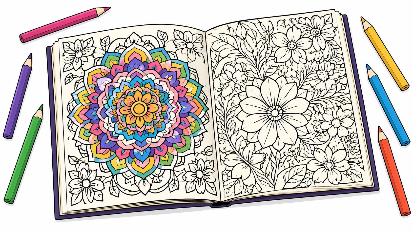
A coloring book for adults is designed for deliberate, detailed coloring rather than quick filling with crayons. Adult pages often include intricate line art, decorative patterns, mandalas, botanical studies, animals, architecture, fantasy scenes, or illustrated interiors. The page gives you a framework, while your decisions about hue, value, texture, and contrast create the finished image.
The format became culturally visible long before its modern wellness popularity. One account records that Mort Drucker's JFK Coloring Book spent 14 weeks at number one on the New York Times bestseller list in 1962, while adult coloring-book sales reached $1 million that year, as summarized in historical adult coloring book market coverage. Decades later, Nielsen data cited by the same coverage shows the category selling 1 million copies in 2014 and 12 million in 2015, a 12-fold year-over-year increase that helped move adult coloring into mainstream publishing.
Different pages suit different intentions
Before buying a book, decide what you want the pages to do for you.
- Stress relief: Choose open shapes, repeated patterns, large florals, or medium-detail mandalas. These pages let your hand settle into a rhythm without demanding constant tiny movements.
- Skill-building: Look for animals, buildings, fabrics, or scenes with clear light and shadow areas. They give you opportunities to practice volume, texture, and color temperature.
- Illustration: Select pages with a strong subject, varied surfaces, and enough negative space for a coordinated color story. These designs reward planning and layering.
Adult books may also use single-sided printing, perforated edges, or paper marketed for markers. Those features aren't guaranteed, so inspect the product description and sample pages before purchasing. A beautiful design becomes frustrating if the paper feathers, the spine won't open flat, or the reverse side is unusable after marker ink passes through.
Practical rule: Choose the page for your goal first, then choose the medium it can support.
The rest of the process is straightforward: check the paper, test your markers, learn a few controlled strokes, plan a palette, and work through one small section at a time. You don't need to solve the whole illustration before making the first mark.
Benefits of Coloring as an Adult
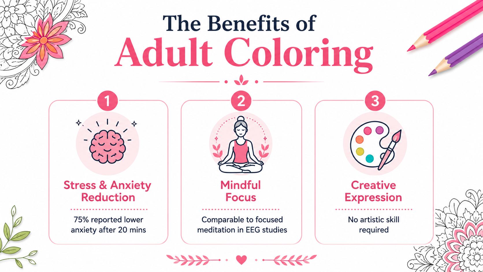
A crowded emergency-department waiting area can leave attention jumping from one worry to the next. Filling bounded shapes gives the hands a steady task and the mind a narrower path to follow. Research supports a careful version of this idea: structured coloring may reduce short-term self-reported anxiety, but it does not establish every mental-health benefit people sometimes claim.
A randomized controlled trial in an emergency-department setting found that adult coloring reduced self-reported anxiety by 3.7 points after two hours, with a 95% confidence interval of 2.4 to 5.1 and p < 0.001. The placebo group reported a 0.3-point decrease, with a 95% confidence interval from -0.6 to 1.2 and p = 0.51, according to the published trial PDF. The finding suggests that a defined coloring activity can provide more structure than unplanned distraction during a stressful period.
A separate controlled study compared adult coloring books, mandala creation, pre-printed mandala coloring, and free-form coloring. Every condition reduced state anxiety. Adult coloring books did not differ significantly from the two mandala conditions, while free-form coloring was significantly less effective, as reported in the Pepperdine study.
What the research does and doesn't show
The practical mechanism is simple. Printed boundaries reduce the number of choices you must make, much like following a marked path instead of choosing every turn yourself. Repeated strokes then give attention something physical to track, which may help interrupt a busy thought pattern for a while.
Coloring may provide:
- A screen-free pause: Paper, markers, and a defined page create a physical alternative to scrolling.
- Mindful focus: Notice pressure, stroke direction, and color transitions rather than trying to force the mind completely blank.
- Fine-motor practice: Small sections encourage controlled hand movement and close visual attention.
- A gentle evening ritual: Lower lighting, quiet music, and a familiar page can support a transition toward rest.
The research does not establish coloring as a replacement for therapy, medication, crisis support, or treatment for ADHD, trauma, depression, or an anxiety disorder. The Psychology Today discussion of adult coloring evidence also explains why broader claims need restraint. Coloring works as a supportive activity for a calming moment, not as a cure or clinical intervention.
If a page makes you tense, perfectionism may be directing the session. Choose simpler line art, limit yourself to one color family, or stop before the page is finished. The useful outcome is a manageable creative experience, not a flawless spread.
How to Choose the Right Book for Your Goals
Four physical features determine whether a book feels pleasant or awkward: paper weight, binding, page arrangement, and line-art complexity. Match those features to your tools before you buy.
Paper weight is often expressed in grams per square meter, or gsm. Heavier paper generally gives markers more room to dry and reduces buckling, but the printed description matters more than the number alone. Look for a paper sample or a clear statement about marker use whenever possible.
Compare the format to your intention
| Format Feature | Relaxation | Marker Use | Skill-Building |
|---|---|---|---|
| Paper surface | Smooth or lightly textured paper that accepts pencils comfortably | Heavier, smoother stock with a protective sheet underneath | Paper that shows layering without making small details difficult |
| Binding | A book that opens widely enough to color without fighting the spine | Spiral or perforated binding for easier access and page removal | Binding that keeps the working area stable |
| Page arrangement | Single-sided or double-sided can work with pencils | Single-sided is the safer choice for alcohol markers | Single-sided pages help you preserve finished studies |
| Line-art complexity | Large florals, broad mandalas, and repeated shapes | Moderate detail with enclosed sections | Detailed animals, architecture, textures, and scenes |
For colored pencils, paper around 160 gsm can be a useful benchmark, especially if you plan to layer gently. For alcohol markers, look for 200 gsm or heavier paper when the manufacturer confirms it is marker-friendly. These are shopping guidelines, not guarantees. Coatings, fibers, and ink behavior can change the result even when two books list similar weights.
Binding changes how your hand works
A glued, perfect-bound book may be affordable and attractive, but its pages can resist lying flat near the center. That forces your wrist to work around a curved gutter. Spiral binding opens more freely and gives both hands access to the page, while perforated pages let you remove a finished piece for framing or testing.
Single-sided printing is especially valuable for alcohol markers. You can place a protective sheet behind the page and accept some bleed without sacrificing another design. With double-sided pages, ink that passes through the paper can ruin the illustration behind it.
Use complexity as a comfort setting
Intricate line art isn't automatically more relaxing. A page with countless tiny spaces may suit a long, absorbed session, but it can feel tiring when you have only a short break. Beginners, older adults, or anyone learning marker control may prefer bold outlines and generous shapes.
Choose a book with large motifs and medium detail if you want an easy starting point. Choose dense architecture, animal fur, or ornamental designs when you specifically want to study texture and value changes.
Marker and Media Compatibility Essentials
Your first purchase doesn't need to be a premium marker set. It does need to match the paper. Alcohol markers use fluid ink that can spread through thin sheets, while colored pencils sit on the surface and usually tolerate a wider range of book formats.
As a working guide, 120 gsm paper is better suited to colored pencils, while paper at 150 gsm or higher gives alcohol markers a more forgiving surface. At either weight, place scrap paper behind the page and test a few strokes in a margin. Watch for feathering along the line, pilling under repeated passes, and bleed-through into the next sheet.
Match the medium to the page
| Book Type | Paper Weight | Ohuhu/Copic Alcohol Markers | Water-Based Markers | Colored Pencils |
|---|---|---|---|---|
| Thin, double-sided book | Around 120 gsm | Risky, use only after testing | Test carefully for buckling | Usually suitable |
| Medium-weight single-sided book | Around 150 gsm | Possible with a backing sheet and light layering | Generally workable after testing | Suitable for layering |
| Heavyweight marker book | Around 200 gsm or more | Stronger choice for Ohuhu dual-tip and Copic Sketch | Usually workable, though pooling still matters | Suitable, with a smoother feel |
| Perforated artist-style book | Varies | Convenient when single-sided and marker-tested | Convenient if the paper resists warping | Good for finished pieces and framing |
Perfect binding can work with pencils and light marker use, but it may make firm strokes uncomfortable near the spine. Spiral binding is easier for broad marker movements. Perforated pages are useful when you want to remove a sheet, place it on a board, or frame it later.
Ohuhu dual-tip brush markers and Copic Sketch markers are alcohol-based, so they need a page that won't absorb ink too quickly or allow uncontrolled spread. Prismacolor Premier colored pencils are a better match for thinner paper because you can build color gradually with pressure and layering.
Water-based markers can be gentler on some papers, but they may cause rippling if you saturate a small area. Gel pens work well for highlights, dots, lettering, and decorative accents after the main layers have dried.
Before buying, check these points:
- Paper: Confirm the listed weight and look for marker-specific reviews or sample images.
- Printing: Prefer single-sided pages for heavy alcohol-marker work.
- Protection: Keep a spare sheet behind the design.
- Binding: Choose spiral or perforated pages if you need a flat surface.
- Testing: Swatch every unfamiliar marker before coloring a focal area.
For side-by-side color behavior and set coverage, use ColorBestie's marker comparison tool before committing to a new collection.
Coloring Techniques and Troubleshooting for Alcohol Markers
Alcohol markers reward quick, light passes. They don't behave like pencils, where you can patiently build a soft field with tiny pressure changes. Your aim is to control how much ink enters the paper and how long wet edges remain workable.
Build color in thin stages
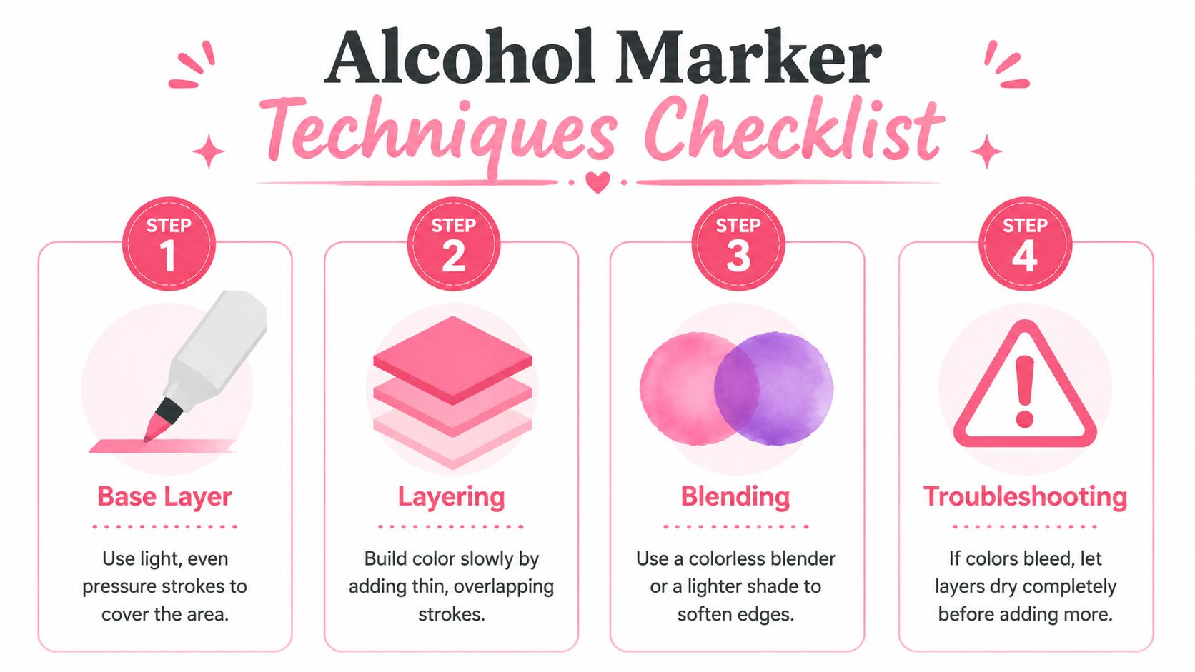
Start with a base layer using a middle-value marker. Hold the marker lightly and use strokes that overlap before the edge dries. Move from one boundary to another rather than repeatedly scrubbing the center.
Add a darker marker where the form turns away from the light. Keep the shadow area smaller than the base area. If the first layer is still damp, a light return with the base marker can soften the transition. If it has dried, use several short feathered strokes rather than rubbing across the entire section.
For a two-color blend, place the lighter shade first, then add the darker shade near the shadow. Return with the lighter marker and pull the darker ink outward. A colorless blender can soften an edge, but it may push ink outward, so use it with care near printed lines.
Practice before touching the page
Take scrap paper that resembles your coloring book and make five swatches, pairing two colors in each. Label the light marker, dark marker, direction of travel, and whether the paper was wet or dry when you blended.
This small test shows you more than a marker label can. You'll see whether the colors become muddy, whether the nib leaves streaks, and how much pressure your paper accepts.
Marker habit: Move on once the area is covered. Repeatedly correcting a drying patch usually creates more texture, not less.
Use the Ohuhu and DecoTime converter when you need to compare a familiar marker family with another set.
| Problem | Likely cause | Practical solution |
|---|---|---|
| Streaks | You went back over a partly dried area | Let the section dry, then add a controlled second layer |
| Puddles | The nib stayed in one spot too long | Lift the marker sooner and use shorter passes |
| Uneven saturation | Pressure or stroke speed changed | Slow down and use consistent, overlapping strokes |
| Harsh blend | The darker color spread too far | Reapply the light shade around the edge with feathered strokes |
| Bleeding | Paper absorbed more ink than expected | Add a backing sheet, reduce saturation, and test another page |
Planning Your Color Palette with Confidence
Many beginners choose each color only after reaching the next section of the drawing. That approach can work, but it often creates a page that feels disconnected. A simple color story gives you a boundary, so you can make creative choices without reconsidering the entire illustration every few minutes.
Choose one of three reliable relationships
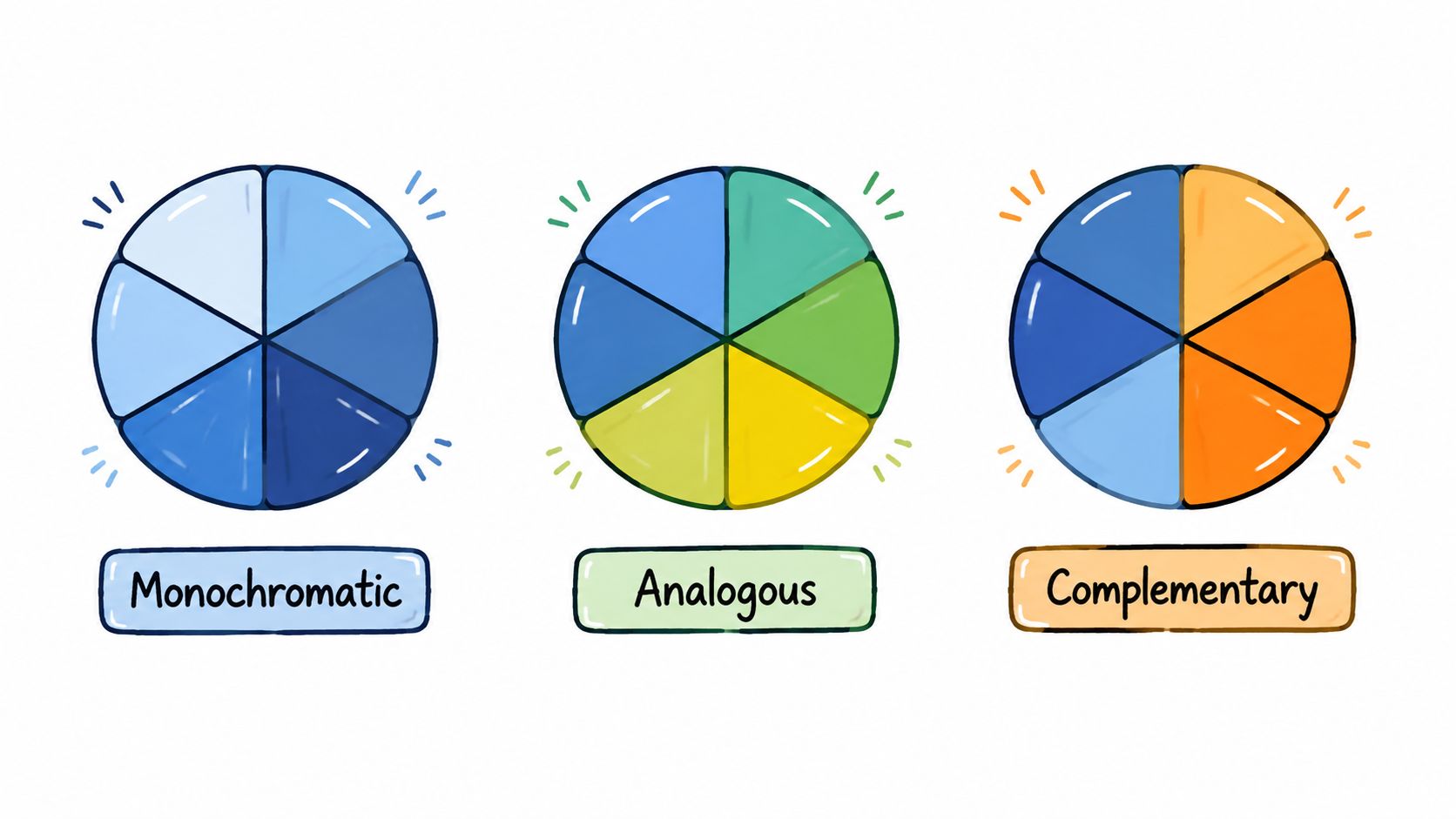
A monochromatic palette uses different values of one hue. Try pale blue, medium blue, and deep blue for a quiet sky or a ceramic object. This is the easiest option when you want harmony and don't want to compare many families.
An analogous palette uses neighboring hues. Green, blue-green, and blue can shape leaves, water, or a cool interior. Add a neutral brown or gray when the page needs separation.
A complementary palette places opposing hues together. Orange beside blue, or violet beside yellow, creates clear contrast. Keep one family dominant and use the other as an accent, especially when the page contains many small motifs.
ColorBestie offers five theme worlds, Cozy, Fantasy, Botanical, Ocean, and Celestial, that can help you decide on a starting mood. Cozy might lead you toward warm neutrals and soft accents. Botanical suggests greens with flower colors. Ocean supports blue and blue-green families, while Celestial gives you a reason to explore deep darks with luminous accents.
You can also test color relationships with Adobe Color or Coolors before opening your book. Treat their screens as planning references, not exact paper predictions.
A digital palette still has to become a physical marker selection. Compare each suggested shade with the numbered colors in your Ohuhu or Copic set, then make a swatch on the actual paper. Look for the closest value and temperature rather than chasing an exact screen match.
Use a palette generator to create a starting combination when the blank page feels intimidating.
The video below offers another visual way to think about color relationships.
Before committing, swatch the full group together. Place the marks side by side, check whether the darkest color overwhelms the others, and remove one color if the set feels crowded. A smaller, coordinated palette usually makes the page easier to control.
Your First Coloring Session Step by Step
Set aside a calm window and choose one page, not an entire book. A first session can fit into roughly 45 to 60 minutes, but you can stop earlier if your hand or attention feels tired.
Start with inspection
Spend the opening minutes checking the page. Identify the focal object, repeated motifs, likely light direction, and the areas most vulnerable to bleeding. Put a protective sheet underneath and test your chosen markers on scrap paper or an unused margin.
Choose a mid-tone for the base rather than the lightest marker in your set. Very pale colors can disappear on paper, while a middle value gives you something to compare against when you add shadows.
Work from broad decisions to small details
Color one small motif at a time. For a flower, lay down the base on every petal, leave the center for later, then add a darker tone near the overlapping petals. Repeat that process on the leaves before moving to another part of the page.
Use a timer if you tend to lose track of pressure or posture. Pause occasionally, hold the page at arm's length, and ask whether the color balance feels intentional. You don't need to finish every shape in one sitting.
When a choice feels wrong, use a simple decision rule:
- Too bright: Add a quieter neighboring hue or reserve it for a small accent.
- Too dull: Place a complementary color nearby instead of adding more saturation everywhere.
- Too dark: Expand the lighter family around it or soften the edge with a blender after drying.
- Too disconnected: Repeat the color in a small detail elsewhere on the page.
Highlights can come from untouched white paper, a lighter marker, or a colorless blender used carefully. Plan those light areas before filling every section, because alcohol marker ink won't behave like an opaque paint that fully covers a dark mistake.
Close the session deliberately
When you finish, place the page under a heavy book if it has curled. Replace marker caps firmly, clean any ink from the nibs, and photograph the page in consistent light. Write two short notes, one about a color combination you liked and one about a technique to try next time.
The finished page doesn't need to prove anything. It gives you a record of decisions, and that record makes the next session easier.
Common Myths and Smart Next Steps
Myth one, you need expensive Copic markers. You don't. Copic Sketch markers offer a refined system, but affordable alcohol markers such as Ohuhu can give beginners useful brush control and a broad way to practice layering. The paper and your handling matter as much as the brand.
Myth two, the most intricate page creates the deepest relaxation. Detail can absorb you, but it can also create pressure. Simpler “cozy” and “bold and easy” designs have gained attention because they reduce friction and fit short, repeatable coloring sessions, as described in CNN's coverage of cozy adult coloring. Pick the complexity your energy can support today.
Myth three, an AI palette tool replaces your color eye. It doesn't. A suggested palette is a practice prompt. You still decide where the light falls, which color feels too strong on your paper, and whether the image matches your mood. Use digital guidance to compare possibilities, then learn from your swatches and finished pages.
A small routine builds skill more reliably than a large supply collection:
- Keep a compact set: Choose a manageable group of markers rather than buying every available shade.
- Maintain a color journal: Record combinations that work on your paper.
- Share progress: An online coloring community can provide gentle accountability and new page ideas.
- Revisit older work: Look at an earlier spread later and note what your hand now controls more confidently.
Choose one page tonight, prepare a backing sheet, and color for twenty minutes without trying to finish. Let the first session teach you what your paper and markers can do.
ColorBestie turns a coloring-page sketch into a marker-style color preview, suggests palette directions across its Cozy, Fantasy, Botanical, Ocean, and Celestial themes, and helps connect suggestions with marker families such as Ohuhu, Copic, and Prismacolor. Visit ColorBestie to test a palette before you commit ink to your next page.
