
You're probably here because a color in your head refuses to come out of the tube.
Maybe you need a quiet sage green for leaves, a believable skin tone that doesn't look chalky, or a sunset orange that feels warm instead of fluorescent. You squeeze out a few paints, mix confidently, and end up with something flat, muddy, or impossible to recreate the next day. That frustration is normal. Acrylic paint mix skills don't arrive with the paint set.
Acrylic became a modern artist's medium in the 20th century. Otto Röhm first invented acrylic resin in 1934, and by 1955 the Permanent Pigments Company had developed the first water-based acrylic gesso later branded Liquitex, which helped move acrylics from industrial chemistry into fine art in just 21 years. That fast shift helps explain why artists embraced a paint that dries quickly and becomes water-resistant when dry, while avoiding the harsh solvents associated with traditional oil systems, as summarized by Edna Pines on acrylic paint history.
That speed is exactly why acrylics can feel both exciting and unforgiving. You can layer quickly, correct quickly, and build crisp color fields. But if you don't have a mixing system, your best color often appears once and then disappears forever.
Unlocking Infinite Colors From a Few Tubes
A beginner often buys more paint than they need because mixing feels unreliable. If green goes wrong, it seems easier to buy three more greens. If purple looks dull, maybe the answer is a different violet in a nicer tube. Before long, the paint box is full, but the confidence still isn't there.
A key shift happens when you stop treating each tube as a final answer and start treating it as an ingredient. A small set of paints can produce a huge range of color if you understand what each one tends to do. That's when acrylic paint mix practice becomes freeing instead of stressful.
Why tube colors aren't enough
A tube color is only a starting point. A ready-made green may be too artificial for foliage. A premixed flesh tone may look lifeless in a portrait. Even a strong red might lean warmer or cooler than you expected, which changes every mix that follows.
That's why many artists build their own reference colors instead of trusting the label alone. If you want a bridge between hand-mixed paint and tidy color planning, a tool like the Palette Generator can help you think in families of color rather than isolated tubes.
Practical rule: You don't need more random colors. You need a smaller set you understand well.
Three words that make mixing easier
Think of acrylic mixing as three connected skills.
- Choosing the right starting pigments
- Adjusting the color without killing it
- Recording what worked so you can do it again
That third part gets ignored in most beginner guides. But for hobbyists, illustrators, and anyone who works in series, repeatability matters just as much as discovery. Freedom in painting feels much better when you can return to a beautiful mix on purpose.
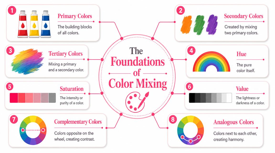
The Foundations of Color Mixing
Color theory sounds bigger than it is. For painting, you only need a few ideas you can use at the palette.
Why tube colors aren't enough
Start with the familiar structure.
- Primary colors are red, yellow, and blue
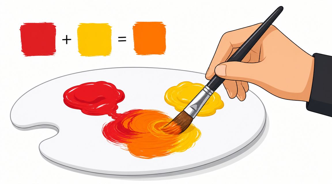
- Secondary colors come from mixing two primaries, so you get orange, green, and violet
- Tertiary colors sit between them, like blue-green or red-orange
That part is simple. The part that confuses beginners is that not all reds, yellows, and blues behave the same. One red may lean orange. Another may lean violet. One blue may push toward green, while another heads toward purple. These hidden leanings are called undertones or bias.
A very practical method is to use warm and cool versions of each primary and build a swatch grid where each top-row color is mixed with each side-row color. That creates a reusable chart and makes undertone shifts visible, as explained in this warm and cool swatch-grid guide.
Three words that make mixing easier
There are three terms worth remembering.
| Term | Plain meaning | What you do with it |
|---|---|---|
| Hue | The color family itself | Decide whether it's red, green, violet, and so on |
| Value | How light or dark it is | Add white to lighten, black carefully to darken |
| Chroma | How intense or muted it is | Soften it with a complement or gray approach |
If your mix looks “wrong,” ask which of these is off. Is the hue wrong? Is it too dark? Is it too dull? That question narrows the fix.
Acrylics behave differently from watercolor here. Acrylic paint typically dries in about 10 to 20 minutes, and artists often adjust tone by adding white or black rather than changing water percentage, which is the opposite of the watercolor method, according to Wikipedia's acrylic paint overview. That quick-drying, opaque character is one reason acrylics work so well for layering.
A handy comparison tool such as Marker Comparison can also train your eye to notice whether a color family shifts warmer, cooler, lighter, or duller across different media.
If a mix looks muddy, the problem usually isn't “I'm bad at color.” It's that the hue bias and value shift weren't obvious yet.
Core Mixing Techniques for Every Artist
Mixing gets easier once your hands know a routine. You don't want to improvise every green from scratch.
Build a split-primary habit
A split-primary palette means you keep a warm and cool version of each primary. That gives you better odds of clean secondaries.
For example, if you want a bright orange, a warm yellow and a warm red usually get you there more cleanly than a cool red that already leans toward violet. If you want a clear violet, a blue that leans violet will usually help more than a blue that leans green.
Set up a small chart on paper or canvas board. Put your warm and cool primaries across the top and down the side, then mix every crossing. Keep it. Label it. This becomes your map.
Mixing secondaries without guessing
When you mix a secondary color, start with the lighter paint and add the darker paint slowly.
- Orange often starts with yellow, then a little red
- Green often starts with yellow, then a little blue
- Violet often starts with red or magenta, then a little blue
This sounds obvious, but beginners often do the reverse and dump too much dark pigment into a pale mix. That wastes paint and makes correction harder.
Professional manufacturers use precise ratios for saturated color targets. Golden gives examples like 10 parts Benzimidazolone Yellow Medium to 1 part Phthalo Green (Blue Shade) for a bright green, and 1 part Phthalo Blue (Green Shade) to 2 parts Quinacridone Magenta to establish an approximate primary blue in their color mixing guide from Golden Artist Colors. The larger lesson matters more than the recipe. Strong color often comes from one dominant pigment plus a very small corrective addition.
Neutrals that feel richer than plain black
A lot of beginners reach for black when they want shadow, depth, or a toned-down area. Sometimes that works. Often it flattens the painting.
A more painterly method is to mix complements.
- Blue + orange can create earthy greys and shadowed browns
- Red + green can make muted neutrals for skin, fabric, and backgrounds
- Yellow + purple can produce natural olive and brownish notes
These mixtures feel more alive because they contain a little color tension. They don't shut the door the way straight black can.
After you've practiced a few complement mixes, watch this demonstration and notice how handling changes once additives enter the picture:
Mix in small increments, especially when one pigment is much stronger than the other. A tiny correction is easy. A rescue operation usually isn't.
Step-by-Step Recipes for Common Colors
Recipes help when your eye knows what it wants but your hand still hesitates. These aren't rigid formulas. Think of them as good starting points.
Skin tones
Skin tones usually look more believable when you build them from warm neutrals instead of starting with pink.
Try these starting mixes:
| Target Color | Base Mix (Approx. Ratio) | Adjustment Tip |
|---|---|---|
| Light skin base | 3 parts white, 1 part red, small touch of yellow | Add a tiny amount of blue or green for a less pink result |
| Medium skin base | 2 parts yellow, 1 part red, 1 part white | Add blue in tiny amounts for shadow or cooling |
| Deep skin base | 2 parts red, 2 parts yellow, 1 part blue | Warm it with more red or soften it with a complement mix |
| Shadow tone for skin | Base skin mix + small touch of green or blue | Keep it muted, not black-heavy |
The common beginner mistake is adding too much white too soon. White lightens, but it can also make skin look chalky. Build the core hue first, then tint carefully if needed.
Natural greens
Tube greens often look too synthetic for leaves, grasses, or botanical studies. A more natural green usually comes from yellow-led mixtures that you mute on purpose.
Start with one of these approaches:
- Fresh leaf green by mixing mostly yellow with a small amount of blue
- Olive green by taking that green and adding a little red or purple influence
- Deep foliage green by darkening a yellow-blue green with its complement rather than relying on black
If you want a very bright, high-chroma green, the Golden example is useful. 10 parts Benzimidazolone Yellow Medium to 1 part Phthalo Green (Blue Shade) creates a bright green in their professional mixing guide. That recipe is a good reminder that intense acrylic paint mix results often depend on a dominant single-pigment base rather than equal parts of everything.
Muted colors
Muted colors are where many paintings become elegant. Dusty rose, sage, and smoky lavender all come from restraint.
Try thinking in two stages.
First, make the clean parent color. Then mute it with a tiny amount of its opposite or with a neutralizing partner already present in your palette.
Here are a few examples in plain language:
- Dusty rose starts as a pinkish red, then gets softened with a little earthier influence or a touch of green's opposite effect
- Sage green starts as green, then gets dulled with red or a violet-leaning neutral
- Soft lavender starts with a red-blue mix and gets lifted with white, then softened if it feels too candy-like
White changes value. It doesn't always preserve chroma. If a mix turns pale and weak, the hue may need rebuilding before more lightening.
One more practical habit helps here. Mix enough paint for the passage you're working on. Beautiful muted colors are notoriously hard to re-create by memory alone.
Using Mediums to Enhance Your Paint Mixes
A color mix isn't only about color. It's also about how the paint moves, how fast it dries, how transparent it appears, and how it looks after the surface cures.
What each medium changes
Acrylic mediums can change handling without forcing you to buy a whole new paint line.
- Gloss medium increases transparency and can make color appear clearer or deeper in the dried film
- Matte medium reduces shine and can soften glare, which helps if a glossy surface makes judging color difficult
- Gel medium adds body, which is useful if you want thicker brushmarks or more physical texture
- Retarder slows drying so you have a longer blending window
Retarder is useful, but it needs restraint. Expert guidance in the video above recommends keeping retarder at or below 15%, because more can interfere with drying and compromise the paint film, as discussed in that acrylic mixing and medium demonstration on YouTube.
How to avoid surprises after drying
One of the more annoying acrylic surprises is color shift. A mix can look right on the palette and slightly different once dry. Acrylics can dry darker, and the final appearance can also be influenced by opacity and by mediums such as gloss or matte.
That's why test swatches matter. Paint a small sample, let it dry fully, and judge that result instead of trusting the wet pile on your palette.
A useful working rhythm looks like this:
- Mix the base hue.
- Paint a small swatch.
- Let it dry.
- Adjust the next batch based on the dry result.
- Record what changed.
This feels slow at first, but it saves a lot of frustration on layered work, portrait sessions, and multi-panel projects.
The best wet mix isn't always the best final mix. Acrylic asks you to judge the dry film, not just the palette.
Troubleshooting and Practical Mixing Exercises
Most acrylic mixing problems come from a few repeat patterns. The good news is that they're fixable.
Why mixes turn muddy
Mud usually appears when too many pigments are fighting in one pile, or when the chosen primaries already lean away from the clean secondary you wanted. If your orange looks brown too fast, the red may carry a cool bias. If your violet looks dull, the blue may lean green.
The fix is often subtraction, not more correction. Use fewer pigments. Start over with cleaner parent colors. Make smaller test piles before committing your main batch.
A simple system for repeatable color
Repeatability is the part most artists wish they had learned earlier. A beautiful acrylic paint mix isn't enough if you can't match it for touch-ups, series work, or a second panel later on.
Artists trying to reproduce color later are advised to measure by volume, such as with teaspoons, and write down the ratios because exact reproduction is otherwise nearly impossible, according to this guide on reproducing the same acrylic color.
Here's a classroom-friendly system that works:
- Label the pigments with the full paint names, not just “blue” or “red”
- Measure the mix by simple repeatable units, even if that unit is just the corner of a palette knife or a small spoon
- Paint a swatch beside the written recipe
- Note the surface you used, because absorbency and sheen affect appearance
- Mark the dry result if it changed from the wet one

If you want one home exercise, make a page of six hand-mixed colors and document every one. Don't aim for pretty. Aim for repeatable.
A translation exercise for paint and marker artists
Paint study becomes especially useful for colorists and marker users.
Mix a custom color in acrylic. Let it dry. Create a swatch card. Then compare that swatch to the marker family you already own or plan to buy. You're not looking for a perfect chemical match. You're building a translation habit. Which marker is the closest light version? Which one works as the shadow? Which one captures the warmer or cooler bias?
If you enjoy moving between paint, digital previews, and physical marker palettes, a tool like ColorBestie can support that translation mindset. Its core value isn't just picking a pretty color. It's learning to move one color idea across different materials without losing its personality.
A final exercise I give beginners is simple:
- Mix one color you love.
- Write the recipe.
- Paint a dry swatch.
- Find two lighter and two darker companions.
- Match those to the closest marker family you own.
That single exercise teaches hue, value, chroma, repeatability, and palette planning all at once.
If you like turning hand-mixed color ideas into marker-friendly palettes, ColorBestie is a helpful next step. You can use it to explore palette options, compare marker families, and make the jump from fluid acrylic experiments to organized coloring choices that are easier to reuse across pages, sketches, and finished pieces.
