
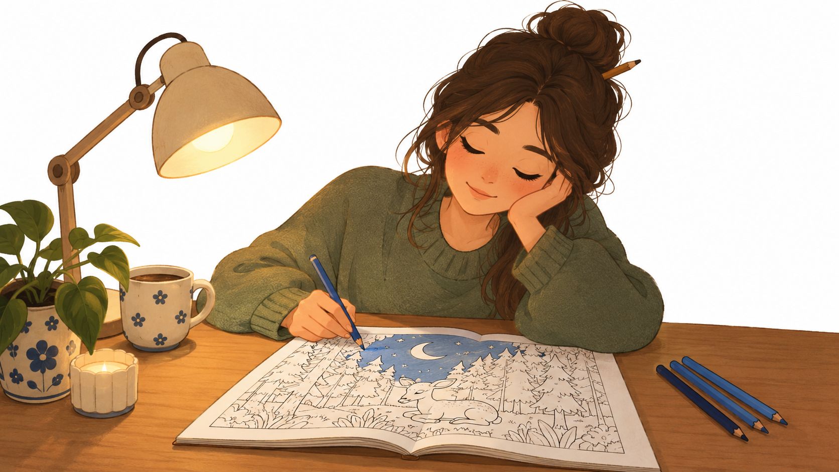
You've finished the line art for a moonlit forest, and three blue markers are waiting beside your page. The trees are outlined, the moon is ready to glow, and yet the whole scene looks strangely flat. You add another blue, then another. The illustration gets darker, but not deeper.
That problem doesn't mean you need a rainbow of colors. Monochromatic color schemes can create atmosphere, distance, focus, and drama with one hue, provided you control the lightness, saturation, temperature, texture, and marker layering. This guide will help you build that control, test a palette before committing ink, and understand why some one-hue illustrations feel rich while others look sleepy.
Why a Single Hue Can Feel Bigger Than a Rainbow
The moonlit forest on your desk has the right subject, but every tree sits at nearly the same visual volume. The sky, foliage, rocks, and shadows all speak in similar blues, so the eye has nowhere obvious to pause. More colors might add variety, but they could also introduce distractions that weaken the quiet nighttime mood.
A single hue works differently. It gives the artwork a shared atmosphere, then asks value and saturation to do the separating. A pale blue can push the moon into the distance. A saturated middle blue can describe the nearest branches. A deep, softened blue can anchor the lower edge of the page. The hue stays related while the roles change.
Monochromatic color schemes have a substantial history in art and design. Picasso's Blue Period ran from 1901 to 1904, when he painted almost exclusively in blues and blue-greens, using changes in lightness and saturation to express grief and isolation, as documented in this history of monochromatic color. In the late 1950s, Yves Klein developed International Klein Blue and made dozens of monochrome canvases, taking the single-hue idea in an intensely focused direction.
Why more color isn't always more interest
A multicolor palette can create instant contrast, but contrast isn't the same as depth. If every object has a different hue, the eye may notice color changes before it notices the arrangement of light, the direction of space, or the focal subject.
A carefully controlled blue palette can make a forest feel still and expansive. A warm red family can make a character portrait feel intimate or theatrical. A green family can support a study of leaves, moss, and quiet natural textures without forcing every object into a separate color category.
Practical rule: If the subject depends on mood, lighting, or form, reduce hue variety and strengthen the value structure first.
The useful question isn't “How many colors can I fit on this page?” Ask instead, “Which area should be lightest, which should be darkest, and where should the eye rest?” Once those decisions are clear, one hue can feel surprisingly spacious.
The next step is learning the vocabulary behind that control. Once you can distinguish a tint, tone, and shade, you can diagnose why your three blue markers aren't creating enough separation and choose the next marker with intention instead of guesswork.
What Makes a Color Scheme Monochromatic
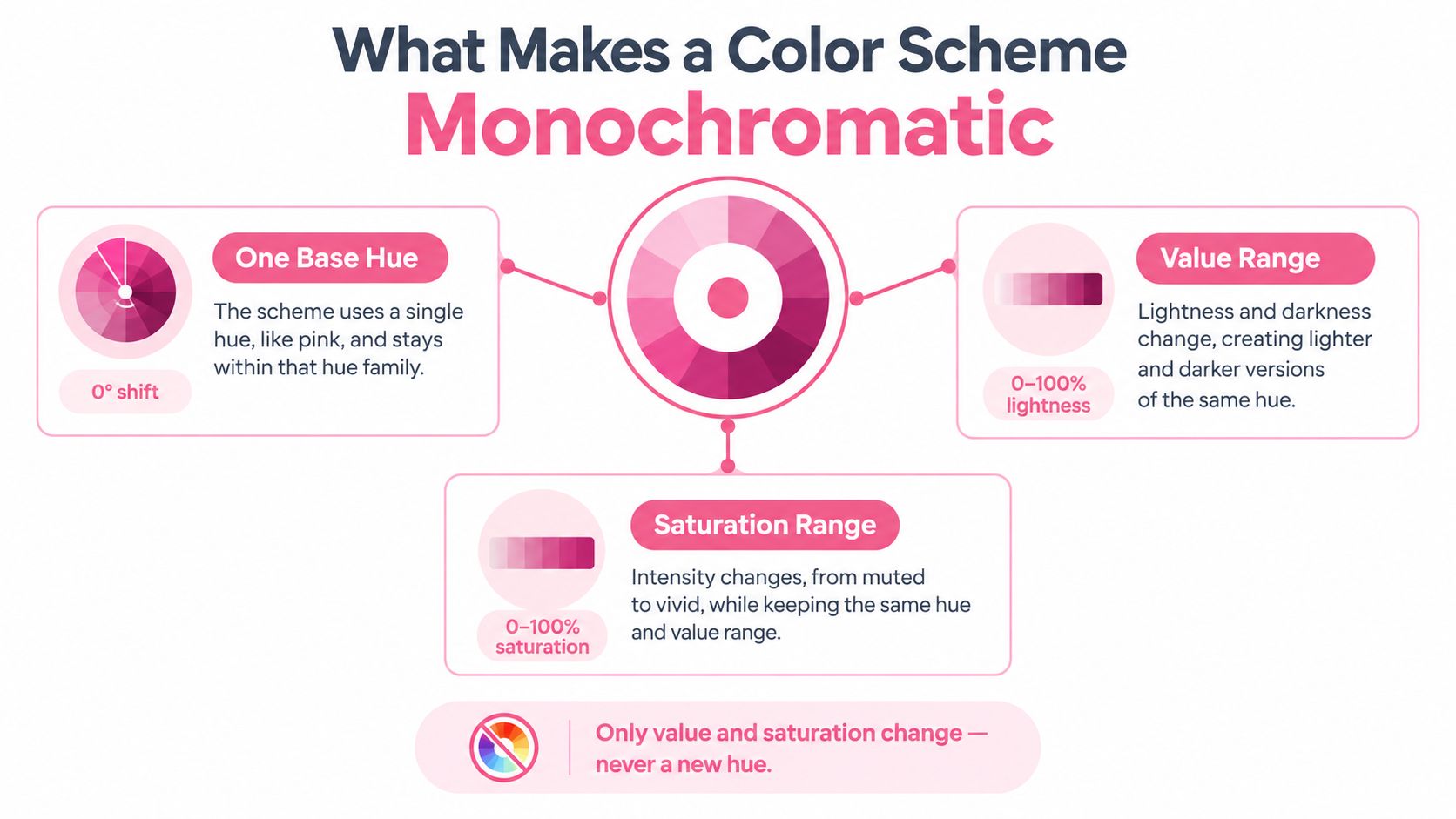
A monochromatic color scheme begins with one base hue from the color wheel. You can shift its lightness and saturation, but the core palette stays inside that same hue family. A blue scheme may move from pale, airy blue to a dark, shadowed blue, yet it still reads as blue throughout.
That definition is more exact than “using one color.” A single marker used everywhere gives you one flat note, not a full palette. Black, white, and gray on their own create an achromatic scheme, not a monochromatic one, because they have no hue. A true monochromatic system can also vary opacity, edge quality, texture, and application, not just the amount of white mixed into a color, as explained in this art and design guide to monochromatic color.
Use ultramarine blue as a shared example.
- A tint is ultramarine blue made lighter with white. It feels open, delicate, and airy. In an illustration, it might describe a distant hill, reflected moonlight, or the soft edge of a cloud.
- A tone is ultramarine blue softened with gray. It loses some intensity and feels quieter or more grounded. It can sit comfortably in a middle value, especially across broad areas that should not compete with the subject.
- A shade is ultramarine blue made darker with black. It feels weightier and more dramatic. Use it for the underside of a rock, a foreground branch, or a strong cast shadow.
Value and saturation do different jobs
Value describes how light or dark a color appears. Saturation describes how intense or muted it appears. Two blue swatches can share a similar value but differ in saturation, or share similar saturation but sit far apart in value. Those differences shape hierarchy.
Because the hue stays constant, monochromatic contrast has to come from value and saturation rather than from a move into another hue. Middle values often blend together, while a very light tint beside a deep shade gives clearer separation. The color theory reference from the Interaction Design Foundation describes this value-based structure and its role in clean interfaces, illustration blocking, and controlled visual hierarchy.
Alcohol markers approximate these categories rather than reproducing paint mixtures exactly. A lighter marker from the same family can act like a tint. Layering a mid-blue over a pale blue can create a subdued tone. A deeper marker from the family can act like a shade, especially when you keep the paper brightest in the lightest areas.
Before coloring, arrange your swatches from light to dark. Then arrange them again by intensity. That small exercise shows whether your palette has a useful range or only several attractive colors that behave almost identically on paper.
Naming each swatch as a tint, tone, or shade turns a vague sense that something is off into a specific fix. If the middle values merge, the palette needs a deeper shade, not a fourth blue.
The Three Levers That Bring a Mono Palette to Life
A one-hue palette becomes convincing when you adjust three practical levers: contrast, value range, and temperature. They overlap, but each answers a different question.
Contrast asks how strongly neighboring areas differ. A pale tint next to a deep shade creates a clear visual break and can pull attention toward a focal point. Small value differences create a quieter transition, which works well for backgrounds, mist, or softly rounded forms.
Value range asks whether your palette travels far enough from light to dark. Many flat illustrations cluster around the middle. The colors may be attractive individually, but they don't establish a clear foreground, middle ground, or focal hierarchy. Start by placing your lightest practical swatch beside your deepest usable shade. If the pair already creates a convincing structure, the middle colors have a job to perform rather than having to carry the entire image.
Temperature is subtler. A blue can feel cooler when your layering leans toward a blue-green impression, or warmer when it leans toward blue-violet or a muted reddish direction. Within a mostly cool blue family, a small warmer variation can attract the eye without breaking the overall unity. The shift doesn't need to become a separate accent color. It can be a quieter change in how you layer or where you place the marker.
| Lever | What It Controls | Effect on the Palette |
|---|---|---|
| Contrast | Separation between neighboring areas | Creates focus, drama, or calm |
| Value range | Distance between the lightest and darkest areas | Builds depth and readable form |
| Temperature | Whether related variations feel cooler or warmer | Adds atmosphere and a subtle focal pull |
A simple planning test
Make three quick marks before starting the illustration:
- Place the lightest tint where you want the most breathing room.
- Place the deepest shade where you want the strongest weight.
- Add a middle swatch between them and check whether it separates the two without disappearing.
This test is more useful than choosing colors by cap appearance. Alcohol markers often change as they overlap, and paper affects how smoothly they spread. A swatch made on the same paper as the final piece gives you a more honest preview.
For digital planning, the ColorBestie palette generator can help you examine a one-hue range before you color. Treat the result as a starting arrangement, then confirm the actual behavior with your markers.
When Monochromatic Is the Best Choice
Choose monochromatic color schemes when the artwork's message depends more on mood, light, form, or texture than on strong hue contrast. The palette acts like a musical key. It limits some options, but it gives every variation a shared emotional direction.
A serene nature study is a natural fit. A family of greens can distinguish leaf shapes through value and surface marks while keeping the scene calm. A cinematic night scene can use one blue family to separate sky, architecture, figures, and reflections without making the lighting feel fragmented. A minimalist character portrait can use one red, violet, or brown family to keep attention on expression, silhouette, and shadow placement.
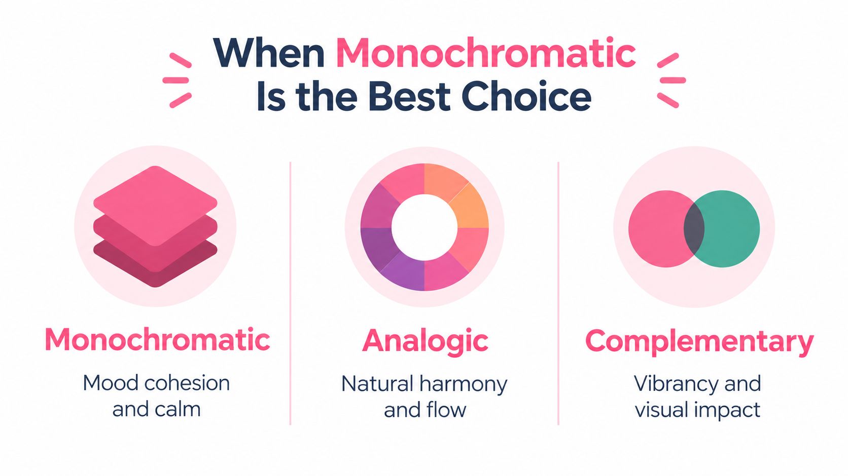
Analogous palettes offer neighboring hues, such as blue moving toward teal. They create more color movement while preserving some visual connection. Complementary palettes place opposing hues together and produce a sharper, more energetic relationship. Neither approach is automatically better. Each answers a different storytelling need.
| Palette choice | Strongest use | Potential limitation |
|---|---|---|
| Monochromatic | Cohesive mood, controlled lighting, quiet form | Can flatten if value differences are weak |
| Analogous | Gentle color flow and natural variation | May lack a strong focal contrast |
| Complementary | Vibrant tension and immediate emphasis | Can feel noisy if every area competes |
Match the palette to the story
Autumn foliage usually benefits from hue variation because the subject's identity depends on distinct leaf colors. A vibrant still life may also need multiple harmonies to express the energy of fruit, glass, flowers, and fabric. A complementary relationship can outperform monochrome when the artwork needs a visual jolt or a clearly separated accent.
Monochrome is strongest when restraint supports the subject. If the viewer should notice the glow on a cheek, the shape of a cloud, or the texture of tree bark before noticing color variety, keep the hue family narrow and let value do the talking.
Building Marker Palettes From One Color Family
Marker caps can make palette planning feel easier than it is. Neighboring labels don't always create neighboring results on your paper, and a color that looks like a perfect mid-tone may become too intense after layering. Build your family around behavior, not just names.
Start with a base color that suits the subject. The plan notes for a blue palette include Ohuhu B236, Copic B29, and Prismacolor PC932 as starting references. Don't assume they will behave identically across brands or papers. Place each marker on a scrap sheet, let the ink settle, and compare the dried marks under the lighting you normally use.
| Brand | Light Tint | Mid-Tone | Base Color | Deep Shade |
|---|---|---|---|---|
| Ohuhu | A lighter family neighbor | A controlled middle blue | B236 | A deeper blue from the same family |
| Copic | A lighter family neighbor | A controlled middle blue | B29 | A deeper blue from the same family |
| Prismacolor | A lighter family neighbor | A controlled middle blue | PC932 | A deeper blue from the same family |
Layer with a job in mind
Lay the lightest area first and protect the paper where you want a clean highlight. Add the base color while the first layer is still workable if you want a softer transition. For a firmer edge, let the first layer dry before placing the darker pass.
Use the mid-tone as a bridge, not as a universal solution. It should connect the tint and shade while preserving their distinction. If you repeatedly scrub across a wet area, you can push too much pigment into the paper and create a dull, uneven patch.
Bristol and marker-specific paper often provide a smoother surface for blending than rough drawing paper, but every sheet has its own response. Test the exact paper before starting the final page.
Marker habit: Make a small ladder of light, middle, base, and deep marks, then blend each neighboring pair in both directions. Keep the combinations that remain clear after drying.
For a faster cross-brand comparison, the ColorBestie marker comparison tool can help you review related marker families before making your physical swatches. The paper test still decides what belongs in the final palette.
A Step-by-Step Workflow With ColorBestie
Suppose your next illustration shows a fabric-covered chair beside a rainy window. The reference photo has the quiet blue-gray mood you want, but its many small color variations would be difficult to translate directly into markers. A monochromatic workflow can reduce that visual noise before you begin.
Start with the mood, not the marker
Upload a reference image that already carries the feeling you want. It could be a sky, flower, wall of fabric, or scene. Look for the light direction and emotional temperature first. A reference with soft overcast light will suggest a different palette structure from one with hard, dramatic illumination.
In the app, use the harmony controls to isolate a single hue family. Adjust the saturation and value sliders until the palette feels focused rather than gray or overly intense. Keep the lightest and darkest results visible together. If the range feels too narrow, change the sliders before you start choosing individual markers.
Turn the digital range into a physical test
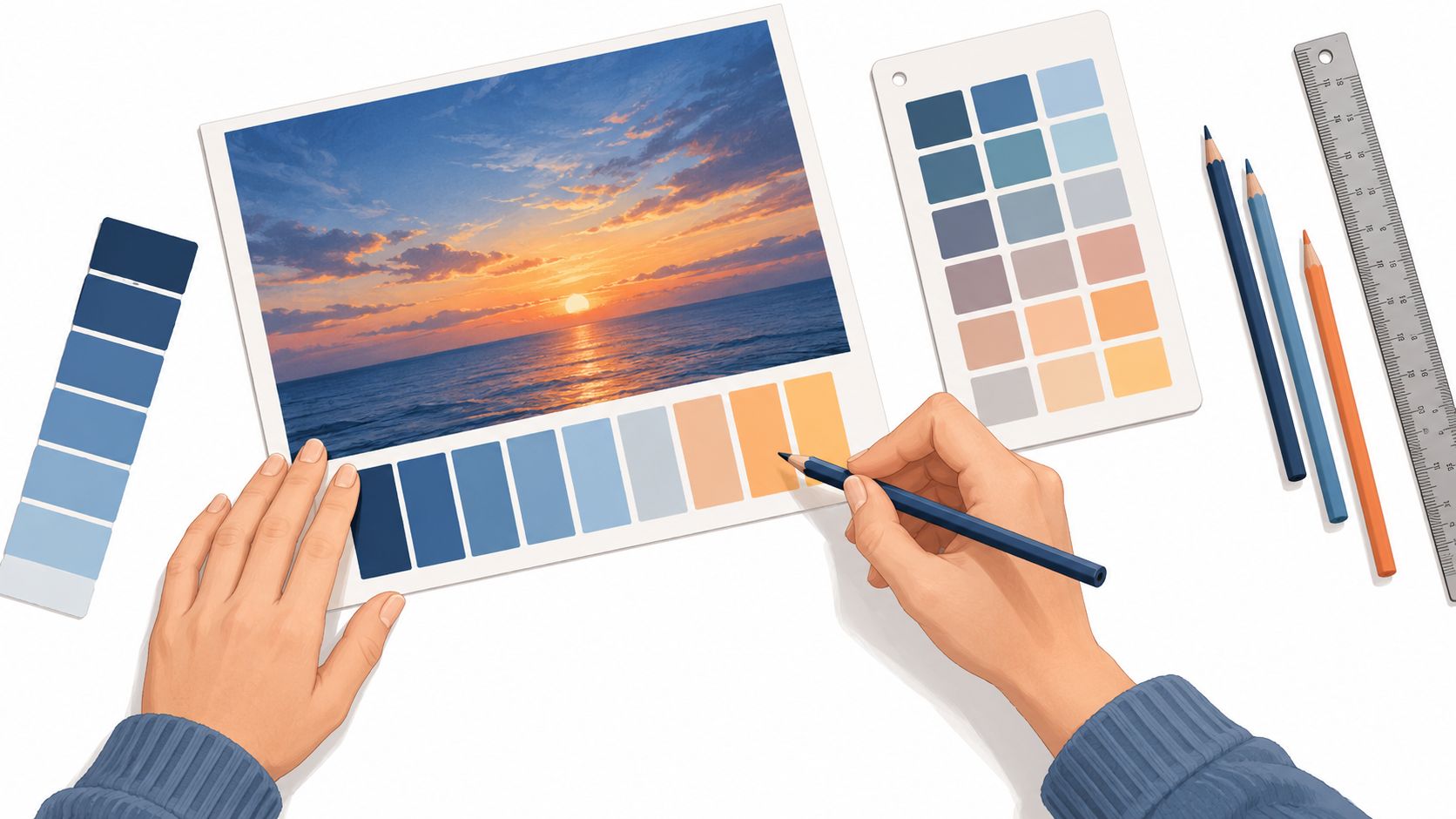
Generate the tints and shades from the selected family, then save the swatch set. Where marker information is available, use the suggested numbers as candidates, not guarantees. A digital color can look different on your paper, especially after several overlapping strokes.
Print or view the swatches beside a scrap sheet and make a small test:
- Lay down the lightest swatch and leave a clean highlight beside it.
- Add the middle colors in separate blocks.
- Blend neighboring colors while wet, then repeat after drying.
- Check whether the edges stay smooth or become streaky.
- Compare a single stroke with a layered area for color consistency.
The DecoTime Ohuhu converter can be useful when your existing collection uses one labeling system and your palette plan references another. Record the combinations that behave well on your preferred paper.
The useful result isn't a perfect screen match. It's a small reference library of palettes you have physically tested. Save notes about which marker creates a quiet shadow, which one overwhelms a pale tint, and which pair blends without losing separation. Your future planning becomes faster because you're choosing from known behavior rather than relying only on appearance.
Common Monochromatic Mistakes and How to Fix Them
The most common mistake is assuming that a one-hue palette should use several similar swatches. Similarity creates unity, but too much similarity removes structure. Diagnose the failure on the page before adding another color.
Flatness
Flatness appears when the tint, middle, and shade occupy nearly the same value zone. The trees, moon, and ground may all be blue, but they don't establish distance or priority.
Put your lightest and darkest swatches side by side. If they don't create a strong enough visual relationship, reach for the lightest marker first and reserve the deepest shade for a deliberate focal or structural area. Next time, plan the extreme values before selecting the attractive middle colors.
Muddy middle areas
Muddy patches often develop when you keep layering while the paper is wet or repeatedly use a similar-saturation marker as if it were a blender. The surface becomes overloaded, and the transition loses clarity.
Let each substantial pass dry before deciding whether it needs another layer. Keep one middle-value marker as a bridge, rather than using every middle marker everywhere. If a region already looks dull, stop adding pigment and test a clean edge or a preserved highlight nearby to restore separation.
Monotone fatigue
Even a technically successful palette can become tiring when every area receives the same treatment. The eye needs a small pause, such as an untouched paper highlight, a neutral break, a white gel pen mark, or a patch of contrasting texture.
Use the break sparingly. A tiny highlight in a wet eye, a sharp glint on glass, or a rough bark texture can reset attention without turning the illustration into a multicolor piece. Before adding it, squint at the page and ask where the eye currently rests. Place the reset close to that area, not randomly.
Self-check: If the page feels dull, don't automatically add a new hue. First inspect value separation, drying time, and texture.
Your Monochromatic Mindset and Quick Reference
A monochromatic palette isn't a shortage of colors. It's a discipline of giving one hue several voices. The tint opens the composition, the tone settles it, and the shade gives it weight. Value creates the structure, temperature shapes the atmosphere, and texture keeps related areas from feeling mechanically repeated.
Your workflow can stay simple:
- Palette planning: Choose one base hue, identify the lightest and deepest usable swatches, and test whether a cooler or warmer variation supports the mood.
- Marker execution: Work from light toward dark, blend neighboring colors with purpose, and let important layers dry before building another pass.
- Surface control: Use marker paper or Bristol when smooth blending matters, then test the actual sheet before beginning the final illustration.
- Focal hierarchy: Reserve your strongest dark for a meaningful structural area, not every outline or shadow.
- Final review: Squint at the page, check whether the lightest area still reads as light, and confirm that one calm focal point guides the eye.
The distinctions matter. A tint isn't just “a pale marker,” a tone isn't merely a weaker shade, and black-and-white isn't automatically monochromatic. The more precisely you name what a swatch is doing, the easier it becomes to correct a palette without abandoning it.
Your next small win can be modest. Choose a blue, green, violet, or red family and color one illustration without adding a second hue until the main forms are complete. Let that exercise show you where your value range works, where your layers become muddy, and which textures make the page feel alive. You aren't limiting your creativity. You're training your eye to make one color carry more responsibility.
ColorBestie helps you turn a reference image or black-and-white sketch into marker-style palette inspiration, with theme previews and marker-family guidance for planning a one-hue illustration. Visit ColorBestie to test your next monochromatic palette before you touch pen to paper.