
Color contrast is the measurable difference in lightness, hue, or chroma between two colors that lets a viewer tell them apart. A pastel yellow marker on butter-cream paper may leave a heart shape almost invisible, while dark ink on white paper creates a clear, immediate edge.
You've probably experienced this at a desk or kitchen table. You choose a soft, cheerful marker, fill a carefully drawn shape, and then tilt the page toward the window because the color seems to disappear. The same problem appears on screens when gray text sits on a slightly different gray button. The colors technically differ, but the viewer has to work to find the difference.
Contrast does more than make an artwork look bold. It helps people recognize shapes, read labels, follow boundaries, and notice interactive elements. Strong choices also hold up better when the lighting is poor, the artwork is reproduced at a small size, or viewers perceive colors differently.
For artists, the useful starting point isn't memorizing a ratio. It's learning to notice how value, hue, and chroma cooperate. Then you can connect that visual instinct to accessibility checks for digital work and to practical marker decisions on paper.
A Simple Way to Picture Color Contrast
A beginner drags a pale yellow felt-tip marker across butter-cream paper. The ink is wet, the heart is filled, and yet its outline seems to disappear. The paper and the marker sit so close in lightness that the edge never announces itself. That closeness is the problem contrast is meant to solve.
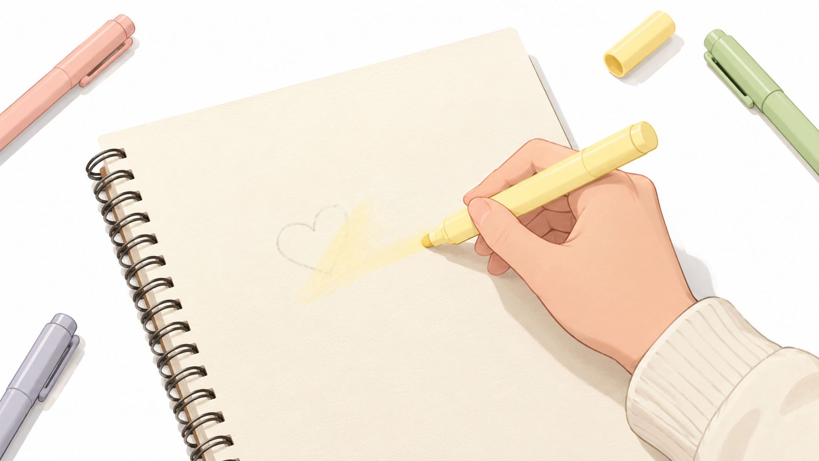
A small change can restore the shape. Use a darker yellow, place the heart on a cooler background, or choose ink with stronger intensity. The drawing stays the same, but the relationship between the heart and the paper becomes easier to read. The same adjustment applies on a screen, where gray text on a gray button may look polished in a design file yet fade on a dim phone or older monitor.
A viewer might miss the label, overlook a border, or fail to recognize that the button can be pressed. Contrast therefore supports both the appearance and the meaning of a design.
A useful artist's test: If you can't tell where one shape ends while squinting, your contrast probably needs help.
Contrast clarifies structure. A dark outline against a pale fill separates a face, leaf, letter, or button from its surroundings. It also helps that separation survive glare, dim light, small reproductions, and differences in color perception.
The paper exercise and the screen check use the same visual instinct. On paper, compare marker swatches with their background before committing to the final layer. On screen, inspect color pairs with a theme preview tool. Look normally, then squint. If the shapes merge, decide whether to adjust brightness, color family, or intensity.
The goal is not to make every pairing loud. A quiet contrast can suit a gentle illustration, provided its important boundaries remain visible. Artists can carry that judgment between pixels and paper, then connect it with accessibility checks and contrast ratios.
The Three Building Blocks Behind Every Contrast
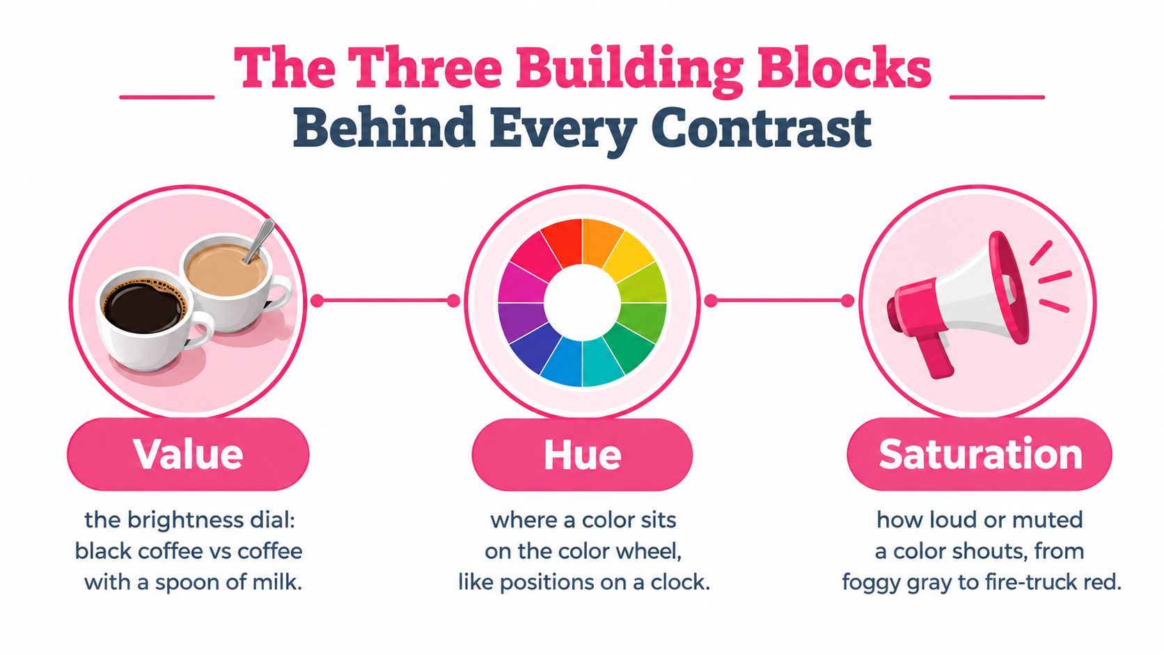
Start with three ordinary objects: a dark coffee, a milky coffee, and the table beneath them. Even before you name the colors, you can tell which cup contains the darker liquid. That difference in brightness is value, the brightness dial of a color.
Value is the brightness dial
In a marker illustration, value separates a shadow from a highlight, a character from a background, or lettering from a colored panel. Black against white creates a strong value difference because one color sits at the darkest end of the scale and the other at the lightest. A pale yellow and a cream paper sit close together, so their shared brightness makes the boundary quiet.
Value often carries the most dependable contrast signal. If you convert a drawing to grayscale and the major shapes still separate, the value structure is doing useful work.
Hue is the color family
Hue describes where a color sits around the color wheel. Cherry red beside mint green feels lively because the two hues occupy very different positions. Cherry red beside brick red feels quieter because the colors belong to neighboring families.
Hue can make an image energetic, calm, playful, or dramatic. But hue difference alone doesn't guarantee clear visibility. Two vivid colors can still share similar brightness, which means they may blur together when viewed quickly or in grayscale.
Chroma is the intensity
Chroma describes how strong or muted a color feels. Think of a television color control moving from a washed-out pastel toward a vivid neon. A dusty rose has less chromatic intensity than a saturated hot pink, even if both belong to the same hue family.
A high-chroma accent can pull the eye forward. A muted background can make that accent feel louder without requiring an extreme value shift. Artists often use this relationship to guide attention, but excessive intensity across every shape can flatten the hierarchy.
Effective marker work usually combines at least two signals. A dark burgundy shape on a pale mint background has value contrast and hue contrast. A muted blue-gray panel beside a vivid orange accent uses a chroma difference as well as a hue difference.
Studio habit: Don't ask only whether two colors are different. Ask how they're different, then decide whether that difference supports the subject.
This distinction helps when a scanner, camera, or display weakens one aspect of the pair. If hue shifts slightly in reproduction, a value difference can preserve the edge. If two colors become similar in brightness, a strong hue or chroma contrast may still help the viewer separate them.
Measuring Contrast with Ratios and WCAG
A marker sketch can look dramatic on a hue wheel yet lose its edges on paper. Digital accessibility measures that separation through relative luminance, a calculated description of how light or dark a color appears. The WCAG contrast ratio compares the lighter color's luminance with the darker color's luminance using (L1 + 0.05) / (L2 + 0.05). Per the WCAG specification documented by WCAG contrast guidance from MDN, results run from 1:1 to 21:1. Identical colors produce 1:1, while black on white reaches 21:1. Section 508's color guidance also explains how color choices affect accessible communication.
You do not need to calculate the formula by hand for every marker pairing. Its value is conceptual: a bright yellow and deep blue may separate clearly because their lightness differs, while two hues that sit far apart on a color wheel can still merge if their values are close. The ratio measures luminance, not the emotional drama of a hue relationship.
| Use Case | Minimum Ratio | Plain-Language Meaning |
|---|---|---|
| Normal body text | 4.5:1 | Small reading text needs a clearly separated foreground and background |
| Large text | 3:1 | Larger lettering can remain readable with a smaller luminance difference |
| Essential non-text content | 3:1 | Icons, controls, meaningful graphics, and similar elements need visible separation |
Apply these thresholds to screens, then translate the same question to paper: can the mark remain distinct when the viewer is farther away, the light is softer, or ink sinks into the page?
For an icon on a gradient, test it against the least-contrasting adjacent area. One edge may stay crisp while another fades into the image.
Three quick visual checks
- Squint at the swatches. Blurring detail makes value differences easier to notice.
- View the pair in grayscale. A phone photo or image editor shows whether the forms depend too heavily on hue.
- Use tracing paper. The softened view helps you judge whether the main shapes still separate.
Try these checks with dusty pink marker over peach paper. If the colors merge, add a darker layer, lighten the base, or place a cooler color nearby. A palette generator can suggest alternatives, but test the final pairing on the actual paper with the actual ink.
How Contrast Shows Up in Real Marker Work
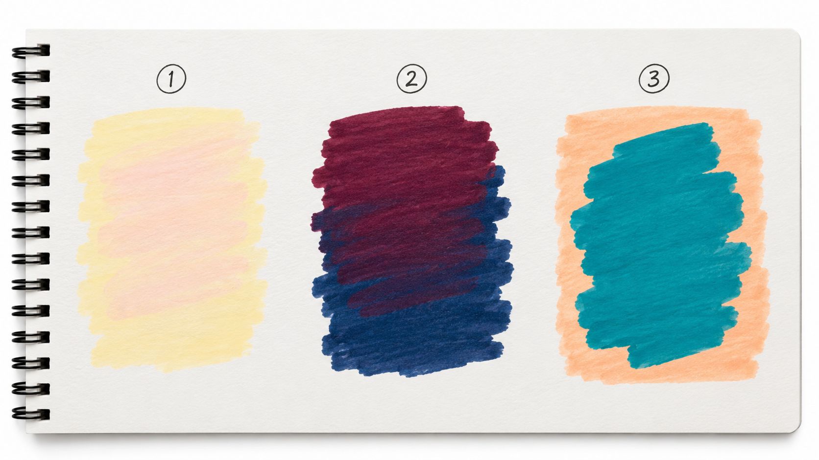
A swatch sheet makes contrast easier to understand because you can compare decisions without the distraction of a finished illustration. Place your colors in broad blocks first. Look for separation at normal viewing distance, then inspect the sheet in softer light.
Pale yellow and pastel pink
Lay down a pale yellow base, let it dry, and add a pastel pink skin tone over a nearby shape. The two colors may feel sweet together, but their values are close. Facial features, fingers, or small decorative marks can lose their edges because the lightness difference isn't doing enough work.
You can preserve the gentle mood by keeping the pale yellow and pink, then adding a darker warm brown for linework or a small shadow. That introduces value contrast without replacing the soft palette. The diagnosis is simple: the hue relationship is pleasant, but the value relationship is weak.
Burgundy and navy
Try a deep burgundy over a navy background. Both colors are dark, so the image may feel rich and moody, yet the shapes can remain difficult to separate. The hues differ, but their values sit close together.
A narrow warm highlight, a pale outline, or a lighter burgundy layer can open the composition. You might also reserve the navy for the background and move the burgundy onto a lighter panel. Here, the lesson is that different hue doesn't automatically mean clear contrast.
After making your swatches, a marker comparison tool can help you review nearby options before choosing a substitute. Keep the physical sheet beside the screen, since marker ink changes as it dries and paper affects the final appearance.
A complementary teal and coral pairing behaves differently. The hues separate quickly, and if one color is darker or more saturated, the contrast becomes even more noticeable. Use teal for a broad background, coral for a focal object, then soften one area with a lighter tint so the pairing doesn't make every shape compete.
This short demonstration offers another way to watch contrast develop through layered marker choices.
The practical question is always the same: which signal is carrying the separation? If the answer is only hue, add value or chroma support. If value already does the work, you can choose a quieter hue pairing without losing clarity.
A Cozy Workflow for Testing Contrast Before You Ink
Marker artists often commit too early. A promising digital palette reaches the page, one layer goes down, and the next color reveals that the shapes don't separate. A small preview routine prevents that disappointment without turning a relaxing session into a technical audit.
Begin with the real surface
Photograph or scan a few swatches on the paper you intend to use. Paper color, texture, and ink behavior all influence the relationship. A palette that looks balanced on a white screen may lose its edge on cream stock.
Next, extract approximate digital color values from the swatch image. Treat those values as a planning aid rather than a perfect replacement for physical ink. Lighting and camera settings can shift the result, so keep the original swatches visible while you work.
Compare before layering
Place the base and layer colors side by side in a contrast checker. Compare the pair against the 4.5:1 body-text benchmark and the 3:1 benchmark used for large text and meaningful non-text elements. These digital thresholds don't dictate every artistic choice, but they give you a useful warning when a label, symbol, border, or focal shape may disappear.
Then perform the human checks:
- Blur your eyes. Confirm that the main shapes remain distinct.
- Flip to grayscale. See whether value supports the composition.
- Shrink the preview. Check whether small details collapse at a reduced size.
- Test the weakest area. For a gradient or textured background, inspect the place where the foreground color comes closest to it.
WebAIM's Contrast Checker and the Stark plugin can provide second opinions during digital planning. Use them as assistants, not judges. A marker illustration also depends on layering, drying, paper absorbency, and the visual role of each shape.
Record the final pairing
Keep a shared palette sheet with the paper type, marker names, intended use, and a small dried swatch. Record whether each color is a base, shadow, outline, highlight, or accent. That note turns a successful experiment into a repeatable recipe for a series.
The final step is deliberately physical. Cap the markers you don't need, place the swatch beside the drawing, and ink only after the relationship feels clear. Testing should create confidence, not remove the quiet pleasure from coloring.
Where Contrast Is Heading in 2026 and Beyond
Contrast planning is shifting from isolated color checks toward system-level governance. In a design system, a color is more than a swatch. It can serve as a background token, accent token, text token, or control state across several screens and themes.
The same idea matters to artists who plan digitally and finish on paper. A palette may appear in a light presentation, a dark interface, a printable mood board, and a marker illustration. A pairing that works on one screen can weaken against a different surface, especially after ink soaks into paper or a pale marker dries lighter.
Some design-system teams are moving toward contrast checks at the token and linter level, so a text or interface color can be flagged before it spreads through many components. The direction remains part of an evolving conversation. W3C-related discussion of WCAG 3 indicates that contrast criteria are still being developed and that the final algorithm has not yet been determined. An adaptable workflow therefore matters more than memorizing a future rule, as discussed in this overview of AI accessibility in UI and UX design.
Themes require more than one good palette
A light theme might place dark text on a pale surface, while a dark theme reverses that relationship. A high-contrast theme may require stronger separation. Each version should preserve the visual order of headings, controls, icons, focus indicators, and meaningful graphics. Swapping colors mechanically can leave one of those roles too faint.
The same check belongs in AI-assisted palette work. A generated palette can look harmonious in a grid yet lose a label or boundary against its real background. A useful system should show the affected context, flag uncertain pairings, and let the artist adjust value, hue, chroma, or the color's role.
Continuous checks support creative work
Continuous contrast checks catch a weak pairing while it is still a swatch, before it spreads across an illustration or interface. For example, a muted marker shadow may look gentle beside its base color, then disappear when both are reduced to a small digital preview. Testing that relationship early lets the artist keep the mood while strengthening one boundary.
For marker artists, accessibility becomes part of palette craft. Subtle combinations still have a place in broad areas and supporting details. Stronger separation belongs where the viewer must read, recognize, or follow a shape.
Quick Reference and Common Questions
Desk-side contrast checklist
- Definition: Contrast is the difference in lightness, hue, or chroma that helps viewers separate colors.
- Value: Compare brightness first. A grayscale view reveals whether forms still separate.
- Hue: Note whether the colors sit far apart or close together on the color wheel.
- Chroma: Check whether one color is vivid while the other is muted.
- Digital thresholds: Use 4.5:1 for normal body text and 3:1 for large text and meaningful non-text elements, following WCAG contrast guidance.
- Marker routine: Swatch on the actual paper, compare the pair at the intended size, inspect it in grayscale, then layer the ink.
What counts as good contrast?
Good contrast lets viewers recognize the intended shape, label, control, or detail without prolonged effort. The best pairing depends on the job. A background can stay quiet, while lettering, facial features, focal objects, and boundaries need clearer separation.
A useful test is distance. If two colors blur together when the artwork is viewed from across the room or reduced to a thumbnail, the relationship may need strengthening, even if the full-size swatch looks attractive.
How do I fix low-contrast artwork?
Change one property, then inspect the result. Darken the foreground, lighten the background, raise one color's chroma, or shift its hue. A line, highlight, shadow, or texture can also mark an edge without changing the whole palette.
Keep soft colors in broad areas when they support the mood. Reserve stronger changes for the places that guide recognition or reading.
Can two similar hues work together?
Yes. Two neighboring blues can feel unified when one is a clear, clean blue and the other is grayish or muted. Their shared hue creates continuity, while the chroma difference separates them. If both blues have similar value and saturation, they may merge, especially in a small icon or narrow marker detail.
How can a color planning tool simplify testing?
A palette tool lets you sort colors by role, compare alternatives, and preview combinations before spending marker layers. It can reveal a pairing that looks distinct on screen but becomes too close after printing or on the chosen paper. Physical swatches remain the final check because ink, paper, layering, and drying can change the result.
Should contrast apply to icons and borders?
Yes. Check icons, controls, focus indicators, form borders, charts, and informative graphics, not just their labels. Test the feature at the size where someone must recognize it. For marker work, the same principle applies to small symbols, pattern boundaries, and highlights that carry meaning.
ColorBestie turns sketches into marker-style color inspiration and helps compare palette, mood, style, lighting, genre themes, and marker families. Visit ColorBestie to preview a palette before you ink.