
You've got two puddles of acrylic on the palette, a brush hovering between them, and no clear idea which color should go in first. The first mix looks promising, then it dries darker, turns muddy, or disappears into the next layer. By the following day, reproducing that same color feels impossible.
The reliable way to mix acrylic paints is to treat every color as a small recipe. Use a clean surface, record the proportions, test the mix on scrap, and judge it after it dries. Acrylic is a comparatively recent medium. Industrial versions appeared in the 1930s, Magna Paint arrived in 1946, and water-based acrylics followed in the 1950s, leading to the fast-drying systems artists use today, as outlined by the National Galleries of Scotland acrylic glossary. That speed is useful, but it makes recordkeeping essential.
Setting Up Your Mixing Workspace
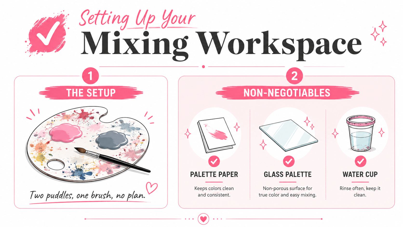
Before pigment touches pigment, settle three things: a clean palette, a plan, and a test surface. A torn sketchbook page fails on all three. It absorbs water and binder, buckles under wet paint, and makes a color look different from how it behaves on a sealed painting surface.
Palette paper, glass, ceramic tile, and a stay-wet palette all work better because they give you a slick, sealed, or replaceable mixing area. Palette paper is convenient for short sessions. Glass gives you the clearest view of undertones and scrapes clean with a razor or palette knife. Ceramic tile is inexpensive and stable, while a stay-wet palette can slow skinning when you're working through a large passage.
Give each area a job
A useful palette has a large neutral mixing zone for substantial puddles, small wells for tints and test colors, and a dedicated streak strip for dragging a brush sample. Keeping those jobs separate prevents a pale tint from picking up a stray dark pigment.
Put two or three brushes beside the palette and reserve them for mixing. A flat synthetic brush works for folding color together, while a palette knife is better for scooping, pressing, and blending without trapping paint deep in the bristles. Keep a small spray bottle, a water cup, scrap paper, or a test card within reach.
Don't use the spray bottle to flood the paint. A light mist can slow surface drying, but too much water changes the paint film and makes your ratio harder to repeat.
Studio rule: Label the ratio beside every wet mix before you start painting with it.
Write notes such as “two parts white, one part ochre, a small touch of red,” then paint a swatch beside the note. The practical acrylic color-mixing guidance from Pamela Groppe recommends small increments, labeled swatches, scrap testing, and judging the color after it dries. That habit turns tomorrow's color match from a guess into a repeatable process.
Color Theory Essentials for Painters
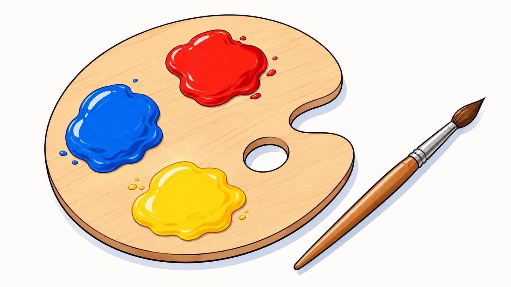
Color theory matters most when it helps you predict a brushstroke. A working primary set might include cadmium red, ultramarine blue, and lemon or cadmium yellow, but the pigment names matter more than the simple labels red, blue, and yellow. Two reds can lean toward orange or violet, and two blues can lean toward green or purple. Those biases decide whether a mixture stays bright or becomes subdued.
Complementary pairs are practical mixing tools. Red and green can produce muted browns and earthy neutrals. Blue and orange can create deep, natural shadows. Yellow and purple can produce subdued ochres, lavender-grays, and other restrained mixtures. The more evenly you combine complements, the closer the result moves toward a neutral. Add one side back in when you want the color to retain a clear temperature.
Pigment bias beats the color-wheel label
A green made from a warm yellow and a cool blue won't read the same as a green made from a cool yellow and a warm blue. The first combination may feel more natural and yellowed, while the second can push toward a sharper, cooler green. If a mixture looks unexpectedly dull, check the undertones of the pigments before adding more paint.
Try two controlled dark neutrals:
- Chromatic black: Mix ultramarine blue with burnt umber, starting with roughly equal small portions and adjusting toward the blue or brown bias you need.
- Chromatic gray: Use the same pair, then add titanium white gradually until the value is right.
These mixtures usually offer more color life than straight black. Black can flatten a mixture quickly, while complementary or near-complementary pigments preserve a sense of temperature.
For planning a palette before you begin, the ColorBestie Palette Generator can help you explore related color groupings. Use it as a planning aid, then verify the actual paint mixture with a physical swatch because pigment strength and bias vary by tube.
Mixing Recipes for Common Color Families
A color family is more useful than a single fixed formula. Flesh tones, pastels, grays, and earth colors all need temperature and value adjustments, so begin with a modest batch and change one pigment at a time. Mix with a palette knife, press the colors together, then scrape and fold until the streaks disappear.
For a pale cool skin tone, start with three parts titanium white, one part yellow ochre, and a small touch of cadmium red light. If it looks too pink, add a little ochre. If it feels too yellow, add a trace more red rather than a large scoop. For deeper warm skin, try raw sienna and burnt sienna as the body of the mix, then add a hint of dioxazine purple to reduce excessive orange.
Dusty pink works well with white, a touch of magenta, and a small drop of raw umber. Mint can begin with white, phthalo green, and a sliver of cobalt blue. The blue cools the green without requiring a large amount, so add it with the tip of a knife.
Starter Recipes for Common Color Families
| Color Family | Recipe by Parts | Notes on Bias |
|---|---|---|
| Pale cool skin | Three parts titanium white, one part yellow ochre, a small touch of cadmium red light | Add ochre for a warmer, more muted result |
| Deeper warm skin | Two parts raw sienna, one part burnt sienna, a hint of dioxazine purple | Purple knocks back excessive orange |
| Dusty pink | Four parts white, one small part magenta, a drop of raw umber | Umber reduces candy-like brightness |
| Mint | Four parts white, one part phthalo green, a sliver of cobalt blue | Cobalt pushes the green cooler |
| Warm gray | One part burnt umber, one part ultramarine, white to value | More umber makes the gray earthy |
| Cool gray | Black and white, with a small hint of blue | Blue cools the neutral but can dominate quickly |
| Neutral earth | Yellow ochre, burnt sienna, and a trace of ultramarine | Adjust the blue sparingly to prevent a green cast |
Paint each formula into a labeled square, then make a second swatch with a small adjustment. Let both dry before choosing. Acrylic can shift as it dries, and a wet mix may appear lighter or darker than the finished film. For marker and palette planning beyond paint, the ColorBestie DecoTime and Ohuhu converter can help translate a chosen color direction into a usable marker family, but the physical acrylic swatch remains the final authority.
Reading Opacity, Consistency, and Coverage
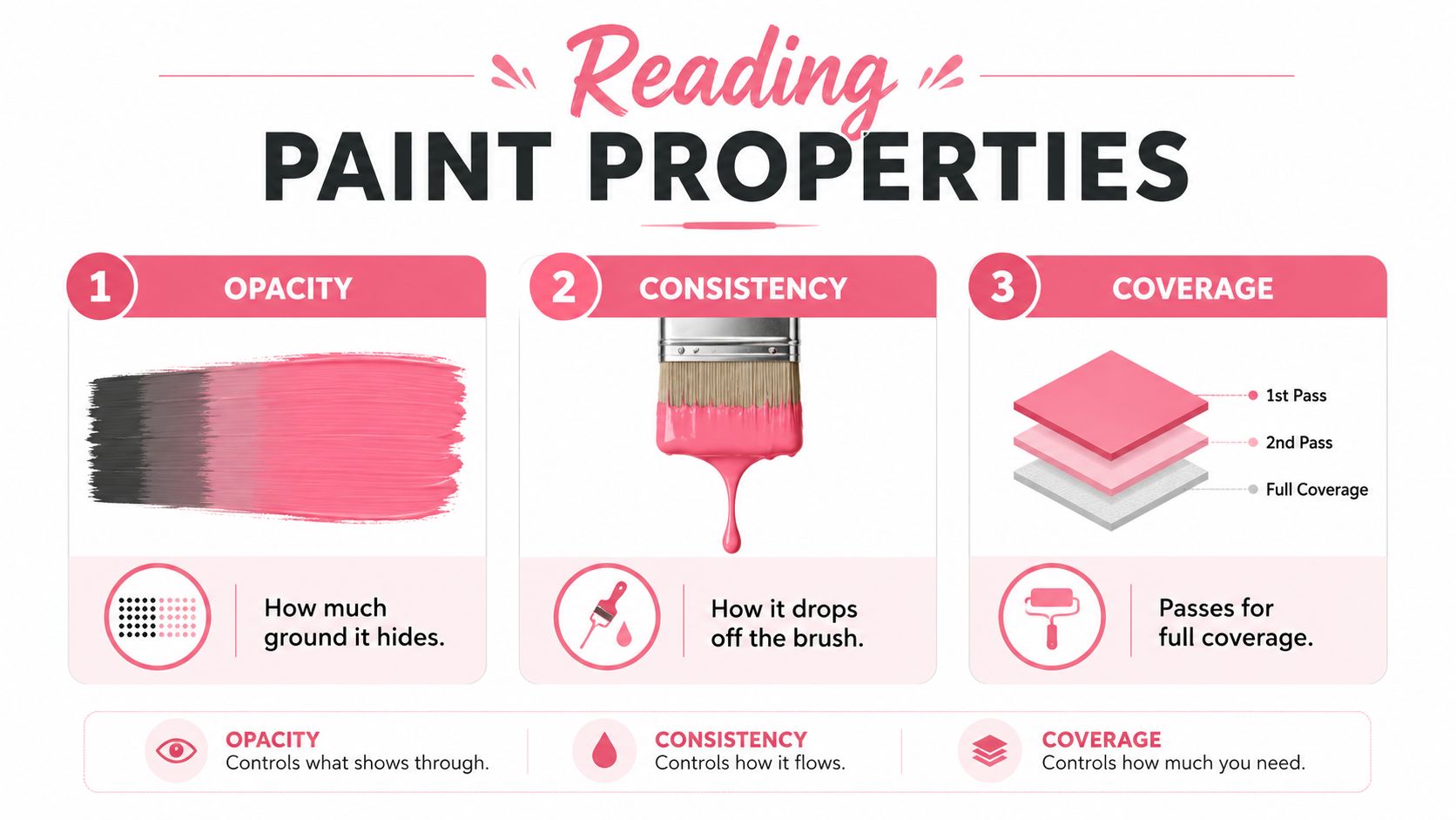
Drag a knife-load of titanium white across one side of a test card, then place a similar load of transparent quinacridone crimson beside it. The white will hide more of the ground, while the crimson will reveal more of the surface beneath. That simple comparison separates opacity, consistency, and coverage, three qualities artists often treat as though they mean the same thing.
Judge the paint by its behavior
Opacity tells you how much ground the paint hides. Titanium white is generally useful when you need a covering light, while transparent pigments may need a second pass or a supporting underpainting.
Consistency describes how the mixture leaves the tool. A stiff, buttery blend holds a knife ridge. A mid-body mix moves smoothly from a brush without running. A wash flows toward the edge of the palette and needs careful control on the surface.
Coverage tells you how many passes you need to reach the visual strength you want. A color can be opaque yet still require careful application if the mix is too thin or unevenly loaded.
Compare two puddles side by side on the same card. Load the brush once and apply one clean stroke of each. If one reaches the needed value in a single pass, stop adding pigment. If it takes a second pass, decide whether you need more pigment, a different underpainting, or a more suitable medium.
Use water for limited adjustment, not as a substitute for every other control. For transparent films, a gloss medium can preserve a coherent acrylic layer while increasing flow and transparency. The ColorBestie Marker Comparison tool is useful for comparing marker color families, but acrylic coverage still needs a direct brush test.
Water, Mediums, and Extenders Explained
“Just add water” is convenient advice, but it isn't a complete mixing method. One artist reference advises keeping water below 25% of the acrylic mix to protect the paint's performance, as described in this acrylic paint technical reference. Independent guidance adds useful nuance, noting that around 20% to 30% water is usually workable, while higher dilution depends heavily on the surface and may behave more like a stain, as explained in this guide to thinning acrylic paint with water.
A primed, absorbent surface can accept a thinner application more readily than a slick surface. Even then, excessive water can weaken adhesion and leave a fragile, chalky-looking film. If you need transparency, use an acrylic medium rather than repeatedly flooding the color.
Compare the same color four ways
| Additive | Mix Ratio Guideline | Effect on Wet Paint | Effect on Dried Film |
|---|---|---|---|
| Water | Keep within the conservative range described above | Loosens flow and reduces body | May weaken the film when overused |
| Gloss medium | Add gradually until the desired transparency and flow appear | Keeps a coherent, fluid mixture with sheen | Produces a clearer, glossier film |
| Matte medium | Add gradually while checking opacity | Reduces slickness and can improve brush handling | Dries with less shine |
| Retarder medium | Use sparingly according to the product directions | Extends open working time | Can alter drying behavior, so test before a large passage |
Gloss medium is useful for thin transparent films. Matte medium suits work where reflected glare would distract from the image. Retarder medium can give you more blending time across a broad passage, but it shouldn't replace a controlled painting pace.
Medium choice: Thin when you need less body. Extend when you need the same color to remain workable or transparent without stripping away its binder.
Avoid household flow improvers unless they're specifically designed for acrylic painting. Some are soap-based and can interfere with the dried film. Keep acrylics in acrylic-compatible systems, and don't combine them with solvents, turpentine, or oils.
Drying Behavior, Color Shift, and Mid-Session Fixes
Acrylics reward decisive work, but they punish an unsealed palette. You walk away to make coffee, return to the studio, and find a half-mixed flesh tone skinned over. The palette cover has shifted, two puddles have separated, and the color that looked right ten minutes ago no longer blends.
Treat that behavior as part of the process. Ultramarine and dioxazine purple can dry noticeably darker, while cadmiums and yellow ochre may shift lighter or warmer. The Art Is Fun guide to reproducing acrylic colors highlights why visual memory isn't reliable and why written proportions and swatches matter.
Build a drying-shift routine
Paint a swatch on the same kind of surface as the artwork. Write the pigment names, approximate ratio, and any medium beside it. Don't judge the final match until the sample has dried, especially if the color will sit beside a contrasting passage.
For a live session, mist lightly with distilled water and cover the palette with glass or another suitable cover. If a skin has only just begun forming, a small amount of retarder medium can help re-wet the surface. A slightly hardened puddle is better handled with a palette knife. Scrape away the skin, fold the usable paint together, and test it before adding fresh paint.
Don't pour new wet paint over a sealed skin and expect a uniform mix. The old film can break into flecks, leaving a texture that looks accidental rather than intentionally granular.
The habit loop is simple: label, swatch, seal, repeat. A quick phone photograph of the labeled grid adds another record, particularly when you need to continue the painting days later.
Troubleshooting, Cleanup, and Habits That Last
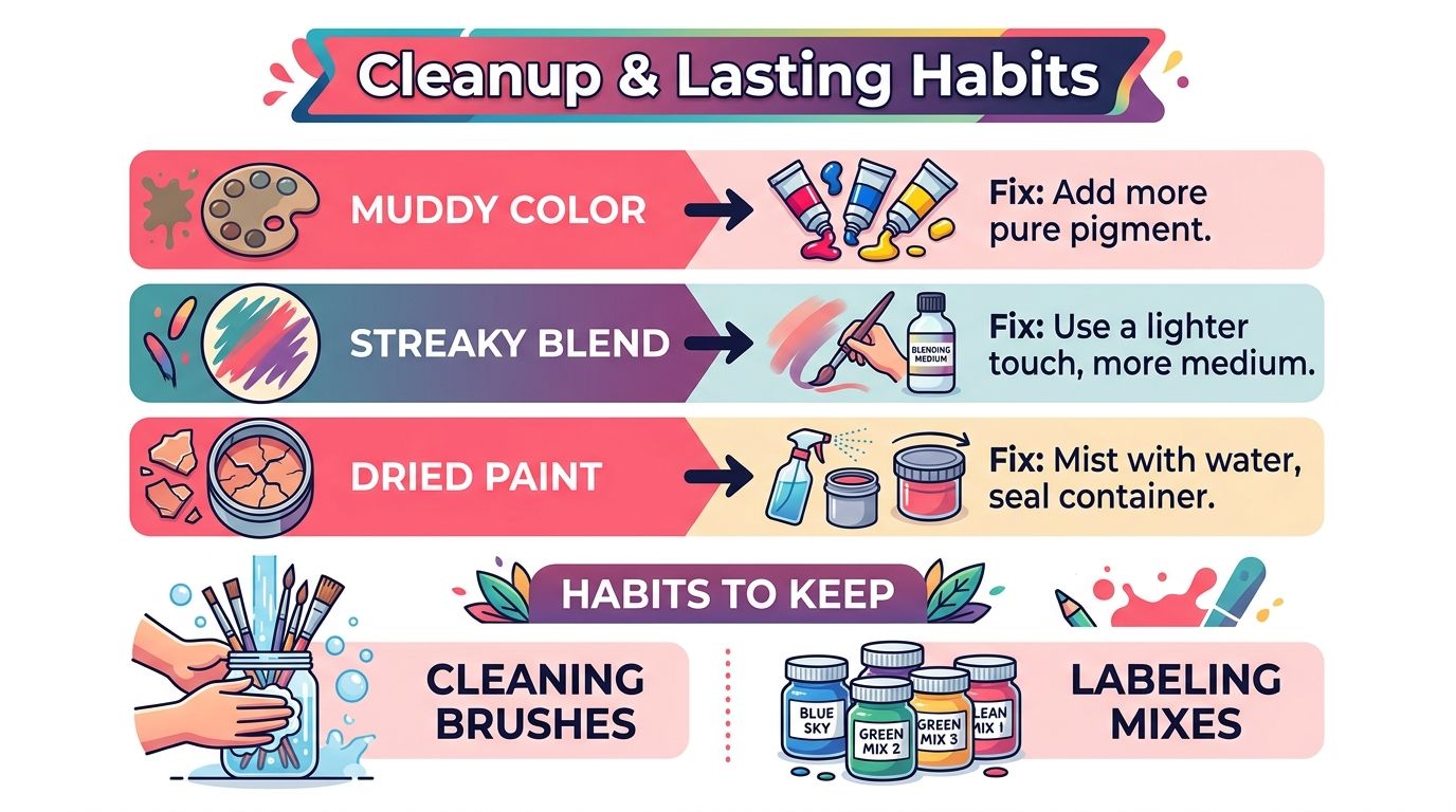
Most acrylic mixing problems have a visible cause. Muddy color usually means too many opposing pigments have been folded together. Streaky blends often come from uneven loading or from trying to blend after the surface has started to set.
Use this quick diagnostic list at the palette:
- Muddy browns: Stop adding complements and return to a cleaner base pigment, then adjust with small increments.
- Streaky gradients: Reload the brush evenly, use a lighter touch, and add compatible medium if the paint needs more open movement.
- Chalky pastels: Reduce water and use white or an appropriate acrylic medium to maintain a stronger film.
- Patchy coverage: Establish a suitable undertone first, then apply the mixed color in controlled passes.
- Ruined leftovers: Don't aggressively revive a fully sealed skin. Scrape it away and make a fresh, smaller batch.
Cleanup order matters. Wipe wet paint from the palette with a damp rag before it skins. Peel dry residue with a palette knife, and wash brushes with brush soap rather than leaving them in water. Rinse water jars before pigment settles into a hard layer at the bottom.
Keep the routine small enough to repeat
Swatch every serious mix on scrap canvas or paper. Write the ratio beside it, seal the palette before stepping away, label tubes opened during the session, and photograph the grid before cleanup. If a color needs to return tomorrow, those records will be more useful than a confident memory of what you “probably added.”
Reliable color mixing is logging, not luck. Start your next session with a clean palette, make a small test batch, let it dry, and only then scale the recipe for the painting.
ColorBestie can help you plan harmonious color directions before you commit them to a physical palette, with its Palette Generator, Marker Comparison, and theme-based previews. Visit ColorBestie to test ideas quickly, compare marker-friendly color families, and build a calmer color-planning routine alongside your acrylic swatch practice.
