
You open a fresh coloring book, uncap a new set of alcohol markers, and expect that satisfying moment when the page comes alive. Instead, the colors sit there. The blends look streaky, shadows turn muddy, and the finished page feels flatter than what you had in mind. That gap frustrates a lot of colorists, especially when the line art is good and the supplies aren't cheap.
The fix usually isn't buying more markers. It's changing how you use them.
The best adult coloring book tips aren't the usual reminders to stay in the lines or pick colors you like. Those help beginners get started, but they don't solve the problems that make pages look amateur: weak value structure, poor paper choice, rushed layering, and color decisions made too late. With alcohol markers, a lot of the polish happens before the darkest shade ever touches the page.
A digital planning step helps too. If you can preview a palette, lighting mood, or marker-friendly theme before committing ink to paper, you make fewer rescue decisions halfway through. That's where a workflow using a tool like ColorBestie can be useful. You can test an idea digitally, then bring that plan to Ohuhu, Copic, Prismacolor, or whatever markers you already own.
These eight techniques are the ones that consistently turn flat fills into finished-looking artwork. They're practical, repeatable, and built for real coloring book pages, not just polished studio illustrations.
1. Layering and Blending with Alcohol Markers
Most marker problems blamed on blending are really layering problems. If your first color goes down too dark, too wet, or too patchy, the second color has nothing clean to melt into. Good blends start with controlled, light passes.
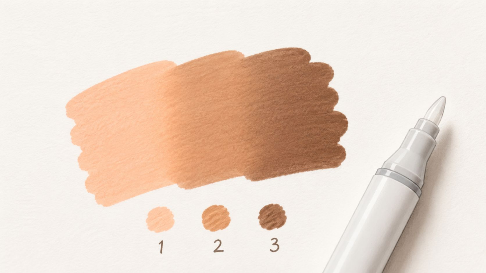
Skin tones are the easiest place to see this. A peach base, a warmer tan in the turn of the cheek, and a muted brown in the deepest shadow will usually look far better than one "skin" marker pushed hard into the paper. The same principle works for hair, petals, and backgrounds. A blue-purple night sky looks richer when the colors overlap in stages instead of being scrubbed together all at once.
Build blends with sequence, not force
Start with the lightest color and cover the full area with a loose, even pass. Then place your mid-tone where the form turns away from the light. Add the darkest shade only where the shadow is most compressed, such as under petals, beneath bangs, or where one object overlaps another.
A few practical rules make this easier:
- Test on matching paper: Marker color shifts depending on stock, so swatch on a spare page or similar paper before touching the final design.
- Keep the first layer light: If you saturate the page immediately, every later layer spreads wider and gets harder to control.
- Use the blender sparingly: A colorless blender can soften an edge, but it can also push pigment outward and create blooms if the paper is already too wet.
Practical rule: Smooth blends come from adjacent values that overlap. They don't come from grinding two distant colors together until the paper gives up.
This matters even more with adult coloring books because page construction isn't always ideal for markers. Industry guidance for print-ready coloring books calls for 300 DPI artwork, 0.125-inch bleed, and keeping important content at least 0.325 inches inside the trim line, with single-sided pages recommended to reduce bleed-through risk, as noted in this adult coloring production guidance. If you're working in a book printed back-to-back, blend with restraint and use a protective sheet behind the page.
If you want a preview before committing to physical markers, test a mood and palette digitally first. ColorBestie's theme worlds can help you mock up how warm highlights, cooler shadows, or muted palettes might sit together before you choose your actual Copic, Ohuhu, or Prismacolor combinations.
A short demo can help lock in the rhythm of overlapping passes:
2. Color Theory and Harmony Planning
You finish a page with clean blends, solid coverage, and careful edges, then step back and something still feels wrong. The colors are fighting each other. That usually comes from weak planning, not weak technique.
Alcohol markers make this problem more obvious because they lay down bold, transparent color fast. Once a loud combination is on the page, correcting it takes more ink, more layering, and more risk. Strong harmony choices save markers and save pages.
I plan palette structure before I uncap anything. For most adult coloring pages, three roles are enough: a dominant family, a supporting family, and a small accent. That gives the eye a clear hierarchy, which matters even more in designs packed with tiny shapes.
Here's a reliable planning framework:
- Choose the dominant color family: This covers most of the page and sets the mood.
- Choose a secondary family: Keep it related or intentionally contrasting, but make sure it supports the main read.
- Choose one accent color: Reserve it for focal points such as gems, flower centers, eyes, ornaments, or border hits.
The trade-off is simple. More colors can create energy, but they also make the page harder to unify. Fewer colors look more polished, but they can feel dull if the value range is too narrow. The fix is to limit hue variety while still using light, mid, and dark versions inside the palette.
A few combinations consistently work well with alcohol markers:
- Analogous palettes: Blue, blue-green, and green feel calm and blend naturally.
- Complementary palettes: Violet against yellow-green or blue against orange creates punch, but keep one side dominant so the contrast does not turn noisy.
- Monochromatic palettes: Different values of one hue look especially strong in mandalas and highly detailed pages where too many color shifts clutter the design.
I see one mistake often. Colorists reach for black or a heavy gray at the end because they want more definition. Sometimes that helps graphic pages. On softer subjects like petals, feathers, skin, and fabric, a deeper version of the local color usually looks better. Plum shadows on lavender petals, blue-gray in teal folds, or olive-dark in green leaves keep the finish richer and more controlled.
A page looks finished when the colors feel related and the accents feel earned.
Digital planning helps here. Before committing to physical markers, test a few schemes with a digital palette generator for marker-friendly color relationships. I use that kind of preview to check whether a palette has enough contrast, whether the accent is too loud, and whether warm and cool notes are balanced before I spend time swatching on paper.
That hybrid workflow is one of the fastest ways to improve results. Use digital tools to pre-visualize harmony, then bring that plan to your actual marker set with intention. It cuts down on guesswork and makes the final page look designed rather than randomly filled.
3. Underpainting, Value Mapping, and Progressive Refinement (Light-to-Dark)
You open a fresh page, pick beautiful colors, and halfway through the subject still looks flat. The usual problem is weak value structure, not poor color choices. If the lights, mids, and darks sit too close together, even expensive alcohol markers look dull.
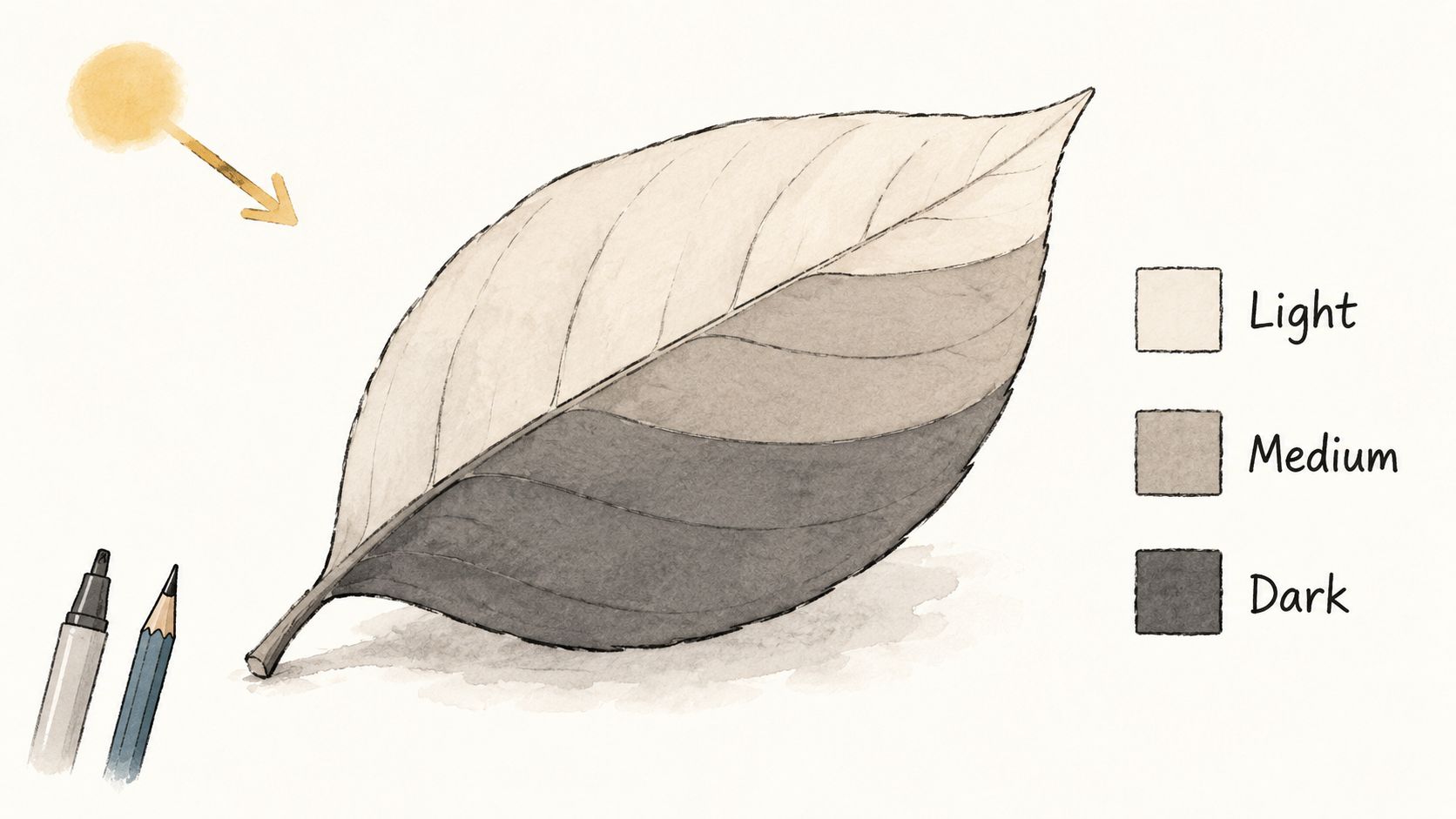
I block in value before I chase color. On a leaf, that means deciding the lit edge, the turning plane, and the crease shadow early. On a face, it means placing the under-brow shadow, nose side plane, lower-lip shadow, and jaw separation before adding any blush or saturation shifts.
Map form first, then refine in passes
A light gray underpainting gives alcohol markers a plan to follow. Warm gray works well for skin, wood, and warm florals. Cool gray suits chrome, blue flowers, night scenes, and anything you want to keep crisp. The trade-off is simple. Heavy gray underpainting can mute delicate colors, so keep it pale and place it only where shadow properly belongs.
Use a controlled sequence:
- Choose one light direction: Top-left, top-right, side light, or backlight.
- Lay in the palest local color first: Cover the form, but leave the brightest highlights mostly white.
- Establish mid-values next: Build them on the planes that turn away from the light.
- Reserve your darkest marker for accents: Overlaps, core shadows, cast shadows, and tight recesses only.
That order protects luminosity. It also prevents the common alcohol-marker mistake of reaching full contrast too early, then having nowhere left to go.
Digital planning helps here in a very practical way. Before I commit to marker on paper, I often test a quick grayscale plan or compare likely marker families in a marker comparison tool for alcohol marker sets and color ranges. That preview is not a substitute for skill. It helps catch a bad value jump before it stains the page.
The method shines on curved subjects. Fruit, petals, fabric folds, hair masses, and rounded fantasy armor all respond well to progressive refinement because each pass describes the form more clearly. Decorative pages benefit too, especially when repeated motifs need to feel consistent instead of randomly shaded.
If the form does not read in grayscale, more color will not fix it.
One more hard-earned rule. Darkest darks belong in the smallest spaces. Save them for contact shadows, deep overlaps, and focal accents. When every section gets the same heavy outline or shadow, the page loses hierarchy and starts to look stamped instead of modeled.
Squint at the page every few minutes. If the focal area still stands out and the forms still read with half-closed eyes, the value map is doing its job.
4. Marker Selection and Palette Building
A lot of marker collections are built emotionally. A sale happens, a set looks pretty, and suddenly you've got six unrelated greens, no useful skin-tone bridge, and three reds that all do the same job. That's normal. It's also why many pages feel harder than they should.
A working palette isn't about owning everything. It's about owning enough connected colors to build transitions.
Build a working palette, not a random stash
If you color botanicals most often, your money should go toward greens that step cleanly from pale yellow-green through olive into deep forest tones. If you color portraits, you need bridge shades between peach, beige, muted rose, and brown. If you love jewel-tone mandalas, prioritize families that can shift value without losing richness.
A practical palette build looks like this:
- Start with one subject category: Portraits, florals, manga, animals, or abstract pages.
- Buy value ladders, not isolated colors: Light, medium, and dark versions of the hues you use.
- Include a few neutrals: Warm gray, cool gray, and a muted brown solve more problems than another novelty bright.
- Track every marker on a swatch chart: Cap color lies. Your chart tells the truth.
Brand mixing is fine. Plenty of colorists use Ohuhu for large families, Copic for reliable blending workhorses, Prismacolor for selected hues, and a white gel pen or pencil for final highlights. What matters is how the colors behave together on your paper.
When you're comparing ranges or trying to fill a gap without buying blindly, a marker comparison tool for cross-brand planning can save time. That's especially useful if you're translating a digital plan into physical markers from different brands.
The market signal is worth noting in a practical sense. One industry estimate puts the global adult coloring book market at USD 152.57 million in 2025 and projects USD 266.04 million by 2031, with non-store-based channels identified as the fastest-growing segment in that report, according to this adult coloring book market forecast. For hobbyists, that means more options. For artists, it means more clutter. A deliberate palette matters more when you're choosing from an expanding wall of products.
5. Texture and Pattern Techniques
You finish a smooth marker blend, step back, and the page still looks printed instead of painted. That gap usually comes from missing surface variation. Texture gives form something to catch on. Fur needs direction, petals need slight veining, and stone needs broken edges that keep it from looking like flat plastic.
Alcohol marker work handles texture best in stages. Put down the main shape and value first. Let it dry. Then build the surface character on top. Wet-on-wet detail sounds efficient, but on coloring-book paper it often turns into fuzzy lines, swollen fibers, and muddy pattern.
Build texture after the form is clear
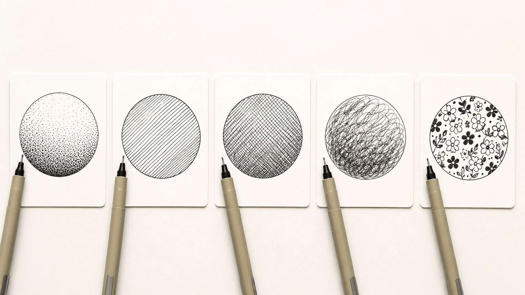
Start by deciding what kind of texture the object has. Soft texture needs grouped, irregular marks. Hard texture needs sharper edges and more separation between light and dark. Decorative texture, like patterned fabric or mandala fills, needs repetition with deliberate breaks so the eye gets rhythm without visual fatigue.
A quick digital preview helps here. Before committing to the page, test whether a section needs grain, stripes, dots, or almost no pattern at all. I often pre-visualize that choice in a planning tool like ColorBestie because it is faster to reject an overworked texture on-screen than to fight it after the paper is saturated.
Use marks that match the subject:
- Scumbling over a dry marker base: good for moss, worn stone, tree bark, and soft foliage
- Short directional strokes: good for fur, hair, feathers, and grasses
- Hatching in shadow areas: good for folded fabric, manga rendering, wood grain, and metal
- Stippling or broken dots: good for flower centers, porous surfaces, and gentle transitions
- Selective pattern repeats: good for tiles, quilts, scales, and ornamental backgrounds
The trade-off is control versus speed. Broad texture covers space fast, but it can flatten the focal point if every area gets the same treatment. Fine texture looks impressive, but too much of it makes a page feel stiff and overexplained.
For animal fur, a smooth base pass still does the heavy lifting. After that dries, pull short pencil or fine-marker strokes in the direction the coat grows. Change the length around joints, cheeks, and tails. Real fur is not uniform, and your marks should not be either.
For scales and feathers, resist outlining every single edge with equal pressure. That creates a tiled look. Push the overlap shadows, soften a few boundaries, and leave some shapes implied. Selective definition reads as richer and more natural than fully tracing every unit.
Pattern density matters just as much as mark choice.
Put the busiest texture where you want attention to land. Keep surrounding passages quieter so the focal area has room to stand out. If every petal, leaf, wing, and background shape gets the same amount of detail, the whole page starts arguing with itself.
Subjects like florals, animals, and fantasy pages benefit from this approach because they depend on tactile differences. Petals, leaves, fur, scales, fabric, and stone should not all receive the same surface treatment. As noted earlier, those are also some of the themes colorists return to most often, which makes texture control a practical skill rather than a decorative extra.
6. Pressure Control and Marker Technique
Alcohol markers reward a light hand. People coming from crayons or felt-tip markers often press too hard because they're trying to get immediate saturation. That usually causes streaking, oversaturation, and damaged nibs long before it creates better color.
Lighter pressure gives the ink room to behave. It also gives you options. You can always deepen a passage. You can't easily un-soak paper that has already been flooded.
Let the nib glide
Try coloring the same shape three times. On the first, use barely enough pressure to keep the nib in contact with the page. On the second, use moderate pressure. On the third, press hard. You'll feel the difference immediately. The light version stays open for more layering. The heavy version grabs, pools, and often feathers more aggressively.
A few technique shifts usually clean this up fast:
- Use circular motion for soft blends: This reduces obvious stroke edges on skin, clouds, and petals.
- Use directional strokes for form: Fur, hair, grass, and drapery look better when strokes follow structure.
- Change marker angle: The brush nib edge can place narrow shadows. The side of the nib can cover broad areas more evenly.
- Pause before another pass: A moment of drying time often improves control more than brute-force blending does.
One overlooked issue in adult coloring book tips is that material mismatch causes more frustration than poor shading theory. General guidance often tells beginners to put a blank sheet behind the page or choose better paper, but that doesn't fully solve bleed-through, ghosting, and page damage with alcohol markers. This gap is discussed in this adult coloring guide focused on common material issues. If your paper stock is thin, no amount of refined hand pressure will make it perform like marker paper.
When pressure is right, your hand feels almost lazy. That's a good sign. Let the alcohol do the spreading. Your job is placement, not force.
7. Reference Image Study and Color Inspiration Gathering
Good colorists don't guess as much as people think. They collect. They compare. They notice what colors repeat in real life and in artwork they admire.
If you color portraits, study more than one skin reference in more than one lighting condition. If you color flowers, don't just look at the idealized bloom. Look at petals in shade, petals backlit by a window, fresh leaves, dusty leaves, and stems that lean warm or cool. Real color is less obvious and more interesting than memory color.
Train your eye with reference clusters
I like reference clusters more than single-image copying. One photo might have the right lighting, another the right local color, and a third the texture cue you need. Put them together and build your own interpretation.
That works especially well for:
- Portrait pages: Borrow skin temperature from one image and lip color harmony from another.
- Botanical pages: Use one reference for the flower head, another for leaf structure, and another for background mood.
- Fantasy and manga pages: Study how professional artists simplify color while keeping focal points strong.
A digital planning step makes this easier. A theme preview tool for testing mood, style, and lighting ideas can help you translate loose inspiration into a clearer marker plan before you start. That's useful when you want a page to feel moody, bright, vintage, dreamy, or soft without spending half the session second-guessing your color choices.
The demand for calmer, more polished palettes is one area where a lot of basic tutorials fall short. Many guides explain blending, but they don't explain when to avoid black-heavy shading or how to keep a page relaxing while still readable. That nuance is part of what makes reference study valuable. You stop asking only, "What color is this?" and start asking, "What mood does this palette create, and how much contrast does this page need?"
8. Paper Quality and Surface Preparation
You can spend twenty minutes building a clean skin blend, then watch it streak, feather, or soak through because the page was never suited to alcohol ink. That is not a marker problem. It is a surface problem.
Paper controls edge sharpness, saturation, drying speed, and how many passes the page will tolerate before it starts to look tired. In adult coloring books, that matters more than many hobby guides admit. A modest marker set on the right paper often produces cleaner results than expensive markers on absorbent stock.
For alcohol markers, I check three things before I commit to a full page. Surface smoothness, sheet weight, and whether the design is printed single-sided. Smooth paper gives the nib room to glide and helps wet edges stay open long enough to blend. Heavier sheets reduce buckling and make bleed-through easier to manage. Single-sided printing gives you freedom to use richer passes without sacrificing the reverse side.
Test the paper before you trust it
A quick test saves a finished page.
Use a corner, the inside cover, or a scrap sheet behind the page and check:
- Blend window: Do two similar colors merge cleanly before the first one dries?
- Feathering: Do edges stay controlled, or does ink spread into the paper fibers?
- Layer tolerance: Can the page handle a second and third pass without pilling or roughening?
- Bleed-through: How much ink reaches the sheet underneath, and is that acceptable for this book?
This is also where digital planning earns its place. If you build a palette in ColorBestie first and know which areas need pale washes versus heavy saturation, you can choose paper more intelligently. A soft botanical page with light coverage may survive on average stock. A high-contrast portrait with repeated glazing needs a more forgiving surface.
Printer choice matters too. Home-printed pages can work well, but only if the paper and printer ink cooperate. Some printer papers stay smooth enough for marker rendering. Others grab ink immediately and create hard edges. Print one test motif first, then compare your planned digital colors to the actual marker result on that sheet. That small step prevents a lot of bad surprises.
Good paper does not fix weak technique, but it does let good technique show up clearly.
Keep a barrier sheet under the page. Store books flat. If a page feels slightly damp from heavy coverage, let it rest before the next layer. Those habits are simple, but they solve problems that many colorists try to blame on their markers.
8-Point Comparison of Adult Coloring Techniques
| Technique | Implementation Complexity 🔄 | Resource Requirements ⚡ | Expected Outcomes 📊 | Ideal Use Cases 💡 | Key Advantages ⭐ |
|---|---|---|---|---|---|
| Layering and Blending with Alcohol Markers | Medium–High, multiple passes and blending skill required | Multiple marker shades, colorless blender, high-quality marker paper | Smooth gradients, realistic shading, professional finish | Portraits, manga, concept art, detailed coloring | Produces polished results; enables color mixing without every shade |
| Color Theory and Harmony Planning | Medium, upfront planning and practice | Low, color wheel/digital tools, time to plan | Cohesive palettes, reduced choice fatigue, balanced visuals | Any artwork needing intentional color (adult coloring, displays) | Makes small collections feel broader; simplifies decisions |
| Underpainting, Value Mapping, Progressive Refinement | High, structured, stepwise workflow | Medium, neutral underpaint tools, extra time, marker layers | Strong depth, preserved highlights, reduced muddy mixes | Portraits, still life, complex scenes, dramatic lighting | Controls value relationships; yields natural dimensionality |
| Marker Selection and Palette Building | Low–Medium, research and curation | Medium, investment in select markers, palette charting | Consistent style, efficient use of collection, portability | Travel kits, focused subject work (portraits, botanicals) | Cost-effective long-term; reduces decision paralysis |
| Texture and Pattern Techniques | Medium–High, fine motor control and patience | Medium, fine-tip pens, colored pencils, mixed-media tools | Enhanced surface interest, perceived complexity without more colors | Manga/comics, mandalas, fabric/animal textures | Elevates flat fills into sophisticated, varied surfaces |
| Pressure Control and Marker Technique | Medium, requires practice and muscle memory | Low, existing markers and suitable paper | Controlled opacity/blending, longer marker life, subtle transitions | Detailed shading, gradients, delicate highlights | Improves blending and prevents oversaturation; essential skill |
| Reference Image Study and Color Inspiration Gathering | Low–Medium, organization and study habit | Low, photo/library, mood boards, digital pickers | More accurate color choices, faster decisions, stronger realism | Portraits, landscapes, botanical, any reference-driven work | Trains the eye; provides reliable palette starting points |
| Paper Quality and Surface Preparation | Low–Medium, testing and selection steps | Medium–High, quality marker paper, storage, testing supplies | Reduced bleed/buckling, better blending, archival results | Final pieces, heavy layering, mixed-media and archival work | Enables advanced techniques and preserves artwork longevity |
Your Next Masterpiece Awaits
The difference between a page that looks colored and a page that looks finished usually comes down to a handful of decisions made at the right time. Start light. Control value early. Build a palette with intent. Respect the paper. Add texture where it matters. Keep your hand lighter than you think. Those habits stack.
That's what separates frustrating sessions from relaxing, satisfying ones. You stop fighting the page and start directing it.
The best part is that you don't need to overhaul everything at once. Pick one of these techniques and use it on your very next page. If your blends are streaky, focus only on lighter first layers and cleaner overlap zones. If your colors feel random, limit yourself to one harmony scheme. If your pages keep bleeding through, make paper testing your priority before you blame the markers. Small corrections show up fast with alcohol markers.
This is also why digital planning fits so naturally into a physical coloring workflow. A preview step doesn't replace the craft. It supports it. If you can test a mood, palette direction, or lighting idea before you touch the page, you save your energy for execution instead of indecision. For colorists who use Ohuhu, Copic, Prismacolor, and similar lines, that can make the process feel calmer and more deliberate.
Adult coloring has clearly grown beyond a niche pastime, and that shows in both the range of books available and the expectations readers bring to them. More people want pages that feel expressive, polished, and worth keeping. You can absolutely get there without making the hobby stressful. The trick is to rely less on impulse and more on repeatable method.
So don't aim for perfect. Aim for controlled. A clean three-color blend, a better shadow placement, or a smarter paper choice will improve your work more than chasing flashy tricks.
If a digital planning companion helps you make those choices faster, ColorBestie is one option worth trying. It can preview marker-style color ideas from black-and-white sketches and help translate those ideas into real marker decisions. Then the physical page becomes the enjoyable part, not the guessing game.
Your next masterpiece probably doesn't need more supplies. It needs a better starting plan and a steadier hand.
If you want a low-pressure way to test palettes, moods, and marker-friendly color ideas before you commit ink to paper, try ColorBestie. It's built for colorists who want fast previews, practical marker guidance, and a smoother bridge between digital planning and physical coloring.
Enhanced by Outrank tool
