
You've probably got a handful of markers on your desk, a page you really want to colour well, and one nagging fear in the back of your mind: what if I ruin it? That's the moment almost everyone hits with alcohol markers. The good news is that the medium is much less mysterious than it first feels.
I've watched beginners blame themselves for problems that were really paper problems, timing problems, or color-choice problems. Once you understand those three things, colouring with alcohol markers gets a lot more relaxing. You stop fighting the ink and start steering it.
Alcohol markers are also far from a tiny niche now. The global alcohol-based markers market was valued at USD 2.35 billion in 2024 and is projected to reach USD 3.45 billion by 2034, according to FNF Research's alcohol-based markers market overview. That doesn't make your page easier by itself, of course, but it does tell you something useful. A lot of people are learning this medium right alongside you.
Your Starter Kit for Alcohol Marker Success
If your colouring feels streaky, fuzzy around the edges, or oddly dull, don't start by replacing all your markers. Start with the surface. Alcohol ink behaves very differently on the right paper than it does on standard printer paper or a soft colouring-book page.
Choose paper first
Marker paper matters because alcohol ink moves. On paper made for markers, the ink sits and spreads in a more controlled way. On absorbent paper, it dives into the fibres, bleeds more easily, and leaves you with less blending time.
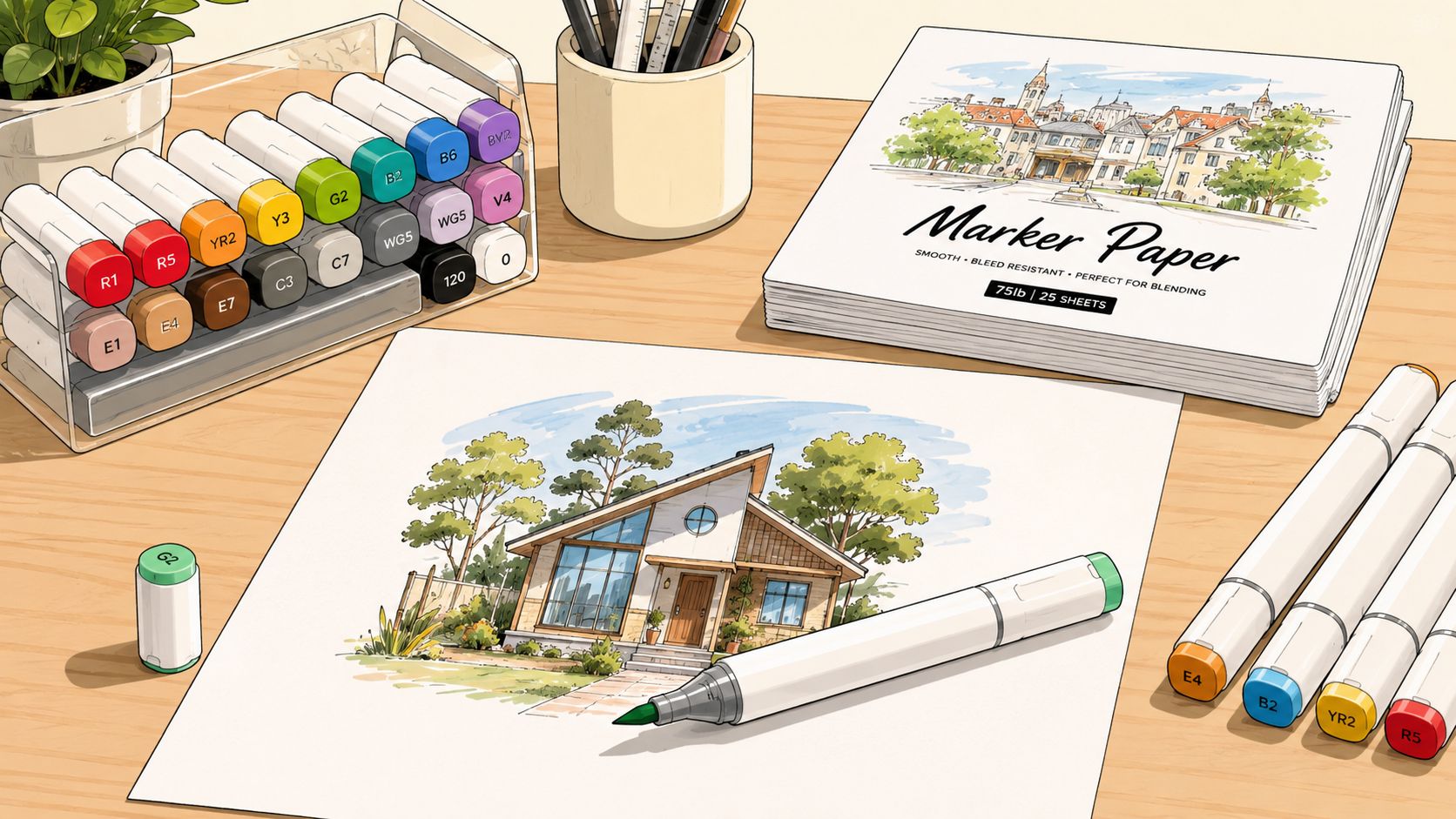
A beginner setup doesn't need to be fancy. It needs to be cooperative. I'd rather see you use a modest marker set on good paper than premium markers on paper that drinks ink like a sponge.
A basic workspace helps too. Put scrap paper or a protective sheet under your page. Keep a separate swatch card nearby. Cap markers as soon as you're done with each colour. Those little habits save far more frustration than people expect.
Practical rule: If your page is precious, test every colour on the same paper before it touches the artwork.
Build a small smart set
You don't need every shade in the shop. You need a handful of colours that can work together. A beginner-friendly set often feels easier when it includes light, medium, and dark options within the same family, plus a few skin tones, greys, and a blender.
Brands such as Ohuhu, Copic, and Prismacolor all show up often in marker conversations because they serve slightly different needs. Copic is well known for refillable systems and a huge colour range. Ohuhu is often the one people pick when they want more colours for less money. Prismacolor can feel approachable if you like a softer entry into marker colouring. The right answer depends less on internet debates and more on your budget, how often you colour, and whether you want refillable tools.
A quick way to compare ranges and practical differences is this marker comparison tool for popular alcohol marker brands.
Here's a solid starter checklist:
- Marker paper or a marker pad so your blending has room to happen.
- A small alcohol marker set with light, mid, and dark tones.
- A fineliner that won't smudge with alcohol ink. This is essential for stamped images and line art.
- A white gel pen for highlights at the end.
- A scrap sheet underneath your page because bleed-through is normal.
If you're not sure where beginners get tripped up, it's usually here:
| Common choice | What happens |
|---|---|
| Regular printer paper | Ink spreads fast and blending time shrinks |
| Very cheap fineliner | Line art can smear under marker |
| Huge marker set right away | Decision fatigue kicks in before you even start |
| No swatching habit | Cap colours and actual colours surprise you |
Your first kit should feel inviting, not impressive. If you can sit down, choose quickly, and trust your tools, you're already ahead.
The Art of Blending Layering and Creating Gradients
Blending looks magical until you know what's happening. Then it starts to feel mechanical in the best possible way. Alcohol ink softens and moves while it's still wet, which means your timing matters almost as much as your colour choice.
A good visual helps before your hand tries to copy the motion.
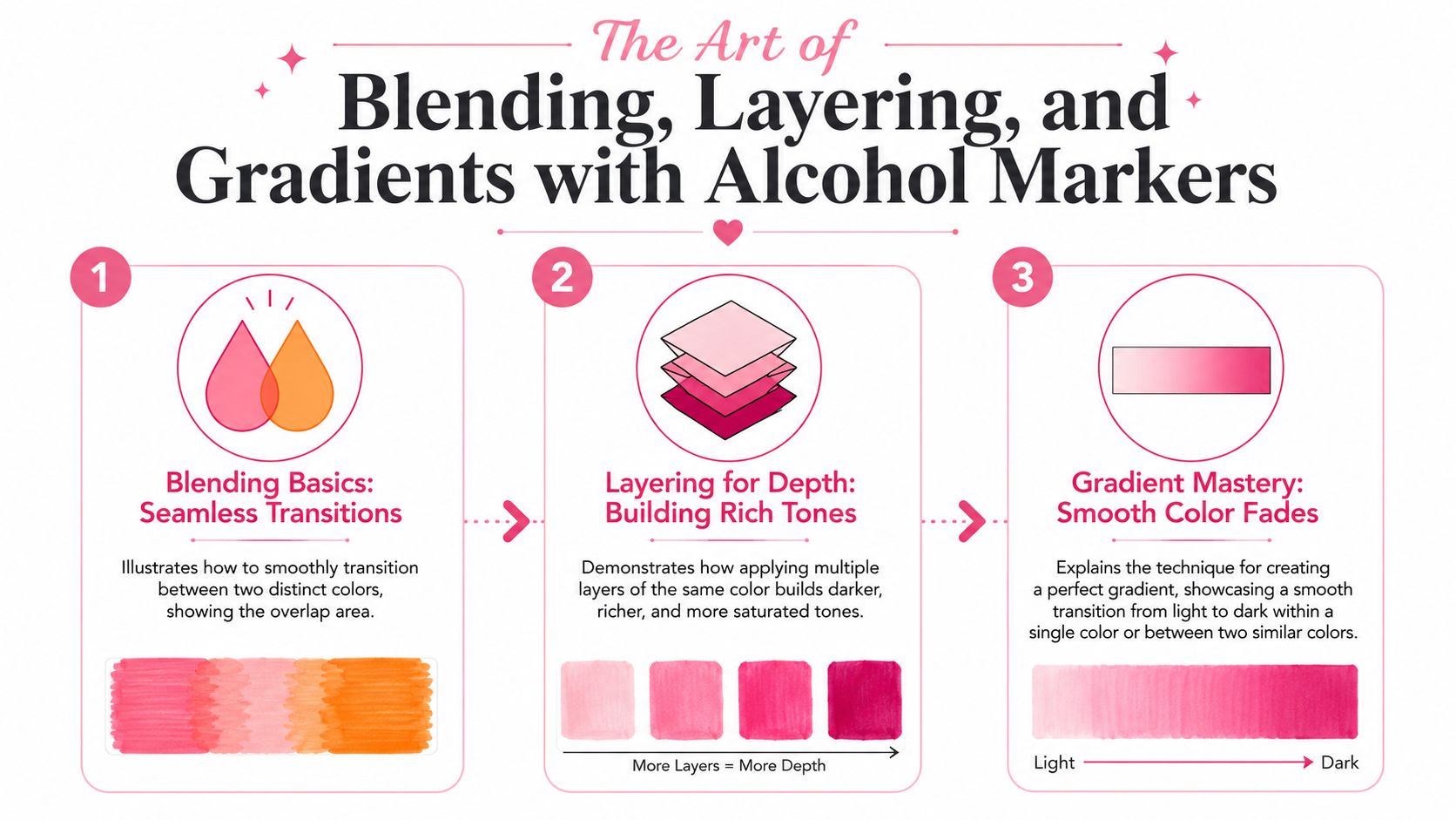
Why blending works
For cleaner transitions, pick colours within 2 to 3 tonal steps, put down the lightest shade first, and blend while the ink is still active. According to this alcohol marker blending tutorial on YouTube, applying a colorless blender when the ink is still about 80 to 90% wet can eliminate nearly all initial streaking errors.
That one detail clears up so much confusion. Beginners often think they need to scrub harder or keep layering until the streaks disappear. Usually the actual issue is that the wet window has passed.
Before the drill below, watch the movement and pacing here:
Three blending habits make the biggest difference:
Use enough ink
Dry, timid strokes often create more streaks than confident ones. You don't need to flood the page, but the area should feel evenly covered.
Overlap your strokes
Don't colour in isolated strips. Let each pass slightly overlap the previous one so the wet edges meet.
Work in sections
Large areas dry fast. Break a big dress, sky, or background into smaller zones and finish one zone before moving on.
The marker isn't fighting you. The ink is just drying faster than your current pace.
A simple three-colour gradient drill
If I were sitting next to you, this is the first exercise I'd hand you. Draw three small rectangles. Pick a light, medium, and dark marker from the same family.
Try this sequence:
- Base first. Cover the whole shape with the lightest colour.
- Middle second. Add the medium tone into the shadow side, overlapping the light area a little.
- Dark last. Keep the darkest colour to the smallest area.
- Blend back. Return to the medium marker and soften the edge between medium and dark.
- Finish with light. Touch the transition between light and medium if needed.
The part people skip is going back with the middle shade. That return pass is often what turns stacked stripes into an actual gradient.
A few technique notes help here:
| Technique | Best use | Beginner note |
|---|---|---|
| Flicking or feathering | Fur, petals, hair, textured edges | Start in the darker area and flick outward |
| Saturated base layer | Smooth skin, simple shapes, flat objects | Helps prevent patchiness |
| Tip-to-tip blending | Very subtle colour shifts | Nice, but not essential on day one |
Layering is different from blending, and that's worth understanding. Blending softens transitions between colours. Layering deepens value by adding more ink, often with the same colour family. If a cherry looks flat, layering gives it roundness. If a sunset looks stripy, blending fixes the joins.
One more important mechanical tip comes from practical marker use. Pressing hard with the brush nib can damage it and leave uneven colour. A lighter touch, especially with the chisel tip for coverage, gives smoother fills and protects the marker over time. That's one of those unglamorous habits that pays off every single session.
Planning Your Palette Like a Pro
A lot of colouring mistakes happen long before the marker touches the page. They happen when you choose colours in a rush, trust the cap too much, or decide halfway through that the leaves should have been cooler and the shadows deeper.
That's why planning your palette isn't fussy. It's protective. Alcohol-based markers grew from niche professional tools in the 1980s into a mainstream art medium, with the market reaching USD 2.4 billion in 2025, according to GM Insights' art and office marker pen market analysis. One reason for that wider appeal is simple: hobbyists want results that look polished without endless trial and error.
Value matters more than you think
Most beginners think colour choice means picking pretty hues. In marker work, value often matters more. Value is how light or dark a colour appears. You can choose a lovely red and a lovely pink, but if their values are too far apart, the blend may look abrupt.
That's why a page can feel “off” even when the colours are attractive on their own. The shadows may be too dark too early. The skin tones may jump from pale to orange. The flower petals may have no middle step.
A quick palette check before colouring can answer practical questions like these:
- Do I have a light, middle, and dark option for each main object?
- Are my warm and cool colours intentionally mixed, or just randomly grabbed?
- Will the background support the subject, or compete with it?
- Do the greys I chose lean warm or cool?
If you've ever coloured half a page and realised the palette feels noisy, this is usually why.
Why digital planning helps
Testing colours digitally first can remove a surprising amount of pressure. It lets you experiment before the irreversible stage. You can try a soft pastel version, a richer comic-style version, or a muted autumn palette without committing ink to paper.
I like this approach most for pages with several repeating elements, such as flowers, tiled roofs, clothing folds, or manga panels. You can preview relationships before your hand has to do the careful part. That doesn't make the art less real. It makes the decision-making calmer.
If you want help building combinations before you colour, a palette generator for marker-friendly colour planning can speed up the trial phase.
Here's where digital planning earns its keep:
| Situation | What planning solves |
|---|---|
| Character art | Keeps skin, hair, and clothing from clashing |
| Floral pages | Stops every bloom from competing for attention |
| Interior scenes | Balances wall, furniture, and accent colours |
| Seasonal cards | Helps you stay within a mood or theme |
A planned palette doesn't box you in. It gives you fewer chances to panic halfway through.
One of my favourite shortcuts is to plan one “star” colour first. Maybe it's a deep teal coat, a peach rose, or a warm wooden door. Then choose supporting colours that let that star colour stay in charge. This keeps the page from becoming a colour argument.
Fixing Mistakes and Embracing Imperfection
Alcohol markers ask for honesty. Some mistakes can be softened. Some can be disguised. Some are part of the piece now.
That's not bad news. It's what makes your decisions cleaner over time.
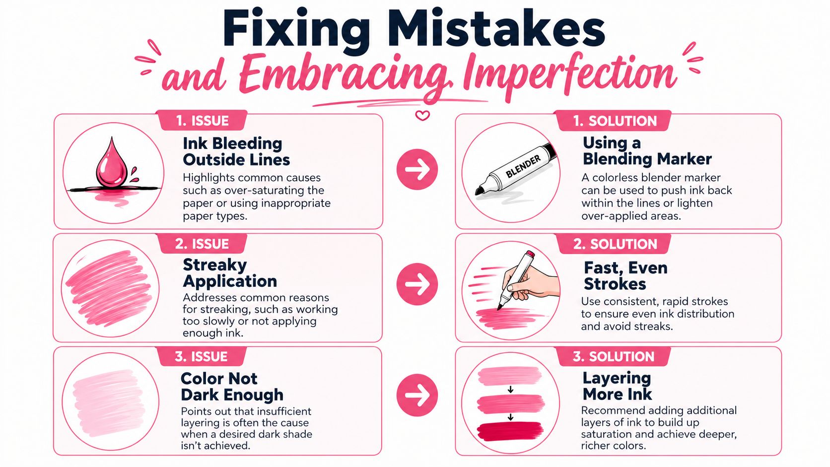
Many tutorials give the impression that every error has a neat rescue trick. That's misleading. As explained in this guide to fixing alcohol marker colouring mistakes, the colorless blender often worsens mistakes, and alcohol markers can't be lightened, only darkened or neutralized with opposite colours.
What you can fix
Bleeding outside the line is often the most fixable problem, but only if you catch it early. A blender can sometimes push fresh ink back from the edge before it settles too far. This is one of the blender's better jobs.
Streakiness is often fixable too, especially if the issue is uneven application rather than a bad paper choice. Going back in with faster, overlapping strokes can help. So can reducing the size of the area you're trying to fill in one go.
A colour that feels too weak is also easy to address. You can layer more of the same marker, or move to a darker related shade.
Here's a practical cheat sheet:
- Fresh bleed over a line. Nudge it back gently with a blender or absorb the edge with careful follow-up colouring.
- Patchy fill. Rework the area with quicker, more even passes.
- Not dark enough. Add layers or deepen shadows with a nearby darker tone.
What you usually can't fix
Putting down the wrong colour is where people get their biggest shock. If you expected pale peach and got orange, you usually can't erase your way back to pale peach. You have to adapt.
Sometimes adaptation looks smart. A too-bright red flower can be deepened into burgundy. A harsh brown shadow can be spread into a richer antique look. A stray tint can be neutralized with an opposite colour in a controlled way. But this isn't the same as undoing it.
That difference matters. It keeps you from overworking the page in the hope of restoration.
The blender is a solvent tool, not a magic eraser.
When I make an unfixable mistake, I ask one question: can this become a feature? A too-dark corner can become stronger shadow. A bloom outside the line can become a cast shadow or a deeper border. A muddy leaf might be the signal to stop, let the page dry, and add pencil detail later rather than forcing another wet correction.
You don't need a perfect page to make a lovely one. You need good judgment about when to repair, when to cover, and when to leave it alone.
Protecting Your Art for the Long Haul
Finishing a page isn't the end of the medium's story. Alcohol marker art keeps interacting with light, air, and storage conditions after you put the caps away.
This part gets skipped too often. People spend hours blending carefully, then tape the page in bright sun or store it loose where it rubs against other work.
Why finished art can still change
A critical issue with many alcohol marker artworks is pigment instability. According to this discussion of alcohol marker fading and UV exposure, dye-based alcohol markers such as Ohuhu and Copic are prone to significant UV degradation and fading within 1 to 3 years if they aren't properly protected.
That's the hard truth many beginners never hear. Most popular alcohol markers are loved for smooth blending and bright colour, but those same dye-based qualities can work against long-term permanence.
If you make cards, journal pages, colouring-book finishes, or decorative art for your wall, this doesn't mean you should stop using them. It means you should decide what kind of life you want that artwork to have. A practice page can be enjoyed. A gift piece or portfolio piece deserves protection.
Simple habits that help your work last
Preservation doesn't need to be complicated. It does need to be intentional.
Here are the habits worth building:
- Keep finished work out of direct sunlight if you want the colour to hold longer.
- Store pages in sleeves, folders, or closed books so they aren't exposed all day.
- Use protective framing choices for anything you plan to display.
- Separate finished pieces with clean sheets if they're stacked.
There's also a tool-care side to longevity. Refillable markers and replaceable nib systems can stretch the life of your supplies. If a nib gets frayed from heavy pressure, colour application gets rougher and less predictable. If a marker is running dry, it won't blend the way you expect. Caring for the tool supports the art.
A simple preservation mindset helps:
| Type of piece | Best approach |
|---|---|
| Practice swatches | Keep as learning references |
| Finished colouring pages | Store flat and out of bright light |
| Gifts | Protect before wrapping or framing |
| Portfolio work | Use your best paper and careful storage |
A finished page has two lives. One is the making of it. The other is what happens after. Artists who understand both tend to enjoy their work longer.
From Practice to Masterpiece Your Creative Journey
Individuals don't improve because they need more motivation. They improve because they lower the pressure enough to practice consistently.
I learned more from colouring small mushrooms, teacups, leaves, and tiny house roofs than I did from staring down grand “masterpiece” pages. Small subjects let you repeat the same skills without spending the whole evening on one risky blend. You start to notice things. Which green family feels easiest in your hand. Which shadows you always place too wide. Which combinations make your page feel calm.
Low-pressure practice that actually helps
If you want a routine that builds skill without draining the fun, try rotating through little exercises instead of always finishing big pages.
A few reliable ones:
- Swatch ladders where you test light, medium, and dark versions of one colour family.
- Mini gradients in boxes or circles until the transition feels natural.
- Single-object studies like one leaf, one ribbon, one cupcake, one eye.
- Same sketch, different palettes so you can compare mood and clarity.
If your collection mixes brands or you're trying to match shades between sets, a DecoTime to Ohuhu marker converter can make experimentation less messy.
Let your pages teach you
One of the nicest things about colouring with alcohol markers is that progress becomes visible. Early pages often show hesitation. Later pages usually show cleaner confidence, even before they show technical perfection.
That's why I'd keep a small stack of “learning pages.” Not for posting. Not for judging. Just for trying. Let one page be about soft skin blends. Let another be all about leaves. Let another be a playground for greys, shadows, and background choices.
A tiny ritual helps. At the end of each page, ask yourself three things:
- What worked better than last time?
- Where did I rush?
- Which colours do I want to use again?
Those questions build an artist faster than vague self-criticism ever will.
Keep your early pages. They become proof that your eye and hand learned to cooperate.
You can do this. You don't need perfect control, a giant marker wall, or years of experience. You need paper that behaves, colours that make sense together, a realistic view of mistakes, and enough patience to let each page teach you something.
The best marker artists I know aren't the ones who never make awkward blends. They're the ones who keep showing up, keep adjusting, and keep enjoying the process.
If you want an easier way to test palettes before you commit ink to paper, ColorBestie gives you marker-style colour inspiration from your sketches in seconds. It's a calm, practical companion for trying ideas, comparing marker-friendly palettes, and building confidence before the first stroke.
