
You open a fresh marker case, line up all those juicy colors, and feel two things at once. Excitement, then panic. The caps look beautiful. The blank page looks expensive.
Most beginners don't struggle because they “aren't artistic.” They struggle because alcohol markers are fast, bold, and a little unforgiving until you understand how they behave. The first time you see streaks, bleeding, or a muddy blend, it can feel like the markers are fighting you. They aren't. They just want a different approach than colored pencils or crayons.
I've watched this happen over and over. Someone starts with huge enthusiasm, grabs regular paper, colors slowly, pauses in the middle of an area, and ends up with blotches and feathered edges. A week later they decide alcohol markers are “not for them.” That's such a shame, because a few small changes make an enormous difference in how your art looks and how relaxed the process feels.
If you're learning how to use alcohol markers, think of this as sitting down with a friendly artist who's already made the messy mistakes for you. You don't need perfect drawing skills. You don't need a giant marker collection. You need a handful of habits that turn color chaos into confident creation. If you're sorting mixed brands or trying to match sets, a handy marker code converter for DecoTime and Ohuhu users can also save a lot of guesswork before you even start.
Your Guide to Vibrant Marker Art
The first good alcohol marker piece usually doesn't happen by accident. It happens when you stop treating the markers like ordinary pens and start treating them like liquid color with a very short working time.
That's why some pages feel magical and others feel chaotic. You might choose a lovely peach for skin, then add a shadow that turns too harsh. You might color a flower petal beautifully, then ruin the next one by going too slowly. None of that means you're bad at this. It means you're learning a medium with its own rhythm.
A lot of people also get stuck because they try to solve every problem at once. They worry about blending, shadows, highlights, line control, color harmony, and paper quality all on the same page. That's too much for anybody.
You'll improve faster if you separate the skills. First control the ink. Then blend. Then choose palettes with intention.
Marker art gets easier when you think in small wins. Pick the right paper. Learn how to fill an area smoothly. Practice layering one color over itself. Blend in a small shape instead of a full illustration. Suddenly the medium feels playful again.
You don't need to chase perfection. You're building trust with your tools. Once that happens, your pages start looking brighter, cleaner, and more intentional, even before you try anything fancy.
Gathering Your Essential Marker Supplies
A lot of frustration begins before the cap even comes off. If your supplies are fighting the medium, your technique has to work twice as hard.
Start with paper, not the markers
If you remember one shopping rule, make it this one. Paper matters more than most beginners expect. The foundation for alcohol markers is paper that's at least 80lb, or about 120g/m², and many artists prefer 160g/m² because it helps resist bleeding while still blending smoothly, according to Julia Henze's alcohol marker paper guidance.
Regular printer paper and notebook paper usually disappoint fast. The ink sinks in too quickly, the back gets messy, and your blends don't have time to stay workable. That's why a page can feel streaky even when your hand is steady.
Here's a simple comparison to make the choice easier:
| Paper Type | Weight/GSM | Bleeding Risk | Best For |
|---|---|---|---|
| Standard printer paper | 75g/m² | High | Quick tests only |
| Lightweight sketch paper | Around the minimum range or below it | Medium to high | Very light practice |
| Marker paper | 80lb / approximately 120g/m² or heavier | Lower | General alcohol marker work |
| Heavier marker paper | 160g/m² | Lower | Smoother blending and finished pieces |
If you color in books instead of on loose sheets, it helps to compare marker systems before committing to a set. A useful marker comparison tool for popular brands can make that decision less random.
Understand what each tool actually does
Markers themselves can look similar while feeling very different in your hand. A brush nib bends and responds to pressure, so it's great for curved shapes, tapered strokes, petals, hair, and soft shading. A chisel tip covers space quickly and works well for bold fills, backgrounds, and broad shadows.
You don't need to pick one as your identity. Most artists use both ends for different jobs on the same piece. The trick is knowing what each nib is best at so you stop forcing a tiny brush tip to cover a big sky.
A beginner kit can stay simple:
- Paper you trust: Thick marker paper gives you time to work and fewer ugly surprises.
- A small marker palette: A light, medium, and dark version of a few color families is enough to learn with.
- A colorless blender: This isn't a magic eraser, but it can soften edges, lift a little color, and help nudge ink.
- A pencil and waterproof liner: Light sketching and clean outlines make marker work easier to control.
- Scrap paper underneath: Even on good paper, protecting the surface below is just smart.
Practical rule: If your markers seem “bad,” test them on better paper before blaming the markers.
Good supplies won't draw for you. They will remove a lot of avoidable frustration, and that's a gift when you're learning.
Mastering Basic Strokes and Layering
Trying to blend before you can control a basic fill is like trying to ice skate before you can stand up. Smooth coloring starts with hand movement.
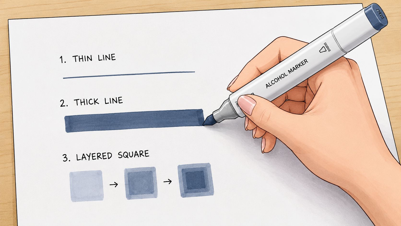
Three motions worth practicing
Start with the fill stroke. Choose a simple square or oval and color it using steady, overlapping strokes in one direction. The goal isn't speed for its own sake. The goal is even coverage without stopping in the middle of the shape.
Then practice the flick stroke. Touch the paper, pull lightly, and lift as you move. This creates a tapered mark that's useful for fur, hair, feathers, grass, and textured shadows. It also teaches you to release pressure instead of grinding the nib into the page.
The third motion is a small circular scribble. This is less polished-looking on its own, but it helps you learn how ink spreads and overlaps. It becomes handy later when you soften transitions between colors.
A simple practice page can include:
- Large boxes: Fill them with one color using overlapping passes.
- Rows of flicks: Keep the base heavier and the end lighter.
- Small circles: Let them overlap to see how the wet ink behaves.
Layering without overthinking it
Layering is one of the easiest ways to make your art look richer. Take one marker and color a shape evenly. Let it settle, then add that same marker again in the shadow area. You'll get a darker look without needing a second shade.
That's a huge confidence boost for beginners. You learn that depth doesn't always come from owning more markers. It often comes from using the same marker thoughtfully.
Use layering to suggest form:
- On a leaf, darken the base where it tucks under another leaf.
- On a cheek, keep the center lighter and build color near the edge.
- On fabric, add extra passes in folds and corners.
Slow, deliberate practice beats rushing through a “real” picture while feeling tense.
If you want to learn how to use alcohol markers well, this is the stage to stay in a little longer than you think. Clean fills and simple layers are the roots of everything else.
The Art of Seamless Blending
Blending is the part that makes people fall in love with alcohol markers. It's also the part that causes the most swearing.
The reason is timing. Alcohol ink doesn't wait around for you to decide what to do next.
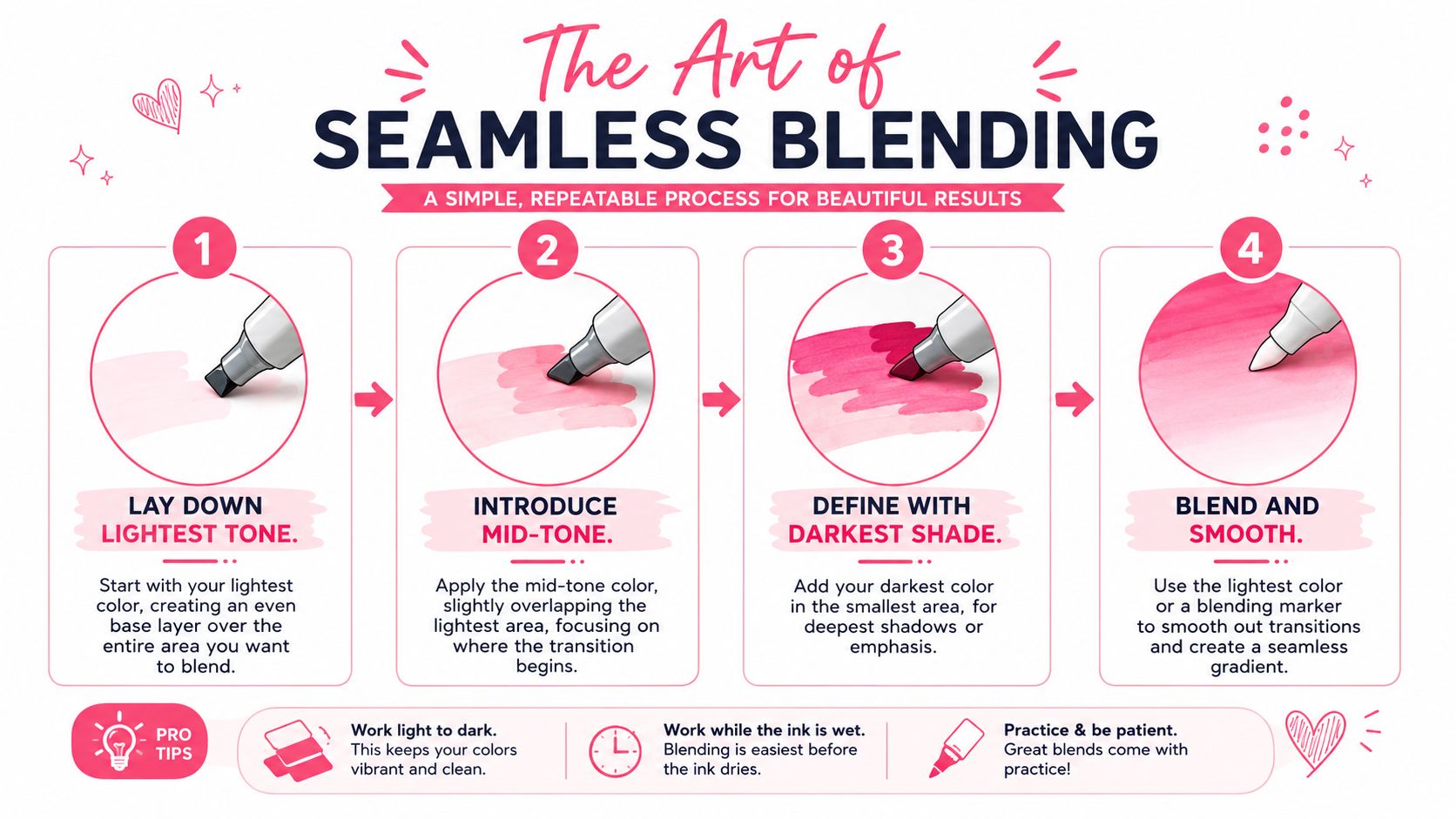
Why blending works or fails
For smooth blends, the useful working window is about 10 to 30 seconds after the first layer goes down, and many artists recommend getting the darker tone in almost immediately while the surface is still tacky, as explained in Finecolour's guide to alcohol marker blending. If you miss that window, hard lines and patchy transitions become much more likely.
That's why beginners often struggle. They lay down a base color, admire it, choose the next marker, test it, hesitate, and only then try to blend. By that point, the paper has already changed.
This short demo helps to see the rhythm in action:
The most reliable approach is wet-on-wet blending. You apply your lightest color first, then add the mid-tone while the first layer still has some moisture. After that, you use the light marker again to feather the border where the two colors meet.
A simple three-color blend
Try this on a small circle, petal, or ribbon shape.
- Lay down the lightest tone over the whole area with quick, parallel strokes.
- Add the mid-tone into the shadow side right away. Let it overlap the light area slightly.
- Place the darkest shade in the smallest zone where the deepest shadow belongs.
- Return with the light marker and gently push across the border in tiny strokes or small circles to soften the edge.
Keep your strokes fluid. If you pause in the middle, ink can pool. If you dab instead of glide, the blend gets blotchy. Using the broad side of a nib on larger shapes often helps keep the application more even.
A few habits make blending smoother:
- Work small: Tiny sections are easier to keep wet.
- Cap markers between turns: That helps prevent nibs from drying while you fuss with the page.
- Overlap on purpose: Don't leave a gap and hope the colors will meet politely.
- Stay light-handed: Pressure doesn't create better blends. It just stresses the nib.
When blends go wrong
Sometimes the transition still looks rough. That's normal. Usually one of three things happened.
You worked too slowly.
You used colors that were farther apart than your paper could handle gracefully.
Or you kept reworking the same spot until the surface got oversaturated.
When that happens, stop scrubbing the area. Let it settle, then decide whether one more light pass will soften it or whether the piece would look better with a deliberate edge. Not every transition needs to be invisible. Clean layered shapes can look beautiful too.
Planning Your Palette with ColorBestie
Technique gets a lot of attention, but color choice is where many pages wobble. You can blend beautifully and still feel unhappy if the palette feels random.
Why color choice feels harder than coloring
A marker set can be strangely overwhelming. You think you want “a blue flower,” then you're staring at several blues, cool grays, muted violets, and a dusty teal that suddenly looks tempting. That's where muddy pages often begin. Not because the colors are bad, but because the decision process is foggy.
Traditional art advice often says to trust your instincts. That's fine once you've built strong instincts. Beginners usually need something more concrete. They need a way to preview how colors sit together before the ink touches the paper.
This is especially useful for coloring book fans, manga artists, and hobby illustrators who don't want to make ten test swatches every time they start a new page.
A calm digital-first planning habit
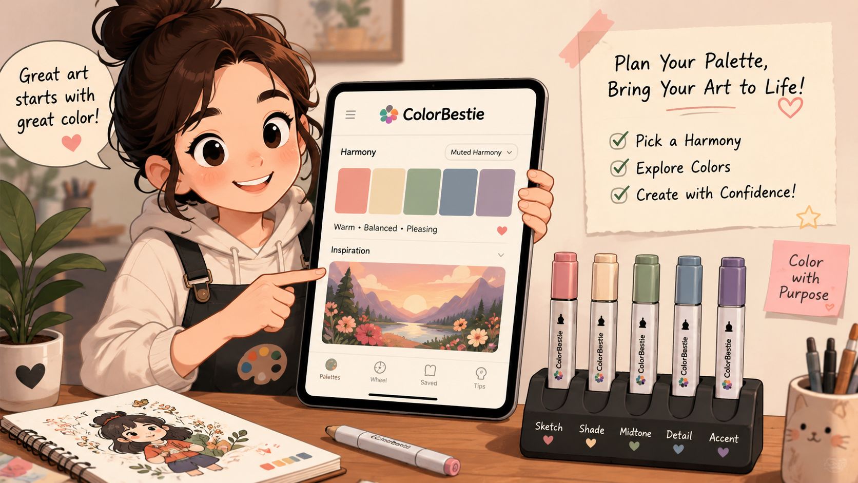
One smart workflow is to plan your palette digitally, then color traditionally. That's where ColorBestie's palette generator fits beautifully into a marker routine.
A simple way to use it looks like this:
- Start with your line art or reference image: Upload a coloring page, character sketch, or inspiration photo.
- Choose the feeling first: Soft and cozy, bright and playful, moody, earthy, dreamy. Mood is often easier than choosing exact marker codes from scratch.
- Review the generated palette: You get a color direction before committing to paper.
- Match the suggestions to your markers: If you use Ohuhu, Copic, Prismacolor, or similar systems, this step becomes much less guessy.
- Make a tiny swatch card: Test the closest physical markers together before starting the final page.
What I like about this kind of process is that it lowers decision fatigue. You're not standing over a page with all your marker caps scattered around, hoping inspiration strikes. You've already made the big decisions.
Good color planning doesn't make your art less creative. It gives your creativity a cleaner runway.
It also helps you avoid a common beginner trap. Many people pick every color they love individually, but those colors don't always cooperate in the same picture. A planned palette gives the page unity. That's what makes even simple coloring look polished.
If you've ever finished a page and thought, “The technique is okay, but something feels off,” palette planning is often the missing piece.
Fixing Common Mistakes and Caring for Markers
Every marker artist has looked at a page and thought, well, that went sideways. The good news is that most alcohol marker problems are manageable, and some are part of learning the medium.
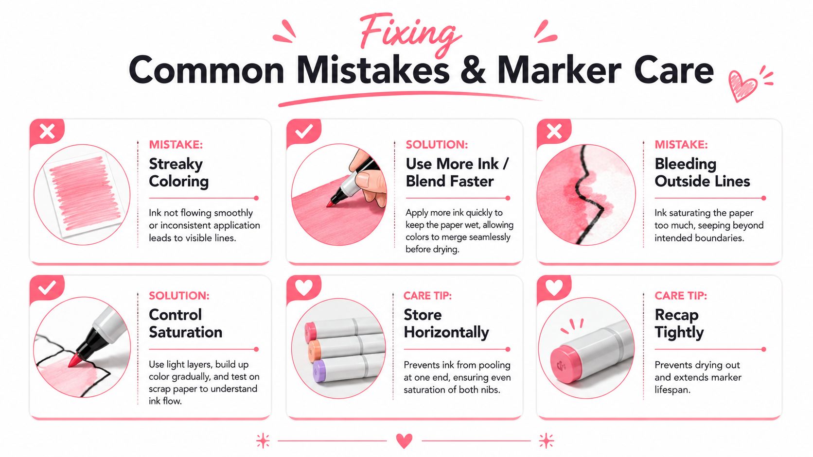
What to do when the page fights back
If you color directly in books, thin pages bring their own headaches. Concerns about burn-through and buckling come up often, and using a backing sheet or blotting paper is a common way to protect the next page when working in books like Jade Summer, as noted in Altenew's alcohol marker dos and don'ts.
A few fixes go a long way:
- For streaky areas: Go back in with smoother, overlapping passes while the area is still workable, or let it dry and add another even layer.
- For bleeding past the line: A colorless blender can sometimes push a little ink outward and soften the mistake, especially if you catch it early.
- For pages in coloring books: Slip a backing sheet behind the page before you begin.
- For oversaturated spots: Stop adding ink. Let the paper rest before deciding whether it needs correction.
Sometimes the smartest fix is design, not rescue. If a shadow gets darker than planned, repeat that depth in a few other places so it looks intentional.
Simple habits that keep markers happy
Marker care isn't glamorous, but it saves money and annoyance.
Store markers horizontally when you can. Keep caps on tightly. If one end feels drier than the other, check whether that cap was seated properly after your last session. And if a marker starts feeling scratchy or faint, test it on scrap paper before assuming the whole marker is done for the day.
The bigger mindset shift is this. Mistakes are not proof that you've failed. They're feedback from a fast-moving medium. Once you stop expecting every page to be pristine, you'll experiment more, and that's when your best work starts to appear.
If you want a gentler way to choose colors before you commit ink to paper, ColorBestie makes that part feel easy. You can upload your sketch or coloring page, explore marker-friendly palette ideas, and turn “I hope these colors work” into a plan you're excited to color.