Staring at a pristine set of alcohol markers and a blank page? The potential is exciting, but the question that stalls many isn't how to blend. It's what to draw, and equally, how to turn a vague idea into a finished piece without wasting paper and ink.
That's the gap most roundups miss. They give you a pile of prompts like “draw a flower” or “draw a portrait,” but they don't tell you which projects teach useful marker skills, which ones are beginner-friendly, or how to choose physical colors that match the mood in your head. For many hobbyists, that color-mapping step is where the process breaks down. The American Art Therapy Association reported in 2024 that 68% of new hobbyist colorists abandon projects due to color frustration and trouble selecting the right shades, a problem especially relevant when digital inspiration has to be translated into real marker choices.
This guide is built like a working sketchbook, not a generic prompt dump. You'll find more than 40 alcohol marker drawing ideas grouped by genre, with practical notes on palette direction, techniques, and difficulty so you can pick something that fits your current skill level. Some ideas are quick warm-ups. Others can become polished portfolio pieces. All of them are marker-friendly.
If you use Ohuhu, Copic, Prismacolor, Winsor & Newton, or a mixed set, you'll also see places where planning digitally first can save real frustration. The goal isn't to overthink every drawing. It's to make starting easier and finishing more likely. Let's get that blank page working for you.
1. 1. Practice Blending & Gradient Swatches
If your blends are streaky, most finished drawings will feel harder than they need to. Swatches sound basic, but they're where you learn the timing of wet ink, the pressure of your hand, and how far one shade can travel into another before the transition turns muddy.
This is one of the few exercises that pays off immediately in portraits, skies, fruit, fabric, and comic coloring. It also aligns with professional methods. Expert benchmark data notes that 90% of professionals use a colorless blender to smooth harsh transitions and create smooth gradients, especially in workflows built around realistic layering on marker-friendly surfaces.
Start with controlled transitions
Begin with simple two-color blends. Try peach into coral, pale blue into deep blue, or warm gray into cool gray. Keep the stroke direction consistent and overlap while the ink is still workable.
For better results, use marker-friendly paper rather than absorbent office paper. Technical guidance for underpainting and overpainting specifically calls for marker-friendly surfaces such as Yupo or specialized synthetic cardstock, because standard cellulose paper absorbs pigment too thoroughly and interferes with the transparency that makes alcohol markers blend well.
Practical rule: If a blend looks patchy, change the paper before you blame your markers.
Before you commit to a full page, it helps to preview pairings digitally. The Marker Comparison tool is useful for checking how close one brand's shade is to another when your set is mixed or incomplete.
Here's a helpful demo before you build your own sheet:
Swatch prompts that actually help
Instead of random rectangles, make your swatch page functional:
- Skin transition bars: Blend light skin base tones into blush and shadow tones.
- Sky strips: Test sunrise, sunset, storm, and twilight transitions.
- Fabric folds: Make narrow gradients that move from highlight to midtone to crease shadow.
- Object curves: Draw spheres, cylinders, and ribbons so your gradients follow form.
A good set of swatches becomes a reference page you'll revisit. It's also the fastest way to test whether a pale lavender really bridges into navy, or whether you need a middle color. If you want smoother results, don't jump from very light to very dark without a bridge shade unless you're deliberately aiming for a graphic look.
2. 2. Render Expressive Character Portraits
Portraits are where alcohol markers become addictive. A face lets you practice skin, hair, eyes, blush, reflected light, and edge softness in one drawing, and even a simple bust can feel finished quickly.
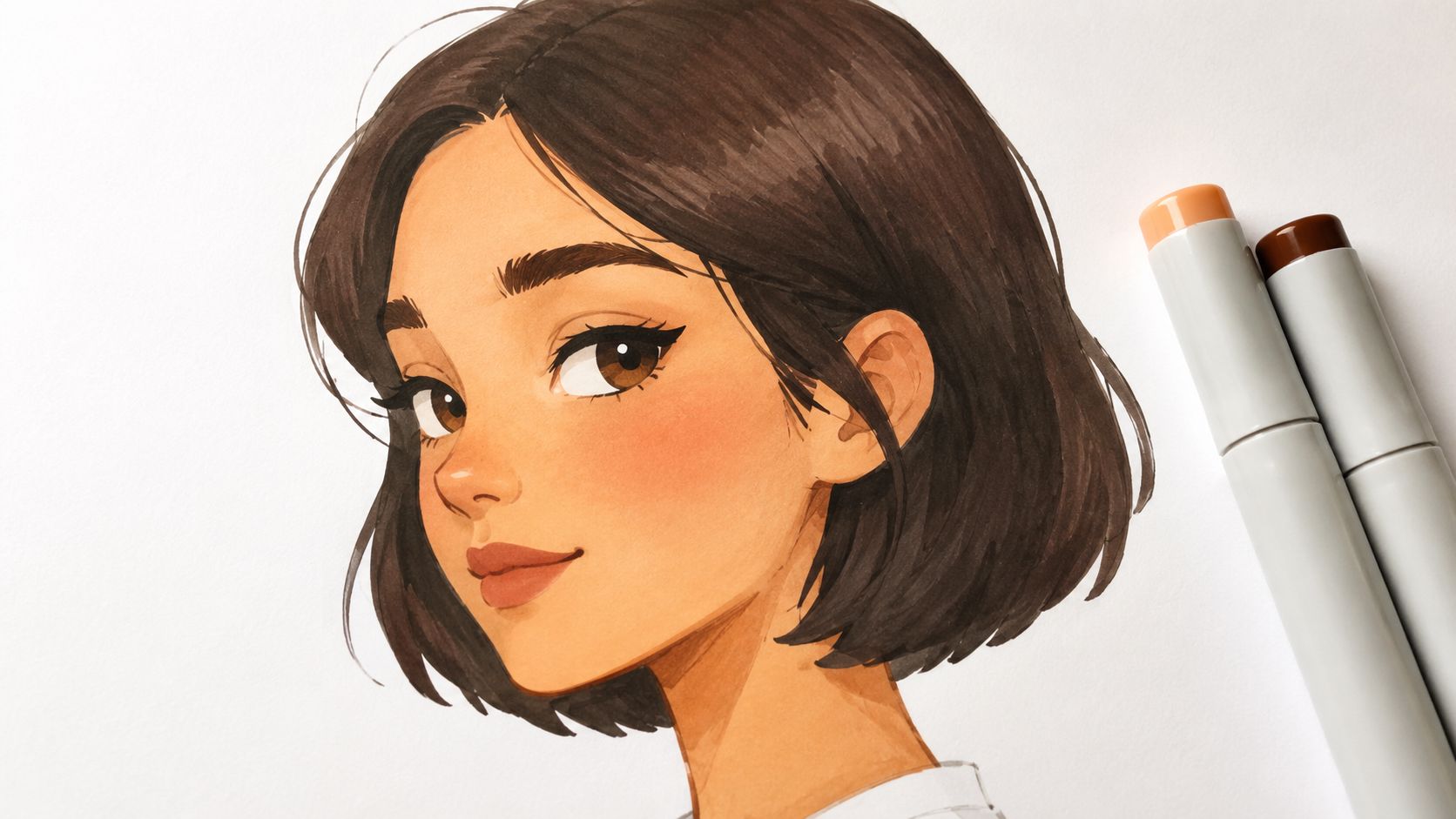
The image below shows the kind of project that rewards careful palette choices more than endless detail.
Build faces with value first
A lot of beginners chase the right skin tone and ignore value. That usually flattens the face. In professional kits, a gray set with at least three values is treated as essential for defining form before or alongside color, and it matters just as much in portrait work as it does in object rendering.
I like to block the head shape lightly, establish shadows under the brow, nose, lower lip, and jaw, then glaze warmer colors on top. That approach works for realistic studies and stylized manga faces alike. It's especially useful if you're trying to keep one character consistent across multiple drawings.
Color planning matters here because slight shifts change the whole personality of a portrait. Cool shadows can make a face feel distant or nocturnal. Warm pinks and apricots can make the same line art feel soft and romantic.
Portrait prompts worth repeating
Try these when you need strong alcohol marker drawing ideas for faces:
- Manga heroine close-up: Focus on luminous eyes, soft blush, and simplified shadows.
- Comic antihero portrait: Use stronger jaw shadows and a restrained palette.
- Animated fan art study: Match hair, skin, and costume colors consistently.
- Original character turnaround: Draw the same character in neutral, warm, and cool lighting.
- Expression sheet: Reuse one face and change only the palette and emotion.
A portrait usually fails from weak values before it fails from imperfect color.
If you use a planning app, portrait work is a smart place to test mood and lighting before touching paper. It saves rework, especially when you're balancing skin, hair, eyes, and clothing in one small image.
3. 3. Illustrate Imaginative Fantasy Creatures
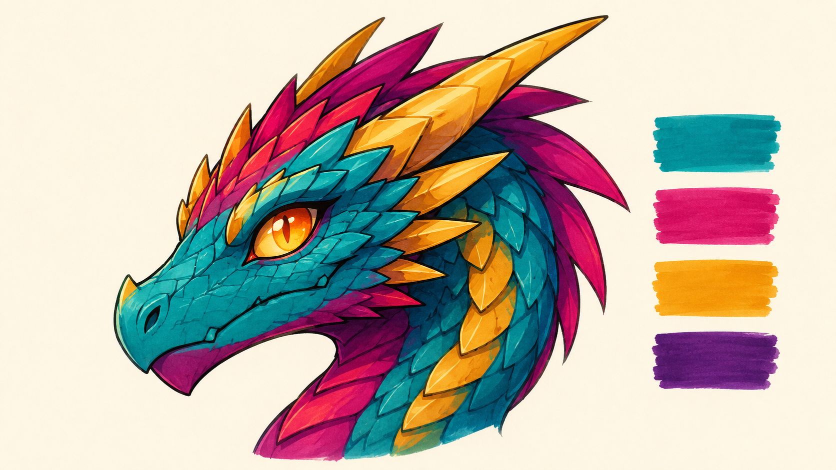
Fantasy creatures are perfect when realism feels too restrictive. Dragons, phoenixes, sea beasts, masked spirits, and antlered forest animals let you practice bold color choices without needing to justify every hue against real life.
That freedom is useful. You can focus on shape language, scale patterns, glow effects, and dramatic shadows instead of chasing strict local color. For artists who get bored by neutral palettes, this category often brings the fun back fast.
Push color harder than reality allows
Alcohol markers shine when you layer transparent color over a stable value structure. For expert-level photorealism and controlled realism, underpainting with grays before glazing color is considered a critical benchmark. That same method works beautifully for fantasy creatures because it keeps wild palettes from collapsing into chaos.
Start with grayscale shadows on the head, chest, wings, or tail. Then layer jewel tones, smoky violets, acidic greens, or ember oranges over the top. You'll get stronger form than if you start by filling every section with saturated color right away.
A practical trade-off: highly saturated palettes look exciting, but they're easy to overblend into dullness. Leave some areas cleaner than you think you should.
Fantasy creature ideas to fill a sketchbook
Use prompts that emphasize one problem at a time:
- Dragon head study: Focus on horn texture, nostrils, and scale direction.
- Moonlit unicorn: Use cool grays and desaturated violets for a quieter feel.
- Phoenix wing close-up: Practice feather grouping and hot-to-cool color shifts.
- Forest guardian elk: Combine botanical textures with animal anatomy.
- Sea serpent portrait: Explore teal, algae green, and deep shadow blues.
For recurring creature designs, it helps to keep a saved palette library so a dragon from one page still looks like the same dragon on the next. That consistency matters if you're building a comic, game pitch, or personal fantasy world.
4. 4. Color Dynamic Manga & Comic Panels
Comic panels force you to think beyond a single nice drawing. You have to manage hierarchy, pacing, repeated characters, background restraint, and the emotional tone of a sequence. That makes this one of the best categories for artists who want practical storytelling skills, not just isolated studies.
Alcohol markers have deep roots here. Copic introduced the first commercially viable alcohol-based marker sets in 1980, a milestone that helped standardize realistic shading and layering in manga production and influenced later marker workflows across comics and illustration.
Think in story beats, not isolated colors
A panel works when the reader's eye lands where you want it to. That usually means choosing one dominant color family per moment, then keeping secondary areas quieter. A fight scene can carry hot reds and sharp shadows. A memory panel might feel better with dusty pinks, low contrast, and softened edges.
Planning color blocks before you ink heavily saves a lot of frustration. The Palette Generator can help you map a small, repeatable palette before you commit to multiple panels.
Keep the loudest color for the narrative focal point, not the whole page.
Panel ideas with clear marker goals
Try one of these instead of jumping straight into a full chapter:
- Single reaction panel: Focus on face, speed lines, and one accent color.
- Two-panel dialogue scene: Keep colors restrained so expressions carry the moment.
- Action impact frame: Use strong shadows and selective saturation around the hit.
- Character entrance page: Give the background less contrast than the figure.
- Webtoon-style vertical moment: Let the palette shift gradually from top to bottom.
One common mistake is coloring every object with equal intensity. That makes the page noisy. In marker comics, selective simplification often looks more professional than complete rendering everywhere. Let black line work, untouched paper, and a few strong color passages do some of the storytelling.
5. 5. Draw Lush Botanical & Floral Art
Flowers and leaves are forgiving in the best way. They don't need perfect symmetry to look convincing, and they teach layering, edge control, and hue variation without the pressure of facial anatomy.
If you like cozy coloring pages, garden studies, or decorative illustration, this category has a lot of range. You can keep it loose with daisies and wildflowers, or go technical with orchids, succulents, and veined leaves.
Plants teach patience and edge control
Botanical work gets better when you stop using one flat green. Leaves often need a base, a shadow green, and either a warm or cool modifier depending on the light. Petals benefit from the same thinking. A pink rose with coral in the center and cooler outer shadows usually feels more dimensional than one filled with a single marker.
This is also a good place to practice nib control. Data on marker workflows shows that 75% of beginner-to-intermediate artists get consistent professional-looking results by using the broad chisel end for initial blocking and shadow definition. In plant studies, that broad side lays even color on petals and leaves much more reliably than a brush tip used too casually.
Botanical prompts with useful color lessons
Use subjects that naturally teach specific marker skills:
- Tulip cluster: Great for smooth, broad petal blends.
- Eucalyptus stems: Excellent for muted greens and shape repetition.
- Sunflower close-up: Good practice for texture contrast between petals and center.
- Succulent rosette: Ideal for cool shadow mapping and tight form changes.
- Tropical leaf study: Useful for vein placement and glossy highlights.
For more decorative pages, combine several species on one sheet and limit yourself to a controlled family of greens plus one flower accent. That keeps the page harmonious and helps you avoid the common problem of every plant competing for attention.
6. 6. Design Atmospheric Landscapes & Environments
Expansive scenes ask for a different mindset. Instead of obsessing over one object, you're managing depth, air, temperature, and mood across the whole page. Alcohol markers can do that beautifully, but only if you simplify the scene before you start coloring.
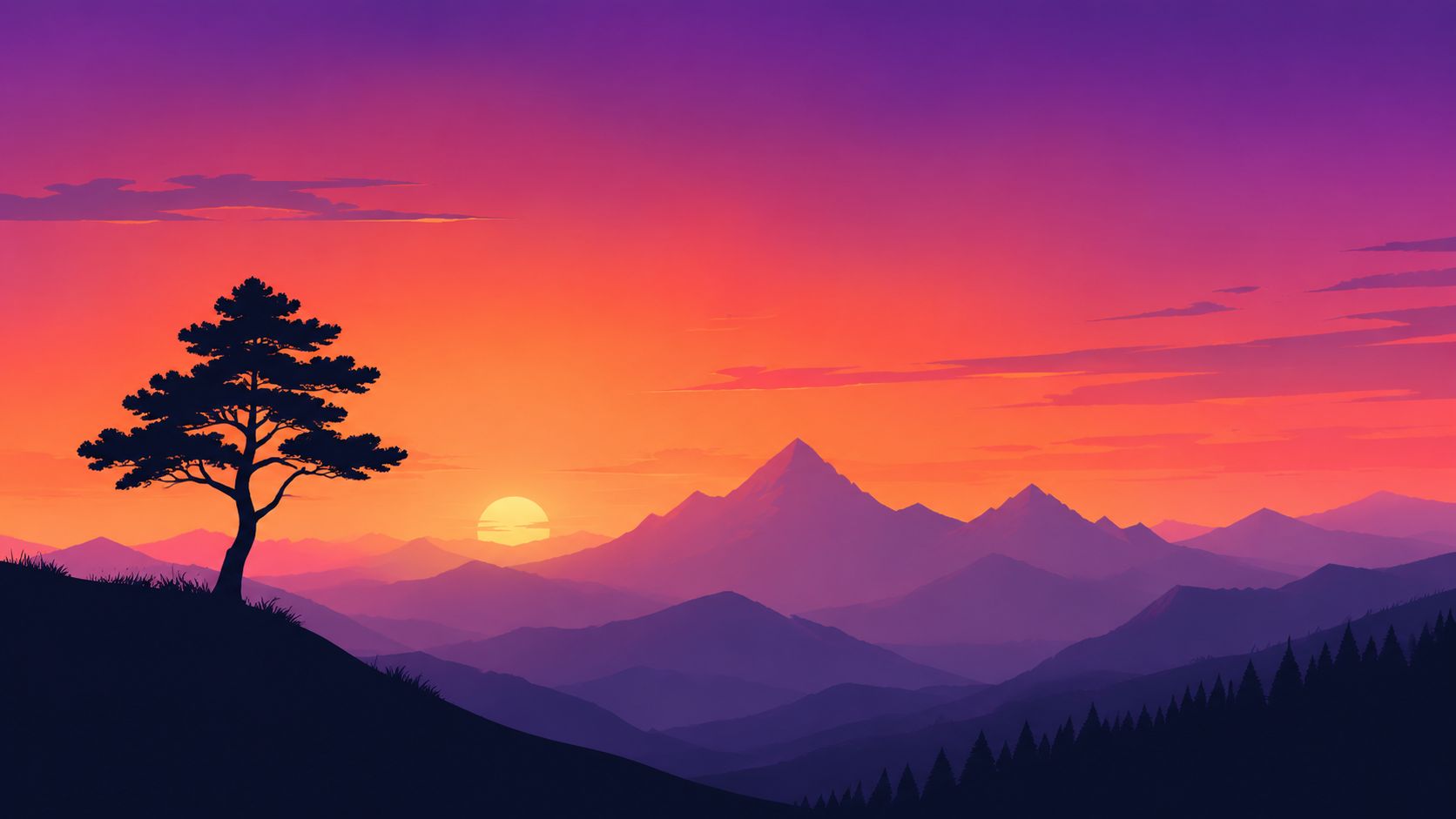
The image below shows why this genre works so well with broad marker shapes and limited detail.
Large scenes need a value plan
If you jump straight into local color, outdoor scenes often turn flat. A better approach is to separate foreground, midground, and background by value and saturation first. Lighter, duller shapes usually recede. Darker, sharper shapes usually come forward.
This matters even more now because professional color sets have expanded. Recent industry data says the average professional artist now uses a set with at least 48 distinct colors, which is a 35% increase from the 32-color standard sets common in the early 2000s. More color choice is useful, but it also makes it easier to overcomplicate a scene.
If you're converting palette ideas across brands, the Decotime to Ohuhu converter is handy when a reference or saved palette doesn't match the set in your hand.
Environment ideas that suit alcohol markers
Try these scenes when you want strong atmospheric practice:
- Sunset mountain ridge: Focus on broad gradient skies and simple silhouettes.
- Rainy alleyway: Use cool grays, reflected light, and restrained signage colors.
- Fantasy forest path: Shift greens cooler as they move into depth.
- Desert ruin at dusk: Work with warm stones against violet shadows.
- Snowy village night scene: Let untouched paper handle some of the glow.
Environmental marker drawings look best when you edit aggressively. You don't need every leaf, brick, or cloud edge. You need clear shape groups, a readable light source, and enough color variation to suggest atmosphere without clutter.
7. 7. Sketch Stylish Fashion Illustrations
Fashion sketches reward speed, and alcohol markers are built for speed. They let you test silhouettes, fabrics, and outfit palettes quickly enough that you can explore multiple versions of the same design in one sitting.
This genre is useful even if you don't consider yourself a fashion illustrator. Outfit studies improve your sense of drape, color coordination, and visual rhythm, which carries over into character design and editorial art.
Fabric first, details second
The strongest fashion drawings usually read from ten steps back. That means the silhouette and value grouping have to work before you start worrying about stitching, jewelry, or tiny patterns.
A reliable workflow is to block the garment with the chisel nib, place the major folds, and then sharpen select edges with a finer tip. Satin, denim, knitwear, leather, and tulle each need different contrast handling. Leather likes crisp highlights and darker shadow jumps. Knitwear tends to look better with softer transitions and less glare.
Don't render every fold. Pick the folds that explain the fabric.
Fashion prompts that sharpen color sense
These prompts stay fun while teaching practical skills:
- Streetwear look sheet: Try three colorways for one hoodie-and-cargo outfit.
- Evening gown concept: Practice sheen, drape, and limited glamorous accents.
- Seasonal capsule wardrobe page: Keep all looks tied together by one palette family.
- Fantasy costume redesign: Blend world-building with believable fabric choices.
- Accessory page: Bags, boots, belts, and hats are great small studies.
A planning tool is especially helpful here because the same line drawing can feel edgy, elegant, playful, or vintage depending on only a few color changes. If you're designing for a recurring character or a fictional brand, saving those combinations gives your work more cohesion than improvising every outfit from scratch.
8. 8. Capture Realistic Still Life & Textures
Still life is where marker habits get exposed. You can't hide weak value, muddy blending, or uncertain edges when you're trying to draw a pear, a glass bottle, chrome scissors, or a ceramic cup under real light.
That's exactly why this category is worth doing. It teaches control fast. It also answers one of the biggest frustrations artists have with markers: how to create convincing texture without fixing everything later in colored pencil or paint pen.
This is where marker discipline shows
Many tutorials drift into mixed media when the textures get difficult. That's useful sometimes, but it doesn't help if you want a marker-only workflow. A 2025 survey from the International Association of Color Artists found that 72% of adult coloring enthusiasts specifically seek marker-only techniques to avoid the mess of multiple media.
For realistic still life, use the light-first, dark-middle, light-back blending sequence with the chisel nib when possible. That sequence is especially effective on fruit skins, simple product renderings, and ceramic curves. Add a colorless blender at the end only where you need a smoother handoff, not across the whole object.
Still life ideas with strong learning value
Choose objects for their surface behavior:
- Apple or pear: Great for round form, reflected color, and simple highlights.
- Glass bottle: Teaches edge placement more than heavy coloring.
- Silver spoon or watch case: Useful for abstract reflections and sharp value jumps.
- Lipstick or perfume bottle: Good for product-style rendering and clean label areas.
- Ceramic mug with shadow: Excellent for form, cast shadow, and handle geometry.
One more trade-off is worth knowing. Hyper-detailed texture can look impressive, but with alcohol markers alone it often works better when simplified into grouped marks rather than tiny repeated lines. Suggest fur, water ripples, or brushed metal with directional value changes first. Then add only the few edges that the viewer needs.
Alcohol Marker Drawing Ideas: 8-Point Comparison
| Technique | Implementation Complexity 🔄 | Resource Requirements ⚡ | Expected Outcomes ⭐ | Ideal Use Cases 📊 | Key Advantages 💡 |
|---|---|---|---|---|---|
| 1. Practice Blending & Gradient Swatches | Medium, timing and wet-on-wet control | Moderate, alcohol markers, colorless blender, marker-friendly paper | ⭐⭐⭐⭐, smooth gradients and believable depth | Character skin, sunsets, fabric shading | Creates professional smooth transitions; fast; forgiving with blenders |
| 2. Render Expressive Character Portraits | High, anatomy, subtle color matching | High, varied skin-tone markers, fine liners, good paper, references | ⭐⭐⭐⭐, striking, shareable portraits | Manga/comic portraits, character design, portfolios | High visual impact; builds transferable figure-coloring skills |
| 3. Illustrate Imaginative Fantasy Creatures | Medium, creativity plus color theory | Moderate, vibrant/iridescent markers, palette tools | ⭐⭐⭐⭐, bold, distinctive creature designs | Game art, fantasy illustrations, concept pieces | Encourages experimentation; forgiving of unrealistic choices |
| 4. Color Dynamic Manga & Comic Panels | High, consistency across panels, speed needed | High, broad marker set, quality paper, workflow planning | ⭐⭐⭐⭐, narrative clarity; publication-ready pages | Comic/manga color pages, webtoons, serialized art | Industry-relevant; teaches color hierarchy and composition |
| 5. Draw Lush Botanical & Floral Art | Medium, knowledge of plant structure, patience | Moderate, nature palettes, fine paper, variety of greens | ⭐⭐⭐, realistic/ornamental botanical renders | Adult coloring books, prints, botanical studies | Natural color harmony; relaxing process; market-friendly |
| 6. Design Atmospheric Landscapes & Environments | High, perspective, subtle temp/value shifts | High, wide marker range, large paper, planning time | ⭐⭐⭐⭐, strong mood and spatial depth | Concept art, game environments, backgrounds | Teaches composition and color theory; strong portfolio impact |
| 7. Sketch Stylish Fashion Illustrations | Medium, figure + fabric rendering skills | Moderate–High, extensive color range, pattern refs | ⭐⭐⭐, fast design exploration, presentable concepts | Fashion portfolios, costume design, lookbooks | Rapid iteration of designs; shows fabric and texture convincingly |
| 8. Capture Realistic Still Life & Textures | High, rendering reflections, transparency, light | High, precision markers, high-quality paper, photo refs | ⭐⭐⭐⭐, technical, realistic product and object renders | Product illustration, commercial renders, practice studies | Builds technical mastery; directly applicable to commercial work |
Your Next Masterpiece Starts Here
The best alcohol marker drawing ideas aren't the flashiest ones. They're the ones that make you sit down and draw. A gradient strip that teaches cleaner transitions, a flower study that sharpens your edge control, a portrait that finally gets skin shadows right, or a still life that proves you can create depth without switching media. Those are the pages that build skill.
If you're feeling stuck, pick by problem rather than by subject. Want smoother blends? Do swatches, skies, ribbons, and fruit. Want stronger value control? Draw portraits with a gray understructure or simple product forms under one clear light source. Want better color confidence? Repeat one subject in multiple palettes instead of chasing a new prompt every day. Repetition is where markers start feeling predictable in the best way.
It also helps to accept the inherent trade-offs of the medium. Alcohol markers are fast, vivid, and satisfying, but they punish hesitation on the wrong paper and they don't forgive random color choices. A beautiful set won't fix weak planning. Good surfaces, a practical gray range, and a colorless blender usually matter more than owning every shade in a giant case. For realistic work, underpainting and value mapping consistently outperform guesswork.
There's also nothing wrong with keeping your project small. A single mushroom cap, one comic panel, a rose bloom, or a three-quarter portrait can teach more than a crowded full-page scene you never finish. Smaller studies make it easier to compare palettes, evaluate what worked, and preserve your enthusiasm. That matters because marker progress comes from consistency, not marathon sessions.
If digital inspiration often falls apart when you try to match it to real markers, use tools that reduce that friction. ColorBestie is one option that fits this workflow well because it's built around marker-style previews, palette planning, and brand-aware color matching. That kind of support is especially helpful for hobbyists who want a calmer, more direct path from idea to paper.
Most of all, don't wait for the perfect prompt. Pick one category from this list, choose a limited palette, and start with a page you can finish today. The blank sheet gets less intimidating once you've got a direction, and every finished drawing gives you a better instinct for the next one.
If you want help turning line art, references, or half-formed palette ideas into something you can color with real markers, try ColorBestie. It's a practical companion for testing moods, palettes, and marker-friendly color directions before you commit ink to paper.