You open a fresh set of alcohol markers, pick a flower, a manga panel, or a cozy coloring page, and expect those buttery gradients you've seen online. Then your physical page reveals the truth. The blend turns streaky. The shadow gets muddy. One edge dries before you can soften it, and suddenly the whole piece looks harsher than you planned.
That frustration usually isn't a talent problem. It's a workflow problem.
With alcohol markers, technique starts before the first stroke. Smooth results depend on three things working together: the right surface, a realistic color plan, and fast, deliberate blending while the ink is still cooperative. Once you understand that relationship, a lot of common problems stop feeling random. They become fixable.
The Secret to Beautiful Alcohol Marker Art
Alcohol markers feel modern in the hand, but the solvent idea behind them goes much further back. Alcohol ink has been traced to Ancient Egypt around 3200 BC, while the marker form artists use today developed much later as a portable, controlled coloring tool, as noted in Altenew's overview of alcohol markers. That old solvent tradition still explains the medium's personality now. The ink moves smoothly, dries fast, and asks you to commit.
That fast drying is the first big studio lesson. Some alcohol markers dry in seconds, so the marker stroke that looked blendable a moment ago may already be set by the time you reach for the next shade. If you've ever wondered why a color transition looked soft in one area and harsh in another, this is usually the reason.
Smooth alcohol marker art comes from timing and planning working together.
Beginners often focus only on hand movement. They try to fix a rough blend by scrubbing harder, going over the same patch again, or adding more dark color. That usually makes things worse. Alcohol marker techniques reward a lighter touch and a clearer plan. You need to know which color goes down first, where the highlight stays, how far the shadow should travel, and whether the paper will support the blend before it sinks through.
A strong piece usually starts with a boring step many people skip. You test the colors. You choose a light, a mid, and a dark that belong together. You decide where the blend will happen. Then the marker work gets easier because the decisions are already made.
Your Essential Marker Art Toolkit
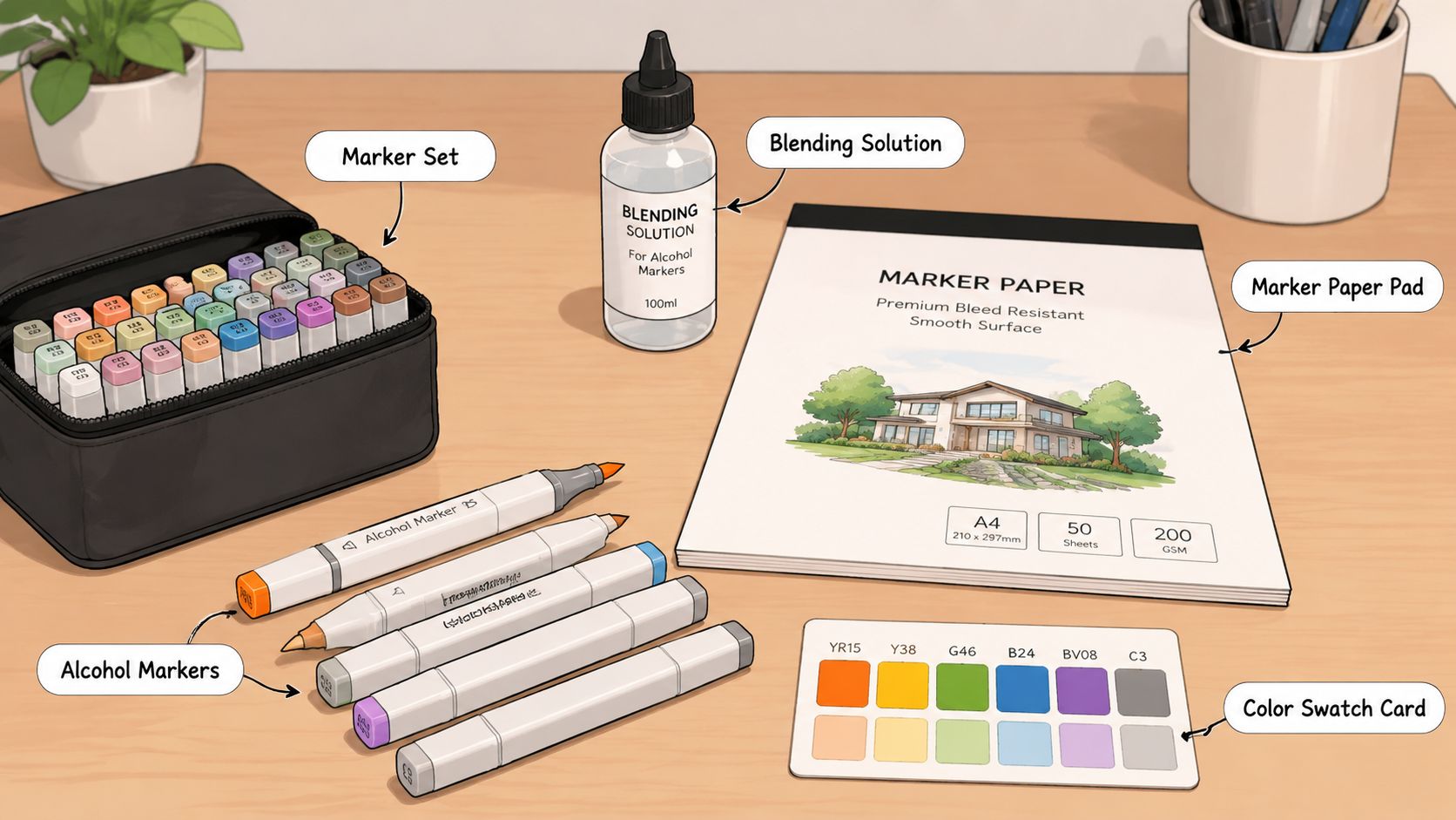
A lot of alcohol marker frustration starts with supplies that fight back. You can make lovely work with Ohuhu, Copic, Prismacolor, and similar marker lines, but the marker set itself is only part of the setup. Paper, nib shape, and even your swatch habit matter more than many artists expect.
Paper decides more than your marker brand
Paper is the surface that either gives you time to blend or steals it. One guide notes that 75 g/m² paper is thin enough that alcohol marker ink will bleed through, while 160 g/m² paper reduces bleed-through, which is why smooth, heavier paper is usually the safer choice for marker work, according to Julia Henze's alcohol marker guide.
That single comparison explains a lot of disappointing first attempts. Standard printer paper often lets ink spread and sink too quickly. The page pills, the back gets trashed, and your blending window feels tiny. On smoother marker paper, the ink sits more predictably on the surface, so you can guide it instead of chasing it.
A few paper realities to keep in mind:
- Thin pages punish experimentation. If you're coloring in a double-sided book or a mixed-media sketchbook, test first.
- Smooth paper protects your nibs. Rough surfaces can fray brush nibs and make fills look broken.
- Large fills need sectioning. Work big backgrounds in smaller areas so the first part doesn't dry before the second catches up.
Practical rule: if your blends look worse on one pad than another, trust the paper test before blaming your technique.
If you want to compare how different marker lines fit your workflow before buying more colors, a tool like ColorBestie's marker comparison tool can help you sort sets by the brands you already use.
Choose nibs by task, not by habit
Most artists end up favoring one nib, but each shape has a job.
| Nib type | Where it shines | Where it struggles |
|---|---|---|
| Brush nib | Organic shapes, petals, skin, hair, curved shadows | Crisp geometric edges if your hand is heavy |
| Chisel nib | Fast coverage, broad areas, clean angled fills | Tiny details and tight corners |
| Bullet nib | Small accents, narrow spaces, line control | Large blends, where it can look streaky |
The mistake is using one nib for everything. Brush nibs feel expressive, so people use them for broad background fills and then wonder why the coverage looks uneven. Chisel nibs can be much cleaner for flat areas. Bullet nibs are handy, but they're rarely the fastest route to a smooth gradient.
Build one simple prep routine
Before the main artwork, do the same tiny setup every time. It saves paper, ink, and a lot of regret.
- Pull your likely colors first. Don't start with the whole case open.
- Make a quick swatch card. Cap color can mislead, so test the actual ink.
- Check pressure on scrap. A heavier hand makes a darker, denser mark, while a lighter touch keeps things softer.
- Place a bleed sheet underneath. Even good paper can let ink pass through.
That routine sounds plain, but it's the difference between controlled alcohol marker techniques and hoping the page behaves.
Mastering Foundational Blending and Layering
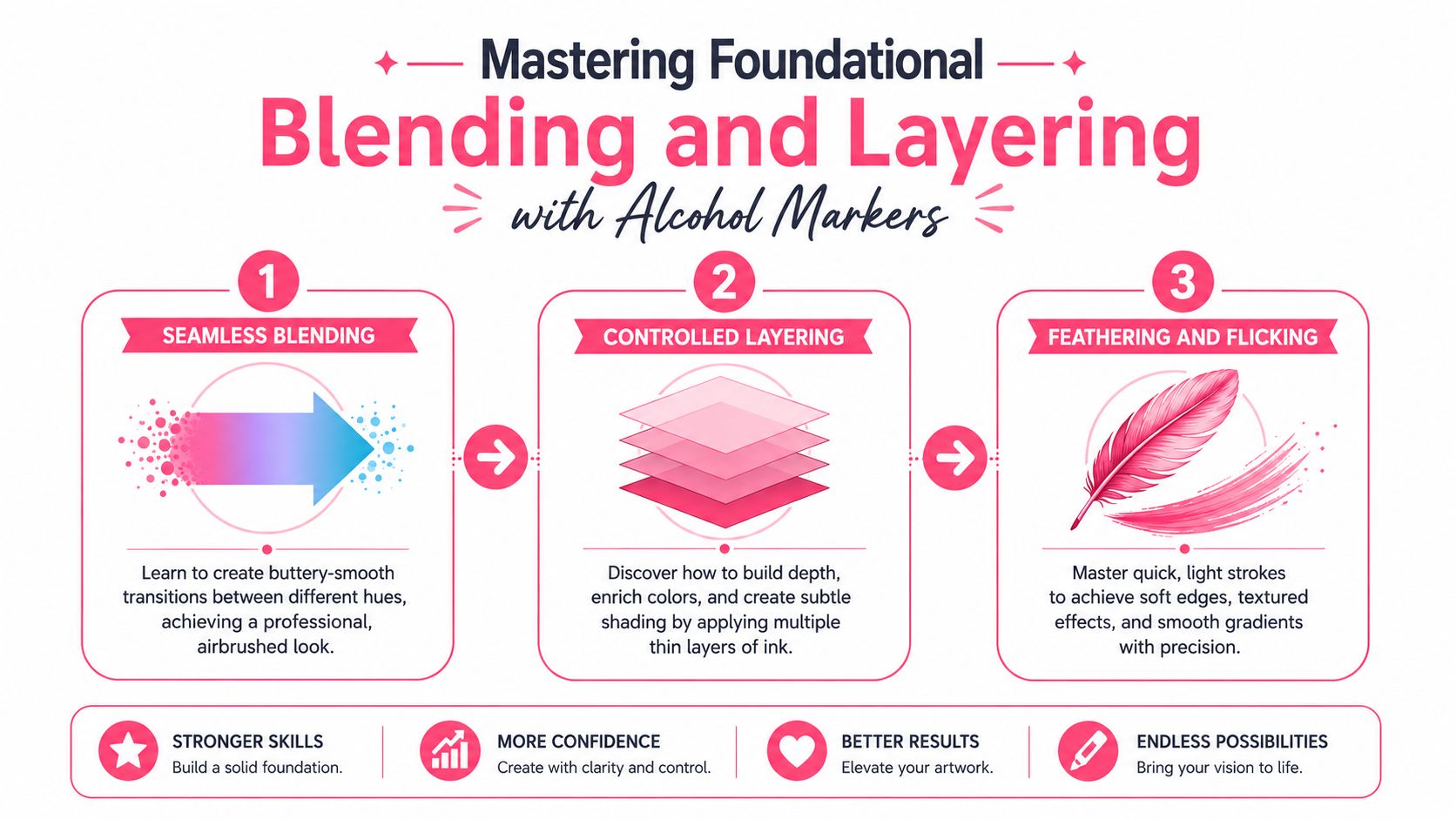
Blending gets easier when you stop thinking of it as “mixing colors” and start treating it as timing on paper. Alcohol markers don't wait around. You have a short window to overlap colors while the surface is still damp enough to let them soften into each other.
A quick visual helps before we get into hand motions.
Use wet-on-wet timing, not wishful thinking
The most dependable sequence is simple. Put down the lighter color first, overlap the darker color while the first layer is still wet, then return to the edge with the lighter marker to re-wet and soften the transition. That wet-on-wet timing is emphasized in Art Is Fun's alcohol marker techniques guide.
This is why slow, hesitant blending often fails. If you pause too long between colors, the edge dries. Once that happens, you're not blending so much as layering over a line that has already settled.
Work with confidence, even if the strokes aren't perfect. A timely overlap beats a timid one.
The practical version looks like this. Fill a small area with your light shade. Drop the darker shade into the shadow side before the sheen disappears. Then use the light marker to push gently into the seam. You're not scrubbing. You're nudging wet ink into a smoother transition.
Later in the section, you can watch the hand rhythm in motion.
Feathering for soft transitions
Feathering, sometimes called flicking, is one of the most useful alcohol marker techniques because it creates a soft bridge instead of a blunt stripe.
Try it with two neighboring values. Start from the darker side and flick outward with quick, light strokes. Then come in from the lighter side and flick back toward the same meeting area. The overlap zone becomes textured at first, then softens as you repeat with a light hand.
A few things make feathering work better:
- Start in the darker mass. That anchors the stroke where you want the strongest value.
- Lift as you move. The stroke should taper naturally.
- Keep the direction consistent. Random flicks create messy texture, not a gradient.
Feathering is especially good for petals, folds, hair, and anything that benefits from movement instead of a perfectly airbrushed finish.
Tip-to-tip and layered gradients
Tip-to-tip blending is useful when two markers are still too far apart in value or temperature. You touch a darker marker to a lighter one briefly, then use the lighter marker to lay down a temporary in-between transition. It's a small bridge, not a replacement for proper color planning.
For a classic three-color gradient, think in bands, not stripes. Your light shade owns most of the form. The mid-tone sits where the shape begins to turn away from the light. The darkest color belongs in the deepest recess or cast shadow. Then each border gets softened with the adjacent lighter marker.
Here's the trap many people hit: they let the dark marker take over too much real estate. When that happens, the whole object gets heavy and flat. Preserve more light area than you think you need.
A reliable sequence for rounded forms:
- Base with the lightest marker. Cover the whole shape except the brightest highlight if you want crisp shine.
- Add mid-tone to the turning planes. Think side planes, lower curves, underlaps.
- Reserve the darkest value for the smallest area. Corners, overlaps, undersides.
- Revisit each seam with the lighter adjacent marker. That's where the smoothness happens.
If a blend still looks patchy, shrink the working area. Big sweeping sections dry faster than most beginners expect. Smaller passes often look cleaner because you stay inside the wet window.
Planning Your Palette for Flawless Results
Most muddy blends are planned, even if the artist didn't realize they were planning them. The wrong pair of greens, two skin tones that jump too far apart, or a shadow color that's too cool for the local color can sabotage the result before the marker touches paper.
That's why palette planning belongs inside alcohol marker techniques, not outside them.

Why trios solve most blending problems
A very practical rule is to plan marker pairs or trios within a hue family and swatch them before you start, because value decisions are hard to correct once the ink sets. Tutorials also recommend testing light and dark variants on scrap paper first, as described in The Virtual Instructor's marker lesson.
A trio gives you structure:
- Light marker for the main local color and blending passes
- Mid-tone for form and gentle depth
- Dark marker for accents and compression points
That sounds obvious, but many hobbyists build blends by instinct from a large case. They grab one pale pink, then one intense coral, then a brownish shadow because it “looks close enough.” Sometimes it works. Often it creates abrupt jumps that no amount of reworking can fully smooth.
Good blending is often just good value spacing in disguise.
When you plan by family, your hand relaxes. You're no longer inventing the palette halfway through the object.
Swatches are part of the technique
Swatching isn't busywork. It's a rehearsal. Alcohol markers can look different from the cap color, and paper changes the result again. A quick strip on scrap tells you whether your light and mid are close enough, whether your dark is too forceful, and whether the combination warms or cools the subject more than you intended.
For practice pages, I like a small swatch set that includes:
- Single-color patches to see the base hue
- Overlap tests to check transitions
- Two-layer tests to see how quickly saturation builds
This is also where a digital planning tool can be useful, especially if you color from your phone or like trying ideas before uncapping anything. ColorBestie's palette generator creates marker-oriented palette ideas matched to real marker brands, which can make it easier to choose a workable trio before you start swatching on paper.
A digital shortcut that still respects real markers
The useful part of digital planning isn't novelty. It's reducing indecision. If you already know you're working with Ohuhu, Copic, or Prismacolor markers, a preview that suggests marker-friendly color relationships can save you from pulling twenty markers to find three that cooperate.
The key is to treat the screen as a draft, not the final authority. Real ink on your real paper still gets the last word. But when the planning phase gets easier, execution usually gets cleaner too.
Creating Advanced Textures and Highlights
Once your blends are smooth, flat color starts to feel a little too polite. Texture gives the piece personality. It also helps rescue areas that would look dull if they were blended perfectly from edge to edge.
Texture starts with restraint
The most convincing textures don't cover the whole object evenly. Stone, fur, denim, bark, soft fabric, polished ceramic. They all need variation. If every inch gets the same dot pattern or the same flick marks, the surface starts to read as a repeating effect instead of a believable material.
That's why texture usually works best after a simple value structure is already in place. First build the form. Then add marks that support that form.
It's useful to consider:
| Effect | Marker motion | Best use |
|---|---|---|
| Stippling | Small dots or clustered taps | Grit, stone, worn surfaces, freckles |
| Flicking | Quick tapered strokes | Hair, fur, grass, directional texture |
| Lifted highlights | Pushing or removing wet color | Shine, reflected light, soft patterns |
Use flicks, dots, and lifted color on purpose
For rough texture, stippling works because the eye blends the dots at a distance while still reading surface irregularity up close. Start with a base tone, then add a denser cluster of darker dots in shadowed areas. Leave the highlight side more open. The change in spacing matters as much as the color.
For hair and fur, use flicking in the direction of growth. Begin at the root or shadow mass and release pressure as you move outward. Layer shorter dark flicks under longer lighter ones. That creates depth without turning the section into a solid block.
The colorless blender is often misunderstood. It doesn't behave like an eraser in the way beginners hope. What it does well is move ink, soften edges in selected areas, and lift small highlights if you catch the timing right. On some papers it can also create subtle texture by pushing pigment away from tiny spots.
Try these uses:
- Sparkle on objects by lifting tiny dots after the base layer dries enough to hold shape
- Fabric wear by tapping the blender lightly along edges and stress points
- Pattern suggestion by pushing small repeated marks into a darker area
Don't use the blender as a panic button. Use it as a shaping tool.
One warning from experience. If you attack a dark area repeatedly with the blender, you can create a chalky, overworked patch. Small, intentional touches look better than heavy correction.
Bringing Your Subjects to Life
Technique becomes real when it meets an actual subject. Skin, hair, and fabric each ask for different handling, even if the same basic alcohol marker techniques sit underneath them all.
Skin needs value control more than extra colors
With skin, the easiest mistake is overcomplicating the palette. You usually need fewer markers and better placement, not a huge stack of peach tones. Keep the lightest tone dominant. Let the mid-tone define cheeks, jaw turns, eye sockets, and the underside of forms. Use the dark sparingly around nostrils, under the lower lip, under bangs, or where the head overlaps the neck.
If skin keeps looking bruised or dirty, the values are often too abrupt or the shadow choice is too heavy for the scale of the face.
Hair works when your strokes follow growth
Hair looks lively when the strokes describe direction first and color second. Lay in a broad light base, place a mid-tone mass where the hair turns away from light, and use dark flicks in the deepest channels between locks. Preserve a strip or broken band of highlight instead of coloring every strand evenly.
That's where flicking earns its keep. Shorter strokes near roots and longer tapered passes through the body of the hair create movement without forcing you to draw every strand.
Fabric looks convincing when you respect the surface
Denim, cotton, knits, and soft drapery all benefit from selective texture. Smooth blending alone can make fabric look plastic. Add small directional marks along folds, seams, and tension points to suggest weave and wear.
Paper choice matters a lot here, especially for coloring books and double-sided pages. A recurring pain point for hobbyists is bleed-through management on pages they didn't choose for marker work, a problem highlighted in Altenew's blending article. If you're previewing a palette for a page you don't want to ruin, ColorBestie's theme preview tool can help you test the mood and direction before committing ink.
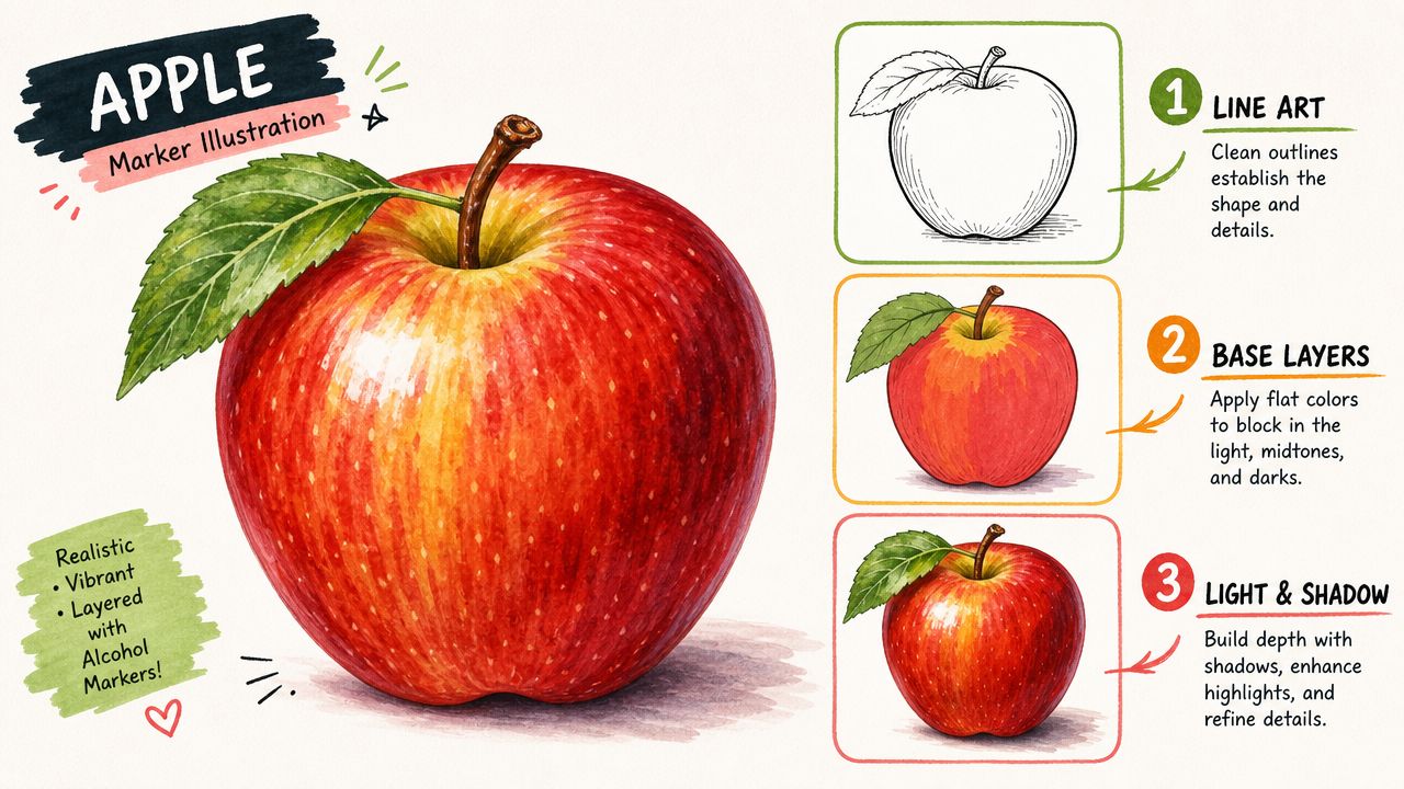
The same logic works for an apple, a portrait, or a jacket sleeve. Plan the palette first. Keep the light area larger than instinct suggests. Blend while the ink is still workable. Then add texture only where the subject needs it.
Color planning is where clean marker work usually begins. If you want a low-friction way to preview marker-friendly palettes and test ideas before you ink the page, ColorBestie is built for that workflow.
