
A vintage family portrait is open beside your marker case. Your Ohuhu set is half-used, the grayscale faces are full of expression, and the blank swatch sheet is somehow more intimidating than the actual drawing. You can see the light, the folds, and the mood, but you can't decide whether the jacket wants olive, navy, or warm brown.
That's where a black and white photo coloring app becomes useful. Not as a magic restoration machine, and not as a replacement for your own eye, but as a fast palette-planning partner. The preview gives you possible color families, lighting directions, and layering ideas before you touch marker to paper. The practical test is simple: does the digital suggestion translate cleanly to alcohol markers?
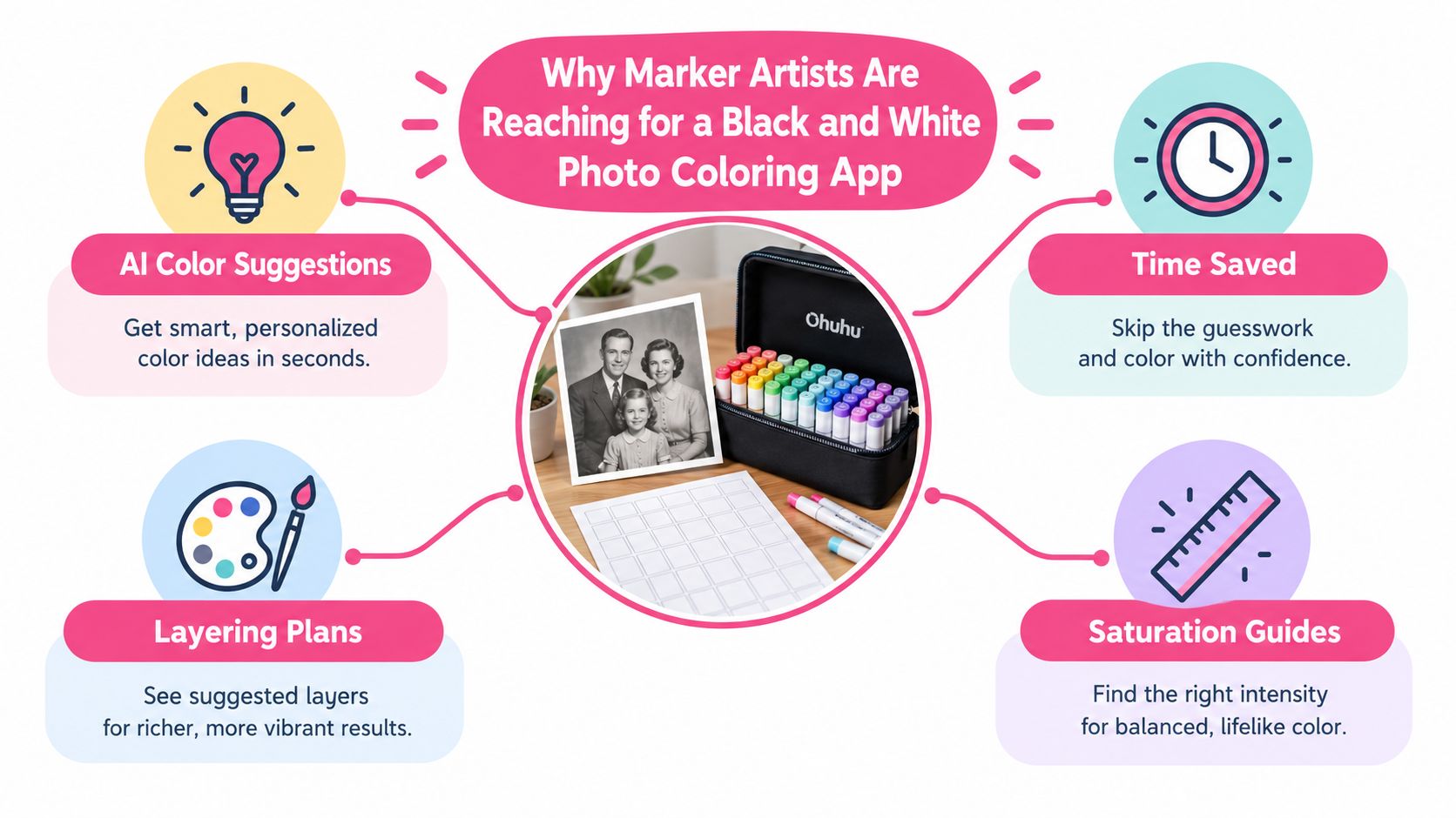
Why Marker Artists Are Reaching for a Black and White Photo Coloring App
Coloring a grayscale image by hand can stall before the first marker leaves its cap. A shadow may work as cool violet, warm gray, or deep brown. Skin can move from peach to rose to muted ochre. Clothing is even less certain because grayscale tells you how light or dark a surface is, not what dye or pigment created it.
A black and white photo coloring app cuts through that hesitation by offering several plausible directions quickly. It can suggest a palette, a mood, and a lighting approach in moments, giving you something concrete to swatch instead of asking you to invent every color from empty grayscale space.
Use the preview as a palette seed
The history of automatic image colorization helps explain why current tools offer more than one fixed result. Research has developed from reference-image transfer, user scribbles, and histogram-based methods into semantic, data-driven colorization, with modern systems extending beyond photographs to sketches, manga, and line drawings. A recent survey of image colorization research describes this progression and identifies semantic colorization as an important milestone in automated workflows.
That flexibility suits marker artists. You can ask for a quieter vintage scheme, a bright illustrated treatment, or a different lighting interpretation, then compare the results on paper. The output is still a guess. It may oversaturate a scarf, turn a neutral wall blue, or invent a convincing but incorrect eye color.
Practical rule: treat the digital image as a reference card with opinions, not as a finished restoration.
A good workflow starts with photo preparation, moves through theme exploration, and then separates three decisions: what hue you like, how light or dark the area should be, and which real marker can reproduce it. On smooth marker paper, alcohol ink will also behave differently from a glowing screen. Some colors dry lighter, some blend warmer, and some edges spread farther than expected. Your swatch sheet remains the final authority.
Choosing and Prepping Your B&W Photo for the Best Results
A colorization app can only interpret the information that survives in the source image. Before uploading, inspect the photograph at full viewing size. Look closely at eye highlights, hair edges, fabric folds, and fingers. If those features dissolve into blur, the app may turn missing detail into invented color boundaries.
Resolution matters, but usable detail matters more than a pixel target. A scan with clean edges and controlled grain will usually give you a more dependable planning reference than a larger file that has been enlarged from a soft original. If you have access to the original negative, use it. For a print, scan carefully and avoid aggressive automatic corrections that flatten the tonal structure.
Four checks before uploading
- Inspect the tonal range. Look for a meaningful spread from dark shadows to bright highlights. A flat gray image leaves the app less separation to interpret.
- Crop with purpose. Remove empty borders, distracting background objects, or stray hands that introduce tonal noise into the preview.
- Check edge clarity. Apply only gentle sharpening when faces or clothing look mushy. Heavy sharpening exaggerates grain and can create false outlines.
- Review the histogram. A quick grayscale histogram helps reveal whether the image is crushed into black, clipped into white, or missing useful midtones.
Brightness adjustments should preserve the original relationships between surfaces. If you brighten a face until the highlights disappear, the app may spread one pale skin color across features that should remain distinct. If you deepen every shadow, it may respond with heavy brown, purple, or blue blocks that are difficult to soften with markers.
For an extra planning step, prepare the grayscale image alongside a marker palette generator. The cleaner the source and the more intentional the crop, the easier it is to judge whether a color suggestion belongs to the subject or is just reacting to background noise.
Exploring the Five Theme Worlds in a Black and White Photo Coloring App
Theme controls are most useful when you understand what decision each one changes. Don't click through presets only because the thumbnails look attractive. Use each world to ask a practical marker question, such as whether the clothing needs a muted family, whether the shadows should stay warm, or whether the output has too many competing accents.
Palette World
Palette World changes the dominant color families. Reach for it when you're deciding between an autumn portrait, a coastal blue scheme, or a restrained neutral study. It can reveal that the same grayscale structure supports very different emotional readings.
Its weakness is false certainty. A strong palette may assign one dramatic family to every object, including areas that should remain quiet. Check whether the background is stealing attention from the face before copying its colors.
Mood World
Mood World shifts the emotional temperature and intensity. A nostalgic treatment can reduce the visual pressure on old paper and clothing, while a dramatic treatment may deepen contrast and make a portrait feel more editorial.
Mood presets can overstate saturation. A screen-friendly rose or teal may become loud when layered with alcohol ink. Use the output to identify direction, then choose a calmer marker family if the subject needs breathing room.
Style World
Style World changes the surface language, from painterly softness to illustrative or graphic-flat shapes. Graphic-flat results are often easier to translate because they show clearer regions for base color, midtone, and shadow. Painterly previews can still help with atmosphere, but their small transitions may not correspond to separate marker decisions.
The warning is that a clean illustration style can erase useful texture. Don't let simplified edges persuade you to ignore hair strands, woven fabric, or irregular lighting in the original.
Lighting World
Lighting World reinterprets highlight and shadow placement. It helps when you're comparing warm side light with cool overcast light, especially on faces and folds. For marker planning, this world is less about finding a perfect hue and more about deciding where the final dark layers should land.
It can lie by moving the light source too far. If the cheek, collar, and background all receive equally strong highlights, the result may look polished digitally but become confusing on paper.
Genre World
Genre World applies contextual direction such as portrait, wide format, or vintage film. It can nudge the result toward a coherent visual vocabulary, which is useful when a family photograph needs a period-inspired mood rather than contemporary color contrast.
Genre presets can also stylize skin and shadows into cinematic combinations that don't suit the source. Test the face separately from the clothing, and reject any preset that makes the subject look graded rather than naturally observed.
| Theme World | What It Adjusts | Best Marker Use Case | Watch Out For |
|---|---|---|---|
| Palette | Dominant color families | Comparing warm, cool, or seasonal schemes | One family may spread across unrelated objects |
| Mood | Saturation and temperature | Matching nostalgic, calm, or dramatic feeling | Screen intensity can become harsh in ink |
| Style | Surface treatment and shape clarity | Planning flat layers or illustrative rendering | Simplification can erase texture |
| Lighting | Highlight and shadow placement | Designing light direction and dark accents | Highlights may shift to implausible areas |
| Genre | Contextual color bias | Building a period, portrait, or film-inspired look | Presets may over-style skin tones |
A theme preview workspace is most valuable when you compare alternatives with the original grayscale image still visible. The right result isn't the prettiest thumbnail. It's the one that gives you a manageable set of marker decisions.
Reading the Marker-Optimized Preview With Confidence
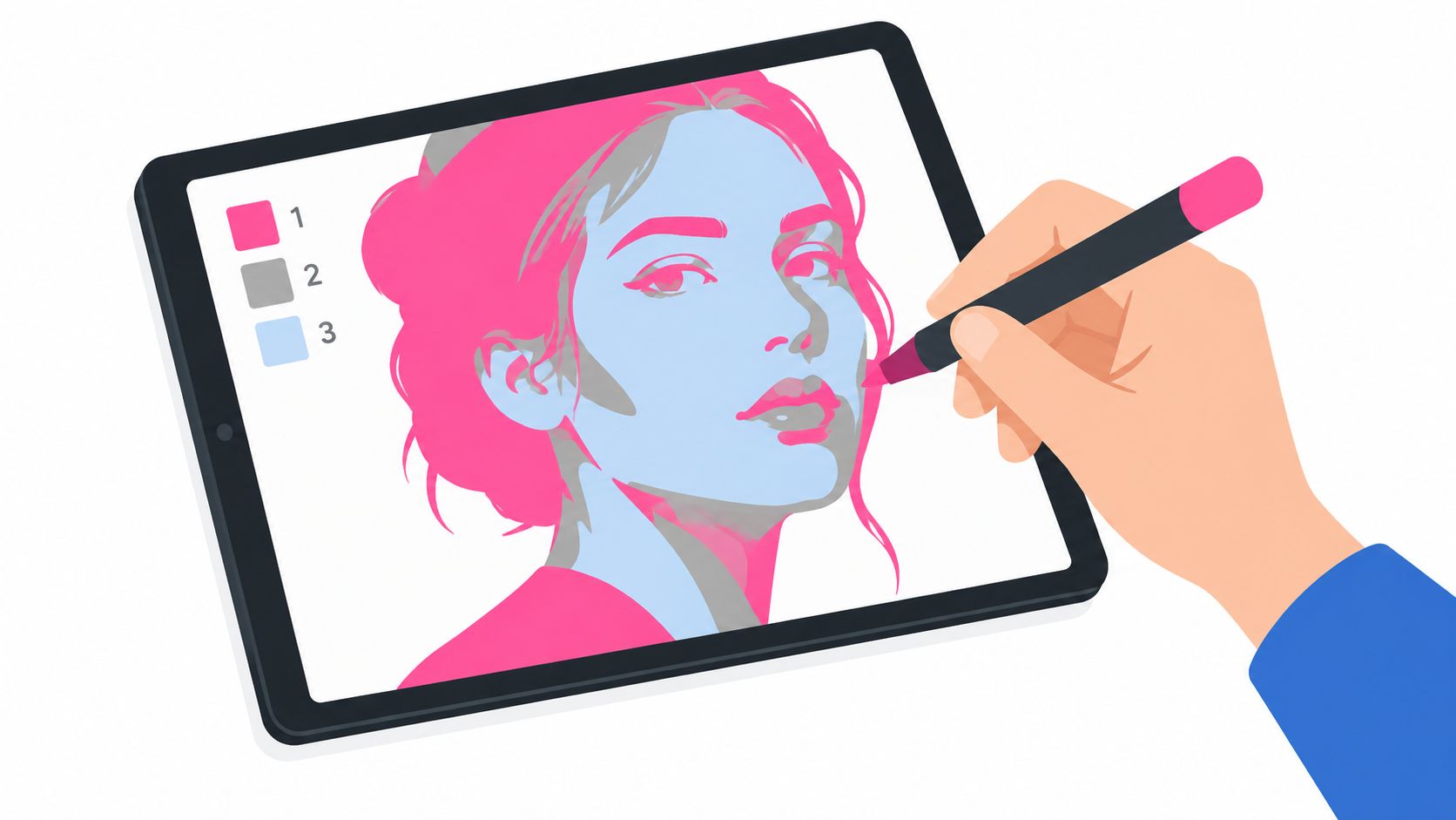
A marker-optimized preview isn't a finished painting. Read it as a flat color map that suggests the order in which you might build the image. Start by squinting at the preview. This strips away small details and exposes the broad regions that will matter first on paper.
Look for three layers of information:
- Saturation zones show where the strongest color is concentrated. These areas often need a deliberate base choice, not automatic layering.
- Midtone bands indicate where two colors may meet. They're useful for planning a soft overlap, flicking motion, or a controlled transition.
- Shadow pockets identify the shapes that will receive the final dark reinforcement. Preserve these until the lighter layers are dry and understood.
Then compare the colored preview with the original grayscale. If the skin and shirt now sit at nearly the same visual value, the color treatment may have erased separation. If the background has more intensity than the subject, lower its importance in your real palette even if the app makes it vivid.
Trust hue, question intensity
Digital color is emissive. Marker ink is physical, transparent, and affected by paper. A vivid coral on a display may dry into a quieter result, while repeated passes can push it darker and warmer than expected. Mentally soften extreme saturation before you begin swatching.
Human preference is especially important here. Research has found that common objective image-quality measures don't reliably match what people prefer in colorized images, and that noticeable hue errors in natural objects can be heavily penalized. The colorization benchmark discussion and perceptual evaluation notes support a practical conclusion: use automated previews for direction, but let your eye and a physical swatch decide whether the result feels believable.
Zoom into the face, clothing, and background separately. Ask whether each region has a light, middle, and dark option. When the answer is yes, the preview has become a recipe rather than a decoration.
Translating Digital Palettes to Ohuhu, Copic, and Other Alcohol Markers
RGB values don't map neatly to marker caps. Translation is a swatching exercise, and every brand needs its own reference because ink behavior, paper interaction, transparency, and naming systems vary.
Begin with a brand-specific swatch card. Lay down one clean stroke of every marker you regularly use on the same smooth paper you plan to color on. Label each sample clearly, let it dry, and judge the dried result rather than the wet stroke. Keep light, middle, and shadow candidates grouped together for skin, wood, foliage, fabric, and neutral areas.
When the app suggests a color, match by value first, then by hue, then by saturation. A close hue with the wrong darkness can destroy the form. For a portrait, choose the lightest usable skin marker, a middle tone for planes, and a separate shadow family rather than trying to force one marker to perform every job.
Brand behavior changes the translation
Ohuhu sets are practical for building grouped families because many artists organize them around broad color relationships. Don't rely on the cap appearance. Compare dried swatches, and keep separate notes for light skin, almond, muted rose, and shadow combinations.
Copic ink often reads transparent and nuanced, so a digital color that looks strong may need a lighter real-world starting point. Build gradually and reserve the deeper marker for the areas that need structural emphasis. Prismacolor Premier can introduce a warmer, waxier impression, so a cooler companion or blender may help neutralize a result that feels too golden.
Winsor & Newton Promarker sits comfortably in a middle ground for many traditional palette decisions. Spectrum Noir Illustrator's light, middle, and dark organization can make triad planning straightforward, especially when you're learning how much overlap your paper can handle. These are starting tendencies, not fixed rules. Your paper and dried swatches outrank brand reputation.
| Brand | Typical Hue Shift | Lightness Adjustment | Best Use Case |
|---|---|---|---|
| Ohuhu | Broad family relationships may need muted companions | Start from the dried swatch | Fast palette exploration and large color families |
| Copic | Often reads cooler and more translucent | Begin lighter, then layer | Controlled gradients and delicate transitions |
| Prismacolor | Can lean warm and waxy | Test a cooler partner when needed | Rich accents and expressive rendering |
| Winsor & Newton Promarker | Balanced, familiar marker behavior | Match by value before saturation | General portrait and object studies |
| Spectrum Noir Illustrator | Clear triad logic | Choose light, middle, and dark roles | Predictable layering practice |
A marker comparison tool can help you compare neighboring brand options before you commit to a purchase or open a fresh page. Still, put the selected caps on scrap paper. A digital match is only promising until the ink dries.
Treating the Preview as Inspiration, Not Restoration
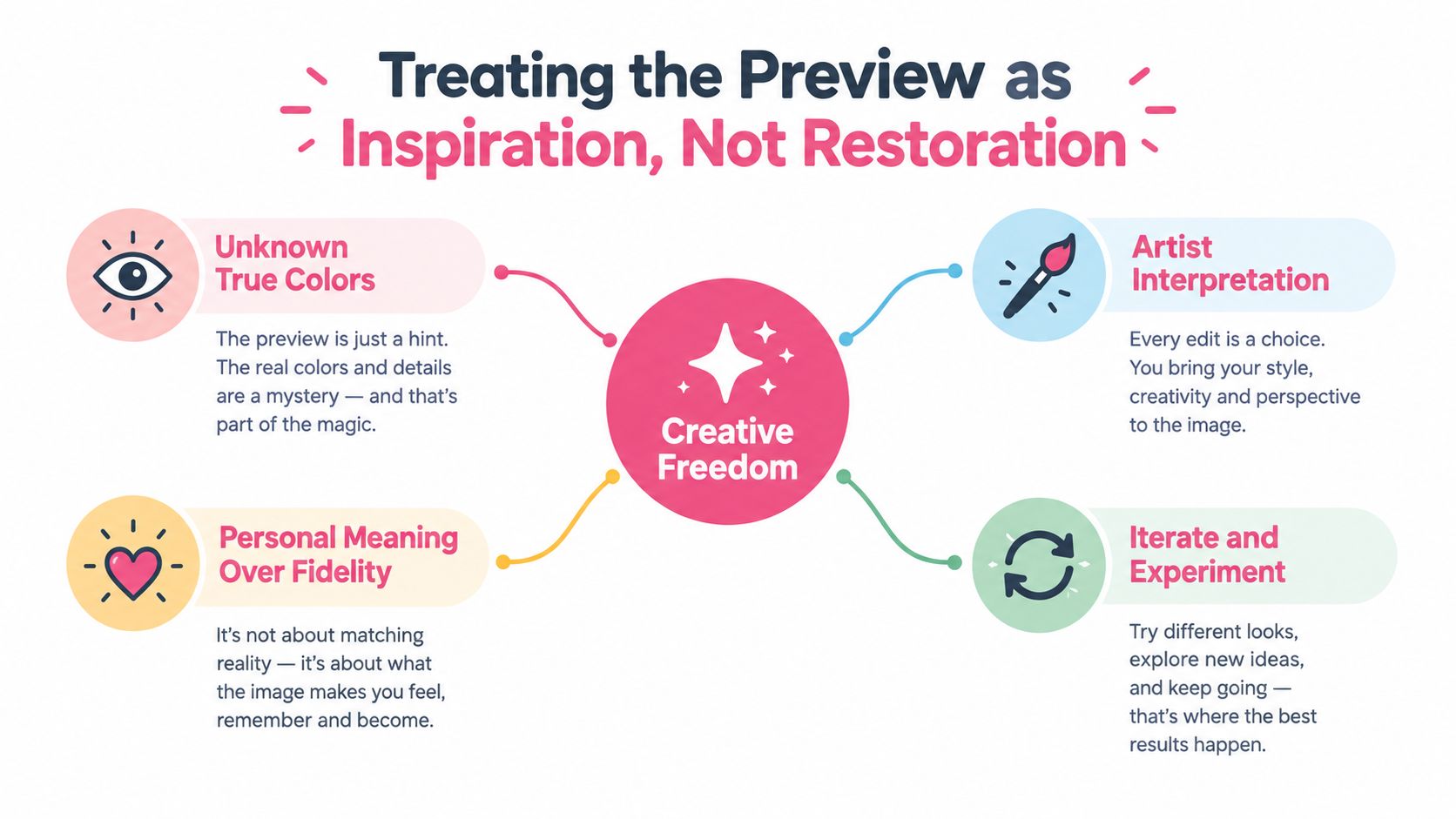
The most useful mindset shift is accepting that colorization can't recover facts that the grayscale image never recorded. The app doesn't know the sitter's actual eye color, the original fabric dye, or the precise warmth of the light. It generates a plausible reconstruction from visual evidence, and plausible isn't the same as historically accurate.
That limitation doesn't make the preview useless. It changes the job. Use the result like a mood board that helps you choose a visual direction, then make deliberate decisions based on the subject, your marker inventory, and the feeling you want the finished page to carry.
Build a bridge to the page
Companion tools are useful because they reduce the distance between a glowing preview and physical ink. A palette tool can identify the dominant families worth swatching, rather than sending you toward every color visible in the image. A comparison view can show how a similar family behaves across Copic, Ohuhu, Prismacolor, or another set. A theme tool lets you test whether the image works better with a warmer or quieter direction before you spend ink.
The same principle applies to authenticity. If you're coloring a historical family portrait, label the result as an interpretation in your own notes. If you're planning a manga character, embrace the freedom to assign colors that serve the design. The purpose changes, but the workflow stays honest.
A convincing preview is valuable because it gives you choices. It becomes misleading only when you mistake those choices for recovered truth.
ColorBestie turns uploaded photos, sketches, and line art into marker-style previews, with brand-oriented guidance for sets including Ohuhu, Copic, Prismacolor, and Spectrum Noir. Used alongside physical swatches, that kind of output can function as a planning stage instead of a novelty filter.
Troubleshooting and Daily Practice for Better Marker Color Plans
Most preview problems are easier to fix when you name the failure before changing settings. Washed-out skin needs a different response from muddy shadows, and a bleeding jacket shouldn't be corrected by adding more saturation.
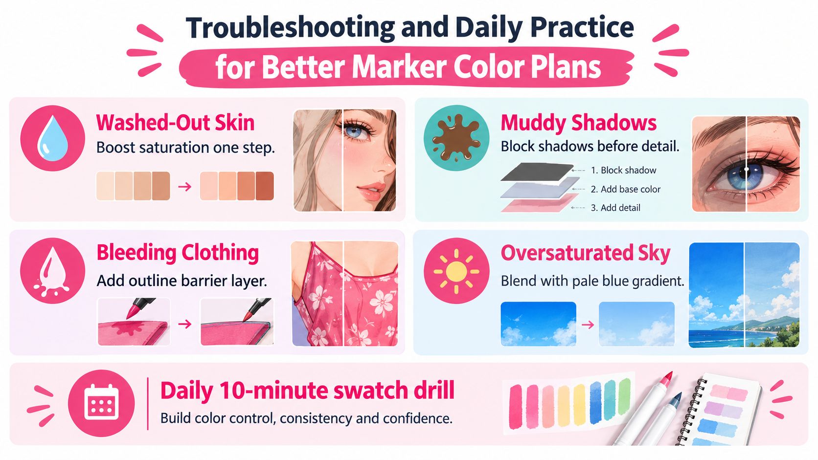
- Washed-out skin: Try a slightly stronger mood or a warmer lighting direction, then check whether the face still has clear light and shadow.
- Muddy shadows: Block the shadow shapes first and keep the deepest marker for the end. Too many overlapping dark colors can turn a readable form gray-brown.
- Bleeding clothing: Create a clean outline barrier with a lighter neighboring marker, and keep the clothing palette separate from the skin family.
- Oversaturated skies: Lower the palette intensity or switch to a calmer genre direction. A pale blue gradient usually supports the subject better than a brilliant digital blue.
A useful practice session needs only one grayscale image, two contrasting theme directions, a scrap sheet, and your notebook. Swatch the most important candidates, record which caps worked, and note whether the dried result became warmer, lighter, or darker than the preview suggested. Over time, those notes become more useful than generic color names.
Before starting a finished piece, run this short check:
- Face: Does the skin have a light, middle, and shadow option?
- Mood: Did you compare the original direction with at least one calmer or warmer alternative?
- Swatch: Did you test the chosen caps on the actual paper?
- Record: Did you save the successful combination for the next portrait?
The app supplies possibilities. Your swatches decide what survives contact with paper.
Use ColorBestie to turn a photo, sketch, or coloring page into a marker-style preview, explore its five theme worlds, and compare the suggested direction with your Ohuhu, Copic, Prismacolor, or other alcohol-marker swatches. Start with one image, test the preview against scrap paper, and let the result guide your next color plan rather than dictate it.
