
You've chosen a promising sketch, laid down what looked like the perfect color, and then watched the result turn streaky, muddy, or completely different from the palette in your head. The problem usually isn't that you need more markers. Better results come from making deliberate choices about paper, value, saturation, stroke direction, pressure, and color temperature.
The best alcohol marker tips become easier to use when they're part of a repeatable workflow. You'll begin by choosing a surface that supports clean ink movement, then map values, build color from light to dark, control each stroke, refine warm and cool relationships, and preview your palette before committing ink. Tools such as ColorBestie can help you test marker-friendly palettes and lighting ideas from a sketch, so your physical marker set has a clearer plan before you start coloring.
1. Layering and Blending with Light to Dark Values
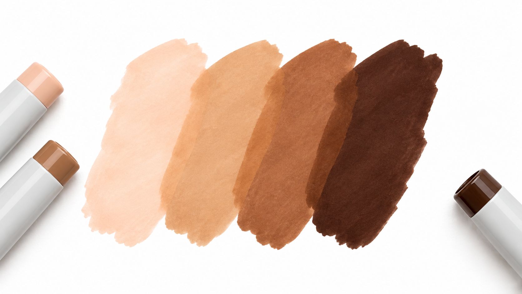
Alcohol marker ink is transparent, so each pass influences the color beneath it. That makes light-to-dark layering one of the most reliable ways to create depth without losing control. Start with the palest marker in the area, then add progressively deeper values where the form turns away from the light.
For example, a character's skin might begin with a light peach, gain warmth with a tan layer, and receive deeper definition with a brown or muted red-brown. The same logic works for foliage, hair, fabric folds, and manga shadows. A pale green base can become dimensional with a middle green, then a darker green placed only beneath leaves or along overlapping shapes.
Build control into every pass
Test the sequence on scrap paper first. Your markers may look different over one another than they do in isolation, and the paper can change how quickly the ink spreads. Keep pressure light and consistent, because pressing hard saturates the surface quickly and leaves less room for later blending.
Use the broad face of a chisel tip to cover large areas, then switch to a bullet or fine tip for edges, narrow shadows, and small accents. Industry guidance commonly describes chisel nibs as roughly 2 to 6 mm wide and bullet nibs as around 1 mm, although exact dimensions vary by product. This guide to dual-tip and brush-nib markers explains how those shapes affect coverage, edge control, and line variation.
Practical rule: Put the lightest color down first, leave the brightest highlights untouched, and reserve the darkest marker for the smallest areas.
For cleaner transitions, let a layer settle briefly before adding the next. If you want a softer merge, work while the first color is still active. Use ColorBestie's theme previews to inspect a possible value progression before you begin, then make a small swatch strip showing the order of your markers.
2. Color Mixing on Paper with Complementary Hues
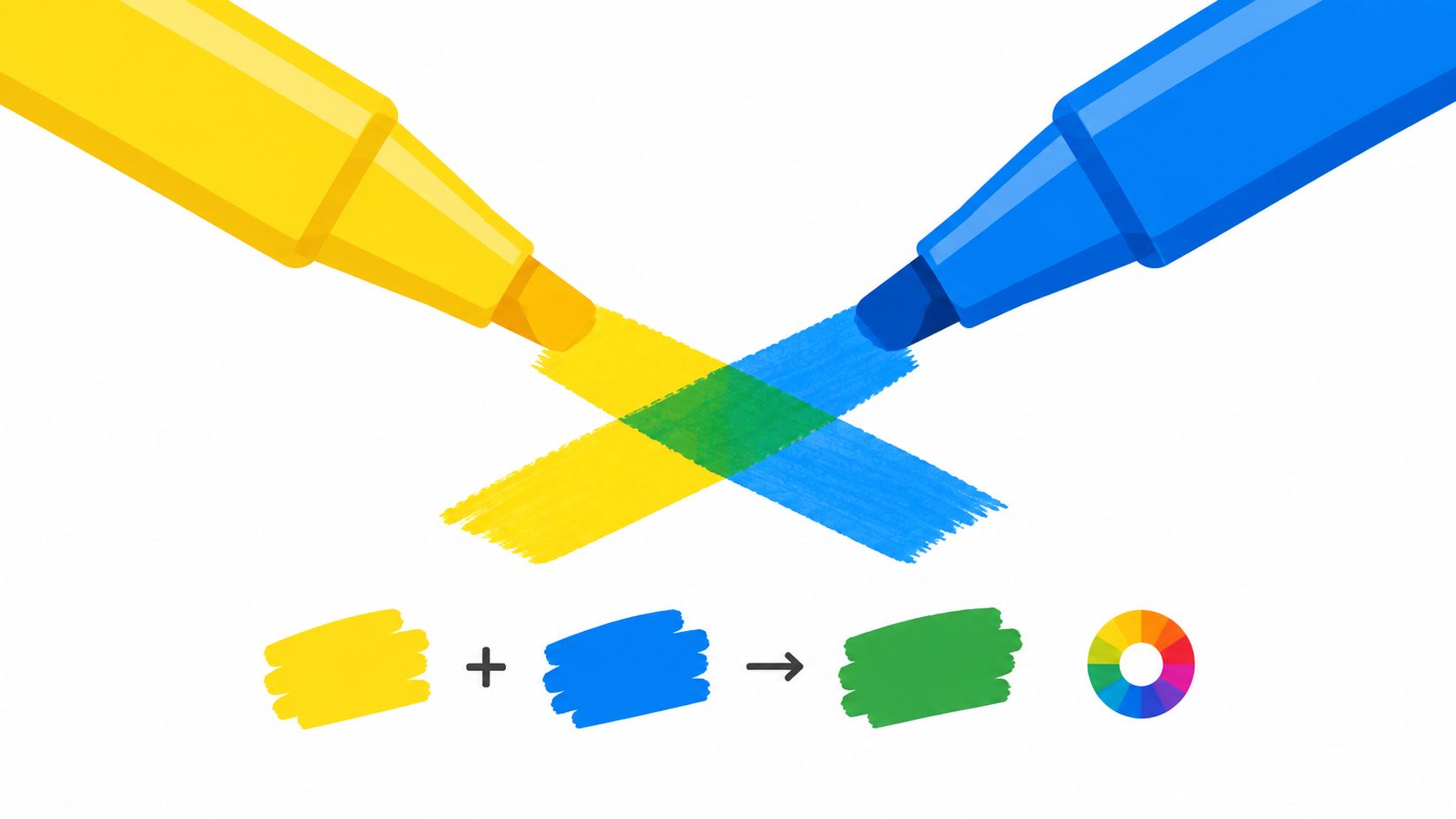
You don't need every finished color in your marker case. You can create new hues directly on paper by layering transparent inks, especially when you understand the relationship between complementary and analogous colors.
Neighboring colors, such as blue and green, usually create harmonious blends. They're useful for water, cool foliage, and quiet background transitions. Opposite colors, such as yellow and blue or red and green, tend to neutralize one another and can produce earthier, less artificial results. A bright orange may become more natural when moderated with a carefully chosen purple, while red layered with blue can create a richer shadow family for portrait work.
Make a swatch before making a decision
Work from the lighter ink toward the darker one. Apply the first color evenly, let it approach a dry state, and then add the second in a controlled area. If both markers are highly saturated, the combination may become stronger than expected. A scrap-paper test lets you adjust without sacrificing the illustration.
Keep a reference sheet of successful mixes. Label each swatch with the marker names or codes, the order of application, and the paper used. That record becomes especially useful for recurring characters, adult coloring pages, and multi-session projects where you need to recreate a color relationship.
Try this small exercise:
- Choose neighboring colors: Layer two blues and a green to create several water or sky transitions.
- Choose opposite colors: Add a small amount of a complementary hue to a bright color and observe how quickly it becomes muted.
- Compare paper areas: Make the same mix on your working paper and a smoother sample, because the surface changes the appearance.
- Save the result: Keep the best swatches beside your marker case for future reference.
Use the ColorBestie Palette Generator to preview complementary combinations before testing them physically. The preview won't replace a paper swatch, but it can help you choose a sensible starting pair instead of guessing through your entire set.
3. Blending with Colorless Blender Markers
A colorless blender marker contains solvent without colored pigment. It can soften a boundary, extend a pale color, lift some ink, or help two nearby colors transition more gently. It isn't a magic eraser, and it won't repair paper that has already become oversaturated, but it's useful when you need to refine a blend rather than add another hue.
Start by placing your colored markers where you want them. Then use the blender along the meeting point, moving from one side of the transition into the other. Angled strokes often feel more natural than repeatedly tracing a straight border, particularly in hair, rounded cheeks, mist, and curved fabric.
Use solvent with restraint
A wet color usually blends more readily than a fully settled layer, so plan your movement before touching the page. Apply gentle pressure. Too much solvent can make the paper buckle, spread a hard edge farther than intended, or create a pale halo around the area.
A practical sequence is simple:
- Lay down the light color: Cover the larger area first and keep the edge open.
- Add the deeper color: Place it where the form turns or where the shadow belongs.
- Blend the boundary: Use the colorless marker with short, controlled passes.
- Reinforce selectively: Add a small amount of the deeper color again if the blend has become too pale.
Brush alcohol marker tips often provide the most expressive blending feel because flexible fibers respond to pressure, but they're also more sensitive to rough paper and heavy handling. Bullet tips are steadier for edges, while chisel tips remain efficient for broad fills. This alcohol marker tip guide compares those trade-offs, including how paper texture, pressure, and cap sealing affect wear.
For help comparing marker families before choosing a working combination, use ColorBestie's Marker Comparison tool. A comparison can narrow your options, but always confirm the final blend on your actual paper.
4. Strategic Color Blocking and Value Mapping Before Detail Work
You have finished the outline, but the drawing still feels flat. Before adding eyes, seams, leaves, reflections, or texture, establish the large color zones and light-dark structure. Color blocking gives every later mark a clear role.
Start by choosing the paper you will use for the final piece, then make a quick value map. Decide where the light comes from, which planes face it, and which shapes should stay lighter or darker. Mark these choices lightly in pencil or on a separate reference image. Squint at the artwork to reduce distracting detail and judge the broad value pattern more clearly.
Start with the middle, not the extreme
A mid-tone leaves room to adjust in both directions. Add a lighter layer for a lit plane, or build darker layers for folds and recesses. Starting with the darkest marker everywhere limits correction. Starting too pale can lead to excessive layering while you try to create enough contrast.
Block the largest areas with the chisel side of a dual-tip marker, keeping the fine or bullet side for narrow borders and corners. Many consumer alcohol markers pair a chisel nib with a bullet or fine nib, though formats vary by brand. This overview of dual-tip and brush-nib designs explains how these designs combine broad coverage with detail control.
For a portrait, place the skin base, hair mass, clothing color, and background before tiny facial accents. For an outdoor scene, establish the sky, ground, distant shapes, and main foreground forms before individual branches or stones. If your palette begins as a digital preview or coloring-book reference, the Decotime and Ohuhu marker converter can help translate those colors into a practical marker selection.
Do a quick check before refining. Every major zone should be present, while the paper white remains reserved for the brightest highlights. If one area pulls too much attention, adjust its value or coverage now. A few minutes of mapping can prevent detail work from locking in an unbalanced composition.
5. Paper Selection and Preparation for Optimal Marker Performance
The paper under your alcohol marker tips affects nearly everything, including color brightness, edge sharpness, bleed-through, blending time, and nib wear. A rough surface creates more friction, while thin or highly absorbent paper can pull ink outward and make a clean transition difficult. Smooth marker paper, coated marker stock, and smooth Bristol-style surfaces generally give you more predictable control.
Test before committing to a finished page. Make a small chart with a single pass, a second pass, an overlap, and a dark edge. Turn the sheet over to check bleed-through, and place a protective sheet underneath your artwork. This matters for coloring books, where ink can pass through the page and affect the next illustration.
Match the surface to the task
Smooth paper suits manga outlines, small facial features, lettering, and crisp clothing edges. A surface with more texture may support atmospheric effects, but it can be harder on flexible brush tips and may encourage fraying or splitting. Paper choice also changes how quickly a marker feels dry, so test your blending sequence rather than relying only on the marker label.
Independent guidance on alcohol marker use recommends smooth marker paper, tight caps, horizontal storage, and careful testing because rough or thin paper can increase bleed and nib wear. This practical alcohol marker tutorial explains why paper and storage habits affect ink flow and tip performance.
Keep your paper flat in a dry, stable place. Don't leave a finished sheet pressed against a damp surface or exposed to conditions that can warp it. If you're practicing a new technique, use a test sheet first and save premium paper for the piece where your palette and value plan are already settled.
6. Utilizing Marker Directional Strokes and Pressure Control for Texture
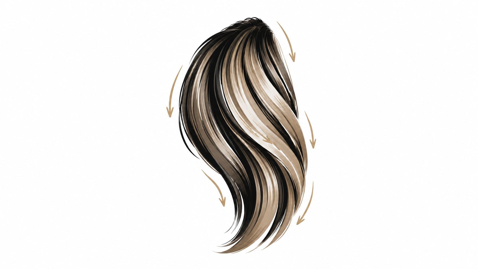
A marker stroke carries information about the surface it describes. Hair usually benefits from strokes that follow growth. Fabric folds need movement along the fold. Grass rises, water travels horizontally, and wood grain follows the structure of the plank. When every stroke runs in the same direction, those surfaces can look flat even when the colors are accurate.
Start with a pressure exercise on scrap paper. Draw a row of strokes from feather-light to medium-firm, then repeat the row with the marker held at different angles. Notice how the ink density, edge, and line width change. Flexible brush alcohol marker tips respond visibly to pressure, while bullet tips offer a more stable line and chisel tips provide broad coverage with a controllable edge.
Let the subject guide your hand
For hair, use long, tapered movements that follow the locks, then add shorter darker strokes beneath overlapping sections. For fabric, turn the marker as the folds turn and reserve heavier pressure for recesses. For water, use lighter horizontal passes with gaps between them so the white paper can suggest reflection.
“Several light strokes usually give you more control than one forceful stroke.”
Change your hand position and the angle of your arm instead of trying to force every directional change through finger pressure. Hold the marker slightly angled to the page when you want a broader, smoother contact. If your hand feels tense, pause and loosen your grip. Tension often creates short, hesitant marks that remain visible after blending.
ColorBestie's style previews can help you think about whether a subject calls for flowing, graphic, soft, or textured treatment. Use the preview as a visual prompt, then test the actual stroke on your paper. The final result still depends on your marker tip, pressure, surface, and pace.
7. Strategic Use of Warm and Cool Color Temperature for Depth and Dimension
Value tells the viewer what's light and dark. Color temperature adds another layer of depth. Warm colors, such as reds, oranges, and yellows, often feel closer or more active. Cool colors, including blues, purples, and many greens, can make forms feel quieter or farther away.
Use that relationship with restraint. In a scene, distant mountains can move toward cooler, softer colors while foreground details keep warmer accents. In a character illustration, a warm garment can stand apart from a cool background without relying on an extremely dark outline. For skin, a warm base with a restrained cool shift in selected shadows can create form without making the face look flat or overly orange.
Decide the light temperature first
Ask whether the scene has warm sunlight, a cool indoor light, or a neutral studio-like source. Then let the light influence the highlights. Shadows can shift toward the opposing temperature, but the change doesn't need to be dramatic. A warm light may support cooler shadows, while cool light can make warmer reflected color more noticeable.
Test the shift on scrap paper. Place your base color beside a version with a subtle neighboring temperature, then compare them at a distance. If the shadow looks gray or disconnected, use a neutral marker as a bridge rather than adding more saturated color.
ColorBestie's lighting and mood themes are useful for previewing how a palette might change under different visual conditions. You can inspect a warm sunset direction, a cool atmospheric setting, or a calmer neutral mood before choosing the physical markers. Start with a small temperature shift, then increase it only where the form or composition needs more separation.
7-Point Comparison of Alcohol Marker Techniques
| Technique | Implementation Complexity 🔄 | Resource Requirements ⚡ | Expected Outcomes 📊 | Ideal Use Cases 💡 | Key Advantages ⭐ |
|---|---|---|---|---|---|
| Layering & Blending (Light→Dark) | Moderate 🔄, iterative passes, steady control | Moderate ⚡, multiple shades, good paper | High 📊, smooth gradients, realistic depth ⭐ | Portraits, hair, foliage, fabric | Precise control of intensity; luminous layering |
| Color Mixing on Paper (Complementary Hues) | High 🔄, color theory & testing needed | Low–Moderate ⚡, existing markers, scrap tests; same-brand preferred | High 📊, expanded, naturalized palette ⭐ | Limited marker sets, custom greens/browns, nuanced skins | Create new hues without buying markers; mute overly bright tones |
| Blending with Colorless Blender Markers | Low–Moderate 🔄, timing & technique matter | High ⚡, blender marker(s), premium paper | Very High 📊, seamless transitions, painterly blends ⭐ | Skin smoothing, atmospheric effects, mixed-media blending | Softens edges, corrects hard lines, extends coverage |
| Strategic Color Blocking & Value Mapping | Moderate 🔄, planning and restraint required | Low ⚡, mid-tones, chisel/fine tips, pencil mapping | High 📊, cohesive composition, strong value structure ⭐ | Compositional work: landscapes, comics, fashion illustration | Prevents overworking, saves ink, guides shading decisions |
| Paper Selection & Preparation | Low–Moderate 🔄, testing and sourcing needed | High ⚡, premium marker/ Bristol paper, sampling | Critical 📊, determines vibrancy, blending success ⭐ | Any professional work, final pieces, high-detail art | Prevents bleeding, enables advanced techniques, consistent results |
| Directional Strokes & Pressure Control | High 🔄, motor skill and practice intensive | Low ⚡, same markers, practice sheets | High 📊, realistic texture, efficient ink use ⭐ | Hair, fabric folds, grass, wood grain, fine textures | Builds texture without extra tools; controls saturation and flow |
| Warm vs Cool Temperature Strategy | Moderate 🔄, subtlety and planning needed | Low ⚡, marker set, color references | High 📊, enhanced depth, atmospheric perspective ⭐ | Landscapes, portraits, still-life, environmental depth | Create depth without value change; cohesive mood/lighting control |
Build a Repeatable Alcohol Marker Workflow
The seven techniques work best as a sequence rather than as isolated tricks. Begin by testing your paper for bleed-through, feathering, and blending behavior. Then preview a palette and lighting direction, map the main values, and block in the broad mid-tones before you touch small details.
Next, layer from light to dark. Use complementary or neighboring hues when a basic marker doesn't give you the exact color you need, and record successful mixes on a swatch sheet. Refine transitions with a colorless blender when the paper can handle additional solvent, but don't use blending as a substitute for planning.
After the color structure is working, direct your strokes according to the subject. Hair, fabric, grass, wood, and water each need different movement. Keep pressure controlled, especially with flexible brush alcohol marker tips, and remember that rough paper, dry nibs, loose caps, and heavy pressure can all contribute to fraying or inconsistent marks.
Finish by checking temperature. Warm and cool shifts can separate foreground from background, describe reflected light, and give a character or object more presence without forcing every shadow into a darker value. A small change is often enough.
ColorBestie can support the planning stage with its Palette Generator, Marker Comparison, and theme-based previews. Its marker-focused suggestions are designed to help artists translate a digital idea into practical choices from lines such as Ohuhu, Copic, Prismacolor, Winsor & Newton, and Spectrum Noir. Keep your own physical swatches beside those previews, because the final appearance still depends on your paper and layering order.
Make your next practice piece deliberately small. Test the paper, create a value strip, block the main shapes, and use one controlled temperature shift. Repetition will teach your alcohol marker tips more effectively than buying another set before you understand the one already in your hand.
ColorBestie turns sketches into alcohol-marker-style color previews and helps you explore palettes, lighting, styles, and marker-brand options before you commit ink to paper. Visit ColorBestie to try the complimentary planning tools, compare marker choices, and build a calmer, more repeatable coloring workflow.
