
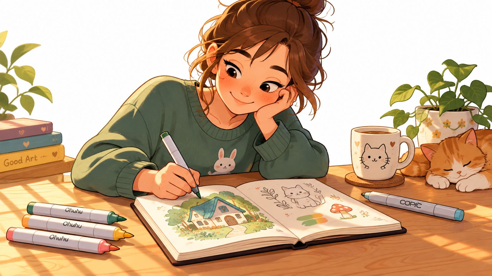
You've got a sketchbook open, three Ohuhu markers uncapped, and a Copic resting across the page like a tiny bridge. The drawing is recognizable, but it still feels a little stiff. You want whimsical art style, not random cartooning, and you're wondering which choices will make the page feel warm, playful, and thoughtfully strange.
This guide gives you a practical way to recognize whimsy on paper. You'll learn what the style means, how six visual ingredients work together, where whimsical overlaps with quirky, cottagecore, and surreal art, and how marker choices such as palette families, ink pressure, layering, and soft lighting can carry the idea. You'll also see how ColorBestie can help preview a whimsical palette before you commit ink to paper, followed by a few ways to keep the result charming without making it feel childish.
A Cozy First Look at Whimsical Art Style
The artist at the desk starts with a small swatch card. A peachy Ohuhu fills one square, a mossy green fills the next, and a muted blue goes beside it. The Copic marker is already dry enough to use, so she tests a curved line beneath the swatches, then adds a tiny sleeping cat to the corner of the page.
The cat is ordinary at first glance, but its tail curls around a teacup. The cup is a little too tall, the saucer tilts toward the viewer, and a tiny window behind it leans as if the whole room is listening. Nothing has become unrecognizable. The drawing follows a gentler set of rules.
That small shift is the heart of whimsical art style. The image keeps enough realism for the viewer to understand the objects, while proportion, color, perspective, and storytelling create a playful opening. You aren't trying to draw a perfect room. You're building a room where a cat can nap beside a lantern-shaped saucer and the scene still feels emotionally believable.
A useful marker habit is to decide what deserves the viewer's first glance. Give that object the clearest silhouette, the lightest open highlight, or the most appealing color family. Then let nearby details support it instead of competing for attention.
Desk-side reminder: Whimsy feels intentional when every unusual choice belongs to the same little world.
The pages ahead move from a working definition to six visible ingredients, then compare neighboring styles, trace the tradition's history, and turn the ideas into a marker workflow. Keep your Ohuhu or Copic swatches nearby. The aim isn't to copy a look. It's to understand the decisions well enough to make your own tiny world.
What Whimsical Art Style Actually Means
Whimsical art style is illustration that bends realism in a gentle, playful, and often tender way. Familiar forms remain recognizable, but their relationships, scale, or visual rules shift. The style creates a world that feels slightly impossible without becoming confusing.
Consider a teacup taller than the table beneath it. A sleeping cat curls around the saucer as if the saucer were a lantern, and a narrow window leans toward the cup. The objects still read as a teacup, table, cat, saucer, and window. Their arrangement creates the story.
This is a controlled break from realism, not an accident caused by loose drawing. The artist chooses which rule to bend and which rules to preserve. If the cup grows taller, its handle may become especially clear. If the architecture leans, the floor line can still guide the eye. If the cat wraps around the saucer, the body needs a convincing curve even though the situation is fanciful.
Start with one familiar object
Choose a simple subject such as a mug, house, mushroom, bicycle, or houseplant. Draw it in a recognizable way first, then change one relationship:
- Make the mushroom cap wider than the stem would normally support.
- Let a house roof sag slightly toward a chimney.
- Give a plant leaves that point toward a moon-shaped lamp.
- Place a tiny door inside a larger teapot.
The distortion should feel like a small, kind joke shared with the viewer. It shouldn't make the object difficult to identify.
Keep the drawing grounded
Whimsy needs a visual foothold. Use a believable overlap, a stable cast shadow, or a familiar contour to keep the scene readable. A marker artist can also preserve clarity by choosing a limited palette and repeating one color in several small details.
Random cartooning changes forms without necessarily creating a shared atmosphere. Whimsy, by contrast, has an internal logic. The viewer senses that the scene could only behave this way inside the world you've drawn.
The next step is to turn that definition into six practical ingredients you can test with markers.
Six Visual Ingredients That Make It Whimsical
A whimsical page doesn't need every possible decorative feature. It needs a few coordinated signals. Line, shape, proportion, pattern, color, and lighting each push the drawing away from strict realism while helping it stay readable.
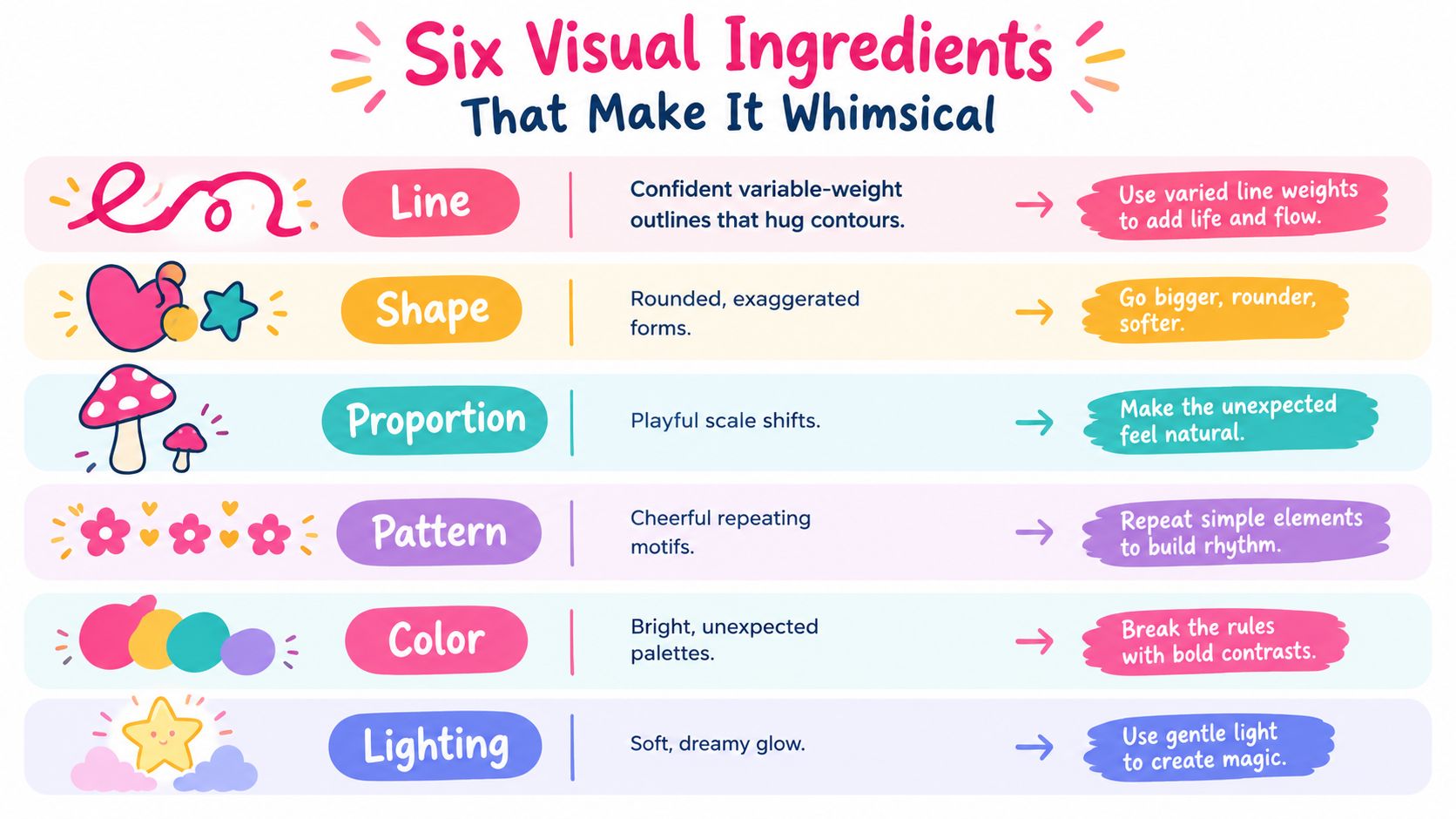
Line
Use a confident contour that follows the object instead of scratching around it. A variable-weight outline can be darker beneath a teapot, softer along a sunlit rim, and slightly heavier where forms overlap.
With an Ohuhu brush nib, lay a mid-tone base around the contour, then deepen the shadow side once the first layer has dried. If you use a Copic liner, let the line describe the bend of the object rather than outlining every section with identical pressure.
Marker takeaway: Press lightly for a delicate outer contour and increase pressure only where overlap or shadow needs emphasis.
Shape
Whimsical shapes often feel rounded, swollen, or gently softened. A roof may bow, a leaf may become plump, and a character's coat may puff around the body.
Use the chisel nib to soften hard corners by placing short angled strokes just inside the edge. Don't erase every sharp shape. Keep one or two corners when you need contrast.
Marker takeaway: Round most silhouettes, then preserve a single firmer edge so the drawing doesn't lose structure.
Proportion
Playful scale shifts tell the viewer where the story lives. A large teapot can dominate a small kitchen, or a tiny figure can carry an oversized umbrella through a garden.
Reserve a pale marker for the enlarged element so it catches attention before the darker background details. You can deepen its underside later without covering the open highlight.
Marker takeaway: Exaggerate one relationship at a time, then give the altered object enough value contrast to read first.
Pattern
Dots, leaves, stitches, stars, stripes, and tiny windows add the feeling of a hand-built world. Repeat motifs sparingly across the page so they connect separate objects.
A fine Copic liner works well for dots over a dry alcohol-marker layer. Let the base dry fully before adding small marks, or the ink may soften more than you intended.
Marker takeaway: Repeat one motif in at least two places, but vary its size so the pattern feels drawn rather than stamped.
Color
Whimsical palettes often rely on related families rather than a full rainbow. Try three to five tones for a single object, such as pale coral, warm coral, muted rose, and a deep berry accent. Soft, rounded forms, warm or pastel palettes, and textured surfaces are commonly associated with the style in this whimsical illustration guide.
For planning, you can test a marker palette generator before pulling every marker from your case. Look for harmony first, then add one unexpected accent.
Marker takeaway: Build families of tones, not isolated color choices.
Lighting
A clear, soft key light gives the scene its dreamy glow. Pick one direction, leave a pale shape on the lit side, and place the darkest marker only along the form-shadow edge.
Avoid filling the entire underside with the darkest color. A gentle cast shadow beneath a cup or cat can anchor the object while keeping the page airy.
Marker takeaway: Decide the light direction before layering, and protect the highlight with the paper itself.
Whimsical vs Quirky vs Cottagecore vs Surreal
These styles share cozy objects, unusual colors, and playful details, so confusion is normal. The easiest way to separate them is to ask what the image is trying to make the viewer feel and which visual rule it bends first.
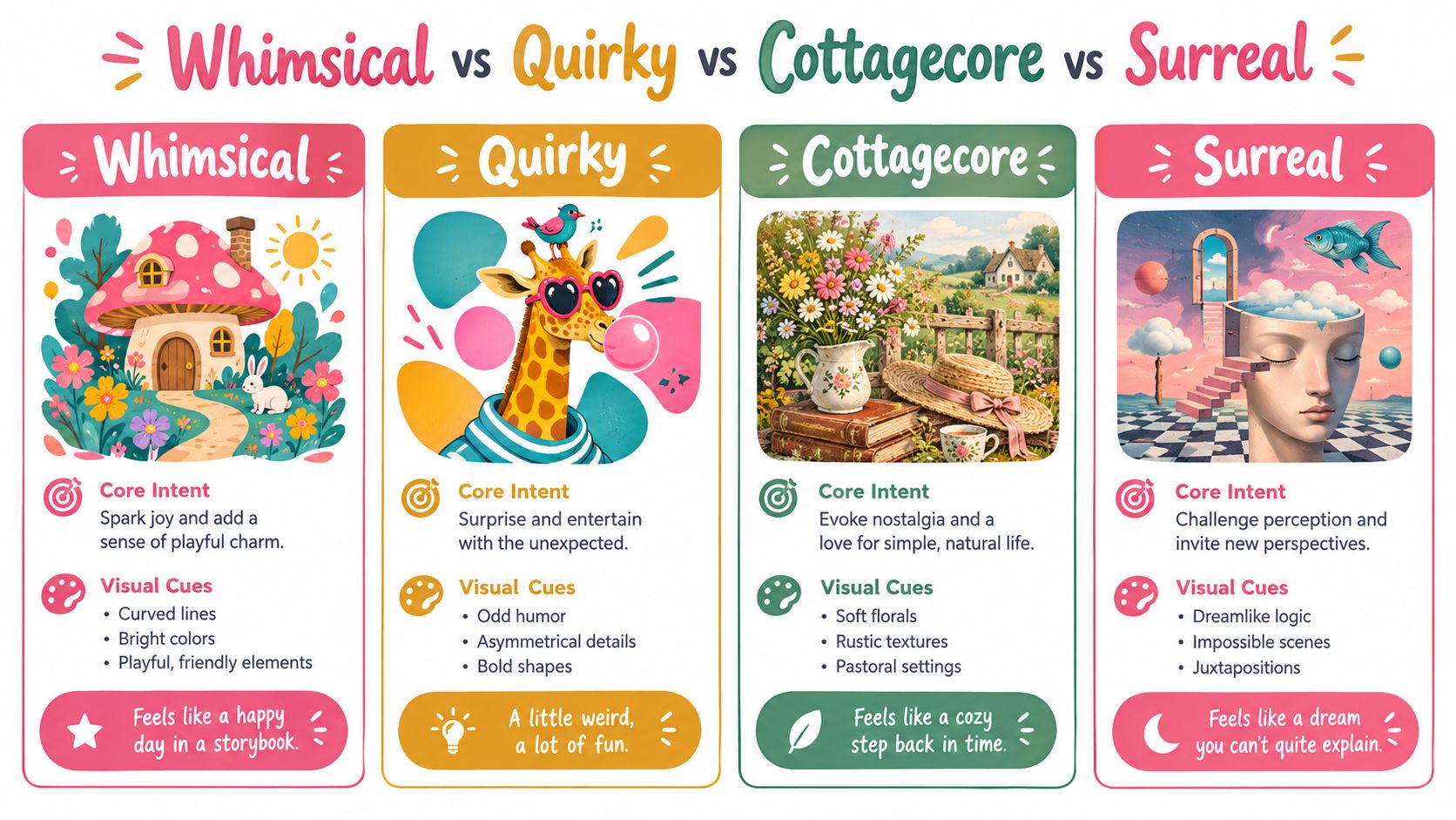
| Style | Core intent | Cues on the page | Marker direction |
|---|---|---|---|
| Whimsical | Playful charm and soft fantasy | Curved lines, gentle distortion, storybook scale | Warm pastels, softened brights, related color families |
| Quirky | Offbeat humor or odd personality | Mismatched props, asymmetry, bold visual jokes | Strong contrasts, unusual pairings, clearer graphic shapes |
| Cottagecore | Pastoral comfort and nostalgic warmth | Florals, rustic textures, gardens, domestic scenes | Sage, cream, terracotta, faded yellow, muted browns |
| Surreal | Dream logic and unexpected juxtaposition | Impossible scenes, altered identities, objects in unlikely settings | Deliberate value tension, unusual color relationships, sharper shifts |
A cottage scene can absolutely be whimsical. A little house with a leaning chimney and a moon tucked into the garden combines pastoral subject matter with playful distortion. The distinction comes from emphasis. Cottagecore usually begins with the feeling of a remembered rural life, while whimsy begins with the gentle rewriting of visual rules.
Quirky work may include a crooked mug or an oversized shoe, but the main reward is often the joke. Surreal art can include a floating teacup too, yet it may abandon the tender narrative warmth that keeps a whimsical image approachable.
For a quick self-check, ask: Is my unusual choice meant to create gentle wonder, odd humor, pastoral nostalgia, or dreamlike disorientation? Your answer will guide both composition and palette.
A Short History of Whimsical Imagery
Whimsical imagery didn't begin with modern cute illustration. Independent art-history commentary traces playful visual culture back thousands of years, including cave paintings, Roman carvings, and medieval illuminated manuscripts. In manuscript margins, monks added creatures and scenes that played beside the formal text, a detail discussed in this overview of whimsy in art history.
That marginal tradition offers a useful lesson for marker artists: the small surprise can carry the personality of a whole page. Add a tiny face to a flowerpot, a bird observing the main scene, or a miniature door beneath a stair. These details don't need to dominate. They need to reward a closer look.
From fairy illustration to storybook warmth
Whimsical and fairy-tale illustration flourished alongside mass publishing in the Victorian era. Arthur Rackham and Edmund Dulac became widely known during the period spanning the mid-19th to early-20th century, while French artist J.J. Grandville created a series of playful, dreamy illustrations dated 1846 and published posthumously in 1847, as described in this illustration-history discussion.
Borrow the period's contour confidence and color storytelling rather than copying its exact costumes or linework. A Copic liner can give a teapot a strong silhouette, while an Ohuhu warm gray can separate its body from a pale background.
A useful historical habit: Let one decorative detail suggest a larger story.
Picture books, comic strips, animation, editorial illustration, and contemporary digital art each expanded the language. Today, artists often combine hand-drawn marks with polished digital previews, keeping visible imperfection as part of the charm. A slightly uneven stripe, a transparent overlap, or a deliberately imperfect dot can make a marker piece feel made by a person rather than assembled by a machine.
Watch the timeline below with that practical lens. Notice how the source of whimsy changes, while the underlying invitation remains familiar: look closer, and you may find another little world inside the first one.
Building Whimsical Art With Markers and ColorBestie
Start with a loose thumbnail in soft graphite. Keep it small enough that you can test the main silhouette quickly, and decide which object receives the playful distortion before adding decorative detail.
A marker-first sequence
- Sketch the world: Draw the large shapes, the focal object, and the direction of the light. Avoid polishing details while the composition is still moving.
- Clean the contour: Use a fine-tip pen compatible with your chosen Copic or Ohuhu workflow. Vary pressure around overlaps, but don't outline every interior mark with equal weight.
- Test the blend: Place light, middle, and dark markers on a scrap swatch. Alcohol-marker color can behave differently on different papers, so test the transition before committing to the final page.
- Layer from light to dark: Fill the broadest pale areas first, then build the middle value and reserve the darkest marker for selective form shadows.
- Add the story marks: Once the base layers dry, place dots, stitches, leaves, stars, or tiny window shapes. Use a warm white gel pen for final highlights rather than covering every bright area with white ink.
For comparing how different marker families behave, use a marker comparison tool alongside physical swatches. The digital check won't replace paper testing, but it can help you narrow the direction before opening a crowded marker case.
Preview before you color
ColorBestie turns a black-and-white sketch or line-art image into a marker-style color preview. You can upload an image up to 10MB, choose from five theme worlds covering palette, mood, style, lighting, and genre, and compare a full-color direction aligned with marker families from brands such as Ohuhu and Copic.
For a whimsical drawing, choose a world that supports the story rather than merely choosing the brightest option. A cozy interior might need warm neutrals with one coral focal object. A woodland character may work better with moss, cream, muted berry, and a small unexpected blue accent.
Try these prompts today:
- Draw a tiny teahouse inside an oversized watering can, with one soft light source and three repeating leaf motifs.
- Color a sleeping orange cat beside a lantern-shaped saucer, using one enlarged object, one patterned surface, and a restrained palette family.
Keeping Whimsy Sophisticated Without Going Childish
Whimsical doesn't mean childish. The style becomes more mature when the artist controls the line, limits the palette, and gives the viewer a clear visual path. That restraint works well for editorial spot illustrations, tea packaging, stationery, and a personal sketchbook spread.
Use a fine-tip 0.05 for selected contour work, especially around small objects and lettering. Swap bubblegum pink for muted coral, pair it with dusty teal, and let warm gray or cream occupy the quieter parts of the page.
A realistic detail can anchor an otherwise fanciful scene. Add a folded napkin beside an impossible teapot, a labeled spice jar in a leaning kitchen, or a carefully rendered clasp on an oversized satchel. The contrast tells the viewer that the distortion is a choice.
For previewing how a palette and lighting direction may change the mood, try a theme preview tool. Keep full saturation for one focal element, then allow desaturated neutrals to give the rest of the composition breathing room.
Before you put the caps back on: Check composition balance, palette restraint, narrative clarity, and confident ink handling.
Choose one small sketch tonight, make one controlled distortion, and test the palette before layering. ColorBestie offers marker-style previews, theme worlds, palette planning, and guidance for translating a line drawing into a whimsical color direction. Visit ColorBestie, upload your sketch, and use the preview to make your first marker decisions with less guesswork.
