
You've just printed a beautifully detailed candy sugar skull, laid out your Ohuhu or Copic markers, and then stopped at the first decision: which colors belong where? The eye sockets invite deep violet, the cheek swirls seem made for pink and turquoise, and suddenly a page that looked relaxing feels like a test.
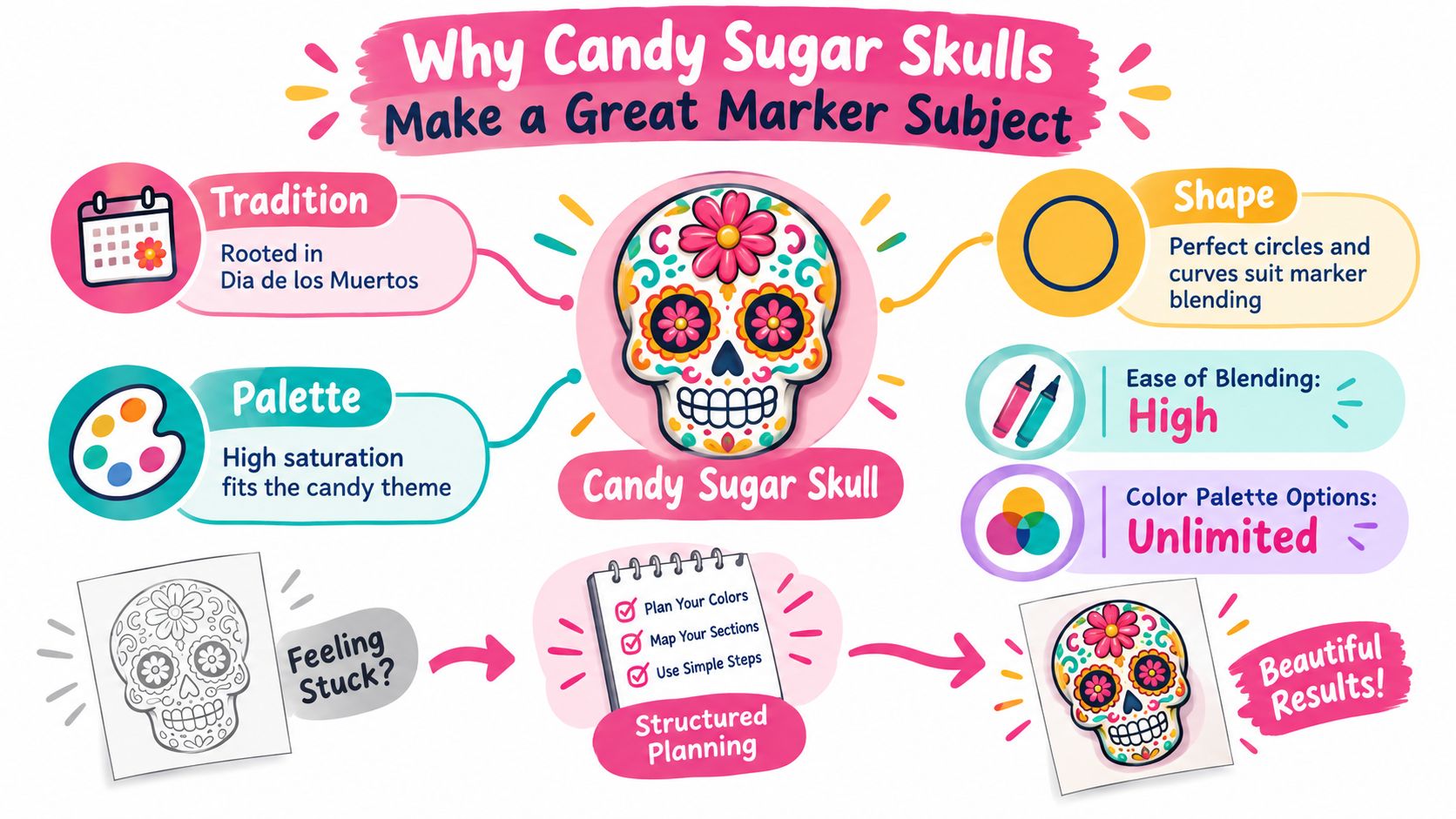
A little structure makes the choice easier. Candy sugar skulls combine broad curved surfaces, tiny decorative motifs, and bold color relationships, so they give you a forgiving subject for practicing alcohol-marker control. They also come from a specific cultural tradition, not a generic spooky aesthetic. Calaveritas de azúcar are closely tied to Día de los Muertos, observed on November 1 and 2, a remembrance tradition that blends ancient Mesoamerican beliefs with later Catholic practices. The candy form emerged after Spanish colonists introduced sugar to Mexico in the 16th century, while earlier offerings used materials such as amaranth and honey. The historical account of sugar skulls and Día de los Muertos also notes that small skulls are commonly associated with children's altars and larger, more elaborate skulls with adults.
That context matters while you color. Bright icing-like decoration belongs to the visual language of the tradition, but a respectful approach keeps the skull connected to remembrance, family, and living craft, rather than treating it as Halloween horror décor. The guide below uses that colorful surface as a calm classroom for flat lays, soft fades, palette planning, and marker substitutions.
Why Candy Sugar Skulls Make a Great Marker Subject
The first time you color a candy sugar skull, start with the forehead. Its rounded shape gives you enough room to test a clean flat fill without worrying about tiny edges. Then move to the cheek swirls, where a short gradient can teach you more about alcohol-marker pressure than a complicated scene ever could.
The skull's design naturally divides into useful practice zones:
- The forehead and cranium offer broad, smooth areas for a base color and a controlled shadow.
- The cheek spirals and floral motifs let you practice tight curves with a bullet or fine nib.
- The eye sockets and nasal cavity create strong dark accents that make surrounding candy colors look brighter.
- The teeth reward restraint, because a pale cream or cool gray usually reads more convincingly than stark white paper.
Color can stay joyful and intentional
Día de los Muertos is often described as a 3,000-year-old Mexican tradition, rooted in pre-Hispanic civilizations including the Aztec, Maya, and Toltec. The sugar skull is a later addition, formed from cane-sugar paste introduced after the Spanish conquest, yet it has become an iconic expression of the holiday. The modern craft history of sugar skulls describes them as decorations placed on ofrendas during November observances and as a sugar-based folk art that continues in Mexico today.
That makes saturated markers a natural fit. Raspberry pink can echo icing, turquoise can suggest a bright wrapper, and lemon yellow can separate petals from bone shapes. A slightly uneven layered bloom can even resemble crystallized sugar, provided you control where it spreads.
Colorist's rule: Use brightness to celebrate the design, and use contrast to keep every symbol readable.
Treat your first skull as a low-pressure study. You're not trying to make every blend invisible. You're learning how a light base changes under a second pass, how a dark socket anchors a face, and how different marker brands interpret the same palette.
Sketching and Prepping Your Skull Line Art
Good marker work starts before the cap comes off. A clean drawing gives alcohol ink room to move without fighting rough graphite, weak paper, or overly heavy outlines.
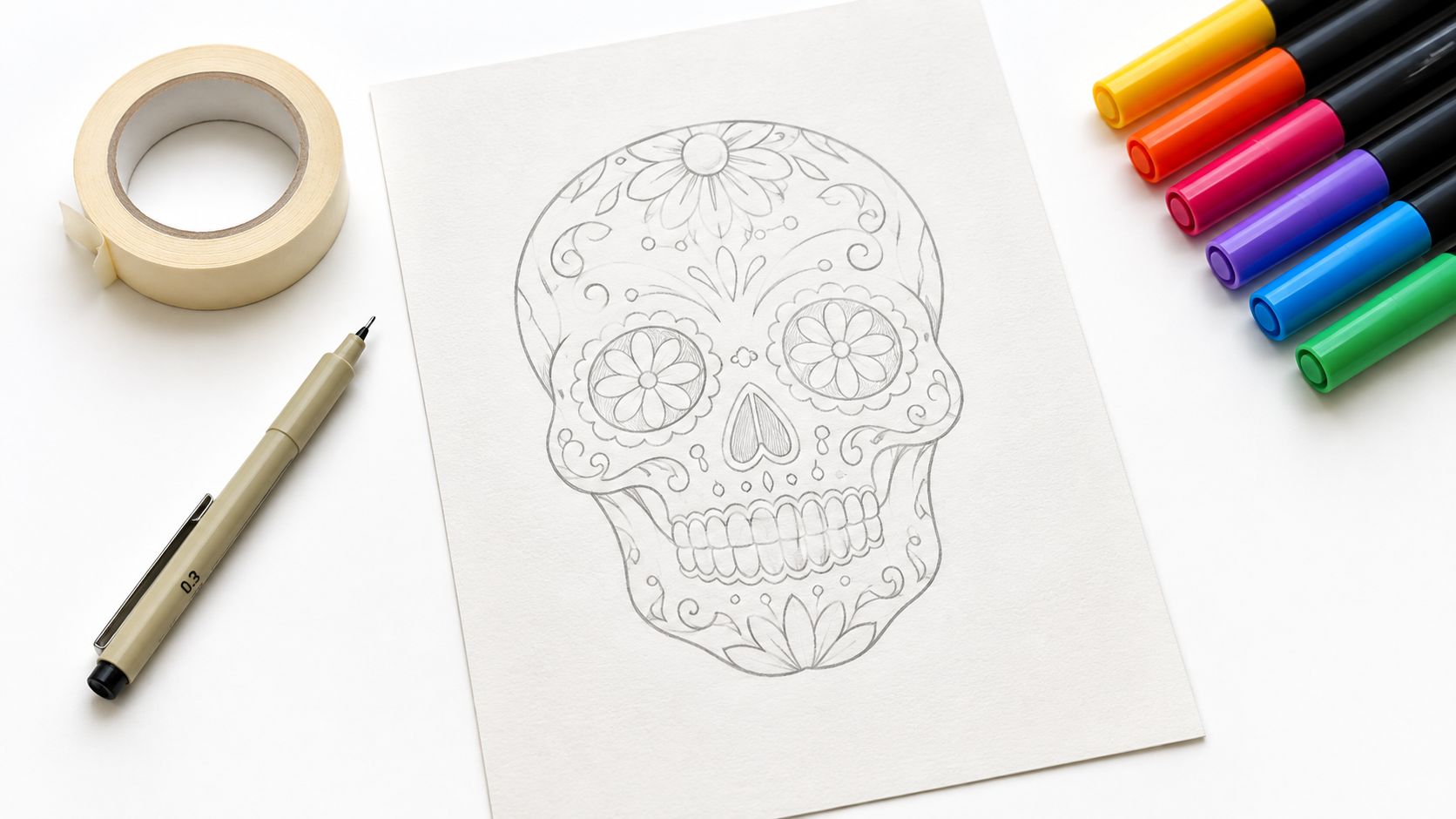
For a reliable base, choose bleed-proof marker paper or 160 gsm Bristol. Marker paper usually handles repeated passes with less feathering, while Bristol gives a firmer surface for crisp decorative lines. If you're transferring an outline, use a light 2H mechanical pencil. It creates a pale guide that's easier to cover than a soft, dark graphite line.
Build a clean drawing surface
Keep the line weight consistent across the skull. Heavy lines around the eyes and hair can look intentional, but random changes in thickness may catch the marker tip and interrupt a smooth fill. For freehand work, sketch the main oval first, then place the eye sockets, nasal cavity, teeth, and cheek decorations before adding flowers or filigree.
A few transfer methods work well:
- Light box: Place the reference beneath marker paper and trace with a relaxed hand.
- Graphite transfer paper: Useful when the final sheet is too opaque for a light box.
- Window transfer: Tape printed line art on 90 to 100 gsm copy paper to a window, place the final sheet above it, and trace the visible contours.
Protect the outside edge with low-tack tape if you want a clean border. Put a scrap sheet beneath your coloring hand, not just beneath the artwork. Alcohol markers can transfer ink and skin oils onto the paper, especially around pale cheek areas.
Test before committing
Touch each nib to a corner or separate swatch strip. Check whether the broad chisel leaves a smooth edge, whether the bullet tip skips, and how far the ink travels through your chosen paper. Cap the marker immediately after testing so the nib doesn't dry while you study the result.
Before adding ink, make a short mental scan of the cheek swirls, eye sockets, teeth, and border. Decide which zones must stay pale, which lines must remain visible, and where you'll leave small highlights. That half-minute prevents the common mistake of filling a highlight just because the blank paper looks unfinished.
Laying Down Flat Color Without the Stress
Flat color is not a lesser stage of the drawing. It's the structural pass that tells you whether your palette works before shading complicates the page.
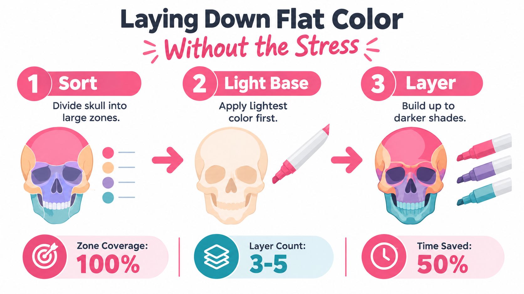
Divide the skull into large blocks first: forehead, cheeks, eye sockets, nasal cavity, teeth, flowers, and background. Assign each block a role in the palette. For example, use a pale raspberry on the cranium, mint around the cheeks, lavender in the sockets, and lemon for petals. You can change the choices later, but a small margin legend keeps you from guessing halfway through.
Work from light to dark
Lay down the lightest marker tone first. Let the area dry for about 30 seconds before returning with the midtone, then add the darker accent only where the form needs definition. This pause matters because wet alcohol ink can make a second stroke spread farther than expected.
Keep strokes moving in one direction within each zone. With the broad chisel nib, angle the long edge parallel to the curve of the forehead or cheek. Turn to the bullet tip for teeth, tiny petals, and narrow swirls. Avoid chasing wet edges across several colors at once. Pink and turquoise may look lively beside each other, but if you work both while saturated, they can pool into a dull transition.
Practical rule: One zone, one marker sequence. Finish the light base before you begin the next layer.
Keep a scrap sheet beside the artwork. Test saturation there, especially when a nib has just been refilled or a marker has been stored horizontally. Cap markers between zones, and write a tiny legend such as “mint, cheek” or “lavender, socket” beside your swatches.
For a quick demonstration of controlled first-pass coloring, use this marker comparison guide to check how available sets may differ before you begin.
The strongest flat fills usually come from fewer, more deliberate passes. If the paper already looks even, stop. More ink won't automatically make the color richer, and oversaturation leaves less room for later shadows.
Shading, Blending, and a Candy-Inspired Palette
A candy sugar skull reads as rounded when the shading follows its forms instead of sitting like a flat mask. Begin with a middle value across the cranium, cheek hollows, and nasal cavity. Add a darker tone beneath the jaw, behind the eye sockets, and inside the deepest decorative recesses. Leave the brow bone and upper forehead lighter so the face keeps a lifted, curved appearance.
Build a palette that separates the design
Brightness alone will not make a candy palette work. Raspberry, bubblegum pink, lemon, mint, and lavender create useful temperature changes while keeping the skull playful rather than grim. Reserve the strongest dark for sockets, narrow outlines, and small floral centers. Too much dark ink flattens the candy effect.
The table maps practical roles to example marker codes across common families. Treat each code as a workable starting point, since paper, nib condition, and layering can shift the result.
| Candy Color Role | Light Swatch | Mid Swatch | Shadow Swatch | ColorBestie Brand Codes |
|---|---|---|---|---|
| Raspberry icing | Pale pink | Raspberry pink | Deep berry | Ohuhu R2 / Copic R83 / Prismacolor PC1029 / Spectrum Noir PP3 |
| Bubblegum accent | Soft blush | Bright pink | Magenta | Ohuhu R19 / Copic RV04 / Prismacolor PC1031 / Spectrum Noir BP6 |
| Lemon candy | Pale lemon | Warm yellow | Golden ochre | Ohuhu Y2 / Copic Y13 / Prismacolor PC1003 / Spectrum Noir CT2 |
| Mint sugar | Pale mint | Fresh mint | Teal green | Ohuhu GY3 / Copic G02 / Prismacolor PC992 / Spectrum Noir MG2 |
| Lavender shadow | Pale lilac | Lavender | Plum violet | Ohuhu V250 / Copic BV02 / Prismacolor PC1026 / Spectrum Noir LV2 |
Use the palette generator for marker-friendly color planning to check substitutions against the markers in your drawer. A named color can behave differently across ranges, so test the actual ink before committing a large area.
Blend the form, not every edge
On smooth heavyweight paper, wet-on-wet blending can give the forehead a soft fade. Lay down the light tone, touch in the midtone while the base remains active, then pull the transition outward with the lighter marker. For a more controlled dry blend, let each pass settle before adding the next. A colorless blender can soften a hard band, but it cannot fix a muddy color relationship.
Use the darkest shade behind the eye sockets, then echo a smaller version near each cheek hollow. That repeated shadow connects the facial structure. Keep the flower crown and swirl motifs brighter or lighter than the bone zones when they overlap, or the decoration will disappear into the cranium.
A useful test: Squint at the skull or view it as a small phone thumbnail. If the sockets, teeth, and main flowers still separate, the value structure is working.
A readable result matters more than a perfectly invisible blend. Candy-style marker art benefits from a few confident transitions that suggest icing, petals, or sugar texture. Stop once the forms read clearly, because extra blending can erase the crisp color boundaries that give the design its candy character.
Using ColorBestie to Plan Marker-Friendly Palettes
Digital planning helps when your desk is full of markers but your palette still feels uncertain. ColorBestie can take an uploaded sketch or line art, apply a marker-style color preview, and align suggested colors with marker families including Ohuhu, Copic, Prismacolor, and Spectrum Noir. It works best as a planning layer between inspiration and paper, not as a replacement for testing real ink.
Start with a mood phrase such as raspberry-lemon-mint. Keep the first palette compact, perhaps five to seven swatches, so the skull has a clear visual hierarchy instead of a different color in every opening. Lock the colors that define the mood, then use the remaining slots for a dark anchor, a pale bone tone, or a background accent.
Check the preview against your physical set
Look at the preview on your phone first. A mobile-first view makes it easy to judge whether the eye sockets still read as the darkest areas and whether the cheek swirls remain distinct at a small size. If two pinks merge in the digital preview, they're likely to compete on paper as well.
Use the workflow below:
- Upload the line art and choose a candy-focused mood.
- Review the full-color preview over the skull template.
- Check brand alignment for the marker series in your drawer.
- Export a labeled swatch card with light, middle, and shadow roles.
- Test the lightest and darkest pair on scrap paper before coloring the final.
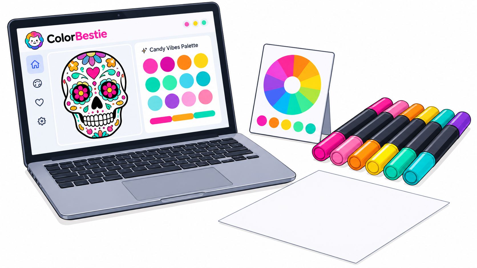
The preview can show how a pair of related pinks may merge across a forehead or how a mint accent changes beside lavender. Real paper will always introduce variables, including absorbency, drying time, and nib pressure, so treat the digital result as a map.
Before committing, print or copy the swatch names into the margin of your artwork. If the skull still reads clearly when reduced to a thumbnail, the palette has enough separation to support the later shading passes.
Fixing Streaks, Pools, and Paper Warp
Three problems appear repeatedly in marker skulls: streaky fills, pooled ink in tiny motifs, and warped paper around heavily colored temples or cheeks. Each one has a different cause, so adding more ink usually makes the result worse.
Streaks often come from a dry nib or fast, hesitant strokes. Refresh the nib on scrap paper, slow down, and overlap each pass while the previous one is still workable. If the marker skips only on one part of the page, check the paper surface for graphite, oil, or a slight texture change.
Pools collect inside flower centers and narrow swirls because those shapes hold liquid longer than broad areas. Switch to a fine tip, reduce pressure, and watch the edge rather than flooding the center. If ink begins moving outward, tap the area gently with the marker barrel or a lint-free cloth held at the edge. Don't drag the cloth across the drawing.
Recover a muddy blend
When raspberry and turquoise turn brownish, another dark layer won't restore clarity. Recolor the zone with a clean midtone that belongs to the dominant color family, let it settle, and then add a small accent instead of rebuilding the entire gradient.
Paper care: Give the sheet support while it dries. A flat board under the work keeps raised corners from becoming permanent habits.
For mild warp, apply a light coat of colorless blender to the back of the sheet, then store it under a flat board overnight. Save your heaviest bleed-proof paper for final pieces, and use cheaper sheets for palette experiments. That trade-off protects both your budget and your confidence.
Building a Cozy Candy Skull Coloring Practice
A single skull can become a useful weekly exercise when you repeat the motif with a different color family. Keep one sketchbook page or printable ready for small variations, then rotate between raspberry-led, mint-led, and lavender-led combinations.
Five habits keep the practice gentle:
- Track pairings: Write down combinations that blend cleanly, including the light, mid, and shadow markers.
- Set a small target: One finished skull each week is enough to build comfort with layering without turning relaxation into homework.
- Revisit old work: After some time away, add a restrained shadow or a fresh accent to an earlier piece and compare the result with your first pass.
- Batch your setup: Prepare paper, pencils, scrap sheets, and swatches before coloring so the session begins with a marker in your hand.
- Preview the next mood: Use Theme Preview to explore a direction before choosing the physical markers.
The most useful record isn't a perfect finished page. It's the note that says a pale mint disappeared beneath raspberry, or that lavender made the teeth look too cool, or that a particular nib handled cheek spirals beautifully. Those observations turn casual coloring into practical color knowledge.
ColorBestie lets you upload line art, generate marker-style color previews, compare palette ideas, and translate suggestions across Ohuhu, Copic, Prismacolor, Spectrum Noir, and other marker ranges. Visit ColorBestie to plan your next candy sugar skull palette on your phone, test the mood before touching paper, and start coloring with a clear, comfortable direction.