
You're halfway through a portrait, and the face has somehow turned orange. The forehead looks flat, the cheek has gone waxy, and every extra pass seems to make the problem harder to fix. You reach for another marker, hoping the next color will rescue the skin, but the palette was already missing a plan.
A convincing skin tone color palette isn't one “flesh” marker. It's a controlled relationship between undertone and depth, built from a base, mid-tone, shadow, bridge, and protected highlights. Once those roles are clear, marker choices become faster, blending becomes cleaner, and you stop repainting the same cheek five times.
Why Your Marker Skin Tones Look Off
The most common mistake is asking one mid-tone marker to perform every job. A single E-series color may establish a general complexion, but it can't also describe the light side of the face, the warm middle planes, the cool turn beneath the cheekbone, and the deeper edge under the hairline. The result often reads as orange, gray, or strangely flat because the marker is carrying too much visual responsibility.
A second problem is choosing depth while ignoring undertone. Two complexions can have similar lightness while leaning peach, yellow, olive, pink, or muted neutral. If you match only how dark the skin looks, the portrait can have the correct value and still feel wrong.
Practical rule: Choose the temperature family first, then choose how light or deep the complexion reads inside that family.
Alcohol markers also punish rushed layering. If you keep adding ink before the previous layer settles, the paper fibers can become rough and the pigment can pool unevenly. Long repeated strokes across the same area create streaks, while aggressive blending can erase the clean value structure you needed in the first place.
One marker versus a working palette
With one E-series marker, the face usually gets a uniform wash. You may add darker lines around the nose or jaw, but those marks sit on top of the complexion instead of growing naturally from it.
A planned set behaves differently:
- Base: Establishes the overall undertone across the skin.
- Mid-tone: Builds the turning planes of the face.
- Shadow: Describes form beneath the cheekbone, jaw, nose, and hairline.
- Bridge: Softens the jump between the middle and deeper values.
- Highlight: Usually remains bare paper, with the lightest tint reserved for selective areas.
The portrait becomes more believable because the colors cooperate. Skin appears lively through subtle shifts, not through a single perfect swatch.
Reading Undertone and Depth Like a Pro
Treat undertone and depth as separate decisions. Undertone describes the color bias, such as warm, cool, neutral, olive, peach, or red. Depth describes how light or dark the skin appears in the reference. Mixing those axes too early is why broad labels like “medium skin” often fail at the marker desk.
Modern scales support a more precise approach. Sociologist Ellis P. Monk created the Monk Skin Tone Scale in 2019, and Google later adopted it in 2020 as a 10-shade open-source system, according to Harvard's explainer on skin-tone classification. The older Fitzpatrick Scale dates to 1975 and uses 6 broad categories, while Monk's scale was designed to represent a wider continuum.
PERLA provides another useful reference, with an 11-step palette ranging from the lightest tone at 1 to the darkest at 11, as described in the peer-reviewed discussion of skin-tone measurement. You don't need to print either scale beside every drawing. Use them as a mental reminder that depth moves gradually, rather than jumping between pale, medium, and dark.
Finding undertone in a reference
Start with daylight near a window. Look at the jawline, not just the center of the cheek, because blush, reflected color, and local redness can mislead you. On your own wrist, veins can offer a rough clue, but confirm that impression against the jawline shadow and the overall face.
A cream-versus-paper comparison can also help. Against warm cream, a cool or pink complexion may look more noticeable, while an olive or yellow complexion can appear greener or more muted. Treat these tests as starting points, not fixed diagnoses. Palette-based self-assessment can correlate well with instrument readings, but validation research on skin-tone palettes also warns that instruments, raters, and broad categories don't always agree.
| Depth Range, Monk or PERLA | Warm Undertone | Neutral or Olive | Cool or Pink |
|---|---|---|---|
| Very light to light | Peach, apricot, soft golden beige | Muted beige, pale olive beige | Rose beige, soft pink beige |
| Light to medium | Honey beige, warm tan | Sand, muted golden olive | Pink tan, rose brown |
| Medium to deep | Caramel, amber brown | Olive brown, neutral umber | Red brown, muted berry brown |
| Deep | Warm cocoa, red cocoa | Deep olive brown, neutral earth | Plum brown, cool espresso |
Before picking a marker, ask two questions: Does the reference lean warmer, cooler, or more muted? How deep does it read beside the white of the eye and the highlights? Answering in that order prevents undertone from being confused with shadow.
Picking Base, Mid, and Shadow Markers
Build every working palette around four jobs: base, mid, shadow, and bridge. A highlight isn't always a marker slot, because bare paper usually gives a cleaner result than repeatedly coloring over the lightest planes.
For very fair skin, Copic E000 or E00 can serve as a base, depending on whether the reference looks more delicate or more beige. E11 works as a light mid-tone, while E21 adds a warm shadow. For a deeper shadow, try E33 or E37, adjusting according to the reference and the amount of contrast in the lighting.
Those codes aren't universal recipes. They're useful anchors within the Copic E family, but the same role may be filled by a different label in Ohuhu, Spectrum Noir, or Winsor & Newton. Compare the actual swatch, not the printed name. “Tan,” “skin pink,” and “almond” can vary considerably between brands.
Assign each marker a job
- Base: Cover the main skin area with the undertone visible. A peach base creates a different portrait from a yellow beige base, even when both are equally light.
- Mid-tone: Reinforce the cheek, side of the forehead, temple, and turning side of the nose. This layer gives the face volume without making every edge a hard contour.
- Shadow: Place it selectively under the cheekbone, lower lip, jaw, nostril, and hairline. Deep color belongs where form turns away from the light, not everywhere the drawing needs definition.
- Bridge: Use a neighboring value to connect the mid-tone and shadow. This is especially helpful when the shadow marker is much stronger than the base.
A useful brand-neutral workflow is to compare marker colors across major brands before buying a replacement. Check the dried swatches under the same lighting in which you'll draw.
If the base looks too pink beside the reference, move toward a warmer beige or muted yellow and keep the pink marker for cheeks or cool reflected light. If it looks too yellow, shift toward peach, rose beige, or a neutral brown. Don't compensate for a wrong base by piling on shadow. That only makes the face darker without correcting its temperature.
Layering and Blending Without Muddy Skin
Begin with a fully dry patch of marker paper and lay down the base in flat, parallel strokes. Keep your pressure steady and cover the skin area without repeatedly scrubbing the same spot. A smooth base gives every later color a stable surface.
Drop the mid-tone into the shadow side while the base is still wet if you want a soft bleed. Keep that transition controlled. You're trying to merge the edge, not soak the entire face.
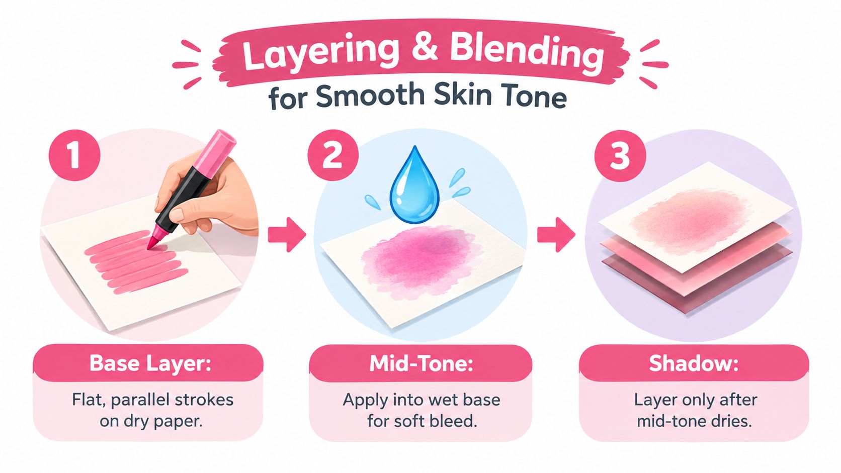
Let the mid-tone dry before adding the shadow. Use the chisel tip in small circular motions or short shaped marks around the cheekbone, jaw, nose, and hairline. Long sweeps across a drying area often leave visible bands and push too much pigment into one direction.
Protect the light
Leave the forehead highlight, bridge of the nose, upper cheek, and small lip highlight as bare paper when the reference supports it. Use the lightest tint only where you need a gentle transition, rather than covering the entire face with it.
For blush, make one diluted pass with a peach or rose marker. Feather its outside edge quickly with a colorless blender before either color sets. Blush should sit inside the base structure, not replace it.
Stop when the swatch looks even and the form reads clearly. Extra passes don't automatically add realism. They often push the complexion toward gray because multiple alcohol layers reduce the clean separation between your chosen temperatures.
Testing Your Palette with ColorBestie
Before committing ink to a finished portrait, test the palette on a simple face reference. Select five swatches from your collection, including a base, mid-tone, shadow, bridge, and optional blush, then compare them against the target undertone and depth.
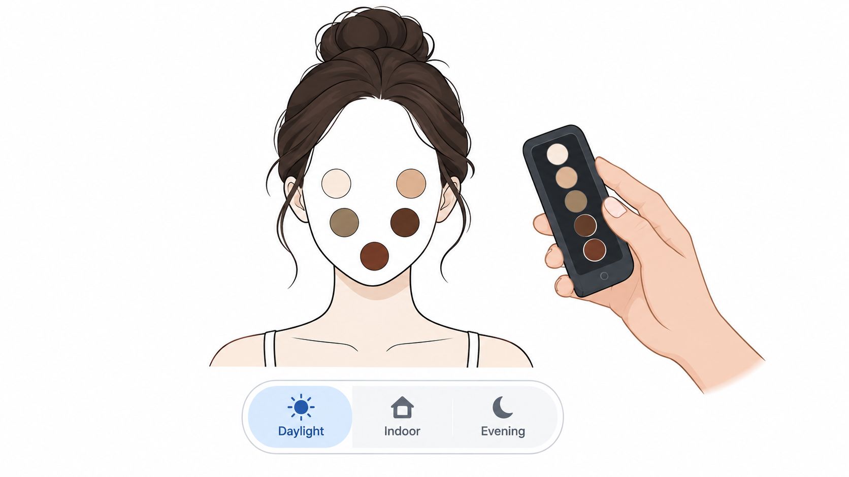
ColorBestie can turn a photo or line-art reference into a marker-style color preview, then help you inspect how a selected palette behaves across visual treatments. Use the Palette Generator to create a starting group, but treat the result as a planning aid rather than a substitute for physical swatches.
Test the palette under changing light
Toggle daylight, tungsten, and overcast previews. A base that looks balanced in daylight may turn orange under warm indoor light, while a shadow that seems rich in one setting may become ashy in another. The point isn't to find a palette that looks identical in every condition. It's to notice which color relationships remain useful.
After the first pass, place two custom blend swatches over the cheek and jaw to mimic marker overlap. Check whether the shadow still separates from the mid-tone without becoming a dark block. Export a side-by-side view against the reference so you can judge hue shift as well as value.
Watch the troublesome colors. If the base turns orange under tungsten, choose a less yellow starting color or reduce the warmth in the mid-tone. If it becomes ashy in daylight, replace a grayish bridge with a clearer peach, rose, or earth color. This small preview step is faster than discovering the mismatch after the face is already saturated.
Adapting for Lighting, Age, and Ethnicity
Warm, cool, and neutral labels are useful only until the reference introduces real conditions. Backlighting, indoor bulbs, reflected clothing color, age-related changes, and deeper complexions all alter how a marker palette reads. A generic warm-cool chart can't make those decisions for you.
Cool evening light can pull the whole face toward lavender. In that situation, a restrained violet mid-tone may describe the turning planes better than a usual yellow beige, while yellow highlights can look disconnected. Warm indoor light does the opposite. It warms the shadow family, so a familiar cool brown may become muddy beside the reference. A warm cocoa can keep the shadow integrated.
Older skin needs a lighter touch with chroma. Reduce the intensity of the shadow color and let fine texture lines, softened edges, and value changes describe age instead of drawing every crease with a dark marker. Overstated lines can make the face look graphic rather than naturally textured.
Build for the person, not the category
Ethnicity shouldn't be reduced to a single undertone label. Depth often changes more dramatically than the basic temperature family, and people within any broad group can have warm, cool, olive, or neutral shifts. Build the palette around a chosen Monk or PERLA depth step, then adjust undertone from the actual reference.
| Variable | Palette Shift | Marker Change |
|---|---|---|
| Cool evening light | More lavender or muted blue influence | Add a restrained violet mid-tone and soften yellow highlights |
| Warm indoor light | Warmer overall shadows | Replace a cool shadow with warm cocoa or red brown |
| Older skin | Lower saturation and softer shadow contrast | Use a quieter shadow and let texture marks carry detail |
| Deeper complexion | Greater need for layered depth | Choose a transparent base, distinct mid-tone, and earth-rich shadow |
| Mixed or uncertain undertone | Less confidence in one temperature family | Test neutral and olive bridges before adding strong warmth |
Rerun the preview whenever the reference changes. The same four-marker structure can work across many subjects, but the actual swatches must follow the lighting and complexion in front of you.
Saving a Reusable Skin Tone Swatch Card
A swatch card saves more time than a marker drawer full of hopeful guesses. Make a fixed template with undertone columns for warm, olive, cool, and neutral, then add rows for the depth steps you use most often. Each row should have slots for base, mid-tone, shadow, bridge, and a blank highlight area.
Swatch every relevant marker on the paper you use. Write the marker name on the front or back, add the date, and record the light source, such as window daylight, studio light, or a warm lamp. Alcohol marker color can appear different as the ink dries, and your working conditions can change the way neighboring colors relate.

Keep the finished card in a clear sleeve beside your markers, with a blank copy behind it for new character references. A brand conversion tool such as Decotime to Ohuhu Converter can help when your palette starts in one marker range and your working set uses another, but always verify the result on paper.
Thirty-second palette check
- Choose undertone: Warm, olive, cool, or neutral.
- Match depth: Select the closest row on your chosen multi-step scale.
- Assign roles: Pick base, mid-tone, shadow, and bridge.
- Protect highlights: Mark the areas that will remain paper white.
- Check lighting: Confirm the card was swatched under a comparable light.
- Test overlap: Blend a small cheek and jaw sample before starting the portrait.
Pin the checklist beside your marker case. The habit should feel like selecting tools, not researching skin color from scratch every time.
ColorBestie lets you upload a sketch or reference, preview marker-friendly color ideas, and compare palettes before you commit ink. Visit ColorBestie to test your next skin tone color palette, then pair the digital preview with your physical swatch card for a calmer, more deliberate portrait workflow.
