
You open a marker set online, then another one, then a third. Every swatch looks bright, every review says “smooth blending,” and suddenly you're trying to decide whether you need 12 colors, 24 colors, a brush tip, a chisel tip, a refillable system, or a whole desk full of grays before you've even colored a single page.
That confusion is normal. Alcohol markers for beginners only start feeling simple when you understand three things at once, the ink, the paper, and the way you build color. Once those pieces click, the buying decisions get much easier, and the expensive trial-and-error starts to shrink.
Understanding Alcohol Markers and Why They Matter
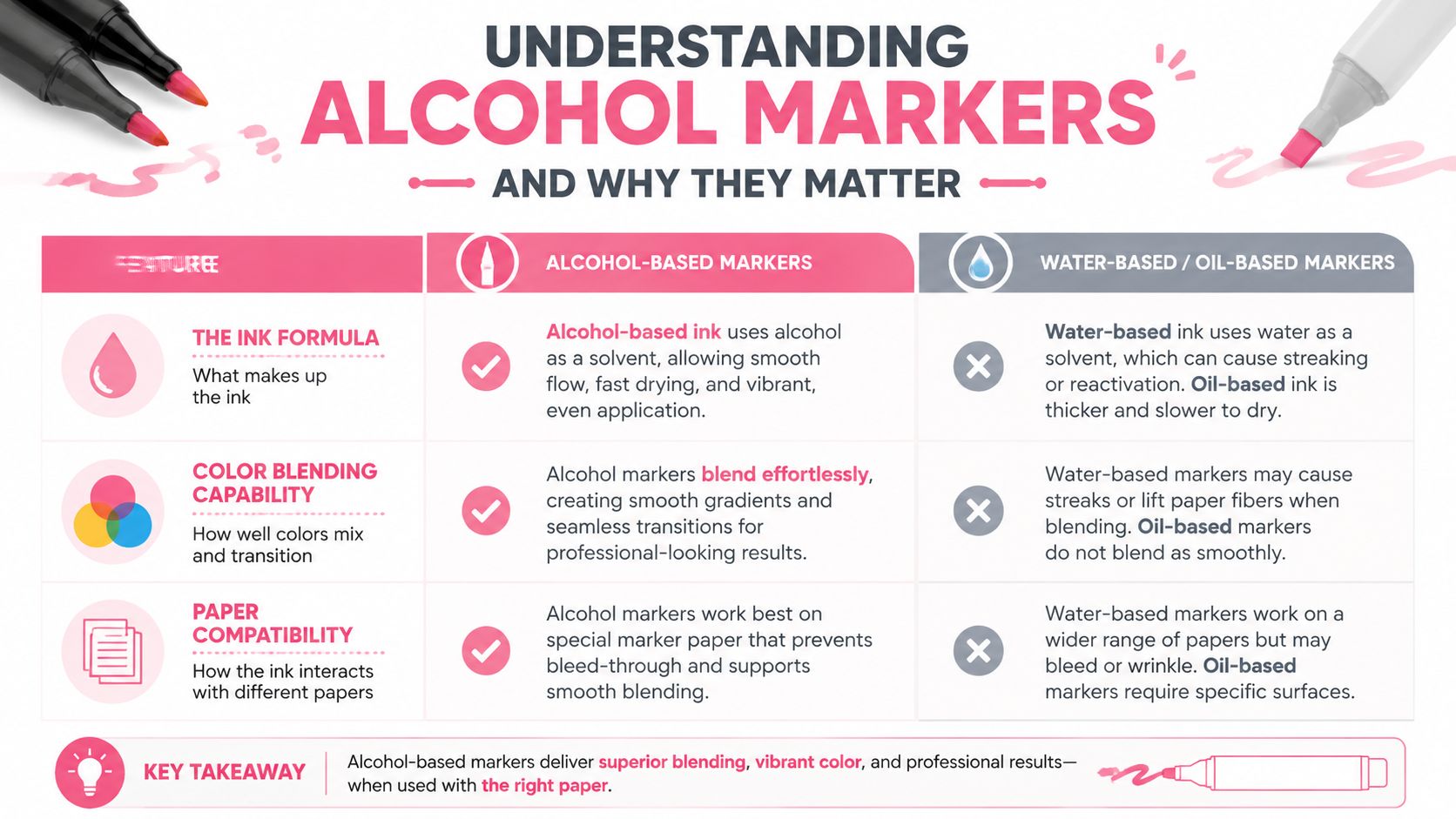
Open a set of alcohol markers and the first thing that matters is not the color name on the cap. It is how the ink behaves on paper. Alcohol-based ink is made to dry fast, spread evenly, and layer cleanly, which is why beginners are usually told to start with the lightest shade first and build darker tones while the surface still has some give. A simple habit helps here. Make color samples on the same paper you plan to use, because swatches show the marker's real behavior instead of the promise on the cap The Virtual Instructor.
What makes them different from water-based markers
Water-based markers give you more time to move color around, but that extra working time can come with more streaking. Alcohol markers are built for rapid blending and smoother gradients, which is why they show up so often in coloring books, manga, illustration, and sketch work Art Is Fun. The short working window changes how you paint the page. If you pause too long, the edge starts to set. If you move with purpose, the tones blend while the ink is still open.
Practical rule: plan your light-to-dark order before the nib touches the page. Alcohol ink responds better to a clear sequence than to hesitation.
The parts you'll use most
A marker is more than a colored barrel. The barrel holds the ink reservoir, the nib carries that ink to the page, and the nib shape changes how the marker feels in your hand. Beginner sets often use dual tips, commonly a 1.0 mm fine tip on one end with a broader chisel or brush end on the other, so one tool can handle detail work and larger fills Target Ohuhu marker listing.
The hidden cost for beginners is usually not the marker itself. It is the paper. A marker that looks rich and smooth on the wrong sheet can bleed through, pill up, or make blending feel muddy, and that can push you to buy more sets when the fix is better paper and a little planning. Tools like ColorBestie can help you map a color plan before you commit ink to the page, which reduces the kind of trial-and-error that gets expensive fast.
If you color for relaxation, alcohol markers make sense when you want vivid color and soft blending. If you draw characters, they are a strong fit for skin tones, hair, shadows, and clean edges. The category can look overwhelming at first, but the working logic stays simple. Smooth ink, fast drying, careful layering, and the right paper.
Choosing Your First Markers and Nib Types Explained
Brand names can make beginners feel like they need a ranking spreadsheet. You don't. You need a clear idea of what you'll color most often, because the right marker set for adult coloring books isn't always the right one for illustration practice.
A practical look at common beginner choices
Copic is the familiar professional name because it's refillable and supports replaceable nibs, which matters if you plan to build a long-term collection. Prismacolor is often chosen for its color range and artist-grade reputation. Ohuhu is popular for budget entry, and Spectrum Noir sits in the middle with beginner-friendly blending options. A detailed buying guide also notes that some brands are refillable while others are more of a low-cost entry option, which changes the long-term value picture Luuk Minkman.
| Beginner Marker Brand Comparison | |||
|---|---|---|---|
| Brand | Price Range | Refillable | Best For |
| Copic | Higher | Yes | Frequent use, long-term collection building |
| Prismacolor | Higher | Varies by line | Strong color range, illustration-minded users |
| Ohuhu | Lower | No on many beginner sets | Casual coloring, first practice set |
| Spectrum Noir | Mid-range | Some options | Balanced entry for blending practice |
If you want a quick way to compare color families and set sizes before buying, the marker comparison tool can help you line up options side by side.
How nibs change your control
Brush nibs feel flexible and expressive. They're great for organic shapes, hair, fabric folds, and anything that benefits from pressure variation. Chisel nibs cover larger areas quickly and can still make thin lines if you use the edge. Fine tips handle small details, edges, and cleanup work. That's why so many beginner sets use a dual-tip format, it gives you two jobs in one marker Target Ohuhu marker listing.
Most beginners don't need more nib styles. They need one comfortable nib, a few neighboring colors, and the patience to practice the same stroke several times.
Building Your Starter Set Without Breaking the Bank
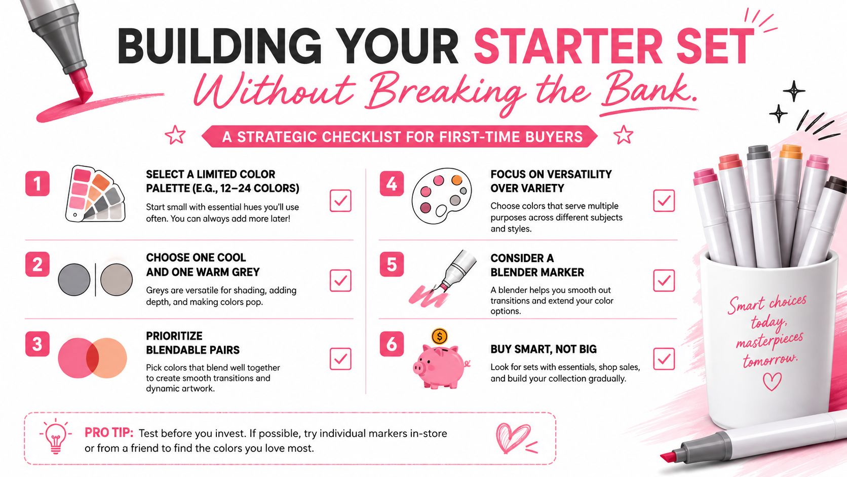
A beginner set can look generous on the box and still be awkward in use if the colors do not support each other. A smaller set with useful overlaps between hues usually teaches more, because you learn how markers behave in families instead of treating each pen as a separate purchase.
What a beginner palette needs
A solid starter palette usually centers on one lighter and one darker variant in the same color family, plus a few core neutrals. That gives you a small range you can reuse across many drawings without buying a huge collection right away. One instructional guide recommends making color samples, choosing one lighter and one darker variant for each family, and adding at least three gray markers to practice shading control The Virtual Instructor.
You will usually get more usable learning value from:
- Warm grays and cool grays, because they help you practice shadow direction.
- Skin tones, if you color people, portraits, or manga characters.
- Primary colors, so you can test mixing behavior without guessing.
- A colorless blender, which helps soften edges and lift highlights.
Why “more colors” isn't always better
A 24-color set with sensible neighbors can teach blending better than a random larger set. What matters more than the count is the presence of adjacent values within each color family. That makes it easier to move from light to medium to dark without a harsh jump. Larger packs can widen hue coverage, but they do not automatically improve blending quality Target Ohuhu marker listing.
Hidden costs matter here too. A cheap bundle can be fine if you are only testing the medium, but paper choice can change the result more than beginners expect. Alcohol markers soak through thin pages, feather on rough sheets, and waste ink when the surface is not built for marker work, so the first “deal” can become a stack of disappointing practice pages. If you expect to keep building the collection, refillable systems matter more than the first checkout price, which is one reason beginner buying guides separate entry options from long-term investments Luuk Minkman.
Planning before you buy helps cut that trial-and-error. A tool like ColorBestie can help you compare color families, test combinations, and spot gaps before you commit money to a set that looks good in photos but leaves out the values you need.
Paper Selection and Blending Techniques That Work
Paper choice changes everything. A strong marker set can still look muddy on the wrong page, while a modest set can look clear and bright on the right one. Beginners often blame the brand when the problem is that the paper soaked up the ink too fast or let it bleed through.
Pick the surface before you worry about style
Smooth heavyweight paper works best because alcohol markers need the ink to stay on the surface long enough for blending. General beginner guidance notes that smooth heavyweight paper is the better choice and that rough paper should be avoided YouTube guide on paper choice. In practice, that means testing the paper you already have instead of assuming every sketchbook will behave the same way.
Here's the practical breakdown:
- Coloring-book paper can work for light practice, but thin pages often bleed through.
- Marker pads are made for marker use and usually handle layering better.
- Printer paper absorbs too quickly and often feathers.
- Mixed-media paper can be usable, but results vary more than beginners expect.
Blend while the ink is still active
The simplest blending method is wet-on-wet. Put down the lighter tone, then add the darker tone while the first layer is still workable. That short open time is why alcohol markers can make smooth gradients so quickly Art Is Fun. If you want a soft edge, feather the stroke where the two colors meet. If you want to lighten a spot or create a highlight, use the colorless blender carefully rather than scrubbing the page.
Good beginner habit: test one color pair on scrap paper before every new project. That saves your finished page from surprises and teaches your hand how fast the ink moves.
Backwicking happens when darker ink flows into an area you meant to keep light. Oversaturation happens when you keep layering after the paper is already full. Both problems usually come from moving too slowly or using paper that cannot handle the ink load. The fix is better timing and better paper instead of more pressure.
Planning Your Colors Before You Commit Ink to Paper
A page can look calm on screen and turn messy in marker if the colors are not planned first. That is where digital planning helps. It lets you test a palette before you spend ink, and it keeps you from discovering too late that a shadow color clashes with skin tones, clothing, or the background.
How planning tools reduce waste
A tool like ColorBestie's Palette Generator lets you build color schemes before you touch paper. That matters because alcohol markers do not give you much room to fix a poor color choice after it is down. You can upload a sketch or coloring page, then try different themes, such as palette, mood, style, lighting, and genre, to see how the page might look in marker-friendly combinations.
That digital-first approach helps in three ways. It reduces paper and ink waste, it builds confidence before you start the finished page, and it teaches color relationships through trial and comparison instead of guesswork. For beginners, that is a better learning loop than opening a pack, hoping for the best, and cleaning up mistakes later.
Planning also helps you spot weak contrast before it becomes a problem. A color that looks clear in a preview may blend into the surrounding area once it sits beside your other marker choices, and that is much easier to catch on a screen than after you have filled a page.
A simple planning workflow
Start with the image you want to color. Then test a palette with a light tone, a midtone, and a shadow color for each major area. If the contrast still feels uncertain, try a second preview with a warmer or cooler gray family, then compare the two versions before you choose a direction.
ColorBestie also fits into that process because it aligns previews with marker brands people already use, including Ohuhu, Copic, and Prismacolor. That makes the digital result easier to translate into real marker choices, instead of leaving you with a screen version that only looks good online.
You still need to swatch real markers on real paper, because paper changes how colors sit, blend, and dry. Planning first just means your swatching has a purpose. It saves time, lowers frustration, and helps the page in your sketchbook match the idea in your head.
Keeping Your Markers in Top Condition
A good marker can wear out fast if you treat it like a pen you can forget about between swatches. I've watched beginners leave caps half-seated, set markers nib-down in a cup, and then blame the brand when the first line looks faint or patchy. In many cases, the marker was not ruined by drawing, it was weakened by everyday habits that let ink dry where it should have stayed sealed.
The storage habits that prevent dry tips
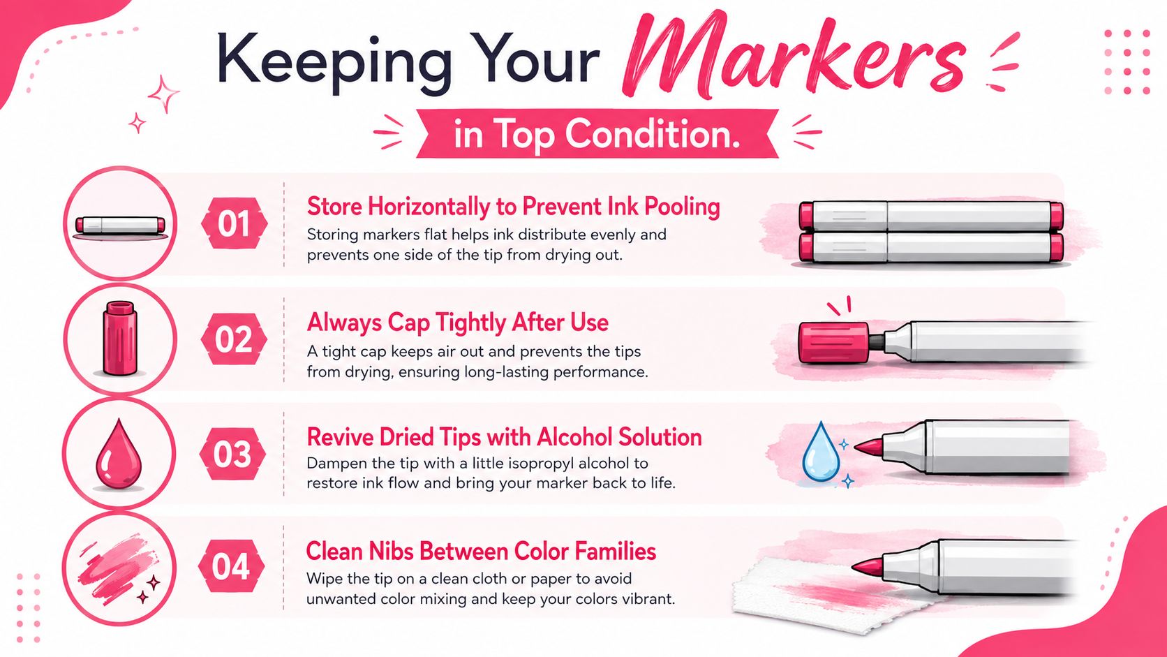
Alcohol evaporates quickly when a cap is not closed tightly, so capping the marker every time you set it down matters Arrtx. Horizontal storage also helps keep the ink distributed evenly, which reduces the chance that one end dries out faster than the other. If you keep your markers in a case, pick one that leaves the colors easy to see, because a visible layout makes it more likely you'll return each marker to the right place.
That small habit protects more than the nib. It also makes your set easier to maintain, since you can spot missing colors, notice duplicates, and keep track of which markers you reach for most often.
What to do when a marker misbehaves
A weak stroke does not always mean the marker is finished. Sometimes the nib needs a moment for ink to travel back into place, especially if the marker has been lying in a less helpful position. If a tip has picked up the wrong color, clean it before using it on a different color family. If the marker is drying out, refillable models can often be brought back, while disposable starter sets are usually simpler to replace than to repair Arrtx.
Some problems come from storage habits, while other markers have reached the end of their usable life. Knowing which situation you're facing keeps you from fighting a tool that can no longer perform well.
If you travel with markers, keep them in a case that protects the nibs and stops them from rolling around. A neat setup also makes it easier to see which colors you use most, and that becomes useful later when you decide what to buy next.
Making Smart Decisions Between Budget and Professional Markers
A beginner standing in front of two marker sets often sees the same colored caps and assumes the choice is about quality alone. The harder question is how much you will draw, what paper you will use, and how much waste you can afford while you learn. A set that looks polished in product photos can still become expensive if it pushes you onto paper that bleeds, feathers, or forces you to replace colors you do not yet understand.
When budget markers make sense
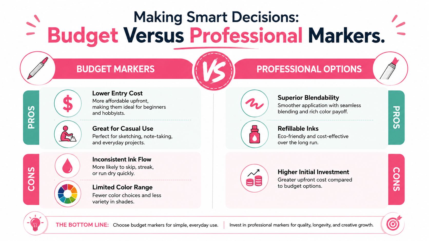
A budget set is often the better starting point if you are coloring to relax, testing basic blending, or learning how alcohol ink behaves on different papers. It lowers the pressure that comes with an expensive purchase, and that matters because beginners usually need more repetition than prestige. It also makes it easier to try colors you might never buy as singles, which helps you understand your preferences before you commit to a larger system.
The tradeoffs still matter. Cheaper markers can have less even ink flow, fewer refill choices, and a narrower path for expanding the set later Luuk Minkman. That does not make them a poor choice. It means they work best when the goal is practice, not a long-term studio inventory.
Paper compatibility matters here too. A budget marker can behave very differently on thin copy paper, marker paper, and heavier mixed-media sheets, so the hidden cost is often not the marker itself but the paper you need to make it perform decently. If you buy the wrong paper first, the marker can look worse than it really is, and that leads many beginners to replace tools that were never the main problem.
When professional options earn their place
Professional markers start to make more sense when you draw often, want tighter color control, or plan to build a palette you will keep using for a long time. Refillable inks and replaceable nibs support repeated use, which helps artists who burn through their core colors quickly. The upfront cost is higher, but the set is built for sustained work rather than occasional testing.
A hybrid approach usually fits beginners well. Start with a budget set for practice, then add professional markers in the colors you reach for most. That keeps the purchase tied to actual use, not aspiration. It also gives you time to learn which hues deserve a better version later, instead of guessing before you have real habits.
Planning tools can reduce expensive trial and error before you buy more ink. If you want to match one brand's palette to another, the Ohuhu to DecoTime conversion tool can help you compare color choices before you commit. A tool like that is especially useful when you are trying to avoid duplicate shades or fill gaps in a set without overspending.
If you want a clearer way to preview your starter palette, compare marker families, and test color ideas before touching paper, ColorBestie can help you organize those choices first. That kind of planning is useful because it cuts down on guesswork, helps protect your paper from avoidable mistakes, and lets you build a starter workflow that matches the way you color.