
You've just laid down a beautiful blue, lifted your marker, and discovered a dark shape on the other side of the page. Or perhaps the first pass looked smooth, but the second one turned the color dull and heavy. Maybe your blend has visible stripes even though you slowed down and pressed harder.
Those moments don't mean you're bad at drawing. They're normal parts of drawing with Copic markers, and each one points to a small, practical habit you can change. Copic markers use dye-based alcohol ink, so some bleed-through is expected, and the company recommends placing scrap paper underneath your work and using less pressure to reduce oversaturation. Copic's marker guidance also explains that paper choice strongly affects bleeding, blending, and gradation.
What Drawing With Copic Markers Actually Feels Like
You lay down a pale blue stroke, lift the marker, and find that the ink has traveled farther than expected. A second pass then turns one corner darker while the rest remains light. That quick response is part of drawing with Copic markers: the brush nib moves smoothly, alcohol ink keeps spreading briefly, and small changes in pressure or timing affect the result.
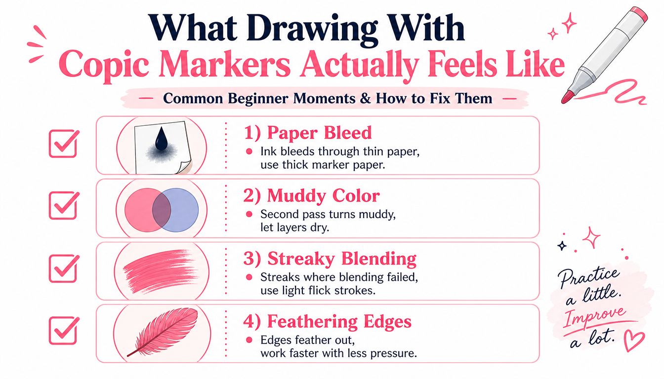
Five habits that make the medium calmer
Test before committing. Make a small swatch on the paper you plan to use. Check the color, edge spread, layering response, and bleed-through before bringing the marker to your illustration.
Work from light to dark. A pale base leaves room for adjustment. A deep first layer can quickly make the area too dark, muddy, or saturated.
Let layers dry. Wet ink shifts as new strokes enter it. If a blend looks uneven, pause before scrubbing the same spot, since repeated passes can create streaks and patches.
Cap markers immediately. Alcohol ink evaporates in open air, and an uncapped marker may dry at the nib. Make replacing the cap part of each stroke sequence.
Rotate your stock. If several markers share a color, alternate between them. This distributes wear across the nibs and reservoirs, while a swatch chart helps you notice when one marker no longer behaves like its usual partner.
Practical rule: When a result surprises you, change one variable at a time. Test the paper, pressure, layer timing, or color pair separately so you can identify the cause.
These habits address the moments beginners usually find confusing. Paper controls how far ink travels, linework gives color a clean boundary, and layer timing affects whether a transition stays soft or turns muddy. Once those small checks become routine, highlights, shadows, and a finished character illustration require less guesswork and more deliberate control.
Choosing Paper That Works With Your Markers
Your first marker stroke may spread farther than expected, especially when you are trying to keep a small shape inside its outline. Paper controls that movement, how quickly an edge dries, and how much time you have to blend. Copic's documentation describes Premium Bond Paper and Custom Paper as basically bleed-proof, while Thick Marker Paper and Soft Watercolor Paper allow easier gradations because the ink spreads more readily. The official paper guidance helps connect the paper choice to the effect you want.
Two qualities deserve attention: bleed resistance and blending friendliness. A resistant sheet keeps edges tidy and protects the surface below, though the ink may dry before two colors merge. A more receptive sheet can produce softer transitions, while ink may travel beyond the line or through the page. Place scrap paper underneath before you begin, then test a small swatch instead of discovering the problem in the finished drawing.
Copic-friendly paper at a glance
| Paper Type | Bleed Resistance | Blending Ease | Best For |
|---|---|---|---|
| Bleed-resistant marker paper | High | Moderate to limited | Clean edges, controlled linework, illustrations where the back of the sheet matters |
| Smooth Bristol or illustration board | Moderate | High | Broad color areas, polished rendering, deliberate layering with scrap paper underneath |
| Mixed-media or vellum-finish paper | Moderate | Moderate to high | A flexible middle ground for sketches, small illustrations, and varied techniques |
A smooth surface usually lets the nib move predictably, but smoothness alone does not guarantee easy blending. Test the actual markers you plan to use. A pale skin color, saturated blue, and dark neutral may behave differently on the same sheet.
A sensible first purchase
Start with thick marker paper while learning blends if you are comfortable protecting the table or sheet beneath your drawing. Choose a more bleed-resistant marker paper when clean edges and minimal show-through matter more than soft transitions. Make a swatch page either way. Record how much pressure creates a light mark, how quickly the paper accepts another layer, and how far colors overlap. That page becomes a practical map when the finished illustration starts to feel unpredictable.
Alcohol-based markers now serve artists working in areas such as art, manga, comics, and professional rendering. Independent forecasts estimate the category at about USD 2.24 billion in 2023, with a projection of USD 3.62 billion by 2033, representing a 4.92% CAGR in that forecast. The market forecast offers context for the range of paper and marker options available. Your own test sheet remains the better guide for choosing supplies, because it shows how your markers behave on that specific paper.
Building Confident Linework Before the Color Goes On
Your ink drawing is the structure underneath the color. Think of it as the skeleton of the illustration. If the lines are too heavy, uneven, or crowded, the marker has less space to create clean shapes and gentle transitions.
Copic Multiliners are a practical choice because their pigment ink is designed to resist alcohol marker smearing. That lets you ink first and color over the lines without watching the contours dissolve into the fill. Keep your line weight moderate while learning. A bold, saturated outline can make a pale marker look weaker than it is and can visually trap the color along the edge.
Give the color somewhere to move
Leave tiny openings where two colored areas will meet if you plan to blend across that boundary. A completely flooded ink junction creates a hard barrier, while a small gap gives your marker room to soften the transition.
Taper the ends of strokes, especially around hair, fabric folds, and cast shadows. A tapered line naturally suggests that the form is fading, so you won't need to force the marker into a narrow, overworked point.
Avoid filling enclosed areas with ink just because they're small. A heavily inked eye, fold, or ornament can become darker than the surrounding illustration, and marker color won't cover that density evenly.
Try a variable line
A ballpoint-style pen tends to produce one steady line weight. A brush pen changes thickness as your pressure changes, which gives you thicker contours in shadowed areas and finer edges near highlights. That variation can make later coloring feel more expressive, but it also demands a lighter hand.
Before starting a finished piece, make three tiny ink tests: a steady line, a tapered stroke, and a brush-pen curve. Color across each one with a pale marker. You'll quickly see which line gives you the edge you want.
For comparing marker families, nib shapes, and general handling before you buy another set, use the marker comparison tool. Treat its information as a starting point, then confirm the behavior on your own paper.
Layering and Blending Without Muddy Colors
The moment a blend goes muddy, beginners often press harder. That usually makes the problem worse. Timing matters more than pressure because wet ink can merge naturally, while an overworked patch collects too much dye and loses its clarity.
Start with the palest version of your intended color. Cover the shape with a controlled first pass, then allow the surface to settle. Add the next value only when the first layer feels dry to the touch. If you need another pass, build it deliberately rather than repeatedly tracing the same area.
The two-pass method
Use the first pass to establish a smooth mid-tone. Keep your strokes moving and overlap them slightly so you don't leave isolated gaps.
On the second pass, deepen only the shadow side. If the first layer is still a little receptive, the darker stroke can melt into it. If the surface is wet and visibly pooling, stop. More movement won't create a better blend.
Use light flicks at the transition rather than pressing into the edge. The flick begins in the darker area and lifts toward the lighter area, producing a gradual taper. Small circles can also help on broad, simple forms, provided you don't keep revisiting a drying patch.
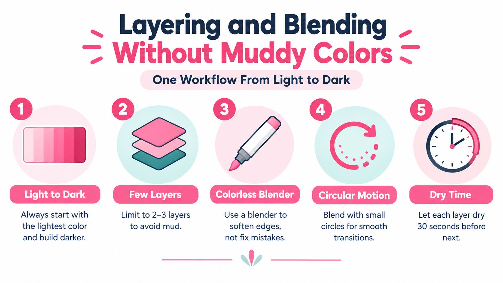
The colorless blender has three useful jobs. It can push pigment away from a small area to create a softer highlight, help lighten a region that has become too dark, and reactivate dry ink so a later stroke can connect with it. It isn't magic eraser fluid, so use it as a controlled lifting and softening tool rather than scrubbing for complete removal.
When the blend fails, pause before adding color. Let the area dry, inspect the paper, and decide whether you need a lighter layer, a darker edge, or a lifted highlight.
| What you see | Likely cause | Try this |
|---|---|---|
| Grainy transition | The paper is resisting the overlap | Use fewer passes and test a more blending-friendly sheet |
| Visible stripes | Strokes dried before they connected | Work in smaller areas and overlap while the first pass is receptive |
| Gray or muddy color | Too many mixed colors or repeated passes | Return to a simpler palette and build light to dark |
| Dark edge | Pressure or ink pooled at the boundary | Use lighter flicks and stop before the edge becomes saturated |
For planning compatible color families, the Decotime and Ohuhu converter can help you compare related marker references before you test them physically.
A short demonstration can make stroke direction and overlap timing easier to judge:
Protecting Highlights and Adding Soft Shadows
The cleanest highlight is usually the paper you never colored. Copic ink soaks into the sheet, so a bright spot meant to look like reflected light should be planned before the first marker pass rather than painted in later.
Begin with a light pencil map. Draw a small arrow showing the light direction, then lightly indicate the three broad value groups: light, middle, and shadow. On a face, that map might reserve the forehead, tip of the nose, cheek, and eye glint. On hair, it might become one long broken shape that follows the curve of the strands.
Lift only where the light needs help
If a highlight becomes too dark, use the colorless blender soon after applying the color. Press the nib into the small area and lift rather than dragging it around. This can pull pigment back from details such as a nose tip, an eye glint, or a narrow hair edge, but it won't restore untouched paper perfectly.
Shadows need restraint too. Instead of darkening an entire shadow shape with one heavy marker, place a slightly cooler or deeper color at the turning edge where the form moves away from the light. Let the base color remain visible through the rest of the shadow. That keeps a cheek, sleeve, or rounded object dimensional rather than flat and overfilled.
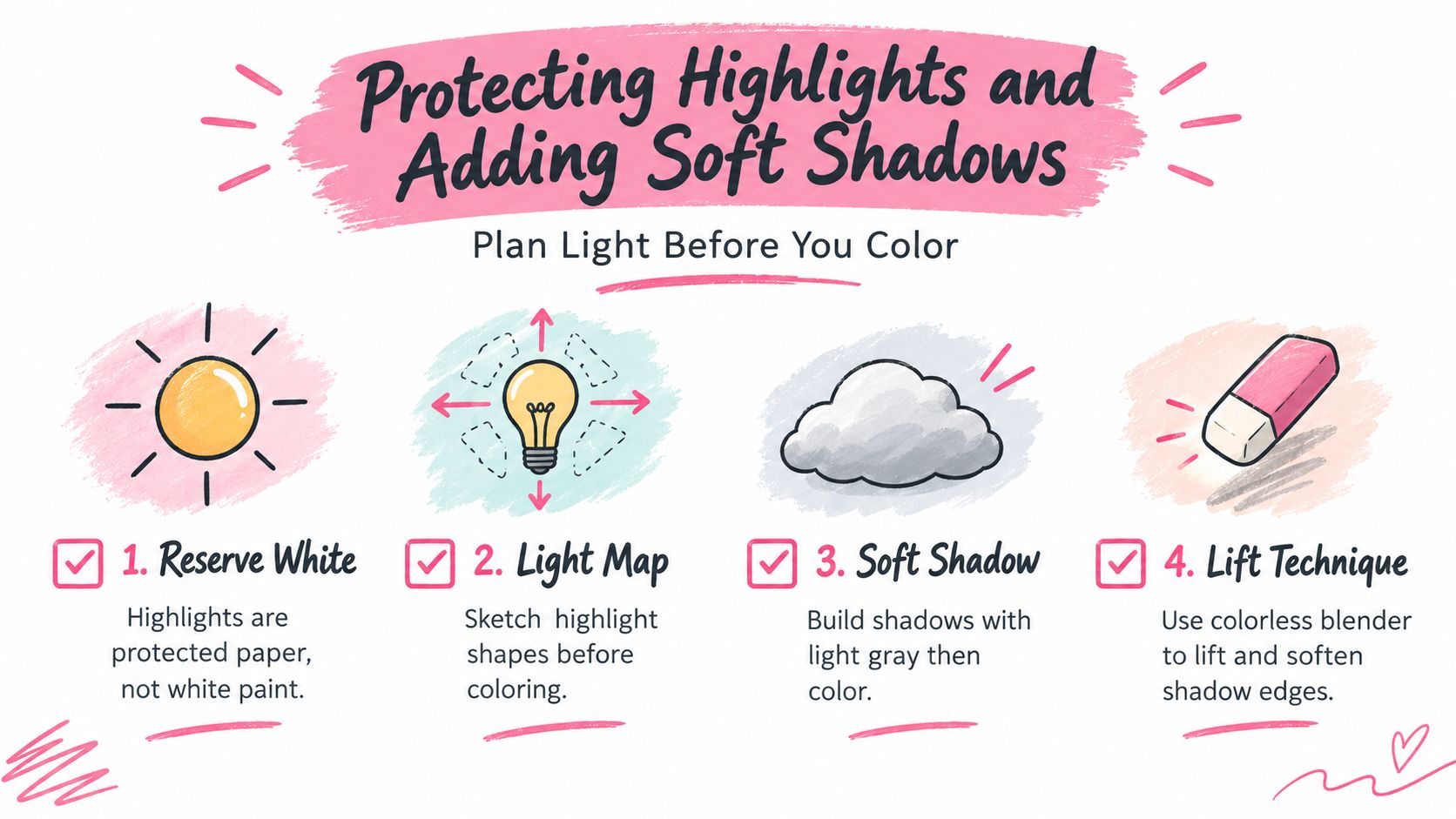
Repeat this lighting checklist
- Mark the light direction: Add a small arrow before coloring.
- Reserve the paper: Keep the brightest highlight untouched.
- Block broad values: Decide light, middle, and shadow before details.
- Place shadows at turns: Darken where the form turns, not everywhere.
- Lift selectively: Use the blender for small corrections and softened edges.
If the lighting still feels uncertain, simplify the illustration. A single clear light source is easier to control than several competing highlights, and a simple sphere can teach more than a crowded page.
A Character Illustration From Sketch to Finished Color
Start with a loose pencil sketch, not an elaborate one. Decide where the character faces, where the light comes from, how the hair flows, and which feature should attract attention. Most marker problems begin here, because an unclear light direction or crowded shape forces you to make color decisions while the ink is already wet.
Ink the sketch with a Copic Multiliner, keeping the contours confident but not overly thick. Leave the largest highlight shapes open inside the hair and eyes. If you're unsure which line weight to choose, make a small colored test beside the drawing first. That prevents a dense outline from becoming the strongest dark in the finished piece.
Skin first
Lay down a warm, pale base over the skin with smooth, moving strokes. Keep the forehead, nose tip, and cheek highlight open. Add a cooler shadow beneath the chin only after the base has dried enough to accept a second pass, then soften the edge with a lighter flick.
The small habit doing the most work here is stopping before the area looks finished. Beginners often keep adding color because the first layer seems too pale. Give the paper time to dry before deciding whether it needs more.
Hair as a direction problem
For hair, follow the growth direction with long strokes. Begin with the lighter base, leaving a broken highlight shape rather than drawing one rigid white stripe. Add the darker color at the roots, under overlapping locks, and in the deepest bends. Don't cover every strand with a separate line. The larger grouping will read as hair more convincingly than a crowded collection of equal marks.
Clothing and pattern
Color the clothing in broad sections, then add the pattern with space between repeated marks. Slivers of paper can suggest fabric shine and prevent a small design from becoming a dark block. If you need help imagining a harmonious set of colors before opening your markers, ColorBestie's palette generator can create marker-style color inspiration from an uploaded sketch or coloring page.
When you zoom out, each earlier habit should have a visible result. Scrap testing prevented a surprise edge, light-to-dark layering kept the skin clear, drying time protected the chin shadow, and reserved paper preserved the eye and hair highlights. The illustration doesn't need every area to be equally detailed. A clear focal point and controlled values will make the finished color feel intentional.
A Gentle 7-Day Practice Plan for Real Progress
Short practice sessions work well because they give you one problem to observe at a time. Set a timer for 10 to 15 minutes each day, then stop when it rings, even if the page isn't perfect. The purpose is to build reliable habits, not to produce seven finished illustrations.
Days one through three
Day 1, single-pass washes. Draw several small rectangles and fill each with one continuous pass. Notice how quickly your marker covers the shape, where your hand slows down, and whether the paper shows bleed-through. Completion means you made the swatches and wrote one observation beside them.
Day 2, pressure control. Create graduated strips from very light to dark using the same marker. Begin with a gentle touch, then increase pressure gradually. Success means the strip contains a visible change in value without a sudden dark jump.
Day 3, two-pass circles. Draw small circles and give each a pale base. After the first layer dries to the touch, add a shadow crescent and blend its edge with controlled flicks. Stop when you can identify where the shadow begins without seeing a hard stripe.
Days four through seven
Day 4, blender practice. Make a colored rectangle, then use the colorless blender to lift a small highlight and soften one edge. Try not to scrub. Completion means you can tell which area was lifted and which area was left untouched.
Day 5, one light source. Render a sphere or egg shape with a pencil arrow showing the light direction. Reserve the highlight, establish the base, and place one soft shadow. The drawing counts if the form reads as round, even with simple colors.
Day 6, limited palette recolor. Revisit an older sketch and use only three markers. This constraint encourages you to rely on value, spacing, and paper highlights instead of searching for a perfect color for every object.
Day 7, small finished piece. Combine a clean sketch, controlled linework, light-to-dark layering, one blended shadow, and reserved highlights. Keep the subject simple enough to complete in one sitting.
Copic markers are designed for refillability and nib replacement, and the brush nib is a serviceable consumable part. Copic's ink information lists alcohol dye ink in 358 colors and gives approximate refill capacities of 1.8 ml for Sketch, 1.4 ml for Ciao, 2.5 ml for Classic, and 3.5 ml for Wide. The same information states that Ciao can be refilled up to 9 times with one refill bottle, while Classic can be refilled up to 5 times. Cap markers promptly, let heavily used nibs rest, and rotate comparable markers so one tool doesn't carry every session.
Use this completion checklist each day:
- The drill is finished: You completed the assigned exercise, not just part of it.
- The result is observed: You wrote down one thing that worked and one thing to adjust.
- The materials are protected: You capped markers and stored the page flat.
- The next step is clear: You know which small habit you'll repeat tomorrow.
ColorBestie can turn an uploaded sketch or coloring page into marker-style color inspiration, while its palette planning and marker comparison tools help you test ideas before committing ink. Visit ColorBestie with one simple drawing, choose a color direction, and use the preview as a calm reference for your next Copic practice piece.