
You open your marker case, fan out the caps, and feel that little mix of excitement and panic. The colors are gorgeous on their own. A fresh peach, a juicy coral, a soft yellow-green, a deep teal. Then you put them together on paper and something goes wrong. The page feels noisy, flat, or strangely muddy, even though every marker looked perfect in the tray.
That moment frustrates a lot of artists, especially when you're working with alcohol markers. They blend so smoothly that it's easy to assume any nice colors will play nicely together. But markers are honest tools. If your palette lacks harmony, they'll show it fast.
Analogous color schemes provide such a relief. They give you a simple way to narrow your choices without making your art feel restricted. Instead of picking from your whole set, you choose colors that sit close together and already share a family resemblance. The result usually feels calmer, more polished, and much easier to blend.
If you've ever wanted your coloring pages, manga panels, florals, or character art to look more intentional, this approach helps. And if you've already tried analogous palettes but ended up with something dull, that's fixable too. The secret isn't just picking neighboring hues. It's learning how to create contrast inside a harmonious group, especially with markers.
Tired of Colors That Clash? Here Is Your Solution
A lot of first coloring projects fail before the coloring even starts. The problem isn't technique. It's palette choice. You pick one marker because it's bright, another because it's pretty, and a third because it looks good on the cap. On paper, those choices can fight each other.
Markers make this more noticeable. In watercolor, happy accidents sometimes soften rough decisions. In colored pencil, heavy layering can hide them. Alcohol markers are cleaner and more direct, so color relationships stand out right away.
A familiar marker moment
Say you're coloring a mushroom cottage page from an adult coloring book. You choose a red roof, a lime door, a violet window frame, and a golden path. Each color is fun. Together, they compete for attention. Nothing feels connected, so the page looks busy instead of charming.
Now try a tighter family. Maybe red-orange, red, and red-violet for the cottage details. Suddenly the page starts to hold together. The colors still have variety, but they no longer pull the eye in unrelated directions.
Practical rule: When your page feels chaotic, don't add more colors. Reduce the family of hues first.
Why this feels easier
Analogous color schemes help because they remove the hardest part of color planning. You don't need to evaluate every marker in your collection. You only need to choose a small cluster that already belongs together.
That doesn't mean your work has to look bland or safe. It means the base of the palette is cooperative. Once that base is stable, you can create interest through darker shadows, lighter highlights, and selective accents.
A good analogous palette feels a bit like choosing cousins instead of strangers for the same group photo. They don't all look identical, but they share enough traits to feel related.
What you gain on the page
When beginners use analogous palettes, a few things usually get easier:
- Blending gets smoother because nearby colors transition more naturally.
- Mood feels clearer since the piece leans warm, cool, earthy, or dreamy instead of scattered.
- Decision fatigue drops because you're not testing random combinations across the whole set.
- Corrections feel simpler since one off-note color is easier to spot and replace.
The best part is that this approach works across subjects. Flowers, hair, skies, clothing folds, forest scenes, cozy interiors, creature art. If you can choose a dominant mood, you can build an analogous palette around it.
What Are Analogous Color Schemes Anyway
You open your marker case to color a leaf, a scarf, or a sunset sky. Then the choice hits you. Which green? Which blue? Which orange? An analogous color scheme solves that problem by giving you a small, related group to work from.
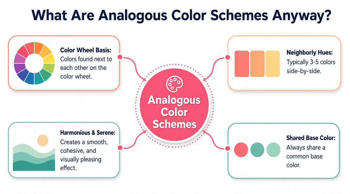
Analogous color schemes use colors that sit next to each other on the color wheel. The usual beginner-friendly version uses three adjacent hues, with one doing most of the work and the two beside it supporting it, as shown in this explanation of analogous schemes on a 12-step color wheel. Some artists widen the range to four or five neighboring hues when they want softer transitions or more variety.
How Neighboring Colors Work Together
The color wheel places related hues side by side. Red sits beside red-orange and red-violet. Blue sits beside blue-green and blue-violet. Yellow sits between yellow-green and yellow-orange.
Because those colors share part of their makeup, they transition more gently than colors pulled from opposite sides of the wheel. That shared base is why analogous palettes feel calm, believable, and easy to blend with alcohol markers.
Here are a few simple families:
| Palette family | Neighbor colors | Typical feel |
|---|---|---|
| Warm floral | red-orange, red, red-violet | lively, romantic |
| Forest range | yellow-green, green, blue-green | fresh, natural |
| Twilight set | blue, blue-violet, violet | calm, moody |
A common beginner question comes up here. Does an analogous palette have to stop at three colors?
No. Three is just the clearest place to start. With markers, that smaller group is often easier to control, swatch, and layer without getting muddy or repetitive.
Why This Idea Has Lasted
Artists have been organizing color into useful systems for a long time. Teachers such as Johannes Itten helped make color harmony easier to practice, and Munsell gave artists a clearer way to sort hue, value, and chroma. You do not need to study their full systems to use analogous color well. You only need one practical takeaway. Neighboring hues usually cooperate.
That matters even more with alcohol markers than it does in a simple color wheel diagram.
Markers can make analogous schemes look beautiful fast, but they also expose the biggest weakness of this approach. If your hues are close together and your values are also too similar, the whole piece can look flat. A green leaf can turn into one green mass. A blue outfit can lose its folds. A sunset can become one soft stripe with no focal point.
So the goal is not just "pick colors that match." The goal is to pick related colors that still give you room for light, shadow, and emphasis.
You can picture analogous colors like notes that belong to the same chord. They sound related, but you still need louder and quieter notes to make the music interesting. Marker work follows the same idea. Harmony gives you unity. Contrast gives you form.
Analogous color schemes succeed because they reduce hue conflict. They only become dull when the values and intensity stay too similar.
If color theory has felt stiff before, this is a friendly entry point. You are choosing a color family, not memorizing the whole wheel.
The Building Blocks of a Beautiful Palette
Choosing neighboring colors is only the first step. A strong palette also depends on how you handle hue, value, and temperature. Those three ideas sound academic, but they become very simple once you connect them to what your hand is doing on the page.
Hue Is Your Color Family
Hue is the basic color name. Blue. Green. Orange. Violet. In an analogous palette, hue is the part that keeps the family together.
If you choose blue-green, green, and yellow-green, your hues already agree with one another. That gives you a stable starting point for leaves, water, glass, fantasy creatures, or soft backgrounds. If you choose yellow, yellow-orange, and orange, your palette immediately leans sunny and energetic.
Hue answers one question first: what color family am I living in for this piece?
Value Creates Form
Value is how light or dark a color appears. This is the part beginners often skip, and it's the main reason an analogous piece can look flat.
If all your chosen markers sit in a similar middle range, the art won't have much structure. Petals lose dimension. Hair clumps together. Clothing folds disappear. The drawing may still look harmonious, but it won't feel convincing.
Try thinking in layers:
- Light value for areas catching the most light
- Middle value for the local color
- Dark value for overlap, shadow, and depth
A yellow-orange palette can still describe form beautifully if one marker is pale and airy, another is richer, and another is noticeably deeper.
The eye reads shape through value before it enjoys color harmony.
Temperature Shapes Mood
Temperature refers to whether a color feels warm or cool. Even inside an analogous palette, temperature matters. A red-orange to yellow sequence feels cozy and lively. A blue to blue-green sequence feels quieter and more reflective.
In this way, many hobbyists gain confidence. You don't need a giant vocabulary of theory terms to control mood. You can ask: do I want this page to feel warm, cool, soft, earthy, bright, or misty?
A few common pairings help:
- Warm analogous groups suit sunsets, florals, autumn pages, and cheerful character art.
- Cool analogous groups fit oceans, winter scenes, nighttime illustrations, and magical themes.
- Mixed-but-neighboring groups can feel more natural, like moss, skin flush, or weathered stone.
The marker artist's hidden advantage
Alcohol markers make value and temperature easier to study because they show transitions so clearly. You can lay down swatches, compare them side by side, and quickly spot whether two markers are too similar to do different jobs.
That means palette building isn't just about finding pretty hues. It's about assigning roles. One marker can lead. One can bridge. One can deepen. Once you start working that way, your color choices become much more intentional.
How to Build Your Own Analogous Palette
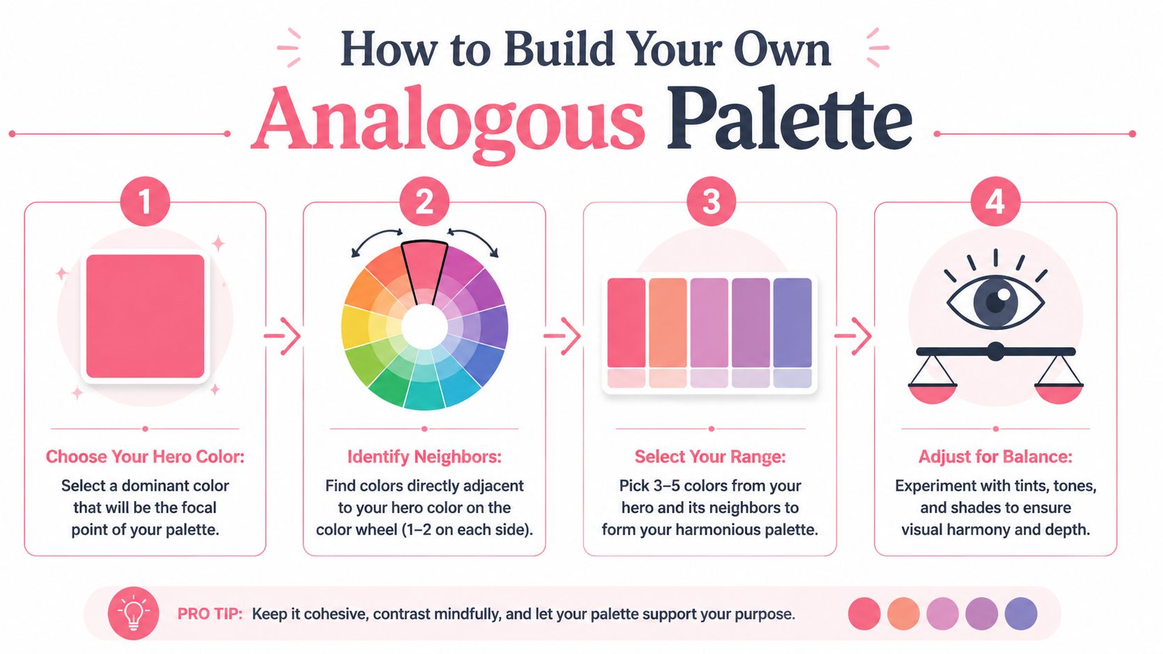
The cleanest way to build an analogous palette is to start small and make each choice do a job. The classic structure uses a dominant hue with neighboring support hues. That's the core idea behind the standard analogous color scheme model, which describes one color with two close companions on either side.
Start with One Hero Color
Choose the color that captures the mood of the piece. This is your hero color, the hue that does most of the emotional work.
If you're coloring eucalyptus leaves, your hero might be a muted green. If you're doing a sunset dragon, it might be orange. If you're working on anime hair with a dreamy feel, it could be blue-violet.
Once you've picked that lead color, use a marker palette generator or a physical swatch chart to find immediate neighbors. Stay close. The point is not to wander across the wheel.
Add Neighbor Colors with Purpose
Now select the colors beside your hero. Don't just ask whether they match. Ask what role each one will play.
A simple workflow looks like this:
- Pick the dominant hue that represents the main object or mood.
- Choose one neighbor that can soften transitions or cover larger secondary areas.
- Choose the other neighbor that can push details warmer or cooler.
- Look for value range inside that trio so one isn't doing all the work.
- Add a neutral if needed when the piece needs breathing room.
A neutral accent can be especially helpful with markers. Warm gray, cool gray, beige, or a muted brown can separate shapes without breaking the harmony of the main palette.
For a quick visual walkthrough, this short demo is useful before you start swatching on paper.
Test Before You Commit
Before you touch your final page, make a tiny test strip. Put the colors in the order you expect to use them. Try a flat swatch, then a blend, then a shadow pass.
Look for three things:
- Separation so each marker still has a role
- Smooth blending between adjacent hues
- Enough dark-light contrast to show form
If two colors melt into one another so completely that you can't tell them apart, that isn't always bad. It just means they may be doing the same job. Replace one with a lighter or darker option from the same family.
This small habit saves a lot of frustration. It turns color theory into something practical, repeatable, and calm.
Bringing Your Palette to Life with Markers
You pick three neighboring colors, start coloring, and a few minutes later the page looks soft but strangely flat. That is a very normal first experience with an analogous palette in alcohol marker work. The colors agree with each other so easily that they can also blur into one voice if you do not give each one a clear job.
A Sunflower Example on Paper
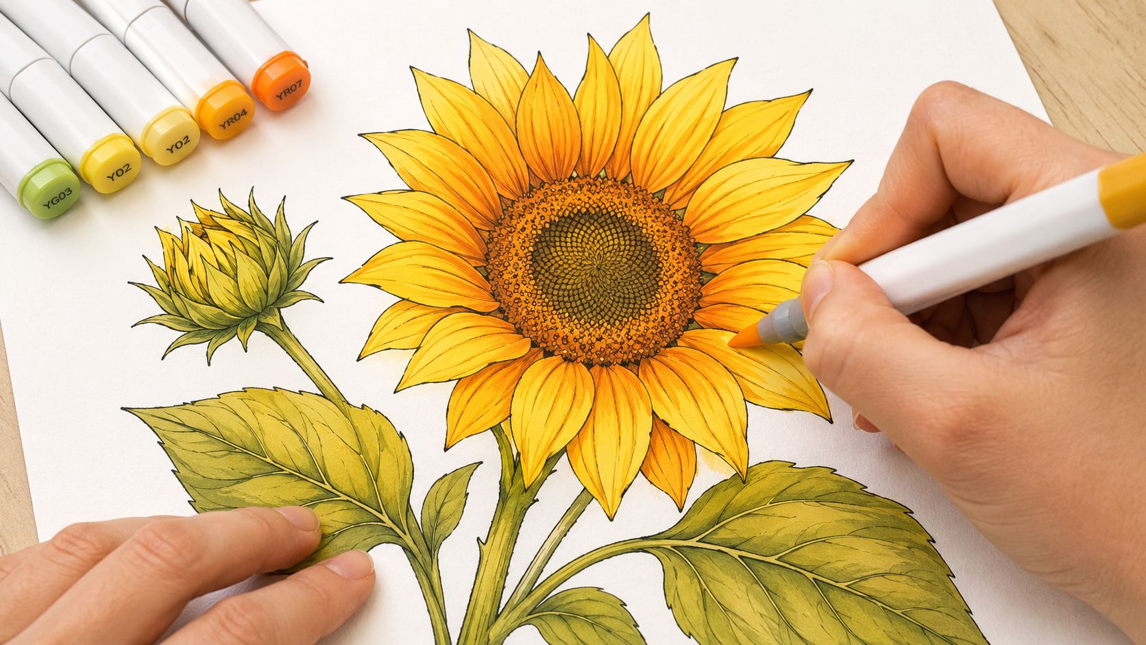
A sunflower is a good subject to practice on because the forms are simple, but the petals still give you chances to show light, overlap, and depth. Try a trio of yellow, yellow-orange, and orange.
Treat those three markers like cast members with different roles. Yellow is the lead. It covers most of each petal and keeps the flower bright. Yellow-orange is the supporting actor. It steps into folds, bases of petals, and places where one petal slips under another. Orange is the specialist. It appears in the smallest shadow pockets and close to the center where the form turns away from the light.
That role-based approach matters with markers. If all three colors get equal space, the drawing can feel mushy. If one color leads and the others support it, the palette stays harmonious and the form stays readable.
How to Blend Without Losing Structure
Alcohol markers make neighboring hues blend so easily that beginners often blend away the very shadows that would give the object shape. A good blend should feel soft, not vague.
Try this working order:
- Cover the main area with the lightest marker first so you have a clean base.
- Add the middle hue into bends and overlaps while the first layer is still helping the transition stay soft.
- Place the darkest hue last and keep it small in creases, tucked corners, and deep turns.
- Use the middle marker to smooth the meeting point instead of flooding the whole area.
- Leave a few light edges or tips untouched so the shape still catches light.
A useful way to picture it is watercolor logic with more control. You are not just filling spaces. You are deciding where the form turns.
Save your darkest analogous marker for the smallest shapes. Small dark notes keep the palette lively.
A colorless blender can help, but it is not the hero here. In many analogous palettes, the middle marker blends more naturally than the blender because it keeps the hue relationship intact instead of pushing color outward and thinning it.
Marker sets also have gaps. One yellow may be pale and creamy, while the next step jumps straight to a loud orange. If you want to check whether your set has a missing bridge color, a marker comparison tool for nearby shades across marker lines can save guesswork. When you spot a gap early, you can plan to layer lightly, use more paper white, or shift the shadow area smaller.
That is how an analogous palette comes alive with markers. The harmony is already built in. The depth comes from placement, edge control, and restraint.
Common Mistakes and How to Fix Them
The biggest complaint about analogous color schemes is fair. They can look monotonous. A page can end up pleasant but sleepy, harmonious but forgettable.
That doesn't happen because analogous palettes are weak. It happens because many artists rely on hue harmony alone and forget to build contrast somewhere else. According to this design guidance on analogous color schemes, these palettes are known for visual harmony but can become monotonous unless you deliberately vary value and color intensity. In marker work, that means light-dark steps, saturation shifts, or a neutral accent.
When Harmony Turns Into Sameness
A flat analogous piece usually shows one of these problems:
| Problem | What it looks like | Better move |
|---|---|---|
| Values are too similar | everything sits in the same middle range | choose a lighter highlight and a deeper shadow marker |
| Saturation never changes | the whole piece feels equally loud | mix brighter and softer versions of the same family |
| Coverage is too even | every area demands equal attention | let one hue dominate and use the others in smaller roles |
| No resting space | color fills every corner | introduce a neutral or leave small light areas |
Many beginners assume they need a contrasting hue to fix this. Sometimes they don't. Often they just need stronger shape design inside the palette they already chose.
Simple Fixes That Work with Alcohol Markers
Try these adjustments when your page feels dull:
- Push the value range by picking one clearly lighter marker and one clearly darker marker from the same neighborhood.
- Change intensity on purpose by pairing a bright hue with a dustier version nearby.
- Use a neutral separator around edges, cast shadows, stone, metal, wood, or background elements.
- Limit the darkest marker so it acts like punctuation, not a flood.
A small outside accent can help too, but treat it carefully. If your whole piece is blue-green and green, a tiny warm detail can wake it up. The trick is keeping that accent small enough that the palette still reads as analogous first.
Harmony doesn't mean equal use. One color should lead, the others should support.
If you're unsure where contrast should go, look at the drawing rather than the palette. Corners, overlaps, undersides, and focal points usually need the strongest value changes. That's what gives the viewer something to read.
Ready-to-Use Palettes for Your Next Project
A lot of guides stop at definition. The harder part is deciding what to color with the markers you own. That's especially true because hobbyists often work with sets that skip certain in-between hues, which makes practical palette planning more important, as noted in this discussion of medium-specific contrast challenges for analogous palettes.
Three Palette Ideas You Can Try Today
Here are a few easy families that work well for marker artists:
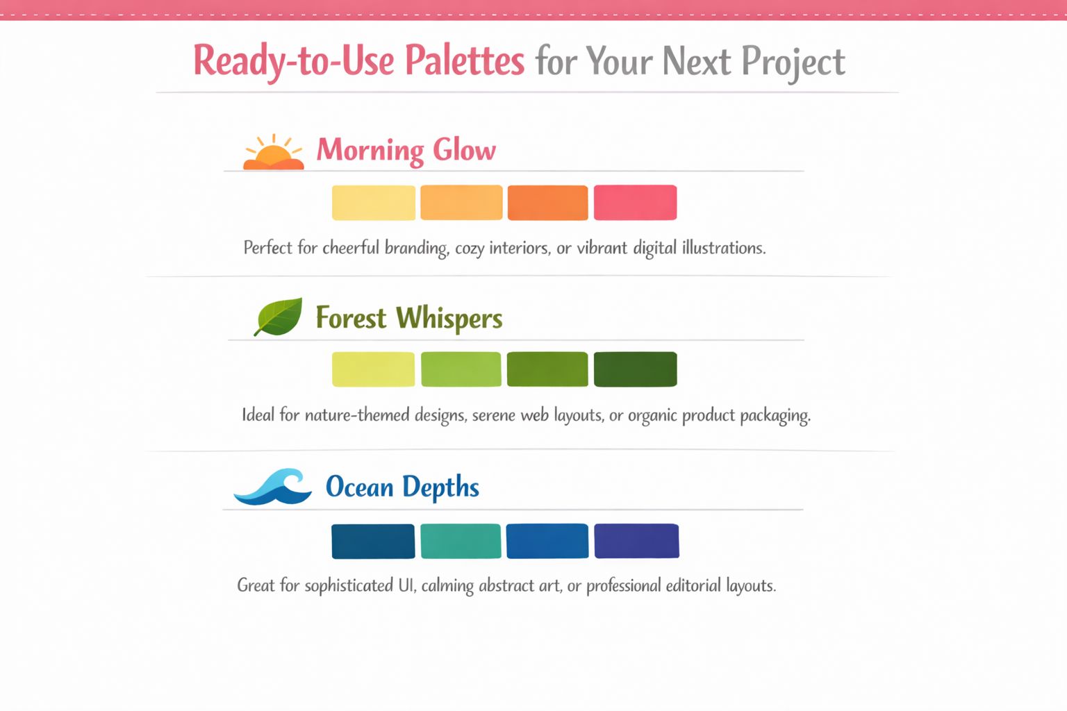
Morning Glow
Use yellow, yellow-orange, and orange. This works beautifully for florals, warm kitchens, sunrise skies, lantern light, and cheerful character scenes.Forest Whispers
Try yellow-green, green, and blue-green. It's a strong choice for leaves, moss, cottagecore pages, dragons, frogs, and quiet scenic backdrops.Ocean Depths
Build with blue, blue-green, and blue-violet. This palette suits water, mermaids, nighttime hair, crystals, magical effects, and moody abstract pages.Berry Bloom
Choose red-violet, red, and red-orange. Great for peonies, lipstick illustrations, sweets, fashion details, and rich fantasy costumes.
How to Adapt Them to Your Marker Set
You don't need exact brand matches to use these. If your Ohuhu set lacks the perfect bridge between green and blue-green, use layering to soften the jump. If your Copic collection has several close reds, swatch them and choose the ones that separate most clearly in value.
A helpful way to preview the mood before you ink a final page is to test your idea with a theme preview tool for marker-friendly color planning. Then compare that plan to your real swatch card and make small substitutions.
When you're choosing from your own collection, ask:
- Which marker should dominate the largest area?
- Which one blends best into it?
- Which one creates the deepest believable shadow in this family?
- Do I need a neutral to keep the page from feeling overfilled?
That tiny decision process turns a pretty palette into a usable one. And once you do it a few times, analogous color schemes stop feeling like theory and start feeling like a shortcut you can trust.
If you'd like a gentler way to test palettes before committing ink to paper, ColorBestie is a cozy option for planning marker-friendly color ideas from black-and-white sketches. It helps you preview harmonious directions, explore moods, and translate those ideas into real marker choices without turning color planning into homework.
