
You generate a soft lilac, mint, and blush palette on your tablet. On-screen, the swatches look airy and perfectly coordinated. Then you print the reference, touch marker to paper, and watch the colors merge into a pale, muddy wash with barely any separation.
That mismatch is common because a digital pastel is light emitted by a screen, while an alcohol marker is transparent pigment absorbed into paper and changed by every additional layer. A useful pastel color palette generator shouldn't stop at attractive HEX codes. It should help you preserve value structure, identify usable marker equivalents, and test whether the palette still works away from a backlit display.
Why Digital Pastels Often Fail on Marker Paper
The first problem is the screen itself. A tablet can make a low-chroma color appear luminous because the display is producing light behind the swatch. Marker paper does the opposite. It receives ink, reflects ambient light, and shows the physical limits of the pigment and surface.
Paper tooth adds another variable. Smooth marker paper may let a pale layer stay clean, while a more absorbent surface spreads the ink and softens its edges. Layering a mint over a pale blue can create a beautiful transition, but the same combination may become a dull green if the underlying values and pigments aren't separated enough.
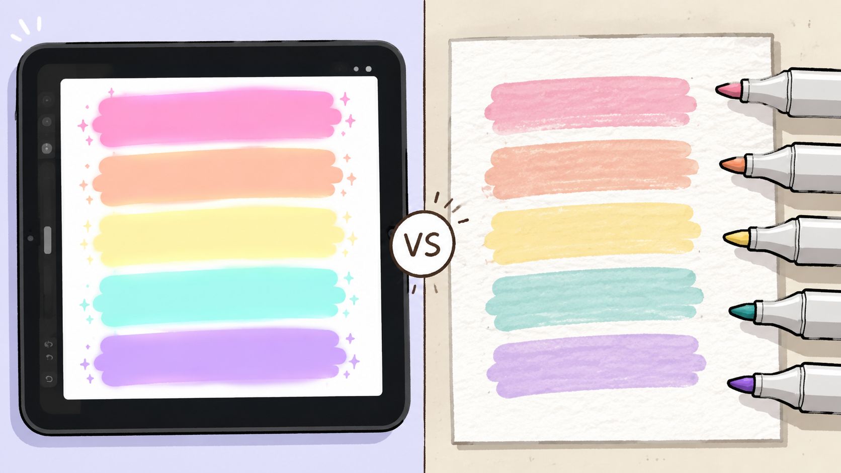
The screen-to-paper mismatch
Digital RGB color describes light made from red, green, and blue channels. Alcohol markers rely on physical inks, and marker names don't map perfectly to a HEX value. Two swatches can look equally light online but behave very differently when layered, especially when one marker has a stronger underlying bias toward yellow, violet, or gray.
Pastels also need anchors. If every color has similarly high lightness and similarly low saturation, the palette may feel harmonious but lack a clear light, middle, and dark. On paper, that produces shapes without hierarchy. Hair, clothing, skin, and background can all drift into the same visual range.
Practical rule: A pastel palette should contain softness in its light colors, not weakness in every color.
What to inspect before generating
Look for a generator that lets you control more than hue. The useful controls are:
- Lightness separation: Swatches should occupy visibly different value levels, even when their saturation stays restrained.
- Chroma restraint: Soft colors need reduced intensity, but excessive desaturation can turn them gray or nearly white.
- Accent support: A deeper companion color gives outlines, shadows, and focal details somewhere to go.
- Physical previewing: A generated palette is a plan, not a guaranteed pigment match.
A reliable workflow begins by treating digital output as a map. Print the palette, make a small marker swatch beside each digital color, and record what happened. That simple comparison reveals which colors stayed clean, which became warmer, and which need a layered substitute.
Tuning Hue, Saturation, and Lightness for Pastel Harmony
Pastel harmony is less about pushing every slider toward “soft” and more about keeping the colors distinguishable after softening. The most dependable process starts with a hue relationship, limits chroma, then assigns each swatch a deliberate lightness role.
Start with hue relationships
Choose a base hue that matches the subject, then rotate around it rather than selecting unrelated pale colors at random. Analogous hues create a quiet flow, while a restrained complementary accent can keep a floral, fashion, or character palette from looking flat.
Template-based harmony rules can be useful for a first pass, but they aren't reliable substitutes for human preference. Research on color harmony estimation notes that preference changes with the actual hue and value, not only with geometric positions in a color space. That matters for marker artists because a mathematically balanced lavender may still look too cold beside a particular peach ink.
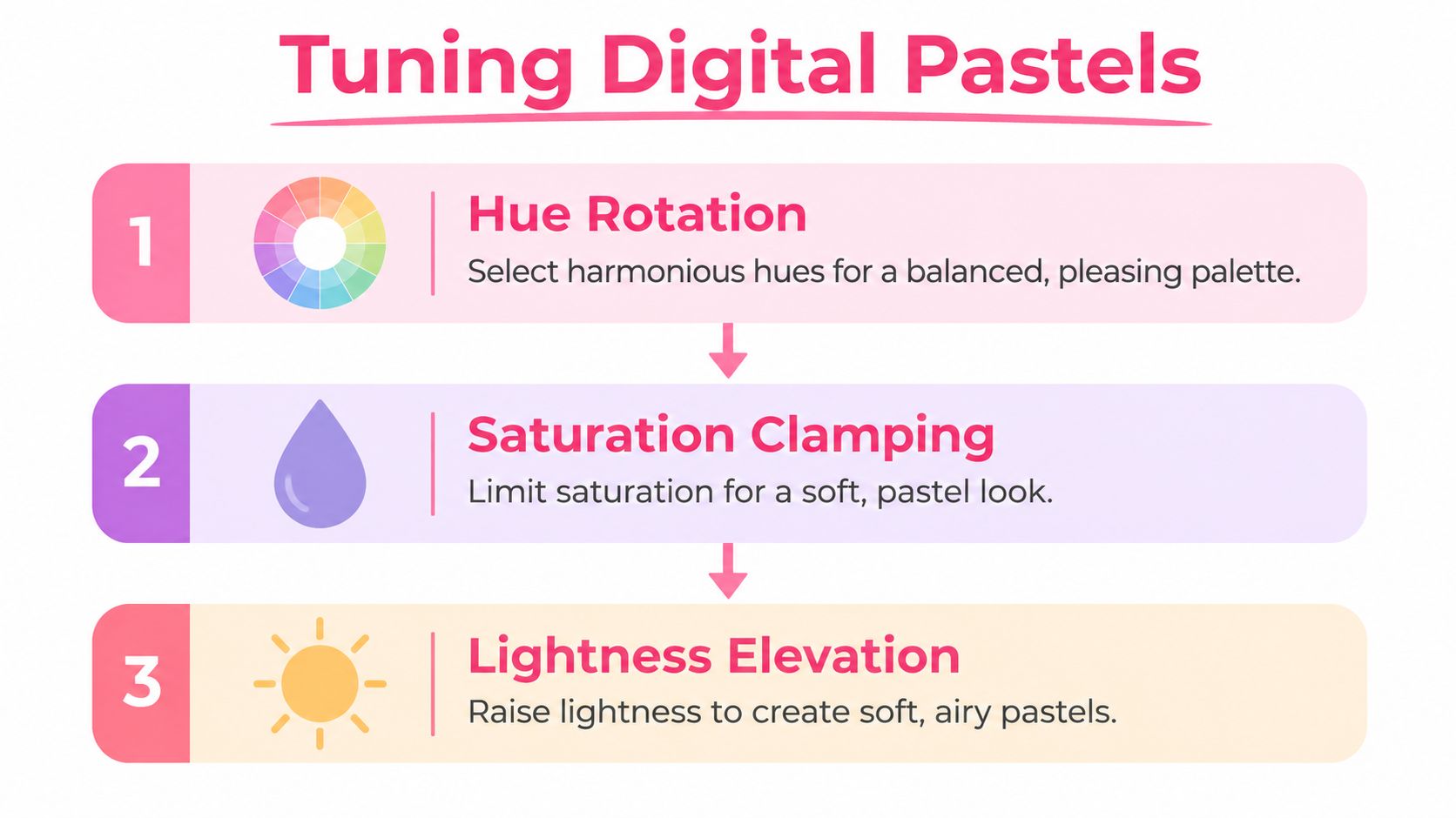
Clamp saturation without erasing identity
For a practical starting point, keep pastel candidates above 75% lightness and below 40% saturation, a commonly used HSL description of pastel territory documented by Colorswatches' pastel palette guide. Those values aren't a physical marker guarantee. They're a screening range that helps prevent harsh digital colors from entering the first draft.
Move saturation downward gradually. If mint, lilac, and blush become almost indistinguishable from white, stop lowering saturation and adjust the hue or lightness instead. A marker-friendly pastel often needs slightly more chroma than a digital-only background because transparent ink loses apparent intensity against paper.
Use the strongest chroma for a focal accent rather than distributing it evenly. A dusty rose may work as the main color, while a cleaner coral or blue can define a flower center, ribbon, eye, or small shadow.
Raise lightness in roles, not uniformly
A five-color scheme needs a value plan. Assign one color as the lightest surface, two as midrange forms, one as a supporting shadow, and one as the accent or anchor. If you raise every color to the same lightness, the palette will look consistent in a generator but collapse when printed.
CIELAB and LCH are more useful than raw RGB distance when you need to compare perceived differences. A color that is numerically close in RGB can appear noticeably different to the eye, while two RGB-distant colors may look nearly identical once their lightness and chroma are reduced. A perceptual workflow lets you inspect hue, chroma, and lightness separately, then judge the result visually.
You can build a first scheme in a pastel palette generator, then make a physical swatch sheet before committing to a full page. The goal isn't one perfect algorithmic score. It's a palette that keeps its mood, hierarchy, and separation after ink touches paper.
Testing Palettes for Contrast and Print Safety
A palette can be harmonious and still be unusable. Pale text may disappear on a phone, a printed reference may lose the difference between two neighboring swatches, and a marker layer may darken faster than expected. Test the palette as a working system, not as a row of attractive color chips.
Run three checks before coloring
Begin with a screen contrast check. View the palette on a phone at ordinary brightness, then place sample labels or line art over the colors. If the text needs to be enlarged or the screen needs to be unusually bright before you can read it, the palette needs a darker text or outline companion.
Next, run a print simulation. Print the palette on the actual paper you use for coloring, not only on office paper. Compare the printed swatches with the screen and mark each one as cooler, warmer, grayer, darker, or lighter. Printer ink and paper white can shift the appearance enough to change how you choose your markers.
Finally, perform an accessibility review. Don't rely on color alone to distinguish adjacent areas. Add line weight, pattern, labels, or value changes so that a viewer with low vision or color-vision differences can still read the composition.
Test difference, not just closeness
Palette evaluation research increasingly considers similarity, diversity, and harmony together. A palette that optimizes only proximity to a target may score well numerically while failing because its colors have too little chroma spread or hue separation. The same issue appears in marker work when two pale layers blend into one uncertain middle tone.
A useful manual test is to convert the printed reference to grayscale. You don't need every color to become dramatically different, but the main subject should retain a readable light, middle, and dark structure. If the entire page becomes one pale gray field, add a deeper anchor before mapping the colors to markers.
Make a small layering test
Draw each candidate marker alone, then layer it once over the nearest neighboring color. Let the ink settle before judging it. Transparent alcohol ink can shift through layering, and a pale blue over a warm pink may produce a different result from the digital blend shown on screen.
Keep a note beside every swatch. Record the marker code, paper type, number of layers, and whether the result stayed clean. This turns a vague “that went muddy” reaction into a repeatable substitution rule for the next palette.
Mapping Digital Pastels to Ohuhu, Copic, and Prismacolor Markers
HEX codes are starting points, not marker prescriptions. A digital blush doesn't guarantee that one physical marker will match it, because the result depends on ink formula, paper, nib, application pressure, and the color beneath the first layer.
Build a swatch-first translation
Start by isolating the role of each generated color. Call it a highlight, base, shadow, accent, or neutral anchor. Then search your Ohuhu, Copic, or Prismacolor swatches for the closest behavioral match, not just the closest screen color.
For example, a soft digital blush might begin with Copic R02 or Ohuhu R31, as a practical comparison rather than a guaranteed exact match. Test both on your paper. One may look brighter, warmer, or more saturated than the digital reference, and that difference tells you whether to use a lighter adjacent marker, a neutral blender, or a controlled overlay.
The mapping process works best in this order:
- Match the value first. A marker with the right lightness but a slightly different hue is often easier to correct than a hue match that is much too dark.
- Compare temperature. If the digital blush is cool and your physical option leans orange, add a cooler neighboring layer only after testing it on scrap paper.
- Check layering behavior. A marker that looks accurate alone may overwhelm the palette when used twice.
- Record the substitute. Save the original HEX code beside the physical code and a short note such as “warmer on paper” or “use one layer only.”
Expect near matches and missing pigments
Some digital pastels sit between available marker families. A muted pistachio may require a pale green base with a small warm neutral overlay. A dusty lavender may need a light violet plus a gray-violet shadow instead of one direct marker.
That isn't a failure of the generator. It reflects the difference between continuous digital color and the limited selection in a marker set. The error comes from pretending that every HEX value has a perfect bottle or marker equivalent.
Use a marker comparison tool to narrow candidates, then confirm them with your own swatch library. Comparison tools can reduce searching, but your paper sample remains the final authority.
Keep a personal pigment map
Organize swatches by color family and value, and include layered samples. Make the sheet large enough to show a single pass, a second pass, and the color over a neighboring base. For Copic, Ohuhu, and Prismacolor users, this record becomes more useful than a generic online pastel chart because it reflects the exact supplies and paper in your studio.
When a generated pastel has no direct match, choose a three-part substitute: a light base, a temperature adjustment, and a darker anchor. The result may not reproduce the exact HEX code, but it can preserve the palette's atmosphere and hierarchy.
Adapting Pastel Palettes for Different Use Cases
A soft palette for an adult coloring page shouldn't be configured like a palette for a mobile interface. The same lilac can feel calm in a wellness app, disappear behind small text, and become too weak for a marker shadow. Start with the task, then choose the pastel substyle.
Current trend coverage describes a move toward dusty, earthy, and neutral pastels, alongside digital neon pastels and other more defined substyles. The shift is visible in recent pastel color trend coverage, which frames pastels as more nuanced than sugary, nursery-like combinations.
Social graphics need a visible focal point
For social graphics, keep the background soft and reserve the clearest accent for the headline, button, or central illustration. A pastel feed tile can feel washed out when every element has equal lightness. Use a deeper mauve, terracotta, blue, or brown as the text and outline companion, then check the design on a small mobile screen.
Marker artists can borrow the same principle. Use a pale base for large clothing or background areas, then place the strongest available pastel around the face, hands, focal object, or decorative edge.
UI needs hierarchy before mood
In an interface, pastel surfaces should support navigation rather than carry all the meaning. Pair light fills with darker text, visible borders, and non-color indicators. A calm palette isn't successful if a user can't tell which control is active or which message needs attention.
Keep functional states separate from decorative accents. If two pastel colors are too close in lightness, change the shape, icon, label, or border as well as the color. This protects the design when screens, printouts, or viewing conditions vary.
Branding benefits from a grounded neutral
Premium branding often needs a soft palette with a firm base. Warm linen, stone, cocoa, charcoal, or dusty brown can prevent blush, butter yellow, mint, and powder blue from feeling childish. For fashion illustrations, warm cool pastels slightly with beige or rose neutrals when the subject needs a lived-in, fabric-like quality.
For adult coloring, label palettes by mood, genre, and lighting. “Dusty botanical,” “cool morning,” “warm café,” and “muted fantasy” are more useful than a generic “pastel” tag because they tell you when to choose the palette. A converter such as the Decotime Ohuhu converter can fit into that planning stage when your project depends on a particular marker collection.
ColorBestie is one option for turning a sketch into marker-style color inspiration, with theme choices that include palette, mood, style, lighting, genre, and a Pastel mood option. Treat its preview as a planning reference, then validate the selected colors with your own marker swatches.
Your Pastel Palette Workflow Checklist
A pastel color palette generator earns trust when its output survives contact with marker paper. Use this checklist to turn a soft screen preview into a repeatable working palette.
- Generate with structure. Set a hue family, control saturation, and give each color a role: light, mid, shadow, accent, or anchor.
- Print on your marker paper. Record temperature, value, and intensity shifts, especially where paper makes pale colors disappear.
- Map by behavior. Select Ohuhu, Copic, or Prismacolor substitutes according to value, pigment strength, and layering response rather than HEX similarity.
- Keep a substitution log. Store it beside your digital palette files, using the original swatch, marker code, pass count, and notes such as “runs warm” or “muddy over gray.”
- Date-stamp each palette. Paper, marker condition, and available colors change. A date lets you trace why a successful combination may need adjustment later.
- Name the finished palette. Record mood, genre, lighting, and the intended subject so you can retrieve a useful combination without relying on memory.
The prettiest screen swatch may fail on paper. Keep physical tests small, document substitutions immediately, and let your marker library shape the next digital revision.
Use ColorBestie to generate pastel-inspired previews and plan a coloring session around mood, lighting, or genre. Validate its preview against your own swatches before coloring the final page.
