
You're probably here because you've had this exact moment: you picked a “safe” gray marker, added a second one for shading, and somehow your page ended up looking either flat as cardboard or muddy like wet sidewalk water.
That happens to good artists all the time.
Neutral color palettes sound simple, but they're sneaky. A beautiful neutral palette isn't just gray, beige, and brown tossed together. It's a quiet little orchestra. Some notes are warm, some cool, some soft, some deep. When they work together, your coloring pages feel cozy, elegant, atmospheric, and polished. When they fight, everything looks tired.
If you use alcohol markers, this matters even more. Markers layer fast, soak into paper, and shift in subtle ways that digital swatches don't always prepare you for. So let's make neutral color palettes feel easy and usable, not technical and stiff.
Why Your Art Needs More Than Just Gray
A student once showed me a beautifully inked cottage scene. Her linework was lovely, her shadows were careful, and her blending was smooth. But the whole page felt sleepy in the wrong way. The stone path, wooden bench, sky, roof, and teacup had all been colored with nearly the same family of cool gray.
Nothing was technically wrong. It just didn't sing.
That's the trap. Many artists treat neutrals like filler colors. They grab them for shadows, backgrounds, and “boring parts,” then save the fun for red flowers or blue clothes. But strong neutral color palettes do the opposite. They create the mood first. Then the accent colors become the sparkle on top.
Think about a café scene in a coloring book. If the walls are soft greige, the tables are muted walnut, the cups are creamy ivory, and the shadows lean slightly cool, the whole image feels intentional before you add a single bright accent. A tiny dusty rose flower or muted sage napkin suddenly looks special because the neutrals gave it space.
Neutrals aren't the absence of color. They're the stage lighting.
This is especially useful with alcohol markers because markers can get loud fast. Saturation builds with layering. Paper can push a color warmer or duller than expected. A thoughtful neutral palette keeps the page calm and gives your eye places to rest.
Here's where artists usually get stuck:
- “My neutrals look dead.” That often means the values are too similar.
- “My blending turned muddy.” That usually points to mixed temperatures, like warm beige layered into cool gray.
- “Everything feels the same.” That happens when every object gets treated with one neutral family.
A good neutral palette gives you depth, hierarchy, and mood. It helps wood look woody, stone look chalky, skin shadows look natural, and backgrounds stay supportive instead of distracting. Gray is only one player in that band.
What Makes a Color Neutral
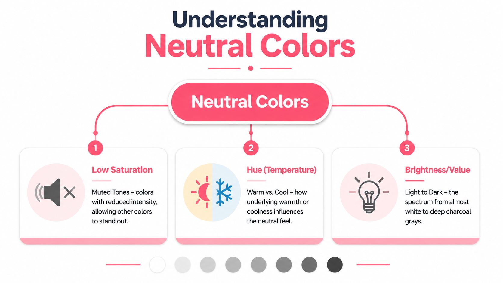
A neutral color isn't just gray. Beige, taupe, greige, stone, mushroom, ivory, sand, and charcoal can all belong in neutral color palettes if they're handled gently.
The most helpful technical definition is this: neutral color palettes use saturation levels below 30% for background and primary surface colors, and they avoid pure white and pure black in favor of softer off-whites and near-blacks according to this explanation of calm color palette design. In plain language, that means the colors are muted, not shouty.
Think of neutrals like soup, not plain water
If bright color is hot sauce, neutral color is broth. It still has flavor. It's just quieter.
Three ingredients shape that flavor:
- Saturation means how intense the color is. Neutral colors keep that intensity low.
- Hue means the hidden color family underneath. A gray may lean blue, green, pink, or yellow.
- Value means how light or dark the color is.
That last one confuses people a lot. A pale cream and a deep charcoal can both be neutral, even though they live at opposite ends of the light-dark scale. What makes them neutral is their muted quality, not their exact brightness.
Warm, cool, and true neutral
At this point, marker artists get a big lightbulb moment.
A neutral can still have a temperature. According to this guide to neutral color palette temperature, a gray with a hue around 40–60° at very low saturation reads warm, while a hue around 200–240° reads cool. It also notes that once saturation rises above effectively zero, the color has a detectable temperature.
You don't have to memorize hue numbers to use this well. Just train your eye to ask:
- Does this gray feel like stone warmed by sunlight?
- Or does it feel like metal under cloudy light?
Warm neutrals include cream, sand, oat, camel, mushroom, and rosy beige. Cool neutrals include slate, fog, blue-gray, putty, and some green-grays. A so-called true neutral sits very close to center and doesn't obviously lean warm or cool.
Practical rule: If your beige shadow looks dirty when layered, the problem often isn't your technique. It's temperature mismatch.
For alcohol markers, this matters because repeated passes deepen undertones. A warm greige and a cool gray may look friendly in the cap, then turn murky on paper when layered over each other.
A quick way to check yourself is to line up three markers before you start: your light, your middle, and your dark. If all three feel like they belong to the same season, you're in good shape. If one feels like winter and the others feel like toast and candlelight, expect trouble.
Building a Harmonious Neutral Palette from Scratch
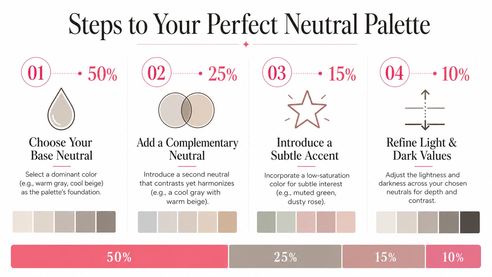
Building neutral color palettes gets much easier when you stop thinking in terms of “which gray should I use?” and start thinking in terms of roles.
Each color has a job.
Start with temperature before you pick markers
Your first decision is not light or dark. It's warm or cool.
If you're coloring a bakery, cottage kitchen, cozy bedroom, vintage bookshop, or autumn street, warm neutrals usually feel natural. If you're coloring manga interiors, rainy windows, modern fashion, moonlit rooms, or sleek city scenes, cool neutrals often behave better.
Once you choose a temperature, pick an anchor color. This is your calmest, quietest neutral. It might be creamy ivory, pale greige, mist gray, or soft stone. This color will cover the largest areas and set the emotional tone.
Then choose:
- A primary surface neutral for furniture, clothing, walls, or larger objects.
- A depth neutral for shadows, outlines, trim, and structure.
- A very small accent neutral or muted accent for special details.
If you want help exploring combinations before uncapping a marker, a palette generator for marker-friendly planning can help you test relationships between soft neutrals and accents visually.
Use the room designer rule on paper
One of my favorite borrowed ideas from design applies beautifully to illustrations. A professional model for neutral palettes follows a 60–25–10–5 proportion: 60% quietest surface, 25% primary surface, 10% structural depth, and 5% accents according to this neutral palette proportion guide.
On paper, that looks like this:
| Palette role | What it does in marker art |
|---|---|
| 60% anchor | Background walls, sky haze, large clothing areas, tablecloths |
| 25% surface | Main objects, furniture, hair masses, roofs, floors |
| 10% depth | Cast shadows, folds, corners, window frames, bark texture |
| 5% accent | Tiny floral notes, book spines, mugs, ribbon, cheeks |
This stops the common beginner mistake of treating every neutral equally. If every color gets equal airtime, the page feels restless. The anchor needs room to breathe.
If adding one more neutral makes the page harder to read, remove one instead of adding two more.
A simple marker planning checklist
Before you start coloring, test your palette in a tiny swatch ladder.
- Choose one family first. Pick warm beige-based neutrals or cool gray-based neutrals. Don't blend across families until you know how they behave on your paper.
- Check your jump in value. Your light, middle, and dark should be visibly different. If they all look like cousins, your page will look flat.
- Reserve your strongest dark. Use your deepest neutral for the smallest areas. Darks are like bass notes in music. A little adds structure. Too much makes everything heavy.
- Add texture with strokes, not extra colors. Wood grain, knit fabric, fur, and stone can all feel richer through mark-making.
When students struggle with neutral palettes, they usually need fewer markers, not more. Three good neutrals plus one restrained accent can do a surprising amount of work.
Three Ready-to-Use Neutral Palettes for Marker Artists
Sometimes you don't want theory. You want a starting point that feels trustworthy. These three palette ideas are built for common coloring moods and can be adapted across marker brands.
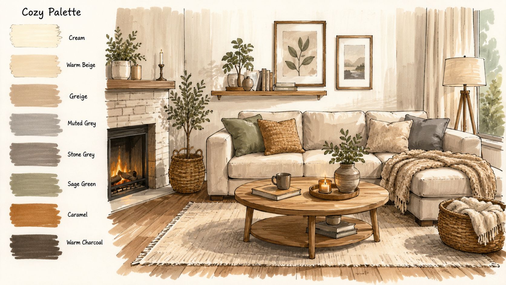
Near the start, keep this kind of visual mood in mind:
Cozy Cottage
This palette is for teacups, blankets, baked goods, old books, flowerpots, farmhouse kitchens, and gentle autumn pages.
Think oatmeal, cream, mushroom, warm wood, and a whisper of dusty pink.
A simple way to build it is:
- Light base with soft cream or ivory
- Midtone in warm beige or greige
- Shadow in a gentle brown-gray
- Accent in muted rose, sage, or faded terracotta
This palette works best when you let paper white do some of the lifting. Don't fill every corner. Leave highlights in mugs, lace curtains, and ceramic dishes. Warm neutrals glow when they have breathing room.
If you work across brands and want a quick way to compare equivalents, the Decotime to Ohuhu marker converter is handy for translating a palette idea into markers you already own.
Modern Manga
This one is crisp, urban, and clean. It's lovely for character shading, monochrome fashion looks, tidy interiors, silver accessories, and rainy-day scenes.
The mood comes from cool neutrals with clear value separation:
- pale mist gray
- medium slate
- charcoal
- tiny accent in dusty mauve, muted teal, or desaturated blue
The trick here is restraint. Don't soften everything. Manga-friendly neutral color palettes often look stronger when edges stay sharper and cast shadows are more intentional.
A school uniform, apartment hallway, or café window scene can feel polished with cool neutrals alone. Then one controlled accent, maybe a muted blue tie or soft rose lip, becomes the focal point.
This walkthrough style can help you study that cleaner, layered look in action:
Enchanted Forest
This is my favorite for backgrounds because it proves neutrals don't have to be plain. Forest neutrals are bark, fog, stone, dried moss, shadowed mushrooms, weathered wood, and cloudy sky.
Instead of bright green, lean on nature's quieter side:
- soft mushroom or fog as the lightest note
- bark brown or olive-gray as a middle
- deep shadow in cool earth charcoal
- tiny accents in muted sage, dusty plum, or pale pink-beige
This palette shines in tree trunks, castle ruins, forest cottages, book covers, animal fur, and old pathways. It also layers beautifully with colored pencil on top if you like to add final texture later.
Here's a quick comparison of the three moods:
| Palette | Best for | Temperature | Accent mood |
|---|---|---|---|
| Cozy Cottage | interiors, food, homey pages | warm | dusty rose or sage |
| Modern Manga | characters, fashion, clean scenes | cool | muted blue or mauve |
| Enchanted Forest | backgrounds, nature, fantasy | mixed but controlled | mossy or plum accents |
Notice that none of these palettes need loud color to feel interesting. They rely on temperature, value, and texture more than brightness.
Translating Digital Palettes to Real Markers
A lot of artists find this frustrating.
A digital palette can look soft, balanced, and elegant on your phone screen. Then you try to recreate it with alcohol markers and suddenly the beige is louder, the gray is bluer, and the blended shadow looks heavier than expected.
Why screens make neutrals tricky
A major gap in hobby content is the lack of practical guidance for translating neutral digital schemes into alcohol marker reality. As this discussion of neutral color scale gaps points out, mainstream resources don't quantify how marker lines such as Ohuhu or Copic shift precise neutral gradients on paper, so hobbyists are often left guessing.
That's especially noticeable with neutrals because subtle differences matter more. A bold red can still feel “red enough” after a shift. A soft greige can turn muddy with only a slight change in undertone.
Paper adds its own opinion too. Smooth paper, coated paper, and coloring book paper all change how muted tones settle. Some pages drink ink fast and darken the result. Others hold the top layer longer and keep blends softer.
Screens show intention. Paper shows behavior.
A practical bridge from swatch to marker case
The safest workflow is simple.
First, pick your digital mood. Maybe it's a cozy warm room, a cool rainy sidewalk, or a pale forest scene. Next, reduce that idea to a very small group of neutrals with clear jobs: light, middle, dark, and accent. Then compare those against your real markers instead of trusting cap colors alone.
This is also where comparison tools help. If you own mixed sets or switch brands, a marker comparison tool for alcohol marker collections makes it easier to see which markers are likely to play similar roles across systems.

A good habit is to build a translation strip before coloring the full page:
- swatch the digital idea
- swatch your likely marker matches
- test one light-over-dark blend
- test one dark-over-light blend
- label which pair stayed cleanest
That tiny strip saves a lot of disappointment. Neutral color palettes live or die on subtle harmony, so a few minutes of testing pays off quickly.
Advanced Tips for Lighting and Contrast
The artists who make neutrals look magical usually aren't using more colors. They're controlling light.
Use temperature to suggest light
Warm light calls for warmer neutrals in the lit areas and more grounded shadows. Think candlelight, bakery windows, sunset rooms, or lamplight on wood floors. Cream, oat, camel, and rosy beige will do more work for you than plain gray.
Cool light asks for the opposite. Overcast skies, snowy air, fluorescent interiors, rainy streets, and moonlit rooms often feel better with blue-gray, slate, fog, and cool charcoal.
The secret is consistency. If your highlights feel warm and your shadows suddenly drift into an unrelated cool family, the image can look dirty instead of dimensional. Artists sometimes assume contrast only comes from darkening. Often it comes from choosing the right temperature shift.
Use value so everyone can read the image
Accessible art isn't only about bright high-contrast color. It's also about readable lightness differences.
Existing guides on accessible palettes often neglect hobbyists, yet for 1-in-12 men with color vision deficiency, varying lightness and texture is the most reliable way to create distinguishability according to this guide to accessible colour palettes. That matters in coloring, especially if you love soft monochrome pages.
Here's how to apply that without losing the cozy mood:
- Separate objects by value first. If the mug and table are both beige, make one clearly lighter or darker.
- Use texture as a second signal. Add wood grain, knit lines, dot patterns, or stone speckling.
- Keep accents small but distinct. A muted pink can stay subtle if its value still separates from the background.
- Check your page in grayscale on your phone. If shapes disappear, your values are too close.
A successful neutral page should still read clearly even when the hue differences fade.
That's one of the most generous things about learning neutrals well. You aren't just making prettier pages. You're making clearer ones.
And once you understand that, gray stops being boring forever.
If you want a calm way to test neutral color palettes before you commit ink to paper, ColorBestie is a lovely companion. It helps you turn sketches and images into marker-style color inspiration, explore soft palette directions, and compare ideas across brands like Ohuhu and Copic so your cozy digital plan is easier to carry onto the page.
