
You're probably in one of two places right now. Either you're staring at a giant wall of markers online, every set looking almost the same, or you've already bought a pack and you're wondering whether you picked the right one.
That confusion makes sense. The marker category is crowded enough that one artist-led comparison project tested 2,872 markers from more than 90 brands across 15 criteria, which tells you how hard it can be to judge them by packaging alone (large-scale marker comparison project). Most artists don't need more noise. They need a way to decide.
The best markers for artists aren't the same for everyone. A manga artist needs different behavior from the ink than someone filling an adult coloring book. A concept artist needs fast, readable color relationships. A hobby colorist may care more about ease, comfort, and a calm palette than refill systems or replacement nibs.
A good marker choice works like a good brush choice. It should match the job. Once you know what matters, the shelves stop looking random.
Your Guide Through the World of Artist Markers
You are standing in the art store with three marker sets in your hands. One promises professional results, one offers 120 colors for a low price, and one has the brand name you keep seeing online. The confusing part is that all three might be good choices for different kinds of artists.
That is why the better question is not “Which marker is best?” but “Which marker fits the way I work?”
Markers work like tools in a studio drawer. A tool is useful when it matches the job. An illustrator planning manga pages needs different strengths than someone filling in a coloring book, and both need something different from a concept artist blocking quick environment ideas. The manga artist may care most about controlled lines, smooth skin tones, and nibs that behave predictably during repeated character rendering. The coloring-book fan may care more about staying within printed paper limits, avoiding heavy bleed, and choosing colors that feel enjoyable rather than stressful to sort through. The concept artist often needs speed, clear value grouping, and enough neutral options to sketch form before worrying about fine detail.
Practical rule: Start with the marks you need to make most often, then choose the markers that produce those marks reliably.
This guide is built around that decision process. Instead of sorting markers by hype or treating one brand as the automatic winner, it helps you judge a set by a few working properties: how the ink behaves, what the nibs let your hand do, how the color system is organized, and whether the line makes sense for your budget over time.
That framework also makes it much easier to turn a digital palette into a real marker collection. If you already build color ideas in an app like ColorBestie, the goal is not to buy every appealing shade. The goal is to identify the colors you repeat in your work, then find physical markers that cover those jobs with as little waste and overlap as possible.
Once you look at markers through workflow instead of marketing, the category gets much easier to judge.
Alcohol vs Water Based The Foundational Choice
If you only make one smart decision before buying markers, make this one. Ink chemistry changes almost everything that follows, including blending, drying behavior, paper choice, and the final look of your work.
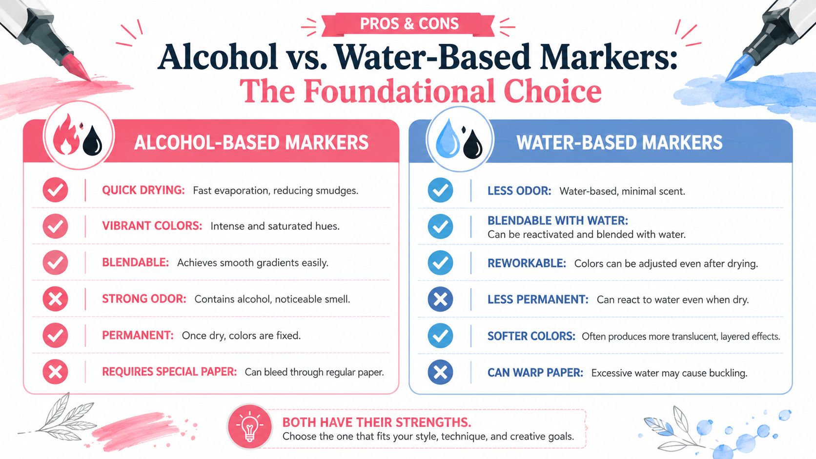
How the ink actually behaves
Think of alcohol-based markers as being built for smooth, fast overlap. The ink is designed to re-wet itself, which means one layer can soften into another instead of sitting beside it as a hard stripe. That's why artists use them so often for illustration and comics. They give smooth blending, vibrant fills, and a polished rendering feel on the right surface (marker guide on alcohol ink behavior and paper).
Water-based markers behave differently. They often feel friendlier for casual coloring and mixed craft use, but their blending method is not the same. Instead of that solvent-driven merge at the edge, you're usually dealing with layering, moisture control, or water reactivation. That can be lovely for softer effects, but it's a different skill.
Here's the short version.
| Feature | Alcohol-Based Markers | Water-Based Markers |
|---|---|---|
| Blending feel | Smooth edge-to-edge transitions | More dependent on layering or water handling |
| Surface preference | Smooth, bleed-resistant marker paper | Often more flexible across everyday papers |
| Drying behavior | Fast and clean on suitable paper | Varies more by paper and moisture |
| Color look | Saturated, illustration-friendly fills | Often softer or more translucent effects |
| Best fit | Comics, concept art, design rendering | Coloring books, crafts, journaling, mixed media |
The paper matters because the ink behavior and the surface are a team. Alcohol markers work best on smooth, bleed-resistant marker paper because that surface helps reduce feathering and keeps transitions cleaner. On ordinary paper, the same marker can feel rougher, streakier, and far less impressive.
Which one fits your kind of art
For manga and comic work, alcohol markers usually make life easier. Flat fills look cleaner, shadows blend faster, and skin tones stack more predictably. If you're drawing panels, covers, or character sheets, that smooth re-wetting behavior is a real advantage.
For adult coloring books, the answer is more mixed. If your paper is thin, water-based markers may feel safer and calmer. If your coloring pages are printed on heavier, marker-friendly stock and you want that rich, polished look, alcohol markers can be wonderful. The right answer depends less on internet hype and more on the paper in front of you.
For concept art and ideation, many artists lean alcohol because it's fast. You can block a sky, throw in a shadow shape, add a neutral gray, and read the whole scene immediately. That speed matters when you're thinking visually and don't want the tool to interrupt the idea.
If you want smooth gradients with less struggle, start by testing alcohol markers on proper marker paper before judging the marker itself.
If you're still unsure, use this beginner filter:
- Choose alcohol-based if you want polished blends, vibrant fills, and illustration-style rendering.
- Choose water-based if you want gentler behavior on common paper, lighter craft use, or less concern about bleed.
- Delay brand decisions until after you know which chemistry matches your projects.
That choice narrows the field fast.
Decoding Nibs Barrels and Ergonomics
Two markers can use similar ink and still feel completely different in your hand. That usually comes down to the tip and the barrel.
I tell students to stop thinking of nibs as accessories. A nib is the steering wheel. It decides how the marker enters the page and how much control you have over detail, coverage, and line character.
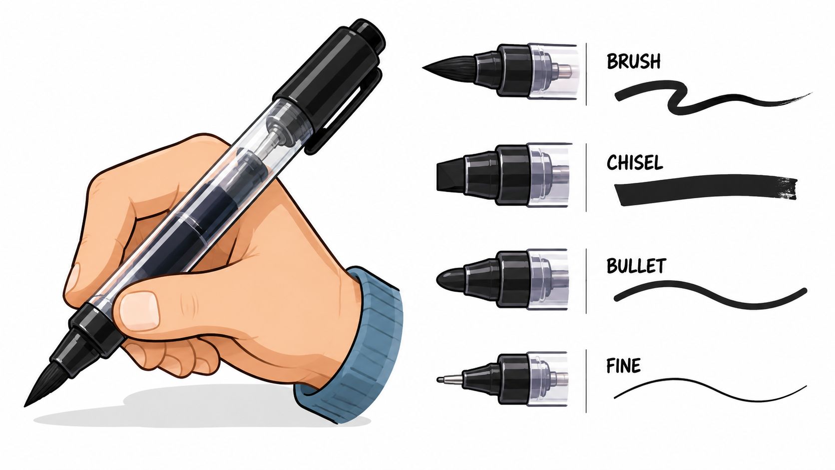
What each nib is built to do
A brush nib is the most expressive option for many artists. With a light touch, it can make a thin line. With more pressure, it opens into a wider stroke. That makes it especially useful for manga hair, folds, organic shapes, and any work where you want movement in the mark.
A chisel nib is the workhorse for coverage. It's excellent for broad areas, straight-edged fills, quick background blocks, and design sketching. If you render cars, products, architecture, or interiors, a chisel tip often feels efficient and tidy.
A bullet nib gives steady, firm control. It won't flex much, which some beginners prefer because it feels predictable. It's useful for outlines, small shape filling, and coloring-book areas where you want consistency more than flair.
A fine nib is your precision tool. Think eyelashes, jewelry highlights, small patterns, or tiny design notes. It's not always ideal for expressive drawing, but it shines when the work gets small.
Here's a simple matching guide:
- Brush nib for character art, manga, expressive illustration
- Chisel nib for large fills, design rendering, fast blocking
- Bullet nib for steady coloring and controlled general use
- Fine nib for detail, accents, and tight spaces
A beginner mistake is buying a huge set without checking the tip combination. If the nib doesn't suit your hand, even good ink feels frustrating.
Why the barrel shape matters
Barrel shape sounds minor until you spend an hour coloring. Then it becomes very important.
A round barrel rolls more easily on the desk, but many artists find it comfortable and familiar. An oval barrel usually feels more secure in the hand and often signals which side has which nib. Some markers use shaped bodies that reduce rolling and make quick tool pickup easier. If you work long sessions, that small ergonomic difference adds up.
Pay attention to grip fatigue. If you pinch tightly because the marker feels slippery, your hand will tire faster. If the barrel is too thick, detail work may feel clumsy. If it's too thin, broad coloring may feel cramped.
For manga artists, a brush-and-fine or brush-and-chisel combination often gives the best flexibility. For adult coloring, many people enjoy a bullet or brush side paired with a manageable barrel that doesn't fight the hand. For concept sketching, chisel plus brush is often a very practical pairing because it covers both fast fills and expressive accents.
The marker should feel like a pencil you trust, not like a tool you wrestle.
Mastering Color Palettes and Blending
The marker itself matters, but your results often come down to a quieter skill. Can you choose a useful set of colors, and can those colors move smoothly from one value to the next?
That's where many beginners overspend. They buy a giant assortment, then discover they're missing the middle tones that make blending believable.
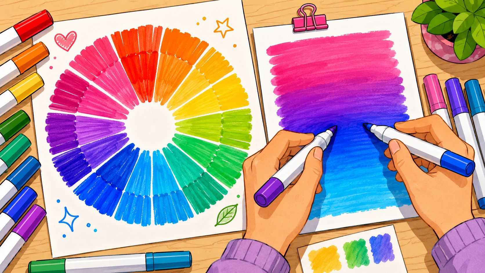
Why color range changes your workflow
A larger color system gives you more than bragging rights. It gives you smaller steps between colors.
That matters when you're rendering skin, cloth folds, atmospheric shadows, or brand-specific design colors. If the jump between your light peach and your mid peach is too large, the blend looks abrupt. If you have a transition tone in between, the form feels smoother and more convincing.
Lightfastness also matters if you display or sell original work. It refers to how well a color resists fading over time. Beginners often ignore this because it doesn't change the drawing session itself, but it matters if your art is meant to last. Along with tip shape and color range, it's one of the practical criteria artists are encouraged to evaluate when choosing markers.
What blendability looks like on paper
“Blends well” can sound vague, so let's make it concrete. A blendable marker lets you overlap one color into another without harsh boundaries fighting back immediately. It should also stay predictable over repeated strokes.
Premium markers are often judged by consistency across repeated strokes, refillability, and predictable blending, not only by how many markers come in the box. In other words, a marker earns trust when the fifth pass behaves like the first, not when the packaging looks generous.
Try this simple test on marker paper:
- Lay down a light color in a rectangle.
- Add a darker related color on one side.
- Use the lighter color to pass back into the edge where they meet.
- Watch whether the edge softens gradually or leaves a hard seam.
If the seam keeps showing up, it may be the marker, the paper, or the gap between the colors. Usually it's a combination.
A quick demonstration can help you see what smooth transitions look like in practice.
Planning a palette before you buy
A smart collection starts with color roles, not random favorites. I suggest thinking in clusters.
- Neutrals first: warm gray, cool gray, and a few values for shadow structure
- Skin or subject tones next: especially if you draw people, creatures, or lifestyle scenes
- Bridge colors: the in-between hues that connect lights to darks
- Accent colors: the bright notes you use sparingly but deliberately
For digital planning, it helps to sketch out a palette before spending money on physical markers. A tool like the ColorBestie palette generator can help you preview color relationships from an image and think in groups rather than isolated swatches.
Good blending often starts before you touch the paper. It starts when your palette has enough middle steps to describe form.
If you work in manga, build around skin, hair, fabric, and neutral shadows. If you color cozy coloring-book pages, choose a controlled set of florals, greens, wood tones, and soft neutrals. If you do concept art, prioritize value structure first. A handful of useful grays can do more for readability than a pile of bright markers.
Navigating the Brand Ecosystem
Buying markers gets simpler once you stop seeing each brand as a sealed-off world. A marker brand is really a system. You are choosing a color map, a set of nib options, a barrel shape, and the long-term question of how easy it is to replace the colors you use up.
That matters because artists do not all use markers in the same way. A student filling sketchbook pages on weekends has different needs from a manga artist inking clean line art, or a concept artist who needs repeatable grays for thumbnails and callouts. The right brand is the one that supports your workflow without making every refill or color match feel like a scavenger hunt.
Professional systems and long-term use
At the premium end, Copic is often treated as the reference point because artists know it as a large, organized, refillable system. As noted earlier in the article, one reason people stay with Copic is the sheer breadth of its color range. A bigger range gives you more ready-made middle steps, which is helpful for skin transitions, subtle fabric shadows, and client work where color consistency matters.
Here is the practical lesson. With a mature system, you are not only buying markers for today's drawing. You are buying a library you can add to one shelf at a time.
That appeals to artists who work in repeatable color families. If you illustrate the same characters, build environments for a game pitch, or return to the same cozy palette for coloring pages, consistency saves time. You spend less energy forcing near-matches to behave like true companions.
A premium ecosystem usually offers three advantages:
- Continuity. You can expand slowly without ending up with random gaps.
- Predictable behavior. Colors and nib formats are designed to work together as a family.
- Maintenance. Refills and replacement parts matter once a marker becomes a regular tool instead of an occasional treat.
Strong alternatives and better starter choices
Many artists do not need the most established premium line on day one. Plenty of pro-capable and student-friendly brands produce strong results, especially if your main goal is learning value control, building a compact manga set, or assembling a coloring collection around a few dependable hue groups.
Here, a decision framework helps more than a brand ranking. Ask what problem the brand solves for you.
If you mostly color printed pages, comfort, clear color labeling, and affordable sets may matter more than refill bottles. If you draw manga, brush nib performance and clean skin-tone ramps may matter more than owning hundreds of colors. If you do concept art, you may care most about grays, muted earths, and how quickly you can replace your workhorse markers.
Use questions like these before you buy:
| Question | Why it matters |
|---|---|
| Can I buy single markers later? | Replacing two empty favorites is cheaper than replacing a whole set |
| Do the nib combinations fit my workflow? | Brush, chisel, and fine tips support different drawing habits |
| Is the color system easy to read? | Clear numbering and families make palette building much easier |
| Will this brand still suit me after six months of practice? | A cheap set is less useful if you outgrow its limits quickly |
For side-by-side sorting, the ColorBestie marker comparison tool can help you compare families in a more practical way.
One last point. Brand reputation is useful, but workflow fit is better. Treat brands the way you would treat brushes in a studio. Each one is a tool with a job. Once you match the system to the kind of art you make, the market feels far less confusing.
From Digital Palette to Physical Markers with ColorBestie
A lot of artists don't struggle with inspiration. They struggle with translation. They see a beautiful image, pull a digital palette, then get stuck asking, “Which actual markers do I buy to make this real?”
That's where a digital planning step can save money and frustration.

A simple workflow from screen to sketchbook
Start with an image that already has the mood you want. It might be a cozy café photo, a fashion reference, a manga cover, or an outdoor scene with interesting lighting. Upload it into ColorBestie and look for the dominant groups rather than every tiny color.
You're not trying to match every pixel. You're building a usable marker palette.
I teach students to sort the result into four buckets:
- Base lights for large open areas
- Midtones that carry most of the scene
- Shadow colors for form and depth
- Accents that create focus
That step matters because physical marker collections work best when each color has a job. If you skip that and shop by emotion, you end up with twelve beautiful colors that don't cooperate.
How to turn suggestions into a shopping list
Once you have a digital palette, compare it to the marker system you plan to use. Look for the nearest physical matches, then check whether you have enough separation between values. A good physical set doesn't need perfect digital accuracy. It needs useful steps.
For adult coloring, keep the list compact and harmonious. You might choose a sage, a muted pink, a cream, a mid brown, a dark brown, and a few neutrals rather than chasing every variation. For manga, think in character categories: skin trio, hair trio, outfit pairings, and shadow neutrals. For concept art, build around readable value groups first and local color second.
A practical shopping list often has three layers:
- Core colors you'll use constantly
- Bridging tones that improve blending
- A few mood accents for personality
Don't buy from the top of the palette downward. Buy from the middle outward. Midtones do most of the visual work.
This approach also helps mobile-first creators. If you plan on a phone, save the palette, note the marker family you want, and build deliberately instead of scrolling through giant bundles and guessing.
The result is simple. You buy fewer markers, but the markers you buy do solve problems.
Building and Maintaining Your Marker Collection
Markers are easy to buy impulsively and expensive to replace carelessly. Treat your collection like a toolkit, not like a trophy shelf.
That mindset changes your spending. Instead of buying set after set full of overlap, you start noticing gaps. Maybe your portraits need better transition tones. Maybe your outdoor scenes need more natural greens. Maybe your cozy interiors need warmer neutrals. That's a smarter reason to add colors than “this set looked good online.”
Build by gaps not by hype
A strong collection grows in layers. Start with the colors that support your most common subjects, then add only where your work keeps asking for help.
Try this order:
- First layer: basic lights, mids, darks, and useful neutrals
- Second layer: colors for your main subject matter, such as skin, foliage, wood, fabric, or metal
- Third layer: specialty accents, unusual moods, and problem-solving bridge tones
If a marker line offers refillable bodies and replaceable nibs, that matters most when you already know you'll return to the same colors often. If you only color occasionally, a simpler disposable path may suit you fine. The right system depends on repetition.
Care habits that keep markers usable
Storage matters more than people think. Keep markers horizontal so ink stays distributed more evenly across both ends. If one side seems dry while the other still works, poor storage is often part of the problem.
Clean caps, close them firmly, and test on scrap paper before assuming a marker is dead. A stained nib isn't always ruined. Sometimes it just picked up pigment from a darker color during blending. Good habits slow that kind of wear.
Use a swatch chart and update it as your collection changes. That one habit prevents duplicate buying and helps you see where your real holes are.
The best markers for artists are rarely built in a single shopping trip. They're assembled over time by paying attention.
If you want a calmer way to plan colors before you spend money on markers, try ColorBestie. It helps you turn inspiration images into marker-friendly palette ideas, so you can choose colors with more confidence and build a collection that fits how you create.