
You've finished the line art. The pose works, the eyes land, the costume details read cleanly, and now the page is sitting there in black and white waiting for the step that can either enhance everything or flatten it. That's usually the moment artists start second-guessing their tools.
The problem usually isn't just “Which brand is good?” It's more practical than that. You may already have a digital palette blocked out, maybe from a color planning app or a rough mockup on your tablet, and now you need real markers that can reproduce it without turning skin chalky, hair muddy, or shadows dead. That gap between digital planning and physical execution is where most marker advice falls short.
For manga work, your marker choices affect speed, consistency, and how repeatable your character colors are across pages. In a market as large and specialized as manga, that matters. The Japanese Publishers Association reported 1,324 manga magazine titles available in Japan in 2023, and manga magazines plus books generated ¥619.3 billion in sales that year, which shows how integral these illustration workflows are to a serious production environment in this industry overview. Artists don't choose markers only for fun. They choose them because a tool either supports clean repeatable color or it gets in the way.
Bringing Your Manga Characters to Life with Color
A finished manga drawing already carries structure. Color decides what the reader feels first. Warm skin can make a character feel open. Cold shadows can turn the same face distant. A sharp accent color in the hair or costume can push the design from “competent” to memorable.
That's why the best markers for manga aren't the brightest or the cheapest. They're the ones that let you move from line art to finished rendering without fighting the tool. When a marker floods paper, frays too quickly, or gives you only blunt value jumps, the page starts looking accidental.
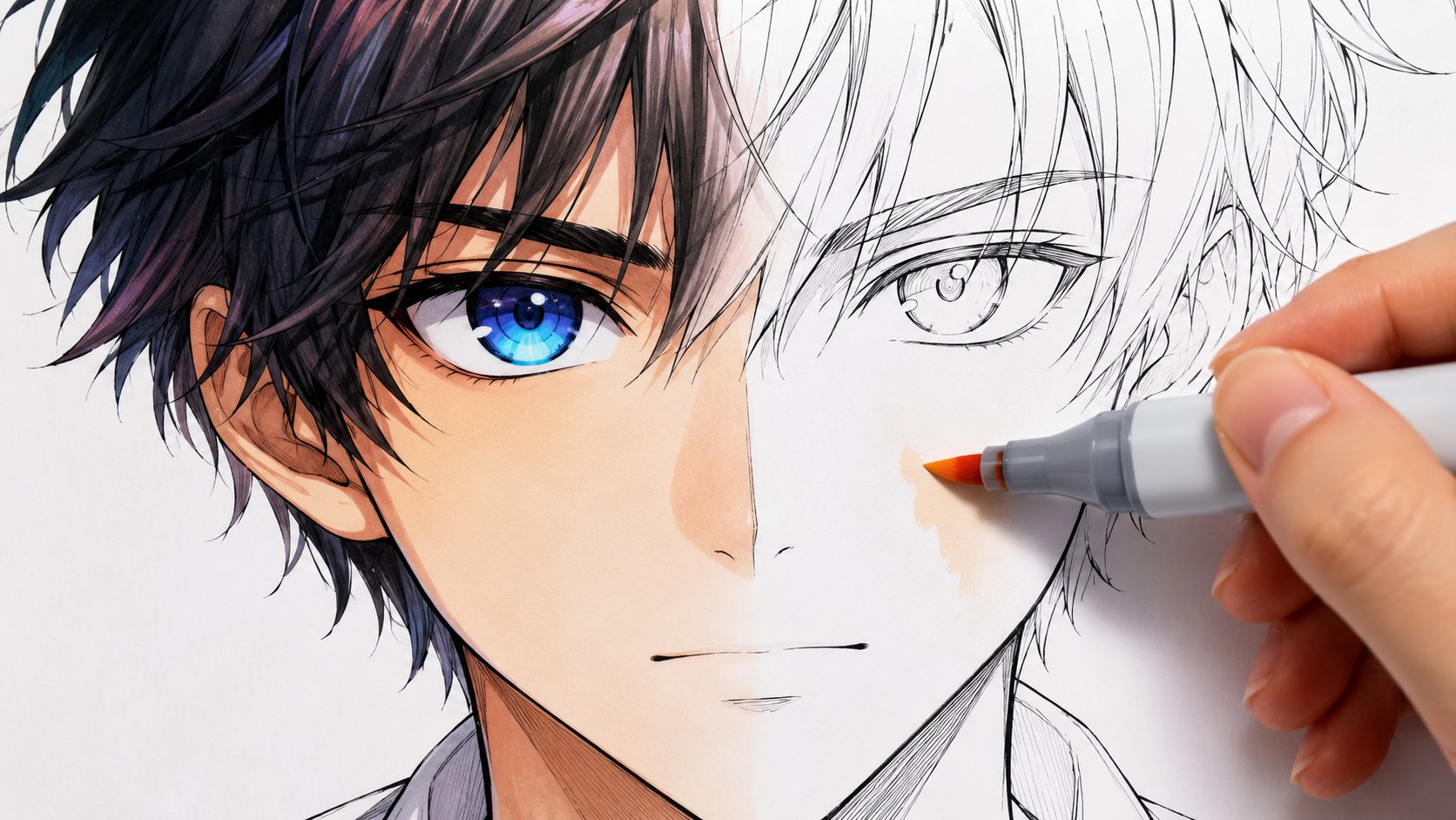
A common workflow now starts before the marker cap even comes off. You rough out a palette digitally, test whether the jacket should lean cool or warm, check if the hair should sit near the background or separate from it, and only then commit to paper. If you want to preview those relationships first, a theme preview for marker-style color planning can help you test mood before you start swatching by hand.
Color has to serve the drawing
Manga coloring works best when it respects the strengths of line art.
- Faces need restraint. Skin usually fails because artists jump too dark too fast.
- Hair needs shape. One base tone and one shadow tone rarely feel like enough.
- Costumes need hierarchy. If every area is equally saturated, nothing stands out.
- Backgrounds need discipline. Over-rendered backgrounds can crush the character silhouette.
The strongest marker render usually looks simple at first glance. That simplicity is controlled, not empty.
What good marker choice changes in practice
A good set doesn't just improve appearance. It changes your whole pace.
You spend less time patching streaks. You can repeat a character palette from one illustration to the next. You know which marker handles the base tone, which one softens the edge, and which one drops the final shadow without contaminating everything underneath.
That reliability is what artists are really paying for. Not luxury. Control.
Understanding Manga Marker Essentials
If you buy markers by brand alone, you'll usually overpay for colors you don't need and still miss the tools that matter. Marker performance comes down to three things. Ink behavior, nib behavior, and how well the color system supports layered work.
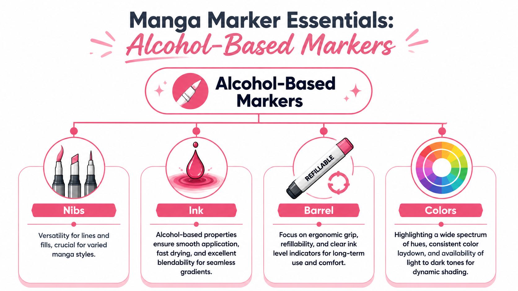
The wider art materials world reflects that priority. The global art and craft materials market was estimated at USD 28.6 billion in 2023, and alcohol-based products are the dominant professional choice for illustration because they support smooth blending and layered color work. Industry coverage also notes that artists typically choose marker families with dual tips and broad color ranges so they can handle both accents and fills efficiently in this marker market and manga tool discussion.
Why alcohol ink is the default
For manga illustration, alcohol-based markers solve several problems at once. They dry fast, blend more smoothly than water-based markers, and let you layer tones without roughing up the paper as quickly.
That matters most in a few predictable situations:
- Skin rendering: you need gentle transitions, not abrupt jumps.
- Cel shading: flat anime-style fills look cleaner when the ink settles evenly.
- Hair shine bands: alcohol ink lets you feather into highlights instead of outlining them.
- Clothing folds: layered passes can create depth without turning the surface muddy.
Water-based markers can still be useful for certain craft or mixed-media workflows, but for manga coloring they often feel less stable. Paper can buckle more easily. Reworking a spot gets riskier. Blending tends to be less forgiving.
Practical rule: If your style depends on clean gradients, layered shadows, and fast drying over smooth paper, start with alcohol markers.
What each nib actually does
New artists often treat nib choice like a minor detail. It isn't. The nib determines how the marker behaves in your hand.
Here's the short version:
| Nib type | Best use in manga work | Main trade-off |
|---|---|---|
| Brush nib | Hair, skin blending, tapered strokes, soft edges | Can wear down if you press too hard |
| Chisel nib | Large fills, graphic shadows, blocking backgrounds | Clumsy in tight details |
| Fine or bullet nib | Small accessories, eye details, texture accents | Not efficient for broad coverage |
The nib combinations that make sense
A brush plus broad/chisel setup is usually the most useful for manga. The brush handles expression and blending. The broader tip covers uniforms, capes, backdrops, and large shadow masses faster.
A brush plus fine tip setup can also work, especially if you do lots of tight costume detail or small-format illustrations. The trade-off is speed. Filling large areas becomes slower, and you may notice more overlap marks if the ink flow isn't generous.
When artists struggle with markers, it's often because they're using the wrong tip for the job.
- Using brush for every fill: slower, more wear, more accidental streaks.
- Using chisel for faces: too blunt, easy to overshoot edges.
- Using fine tip for shadows: patchy coverage, uneven tone.
The best markers for manga usually feel predictable because the nib pair covers both expressive and mechanical tasks. One end interprets the drawing. The other gets work done.
The Top Tiers of Manga Markers Compared
Most artists end up choosing between a few familiar names. The core question isn't which brand wins in the abstract. It's which system fits the way you color. Some brands are built for long-term collection building. Others make more sense when you want a large usable palette right away.
Before the deeper notes, here's the quick comparison.
Manga Marker Brand Comparison
| Brand | Ink Quality & Blendability | Nib Type & Quality | Color Range | Refillable / Replaceable Nibs | Price Tier |
|---|---|---|---|---|---|
| Copic Sketch | Excellent, very controlled for layered rendering | Brush + medium broad, highly trusted feel | Extensive | Yes, refillable ink and replaceable nibs | Premium |
| Ohuhu | Strong for everyday illustration, good value blending | Usually brush + broad in popular sets, solid for general use | Broad enough for most character work | Varies by line, generally less system-driven than Copic | Budget to mid-range |
| Prismacolor | Rich color character, often pleasing for expressive palettes | Comfortable but less uniform across heavy long-term use | Good for illustration palettes | Typically less serviceable as a full refill system | Mid-range |
| Winsor & Newton | Smooth laydown, especially nice for graphic fills | Strong broad coverage, brush options available depending on line | Good practical range | More limited long-term modularity than Copic | Mid-range to premium |
If you want to compare marker systems side by side before buying into one family, a marker comparison tool for popular brands is useful for checking where sets overlap and where they leave gaps.
Copic Sketch
Copic Sketch is still the benchmark for a reason. JetPens notes that Copic Sketch markers use a brush nib plus a medium broad nib, a replenishable alcohol-based ink system, and replaceable nibs, which makes them especially strong for controlled gradients, line-to-fill versatility, and long-term cost efficiency in this manga supply guide.
That combination matters on the page. The brush nib is responsive enough for feathering shadows into skin or hair. The medium broad side fills larger areas without feeling as crude as a heavy chisel. And because the system is serviceable, dead markers don't automatically become trash.
Where Copic Sketch works best
- Ongoing character work where you need consistent recurring palettes
- Layered skin rendering
- Controlled transitions in hair and fabric
- Artists who know they'll keep using markers for years
Where it can frustrate
- Upfront cost
- Slow collection building if you buy one or two at a time
- Overkill for casual experimentation
Ohuhu
Ohuhu has become the practical answer for artists who want a broad working set without paying premium-system prices immediately. For manga use, the appeal is simple. You can cover skin, hair, costume accents, and background tones quickly with one purchase instead of assembling a collection over a long period.
The trade-off is that the system usually feels less modular. You may not get the same long-term serviceability, and color organization across sets can require more personal swatching discipline. Still, for many hobbyists and even working illustrators doing personal pieces, the performance-to-cost ratio is hard to ignore.
Ohuhu makes the most sense when:
- You're still learning your palette preferences
- You want a lot of usable colors now
- You do finished illustrations but don't yet need a full refill ecosystem
Prismacolor
Prismacolor markers tend to attract artists who like color character. Some palettes feel a little softer or more illustration-forward than rigidly systemized. That can be a strength if your manga work leans painterly, fashion-focused, or emotionally atmospheric instead of strictly cel-shaded.
The downside is predictability over time. When you're building repeatable production habits, a looser system can become less efficient. For one-off illustrations, though, Prismacolor can be very enjoyable.
Some brands are optimized for collecting. Others are optimized for finishing a beautiful piece today. Those aren't always the same thing.
Winsor & Newton
Winsor & Newton markers sit in an interesting middle ground. They often feel appealing to artists who value smooth coverage on larger shapes. If you color anime-style clothing blocks, props, or background architecture, that steadiness can be valuable.
Their biggest strength in manga work is often fill behavior rather than system depth. If your style uses bold shadow shapes and flatter graphic color, they can feel very natural. If you want an endlessly expandable serviceable system, other brands may fit better.
Which one I'd put in your hand
If you're serious about long-term marker work and care about maintenance, Copic Sketch is the safest professional recommendation.
If you need a wide starter or mid-level palette without committing to a premium ecosystem, Ohuhu is the sensible pick.
If your style is expressive and color-driven, Prismacolor can be rewarding.
If you render in broader, cleaner, more graphic color masses, Winsor & Newton deserves a look.
How to Choose Marker Sets for Skin Hair and Shading
Buying a giant set feels productive. Building a working subset improves your art. Most manga pieces rely on the same recurring color jobs. Skin, hair, clothing hierarchy, and shadow structure. If those four areas work, the illustration usually works.
Skin tones that don't go flat
Skin needs small value steps more than dramatic color variety. That's where beginners often go wrong. They pick one base tone, one darker tone, and create a face that looks striped.
For skin, prioritize:
- A pale base tone
- A mid transition tone
- A soft shadow tone
- A blush or warmth accent
- A colorless blender only if you understand what it does
A blender won't magically fix bad layering. It can soften edges, lift a little pigment, or push ink around. It can also create cauliflower-like texture if you overwork the paper.
For manga skin, warmer shadows usually feel more alive than gray shadows unless your lighting is intentionally cold.
Test skin colors on the same paper you'll use for the final piece. Marker paper changes the result. Bristol changes it again.
Hair palettes that hold shape
Hair in manga is rarely just “fill and done.” Even black hair needs value design. Blue-black, violet-black, warm black, or neutral black all tell different story cues.
A useful hair palette usually has:
- A base color that establishes local color
- A deeper shadow for form
- A near-dark accent for depth at roots and overlaps
- An optional reflected-light tone if the style is polished
Bright anime hair colors are where digital planning helps most. Pink, mint, silver, teal, and saturated red often look different in marker than they do on-screen. Some marker lines have beautiful midtones but weak pale companions. Others have enough lights but muddy darks. That's why swatching trios matters more than buying a huge rainbow.
Shading sets you'll use constantly
If I had to advise one category almost every manga artist underestimates, it would be grays and neutrals. A dependable grayscale set makes everything easier.
Use them for:
- Clothing folds
- Cast shadows
- Metal, leather, and stone
- Background separation
- Correcting over-saturated color decisions
There are three common families worth understanding in practice.
| Shade family | What it feels like | Best use |
|---|---|---|
| Cool gray | Clean, distant, modern | Techwear, steel, winter lighting |
| Warm gray | Soft, human, natural | Skin-adjacent shadows, interiors, vintage moods |
| Neutral gray | Balanced, flexible | General-purpose manga shading |
Build around characters, not sets
A smart buying method is to choose colors by character function.
- Main character kit: skin trio, hair trio, eye accent, signature costume colors
- Support cast kit: shared neutrals plus one or two identity colors per character
- Scene kit: atmospheric colors for background, props, and lighting shifts
That method keeps your collection focused. It also matches real production needs better than chasing every unusual hue.
If your digital palette says a jacket should be cool navy with a dusty lavender shadow, don't buy ten blues. Buy the three markers that reproduce that relationship. That's how marker collections become useful instead of impressive-looking.
Budget-Friendly vs Professional Grade Markers
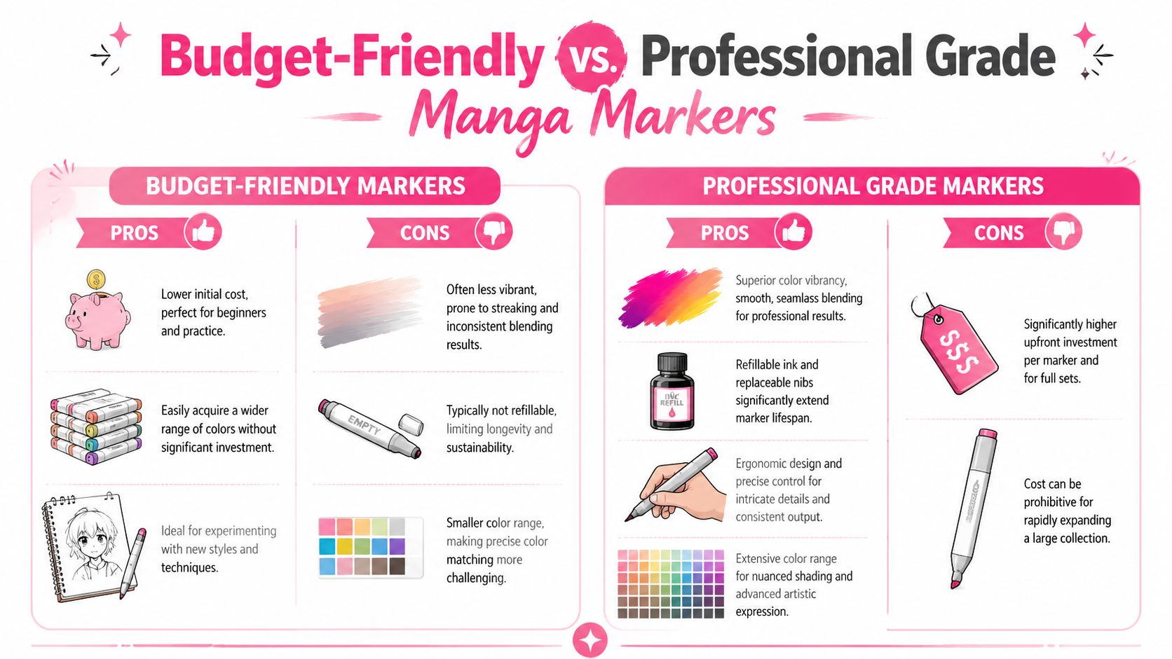
The budget-versus-pro debate gets distorted because artists compare only the sticker price. That's not how marker value works. What matters is whether the marker supports your actual workflow over time.
What you pay for
Professional-grade markers usually justify their price in four ways:
- Serviceability: refillable ink and replaceable nibs keep the marker in rotation
- Consistency: colors behave more predictably from marker to marker
- Control: better nibs hold their shape longer
- System logic: expanding a palette tends to feel deliberate rather than random
Budget markers often win on one major point. Access. You can get a broad set fast, which is valuable when you're learning layering, palette building, and speed.
When cheap markers are the smart choice
If you're still figuring out whether manga coloring will become a serious part of your practice, budget markers are a rational choice. You'll learn blending order, paper behavior, and which colors you empty first.
They're also useful for:
- practice sheets
- warm-up illustrations
- experimenting with unusual character palettes
- keeping a backup travel set
The main weakness shows up later. Once your hand gets more precise, you start noticing where the system doesn't support you. A weak brush nib, inconsistent ink flow, or missing transition tones become more annoying the better you get.
Here's a useful visual summary before you choose:
When pro markers earn their keep
Professional markers make the most sense when your work becomes repetitive in the good way. You're coloring recurring characters. You know which markers run dry first. You need the same hair tone next month, not “something close.”
Working rule: Upgrade when inconsistency costs you more time than the cheaper set saves you money.
If that point hasn't arrived yet, don't force it. A strong artist with a modest set will still make better decisions than a beginner holding expensive markers they don't understand.
Translating Digital Palettes to Real Markers
Digital color planning is clean, fast, and deceptive. A palette that looks perfect on a bright screen can collapse once it hits paper. Saturation shifts. Light colors disappear. Shadow colors turn heavier than expected.
Why screen color lies to you
Screens emit light. Markers reflect it. That changes everything.
A digital peach skin tone may need a much duller-looking physical marker than you expect. A luminous teal on-screen may require a lighter base plus a cooler shadow rather than one highly saturated marker. Brand color systems also interpret similar families differently. One company's dusty rose can lean beige. Another's leans pink.
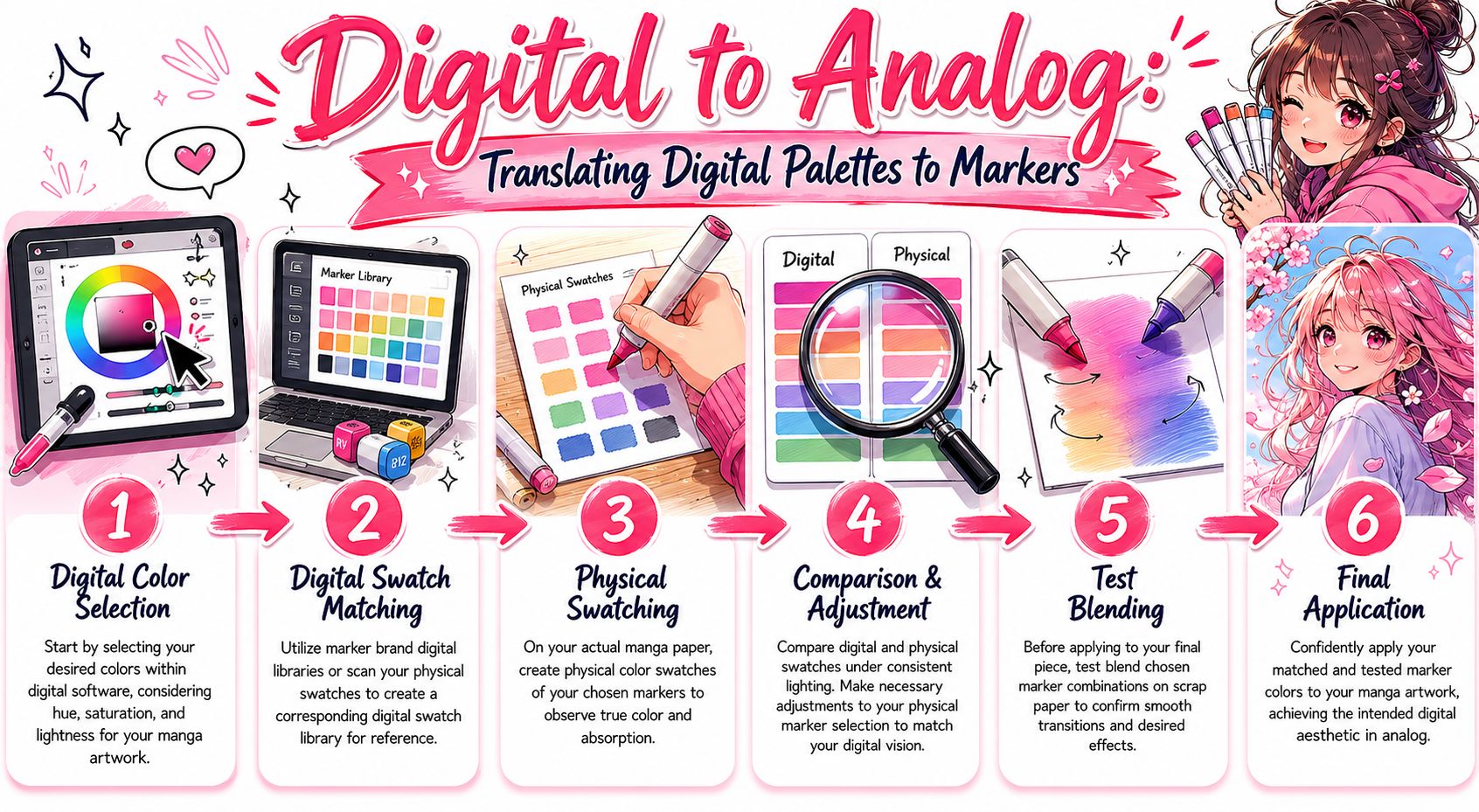
A workable digital-to-marker routine
The best workflow I know is simple and repeatable.
- Lock the palette digitally first. Decide the relationships, not just the individual swatches.
- Translate by function. Find your base, transition, and shadow marker for each major area.
- Swatch on final paper. Never trust cap color alone.
- Test layered pairs. Some good solo colors make ugly blends together.
- Adjust before the final page. Tiny changes at the swatch stage save finished work.
For artists who want help moving from a digital idea to real marker codes, ColorBestie's palette generator can be used to turn a sketch into marker-style palette suggestions matched to common marker brands. The practical value isn't hype. It's reducing guesswork when your digital palette needs a physical equivalent.
A digital palette should be treated like a lighting plan. Your markers are the cast. They still need auditioning on paper.
Frequently Asked Questions About Manga Markers
Can you mix brands in one piece
Yes, you can. The core issue isn't brand purity. It's compatibility of feel, saturation, and layering order.
Mix brands when one line gives you a better skin transition, another offers stronger darks, or a third has the exact accent hue you need. Just swatch combinations first. Some markers blend politely together. Others create harsh edges or uneven overlap.
A safe approach is to keep one brand dominant in a piece and use the others as specialists.
What paper works best
For alcohol markers, smooth paper is your friend. Rough tooth catches nibs and makes blending harder. Very thin paper invites bleed issues and can make the whole process more frustrating than it needs to be.
Look for:
- Smooth marker paper for the cleanest blends
- Bristol board when you want a firmer surface
- A test sheet underneath to catch bleed-through
If your line art is precious, never do your first color experiment directly on it. Print or trace a duplicate and test there.
How many markers do you need to start
You need fewer than most beginners think. What matters is coverage of roles.
A practical starter setup includes:
- A small skin group
- A few warm and cool grays
- Several hair colors you like
- A dark accent
- A light blender or pale softener if you use one intentionally
That gives you enough range to learn form, value, and palette control. Huge sets are exciting, but they can hide weak decision-making. A smaller curated group forces you to understand why each marker exists in your workflow.
Do marker caps match the real ink
Not reliably enough to trust them on final work. Caps are quick references, not color proof. Swatches on your actual paper will always tell you more.
Should beginners buy singles or sets
If you already know the kind of manga art you want to make, singles are efficient. If you're still exploring, a set gives you room to discover unexpected pairings. The mistake is buying randomly. Whether you buy singles or sets, think in palettes and roles, not isolated pretty colors.
What ruins marker coloring fastest
Usually it's one of three habits:
- choosing shadows that are too dark too early
- overblending until the paper gets exhausted
- using every bright color at full saturation in one character design
Most marker problems aren't dramatic. They're cumulative. A slightly wrong shadow, a slightly muddy transition, one more pass than the paper wanted. Clean workflow fixes most of them.
If you plan palettes digitally before coloring by hand, ColorBestie is one option for turning black-and-white sketches into marker-style previews and matching those ideas to real marker families such as Copic, Ohuhu, Prismacolor, and Winsor & Newton. It's useful when you want to test palette direction before committing ink to paper.
Created with the Outrank tool
