
A cool cat drawing isn't just about the cat. It's also about the treatment you choose. Sharp geometry feels modern. Soft cartoon shapes feel friendly. Dense fur rendering feels serious and slow in the best way. The same sitting cat can become graphic, dreamy, playful, dramatic, or nostalgic depending on line, palette, and finish.
That idea has deep roots. Cats have appeared in art for at least five millennia, from ancient Egyptian imagery in the mid-third millennium BCE through later museum pieces and early modern works, which shows that feline subjects have lasted far beyond modern internet culture (art history of cats in Egyptian and later art). So when you look for cool drawings of cats, you're joining a very old image tradition, not chasing a passing trend.
For marker artists, that's good news. Cat drawings give you room to practice almost every coloring skill that matters. Clean fills, soft blends, dramatic contrast, stylized palettes, texture, white space, and background control all show up here. You can pick a style based on your confidence level, your marker set, and the mood you want on the page.
A simple lens helps. Look at each style through four questions: How complex are the lines? How free can the colors be? How much blending does it demand? What kind of finish does it reward?
ColorBestie can help before ink touches paper. If you have a black-and-white sketch, it can turn that line art into marker-style color inspiration so you can test moods, palettes, and lighting directions first. That makes it easier to compare a calm sepia cat against a neon fantasy cat before you commit to your Ohuhu, Copic, or Prismacolor markers.
1. Geometric and Minimalist Line Art
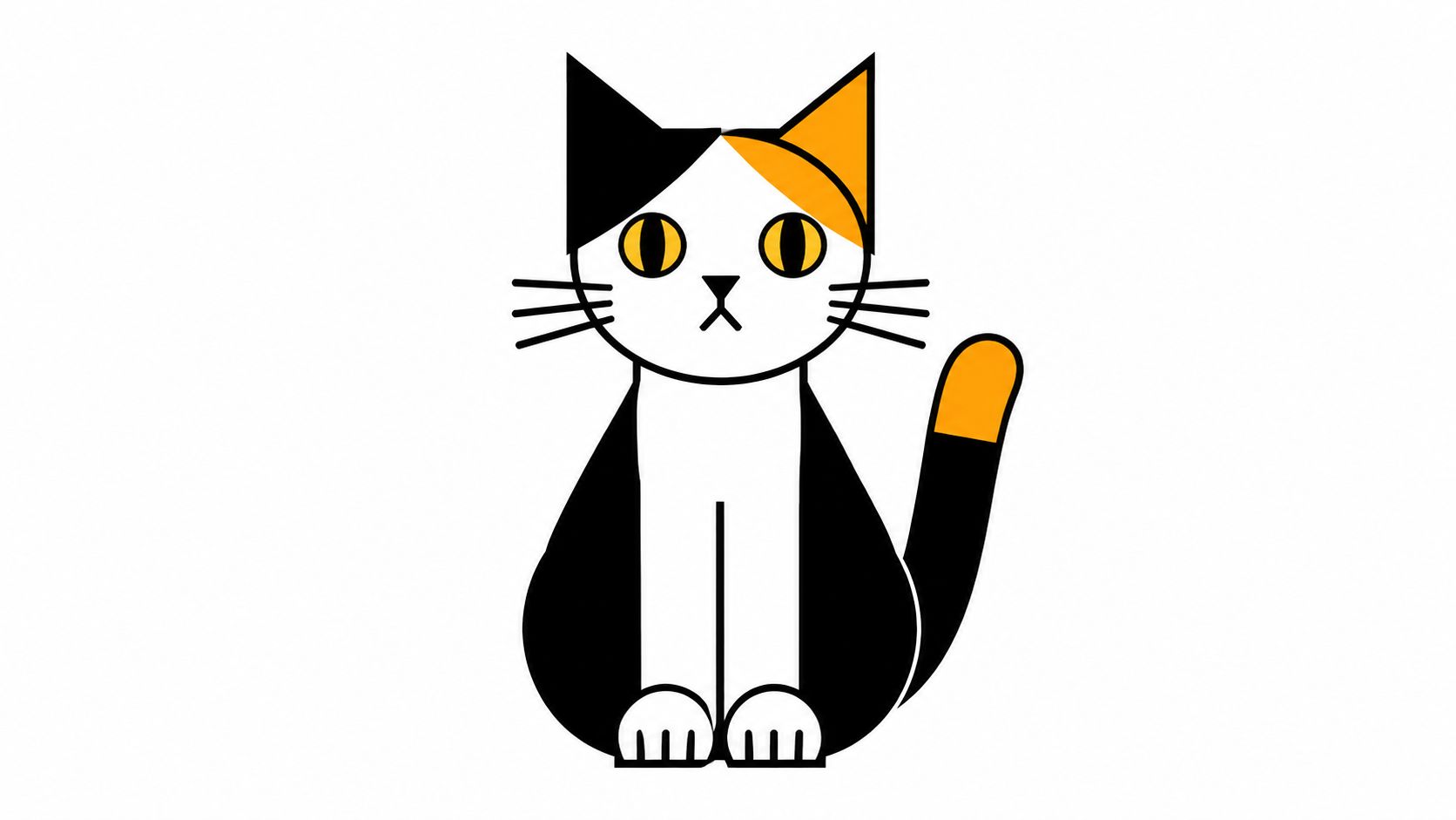
If you want a fast win, start here. Geometric cat drawings reduce the animal to a few strong decisions: a curved oval for the body, a circle or wedge for the head, triangles for ears, and a tail that works almost like a design accent. The result feels clean and current, especially if you like modern posters, app icons, or bold coloring-book pages.
This style also matches a practical drawing method. A widely used cat workflow begins with simple circles, ovals, and triangles before refining ears, legs, and tail, which makes construction easier before you add detail (basic shape workflow for drawing a cat). That same structure works beautifully for minimalist line art because you can stop early and keep the forms simple on purpose.
How to color it with markers
Minimalist cats don't need many colors. In fact, too many colors often weaken the design. A black fineliner or dark gray outline plus three or four marker colors is usually enough.
- Best marker move: Fill large shapes with flat, even color instead of trying to blend every section.
- Strong palette choice: Try one neutral, one warm accent, one cool accent, and one shadow tone.
- Useful restraint: Leave some areas white. White space is part of the style, not an unfinished mistake.
Practical rule: If the line work is simple, let the palette carry the personality.
ColorBestie's style themes are useful here because geometric drawings can change mood quickly. A calico-inspired palette feels friendly, while black, sand, and muted olive feel more editorial. Test a few combinations in your own marker family first, then choose the version with the cleanest contrast.
Trade-offs and a smart first experiment
The trade-off is simple. This style is easy to start, but hard to make elegant. Every crooked edge shows. Every color decision matters more because there are fewer of them.
Try this exercise. Draw the same cat silhouette three times. Color one with earth tones, one with pastels, and one with high-contrast black plus one accent color. You'll see how much the style changes even when the drawing stays almost identical.
2. Realistic Portrait and Anatomical Detail
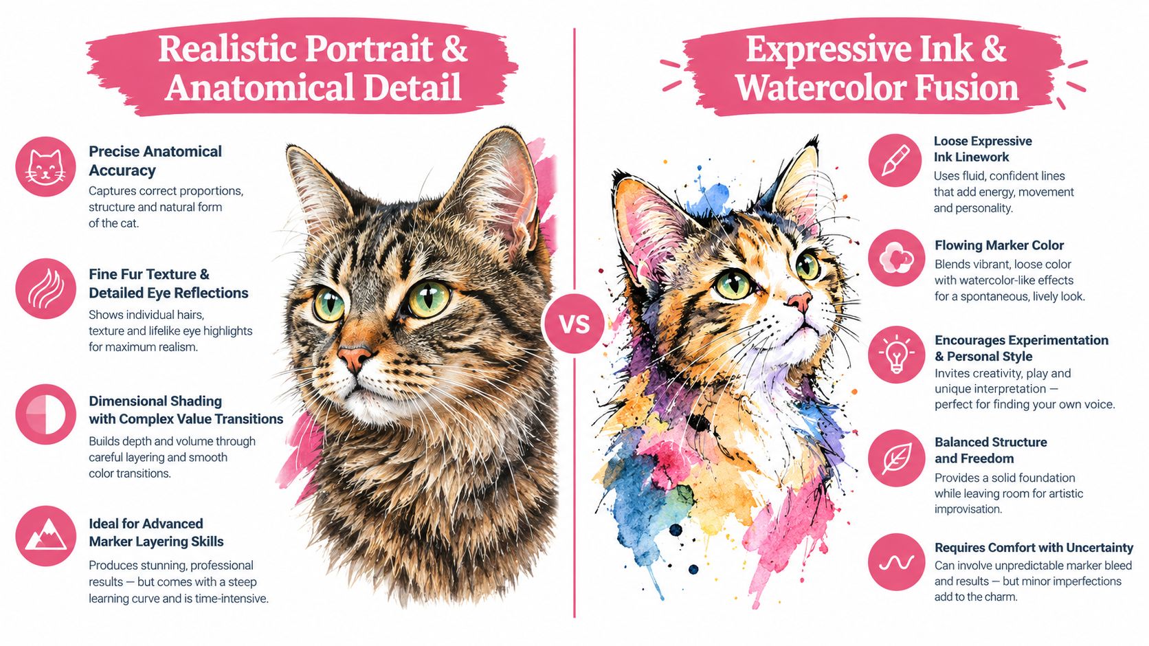
Realistic cat portraits reward patience. They ask you to notice eye spacing, cheek width, muzzle shape, whisker pads, fur direction, and the way light breaks across short versus long hair. If you enjoy slow layering, this style can be satisfying.
Strong realism starts underneath the fur. Expert cat-drawing instruction recommends studying the underlying anatomy and “skeleton” first, then building the body around it so poses stay accurate and proportions hold together from different views (anatomy-first cat drawing guidance). That matters even in a portrait, because a believable head tilt depends on structure, not just soft shading.
Before you color, check your reference carefully. A tabby forehead pattern, a black cat's reflected highlights, and a long-haired cat's ear tufts all need different marker handling. Realism isn't only about detail. It's about choosing which details belong.
Marker decisions that make fur believable
Alcohol markers can create convincing fur if you stop thinking in outlines and start thinking in direction. Follow the coat, not the page. On the cheeks, strokes may flare outward. On the forehead, they may arc upward or diagonally.
A simple sequence helps:
- Base layer first: Put down the lightest local color over the full area.
- Middle values second: Add form shadows under the chin, around the eye sockets, and inside the ears.
- Texture last: Use shorter directional strokes sparingly so the face doesn't turn scratchy.
A realistic cat drawing often needs fewer colors than people expect. What it really needs is value control. Three browns that are too close together won't separate form. A better set is a light base, a clear midtone, a darker shadow, and a cool neutral for the deepest accents.
This video is a useful visual reset before you begin blending:
Fur looks softer when you leave tiny breaks between strokes than when you color every inch evenly.
Trade-offs and a smart first experiment
The trade-off here is time. Realistic marker cats look impressive, but they're less forgiving than cartoon work. Overblend a light area and the face can lose structure. Add too many dark strokes and the cat can age instantly.
A good experiment is to color only one feature study at a time. Try just the eyes, or just the ear and cheek area, before doing a full portrait. You'll learn more from one carefully observed patch of fur than from rushing a whole page.
3. Expressive Ink and Watercolor Fusion
Some cool drawings of cats feel alive because they don't stay inside every line. Expressive ink work uses loose contours, broken edges, and visible energy. Then the color softens or spills around that structure, giving the piece a painterly feel even when you're using markers instead of watercolor.
This style works especially well for cats because they shift mood fast. A tiny tilt in the ears can read as wary. A soft curve in the back can read as sleepy. Loose ink lines let you exaggerate that emotion without needing polished realism.
How marker color changes the mood
In this style, color doesn't have to match life. It has to support feeling. A rainy blue-gray cat with plum shadows feels reflective. A warm coral-and-gold cat feels social and bright. That makes palette planning more emotional than anatomical.
If you want help trying mood-led combinations, use ColorBestie's Palette Generator for marker-friendly cat palettes. It's especially helpful when you know the feeling you want but not the exact marker family to pull.
A few choices make this style easier:
- Looser linework: Use a pen line that varies in weight instead of one perfectly even outline.
- Soft overflow: Let marker color drift slightly beyond small edge areas so the result feels painted.
- Limited correction: Keep some accidents. Tiny bleeds can make the piece feel more natural.
Trade-offs and a smart first experiment
The trade-off is control. If you love neat edges, this style may feel uncomfortable at first. But that looseness is also its strength. It lets you finish a lively drawing without rendering every hair.
Try drawing the same curled cat twice. On one version, keep the line very tidy and the fills exact. On the second, break the outline in places and use two blending colors that overlap more freely. You'll quickly see which version feels more expressive.
4. Playful Cartoon and Character Design
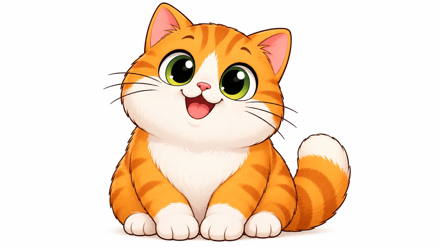
Cartoon cats are about personality first. The head can be oversized, the paws can be rounded, the eyes can take up more face space than they would in life, and none of that hurts the drawing. In fact, it often helps. A cartoon cat succeeds when you can tell who it is emotionally in a single glance.
This is why character icons like Pusheen or Hello Kitty stick so well in memory. Their shapes are simple enough to repeat, but specific enough to feel intentional. For marker artists, that's a gift. You can spend less energy on anatomy and more on charm, color, and expression.
Coloring for cuteness, not realism
Bright palettes usually work well here, but don't assume “cute” only means sugary pink. A cartoon cat can be cute in mint and cream, lilac and charcoal, or orange and teal. The key is simple contrast and readable shapes.
If you want to compare how your actual marker brands line up before choosing, ColorBestie's Marker Comparison tool for matching cat palettes is a practical step. It helps when you own mixed sets and need to decide whether your closest Copic or Ohuhu colors will keep the design cheerful instead of muddy.
A cartoon workflow can be very direct:
- Start chunky: Block the largest head and body shapes with broad strokes.
- Pick one hero color: Let one bright marker define the cat's identity.
- Save tiny accents for last: Nose, inner ears, blush, collar, or toy details should come after the main fills.
A cartoon cat usually looks stronger when every color area is easy to name at a glance.
Trade-offs and a smart first experiment
The trade-off is subtlety. You won't get the depth of realism, but you gain speed and clarity. That makes cartoon cats ideal for greeting cards, stickers, study breaks, and casual coloring sessions.
A fun experiment is to draw one cat body and change only the face. Try sleepy eyes, huge excited eyes, smug eyes, or a tiny open smile. Then shift the palette to match the expression. You'll learn how strongly color and expression reinforce each other.
5. Dynamic Action and Movement Poses
Action poses make a cat drawing feel fast before you add a single background detail. A leap, twist, skid, or mid-air swat gives you a clear job as a colorist: protect the direction of the pose so the eye moves through it in one sweep.
A useful way to read these drawings is to follow the body like a thrown ribbon. The spine sets the main curve. The head, front paws, hips, and tail either support that curve or interrupt it. If those parts feel disconnected, the pose goes stiff. That is why artists studying feline motion often need stronger spinal curves and clearer joint placement, as noted in cat anatomy guidance for dynamic structure.
Here, coloring is less about fur description and more about traffic control.
Try a simple workflow that matches that goal:
- Trace the motion path first. Before filling the whole cat, place your lightest marker along the spine, chest, and tail flow. This works like a rehearsal pass and helps you avoid breaking the gesture with patchy fills.
- Choose one speed zone. Put your strongest contrast at the face, the leading paw, or the point of landing. Pick one. If every area shouts, the jump loses direction.
- Let the back half quiet down. Use softer value changes on the trailing legs and tail unless the tail is steering the pose. You want a hierarchy, not equal emphasis.
- Add texture last, if the pose can afford it. Stripes, fur flicks, and shadows are useful only after the movement still reads from a few feet away.
Marker choice changes the result more than many beginners expect. Brush tips help on long curved passes across the torso. Chisel tips can work for broad shadow shapes under the belly or behind a hind leg, but they are easier to misuse on small joints. If your markers tend to streak, that can help in action drawings when the streaks run with the motion instead of across it.
ColorBestie is handy here because dynamic poses punish indecision. If you test a theme first and map your dark, mid, and accent markers before you start, you are less likely to stop mid-pose and fill important areas with the wrong value.
The trade-off is control. These cats often look more impressive than seated poses, but they give you less room to correct anatomy mistakes with shading. A beautiful gray blend will not fix a front leg that bends the wrong way.
One practical experiment works well. Draw the same cat twice in a stretched run or pounce. In version one, keep the palette close in value, such as tan, warm gray, and muted brown. In version two, push the focal point with a darker face mask or brighter leading paw. Compare them from across the room. You will see how value planning changes the sense of motion even when the line art stays the same.
6. Surreal and Fantasy Stylization
Fantasy is the cat style that teaches color planning fastest. A realistic tabby asks, "What color is this fur?" A surreal cat asks a better art question. "What rules does this world follow?"
That shift changes the whole workflow. You still start with a cat silhouette readers can recognize, but now color carries meaning. A crescent-shaped pupil can suggest a nocturnal spirit. Antlers can turn a house cat into a forest guardian. A galaxy pattern across the back can make the body feel less like fur and more like sky. The drawing succeeds when those choices agree with each other.
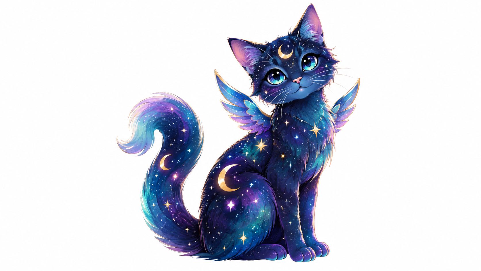
A helpful way to avoid chaos is to plan the cat like a stage set. Pick the role first, then cast the colors.
A moon-spirit cat usually works best with close-value cools, such as blue gray, lavender gray, and a small white gel accent. A forest-magic cat can handle earthier mids, such as moss, bark brown, and muted gold, because the concept already suggests organic texture. A mascot-like fantasy cat often needs cleaner separation between shapes, so brighter markers and firmer outlines make more sense than soft blends.
ColorBestie is useful here for one reason. It lets you test a theme before you commit marker to paper. That matters in fantasy work because the palette is doing narrative work, not just decoration. If the app helps you assign one dominant family, one support family, and one accent, the drawing usually feels intentional instead of crowded.
Two marker decisions create very different kinds of magic:
Soft-build rendering works well for ghost cats, dream cats, and misty celestial pieces. Use lighter alcohol markers first, keep transitions gradual, and save the brightest highlight for the eyes or aura edge. The trade-off is contrast. If every transition stays soft, the design can lose its focal point.
Shape-first rendering fits magical emblems, sticker-like familiars, and fantasy cats with wings, armor, or symbolic markings. Block the main color zones early with cleaner edges, then add a few special effects on top. The trade-off is subtlety. Strong shape separation reads clearly, but it can feel less atmospheric.
If readers get stuck here, the usual problem is not creativity. It is commitment. They add stars, glow, antlers, smoke, extra colors, and patterned fur all in one pass. The result reads like five ideas competing for the same cat.
A better experiment is small and repeatable. Draw one simple sleeping or sitting cat three times. In version one, change only the palette. In version two, keep the palette and add one fantasy feature, such as antlers or a star tail. In version three, add one light effect, such as a halo or glowing eyes. Compare which version still reads clearly from a few feet away. That test shows how surreal styling builds best in layers, like seasoning food. One strong note is memorable. Too many at once flatten the taste.
7. Vintage and Retro Illustration Style
Vintage cat drawings feel curated. They don't usually chase photographic realism or maximal fantasy. Instead, they rely on era cues. Maybe it's an Art Deco symmetry, a mid-century flatness, or a storybook softness with patterned borders and muted color.
Cats fit this approach especially well because they've stayed visible across art history for centuries. One cat-art compilation estimates nearly 500 artworks across roughly 500 years, from 1525 to 1999, which shows long-running artistic interest rather than a brief fad. The same historical context notes the British Museum's Department of Prints and Drawings holds about 50,000 drawings and more than 2 million prints from the early fifteenth century to the present, placing cat imagery inside a huge, well-documented drawing tradition (historical compilation of cats in art and print collections).
Coloring with period feeling
Retro palettes usually depend more on temperature and saturation than on lots of blends. Think mustard, dusty teal, brick, cream, olive, faded pink, tobacco brown, or soft black. Even when you use alcohol markers, the goal isn't ultra-slick rendering. It's a deliberate printed or illustrated feel.
If you care about consistency across a series of pieces, this is also the style where visual identity matters. Color choices, border motifs, and repeated shapes can make multiple cat drawings feel related. ColorBestie's article on why on-brand imagery changes visual consistency is useful for thinking about that principle, even in a personal art set.
Consider these choices:
- Muted first: Pick quieter markers than your instincts suggest.
- Decorative support: Add border bands, wallpaper-like shapes, or a patterned cushion.
- Texture through restraint: A slightly uneven fill can feel more vintage than a perfectly glassy blend.
Trade-offs and a smart first experiment
The trade-off is subtle drama. Vintage cats often whisper rather than shout. If you love neon contrast, this style may feel too calm unless you pair it with strong composition.
A good experiment is to take a modern cartoon cat drawing and recolor it in a retro palette only. No line changes. No new details. Just a palette shift. You'll see how strongly color alone can move a drawing into a different visual decade.
8. Mixed Media and Collage-Based Technique
Mixed media cat art is where marker coloring stops being the whole piece and becomes the backbone of the piece. You might begin with fineliner and alcohol marker, then add colored pencil fur texture, white gel pen whiskers, torn paper shapes, gouache highlights, or pastel dust in the background.
This approach is especially satisfying if you get bored using one finish from start to finish. Markers give you clean structure and strong color blocks. Other materials add friction, tooth, opacity, and surprise. A cat's fur, collar, toy, or surrounding fabric can all benefit from that variety.
How to keep the layers from fighting
The easiest way to make mixed media look intentional is to assign jobs. Let markers handle large flat color and base shadows. Let pencil handle texture. Let collage handle graphic pattern. Let gouache or gel pen handle final light.
A calm order helps:
- Markers first: Put down the main cat colors and large value shapes.
- Dry media second: Add pencil texture where fur direction matters most.
- Opaque accents last: Use white or pastel details only where you want a finish point.
You'll also want a test page. Some papers hold marker beautifully but resist collage glue. Some pencils disappear on slick marker layers, while others sit nicely on top. Small swatches save frustration.
Mixed media works best when each material has a clear reason to be there.
Trade-offs and a smart first experiment
The trade-off is complexity. More materials mean more chances for overworking. But they also create some of the most memorable cat pieces because surface variation adds personality fast.
Try a simple project first. Draw a black cat, color it with cool grays, then add a patterned paper moon or sofa shape behind it. Finish with colored pencil texture on the chest and a white gel pen on the eyes and whiskers. You'll get a layered look without losing control of the image.
Cool Cat Drawings: 8-Style Comparison
| Style | 🔄 Implementation Complexity | ⚡ Resource Requirements | ⭐ Expected Outcomes | 📊 Ideal Use Cases | 💡 Key Advantages |
|---|---|---|---|---|---|
| Geometric & Minimalist Line Art | Low, simple shapes, fast execution | Low, 2–5 marker colors, neutral inks | Clean, graphic visuals; quick completion | Icons, daily coloring, stickers, social posts | Forgiving for blending; fast; works across marker brands |
| Realistic Portrait & Anatomical Detail | High, precise anatomy, fine strokes | High, premium markers (Copic/Prismacolor), many shades, refs | Photorealistic depth and strong emotional impact | Professional illustration, portfolios, commissions | Showcases mastery; impressive, museum/portfolio-ready results |
| Expressive Ink & Watercolor Fusion | Medium, loose control, unpredictable blending | Medium, mid-range markers + ink pens, practice swatches | Painterly, spontaneous, emotive outcomes | Manga/comic work, expressive editorial pieces | Encourages experimentation; imperfections add charm |
| Playful Cartoon & Character Design | Low, simplified anatomy and forms | Low, minimal marker set, bright palettes | Charming, approachable characters; fast to produce | Children's books, merch, stickers, social content | Highly accessible; immediate audience appeal; quick workflow |
| Dynamic Action & Movement Poses | High, foreshortening, strong line of action | Medium–High, quality markers, reference photos, time | Energetic, high-impact compositions with implied motion | Animation, comics, character design, portfolio pieces | Conveys motion and drama; strong social/portfolio engagement |
| Surreal & Fantasy Stylization | Medium, conceptual planning, unconventional choices | Medium, flexible marker use; emphasis on palettes | Distinctive, imaginative visuals that stand out | Fantasy concept art, character concepts, social shareables | Maximum creative freedom; bold, memorable results |
| Vintage & Retro Illustration Style | Medium, period-accurate design knowledge | Medium, muted/jewel-tone markers, era research | Nostalgic, harmonious compositions with timeless feel | Editorial, packaging, adult coloring, cozy branding | Naturally balanced palettes; strong crossover appeal |
| Mixed Media & Collage-Based Technique | High, multiple materials and layered planning | High, markers + pencils/pastels/gouache/collage supplies | Textured, dimensional, unique mixed-media pieces | Fine art, art journaling, experimental portfolios | Rich texture and personalization; highly experimental |
Turn a Cat Sketch Into a Color Plan
The best cool drawings of cats aren't always the most detailed ones. They're the ones where style and color agree with each other. A geometric cat wants clean shapes and controlled contrast. A cartoon cat wants readable color blocks and instant personality. A realistic portrait wants patient value changes and directional strokes. When the style and coloring process match, the finished piece feels intentional.
If you want quick wins, start with geometric or cartoon cats. They're forgiving, readable, and easy to finish in one sitting. If you want mood-driven work, expressive ink pieces and vintage illustrations are strong choices because the palette does so much of the storytelling. If you want a deeper challenge, move into realistic portraits, dynamic action poses, surreal cats, or mixed media, where structure and sequencing matter more.
A repeatable workflow makes all eight styles easier. First, choose the style before you choose colors. That sounds obvious, but it prevents a common mistake: using realistic blending on a design that really wants flat graphic fills, or using neon fantasy color on a drawing that depends on quiet vintage harmony.
Then define the mood or lighting. Is the cat playful, sleepy, eerie, elegant, rainy, cozy, theatrical? Is the light soft and indoor, sharp and dramatic, or glowing and imagined? Those decisions narrow your palette faster than asking which marker looks nicest on its own.
After that, generate a rough palette idea, compare it against the markers you already own, and swatch before you color the actual page. This step matters with alcohol markers because cap colors can mislead you, close shades can blend together too much, and a beautiful digital idea may need slight translation into your real set. Color from large shapes to medium forms to small accents. Save whiskers, eye sparkles, and tiny decorative touches for the end.
You also don't need to treat every cat drawing like a final artwork. Some of the best practice comes from mini studies. A single paw in retro colors. One cat face in a fantasy palette. A simple leaping silhouette with action-led shading. Small studies teach style faster than waiting for the perfect full-page piece.
If you want a digital planning step before using your markers, ColorBestie is one practical option. It can preview marker-style color inspiration from black-and-white sketches, which makes it easier to test moods, themes, and palette directions before you commit ink to paper. Used that way, it's less about replacing your judgment and more about giving you a calmer place to compare possibilities.
If you want help turning cat line art into a workable marker palette, ColorBestie lets you upload a sketch, explore themes like mood, style, lighting, and genre, and preview marker-friendly color ideas before you start coloring. It's especially useful for cool drawings of cats because small palette shifts can completely change whether the piece feels playful, realistic, vintage, or fantastical.

