
You're standing in an art shop with a marker in each hand, or scrolling through a giant online set while wondering whether the expensive box really will make your sketches better. The packaging promises professional color, effortless blending, and endless creative freedom. Your sketchbook, meanwhile, is asking a simpler question: which marker feels right for the way you draw?
The best markers for sketching aren't chosen by brand prestige alone. They're chosen by your subjects, your pressure, your paper, your tolerance for bleed-through, and whether you want quick color notes or polished illustration. This guide matches marker choices to real workflows, then shows how to plan a physical palette from a digital preview without buying colors you'll barely use.
Staring at the Marker Wall and Wondering Where to Start
A hobbyist named Maya once told me she spent longer comparing marker sets than sketching with them. She wanted to draw interiors, café scenes, and occasional characters, so she bought a large assortment filled with bright colors. The markers were perfectly usable, but her sketches needed muted neutrals, warm wood tones, soft greens, and a few dependable grays. Her problem wasn't a bad brand. It was a mismatch between the set and her habits.
That's why I'm suspicious of any buying guide that declares one universal winner. Before you compare nibs or color charts, ask yourself three practical questions:
- What do you draw most often? Faces, clothing, buildings, plants, product concepts, and comic panels need different kinds of control.
- How much do you blend? If you mostly block in shapes, fast-drying alcohol ink may be more capability than you need. If you build smooth gradients, ink behavior matters immediately.
- Where do you sketch? A desk-based illustrator can keep marker paper, swatch cards, refills, and a protective sheet nearby. A traveler needs a compact set, secure caps, and paper that won't create a mess in a café.
Your answers give you a shopping lens. A manga artist may prioritize a responsive brush nib. An interior sketcher may care more about broad coverage and restrained color families. Someone practicing quick urban studies may prefer a small dual-tip set that opens fast and travels well.
Practical rule: Buy for the next hundred sketches, not for the fantasy version of yourself who uses every color in a giant set.
You can also create a digital palette before committing to ink. ColorBestie is one option for turning a line drawing into marker-style color inspiration, which can help you think through harmony before you fill a shopping cart. The tool won't replace a swatch sheet or your own judgment, but it can give a vague color idea a more concrete direction.
Alcohol vs Water-Based Markers and Why It Matters for Your Sketch
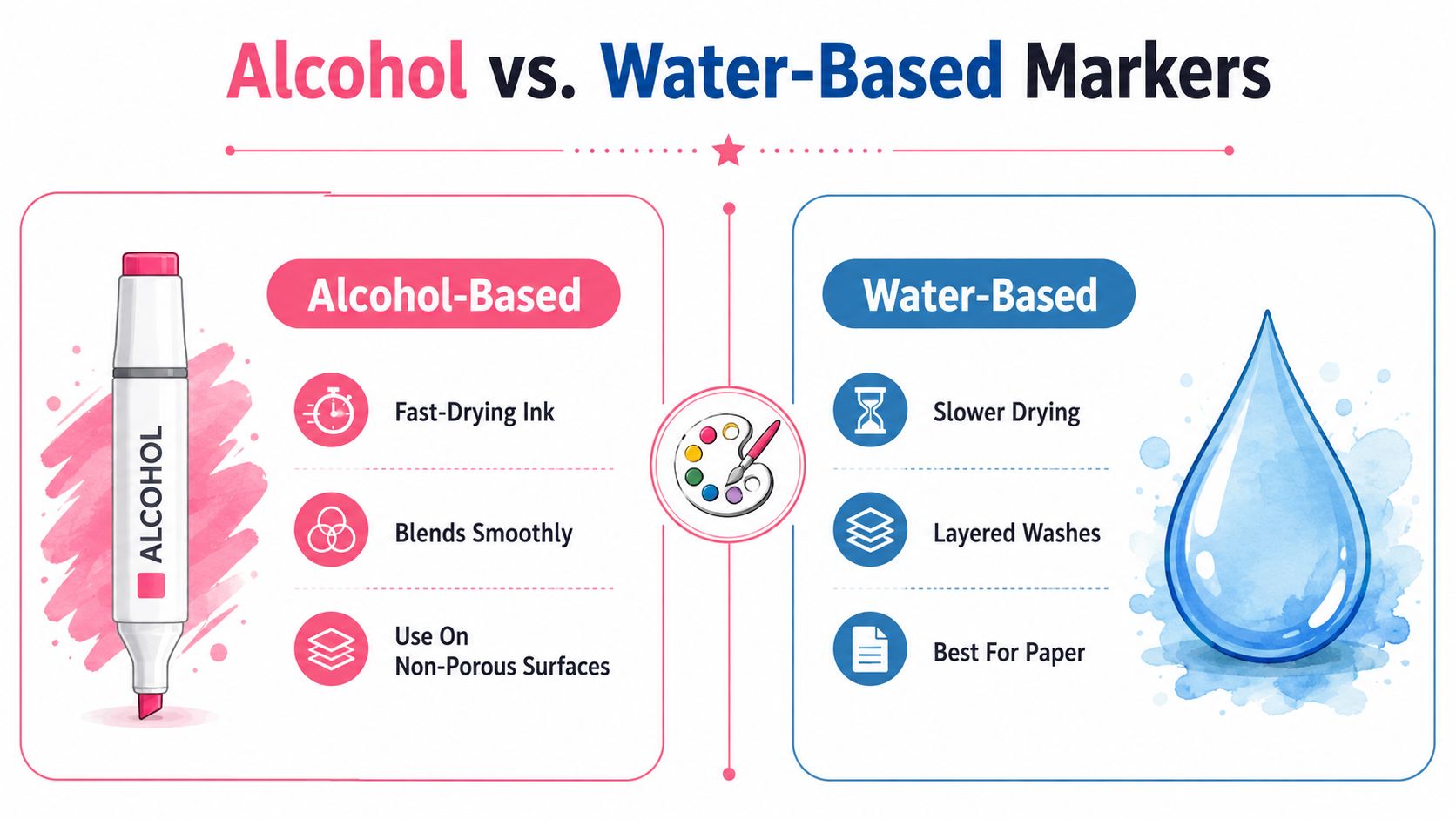
Ink chemistry controls the experience more than most beginners realize. Alcohol markers use dye suspended in alcohol, so the ink dries quickly and spreads evenly across a suitable surface. That makes them excellent for smooth blends, saturated fills, and fast illustration work, but it also means bleed-through on thin or uncoated paper is difficult to avoid, particularly on ordinary 80 GSM sheets. Sarah Renae Clark's marker guide explains this relationship between alcohol ink, quick drying, blending, and paper choice.
Water-based markers behave differently. Their ink can feel closer to a controlled watercolor wash, especially when you layer lighter strokes or activate marks with water. They're often more forgiving on everyday paper, though they can take longer to dry and may show uneven edges when you repeatedly work over the same area.
Try this at home before buying a full set:
- Draw the same small square with an alcohol marker and a water-based marker.
- Add a second layer along one edge.
- Place a clean sheet underneath and check the back of both papers.
- Blend a light color into a darker one while the first layer is still fresh.
You'll feel the difference quickly. Alcohol ink usually gives you a smoother transition while it's wet, but it demands a more deliberate paper setup. Water-based ink may let you work on cheaper sketch paper with less immediate bleed, but it can produce a more textured or streaked result.
Choose alcohol markers if your sketching depends on speed, clean gradients, vivid fills, and repeated color layering. Choose water-based markers if you prefer looser washes, lighter paper demands, and a more watercolor-like rhythm. Don't choose by the word “professional” on the package. Choose by the surface and finish you want.
Choosing the Right Nib for Your Sketching Style
The nib is where a marker stops being a color product and starts becoming a drawing instrument. Two markers with similar ink can feel completely different if one has a stiff bullet tip and the other has a flexible brush.
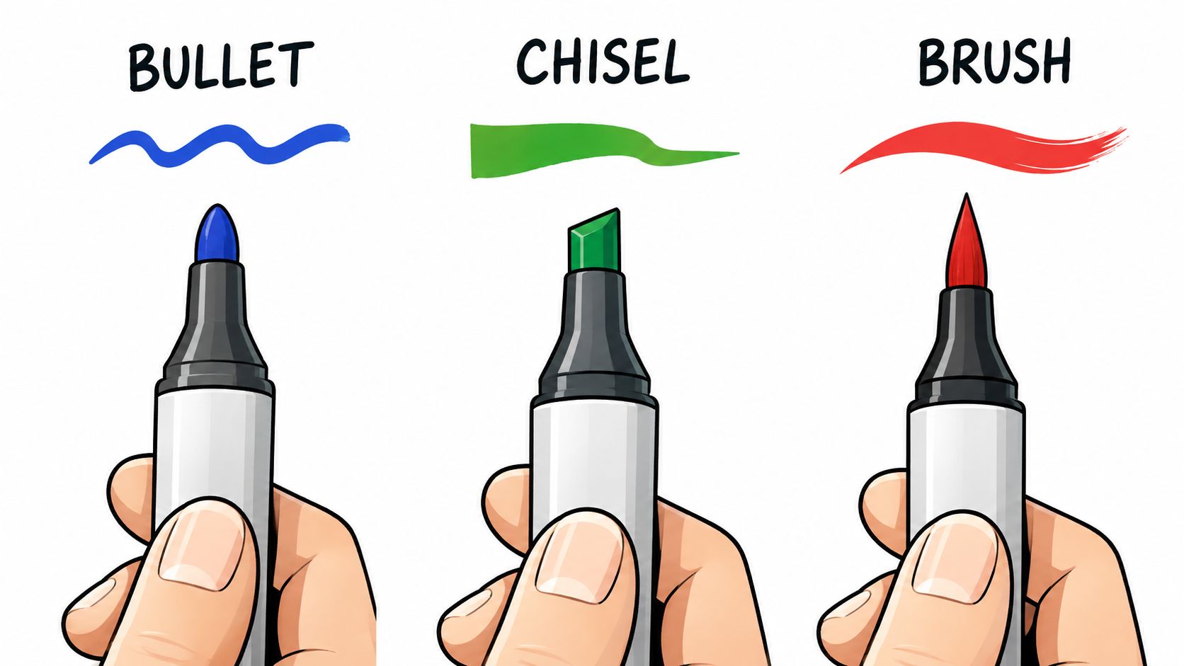
Bullet nibs for control
A bullet nib gives you a predictable line. It suits small details, facial features, lettering, compact objects, and sketchers who like consistent pressure. The trade-off is coverage. Filling a broad shape with a bullet tip can take more passes, and those passes may create visible overlap.
Chisel nibs for efficient shapes
A chisel nib offers a broad face, a narrow edge, and angled corners. Rotate it and you can switch from a flat fill to a sharper contour without changing tools. It's a practical choice for architectural studies, furniture, clothing blocks, and quick value mapping.
Brush nibs for expressive movement
A brush nib responds to pressure. Light pressure creates a fine stroke, while heavier pressure spreads the tip for a broader mark. That flexibility makes it valuable for hair, foliage, flowing fabric, organic forms, and manga-style line variation.
Copic's history shows why brush tips became such an important part of marker sketching. Copic launched in Japan in 1987 for designers who needed a graphic marker that could work over printing ink and photocopies without dissolving toner. The original line, later known as Copic Classic, debuted with 71 colors, and Copic introduced the Sketch line in 1993 with a brush-like nib that influenced manga and illustration workflows. Copic's official history documents that development.
My practical preference is a dual-tip marker with a brush nib on one end and a more controlled nib on the other. You get expressive marks for the main drawing and dependable detail control when the sketch needs structure. Still, test the grip if you can. A nib that looks impressive in a product photo may feel too soft, too scratchy, or too broad for your hand.
Paper Compatibility Is the Quiet Performance Factor
Many marker complaints are paper complaints. The ink may be working exactly as designed, while the page absorbs it too quickly, spreads the edges, or lets it pass straight through to the next sheet.
For alcohol-marker sketching, paper weight gives you a useful starting point. Independent marker-paper guidance places 70 lb / 116 GSM as a practical minimum, while 160 to 180 GSM is a safer working range for artists who blend and layer often. Heavier bleedproof papers from 75 lb / 125 GSM to 98 lb / 160 GSM are reported to reduce or eliminate bleed-through in real use. Pickory's alcohol-marker paper review compares these weights and performance considerations.
Weight isn't the whole story. A coated surface keeps more ink near the top of the page, giving you extra time to blend before the dye sinks deep into the fibers. That surface can make a lighter-weight marker sheet perform better than a thick but absorbent page.
Run a three-paper test
Take one marker, preferably a medium-value color, and draw the same swatch on three papers:
- Thin sketch paper: Check how far the ink travels through the sheet.
- Uncoated heavier paper: Look for feathering, rough edges, and patchy fills.
- Dedicated marker paper: Compare the smoothness of the blend and how much ink remains visible on the surface.
Put a clean backing sheet behind every test. Don't judge only the front. Ghosting means the next page shows a shadow of the drawing, while bleed-through means ink has visibly passed into or through the sheet. Both can ruin a sketchbook spread even when the front-side color looks attractive.
Paper changes the marker's personality. A nib that feels scratchy on ordinary paper may glide on coated marker stock, while a color that looks pale on absorbent paper may appear much richer on a smooth surface.
If you sketch on the go, carry a protective insert or a small pad of marker paper. If you work in a bound sketchbook, check the paper specification before buying a large marker set. The marker and paper are a system, and the cheaper component can determine the entire result.
Comparing Top Marker Brands for Real Sketching Workflows
Brand comparisons become useful when they answer a workflow question. Instead of asking which company has the most colors, ask which marker handles your pressure, paper, nib preference, and refill habits.
| Brand | Nib Style | Blend Behavior | Refillable | Sketching Strength | Price Tier |
|---|---|---|---|---|---|
| Copic | Brush, chisel, bullet depending on series | Smooth and controllable on suitable paper | Yes, with replaceable nib options in relevant systems | Professional illustration, manga, long-term color systems | Premium |
| Ohuhu | Brush and chisel or bullet combinations depending on series | Smooth, accessible, strong for broad fills | Varies by series | Beginner practice, casual illustration, large working palettes | Budget to mid-range |
| Prismacolor | Broad alcohol-marker options with dual-tip designs | Saturated, useful for rendering and layered color | Varies by product line | Character work, bold color, mixed-media workflows | Mid-range |
| Winsor & Newton | Flexible illustration-oriented nib options depending on marker | Controlled, polished color application | Varies by product line | Design sketches, presentation work, color studies | Mid-range to premium |
| Spectrum Noir | Dual-tip options with brush and broad/detail combinations | Practical for layering and craft-oriented illustration | Varies by product line | Coloring, hobby illustration, accessible color planning | Budget to mid-range |
Copic remains my pick for serious illustrators who draw frequently and want a marker system they can maintain over time. Its history, brush-nib development, refillable structure, and replaceable components make the premium price easier to justify when you repeatedly use the same colors. It's overkill for someone who only colors occasionally and hasn't yet learned which nib they enjoy.
Ohuhu is the straightforward beginner recommendation. It gives new hobbyists a comfortable entry into alcohol-marker blending without asking them to make a premium investment immediately. The important caution is to check the exact series, because nib combinations and refill options can differ across product families.
Prismacolor suits artists who want strong, saturated rendering and may add colored pencil or other media later. It feels especially natural for characters, clothing, and graphic studies where bold color matters more than a restrained architectural palette.
Winsor & Newton is a good fit for design-minded sketchers who care about controlled presentation and a refined color study. Spectrum Noir deserves attention from hobby colorists and craft artists who want accessible dual-tip options and practical coverage.
For a more detailed side-by-side decision, use this marker comparison tool to check how different series align with your intended palette and nib preferences. Don't let a table make the final decision for you. Buy a small selection, test the grip, and swatch every color on the paper you'll use.
The Right Marker for Your Skill Level and Sketching Habit
Your skill level matters less than your repeatable routine. A beginner who sketches every evening may outgrow a disposable-feeling set faster than an occasional illustrator, while a professional may still prefer a compact travel palette for quick studies.
The casual beginner
Start with a modest set built around light, middle, and dark values, plus a few colors you want to draw. A basic 12-color set can teach mixing, value control, and restraint without turning every sketch into a cataloging exercise. The marker set should feel easy to pick up, not like a new course you have to organize.
Ohuhu is my practical starting recommendation for this profile. Choose a series with a brush tip if you expect to draw organic subjects, or choose a controlled bullet-style option if you mostly make small objects, notes, and simple studies.
The intermediate illustrator
If you blend often, move toward a more responsive dual-tip marker and a paper designed for alcohol ink. Copic Sketch is the clear upgrade when brush control, refillability, and consistent long-term use matter. Prismacolor can be the better choice if your work leans toward saturated character illustration and you plan to add colored pencil details.
Don't expand your palette just because a larger set exists. Add colors when a subject exposes a real gap, such as a missing skin value, foliage shadow, warm gray, or deep clothing tone.
The serious student or professional
Invest in the system, not just the initial box. Copic earns its premium place here because a refillable marker with replaceable nib components can support a stable workflow over repeated projects. Winsor & Newton or Spectrum Noir may suit a different professional need, particularly if presentation sketches or craft-oriented coloring are central to your work.
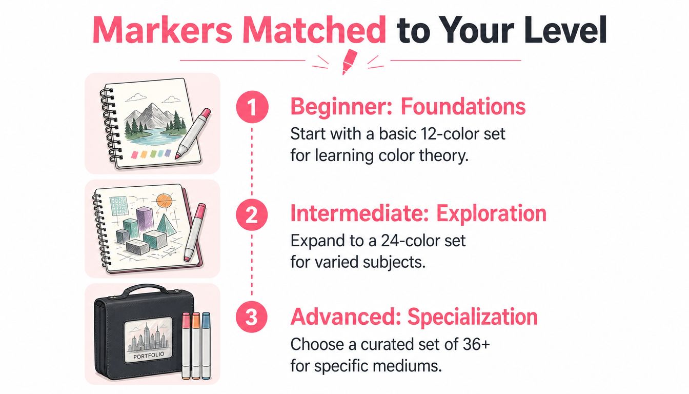
A curated palette teaches more than a giant one. A restrained set forces you to notice value, temperature, and harmony instead of solving every problem by reaching for another color. Choose a larger collection only when your subject matter demands specialized families.
Turning a Digital Color Preview into a Real Marker Palette
A digital preview becomes useful when it leads to a physical swatch sheet. The goal isn't to trust a screen as a perfect color reference. Screens vary. The goal is to narrow your choices before you spend ink and money.
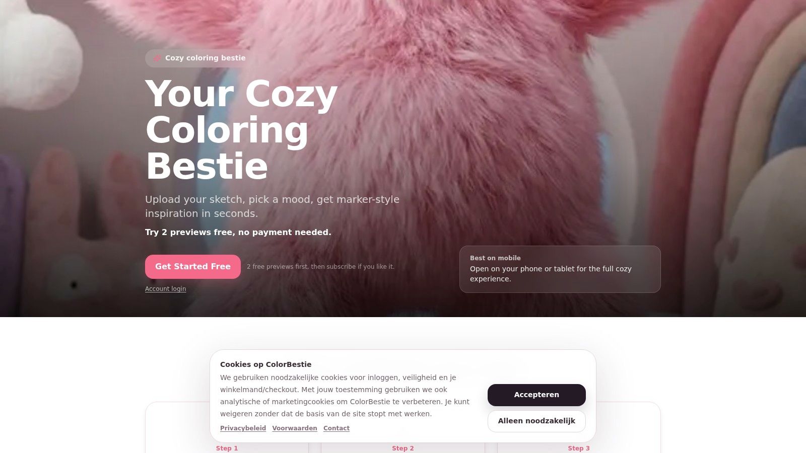
Start with a clean photo or scan of your line art. Upload it to ColorBestie, select a theme based on the mood or subject, and review the resulting color direction. Its marker-oriented workflow can align suggestions with series such as Copic Sketch, Ohuhu, Prismacolor, Winsor & Newton, and Spectrum Noir.
Then turn the preview into a small test plan:
- Identify the dominant families. Separate skin, foliage, sky, clothing, wood, shadow, and accent colors.
- Match marker codes. Use the suggested series as a starting point, then check your own swatches.
- Test blends on final paper. A digital gradient can look smooth while two physical markers fight each other on absorbent paper.
- Reduce the palette. Keep the colors that support the subject and remove duplicates that add confusion.
- Save the swatch page. Record the marker name, code, paper, and blend order.
For a more focused starting point, try the marker palette generator. Use it as a planning aid, not a substitute for physical testing. The most reliable bridge from screen to sketchbook is still a labeled swatch card made with your own markers.
Care, Storage, and Lifespan Tips Most Guides Skip
A marker set can be excellent and still deteriorate quickly if you treat it carelessly. Store alcohol markers horizontally when the manufacturer's storage guidance allows it. This keeps the ink distributed more evenly through the barrel and is specifically identified as a way to extend marker service life in this sketching-focused maintenance guide.
Cap every marker immediately after use. A few minutes exposed to air can dry a nib, and a loose cap can evaporate solvent while the marker sits in a drawer. Keep markers away from direct sun and avoid storing them where heat swings are severe.
Use this small maintenance checklist:
- Close both caps: Dual-tip markers need protection on both ends.
- Separate dry tools: Don't keep a marker that needs attention mixed into your active colors.
- Refill before failure: Refillable systems are easier to maintain when you top up a frequently used neutral before it runs completely dry.
- Protect the nib: Don't force a tip into rough paper or use it to scrub across abrasive surfaces.
- Keep a test sheet nearby: Check a questionable marker before using it on a finished drawing.
If a nib starts feeling pale or chalky, stop using it on the artwork. Check whether the cap sealed properly, follow the brand's refill or nib-replacement instructions, and test the marker on scrap paper before returning it to your main set. A little routine care prevents many avoidable replacements.
ColorBestie helps you turn a sketch into marker-style color inspiration, compare palettes, and plan physical swatches before committing ink. Visit ColorBestie to test a calmer, more deliberate way to choose colors for your next sketch.