
You're standing in front of a marker aisle or a browser tab with twenty open product pages, and every set claims to be “professional.” Most of them aren't. A true professional marker set earns that label with ink consistency, blend control, tip precision, refill support, and color stability, not with a glossy box or a big color count.
The market context matters. The global art supplies market was valued at about US$10.2 billion in 2023 and is projected to reach roughly US$16.1 billion by 2032 (Texas Historical Commission PDF). That kind of scale is why the serious brands invest in technical systems, spec sheets, and refill ecosystems instead of treating markers like disposable school tools. If you want a set that behaves well at the desk, you need to judge the engineering, not the marketing.
| Brand | Price Range | Nib System | Refillable | Best For |
|---|---|---|---|---|
| Copic | Premium | Brush and chisel systems with strong replaceability | Yes | Manga, illustration, long-term studio use |
| Ohuhu | Budget to midrange | Brush and chisel options on many sets | Limited, depends on line | Hobbyists, fast color coverage |
| Prismacolor Premier | Midrange | Common dual-tip style in many sets | Limited compared with premium refill systems | Coloring, general illustration |
| Spectrum Noir | Midrange | Dual-tip systems in many lines | Some refill-oriented options | Mixed-use artists, planned palettes |
| Winsor & Newton | Midrange to premium | Professional marker systems with fine control | Varies by line | Illustration, design, controlled layering |
What Makes a Marker Set Professional
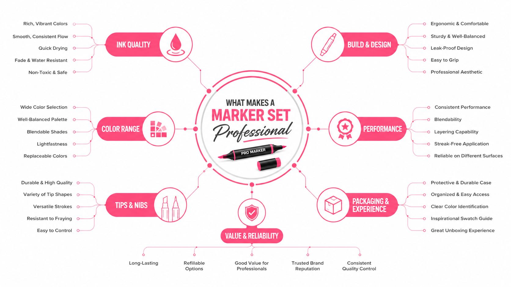
You're staring at two boxes. One is cheaper and louder. The other costs more and looks boring. The expensive one isn't automatically better, but the professional one usually behaves in ways that matter when you're drawing for hours.
What to look for at the desk
A professional marker set gives you predictable ink saturation, clean layering, useful tip geometry, and a color system that stays consistent from one marker to the next. That matters because alcohol markers are used in illustration and manga workflows specifically for vibrant color, smooth coverage, fast drying, and strong blendability (alcohol marker comparison). If the ink feathers, the tip frays early, or the blues in one set don't behave like the blues in another, the set is not professional in any practical sense.
Professional also means the brand thinks beyond the first sale. Look for specification sheets that explain ink type, tip geometry, refill and spare compatibility, and replacement parts (manufacturer spec sheets). That kind of documentation is a clue that the company expects studio use, not one weekend of scrapbooking.
Practical rule: if a marker listing talks only about “lots of colors” and never tells you how the system is built, treat it as a casual set.
Why the word professional actually matters
The modern alcohol-marker era grew out of design-oriented illustration, where artists needed portable tools that blended predictably. That's why dual-tip alcohol systems became the standard in serious marker work, they let you do broad fills and fine detail with one barrel, which is exactly what manga panels, concept sketches, and coloring pages demand.
The word itself matters too. “Professional” in the dictionary sense is work that requires special training or education (Merriam-Webster). In marker terms, that means you're paying for control, repeatability, and a system you can actually build around. If a set can't support that workflow, it's not professional, no matter what the packaging says.
The Four Technical Pillars of Professional Markers
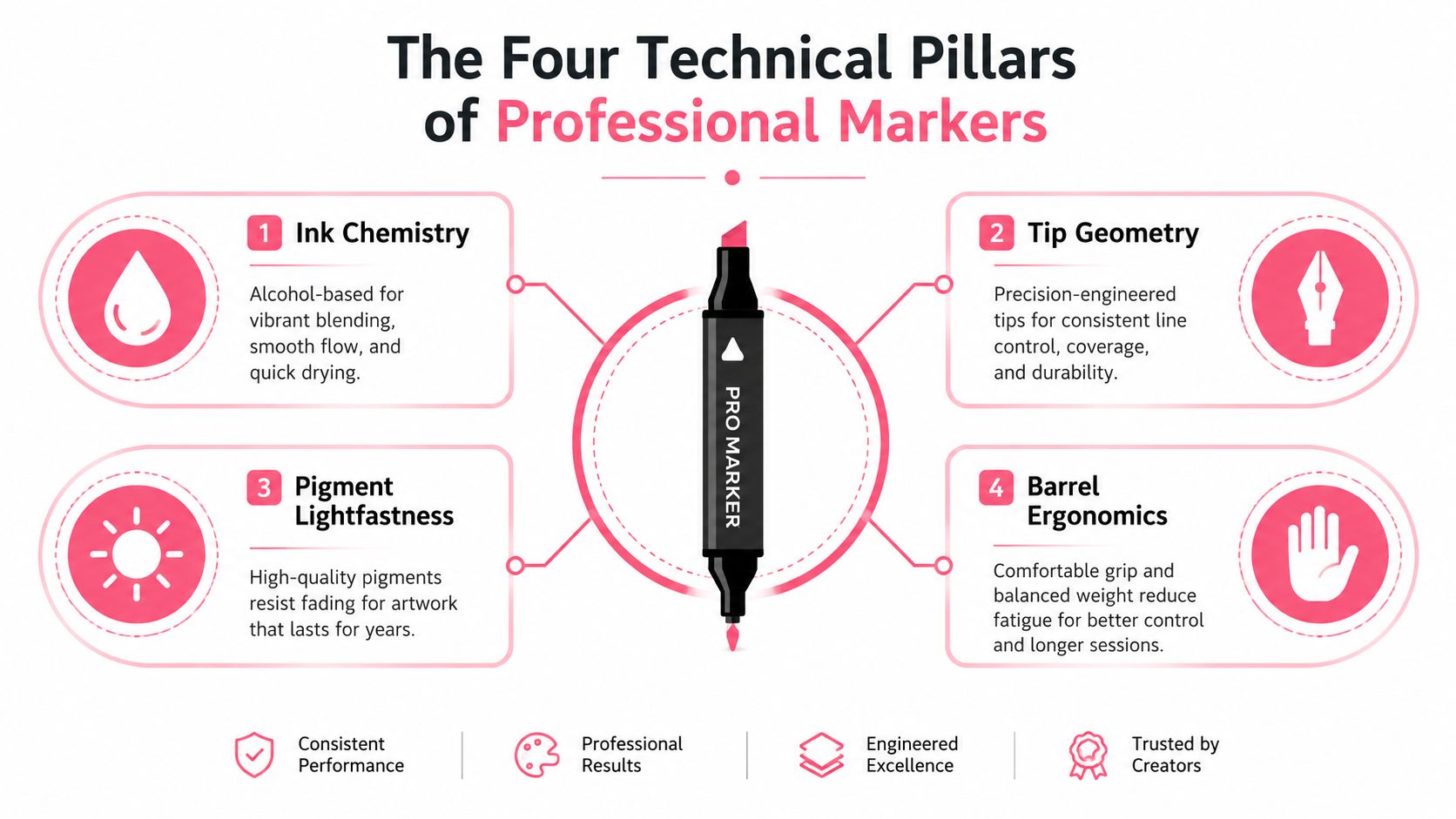
A marker set lives or dies on four things. Ignore the box art and check the mechanics.
Ink chemistry and drying behavior
Alcohol-based markers are the default choice for serious illustration because they move fast, blend cleanly, and don't make you wait around for a page to dry. That matters if you layer skin tones, shadows, or manga hair, because the ink needs to stay workable for a short time and then lock in cleanly.
Water-based markers have their place, especially if you want easier cleanup, but they behave differently on paper and don't give the same snap-to-blend feel. Xylene-based markers exist too, yet most artists who want studio control and predictable color planning end up in alcohol-marker territory. The reason is simple, the chemistry supports the workflow.
Tip geometry and line control
A professional set usually gives you at least two useful tip behaviors, a broad tip for fill and a finer tip for edges, hair, folds, and facial features. That's the difference between a marker that helps you finish a drawing and a marker that makes you fight the page.
Manga artists usually care more about the fine side and brush-like control. Adult colorists often care more about smooth fills and clean transitions. Interior sketchers and designers tend to want a broader tip with dependable coverage on larger shapes. Same category, different needs.
Refillability and replacement parts
Budget sets often stop making sense. A good professional system lets you replace nibs and, in better lines, refill the ink. That lowers long-term cost and keeps favorite colors alive after the barrel looks tired.
A marker that can't be serviced becomes disposable the moment the nib degrades or the ink runs low.
Color consistency and documentation
A solid professional brand should feel stable across batches and color families. Specification sheets help here because they tell you what the company says the system should do, and that gives you a baseline for judging color planning and replacement buying. If you're building a repeatable palette, you need that discipline more than you need novelty shades.
Head-to-Head Brand Comparison
The brands people ask about most are Copic, Ohuhu, Prismacolor Premier, Spectrum Noir, and Winsor & Newton. They don't win for the same reasons, and that's exactly why blind “best marker” lists are useless.
| Brand | Strength | Weak Spot | Best Fit |
|---|---|---|---|
| Copic | Refill system, replaceable nibs, long-term studio logic | High entry cost | Serious illustrators, manga artists, professionals |
| Ohuhu | Strong initial value, easy way to build a large palette | Less durable as a long-term system than premium refill lines | Beginners, hobbyists, casual colorists |
| Prismacolor Premier | Familiar choice, comfortable for general art use | Less compelling if you care about refill economics | Coloring, general illustration |
| Spectrum Noir | Balanced middle ground, practical set planning | Not the first pick if you want the deepest refill ecosystem | Mixed-use artists, planners, learners |
| Winsor & Newton | Polished professional feel, respected art-brand positioning | Cost can move up quickly as you expand | Controlled illustration, design, premium users |
Copic is the obvious long-game choice if you care about the desk more than the unboxing. The reason is not hype, it's the combination of refillability and nib replacement, which changes how the set ages. If you're buying for years, not months, that matters.
Ohuhu makes sense when you want usable color coverage without paying premium-brand money on day one. I'd call it the smart starting point for hobbyists who are still learning blending and palette discipline. It's not the system I'd choose for heavy studio abuse, but it gets a lot of people drawing faster.
Prismacolor Premier sits in the familiar middle. Many artists like it because it's easy to understand and easy to buy, but the real question is whether you want a set that you'll replace over time or one you'll keep maintaining. If you're asking about total ownership, maintenance wins the argument.
Spectrum Noir and Winsor & Newton both make more sense once you already know your style. Spectrum Noir is practical for artists who want a planned set without immediately jumping to a top-shelf price tier. Winsor & Newton feels more deliberate and premium, which suits controlled illustration and design work better than casual dabbling.
If you want a brand comparison tool to sanity-check a palette before you buy, use this marker comparison tool and treat it like a shopping filter, not a toy.
Choosing the Right Set Size and Colors for Your Art Style
Buying marker sets is where people waste the most money. They either buy too little and outgrow the set in a week, or they buy a giant bundle before they know how they color.
Start from the work you do most
If you draw manga or comics, prioritize skin tones, cool greys, hair families, and a few strong accent colors. If you color adult coloring books, you usually need smoother families that blend cleanly across floral, mandala, or character pages. If you're doing illustration or concept art, you want a broader spread of neutrals, atmospheric tones, and enough warm and cool variations to control mood.
A small, focused set can be enough for a beginner. Interior-sketching advice often favors restrained palettes, because too many choices slow the hand down and make the page harder to finish. That logic holds for marker art too, especially when you're still learning how colors mix on paper.
Pick expansion logic, not bundle logic
Buy the smallest set that covers your most common subjects, then expand by color family.
That means a manga artist shouldn't buy random rainbow extras when what they really need is more believable skin and shadow steps. An adult colorist shouldn't chase giant rainbow boxes if half the colors never leave the tray. A concept artist should think in families, not individual pretty colors.
The biggest mistake is jumping straight to a huge set because the per-marker price looks good. That only works if you already know you'll use most of the range. Otherwise, you're paying to store dead inventory, and alcohol markers don't improve by sitting there.
Use a planning tool before you buy
If you're choosing a next set, run your target palette through this set-size conversion tool before you commit. Even if you're not buying the exact brand in the tool, the exercise forces you to think in real color families instead of marketing bundle names.
The right size is the one that matches your actual drawings. Not your aspirational shelf.
Mapping ColorBestie Palettes to Real Marker Brands
A digital palette preview is useful only if it turns into a real shopping list. That's the bridge most marker buyers never build, and it's why so many nice-looking palettes never make it off the screen.
From mood board to barrel
When a palette generator gives you a mood, style, or lighting direction, don't think in abstract color names. Think in marker families. A soft portrait palette usually translates into skin-tone blends plus muted cool shadows. A fantasy palette usually needs stronger saturation and a few anchor hues. A coloring-book palette often works best when it stays coordinated instead of overstuffed.
The trick is to use the preview as a filter, then match it to real marker systems from brands like Ohuhu, Copic, Prismacolor, Winsor & Newton, and Spectrum Noir. That's where a digital tool becomes a purchase guide instead of a visual game.
Build the physical set from the digital preview
Start by generating one palette that fits the project, then break it into roles, base colors, shadow colors, accents, and neutrals. After that, compare the result with the marker families you already trust. If the preview leans warm, don't force it into a cool-heavy set just because the box is on sale.
Use the palette generator to test combinations before you buy replacements or expansion packs. That's especially helpful when you're trying to match a coloring book theme, because the right palette usually feels calm and intentional, not crowded.
Best practice: preview first, swatch second, buy last.
This workflow saves you from chasing random singles. It also keeps your physical set aligned with the same color logic you'd use on a screen, which matters if you switch between digital planning and marker rendering often.
Blending, Maintenance, and Safety Essentials
The best marker set can still turn sloppy if you abuse it. Good blending and basic care are what keep the ink behaving like a tool instead of a problem.
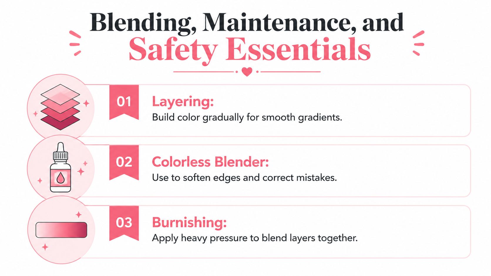
How to blend without muddying the page
Use layering first. Put down a light pass, then deepen the shadow with a second pass while the first layer still has some open time. A colorless blender is useful for softening edges and rescuing transitions, but it won't fix a bad color choice. Burnishing with pressure can smooth layers together, but only when the paper can handle it.
The better your paper, the less you have to wrestle the marker. Marker paper, bleed-resistant pads, and heavyweight illustration sheets all give you more control than cheap copy stock. That's not a luxury, it's part of the system.
Care, storage, and replacement logic
Keep markers horizontally so the ink stays distributed evenly, and keep them cool and dry. That advice shows up everywhere because it works. If a line offers replaceable nibs, use them before you throw away the whole marker, because a worn tip can make a good barrel feel broken.
Refill economics matter too. A refillable system costs more upfront, but it avoids the waste cycle that comes with disposable sets. For artists who use their favorite neutrals or skin tones constantly, that's the difference between a smart tool and a recurring annoyance.
Safety deserves a real look
This is the part most buying guides ignore. Independent lab testing has found that some popular art-marker products can contain heavy metals such as cadmium and lead, and the U.S. Consumer Product Safety Commission warns that adult art materials aren't automatically reviewed for chronic-toxicity risks the way children's products are (independent testing and safety discussion). That doesn't mean every marker is unsafe. It means you need to read labels, respect ventilation, and treat bulk purchases for home studios or small classrooms seriously.
If you buy in quantity, watch for odor, cap sealing, and storage habits. Safety is part of professionalism, not a side note.
Which Marker Set Matches Your Style
If you want the short answer, buy for your workflow, not for the box.
- Budget beginner: Ohuhu is the easy entry point if you want solid color coverage without committing to a premium refill system. Start with a mid-sized set, then add only the families you keep reaching for.
- Serious manga or comic illustrator: Copic is the safer long-term bet because the nib and refill ecosystem supports heavy use. A smaller, controlled set beats a giant bargain bundle every time.
- Adult coloring enthusiast: Prismacolor Premier or Spectrum Noir works well if you want smooth fills and an approachable palette for books like Jade Summer or Coco Wayo. Choose the set size that covers your favorite page themes, not the widest rainbow.
- Mobile-first planner: if you like testing palettes before buying, use a digital preview workflow first, then match the result to a physical system like Copic, Ohuhu, or Winsor & Newton. That's the cleanest way to avoid impulse buys.
The comparison table above should settle most of the brand questions. The decision is whether you want the cheapest start, the strongest long-term system, or the most controlled artistic workflow.
Quick Decision Checklist and Common Questions
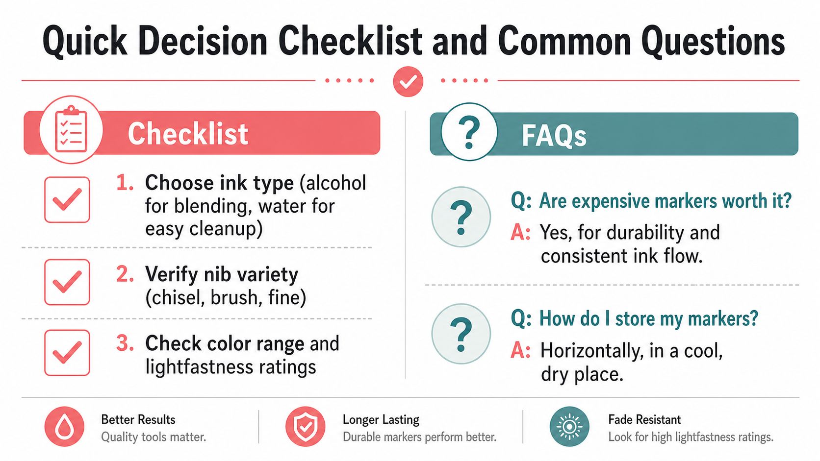
- Choose ink type first, alcohol for blending-heavy work, water-based if cleanup matters more.
- Check nib variety, because chisel, brush, and fine tips solve different problems.
- Verify refill and replacement support, since that decides long-term value.
- Match the palette to your art style, not to the biggest bundle on sale.
Are expensive markers worth it? Yes, if you'll use them often and care about durability, nib replacement, and consistent ink flow.
Do alcohol markers expire? They can dry out if stored badly or left uncapped, so storage matters more than a formal shelf-life number.
Can you mix brands in one project? Yes, but test the blend behavior first, because different ink systems don't always layer the same way.
If you want help turning a digital palette into a real marker shopping list, ColorBestie makes that part much easier. It's built for previewing color ideas before you spend money on ink, and it helps you compare marker-friendly palettes without guesswork. Visit ColorBestie and test your next set before you buy it.