
You're probably staring at a screen full of watercolor palettes that all look oddly similar at first. Some are folding tins. Some are white plastic trays with lots of tiny wells. Some are heavy ceramic dishes that look beautiful but a little impractical. And nearly every product description claims it's ideal.
That's where most painters get stuck. They assume the best palette for watercolor painting must be a single perfect object, and that if they choose the wrong one, they'll make painting harder from the start. In practice, your palette works more like part of your routine. It affects how quickly you can mix, how clean your colors stay, whether you enjoy painting outdoors, and how much cleanup you'll face later.
A good palette doesn't just hold paint. It supports the way you think about color. It gives you space to test washes, mix neutrals, and return to favorite combinations without friction. It should feel easy to reach for, not fussy or precious.
If you want a calmer way to think through art materials and color decisions, ColorBestie's home base is built around that same idea: make planning feel simple, visual, and enjoyable.
Introduction Why Your Palette is More Than Just a Plastic Tray
Most beginners shop for a palette as if they're buying storage. They look for something with enough wells, a decent lid, and a low price. That seems sensible, but it overlooks the palette's core purpose.
Your palette is your mixing station. It's where choices happen. It's where a yellow becomes a muted olive, where a blue shifts toward gray, and where you decide whether a shadow should feel warm or cool. If the surface fights you, or the layout feels chaotic, painting gets tiring fast.
That's why the best palette for watercolor painting isn't always the one with the most compartments. Sometimes a crowded palette gives you less freedom because it leaves too little room for actual mixing. Sometimes a beautiful palette turns into a nuisance because it's heavy, hard to clean, or awkward to carry.
Practical rule: Choose a palette for the way you paint on an ordinary day, not for the fantasy version of yourself with unlimited time and perfect habits.
A useful palette should answer a few simple questions. Can you find your colors quickly? Can you mix a large wash without spilling into the next area? Can you clean it without resentment? Can you leave it loaded and come back later?
Those questions matter more than trend, brand hype, or appearance. Once you start thinking in terms of workflow, the options become much easier to sort.
The Three Core Types of Watercolor Palettes
A palette works a lot like a cook's prep station. The ingredients matter, but so does the surface you use, the room you have to combine things, and how easy it is to clean afterward.
Most watercolor palettes fall into three material families: plastic, ceramic, and metal. Each one changes the experience of painting in a different way.
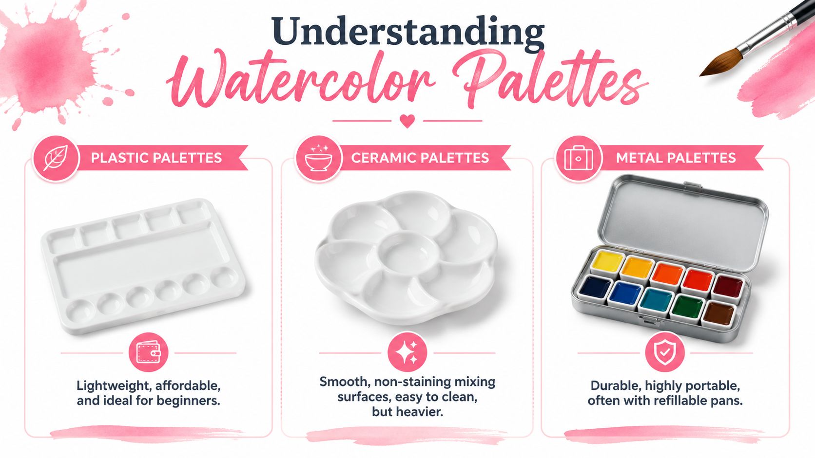
Plastic palettes
Plastic is often where painters begin, and for good reason. It's easy to find, light in the hand, and usually less stressful to own. If you toss it in a bag or leave paint in it for a while, you probably won't worry much.
The tradeoff is surface behavior. Some plastic palettes stain. Some bead water on the mixing area at first. Some feel slightly grabby, while others feel slick. That means two plastic palettes can behave very differently even when they look almost identical online.
Plastic works best for painters who want an affordable starting point, students taking classes, or anyone who wants a larger mixing area without extra weight.
Ceramic palettes
Ceramic feels different right away. The surface is smooth, the paint tends to spread in a predictable way, and strong colors don't permanently tint the white surface the way they often do on plastic.
Many painters love ceramic because it makes color easier to judge. A clean white dish shows subtle shifts clearly, especially when you're mixing skin tones, skies, or soft neutral shadows. The downside is obvious. Ceramic is heavier and breakable, so it suits a desk or studio better than a backpack.
Ceramic often feels “better” not because it's fancy, but because the surface lets you see what the paint is actually doing.
Metal palettes
Metal palettes are common in travel kits, especially folding tins with pan spaces and built-in mixing surfaces. They're durable, compact, and easy to close up for painting on location.
Their main strength is portability. You can keep a stable set of colors in one small box and take it almost anywhere. Some metal mixing surfaces can feel slick when new, though, and the mixing area is often smaller than what studio painters prefer.
They're excellent for urban sketching, outdoor painting, and artists who want one contained kit.
| Material | Pros | Cons | Best For |
|---|---|---|---|
| Plastic | Lightweight, affordable, easy to replace | Can stain, may bead water, quality varies | Beginners, classes, casual home use |
| Ceramic | Smooth mixing surface, easy to clean, resists staining | Heavy, fragile, less portable | Studio painting, careful color mixing |
| Metal | Durable, portable, compact, great for travel kits | Often smaller mixing space, can feel slick at first | Travel sketching, plein air, compact setups |
How to Choose a Palette for Your Painting Style
A palette only feels “wrong” when it clashes with your habits. That's why the best way to choose is to start with your own painting routine instead of the product listing.
Start with where you paint
If you paint at a table most of the time, weight doesn't matter much. A ceramic plate-style palette or a roomy plastic tray can be wonderful because it stays put and gives you space.
If you paint on trains, in cafés, at the park, or during short breaks, compactness becomes more important. A folding metal palette or a smaller plastic travel palette will probably serve you better because it opens quickly and packs away without fuss.
Ask yourself these questions:
- Desk or travel: Do you mostly paint in one place, or are you carrying supplies around?
- Short sessions or long sessions: If you paint for brief windows of time, setup speed matters a lot.
- Sketchbook size: Small sketchbooks don't need the same mixing area as larger paintings with broad washes.
A heavy, beautiful palette can be a poor choice if you avoid using it because it feels inconvenient.
Look at wells and mixing space together
People often focus on the number of wells and ignore the mixing area. That's a mistake. Wells store paint. Mixing space is where watercolor becomes usable.
A palette with many tiny wells may look organized, but it can be frustrating if you can't mix a clean puddle for a sky wash or a shadow color. On the other hand, a palette with fewer wells and generous flat areas often feels calmer and more practical.
Look for balance.
- Deep wells help if you like loading tube paints and letting them dry in place.
- Open mixing zones help if you paint larger shapes or make lots of intermediate colors.
- Folding lids can double as extra mixing space, which is especially useful in travel palettes.
Budget matters, but friction matters more
It's smart to stay within budget. But don't judge only by price. Think about the small annoyances a palette can create over months of use.
A cheap palette that beads water badly, stains heavily, or never feels comfortable may end up abandoned in a drawer. A simple palette that cleans easily and fits your hand can keep earning its place every week.
The right palette lowers friction. You reach for it without debate, and that matters more than having the most impressive setup.
A helpful way to decide is to rank these in order: portability, mixing space, cleanup ease, and cost. Your top two priorities usually point to the right material quickly.
Preparing and Maintaining Your Watercolor Palette
You sit down for a first proper painting session, squeeze out fresh color, add water, and the puddle skates into little droplets instead of spreading into a usable mix. Nothing is wrong with your technique. Your palette needs a bit of setup.
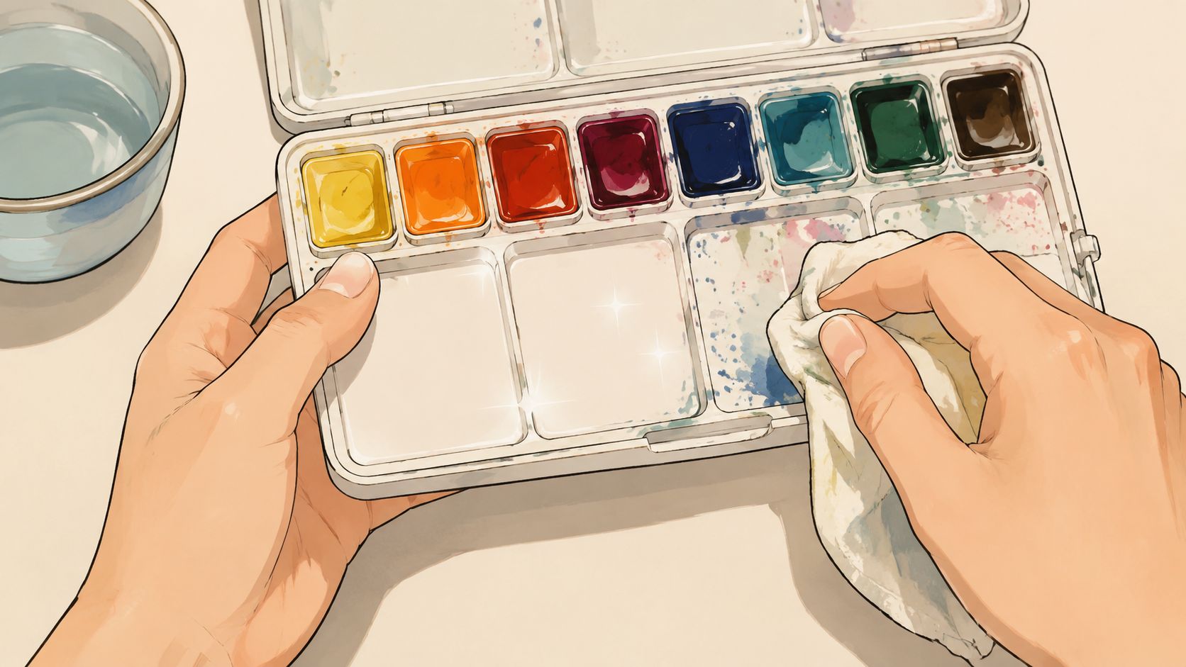
A watercolor palette is part mixing surface, part storage system, and part habit builder. The way you prepare it affects how easily you mix color, how clearly you judge washes, and how pleasant cleanup feels months from now. That long-term usefulness matters more than how pristine it looks on day one.
What to do before first use
New palettes often arrive with a slick factory finish or a bit of residue from packaging. On some surfaces, especially plastic, that can cause beading. Water gathers into droplets rather than forming a thin, even film, which makes it harder to mix a reliable puddle.
Emily Wassell notes in her guide to watercolor palettes that some artists gently dull a stubborn surface with a soft scouring sponge or even toothpaste, while avoiding harsh abrasion because deeper scratches can encourage heavier staining later on, as explained in her guide to watercolour palettes.
Ceramic usually needs very little preparation. A careful wash is often enough. Plastic and enamel-coated metal deserve a quick test before you commit your paints.
A good first-use routine is simple:
- Wash the palette with mild soap and warm water.
- Brush clean water across the mixing area and watch how it behaves.
- Try the gentlest fix first if the water beads strongly.
- Let your paints dry into place if you use tubes, so your setup is ready for regular use.
That last step matters more than it seems. A palette starts becoming yours when it holds color in a stable, repeatable way. If you want help planning where those colors will live before you fill the wells, a watercolor palette layout generator can help you test an arrangement before paint makes it permanent.
Cleaning without damaging the surface
Cleanup is really about color accuracy. If yesterday's pigment leaves a haze on the mixing area, today's blue may look duller than it is. If a dark neutral stays hidden in a corner, it can muddy the next wash without warning.
Treat the palette the way you would treat a brush. It is a tool with a surface that teaches your hand what to expect. Gentle, regular care usually works better than occasional heavy scrubbing.
These habits keep a palette reliable:
- Wipe fresh mixtures while they are still soft. A damp cloth or soft sponge usually removes them easily.
- Rinse mixing areas more carefully than paint wells. The open surface needs to stay readable.
- Use abrasion sparingly. Every scratch gives pigment more places to cling.
- Dry the palette before closing or storing it. Trapped moisture can soften paint unevenly and make the setup messier next time.
This walkthrough is useful if you want to see palette care in action.
When staining matters and when it does not
Beginners often worry the first time a bright phthalo or deep earth leaves a mark behind. Some staining is part of use. A palette works like a cutting board in a kitchen. A few marks do not stop it from doing its job.
What matters is where the staining happens and what it changes.
Staining inside a well is usually harmless because that area already holds one family of color. Staining across the mixing surface is more important because it can affect how water spreads and how clearly you read a fresh mixture. Surface wear matters for the same reason. A heavily scratched area may grab pigment, dry unevenly, or make a wash look patchy before it ever reaches the paper.
Wassell also points out that many palettes bead less as they are used more. That is a helpful reminder to judge performance over appearance.
A good palette does not need to stay spotless. It needs to stay predictable.
If paint rewets well, mixes remain easy to read, and cleanup stays manageable, the palette is serving your workflow well. If puddles break apart, residue keeps contaminating mixes, or the surface feels rough and tiring to use, then maintenance habits or material choice deserve a closer look.
Designing Your Palette Layout and Color Selection
You open your palette in the middle of a painting session, reach for a blue, hesitate, then realize your earth colors are scattered between reds and greens. Nothing is technically wrong with the palette. It still slows you down.
That is why layout matters. A good palette supports your workflow the way a well-organized kitchen supports cooking. You stop searching, start mixing faster, and make cleaner decisions because your colors live in places that make sense.
Why a smaller color set often teaches more
Beginners often buy colors the way children collect crayons. More options feel exciting at first, but too many similar paints can make every choice harder. A limited set gives you fewer decisions and more practice with the ones that count.
A simple starter range of 3, 6, or 12 colors is a sound teaching approach because each step adds flexibility without turning the palette into a guessing game. Three colors teach you the bones of mixing. Six colors usually give you warm and cool versions of the primaries. Twelve colors leave room for a few earths or convenience colors while still being easy to learn.
Liz Steel shows one practical version of this idea in her basic watercolor palette post. Her setup uses warm and cool choices across the primary families, with earth colors and a few useful mixers. That structure helps because color mixing becomes more intentional. You can choose a warmer blue for lively greens, or a cooler red for cleaner violets, instead of hoping one paint will do every job.
The goal is not to own every useful color. The goal is to know your colors well enough that they behave like familiar tools.
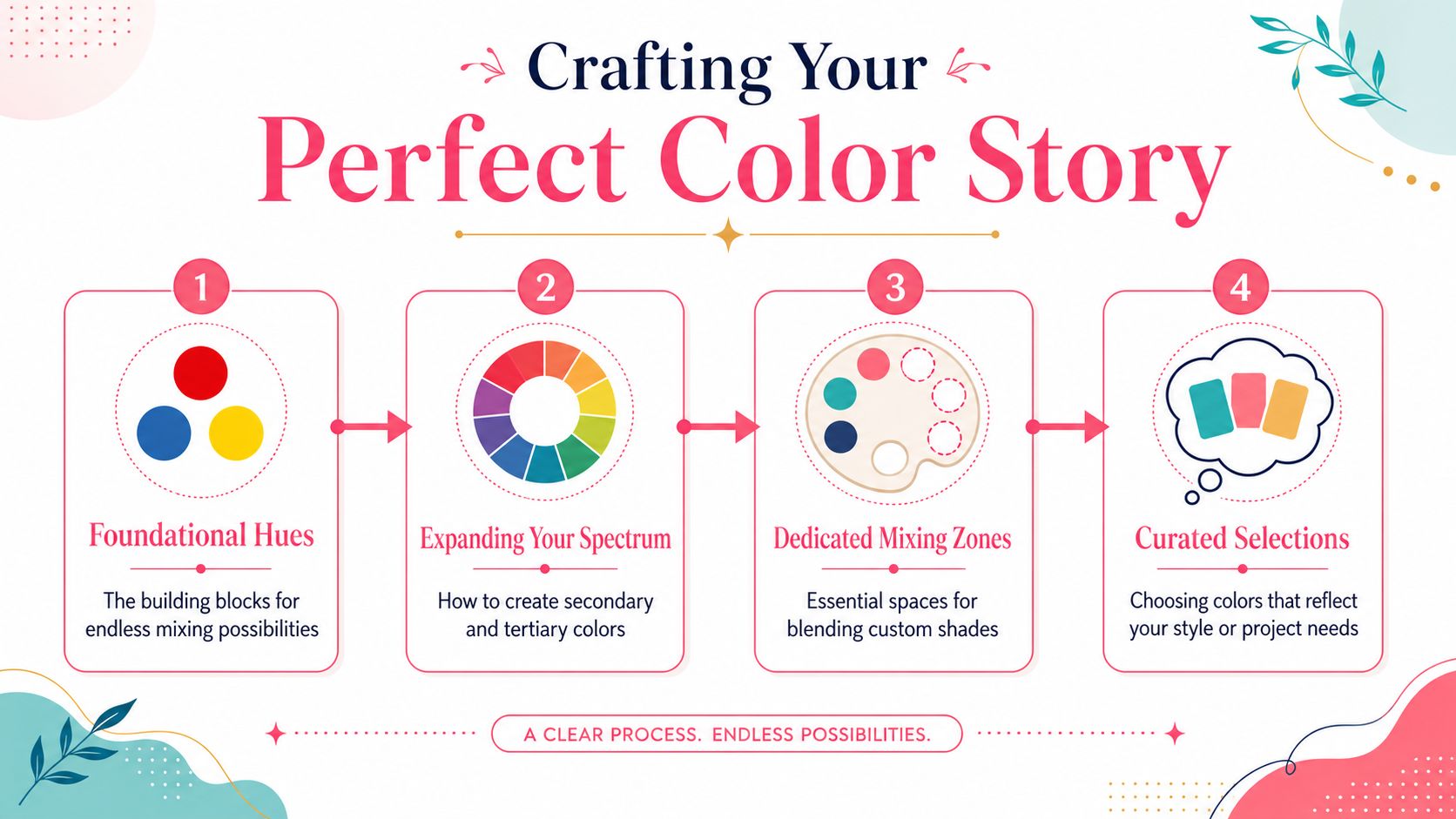
Arrange colors so your hand can remember them
Once you have chosen your paints, put them in an order that matches how you see color. Watercolor Affair suggests arranging them in a spectral sequence in this travel palette layout article, moving from yellows through oranges, reds, blues, and greens, rather than placing them by brand or by the order you bought them.
That method works for a simple reason. Nearby colors are easier to compare. If your yellows sit together and your blues sit together, you can judge temperature and bias at a glance. Over time, your palette becomes a map your hand remembers.
A layout like this works well for many painters:
- Keep yellows together: Place warm and cool yellows side by side so mixing greens starts with an easy choice.
- Move around the wheel: Follow a rainbow order through oranges, reds, violets, blues, and greens.
- Set earths in their own zone: Burnt Sienna, Raw Umber, and similar colors are easier to find when they are grouped instead of tucked between brighter paints.
- Protect your mixing area: Leave enough open space for large puddles, test swatches, and neutral mixes.
If you want to test different arrangements before filling the wells, this watercolor palette layout generator is useful for planning color order visually.
Build around the way you actually paint
This part gets skipped in many palette guides. Your best layout depends on how you work, not only on color theory.
If you mix large sky washes, keep your most-used blues near the biggest mixing area. If you paint botanicals, place your yellows, blues, and earth greens where you can reach them quickly. If you often paint on location, avoid a layout that forces you to open too many mixing zones at once. A good palette setup reduces hand travel, cleanup time, and the chance of muddying fresh mixtures.
Surface wear matters here too. Colors you use constantly will wear certain wells and mixing spots faster than others. Staining can also affect readability over time, especially with intense pigments. For that reason, many painters put heavily staining colors in consistent wells at the edges or in corners, where residue is easier to predict and less likely to confuse delicate mixes.
Put colors where you naturally reach for them again and again, then keep that order long enough for it to become habit.
A memorable layout, a restrained color selection, and clear mixing space do more than make the palette look tidy. They turn it into a working system that supports your painting session from setup through cleanup.
Palette Examples for Three Common Artist Types
A palette feels very different at a kitchen table than it does on a windy bench in the park. That is why the best choice usually becomes clear when you start with the painter's routine, not the product label.

The travel sketcher
This painter works quickly and packs light. They may be standing, balancing a sketchbook on their lap, or painting between stops during the day. In that setting, a palette has to behave more like a good field notebook than a studio tool. It needs to close securely, survive being bumped around, and open without fuss.
A compact metal palette usually fits that workflow well. It protects dried paint, slips into a bag easily, and can handle repeated travel better than ceramic. The limitation is mixing room. Small palettes ask you to mix with intention, so they suit artists who are happy to carry fewer colors and remix often.
Wear matters here too. If a travel sketcher uses the same blue for skies every day, that pan and nearby mixing area will show use fast. A setup with staining colors placed in predictable spots helps keep the palette readable when you are painting on location and making decisions quickly.
The studio painter
This painter has different pressures. They often stay in one place, work longer, and need enough room to mix generous puddles without crowding the surface. If you paint large washes, a tiny folding palette can feel like trying to cook a full meal on a saucer.
A ceramic palette often makes studio work easier. The surface stays visually clear, subtle mixtures are easier to judge, and larger open areas support repeated mixing without the cramped feeling of travel gear. Its weight is useful here because the palette stays put while you load the brush, adjust a mix, and return to the paper.
The tradeoff is maintenance and fragility. Ceramic is pleasant to mix on, but it is not the palette you want rattling around in a backpack. For a painter who mostly works at a desk, that tradeoff usually makes sense.
The beginner who wants one good setup
This painter is still building habits. They are learning how much water belongs in a mix, which colors they reach for repeatedly, and whether they prefer to paint at home or carry supplies out. A first palette should leave room for those discoveries.
A medium plastic palette is often a smart place to begin. It gives enough space to practice mixing, keeps the cost reasonable, and makes experimentation feel less risky. If staining happens, or a mixing area starts to look worn, that is not failure. It is evidence of use, and plastic is forgiving enough for that learning phase.
Color selection should stay simple, as noted earlier. A small set can teach far more than a crowded tray if the goal is to understand mixing rather than collect options. Many beginners do well with a limited group of paints and a layout they can memorize quickly.
If you want to test color direction before filling wells or buying more paint, the theme preview tool for exploring color moods is a practical way to compare options.
The pattern across all three artists is straightforward. The right palette is the one that fits your pace, your setup, and the kind of cleanup you are willing to do after painting.
Conclusion Your Palette is a Journey Not a Destination
The best palette for watercolor painting is the one that fits your actual practice right now. Not the one a product page calls professional. Not the one another artist loves for a completely different routine. Yours.
Some painters need a compact metal box they can carry every day. Others need a ceramic surface that makes mixing feel calm and precise. Many beginners do best with a simple plastic palette that gives them room to experiment without pressure. None of those choices are lesser. They're just matched to different needs.
What matters most is how the palette supports your workflow. Does it open easily? Does it give you enough mixing room? Can you keep the colors in an order that makes sense to your eye? Can you maintain it without turning cleanup into another chore?
A good palette also changes with you. You may start with a broad beginner setup and later trim it down. You may begin with travel gear and eventually want a larger studio surface. That isn't inconsistency. That's growth.
Keep the decision simple. Choose a material that suits your painting life. Keep your color selection intentional. Arrange your paints so mixing feels natural. Maintain the surface well enough that it stays pleasant to use.
That's usually enough to turn an overwhelming purchase into a dependable creative partner.
If you enjoy planning color before you commit to real materials, ColorBestie offers a cozy way to preview palettes, test themes, and build marker-friendly color ideas from black-and-white art. It's a nice companion when you want clearer color direction without making the process feel technical.
