
You've got a watercolor set on the table, a cheap little tin or tray that came bundled with your paints, and you're already annoyed by how cramped it feels. The colors bleed into each other, the mixing area is tiny, and every time you try to pull a clean wash, you end up fighting the palette instead of painting. That's the problem with shopping for the best watercolor paint palette. Many artists buy the wrong workflow first, then blame their painting.
| Palette format | Wells | Mixing area | Portability | Best for |
|---|---|---|---|---|
| Tin half-pan set | Usually compact | Small to modest | High | Travel, quick sketching, beginners who want minimal gear |
| Fold-out travel palette | Moderate | Better than a basic tin | High | Plein air, mobile artists who still want room to mix |
| Open ceramic mixing tray | Low to moderate storage, strong mixing focus | Large | Low | Studio washes, color control, clean mixing |
| Large studio box | High | Large or split between wells and mixing zones | Low to moderate | Artists who keep many colors loaded and paint at a desk |
Why the Palette You Choose Changes Everything
The palette isn't a container. It's the part of your setup that decides how you mix, how fast you work, and whether your colors stay usable or turn into mud. A beginner who grabs the cheapest tin usually ends up with a cramped layout, which means less room for mixing and more frustration with every wash.
The smartest shift is to stop asking which brand looks nicest and start asking what workflow you want. If you paint at a desk, a ceramic or porcelain tray makes more sense than a tiny travel tin. If you sketch on the go, portability beats luxury every time. The best watercolor paint palette is the one that supports your actual process, not the one with the prettiest lid.
Practical rule: buy for the way you paint on your worst day, not the way you picture yourself painting on your best day.
Start with the use case, not the label
Beginner advice often starts with fewer colors, and that same logic applies to palette choice. One guide recommends 3 colors if budget is tight, 6 colors if you can stretch, and 12 colors for enthusiastic beginners, because fewer colors make mixing easier and help you learn pigment behavior faster. You can read that limited-palette logic in a broader buying context in Susan Chiang's watercolor paint guide.
The same principle applies to the physical palette. If you don't need a huge tray, don't buy one. If you do a lot of mixing, don't trap yourself in a cramped travel tin just because it looks tidy.
Storage and mixing are different jobs
A lot of palettes try to do everything at once. That usually means they do nothing especially well. A strong palette separates storage capacity from mixing capacity, which is why some artists prefer a small set of wells plus a wide open area, while others want many wells and don't mind a smaller mixing zone.
That's the primary decision. Not brand name. Not hype. Workflow first, palette second.
The Four Buying Criteria That Matter
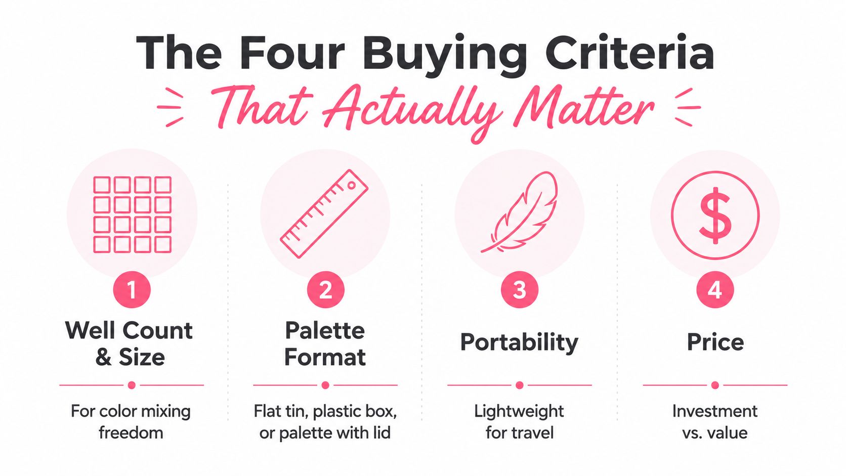
Well count and geometry
Well count controls how many colors you can keep ready without constant cleanup and refilling. For beginners, a palette with 12 wells or more is a smart floor, and studio advice still points to larger ceramic layouts for painters who keep a lot of colors loaded at once. That spread tells you the answer, more wells help only if the layout matches the way you mix. Arts of Course's palette guide spells out that beginner-to-studio range clearly.
Geometry matters just as much as raw count. Deep, slanted wells keep colors separated better, while flat, shallow wells give faster access but get messy sooner. If you switch pigments often, choose sloped wells and save yourself the contamination.
Material
Ceramic and porcelain win for one plain reason, they're non-porous. Paint stays workable longer, cleanup is easier, and the surface feels better for controlled mixing because the color sits on top instead of sinking into texture.
Plastic and metal still have a place. They're lighter, cheaper, and easier to throw in a bag. If you care more about weight and travel than about the best mixing feel, plastic is the practical pick.
Mixing area
The mixing area is where a palette proves itself or falls short. A row of tiny wells can look tidy, but it becomes annoying fast when you need room for a clean wash or a smooth glaze.
A wide flat area matters more than extra wells if you mix a lot. This is the part most buyers underbuy. They focus on storage and end up cramped every time they blend a shadow, a skin tone, or a muted green. For a quick visual planning aid, use this palette preview tool before you commit to a layout.
Rewetting workflow
Travel sets live or die by rewetting. Half-pans can work beautifully, but only if they reactivate fast and predictably after drying. That's why reviewers compare travel palettes by pan count, portability, and rewetting workflow, and why compact sets around 12 half-pans get treated very differently from larger professional sets with far more paint loaded in them. You can see that framing in MuseItUp Publishing's watercolor paint set roundup.
A good travel palette should open cleanly, close securely, and give you paint that wakes up without a fight. If you paint on the move, seal and rewetting behavior matter more than a pretty exterior.
Bottom line: if you paint in one place, choose surface and mixing room first. If you move around, choose sealing and rewetting first.
Comparing the Main Palette Formats Side by Side
Here's the blunt version. Most artists don't need the most impressive palette, they need the one that stays out of the way.
| Format | Wells | Mixing Area | Portability | Best For |
|---|---|---|---|---|
| Tin half-pan sets | 12 to modest counts | Tight | Excellent | Beginners, travel, quick sketching |
| Fold-out travel palettes | Moderate counts | Better than basic tins | Excellent | Plein air artists, mobile painters |
| Open ceramic mixing trays | Lower storage focus | Strongest | Poor | Studio painters, wash-heavy work |
| Large studio boxes | 24, 32, 48 style layouts | Varies, often good | Low to moderate | Artists who keep many colors loaded |
The tin half-pan set is the cheapest easy win, and that's why it's common. It's portable, simple, and fine for small setups. The trade-off is obvious, mixing space gets cramped fast, and that limits how useful it feels once you start blending more seriously. For a quick reference on how digital planning tools think about color setup, I'd bookmark this palette preview tool and keep moving.
Fold-out travel palettes give you breathing room without getting too bulky. They're the sweet spot for artists who leave the house with paint in their bag but still want enough room to mix skin tones, shadows, or layered florals. They're not glamorous, but they work.
Open ceramic trays are what I'd pick if I cared most about the paint experience itself. They're bad for portability and great for control. If you paint long sessions at a desk, this format feels like relief.
Large studio boxes sound ideal until you use them. Then you realize they can become cluttered, heavy, and overcomplicated. They're useful if you load many colors at once, but they're a bad answer for artists who mostly need good mixing behavior.
Matching a Palette to Your Painting Style
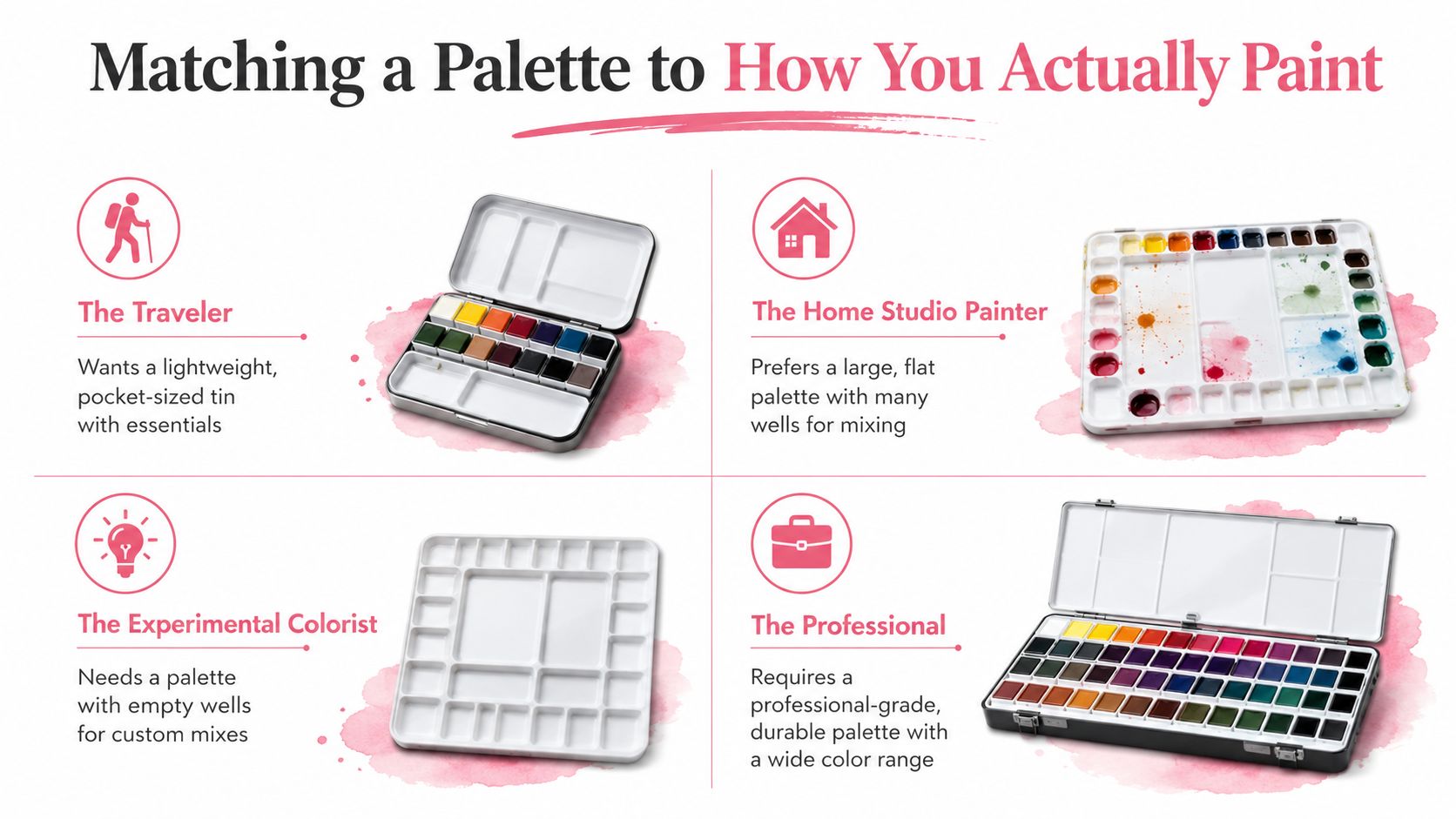
The traveler doing plein air sketches
If you paint outside, stop pretending a heavy studio tray belongs in your bag. You need a lightweight tin or fold-out palette with half-pans that rewet fast and close securely, because anything bulky becomes a nuisance the second you start moving. The travel sets in MuseItUp Publishing's set comparison make the same point through their range, from 12 half-pans in compact formats up to 45 to 48 half-pans in bigger sets.
My pick for this setup is the smallest palette that still gives you enough mixing room to avoid frustration. That usually means a compact fold-out, not the flimsiest little box you can find. If you want a quick way to test layouts before buying, try the palette generator tool and compare how much room each layout gives you.
The home studio painter
If you paint at a desk, buy for comfort, not portability. A wide ceramic or porcelain tray with deep wells and a generous central mixing area is the right move. The non-porous surface keeps washes clean and makes cleanup easy, which is exactly what you want when you are building layer after layer.
This setup rewards slower, more deliberate painting. I would choose ceramic over plastic here without hesitation. It gives you better mixing behavior, less staining, and a surface that feels made for long sessions.
The classroom student
Classroom painting is about cleanup, reliability, and not wrecking your bag. A mid-size plastic palette with 18 to 24 wells makes sense because it is practical, light, and easy to replace when it gets beat up. You are not trying to impress anyone, you are trying to keep your colors separated and your workspace manageable.
For students, I would take a clean plastic palette over a fancy one with awkward geometry. Learning beats prestige every time. A simple layout also makes it easier to spot when your colors are muddy or your wells are overcrowded.
The professional taking commissions
Professionals often need two setups, a portable field palette and a dedicated studio tray. That is not indecision, it is efficiency. One format handles mobility, the other handles control, and neither has to compromise too hard.
If you take commissions, buy for the jobs you do. Do not make one palette carry every scenario on its back. A smart working setup keeps one palette ready for quick travel work and another reserved for controlled studio mixing.
Direct verdict: travelers should buy compact and sealable, studio painters should buy ceramic and wide, students should buy practical plastic, and professionals should keep two palettes instead of forcing one to do everything.
The Limited Palette Approach for Beginners
Beginners burn money fast when they buy too many colors at once. Start small instead, with a few single-pigment primaries and learn how far you can push them through mixing. A solid beginner set often includes Hansa Yellow Deep (PY65), Lemon Yellow (PY175), Phthalo Blue GS (PB15:3), French Ultramarine (PB29), Quinacridone Rose (PV19), and Pyrrol Scarlet (PR255), plus a couple of earth tones. Susan Chiang's guide to paint selection lays out that six-color approach clearly, and Bruce MacEvoy's Handprint color notes also make the case for keeping the first palette small and predictable.
Why six good pigments beat a big random set
Single-pigment paints mix cleaner than convenience mixes. Every extra pigment in a tube raises the chance of dull blends and weird surprises, which makes it harder to learn how your colors behave. If you are still building color confidence, cleaner mixing gives you clearer feedback every time you paint.
Transparency and lightfastness matter more than stuffing a palette full of tubes. A small set of carefully chosen paints teaches more because each mix shows you something useful instead of hiding the result under too many ingredients. You learn how warm and cool versions of yellow, blue, and red work together, and you see fast which combinations stay bright and which ones turn to mud.
How to expand without wasting money
Start with six and add only when you hit a real gap. If your mixes cannot make believable earth tones, add one earth pigment. If your shadows feel flat, add a color that solves that problem directly. That is a better move than buying a huge beginner set and hoping skill appears because the box looks complete.
Keep the progression simple:
- Start with six primaries: build your mixing range first.
- Add earth tones: make neutrals and natural subjects easier.
- Grow to twelve only if needed: expand when your subject matter asks for it.
That same discipline helps marker users who plan color harmony before buying a set. The habit is the same, choose a small number of reliable colors and make them do real work.
Keeping Your Palette Clean and Long-Lasting
A good palette should last years, but only if you stop abusing it. The biggest mistakes are simple. People let dried paint cake into wells, they close tins while everything is still damp, and they turn every well into both a storage slot and a mixing zone.
The maintenance routine I actually trust
Scrape dried paint gently with a plastic card, then rinse. Don't soak cracked ceramic and hope for a miracle. Let half-pans dry fully before closing the lid, even if you're impatient, because trapped moisture invites mildew in sealed tins.
Keep one well for one pigment if you can. Once a well becomes a muddy mixing pit, it stops helping you judge color cleanly.
Stained wells are another silent problem. If a palette looks permanently dirty, your mixes will start looking less accurate too. That's why I like separate wells for storage and a distinct area for blending.
When to replace a palette
Replace a palette when the lid warps and won't seal, when porcelain cracks enough to let water underneath, or when plastic wells start repelling paint. At that point, you're not preserving a tool, you're fighting it. Good gear should make painting easier, not ask for constant forgiveness.
Quick Recommendations and Planning Your Next Steps
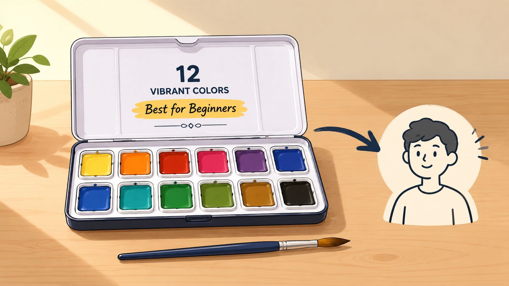
If you travel, buy a compact fold-out tin or half-pan set. If you stay in the studio, buy a ceramic tray with a real mixing area. If you're still learning color, buy a six-pigment starter strategy before you buy a giant box of random hues. Those are the choices that save time and paint.
For artists who also plan marker-friendly color schemes, a tool that helps you preview color relationships can make decision-making a lot faster. That's where ColorBestie fits naturally into the process, because it helps you think through color harmony before you commit. The better your planning, the less paint you waste and the faster your palette starts working for you.
If you want a calmer way to plan color, build a palette, and test how your choices work together, visit ColorBestie. It's a smart companion for artists who want better color decisions without the guesswork, especially when you're translating a watercolor mindset into marker-friendly planning.
