
Your markers are uncapped. The black outlines are gorgeous. Maybe it's a Mucha-style woman with a halo of flowers, or a Beardsley-inspired page full of dramatic black shapes and white air. You want to color it well, but the first choice feels oddly heavy. Warm skin or cool skin. Soft greens or peacock blues. One wrong start and the whole page seems to tilt.
That hesitation is common, especially with black and white Art Nouveau. The linework looks finished enough to admire on its own, yet open enough that every color choice feels important. That can freeze even experienced hobbyists.
The good news is that monochrome Art Nouveau can be a very gentle teacher. When color is removed, you can finally see what the artist is asking the page to do. You notice where the eye should rest, where the rhythm flows, and which parts are meant to sing louder than others. For alcohol-marker users, that makes the style less like a museum relic and more like a reliable practice sheet for testing harmony before ink meets paper.
A Calm First Look at Black and White Art Nouveau
A reader once described the feeling perfectly. She had printed a flowing Art Nouveau portrait, laid out her Ohuhu markers in a neat arc, and then spent more time staring than coloring. Nothing was wrong with the page. The problem was that everything looked equally beautiful.
That's often the first confusion point. If a design has curling hair, flowers, borders, jewelry, and a face all competing for attention, where should the colorist begin? Many people assume they need a full palette plan immediately. Usually, they don't. They need to read the page before they decorate it.
Why monochrome helps
A black-and-white version strips away one layer of pressure. Instead of asking, “What colors should this be?” you can ask simpler questions first.
- Where does the eye land first. Usually a face, a hand, a flower center, or a strong black accent.
- Which lines connect the page. Hair, stems, ribbons, and fabric often carry the rhythm.
- Where does the page breathe. White space is rarely empty in this style. It's part of the design.
Practical rule: If you can identify the focal point, the repeated curve, and the quiet space, you already have the beginning of a coloring plan.
That shift matters. It turns the page from a test of taste into a readable visual system.
A study partner, not a fragile masterpiece
Many hobbyists treat Art Nouveau pages too carefully at first. They think they must honor the style by producing a grand, polished result. A calmer approach works better. Think of the page as a study guide for line, balance, and restraint.
For marker users, that's especially useful because alcohol markers move quickly. Once you've filled a section, you can't unfill it. A black-and-white Art Nouveau page helps you slow down before the first stroke by teaching structure first. That structure becomes your safety net.
If you've ever wished someone would sit beside you and point out what matters, that's what this style can do when you learn how to look at it.
Where the Style Came From and Why It Still Matters
You sit down with an Art Nouveau page, cap off one warm gray marker, and pause. The lines already feel organized. Hair loops into the flowers. The border answers the curve of the dress. Even before color enters, the page has a plan.
That sense of order has a history. Art Nouveau spread across Europe and the United States around the turn of the 20th century, favoring organic curves, plant forms, and decoration that seemed to grow across a surface rather than sit stiffly on top of it, as summarized in Britannica's overview of Art Nouveau. A useful way to recognize the shift is this: older ornament often behaves like trim added after the fact. Art Nouveau line behaves more like a vine. It connects, repeats, and keeps moving.
For black-and-white work, Aubrey Beardsley is one of the clearest starting points. His illustrations reduced the style to a sharp lesson in contrast. Large black shapes, pale open space, and elegant contour lines do a surprising amount of work. If Mucha often feels musical and flowing, Beardsley can feel more like chamber music played in ink. Fewer notes, carefully placed.
A broader public met the style in posters, interiors, furniture, and exhibitions. The Musée d'Orsay's history of Art Nouveau helps place it in that wider decorative world, where artists and designers treated architecture, objects, and printed images as parts of the same visual language. That matters for a colorist because Art Nouveau was never only about pretty figures. It was built on repetition, rhythm, and harmony across a whole design.
Mucha is the name many hobbyists recognize first. His posters, discussed in The Metropolitan Museum of Art's overview of Alphonse Mucha, show how halos, flowers, lettering, drapery, and hair can all belong to one flowing system. That is the small aha moment. The decorative parts are not extras. They are the structure.
That is also why the style still matters at a coloring desk today.
For alcohol-marker hobbyists, black-and-white Art Nouveau works like a calm rehearsal before the full performance. You can study how one curve repeats through hair, stems, and sleeves, then build a palette that repeats with the same discipline. You can test where a dark marker should anchor the page before broad blends make changes hard to reverse. Mucha and Beardsley stop being distant historical names at that point. They become practical teachers of palette control.
Three lessons tend to come out of that practice:
- Repeat color where the line repeats, so the page feels connected instead of scattered
- Save your strongest darks for structure, because black areas already show you where weight belongs
- Let some spaces stay quiet, since Art Nouveau often depends on breathing room as much as ornament
The style looks ornate, but it teaches clarity. For marker users, that makes it less of a museum relic and more of a reliable workbook for choosing harmonious color with intention.
Reading the Linework Like a Visual Sentence
You sit down with a fresh Art Nouveau page and uncap three markers. Before color enters the picture, the ink has already set the pace. One curve pulls your eye upward, a cluster of petals slows it down, and a dark corner says, "pause here."
That is a useful way to read black and white Art Nouveau. The linework behaves like a sentence. It has a subject, movement, and rests. Once you notice that structure, the page feels less ornate and more readable. For alcohol-marker hobbyists, that matters. You can test harmony in your head before you test it on paper.
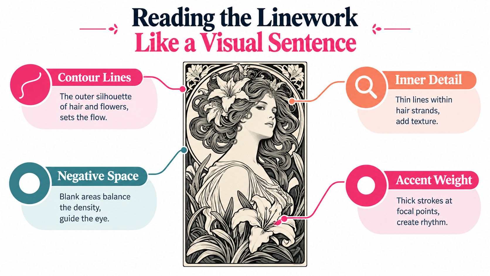
The whiplash curve carries the rhythm
Art Nouveau graphic design often relies on what museum writers describe as an undulating, asymmetrical line, along with simple contours, parallel hatching, flat dark shapes, and active blank paper, as noted in MoMA's catalogue discussion.
On the page, that idea feels much simpler than it sounds. The long S-curve is the motion line. Mucha uses it in hair and drapery. Beardsley sharpens it into something leaner and more dramatic. Either way, your eye follows that path first.
A colorist can use that same path as a planning guide. If one sweeping line links hair to fabric to vines, those areas usually want related colors. They do not need to match exactly. They just need to belong to the same family, the way repeated words in a sentence belong to the same thought.
Symmetry gives the eye a place to rest
Many black and white Art Nouveau designs balance a lively curve with a steady frame. You may see a centered figure, mirrored flowers, or corners that answer each other across the page. That balance keeps the ornament from drifting apart.
For marker work, symmetry is helpful because it gives you built-in comparisons. If a flower appears on both sides, you can test a lighter and darker version of the same hue without breaking the design. If you like to check near-matches before committing, a marker comparison tool for similar alcohol-marker swatches can help you spot close cousins in your set.
Here is the small aha moment. Repetition in line usually wants repetition in color. Not perfect duplication. Quiet echo.
Flat blacks and white space do as much work as the details
Many beginners see an open area inside a sleeve, cheek, or petal and assume it needs more rendering. In Art Nouveau, that empty space is often doing a job already. It lets the ornate parts breathe. It also keeps bold black accents from feeling heavy.
Beardsley is especially useful here. His pages show how black areas can act like commas or periods. They stop the eye, then send it onward. Mucha often handles the pause more softly, with open halos, pale interiors, and clean borders. Both approaches teach the same lesson. You do not have to color every shape at full intensity to make the page feel complete.
A simple reading pattern helps:
- Find the subject. Usually the face, hands, or central flower.
- Follow the verb. Look for the longest curling line or repeated directional sweep.
- Mark the pauses. Notice solid blacks, borders, and white pockets where the eye naturally rests.
That is why black and white Art Nouveau works so well as a study guide for marker users. It trains your eye to organize color before the first stroke, which is exactly the kind of calm, repeatable practice that makes palette choices feel more confident and less accidental.
Signature Motifs You Will See Again and Again
The quickest way to feel at home in black and white Art Nouveau is to meet its recurring characters. Once you notice them a few times, they stop feeling decorative in a vague way and start feeling familiar.
One of the most recognizable appears almost immediately.
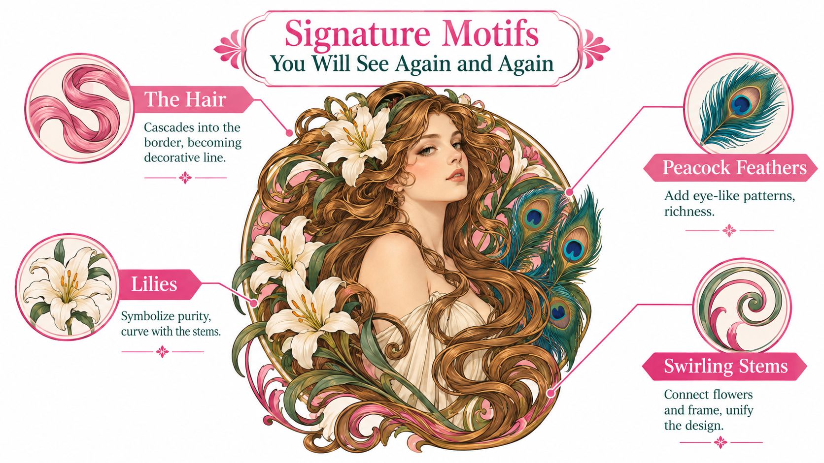
The hair that becomes part of the frame
Art Nouveau hair rarely just sits on a head. It streams, coils, loops, and drifts into the border until portrait and ornament almost merge. That's why many Mucha-style figures feel so unified. The hair isn't separate from the composition. It is the composition.
For a colorist, this is an aha moment. Hair often isn't asking for hyperrealistic highlighting. It's asking for rhythm. Repeated marker strokes in related shades usually work better than fussy blending in every strand.
Flowers chosen for shape as much as meaning
Lilies, irises, poppy-like blooms, and wisteria clusters appear again and again because they bend beautifully. Their petals echo the same curves already present in the figure and border.
Notice what that does to your coloring choices:
- Lilies often invite graceful, open coloring with pale interiors
- Irises can carry stronger directional folds
- Trailing blossoms work well when repeated in gentle hue shifts
The point isn't botanical accuracy. The point is visual rhythm.
Later in the same section of a page, you may also notice feathers, seedpods, leaves, and spirals stepping in as supporting players.
A short visual tour helps:
Borders and letters that behave like ornament
Frames matter more than many beginners expect. Thin rules, corner flourishes, halos, ovals, and cartouche-like panels act like parentheses around the subject. They hold the page together.
Typography often joins that system. Letters may seem to grow from stems or settle into curved compartments rather than sitting in separate blocks. If you're coloring a printable with text, treat the lettering as part of the ornament, not an afterthought.
When you start spotting the same hair sweep, the same floral bend, and the same enclosing frame, your palette choices get easier because the page stops looking crowded and starts looking organized.
That recognition is quiet, but it builds confidence fast.
Where These Designs Live Today
Black and white Art Nouveau isn't confined to archives. It shows up in everyday creative spaces where people want linework they can study, print, adapt, or enjoy.
Printable coloring pages are one of the most obvious homes. Hobbyists regularly collect Mucha-inspired maidens, ornamental florals, and Beardsley-like black-ink pages as PDFs to use with markers, pencils, or mixed media. In that setting, monochrome isn't a missing step. It's the point. The linework arrives ready for interpretation.
Why monochrome keeps returning
A useful gap in current coverage is that black-and-white Art Nouveau often appears as decor or printable content rather than scholarship, even though monochrome changes how people read the style. One retail example notes that removing color shifts attention toward line, rhythm, and silhouette, which can make the underlying structure easier for hobby colorists and marker users to study in practice, as reflected in this Art Nouveau-inspired coloring book listing.
That explains why the style fits so many current uses:
- Tattoo reference sheets value clear contour and ornamental flow
- Wall prints and bookplates use black line to keep the look crisp
- Journal dividers and planner stickers benefit from framed motifs and elegant silhouettes
- Book and album covers borrow the style when they want romance, mystery, or vintage drama
A style that suits the current monochrome mood
There's also a broader design reason these pages feel timely. Neutral trend coverage has framed black and white as a notable projected visual language in 2026 fashion and design, while broader monochrome commentary reflects a deliberate move toward color restraint, as discussed in Elle Japan's 2026 trend piece. That doesn't prove one direct cause. It does help explain why monochrome line art feels fresh again rather than old-fashioned.
For colorists, this is good news. It means your black-and-white references aren't just leftovers from the past. They belong to a living visual taste that still makes sense on screens, in print, and in handmade practice.
Turning Black and White Lines Into Marker Color
Once the linework makes sense, the page becomes much easier to color. You're no longer trying to beautify everything at once. You're deciding where color should lead and where it should stay quiet.
Start with one anchor
Pick the focal motif first. In many Art Nouveau pages, that's the face. Sometimes it's a central flower, a peacock feather, or a jewel-like circular frame.
Ask one simple question: which area deserves the boldest attention? Not the most color everywhere. Just the clearest emphasis.
A page becomes calmer the moment one element gets promoted and the others agree to support it.
Build a small harmony before you touch the paper
This style responds well to limited sets. A 3 to 5 marker harmony is often enough for a full page because the linework is already doing so much of the design work.
Here's a practical preview table you can use.
| Mood | Suggested Marker Harmony | Best For |
|---|---|---|
| Dreamy and soft | muted violet, dusty rose, sage, cream | flowing hair, lilies, gentle portraits |
| Dramatic and theatrical | black, deep red, antique gold, warm gray | Beardsley-inspired contrast, ornate borders |
| Fresh and botanical | leaf green, olive, pale aqua, soft peach | florals, stems, springlike pages |
| Moonlit and quiet | blue gray, lavender gray, muted teal, ivory | halos, evening scenes, reflective moods |
| Vintage poster feel | terracotta, olive, honey, faded coral | framed prints, decorative lettering, garments |
If you want to test combinations digitally first, a palette generator for marker-friendly color planning can help you narrow the field before you swatch by hand.
Work in gentle passes
A repeatable marker routine keeps the style from becoming overworked.
- Swatch first on scrap paper. Heavy outlines can tempt you to color fast, but bleed behavior changes by paper.
- Lay the base tone. Keep it light and even.
- Add a restrained midtone. Follow the main curve, not every tiny enclosed shape.
- Choose shadows carefully. In this style, too much shadow can fight the decorative flatness.
- Leave breathing room. White paper often does the job of highlight better than another marker layer.
One more useful habit is to stop after one motif. Color the hair today. The lilies tomorrow. That pause keeps alcohol-marker work from turning muddy and keeps your decisions clearer.
A Relaxing Way to Practice and Keep Growing
The kindest way to use black and white Art Nouveau is not as a big performance piece. It works better as a recurring practice ritual. A page, a motif, a short session. That's enough.
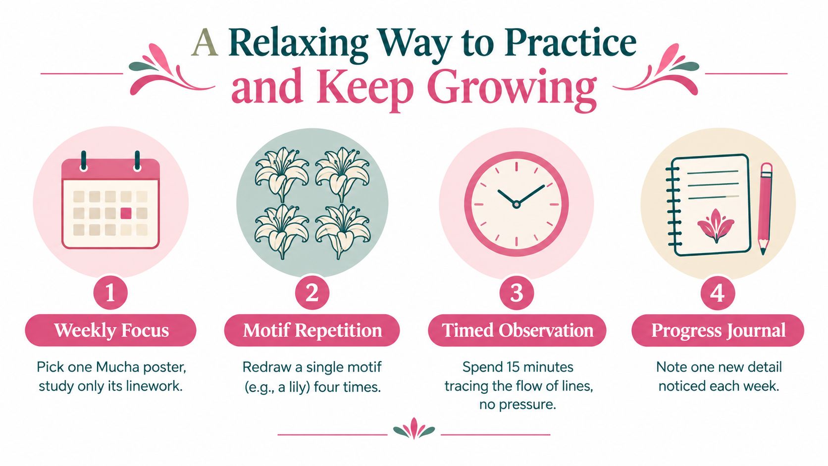
Many people improve faster when they separate observation practice from finished coloring. One evening, study only the border shapes. Another day, redraw a single lily in pen. On another, print one page and use it only to test a skin palette against floral accents. Each small exercise teaches something specific without the pressure of making a masterpiece.
Keep a simple reference habit
A personal folder helps more than expected. Save examples under small categories such as hair, floral, frame, figure, and typography. After a while, you'll notice your own taste patterns. Maybe you lean toward halo compositions. Maybe you love iris shapes but avoid dense feather motifs. That awareness makes future palette decisions easier.
A quiet practice rhythm could look like this:
- One poster study each week with no coloring at all, just line observation
- One motif repetition session where you redraw a leaf, lily, or curl several times
- One short palette test on a printed page using only a few markers
- One note in a progress journal about what you noticed this time
If you enjoy collecting ideas and gentle practice prompts, browsing a dedicated coloring inspiration blog can support that habit between sessions.
Let repetition do the teaching
The biggest shift often comes when you stop trying to finish everything beautifully and start trying to notice one thing clearly. A border starts making sense. Hair stops looking overwhelming. You realize a white gap near a cheek is not unfinished space but designed light.
That's when confidence starts to feel real. Not loud. Not dramatic. Just steady.
Calm repetition trains the eye faster than perfectionism does.
Every completed study, even a partial one, adds another reference point to your visual memory. Over time, black-and-white Art Nouveau becomes less mysterious and more companionable. You begin to trust your eye, then your palette, then your hand.
If you'd like help turning linework into marker-ready color ideas, ColorBestie gives you fast palette previews for black-and-white pages and sketches, with marker-friendly suggestions built for hobbyists. It's especially handy when you're studying Art Nouveau and want to test a calm, harmonious scheme before you commit to the paper.
