
The lamp is warm, your phone is face down, and you want to make something without turning the evening into a performance. A blank page can feel strangely demanding, though. Drawing a mandala gives your hands a quieter assignment: find the center, repeat a shape, and let the design grow outward one calm decision at a time.
You don't need drafting equipment or perfect control. With a pencil, a few circular guides, and a pen that feels comfortable, you can create linework that looks balanced even when small wobbles remain. The finished page can then stand on its own as a black-and-white drawing or become a marker-friendly coloring piece.
Why Drawing a Mandala Feels So Calming
A mandala fits naturally into a slow evening ritual. You sit down with one sheet of paper, make a center point, and begin placing shapes around it. Unlike other drawing forms, there's no horizon line to spoil and no perspective exercise to flunk. The page gives you a contained circular world, so your attention doesn't have to manage an entire scene.
The tradition behind that circle is also long and layered. The earliest attested use of the word appears in the Rig Veda, compiled roughly between 1500 and 1200 BCE, where it meant “circle” and also referred to a section of the text. Buddhist art includes mandalas by at least the first century BCE in India, and later traditions carried and adapted them across Tibet, Nepal, China, Japan, Bhutan, and Indonesia, as described in this historical overview of mandalas. That history doesn't mean your page needs to follow a sacred design. It does remind us that the form has long helped people organize attention through circles, repetition, and visual balance.
Repetition gives the hands somewhere to go
A repeated petal or dot cluster asks for steady movement rather than constant invention. Radial symmetry adds another layer of forgiveness. If one petal leans or one curve lands unevenly, it has companions around the circle, and the whole design can still feel intentional.
Research supports the idea that the structure matters. In a randomized controlled trial with 67 adult participants, the groups drawing circle-based mandalas reported significantly greater mood improvement than the groups drawing squares, according to the PubMed record on mandala drawing and mood. A separate summary of structured pattern work reports short-term anxiety reductions after both mandala coloring and blank-circle coloring, with structured geometric patterns described as more calming than free-form coloring in the summarized findings at this research discussion.
Treat each ring as a breath and each motif as a small decision. The page doesn't need to prove your skill. It only needs to hold the calm you bring to it.
Setting Up Your Space and Symmetry Tools
Start with a surface that won't fight your pen. Smooth 8.5 x 11 or 9 x 12 paper works well, and paper around 160 gsm gives marker ink more resistance to bleeding than very thin copy paper. If you're unsure about a sheet, test a small corner before committing to the full mandala.
Keep the tool kit modest:
- Guidelines: Use a mechanical pencil with a light touch and a soft eraser.
- Linework: A 0.3 mm fineliner handles most outlines, while a 0.5 mm fineliner can strengthen outer borders.
- Circles: Use a school compass if you have one. A cup, lid, or small bowl can also give you a useful guide.
- Low-tool option: Place a printed protractor template under tracing paper, or use a phone protractor app held above the page.
- Color planning: If you're choosing marker families before coloring, compare available tips and color behavior with this marker comparison tool.
You're not building an architectural plan. You're creating a faint scaffold that will disappear under ink.
Make the grid light and useful
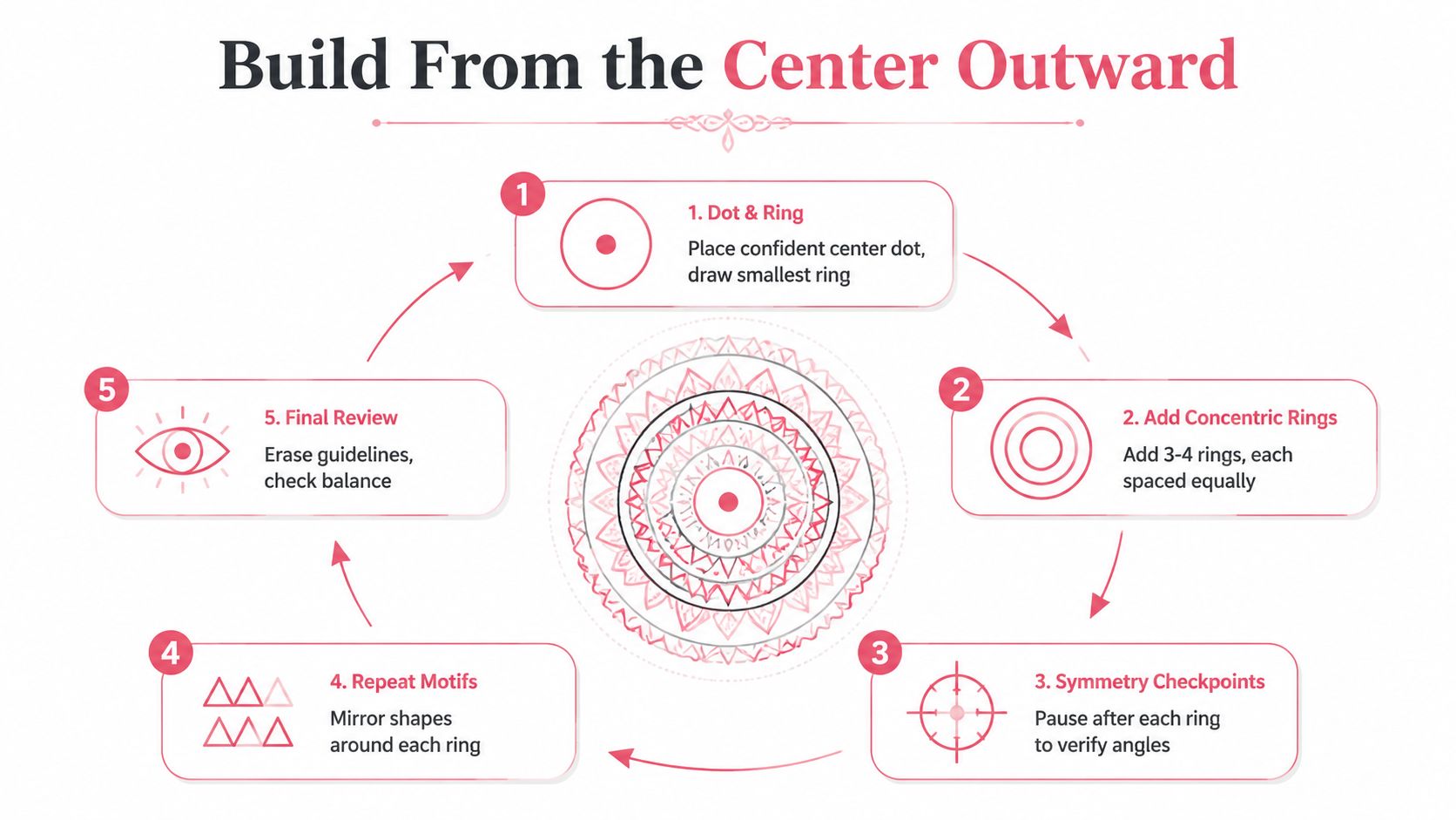
Find the paper's visual center and place a small dot there. Draw two to four concentric circles first, keeping the spacing comfortable rather than obsessively exact. Then add faint spokes from the center to divide the circle into equal sectors. Beginner workflows commonly use 8 or 12 sectors, because repeated motifs remain readable while slight measuring drift stays manageable, as outlined in this beginner symmetry guide.
Before you draw, blow eraser dust away instead of brushing it across the paper. Rest your wrist on a scrap sheet to reduce smudging, and lower harsh overhead lighting if pencil glare makes the circles difficult to see. If a ring looks wrong, erase it now and redraw it lightly. Faint construction lines are meant to be corrected, not admired.
Building the Mandala From the Center Outward
Begin with the smallest decision. Place a confident center dot, then draw the smallest ring around it. Add the next three or four rings, spacing them by roughly a fingertip width if that feels comfortable for your hand. The spacing doesn't have to be mathematically equal. It only needs to leave enough room for the motif you plan to place inside each band.
Use the spokes already marked on the page to divide the circle into sectors. Choose 8 or 12 for a first attempt. A larger number of slices can make each motif feel cramped, while fewer, wider sectors give your curves more room to breathe.
Build one ring at a time
Start in the innermost band and choose one simple motif. A teardrop petal, a small leaf, or a dot cluster is enough. Draw that motif in one sector, then repeat it around the entire ring before moving outward. This keeps your attention on one shape and lets you notice drift while the design is still easy to adjust.
Sketch each motif in pencil before tracing it. If you're repeating a petal, mark its highest point and base against the sector guides. If the shape begins touching a spoke, shrink the next petal slightly rather than forcing the whole ring to match the first attempt. Small corrections disappear into the rhythm of the pattern.
Practical rule: Check symmetry after each ring, not only when the whole drawing is finished.
Watch for a gap that catches your eye. If one opening looks much wider than the others, nudge the next pencil guide inward or alter the following motif's width. Don't erase an entire ring because one curve wandered. A controlled adjustment usually protects the flow better than starting over.
As you move outward, let the bands become slightly more decorative if you like. You might place dots beside the petals, add a scalloped edge, or frame a quiet inner ring with a crisp zigzag. Working from the center outward keeps the hands steady because every new band responds to a structure that already exists.
A Motif Library You Can Mix and Match
Choosing shapes gets easier when you organize them by feeling rather than by technical name. Think of the following families as a small menu. Pick what matches your energy today, then repeat it enough that the page feels held together.
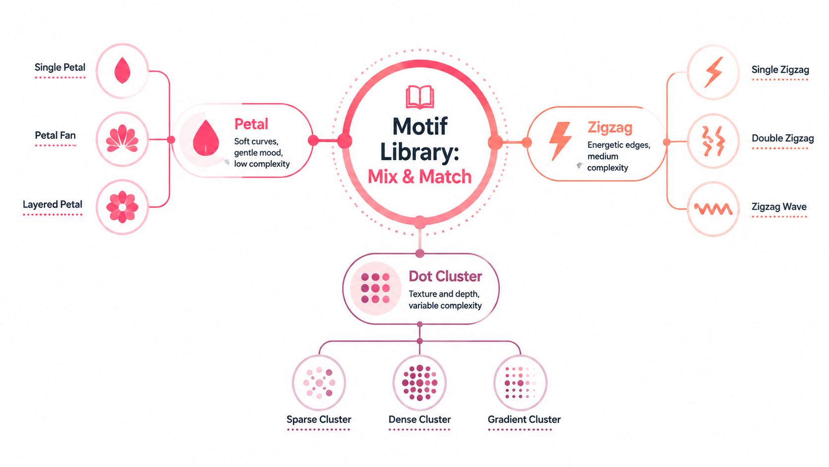
| Motif family | Examples | Visual feeling | Useful placement |
|---|---|---|---|
| Petal shapes | Teardrop, lotus, leaf | Soft and meditative | Inner rings or broad outer bands |
| Dot shapes | Single dots, clusters, ringed dots | Quiet texture and depth | Gaps, borders, and narrow bands |
| Line shapes | Zigzag, scallop, wavy braid | Crisp, lively, or energetic | Borders and transition rings |
A teardrop petal is a good starting shape because its curved sides are forgiving. Repeat it point inward for a floral center, point outward for a sunburst, or place two petals side by side to create a leaf-like rhythm. A lotus form takes longer because it has overlapping curves, but it can make a wider ring feel substantial without filling every space.
Dots are the easiest way to add texture without creating visual stress. One dot can mark the center of a petal. A small cluster can fill a gap, and a ring of dots can act as a border when you want detail without another complex shape.
Line motifs change the character of the page. A scallop keeps the mood gentle, a zigzag creates sharper movement, and a wavy braid can connect two neighboring bands. If a line family feels too energetic, reduce its height and repeat it in a narrow strip.
Use the same motif in several ways rather than adding unrelated shapes everywhere. Stretch petals into a border, stack dots beside a scallop, or place a simple line between two more decorative rings. A reliable rule is to choose one petal family, one dot family, and one line family for a single mandala. The same approach works on a downloadable template, where you can trace a motif first and then adapt it freehand.
For a quick visual reference on arranging linework and color, watch this short demonstration before you begin.
Inking and Marker-Friendly Coloring Choices
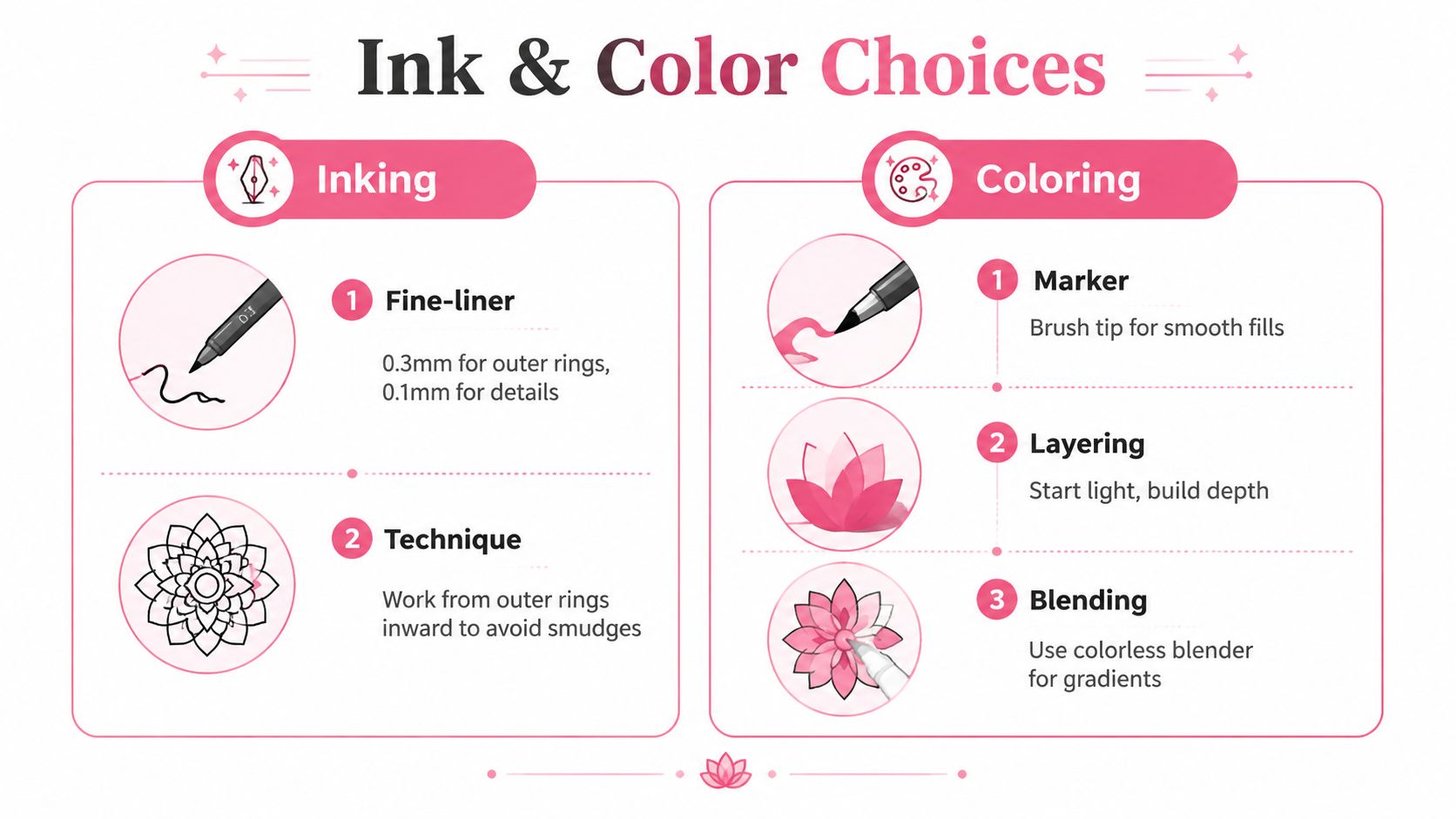
Your pencil drawing is ready for ink when the repeated forms feel stable, even if the guides are imperfect. Use a light hand and trace only the lines you want to keep. For a clean result, many artists prefer to ink the outer rings first, then work toward the center. That order keeps your hand away from freshly drawn interior details and reduces accidental smudging.
A 0.3 mm fineliner is useful for petals, dots, and narrow decorative lines. A 0.5 mm fineliner can give the outside edge more visual weight. Don't press harder to make a line darker. Switch pens when you want contrast, because pressure can create uneven width and damage the paper's surface.
Plan color before the marker touches paper
Marker-friendly planning works best when the palette has a clear hierarchy. Choose one dominant hue, add a supporting hue that sits nearby on the color wheel, and reserve a small accent for contrast. This gives the mandala variety without forcing every ring to compete.
Three approachable directions are:
- Analogous calm: Use neighboring blue and blue-green families, then add a restrained violet or pale neutral accent.
- Warm earth: Combine terracotta or warm red with ochre and a muted brown accent.
- Jewel contrast: Pair deep blue or violet with a neighboring rich tone, then use a small bright yellow or coral accent.
Assign colors by ring instead of choosing each shape independently. For example, keep the center quiet, use the dominant hue in the next petal band, place the supporting hue in alternating rings, and save the accent for dots or tiny borders. If you want help comparing combinations before you color, the ColorBestie palette generator can provide marker-style color inspiration from a planned image or sketch.
Layer for depth without burying the linework
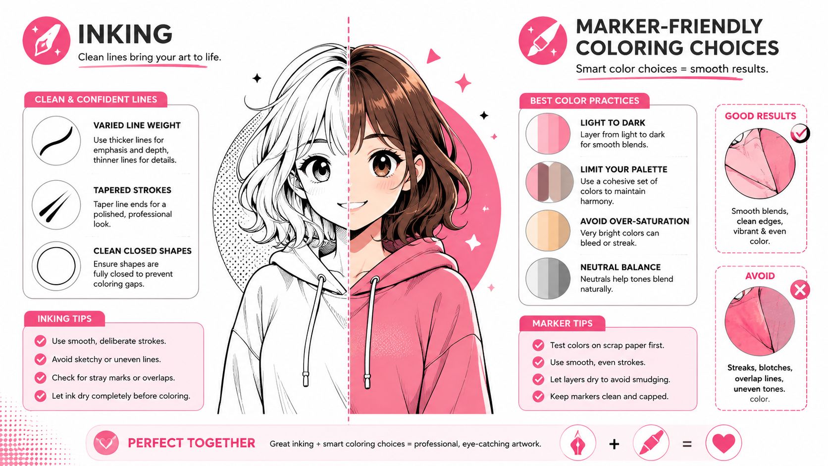
Pigment-based markers can be useful for layered coloring because they keep fills crisp against ink and let you build color gradually. Whichever markers you own, test them on a spare piece of the same paper first. Water-based ink may behave differently from an alcohol marker, especially near fineliner lines, so the test prevents an unexpected bloom on the finished page.
Lay down the lightest tone first. Add a deeper version near the center of each petal or along one edge, then leave a thin uncolored highlight so the shape doesn't become flat. Let each pass settle before adding another. If the ink begins pooling, stop and allow the paper to dry rather than chasing the wet edge.
Keep the linework visible as the main structure. Color should clarify the repeated forms, not cover the boundaries that make the mandala readable. A restrained palette with deliberate alternation usually looks more finished than a page where every available marker appears.
Practices That Keep the Process Relaxing
A mandala becomes more calming when you treat it as a repeatable habit instead of a project that must be completed in one sitting. Set up the same small cue each time, perhaps a cup of tea, a familiar playlist, or the soft light you use only for drawing. Your hands begin to recognize the sequence before the page looks finished.
Try a compact session:
- Pencil the structure: Spend about five minutes placing the center, rings, and spokes.
- Ink one band: Give the next ten minutes to a single ring rather than the entire page.
- Color one section: Use about five minutes to fill one band or a small group of motifs.
- Close gently: Take one slow breath, put the pen down, and leave the page where you can return to it.
The timing is a container, not a test. Stop earlier if your wrist tightens or your breathing becomes hurried.
Two exercises for low-pressure practice
A seven-day grid warm-up uses the same basic grid each day and changes only the motif. One day can feature petals, another dots, and another a scalloped border. Repeating the structure helps you compare shapes without asking you to solve the entire composition again.
A freehand Friday removes symmetry aids completely. Draw a center by eye, let the rings drift, and welcome the uneven spacing. This practice teaches you that balance can come from rhythm and repetition, not only measurement.
A relaxed mandala can have lifted pencil marks, uneven rings, and a petal that doesn't quite match its neighbor.
If you want to explore marker combinations between sessions, the Ohuhu color converter can help translate ideas across marker ranges without interrupting the drawing ritual. Save the motifs and grids you enjoy in a small personal library. Next time, you'll have a familiar starting point and more room to notice how your attention settles.
ColorBestie lets you upload a sketch or line-art image, choose a palette, mood, style, lighting, or genre direction, and preview it in marker-style color before you commit your physical markers. Visit ColorBestie to test a calm mandala palette, compare coloring ideas, and return to your next drawing session with a clear, low-pressure plan.
