
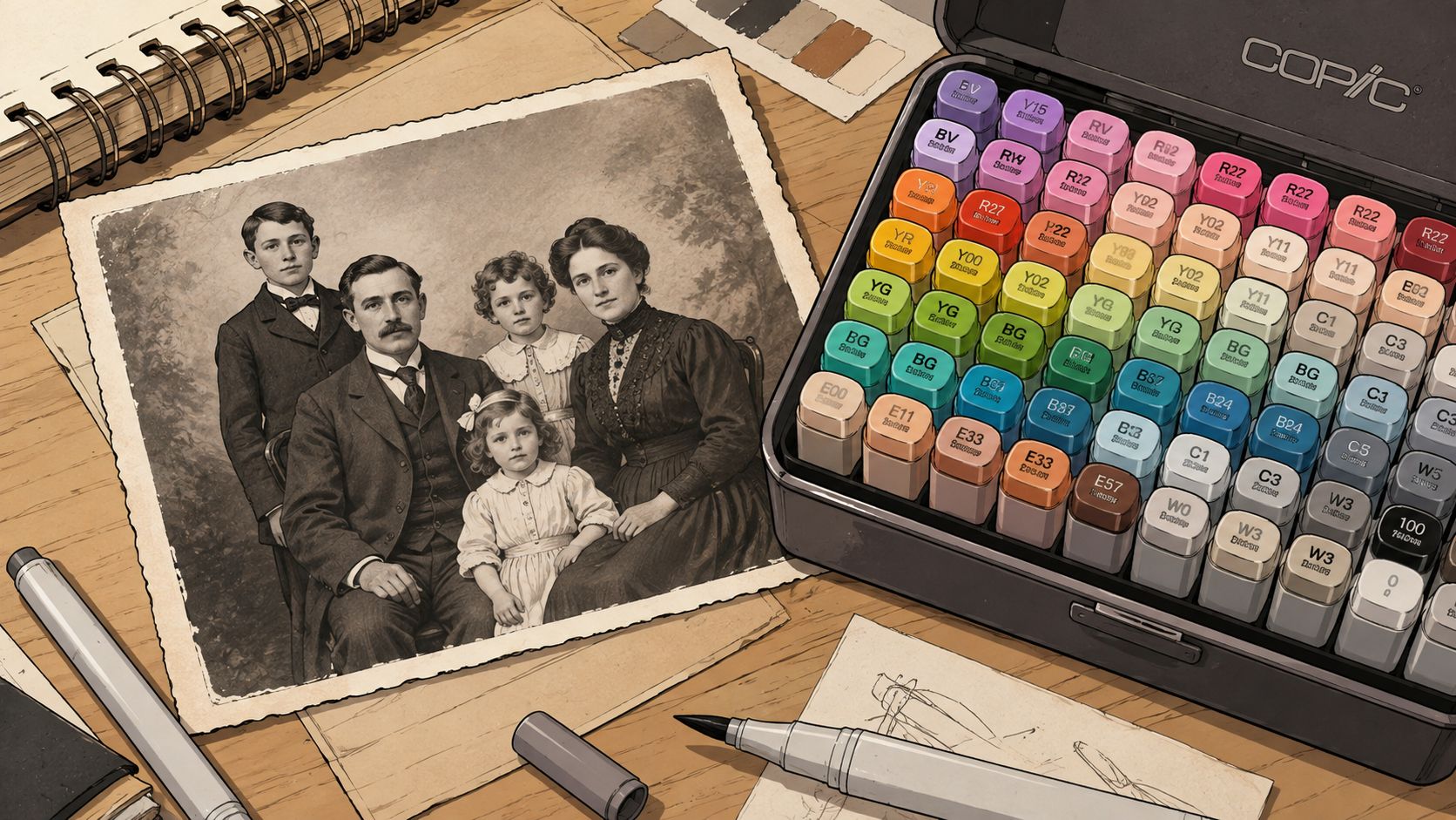
You've got a printed family photograph on the desk, a fresh marker set open beside it, and one question holding up the entire session: which color goes down first? The grayscale image gives you beautiful values, but it also leaves skin, clothing, wood, and sky open to interpretation. One confident stroke can start a lovely blend, or it can turn an expensive sheet of paper into a muddy experiment.
That hesitation is exactly where digital colorization earns its place. Used well, a preview isn't the finished artwork and it isn't proof of the original colors. It's a planning sheet that lets you test a palette, study value structure, and commit fewer markers to paper by choice rather than guesswork.
Why Marker Colorists Are Falling in Love with Black and White Photo Coloring
A printed photograph and a marker set have an appealing friction between them. The photograph supplies real faces, folds, architecture, and expressions. The markers bring decisions. Unlike a generic coloring page, a portrait gives every color a job. A warm cheek has to sit beside a cool shadow, a wool coat needs a different rhythm from polished shoes, and a pale wall has to support the subject without swallowing it.
That makes black and white photo coloring a useful exercise in observation. Black-and-white photography directs attention toward shape, texture, light, and tonal contrast, which are also the structures that keep a marker rendering readable. Visual Wilderness explains tonal range and tonal contrast in black-and-white photography, and those same values remain your map after you add color.
The digital preview removes the first layer of doubt
Suppose the portrait has a child in a pale shirt, an older relative in a dark jacket, and a patterned curtain behind them. On paper, you might spend several minutes asking whether the shirt should be blue, cream, or faded green. A digital preview lets you try those directions before the nib touches the page.
That second pass changes the nature of the craft. You're no longer solving every problem while the ink is wet. You're choosing how closely to follow the preview, where to simplify, and which folds deserve a darker pass. The page becomes about blending and interpretation, not panic management.
Practical rule: Treat the digital colorization as a rehearsal. It can suggest plausible hues, but it cannot recover colors that the grayscale file no longer contains.
Colorization is prediction rather than exact restoration because the source image has lost its color information. Adobe describes AI colorization as an inference based on visual context rather than a guaranteed recovery of the original hues. That distinction matters for historical portraits, uniforms, flags, and anything with identity attached to a particular color.
The history of the practice makes the digital-to-marker bridge feel less strange. Hand-coloring began in the mid-19th century, with early hand-colored daguerreotypes attributed to Johann Baptist Isenring around 1839. The method spread through Europe during the 1850s, reached Japan commercially and artistically with Felice Beato in 1863, and remained useful while monochrome photography dominated until color film became broadly available in the mid-20th century. The history of photo colorization shows how artists used added color to simulate what cameras could not yet capture.
Your marker preview follows the same basic instinct, only with a cleaner planning stage. Test first, then make the physical page your own.
Building Your First Digital Preview the Right Way
Start with the cleanest source you can find. A flat scan with even lighting and strong separation between light and dark areas will give a colorization tool clearer boundaries than a phone photograph taken at an angle under a desk lamp. If a phone is your only option, flatten the print, avoid glare, and crop away the table, fingers, and surrounding clutter before uploading.
For a practical session, use ColorBestie as a reference tool, not as an authority. Upload the cleaned image, then choose a theme that matches the marker result you want to test. A vintage direction can help with faded portraits and sepia-era mood, while a natural theme may keep skin and clothing quieter. A vibrant theme can be useful for playful reinterpretation, but it's the easiest setting to overdo before you've checked the physical swatches.
Capture three views before choosing a marker
Save more than the full-color result. Keep a full-color preview for palette extraction, a grayscale reference for values, and a flat-color map for stroke planning. The grayscale version tells you where the darkest darks and lightest lights belong, while the flat map makes large color zones easier to read without getting distracted by simulated texture.
For a quick theme comparison, use the ColorBestie theme preview tool. Comparing restrained and vivid versions side by side is more useful than staring at one polished image and assuming every digital color will behave the same way in ink.
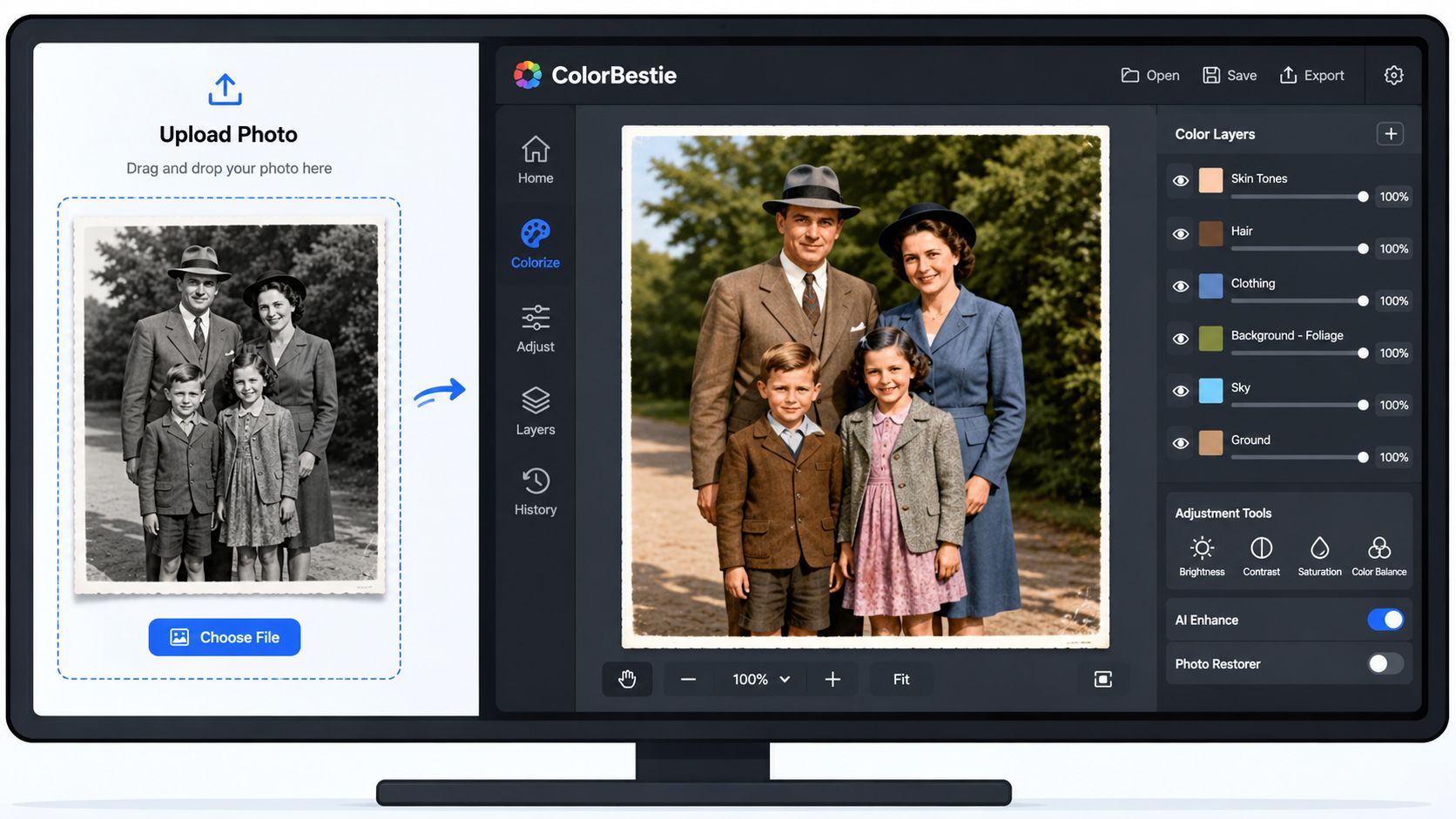
Keep the screen result slightly muted. A punchy preview can make you select markers that look harsh once layered on paper, especially in a large background or a broad area of clothing. Alcohol markers also build saturation through repeated passes, so a color that seems modest on screen may become exactly right after the paper accepts the base layer and shadow.
The underlying reason for this caution is structural. Automatic colorization is an ill-posed problem, meaning one grayscale image can support several plausible color outputs. Research on current methods recommends cleaning the source, establishing object boundaries, adding semantic or reference guidance for ambiguous areas, and finishing with local corrections because color bleeding and boundary confusion remain common. The language-guided colorization benchmark and workflow discussion on arXiv supports a preview-plus-editing approach rather than one-click trust.
Before moving to the printed page, label your preview layers or notes with simple roles: base, mid-tone, shadow, and highlight. You don't need a complicated digital file. You need enough information to know whether the face is warm, where the jacket turns cool, and which background areas can stay quiet.
If you want to see the reference process in motion, watch this short demonstration after you've saved your three preview views.
Choosing a Marker Family That Matches Your Style
Marker choice changes the amount of correction you can make after the first stroke. For photo coloring, the important questions aren't only whether a set has attractive colors. Look at nib feel, ink load, blend window, and paper tolerance. A digital palette can be perfectly planned and still fail if the marker floods a small face or dries before two neighboring tones meet.
Copic generally gives the longest open blend time of the three main families, which is comfortable when you're shaping cheeks, collars, and rounded sleeves. That flexibility comes with a catch. Copics can punish cheap paper by feathering through the fibers or spreading beyond a narrow boundary, so the marker's control depends heavily on the surface.
Ohuhu brush-and-bullet combinations suit hobbyists who want a flexible brush for curves and a firmer bullet nib for small details. They handle layered skin planning well and cost less than Copic, but they dry faster, so you'll need to work in smaller connected areas rather than wandering across the whole photograph.
Prismacolor Premier markers give rich saturation and a decisive, full-looking pass. The working window is shorter, which means you'll get better results by laying the base smoothly and adding shadows with restraint. They're a good fit for colorists who prefer bold, finished shapes over many soft transitions.
Water-based options such as Karby can be a useful budget contrast, particularly if you like a slower, more illustrative stroke or don't want alcohol ink moving through the sheet. They won't behave exactly like an alcohol-marker preview, so test the translation on the paper you plan to use.
| Marker Family | Blend Window | Nib Feel | Price Tier | Best Use Case |
|---|---|---|---|---|
| Copic | Longest open blend time | Flexible, controlled feel | Premium | Detailed portraits and extended blends |
| Ohuhu | Moderate, dries faster | Brush and bullet versatility | Accessible | Layered skin, everyday practice, and palette testing |
| Prismacolor Premier | Shorter working window | Firm, saturated application | Mid to premium | Strong color blocks and compact rendering |
| Karby water-based | Depends on paper and moisture | More traditional illustrative feel | Budget contrast | Low-pressure experiments and water-based techniques |
For a beginner testing digital palettes, Ohuhu is the practical starting point. The brush-and-bullet pairing gives you room to learn both broad coverage and small facial details without requiring a premium investment immediately. If you already own Copic, use it where a longer blend window matters. If your style favors strong saturation and cleaner blocks, Prismacolor Premier may feel more natural.
A comparison of nib behavior and set differences is available in the ColorBestie marker comparison tool. Use it before buying duplicates, then verify the final choices against your own swatches because screen color and ink color will never match perfectly.
Turning an On-Screen Palette into Real Marker Picks
The preview on your screen gives you direction, while the paper, ink, and lighting determine the result. Place a screenshot of the colorized image beside a printable Copic, Ohuhu, or Prismacolor swatch chart. If the app or image editor provides RGB values, treat them as rough guides rather than targets. Choose a physical marker family that occupies the same color neighborhood under the light where you will work.
Translate the image zone by zone. For a face, select a light base, a middle value for planes turning away from the light, and a shadow from the same warm or neutral family. For a coat, follow the same map, then allow the shadow to cool if the preview suggests reflected light. Label one pen as the base, one as the transition helper, and one as the shadow.
Map three marker roles before you shop
A short written map prevents you from buying several attractive colors that all do the same job. It also reveals missing values. A face palette with a base and shadow but no gentle middle can jump from pale to harsh, leaving little room to build volume.
| Photo Zone | Sample RGB | Copic Pick | Ohuhu Pick | Prismacolor Pick |
|---|---|---|---|---|
| Skin base | Warm, light neutral from preview | Light warm skin swatch | Light warm skin swatch | Light warm skin swatch |
| Skin shadow | Deeper warm neutral | Warm shadow swatch | Warm shadow swatch | Warm shadow swatch |
| Jacket | Muted cool dark | Cool gray or muted blue swatch | Cool gray or muted blue swatch | Cool gray or muted blue swatch |
| Background | Soft, low-saturation neutral | Pale neutral swatch | Pale neutral swatch | Pale neutral swatch |
The table uses swatch families rather than invented exact codes. Marker numbering differs across brands and sets, while printed charts shift with paper, ink coverage, and lighting. Use the ColorBestie palette generator to arrange a starting scheme, then test every candidate on the paper intended for the final page.
A digital preview can also expose a background that needs restraint. If it produces a neon mid-tone, replace it with a desaturated color from the same temperature family. A quieter green, blue, or coral leaves more attention for the subject and layers with less risk of turning the background into a competing focal point.
Before marking the original page, place the selected caps or test strips over the printed preview. Check them in daylight or under a daylight-balanced lamp, then make a small mark on scrap paper. The scrap mark shows the ink's actual value and saturation after it meets the surface, which the cap cannot predict.
Test the transition helper beside the base and shadow as well. Some colors look related on screen but create a hard jump or a dull middle when layered. If the middle turns muddy, choose a closer value before committing to the page.
Working habit: Choose the palette in the same light you'll use for coloring. A warm room lamp can make cool shadows look more neutral than they'll appear later.
Fixing the Mistakes That Ruin a Good Coloring Page
Most marker disasters announce themselves early. A boundary starts feathering, a face loses its planes, or two attractive colors combine into a dull middle that wasn't in the plan. The fix is usually a change to the next stroke, not a heroic attempt to erase what the paper has already absorbed.
Bleeding and muddying
For bleeding edges, place a scrap sheet under and around the working page. Build the first layer with less pigment and leave a narrow breathing margin at the boundary. Paper grain predicts feathering before you begin, so test a corner with the lightest planned marker. If the nib immediately spreads, reduce pressure, shorten the stroke, or move to a marker-friendly sheet.
Muddying usually comes from stacking unrelated temperatures. A warm orange-brown over a cool blue-gray may look interesting in separate swatches, but repeated passes can produce a dull area with no clear purpose. Keep the base, middle, and shadow within a related hue family unless you're deliberately introducing reflected color.
The same caution applies to digital previews. Technical failure analysis identifies semantic boundaries, skin, fabric, and object classes as high-risk areas, with color bleed and wrong-object colors becoming especially visible on damaged or compressed scans. The ColorizeAI failure analysis reports that 89% of observed failures belonged to seven categories, including 34% semantic boundary bleeding, 21% skin-tone inaccuracy across ethnicities, 15% fabric texture confusion, and 12% lighting-context loss. It also reports a 47% accuracy drop when segmentation confidence fell below 0.73. Those figures reinforce a useful studio checklist, inspect edges, skin, cloth, and object identity before exporting your palette.
Skin that looks flat
Don't stretch one skin marker across the entire face. Divide the face into a base, a soft blush area, a jaw or hairline shadow, and a highlight left lighter than the surrounding planes. The digital preview can suggest the direction, but your grayscale reference should decide where the value changes belong.
If a nib starts producing patchy strokes, rotate between three pens instead of forcing one nearly dry marker to cover everything. One pen can rest while you use the next, and the switch often gives the first nib time to recover enough for another smooth pass.
For a page that's already half-ruined, stop adding color. Let the area settle, identify the strongest surviving value, and repeat that value in another part of the image so the accident feels intentional. Then simplify the damaged zone, deepen a nearby shadow, and reserve the lightest highlights for the cleanest remaining paper. A coherent limited palette can rescue a page more convincingly than trying to restore every lost transition.
Building a Relaxing Coloring Habit That Actually Sticks
A sustainable coloring habit needs a trigger and a small reward. Set aside a 20-minute weekday window, pair it with a podcast or playlist, and follow a single-photo rule. One photograph per session keeps the desk calm and prevents a pile of half-finished portraits from turning a relaxing hobby into a guilt display.
Keep a swatch binder beside the paper. Add the tested base, middle, and shadow choices for each photo, along with a note about the paper and whether the ink feathered. Future sessions will start with useful information instead of the same uncertainty.
On Sunday, preview two or three palettes and save the ones that feel workable. Monday's session can then begin with a chosen direction rather than a long color hunt.
A short beginner FAQ
How long should one photo take? Let the image determine the pace. A small, simple portrait may fit a short sitting, while a crowded family scene deserves several sessions. Stop when your attention drops, not when every region is technically complete.
When is it okay to skip blending? Skip it when the subject benefits from graphic shapes, when the paper is already saturated, or when the digital preview uses clear flat zones. Blending is a tool, not a requirement for a successful page.
Should I archive old attempts? Yes, if you can treat them as records rather than judgments. Keep the first version beside the later one and look for one specific improvement, such as cleaner edges or a better shadow choice. That comparison makes progress visible without turning practice into performance.
The strongest routine is the one that leaves a little curiosity for tomorrow. Save the preview, cap the markers, and stop before the craft table feels like work.
ColorBestie can turn an uploaded photo or sketch into a marker-style color preview, with theme choices and palette guidance that help you test ideas before spending ink on the physical page. If you want a calmer way to plan your next portrait, visit ColorBestie, save a few restrained palettes, and bring the one you trust to your marker table.
