
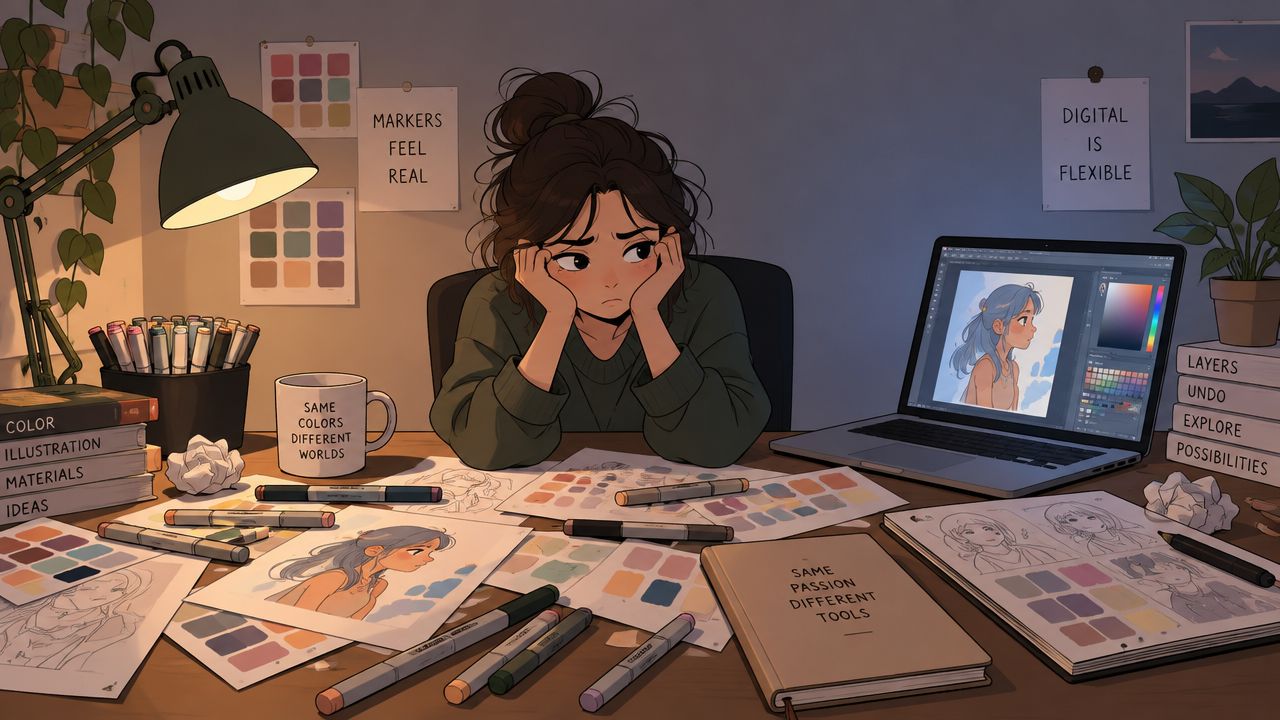
You've got a reference image open, a sketchbook waiting, and markers scattered across the desk. Five greens look promising, yet they may collapse into the same muddy middle once they touch paper. The skin tones might blend beautifully, or they might leave a harsh jump. The sunset that looked glowing on your screen could turn dull after two layers of alcohol ink.
A palette generator tool can take some of that guesswork off your hands. It suggests relationships between colors, pulls shades from an image, and helps narrow a huge choice into a workable group. It doesn't replace your eye or your understanding of paper and ink. It gives you a calmer starting point, so you can spend more time rendering and less time hovering over your marker case.
The Moment You Realize You Need a Palette Generator
The need usually appears halfway through a piece. You've finished the outline, blocked in a few areas, and reached the part where every color choice feels permanent. Your reference has soft moss, cool shadows, warm skin, and a bright accent, but your marker collection offers several versions of each. You test one green, then another, then a third. On the page, they sit too close together to create the separation you wanted.
That hesitation costs more than time. It interrupts your rhythm and makes a relaxing coloring session feel like a technical exam. You may start choosing colors because they're nearby rather than because they support the subject. A palette generator reduces that friction by organizing the visual relationships before you uncork a marker.
A small example from the sketchbook
Suppose you're coloring a cabin surrounded by pine trees at sunset. Instead of picking every shade independently, you can ask a tool to build a starting group from the reference. It might reveal a warm light family, a darker tree family, a quiet ground neutral, and one strong accent for the sky.
That output is not your final marker plan. A screen can show a color that has no close match in your set, while a digital swatch can't predict how a second alcohol-marker layer will deepen the paper. Still, the generated group gives you a useful map. You can see which colors should dominate, which should support them, and where you need a clear value change.
Practical rule: Use the generator to reduce decisions, not to surrender them.
Palette tools have been part of design workflows for at least two decades. Paletton's history of its Color Scheme Designer traces earlier versions back to 2002 and describes the successor as having been used by almost 20 million visitors since 2009. That long timeline matters to marker artists because it shows palette generation has grown from a simple web utility into a familiar planning aid, while newer tools add image extraction, contrast checks, and export-ready formats.
The best habit is simple. Generate several directions, choose the one that suits your subject, then translate it through your actual marker collection and paper. Your eye remains in charge. The tool just clears the crowded table.
What a Palette Generator Tool Does Under the Hood
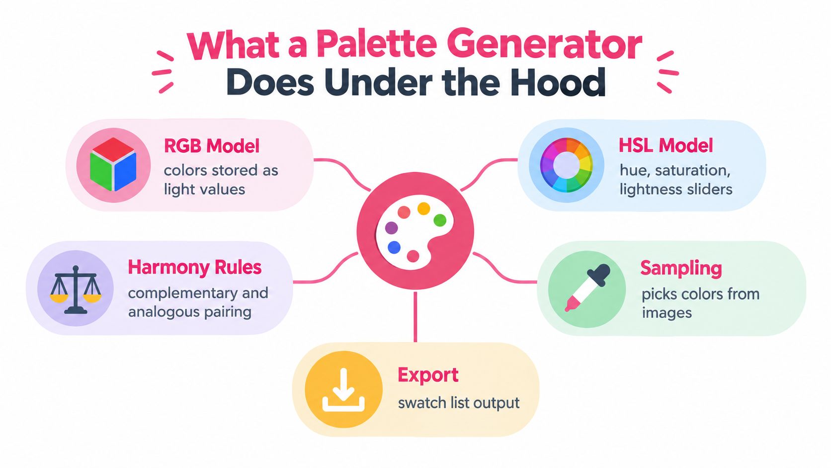
A digital palette begins as information, not paint. Computers commonly describe color through spaces such as RGB, which stores red, green, and blue light values, and HSL, which describes hue, saturation, and lightness. Think of RGB as three digital ink bottles measured by how much light they contribute. HSL is more like a studio dial, where you turn the color family, mute or intensify it, and raise or lower its brightness.
The different spaces help a generator compare colors in useful ways. If you choose a blue, an HSL-based tool can shift its hue while holding its brightness relatively steady, or reduce saturation to create a quieter companion. That feels closer to asking, “Give me a softer version of this blue,” rather than randomly searching through millions of swatches.
How images become palettes
Image extraction works by examining the colors present in a picture. A technically sound system can create a histogram or group similar pixels into clusters, then select dominant colors from frequent groups or cluster centers. Common approaches include histogram analysis, k-means, fuzzy C-means, and self-organizing maps, as described in this technical overview of image-based color extraction.
The result depends on the image itself. A large blue sky may influence the palette more than a tiny flower, even if the flower is the part you love most. For marker work, sample deliberately. Crop the image, focus on the character's clothing, or use a tool that lets you select a particular area instead of accepting the whole picture.
Why harmony rules help
Harmony rules are recipes for arranging relationships. Complementary colors sit opposite each other and create strong contrast. Analogous colors sit close together and usually feel more blended. Triadic schemes distribute color around the wheel, giving you variety without making every choice unrelated.
You can use these rules as a first draft, not a law. An analogous group may suit a quiet botanical page, while a complementary accent can make a character's scarf stand out. Many generators also let you lock a starting color, create variations, and export HEX or RGB values, swatch lists, or design files. Those exports are useful references, but you'll still need to write the matching marker codes beside them.
Types of Palette Generators and How They Differ
Not every palette generator solves the same problem. One tool may be excellent at finding colors inside a photograph, while another starts with a single hue and builds balanced companions. Choosing well means matching the tool to the moment in your workflow.
| Tool Type | How It Works | Best For |
|---|---|---|
| Image extraction tool | Samples dominant or selected colors from a photo or illustration | Building a palette from a saved reference |
| Harmony-rule generator | Starts with a color and applies relationships such as complementary or analogous | Exploring coordinated color families |
| Brand-tinted generator | Keeps colors within a defined identity or library | Repeating a recognizable color direction |
| AI prompt-based generator | Uses a mood, subject, or style description to suggest combinations | Early inspiration when you don't have a finished reference |
| Artist-focused generator | Adds constraints related to marker sets, blending, or usable swatch groups | Translating digital ideas into physical marker choices |
Match the tool to the job
For a landscape reference, image extraction is often the most direct route. For a manga character with a fixed costume color, a harmony generator can build supporting shadows and accents around that anchor. A prompt-based system may help when you know the feeling you want, such as quiet autumn, cheerful seaside, or nocturnal fantasy, but haven't found the right image yet.
Brand-tinted tools can be useful when you're working on a repeatable identity, although marker artists should treat brand libraries carefully. A digital brand color may not map cleanly to an alcohol marker, and a named shade in one physical range won't necessarily behave like its counterpart in another.
Commercial adoption shows how broad this category has become. Coolors describes its platform as trusted by more than 8 million creative minds and top companies, while ColorMagic displays 4M+ palettes generated and 800K+ public palettes in its usage counters. These figures indicate that people use generators for repeated exploration, not just occasional inspiration.
Experienced colorists often combine methods. They may extract a palette from a photo, use harmony controls to repair the relationships, and then choose physical markers through a comparison or swatch process. No single generator needs to do everything.
Why Marker Creators Need Special Palette Rules
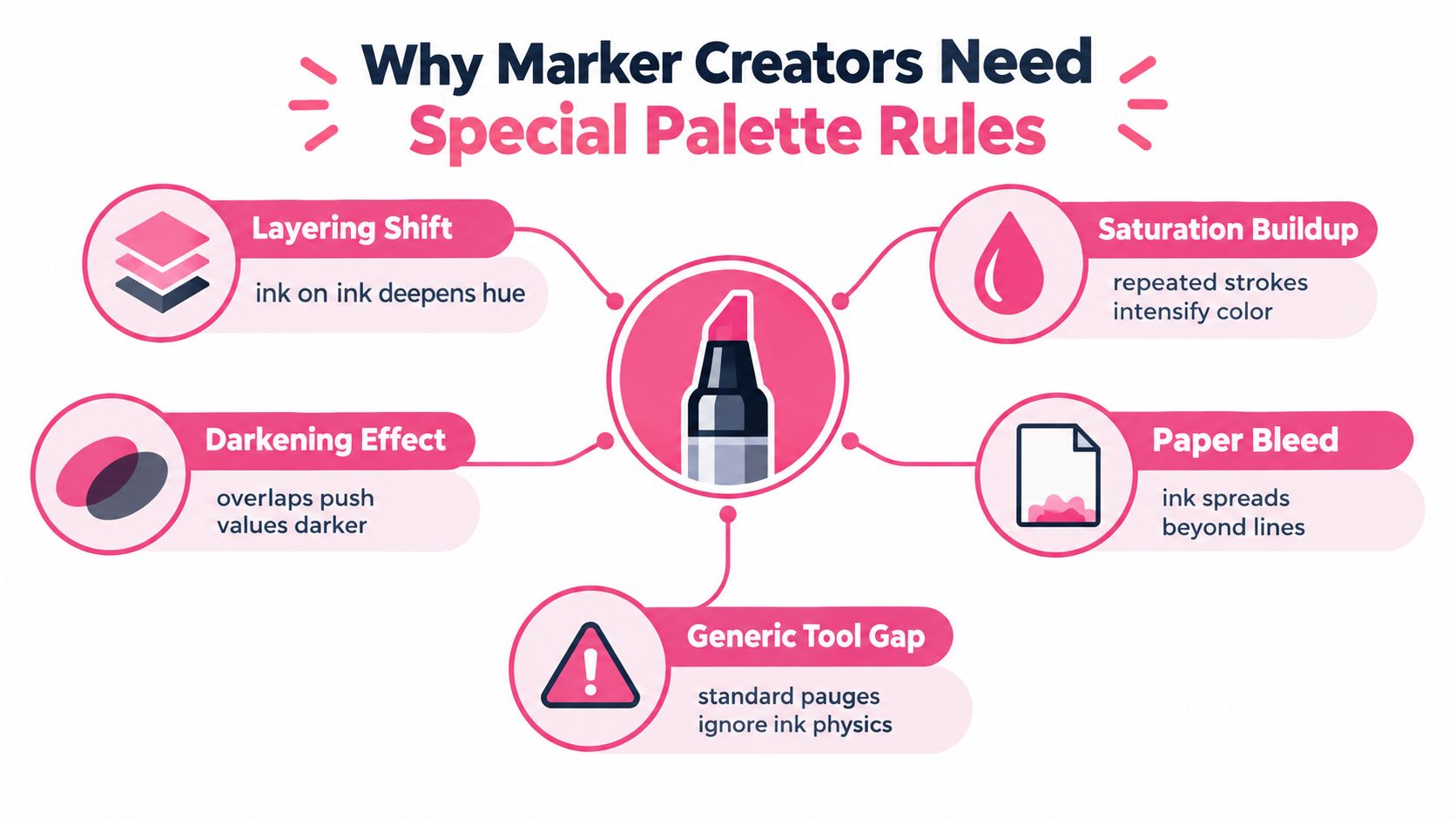
A screen palette assumes colors behave like light. Markers behave like wet ink moving through paper. That difference explains why a gorgeous digital set can disappoint you after the first layer.
Layering is the main surprise. When you pass an alcohol marker over an existing stroke, the new ink can deepen the area, shift its apparent hue, or increase saturation. The change depends on the paper, the ink load, the drying time, and the order of your strokes. A generator can place two colors at a pleasing digital distance, but it can't fully predict the blend where those colors overlap in a real sketchbook.
The physical limits behind a good set
Blending chemistry matters too. Fast-drying alcohol ink can spread beyond a line, soften an edge, or create a darker seam where strokes meet. Two colors that look like gentle neighbors in RGB may clash when they touch wet paper. This is especially noticeable in skin, pale fabric, clouds, and other areas where you want a smooth transition.
Your marker case also creates a practical budget. You may own a limited skin-tone family, only a few useful greys, or a particular range from Copic, Ohuhu, Touch, Prismacolor, or Spectrum Noir. A generated color is only helpful if you can find a close substitute or adjust the role it plays.
Turn those limits into design rules
A marker-friendly palette should leave room for light, mid, and dark passages. It should avoid filling the entire set with near-duplicates. It should also separate colors by function, not just appearance.
- Reserve the lightest family: Keep pale colors available for first layers and gentle highlights.
- Protect the dark anchor: Choose a dependable shadow or outline support that won't make every area look equally heavy.
- Watch the middle: Similar mid-tones often merge on paper, especially after layering.
- Test the meeting points: Swatch colors beside one another, then overlap them in the order you plan to use.
- Flag redundancy: If two markers perform the same job, replace one with a clearer temperature or value change.
For a practical way to compare physical ranges before committing to a project, use the marker comparison tool. The useful question isn't “Does this digital swatch look right?” It's “Can these markers create the light, transition, shadow, and accent roles my drawing needs?”
A beautiful palette is only half finished until it survives the paper test.
A Friendly Workflow From Image to Marker Set
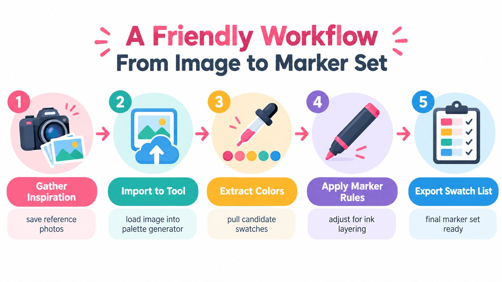
Start with a reference that has a clear mood and a manageable subject. A photo of a twilight garden, for example, may contain hundreds of tiny shades, but your drawing doesn't need every one. Save the image, crop away distracting areas, and decide what deserves attention first.
Step 1 gather the visual direction
Import the reference into a palette generator that supports image extraction. Let the tool suggest a broad group, then inspect it with an artist's eye. If the sky dominates the image, it may contribute too many blues. If a small orange flower is important to the composition, sample it separately so it doesn't disappear from the result.
Step 2 choose the working colors
Select five to seven core colors for the first draft. This is a practical starting range, not a rule about how many markers you may use. Give each chosen swatch a job, such as background light, main subject, supporting shade, deep shadow, neutral, or accent.
Write the role beside the digital value. “Warm shadow” will help you make a better substitution than a bare HEX code when you're standing in front of your marker case.
Step 3 translate each color into ink
Search your physical collection for the closest marker, but don't chase an exact screen match. Compare temperature, darkness, and likely layering behavior. A slightly different warm red may work better than a visually closer red that bleeds harshly into the neighboring orange.
For creators moving between marker families, the Ohuhu and DecoTime converter can help identify a practical equivalent. Treat any suggested match as a candidate. Your own swatch card remains the authority because paper changes the result.
Step 4 test before the final page
Use the same paper as the finished piece whenever possible. Make a small grid with the first layer, second layer, and overlap between neighboring colors. Label every square immediately. Alcohol markers can look deceptively similar when wet, and unlabeled tests become confusing quickly.
If the palette fails, don't throw it away. Trim the weak mid-tone, replace it with a brand-available equivalent, or divide the group into a dominant family and a small accent group. A sunset might work better with several warm colors as the main structure and one cool shadow used sparingly.
Step 5 record the result
Keep the final marker codes beside their roles and notes. Record combinations that blend cleanly, combinations that become too dark, and colors that need a lighter first layer. Over time, this log becomes more valuable than a gallery of attractive digital palettes because it reflects your hands, your paper, and your actual supplies.
Choosing and Using a Palette Generator Tool
The right tool should fit your working habits before it impresses you with a long list of features. Start by checking how you provide color. Image upload is useful for reference-led projects, while HEX input helps when you already have a fixed color. A mood or text prompt can support early exploration, but it shouldn't be the only route for a marker artist who needs physical matches.
A practical checklist
- Input flexibility: Can you upload a reference, sample a region, or enter a starting color?
- Harmony controls: Does it offer complementary, analogous, triadic, or custom adjustments?
- Marker awareness: Can it account for a particular brand, set, or blending concern?
- Useful exports: Does it produce a readable swatch sheet, code list, or saved palette?
- Revision control: Can you lock a color, remove a duplicate, and regenerate the rest?
- Palette library: Can you name and revisit groups by subject, mood, or project?
The most important test is not the landing page. Run the same reference through two different tools and compare the outputs. One may capture the image's dominant background, while another may give you a more useful subject-focused group. Then check whether either tool identifies muddy middle values or colors that perform the same job.
Build habits that compound
Name palettes by a useful combination, such as “rainy greenhouse, cool shadows” or “warm portrait, soft contrast.” Add your physical marker codes and a short note about the paper. If a group worked well for hair, fabric, or foliage, record that function so you can find it without rebuilding the palette.
You can also use ColorBestie's Palette Generator as one option for creating harmonious color directions for marker coloring sessions. Its role is to help you explore a palette before you make physical swatches, while your tested marker combinations decide what belongs in the final set.
Studio habit: Save the palette before you begin coloring, then save the tested version after the piece is complete.
Revisit old palettes when you start a new drawing. You may discover that a group created for a floral page also works for clothing, or that a color you rejected in one paper performs beautifully in another. Your library grows through use, not through collecting endless untested suggestions.
Quick Answers and Next Steps
Are palette generators free? Access depends on the tool and its subscription structure. Some offer a usable free level, while advanced exports, larger libraries, image features, or AI guidance may sit behind a paid plan. Check the current terms before building a workflow around a feature you can't consistently access.
Will a generated palette work on paper? It may provide a strong starting direction, but it isn't a guarantee. Digital color can't fully account for ink layering, paper absorbency, bleed, drying, or the exact behavior of your marker brand. Swatch the important colors and their overlaps before using them on a finished page.
How long does testing take? A small scrap-paper test can be quick, especially when you check only the key transitions. The time depends on how many colors you're comparing and whether you need to test multiple layers. Labeling the swatches is part of the process, not an optional extra.
How often should you refresh your swatches? Update them when your collection grows, when you change paper, or when a marker begins behaving differently. New markers can fill a missing light or dark role, while an old marker may no longer blend like the note in your library suggests.
The central idea is easy to keep: a palette generator tool is a planning partner. It can suggest harmony, extract inspiration, and narrow your choices, but you decide how the colors should layer, where the strongest contrast belongs, and which physical markers feel right.
Start small:
- Choose one inspiration image.
- Run it through a generator.
- Pick the most useful core colors.
- Test the top three on scrap paper.
- Log the combinations that behave well.
You're not trying to predict every stroke. You're giving yourself a dependable first nudge, then letting observation and practice guide the rest.
ColorBestie turns sketches and reference images into marker-style color inspiration, with palette and mood options designed for real alcohol-marker workflows. Visit ColorBestie, create a starting palette, and test your first color group before you commit ink to the finished page.