
You've found the perfect digital palette, printed the page, and opened your marker case with confidence. Then the first swatch lands on paper, and the color is warmer, duller, brighter, or stranger than the screen preview promised. That mismatch isn't a failure of your eye. A backlit display and an alcohol marker on paper are showing you two different color experiences.
Printable color charts become useful when they record what your actual markers do on your actual paper. The reliable chart on your desk isn't a generic rainbow sheet. It's a working reference for undertones, drying shifts, layering behavior, and blends you can reproduce during a coloring session.
Why Marker Artists Still Need Printable Color Charts
A digital palette preview may point you toward a color, but it cannot show how a marker's nib loads the paper. A pale blue that looks cool on your phone may dry with a green undertone. Soft peach can deepen after a second pass, while a screen-neutral gray may lean violet, brown, or blue beside the other colors in your set.
A swatch chart records those differences under working conditions. Apply each marker to the surface you use for finished work, then keep the dried result where you can compare it during a coloring session. The chart captures true lay-down, the dried value, and the change between one stroke and a layered stroke.
Practical rule: Treat the chart as a record of marker behavior, not a promise of screen color.
A printed chart has limits. Printer ink is not alcohol-based marker ink, so a page cannot replace testing the marker directly. Paper brightness, coating, absorbency, and the amount of ink released from the nib all affect the result. A useful chart gives you a repeatable reference while leaving room for those variables.
Why generic swatch sheets disappoint
Generic RGB swatch sheets often mislead marker artists for three practical reasons:
- The paper doesn't match: A swatch printed on smooth coated stock cannot predict how the same marker spreads on a porous marker pad.
- The ink density is unrelated: Printer ink and alcohol marker ink build color differently, especially in pale and highly saturated families.
- Blend information is missing: A flat digital square cannot show whether two markers merge cleanly, leave a hard edge, or turn muddy together.
Color references have served a standardizing role for centuries. One early known manuscript color chart dates to 1692, and the history of printed color charts records how these systems later helped naturalists and industries name and compare colors consistently. In 1915, the Textile Color Card Association of the United States issued a printed reference with 110 standardized colors on 5,000 cards, shifting color communication toward repeatable physical references.
Marker artists rarely need an industrial standard for every project. They need a chart calibrated to their own marker set, paper, and habits. Self-made swatches answer questions a vendor palette preview cannot: which red stains the page, which blue overpowers a blend, and which pale marker disappears unless you make a second pass. A chart built from your real tools is less glossy than a digital palette, but far more dependable at the desk.
Choosing the Right Chart Format and Paper
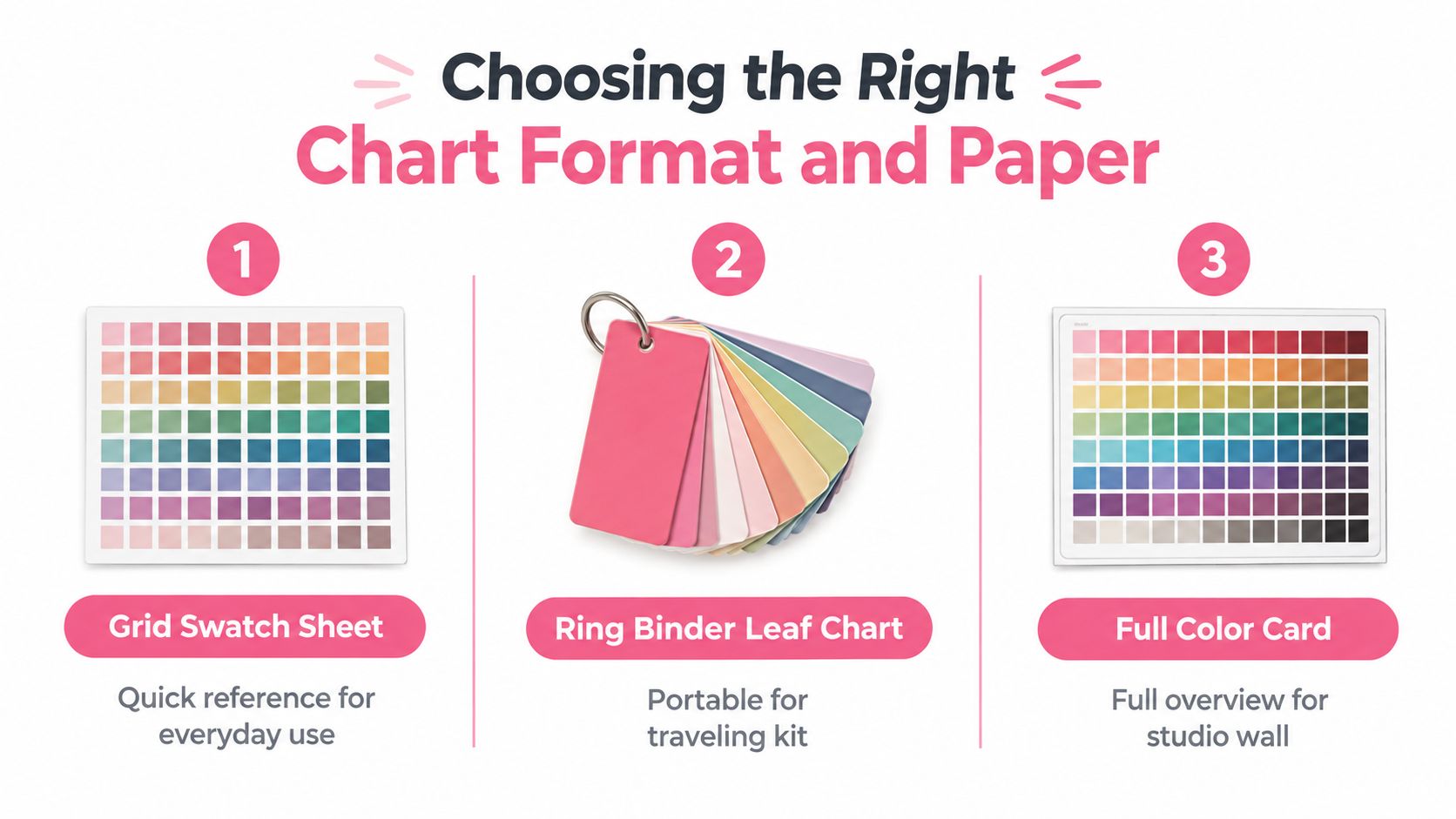
The best chart format depends on how you'll use it. A dense grid works well beside your desk, a ring-style leaf chart travels with a compact kit, and full-panel cards give you room to test blends, values, and notes without squeezing everything into tiny boxes.
Match the layout to the job
A grid swatch sheet is the practical everyday choice. Arrange markers by hue family, leave space for the code and name, and keep enough room for a broad stroke plus a layered sample. It's quick to scan when you're choosing between neighboring greens or trying to find a less intense skin-tone option.
A ring-style leaf chart is better for a traveling kit. Each leaf can hold one marker code, a small swatch, and a note about its blend partners. You can rearrange pages when you buy more markers, although the loose format makes broad comparisons less immediate.
A full-panel color card suits a studio wall or a focused family study. Use it for warm grays, skin tones, foliage, shadows, or a planned palette. The larger surface lets you show a gradient, overlapping strokes, and a small blend test rather than only a color chip. If you're planning combinations before swatching, a palette generator for color planning can help you decide which families deserve their own cards.
Choose the surface before the template
For alcohol markers, start with bleed-resistant cardstock around 80 to 100 lb or a dedicated marker pad. The right sheet slows uncontrolled spread, gives the nib a predictable path, and lets you see the marker's natural saturation. A very porous sheet can feather at the edges and make pale colors look uneven. An overly slick surface may keep ink wet longer, encourage pooling, and behave differently from the paper in your coloring book.
Printer settings matter just as much. Set scaling to 100%, turn off fit to page, and select a high-quality print mode. Some inkjet drivers offer borderless printing, but that setting can enlarge the file or clip labels at the edges. The print guidance for ICC color-chart targets also stresses full visibility, correct orientation, one-sided printing, and full-size output. A cropped or resized target can't be measured consistently, and the same geometry problem can make your marker chart awkward to compare.
Print a grayscale draft before using color ink. You'll catch crowded labels, weak borders, and confusing family breaks without wasting a finished sheet. Lock the paper and printer combination first. The template matters, but paper surface and printer behavior shape the swatch more than decorative layout choices do.
Brand-Specific Chart Layouts for Popular Marker Sets
A chart earns its space when its structure matches the markers in your case. Alphabetical order looks neat, but hue families and each brand's coding system usually make color selection faster at the desk. Build around the pens you own, because a digital palette preview cannot show how your paper, nib, and ink flow will interact.
Copic uses familiar letter-and-number codes, with families such as cool grays, warm grays, earth tones, and blue-violets. Its published system spans 358 colors, from BV-0 to 100, across Sketch, Ciao, and Original marker formats, as described in Copic's official color chart overview. Give each swatch enough width for the code and a short note. Keep printed labels away from the inked area, since wet marker can blur nearby text and some printer inks may smear.
Ohuhu sets commonly use compact two-letter and two-digit codes, such as BG01 or YG09, across smaller and larger assortments. Add a prominent set identifier to the chart. Similar codes can appear in different assortments, so the code alone may not tell you which pen is in your case. Record the exact set beside the marker when you test it.
Prismacolor Premier combines descriptive color names with numeric 700-series IDs. Names need more room than compact alphanumeric codes, so use wider label boxes or place the name beneath each swatch. On some papers, Prismacolor marker colors can appear less stable over time. Add a date or revision note so you know when the physical sample was made.
Winsor & Newton Promarker labels use three-digit codes with shade suffixes. Keep the code prominent, then give the full name its own line. Spectrum Noir uses SN-prefixed alphanumeric ranges, with families divided across Illustration and Spectrum packs. Include a pack or collection field so a mixed chart remains searchable.
| Brand | Set Size | Naming Convention | Suggested Swatch Size | Label Box Width |
|---|---|---|---|---|
| Copic | Broad range | Letter and number codes | Medium rectangle with a layered strip | Medium |
| Ohuhu | Set-dependent ranges | Two-letter and two-digit codes | Medium rectangle with blend area | Narrow to medium |
| Prismacolor Premier | Set-dependent range | Descriptive name plus 700-series ID | Wide rectangle | Wide |
| Winsor & Newton Promarker | Set-dependent range | Three-digit code with shade suffix | Medium rectangle | Medium |
| Spectrum Noir | Pack-dependent ranges | SN-prefixed alphanumeric codes | Medium rectangle with pack note | Medium to wide |
Make the chart readable at a glance
Use larger swatches for families where undertones matter most, especially grays, pale blues, and skin tones. Keep the code dark and visually separate from the color field. For cross-brand planning, the marker comparison tool helps check naming and range differences before you finalize the layout.
Community template directories can save drawing time, especially when they include brand labels. Treat every template as a starting point. Test each printed label against the pens in your case, because assortments change, mixed sets can contain confusing duplicate codes, and a pre-filled file may match another release or region. Your own inked swatches remain the reliable reference.
Building and Printing Your Custom Color Chart
Start in a design app with the physical page already chosen. Set the document to Letter at 8.5 × 11 inches or A4 at 210 × 297 mm, depending on the paper you'll load. Keep important content inside the printer's safe area, typically 0.25 inches from each edge, so labels don't disappear when the driver refuses to print to the border.
Build the workbook around real marker behavior
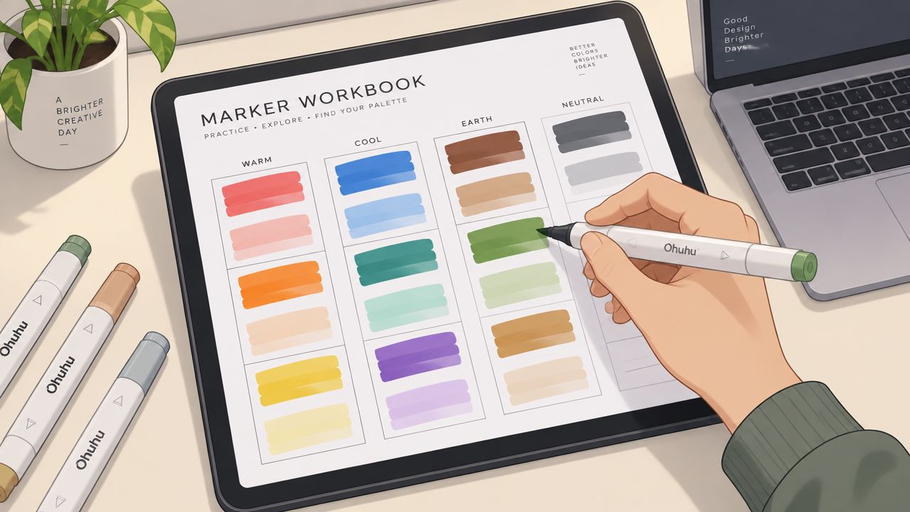
Give each cell enough room for a broad stroke and a double pass. A narrow square may be attractive in a digital template, but it won't show whether the marker darkens evenly, feathers at the edge, or reactivates a previous layer. I like including a single-pass area, a second-pass strip, and a small blend segment when the page has room.
Group pens by a system you'll remember:
- Cool and warm grays: Keep them separate so a neutral-looking shadow doesn't surprise you.
- Skin tones: Arrange light, mid, and shadow colors together, then leave room for a small blend test.
- Nature families: Put foliage greens, earthy browns, and muted yellows close enough for scene planning.
- Bright accents: Reserve a section for colors that overpower nearby blends or need careful layering.
Add a header row for the family name and the number of pens covered on that page. Put the marker code beside the swatch, then add the brand name only when the page combines sets. Leave a small notes field for “bleeds,” “good blender,” “second pass,” or “muddy with blue.” Those short observations often become more useful than the printed color name.
Export a master PDF at 300 dpi, with bleed turned off and scaling fixed at 100%. Don't let “Fit to Page” rewrite the measurements. The target-printing guidance linked earlier explains why all patches must remain visible and why even a multi-page target can fail if the output is incomplete. Your chart isn't a profiling target, but the same principle applies: a resized grid changes the physical reference you designed.
Print one test page on inexpensive copy paper first. Check alignment, label spacing, family breaks, and whether any row clips into the next section. Then print the chart on your chosen marker paper and swatch it with the pens, not with a fill tool.
A short video walkthrough can be useful if you're building the layout inside a design application. Use it as a visual aid, but confirm the final document dimensions and printer settings yourself.
Once your page is stable, keep the master file untouched and make a working copy for each paper type. A conversion tool such as the Ohuhu Decotime converter can help when you're translating codes between related marker collections, but your own dried swatch remains the deciding reference.
Calibrating Your Printer and Paper for Honest Swatches
Printer calibration starts with restraint. Select the paper preset that matches the sheet instead of choosing a vivid mode that makes the preview look impressive. For coated heavyweight cardstock, a Heavyweight Matte or Presentation Matte setting is a sensible starting point. Uncoated copy paper needs a plain-paper setting, while photo or glossy modes can push dense colors and make the printed palette look more saturated than the page you'll color on.
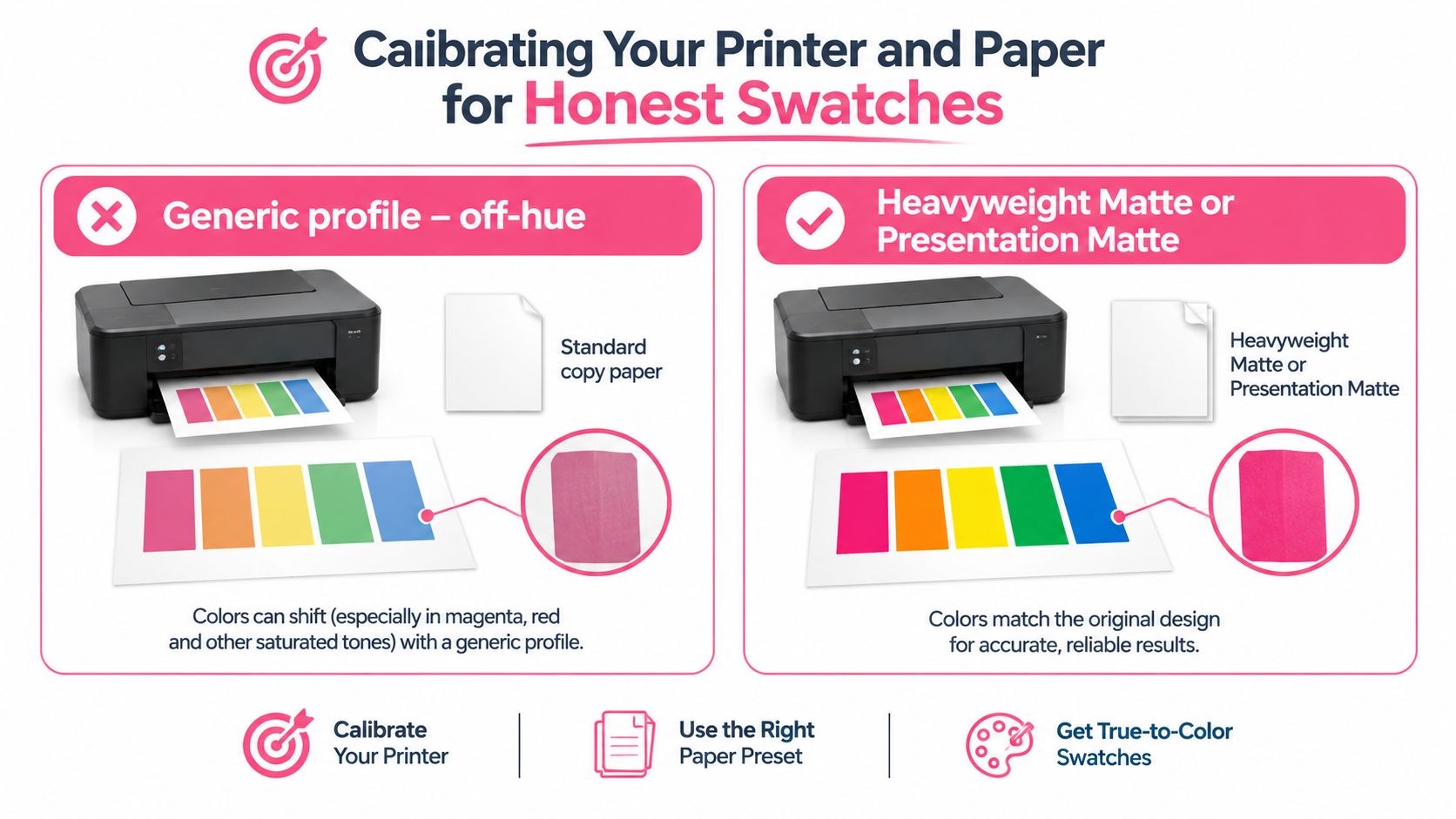
Turn off automatic adjustments named Enhance, Vivid, or auto color correction. These controls alter the file before it reaches the paper, often favoring a punchier result over a faithful one. Run the printer's alignment or head-cleaning utility if you see banding. A striped swatch isn't a reliable record of the marker underneath it.
Read the failure before changing the file
Fit-to-page scaling creates a geometry problem. The swatches become smaller, margins shift, and labels may no longer sit beside the colors they identify. Paper brightness changes perceived value and temperature. Ink density affects how much the printed chart resembles a digital palette, but it doesn't reproduce the alcohol marker's absorption or layering behavior.
For professional color-management workflows, a target is printed without color correction, measured with a spectrophotometer, and used to build an ICC profile. The color-management reference describes profiling targets as datasets sent to a printer and notes that professional targets can range from about 400 to more than 1,700 patches, depending on the desired accuracy. It also shows why print quality is assessed through measured patch behavior, repeatability, reproducibility, gamut, and perceptual color differences rather than visual similarity alone.
You don't need that equipment for a hobby chart, but you should borrow the mindset. Print a gray ramp, inspect it under neutral daylight, and compare it with a physical marker swatch or a trusted color reference. If the ramp looks warm, adjust cautiously in the driver. If it looks muddy, test another paper preset before raising brightness. The research on print-reproduction methods reinforces the practical limitation: printed output can retain noticeable perceptual error, so an honest chart calibrates expectations instead of promising a perfect screen-to-paper match.
Labeling and Storing Charts for Daily Marker Work
Label the page while the swatches are fresh, but don't use an ordinary ballpoint as your permanent record. Alcohol ink can travel through some writing tools and blur codes over time. A fine archival pigment liner, such as Pigma Micron 005 or Uni Pin, gives you a clearer label. Let the marker area settle before closing the binder, and write the code where a later layer won't cover it.
Leave a blank corner for the date and a set revision note. A marker chart without a date can become misleading when a pen is replaced, a color is renumbered, or a new paper changes the result. Record the paper brand and finish too. That small detail tells you whether a future difference comes from the marker or from the surface.
Store the reference flat
Slip completed pages into clear poly sleeves inside a three-ring binder. Store the binder flat when possible, because upright filing can bend the grid and make pages harder to compare. Keep it away from direct window light. UV exposure can fade marker swatches, and a faded reference sends you toward the wrong pen during a long coloring session.
Use the chart actively. Put it beside your page, mark promising combinations with removable tabs, and add short notes after a blend succeeds or fails. The chart should evolve with your practice instead of becoming a decorative archive.
Quick-Start Checklist and Common Questions
You can get a useful first chart made tonight without designing an elaborate color system. Keep the first version practical, then revise it after you've used it during a real coloring session.
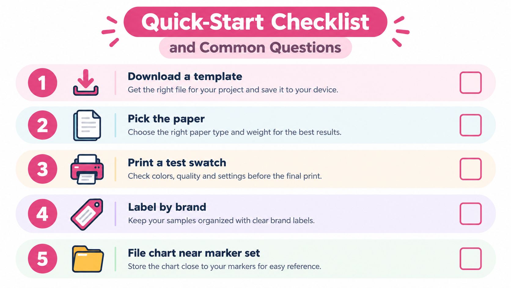
- Download a template: Choose a layout with readable labels and enough room for a layered stroke.
- Pick the paper: Use the marker stock you normally trust, not a random sheet from the printer drawer.
- Print a test swatch: Confirm scale, margins, and paper handling before using your finished cardstock.
- Label by brand: Add the exact code, name, and set where mixed collections could cause confusion.
- File it near the markers: Store the chart where you'll reach for it while choosing colors.
Common questions
What paper weight should I use for alcohol markers?
Start with bleed-resistant cardstock around 80 to 100 lb, or use a dedicated marker pad. The best choice is the one that behaves like the paper you'll use for finished coloring.
Why don't printed swatches match the inked ones?
A printer lays down ink differently from an alcohol marker. Paper brightness, coating, absorption, and layering all change the result, so use the printout for palette planning and the hand-made swatch for final judgment.
Should I laminate the chart?
Usually not. Lamination protects the sheet, but glare can make color decisions harder and may change how you perceive pale shades. Poly sleeves offer protection without permanently sealing the page.
How often should I rebuild a chart?
Rebuild it when your paper changes, a marker is replaced, the ink behaves differently, or the page has visibly faded. Add a date so you can tell a current reference from an old one.
ColorBestie can turn an uploaded sketch into a marker-style color preview, provide marker-oriented color codes, and help you test palette ideas before you commit ink to paper. Use the preview as a planning reference, then swatch the suggested colors on your own paper and keep the result in your workbook. Visit ColorBestie to start planning your next marker chart.
