
You're halfway through a piece, the colors are close, and the wrong gray keeps landing on the page because the last swatch sheet was too pretty to be useful. That's the moment a color swatch booklet earns its keep. It stops being a pile of samples and starts acting like the page where you decide what works before ink touches artwork.
A working booklet is different from a decorative chart. It helps you compare near-duplicate hues, track which marker series is which, and remember how a color behaves on the paper you use. That practical role is rooted in a long history of swatch books as industrial color tools, not just display pieces, with early manufacturer booklets used to communicate available colors and later evolving into forecasting and shade-card systems for production and retail markets, as documented by Yale's Beinecke Library on the origins of color forecasting.
Why a Marker-Friendly Color Swatch Booklet Changes Everything
You know the drill. You're in front of a half-finished page, the shadow needs to be right, and you're flipping between three grays that all look the same in the cap. A marker-friendly color swatch booklet fixes that problem because it records how a marker behaves in real use, not just how it looks in the barrel.
The booklet's job is decision support
The best booklet doesn't try to show everything at once. It gives you a fast way to answer practical questions, like whether a neutral leans warm on kraft paper, whether two brands duplicate each other, or whether a color can handle layering without turning muddy. That's why blank space matters, because you need room for blending notes, second-pass testing, and a quick check of paper response.
It also helps you stop buying or reaching for duplicate hues that do the same job. Once a swatch is labeled by marker series, you can see at a glance where sets overlap and which one gives the smoother transition into skin, sky, shadow, or foliage. That matters more than having a rainbow arranged for display.
Practical rule: if a swatch page can't help you choose faster on a deadline, it's decoration.
A working booklet is closer to a field notebook than a collector's album. The point is to shorten the gap between “I think this will work” and “I know this will work” before you commit to the page.
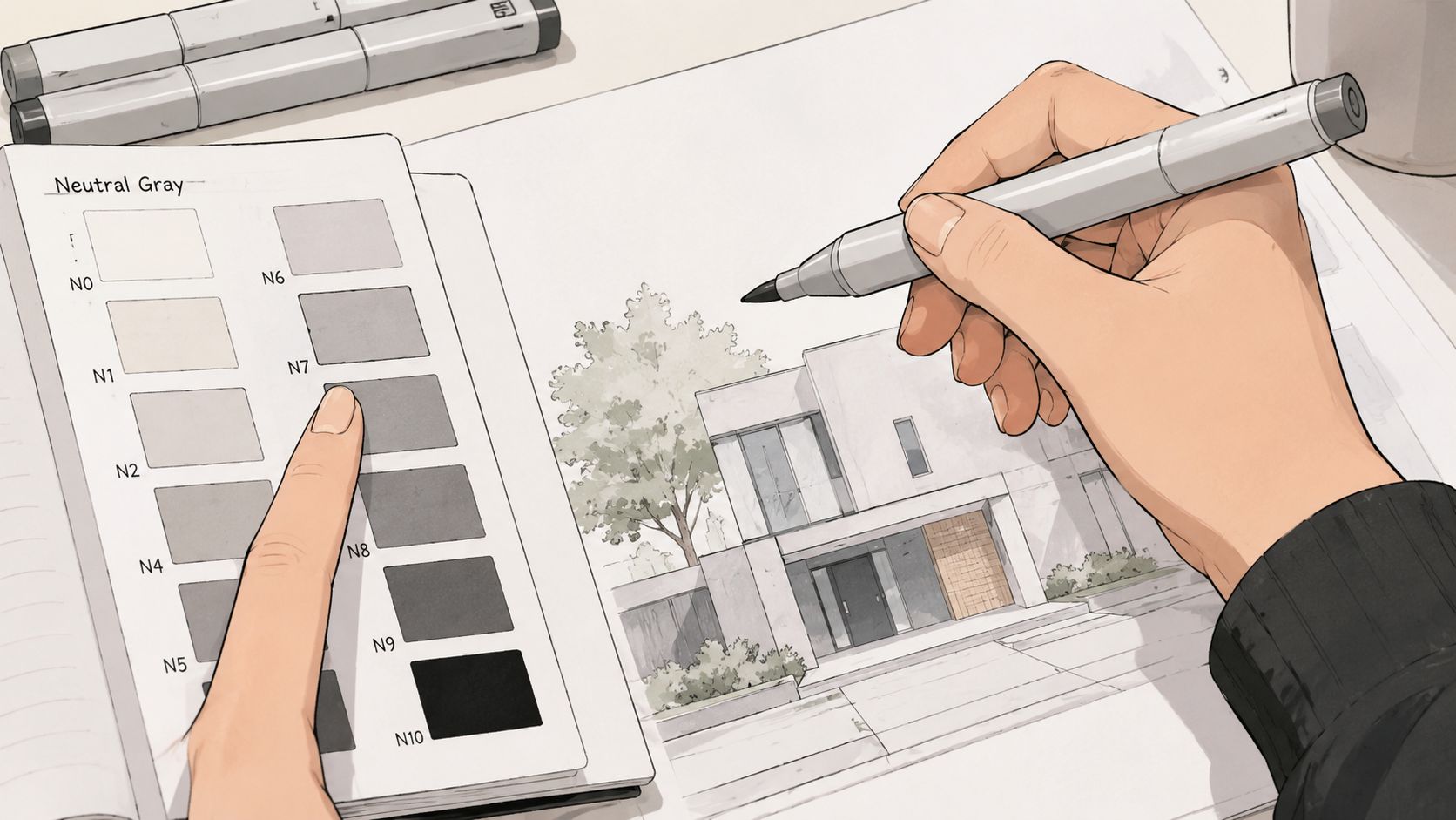
What to record so the page stays useful
A swatch without context gets stale fast. Label by marker code, brand, and the paper used, and leave enough room to note a blending partner or a related family member. If you refill or reorganize later, those labels are what keep the booklet readable after the original set fades from memory.
The most useful entries are the ones that help future-you make a better choice in seconds. That usually means a solid block, a lighter test, and a note that says what the color did under the paper you normally use. The swatch becomes a memory aid, and it becomes a prediction tool.
Picking Paper, Binding, and Tools That Survive Alcohol Markers
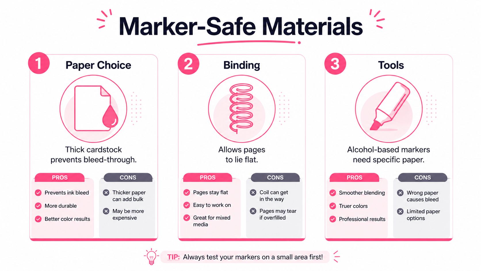
Alcohol markers are hard on cheap paper. Thin copy stock ghosts, bleeds, and warps, and once that starts, the booklet stops being portable and starts feeling like clutter. The safest move is to choose a heavier paper or a marker-specific pad, then build the booklet around the way you test color.
Paper choices that hold up
If you're building for real use, paper weight and surface matter more than fancy covers. Heavier cardstock gives you a more stable swatch, while marker pads are usually made to handle blending without turning the back of the page into a mess. The downside is that some papers feel great for a single block of color but show streaks or dry too quickly when you layer.
A bleed-prevention layer helps, especially if you swatch on both sides of a page or want the booklet to stay clean after repeated handling. Interleaving sheets can reduce ghosting, and they're worth the small bulk if you carry the booklet in a bag. If you've ever opened a favorite notebook and found yesterday's swatches transferred through the page, you already know why this matters.
Binding that matches your use case
Spiral binding lays flat, which is useful when you're building swatches at a desk or comparing two colors side by side. Wasabi-tape binding and stitched signatures can look nicer, but they're less forgiving once pages start swelling from repeated marker testing. Pocket rings are a solid middle ground if you want to add, remove, or reorder pages without rebuilding the whole book.
Practical rule: choose the binding that lets the page stay flat first, then worry about aesthetics.
Leave the first and last pages blank if you want a little extra protection from scuffs and bleed. Keep a loose backup strip too, especially if your booklet outlives one marker set and you want a quick reference outside the main binder. For a compact comparison workflow, the marker comparison tool is useful when you're deciding which physical swatches deserve a place in the booklet.
Tools worth keeping on the desk
A ruler, pencil, and fine-tip pen are enough for a clean grid, and a scrap page for corner tests saves you from ruining a fresh layout. Pre-test the marker in one corner, because some nibs lay down wetter than others and you'll want to know before you commit to a full cell. If you only have time for one precaution, test on the exact paper you plan to use, not on whatever was closest.
Designing Page Layouts and Templates That Actually Scale
The most practical layout I've used starts small and stays readable. A 1-inch by 1-inch swatch cell on a 4-inch by 8-inch grid works well on standard scrapbook pages, and when I want room for more charts and mixtures on one page, I switch to an A4-size sketchbook because the page can hold more system notes without feeling cramped. That simple shift changed whether the booklet felt like a reference or a drawer full of scraps.
A page structure that earns its space
Start each cell with a solid top block, then place the number and brand below it. Add a second smaller square for a tone-by-tone layer, and leave a third column for a blend test or a related overlay. That gives you one place to see the flat color, one place to see how it changes with pressure or layering, and one place to note a useful pairing.
A ready-to-copy page can look like this:
- Top band: full swatch block, applied evenly
- Middle line: marker code, brand name, and any set name
- Lower square: second-pass layer or a lighter value
- Right column: blend partner, paper name, and a quick behavior note
Use a small date stamp or handwritten date near the label. Marker formulas, nib wear, and paper choices all affect what you're seeing, so a page from six months ago shouldn't be treated like a fresh test. If a brand changes ink feel or a set gets replaced, the date keeps the page from lying to you.
A swatch page without paper notes is only half a reference. The same marker can look calm on one stock and noisy on another.
A compact version for travel
If you need something portable, build a swatch strip instead of a full grid. Narrow strips fit into smaller sketchbooks and are easier to carry to classes, conventions, or café sketch sessions. They're not as complete as a full page, but they're better than carrying no reference at all.
The trick is to keep the strip uniform. Same order, same label position, same test area. That consistency is what makes a portable booklet useful when you're away from the main set.
Organizing Swatches by Palette, Mood, and Brand
A good system has more than one way to find a color. I've rebuilt mine enough times to know that organizing by only one lens turns into a search problem the moment a new brand lands on the desk. The cleanest setup combines palette, mood, and brand so you can find a swatch for both technical matching and creative direction.
Palette groups keep harmony easy
Group swatches into warm, cool, neutrals, and earth tones first. That makes it faster to build a harmonious page or scene because you can see family relationships before you get lost in names. Warm and cool groups are especially helpful when you're deciding whether a piece needs contrast or a softer transition.
Mood labels help with actual projects
Mood-based tabs matter more than people expect. A palette can be soft, dramatic, cozy, or ethereal, and those labels are useful when you're working from a coloring page or an illustration where the emotional read matters as much as the hue. That's especially practical for themed adult coloring pages, where the color choice has to support the page's atmosphere, not just its outline.
Brand separation prevents false matches
Keep Ohuhu, Copic, Prismacolor, Spectrum Noir, and Winsor & Newton in separate sections. Brand isolation makes duplicate hues obvious, and it keeps you from assuming two markers are interchangeable when one is cleaner, warmer, or more transparent than the other. If you like a color from one set but want a similar result from another, the brand divider shows you where the closest match really lives.
Use index tabs for use case too. Skin, foliage, sky, and shadow are the most useful shortcuts because they reflect how artists search under pressure. The point is not to make the booklet pretty, it's to make the right page show up before your attention breaks.
If you're building your own categories, the palette generator is a useful way to test a scheme digitally before you assign a physical tab. That helps the booklet stay organized around choices you'll make, not just colors you happened to own.
Testing Blends, Tones, and Lighting Like a Pro
A swatch book that only records flat color is incomplete. The true value appears when you test how a marker behaves in a blend, how it shifts over gray, and how it looks when the lighting changes. That's when the booklet stops being a catalog and starts predicting what the page will do.
Build in blend tests
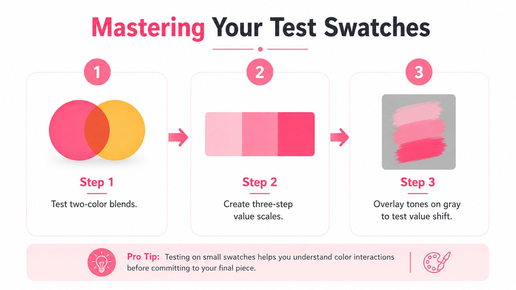
For each important color, make at least one two-color blend with a common partner you already use often. Add a three-step gradient when a marker is part of a skin, sky, or shadow family, because those are the places where value control matters most. If you work with neutrals, try an overlay on a neutral gray so you can see the color's value shift instead of just its hue.
That neutral test matters because some markers look rich on white paper and then go flat when layered over anything darker. A quick overlay tells you whether the color still has enough presence when it's asked to do more than sit alone. It also helps when you're choosing between close alternatives that only separate once they're blended.
Check the same swatch under different light
View the page in daylight, under an indoor LED, under a warm lamp, and with a quick phone flashlight check. Those four views will expose whether a marker leans cooler, warmer, or duller than you expected. You don't need a formal lab setup to catch the problem, you just need consistency.
Mark the lighting that fooled you. The note is more useful than the swatch when you're working under deadline.
Repeat on different papers only when it matters
Not every marker needs every paper test, but your core colors do. If a Copic skin tone or an Ohuhu neutral is part of your regular work, swatch it on the papers you reach for most and write down the difference. The same nib can look smoother, dryer, or more saturated depending on stock, and that information belongs in the booklet next to the color itself.
Syncing Your Booklet With Digital Tools Like ColorBestie
Physical swatches work best when they're easy to consult before and after a session. I photograph finished pages, keep the images in my archive, and use that digital record as a fast index when I'm planning a new palette. That way, the booklet doesn't live in a drawer as a dead object, it stays part of the planning loop.
Use digital previews to narrow the search
A digital preview lets you test color relationships before you dig through the whole booklet. If you know the theme, style, lighting, or genre you're aiming for, you can use a digital planner to narrow the candidate colors first, then confirm them against the physical swatches. That saves time when a page needs a very specific feel and you don't want to guess across three similar marker sets.
The reverse workflow works too. Start with a physical swatch you already trust, photograph it, and use that reference when planning the next page. The point is not to replace the booklet, it's to make the booklet easier to use on demand.
Keep the loop small enough to repeat
A useful digital habit is one you'll do after a marker session. I keep the process simple, take one photo, flag the colors that mattered, and archive the page before moving on. If I need a matching set later, I can search the image record instead of rebuilding the test from scratch.
ColorBestie fits into that rhythm because it gives you a place to compare ideas before you open the markers, then check them back against the physical page afterward. The ColorBestie app is built around that kind of quick planning loop, and the low-pressure format makes it easier to stay consistent than a giant, all-or-nothing swatch project.
Make maintenance feel lightweight
Short prompts help. A quick streak, a small milestone, or a bite-size tip turns upkeep into a habit instead of a cleanup chore. The booklet stays current when the workflow feels short enough to finish on a tired evening, not just on a perfect studio day.
Maintaining, Storing, and Replacing Your Booklet Over Time
A swatch booklet only stays useful if you treat it like a tool that ages. Keep it out of direct sun, because even strong swatches can fade with time, and premium guides often recommend replacing color books every 12 to 18 months when they're in active use, according to industry guidance on color book longevity and viewing conditions. That replacement rhythm is less about rules and more about honesty, because an old swatch that no longer matches the marker is a trap.
Keep the system alive without starting over
You don't need to rebuild everything each time a new set lands on your desk. Add a new sleeve page for the fresh brand, then tag it with the same palette and mood labels you already use. When the booklet gets crowded, migrate the older pages into a backup section so the main reference stays quick to flip through.
A quarterly daylight spot-check is enough to catch the worst mismatches if you use the booklet often. If a swatch has shifted too far, mark it as stale instead of pretending it still represents the marker accurately. That note saves more time than a pristine page ever will.
A one-page quick-start checklist
- Gather the base materials: choose a paper that can handle alcohol markers, a ruler, a pencil, and your first marker set.
- Sketch a simple grid: leave room for the main swatch, a second test square, and a note line.
- Swatch one set completely: label each color by code and brand as you go.
- Test under two lights: compare daylight with an indoor lamp before you trust the match.
- Add one digital record: photograph the page and save it with a clear name.
That's enough to build a usable booklet in one sitting. After that, the system grows by small additions, not big rebuilds.
If you want a faster way to keep your marker planning organized, ColorBestie gives you a simple bridge between digital previews and the swatches sitting on your desk. It helps you compare ideas before you ink, then come back to the booklet with clearer choices and less second-guessing.
