
You're halfway through a coloring page, you want a thicker stroke for a leaf and a hair-thin line for the vein, and every time you swap pens the page loses its rhythm. That's the exact little annoyance dual tip markers are built to fix, and once you get used to them, it feels a lot like keeping a chef's knife and a paring knife in the same hand. One tool handles the broad pass, the other handles the small correction, and your flow stays intact.
What Dual Tip Markers Actually Are
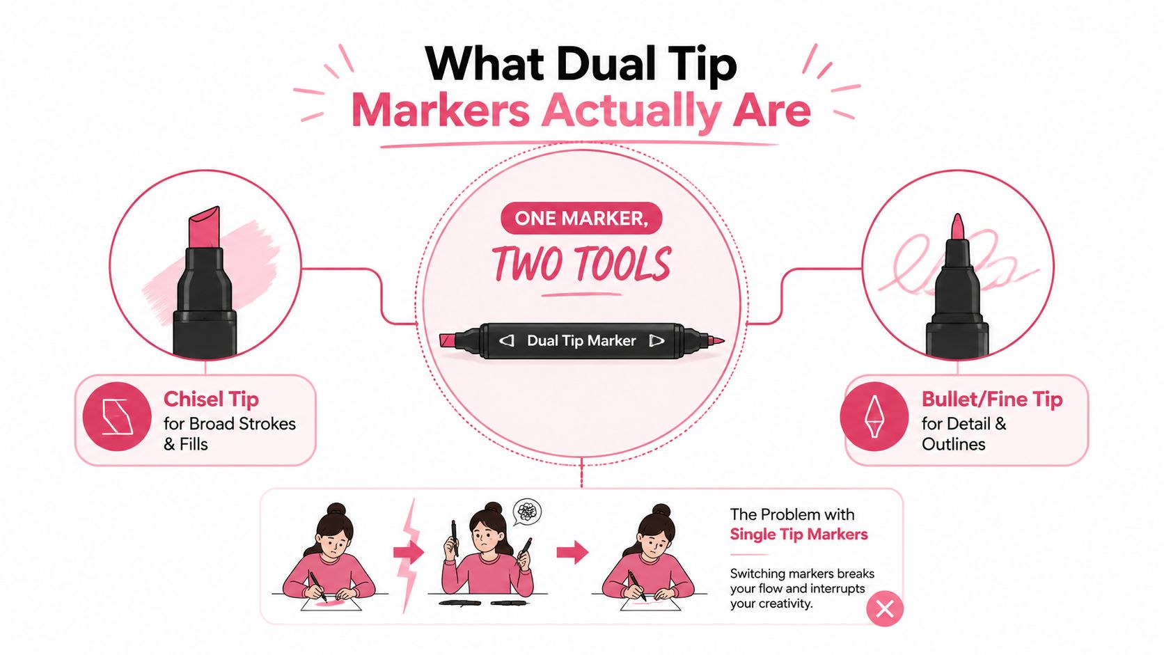
A dual tip marker has two working ends in one barrel, so you can switch between a broad mark and a detailed mark without hunting for another pen. In a coloring session, that means one end can sweep across a petal, while the other end can trace the vein, outline, or tiny gap you almost missed. That little switch sounds simple, but it changes the pace of the whole page.
One body, two jobs
The format is not just a convenience trick. It is a workflow choice, and that matters because the right tip keeps you from stopping every few seconds to grab a different tool. A single-tip marker can be great, but it asks you to compromise on either detail or coverage. A dual-ended body tries to remove that compromise.
You'll see the same idea in different aisles, but the meaning shifts by product family. Art markers are usually designed for sketching, coloring, lettering, or blending on paper. Industrial permanent markers are built more like utility tools, with fast-drying ink and nibs meant for labels, packaging, or hard surfaces. The body shape may look similar, but the job is different.
Practical rule: If you want one marker that can outline and fill, dual tip makes sense. If you only need a bold label on a box, the fancy art features are probably overkill.
What to look for in the aisle
When you read a package, check the tip pair first. A broad end paired with a fine end is the classic “do most things” setup, while a brush end gives you more expressive marks and a chisel end gives you faster coverage. The format is popular in alcohol marker lines because it mirrors how people color, sketch, and letter in one sitting.
| Format | Typical Use | Best For |
|---|---|---|
| Fine + Broad | Labeling, sketch notes, quick fills | Office work, mixed utility |
| Chisel + Bullet | General coloring, steady outlines | Adult coloring pages, all-around use |
| Chisel + Brush | Broad fills, smoother blending | Illustration, expressive coloring |
| Brush + Bullet | Detail and soft movement | Lettering, manga, careful accents |
For a quick compare tool while you shop, the marker comparison view is a useful way to sort what you already own from what you're thinking about buying.
A Short History of Why Two Ends Exist
Dual-ended markers did not appear out of nowhere. They sit on top of a long marker-pen lineage that started with the 1910 felt-tip marking pen patent, moved through Sidney Rosenthal's commercially successful Magic Marker in 1953, and kept evolving with modern fiber-tipped pens in 1962 (marker pen history). That progression matters because two-ended art markers only became practical once nib materials and ink chemistry had caught up.
From utility pen to artist tool
Early marker development focused on marking and labeling, not blending and shading. Later improvements in solvent-based inks and nib construction made smoother laydown possible, and that opened the door for tools artists wanted to hold for long sessions. The dual-tip idea follows naturally once makers saw people reaching for a second pen right after the first mark.
Tombow's Dual Brush Pen line is one of the clearest examples of that shift. Tombow says the line has been around for 40 years, launched in 1984 with 72 colors, and later expanded to 108 colors in the current range (Tombow Dual Brush Pen history). Tombow also explains that the product grew from an original “soft lettering pen” concept, and the AB-T name stands for “Art Brush Twin.” That naming gives away the design goal, switching between expressive brushwork and precision lettering in a single body.
Why the format stuck
Once hobbyists got used to that convenience, the logic became hard to ignore. A lettering brush on one end and a finer writing end on the other means less tool swapping, less table clutter, and a steadier hand rhythm. The dual-tip layout is not a gimmick when you are halfway through a page and your hand needs two different strokes in the same minute.
The reason it feels so normal now is that the format matches real tasks. People color borders, then fill fields. They sketch thumbnails, then add notes. They letter a headline, then tighten the spacing. Dual-ended design removes a small bit of friction each time, and that matters in a hobby you want to feel relaxed.
The same practical logic also helps when you move from a digital palette to a physical set. If an app gives you five colors for a project, you still have to decide which tip pair will make those colors easy to use on paper. A brush plus fine combo can handle lettering and edge work in one sitting, while a chisel plus bullet pair may suit faster filling and cleaner outlines. A marker palette planner can help turn that screen-based idea into a set that matches how you color in real life.
Matching Tip Combos to the Way You Color
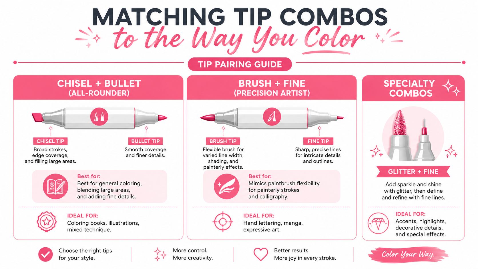
The trick most shoppers miss is that the tip combo matters as much as the ink brand. A chisel end plus a bullet end does not behave like a brush end plus a fine end, even if the barrel colors look identical. That choice changes how much control you get, how fast you can cover a page, and how hard you'll work your wrist by the end of a long session.
Pick the pair, then pick the project
| Tip Combo | Strength | Watch Out For |
|---|---|---|
| Chisel + Bullet | Stable, broad, easy to control | Less painterly movement |
| Chisel + Brush | Fast fills, smooth blending | Brush nib wear needs attention |
| Brush + Bullet | Detail with soft transitions | Less common, more task-specific |
| Fine + Broad | Utility labeling, simple coverage | Not ideal for expressive art |
Chisel + bullet is the broad-usability setup. The chisel gives you speed for larger areas, and the bullet gives you a more predictable edge for outlines and small text. If you color a lot of adult pages with borders, flowers, and pattern blocks, this is the safest all-rounder.
Chisel + brush is the pair I reach for when I want fast fills and a little more movement in the stroke. It's better for blending and painterly shading, but the brush end asks for cleaner paper and gentler handling because the nib is doing more of the expressive work. That makes it a little less forgiving if you press like you're writing with a ballpoint.
Brush + bullet suits detail-heavy coloring, lettering, and manga-style work. The brush gives you a lively line, while the bullet keeps small edges from getting away from you. It's the combo that feels most natural when a page has tiny ornaments, hair strands, or decorative script.
Fine + broad is more of a practical utility pairing. It belongs in sketch notes, planners, and industrial use where you want a narrow line and a faster fill option. It's useful, just not as satisfying for an art page unless your goal is crisp labeling.
If your main hobby is adult coloring books, start with chisel plus bullet or chisel plus brush. If you letter or sketch characters more often, brush plus bullet usually feels more natural in the hand.
A palette planning tool like the palette generator helps you test whether your color choices fit the combo you already prefer before you buy another set. That's handy when you're trying to build around one favorite marker family instead of starting from zero.
Ink Types and How They Behave on Paper
Marker ink decides whether a page feels silky, fussy, or frustrating. The tip might get the attention, but the ink chemistry is what determines whether the marker blends, bleeds, dries fast, or sits on top of the surface. Surface compatibility is the first spec I check, because the same nib can feel smooth on one paper and awful on another.
Alcohol, water, and permanent ink
Alcohol-based markers are the default in a lot of hobby art because they're blendable and dry quickly. They're usually the right choice for smooth, uncoated marker paper, and they work best when you plan your layer while the previous pass is still slightly wet. That timing is why they feel so satisfying on gradients and shadows.
Water-based markers are friendlier on thinner papers and often reduce bleed-through in coloring books. They're easier to clean up, but they don't usually give you the same smooth blend behavior as alcohol markers. If you want a calmer, less technical coloring session, they can be a good fit.
Oil-based or permanent industrial inks are built for hard surfaces like plastic, glass, and metal. They're often quick-drying, weather-resistant, and aimed at utility work, not page blending. On paper, they're more about mark permanence than soft color transitions.
Match the ink to the surface
The surface matters because it changes how the ink sinks, sits, or feathers. Industrial dual-tip markers are described as suitable for plastic, glass, metal, and other hard surfaces, while artist alcohol markers are often recommended for uncoated smooth paper so the nib doesn't fray and the lines stay even (industrial dual-tip marker specs). That cause-and-effect relationship explains why one set feels great on a sketch pad and miserable on slick craft plastic.
Practical rule: Smooth paper favors alcohol markers. Thin coloring-book paper often pushes you toward gentler ink or more careful layering. Hard surfaces belong to permanent marker families, not blending-focused art sets.
If you're standing in a store aisle, use a simple decision rule. For blending and shading, reach for alcohol-based art markers. For lighter paper and lower bleed-through pressure, water-based sets are easier to live with. For labels, signs, or non-paper surfaces, permanent industrial ink is the better tool.
Blending Techniques and Caring for Your Nibs
Alcohol markers behave a lot like a watercolor wash with a deadline. You need the ink wet enough to merge, but not so wet that the page turns muddy or the edges spread into a swamp. That timing is the whole game, and once you learn it, blending starts to feel less mysterious.
Blend while the page is still alive
A basic layering approach works well. Lay down a lighter tone first, then bring in the darker tone while the first pass still has some moisture left. The second color softens into the first more naturally that way, and you get a smoother transition without scrubbing the paper.
Pressure matters just as much as timing. Let the nib glide, don't press it like you're trying to flatten the page. A light touch keeps the fine tip from bending, and it also helps the broader end stay predictable when you switch ends mid-stroke.
Keep the nibs in better shape
Store the marker so both ends stay capped when you're not using them. That sounds basic, but dried nibs are a very ordinary way to ruin a set you otherwise like. A quick scratch-paper test before you commit to a page also saves a lot of regret, especially if you're checking a new paper batch or a color you haven't used in a while.
Paper choice changes the whole feel. Alcohol markers are built around layering, so the paper has to handle repeated passes without turning fuzzy or letting ink soak through too fast. That's why a test square on scrap paper is never wasted time.
- Use light pressure: Let the ink do the work, not your hand.
- Cap immediately: Keep both ends from drying out between color shifts.
- Test first: Try color, blend, and overlap on scrap before the actual page.
- Wait between layers: Let the first pass settle if the paper starts getting mushy.
A marker set lasts longer when you treat the fine nib like a drafting tool instead of a paint stirrer.
The same discipline applies when you're filling large spaces. If a page has tiny flower centers, thin borders, or tight lettering, switch to the more precise end before the nib starts dragging. That habit protects the tool and keeps the line from turning ragged halfway through the page.
Turning Digital Color Plans into Real Markers
A lot of marker frustration starts before you ever open the box. You pick colors by instinct, then realize the set doesn't match the sketch in your head. A better approach is to plan digitally first, then translate the result into the physical markers you already own.
From app palette to marker tray
ColorBestie generates marker-style color previews from uploaded sketches and lets you steer the look with theme choices like palette, mood, style, lighting, and genre. It also aligns suggestions with marker families hobbyists already use, including Ohuhu, Copic, Prismacolor, Winsor & Newton, and Spectrum Noir, so the jump from screen to desk is less random.
The useful part is not just seeing pretty colors. It's checking whether the app's suggestion matches the actual marker set you've got in your tray. If a preview leans warm and earthy, you can compare that to your current marker caps and see whether you're missing the shadow tones or only need one accent color.
A simple workflow keeps it practical.
- Upload the sketch and let the app generate a preview.
- Choose a theme that matches the final mood you want.
- Cross-reference the colors against your real markers.
- Swap or simplify any shade you can't match cleanly.
- Color the page with the physical set that's closest.
That workflow matters because marker brand systems don't all name colors the same way. The same visual family might show up under different labels across sets, so a digital preview helps you think in color relationships first, brand names second. That's a lot less stressful than buying three pens to solve one shadow problem.
If you like mapping one marker family to another, the ColorBestie conversion tool helps translate between set-specific references without turning your desk into a spreadsheet. I'd use it for planning, not for guessing, because color memory gets sloppy fast when you're shopping in a hurry.
Choosing Your First or Next Dual Tip Marker Set
A marker set feels much easier to choose once you start with the job it needs to do. If your pages are mainly for coloring, your notes are mostly letters, or you sketch small thumbnails in the margins, the tip pair and ink family should fit that habit first. After that, brand names and color counts matter a lot less.
A real-world example helps. A set that looks perfect for a coloring book page can feel awkward in a journal spread if the tips are too broad, while a lettering-friendly set can feel slow when you need to fill larger shapes. The goal is to match the marker to the way your hand moves across paper.
Quick decision checklist
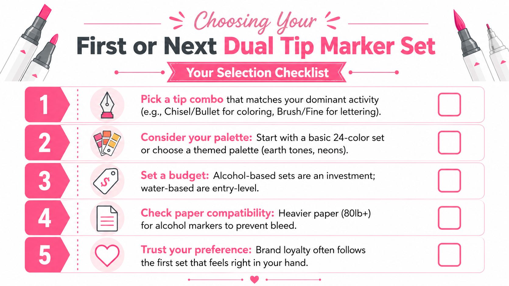
- Pick your main task: Chisel and bullet tips suit most coloring pages, while brush and fine tips fit lettering and expressive drawing better.
- Match the ink to your paper: Alcohol markers work better on smoother, marker-friendly paper. Water-based sets are kinder to thinner sheets.
- Think about your palette: A smaller starter set is often easier to learn than a huge box of colors you rarely reach for.
- Check nib care needs: If you press hard, avoid combinations that rely on delicate brush tips unless you are ready to adjust your grip.
- Use a preview tool first: A digital palette check can keep you from buying colors that look good online but do not fit the pages you color most.
| If You Mostly... | Reach For This Combo | Ink Family To Try |
|---|---|---|
| Color adult pages | Chisel + Bullet | Alcohol or Water-Based |
| Letter and journal | Brush + Bullet | Alcohol-Based |
| Sketch characters | Brush + Fine | Alcohol-Based |
| Label or plan | Fine + Broad | Permanent or Water-Based |
The safest first upgrade is usually a pair that gives you both coverage and control. If you already know you like clean outlines and fast fills, chisel plus bullet is easy to live with. If you want softer pressure and more varied strokes, brush plus bullet or brush plus fine usually feels better in hand.
That choice gets sharper when you compare a digital palette to the markers sitting in your tray. A preview can show whether your app-generated colors need more shadow tones, a different accent family, or just a simpler match. The ColorBestie marker comparison tool helps you see how one set lines up with another before you commit.
For people narrowing choices by brand names and color charts, the ColorBestie conversion tool also helps translate between set-specific references without turning your desk into a spreadsheet. I would use it for planning, not guessing, because color memory gets fuzzy fast when you are shopping in a hurry.