
You've picked up a marker, found what looks like the perfect shade on the cap, and laid down a beautiful first stroke. Then the ink dries warmer, the second layer turns muddy, and the color you expected on the page isn't there. Most alcohol-marker artists meet this problem sooner or later, especially when a digital palette or printed cap gives a misleading preview.
A color swatch booklet fixes that uncertainty by turning your own paper, markers, blends, and notes into a working reference. The useful version isn't a decorative rainbow of neatly arranged pens. It's a living studio system that helps you choose colors before you commit ink, compare neighboring shades, and pair physical tests with digital planning in ColorBestie.
What a Color Swatch Booklet Is Really For
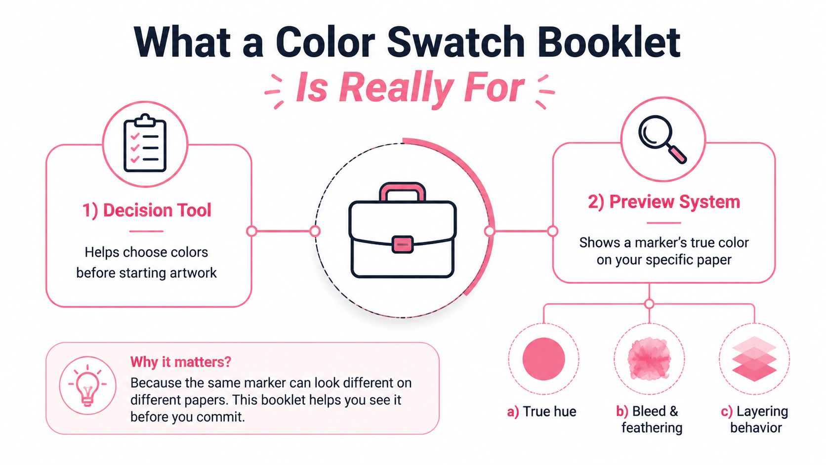
A color swatch booklet has two jobs. First, it should show a marker's actual appearance on the paper you use, including its undertone, saturation, feathering, and behavior after drying. Second, it should give you a quick way to make decisions while you're coloring, such as choosing between two blues, checking whether a second layer adds depth, or testing whether two colors transition cleanly.
Those jobs should guide every design choice. Use the same paper in the booklet that you use for finished artwork. Make swatches large enough to reveal streaks and layering, but compact enough to scan quickly. Put labels directly below the ink instead of on a separate key that forces you to flip pages. Organize colors around how you reach for them, usually by family and value, rather than creating a display that only looks attractive on a shelf.
A reference should work under pressure
A decorative booklet may group every pink, blue, or brand collection in a pleasing sequence, yet still fail when you're halfway through an illustration. If you have to remember which page contains a marker, guess what the cap means, or test every candidate on scrap paper, the booklet isn't saving time.
Try this studio test:
- Find a swatch: Can you locate a specific marker without searching through every page?
- Compare candidates: Can you place two likely colors beside each other quickly?
- Test a relationship: Can you see a blend, overlap, or value change without opening a separate notebook?
If any answer is no, restructure before adding more colors. A smaller booklet that supports fast decisions is more useful than a complete archive you avoid using.
The idea has a long history beyond hobby art. Swatch books were used by manufacturers at least as early as the early 1800s to communicate available raw-material colors, and synthetic dyes expanded bright, light-fast options in Europe during the mid-19th century. By the 1870s, French dye houses were issuing seasonal color cards, helping transform swatch books from availability lists into forecasting and specification tools, as documented by Yale's history of color forecasting. Your marker booklet serves the same basic purpose on a personal scale: it makes a variable physical result easier to understand and repeat.
Choosing Paper and Markers That Swatch Well
Paper decides what your marker looks like. A color that seems soft and controlled on bleed-proof marker paper may spread, feather, or become more transparent on mixed-media stock. Before you make a booklet, test the paper for the behaviors that matter in finished work: edge crispness, ink spread, blending time, and whether the reverse side is usable.
For alcohol markers, bleed-proof marker paper is often the most predictable starting point because it's designed to manage solvent-based ink. Hot-pressed Bristol offers a smoother surface and can produce crisp edges, while heavyweight mixed-media stock gives you more body but may show a different stroke texture and absorb ink differently. There isn't one universally correct choice. The correct paper is the surface you'll use often enough that your swatches remain relevant.
Prepare the page before the ink
Leave generous space around each test. A crowded grid hides feathering and makes it difficult to compare values. If you use double-sided pages, put a protective sheet behind every test page until you know how much ink travels through.
Prepare markers before recording them. Check that both nibs are primed, caps click shut cleanly, and ink flow looks even. A dry bullet nib or over-saturated brush tip can create a false impression of the marker's color and coverage.
| Paper Type | Bleed Behavior | Blending Behavior | Best Marker Prep Step |
|---|---|---|---|
| Bleed-proof marker paper | Usually controlled, but still needs a barrier sheet | Often gives smooth, predictable transitions | Test both nibs with one light stroke before swatching |
| Hot-pressed Bristol | Can keep edges crisp, though solvent may pool or show through | Supports clean layering when the surface isn't overloaded | Check for consistent flow and use lighter pressure |
| Heavyweight mixed-media stock | May absorb more unevenly and show feathering | Can produce textured or slower transitions | Test a small blend first and allow longer drying time |
Let each page cure before labeling, stacking, or closing the booklet. Wet alcohol ink can transfer to the facing page, smear handwritten codes, and create accidental dark borders. If you're unsure whether a swatch is dry, place a clean scrap sheet over it and press lightly. Any transfer means it needs more time.
Swatching Techniques That Show True Marker Behavior
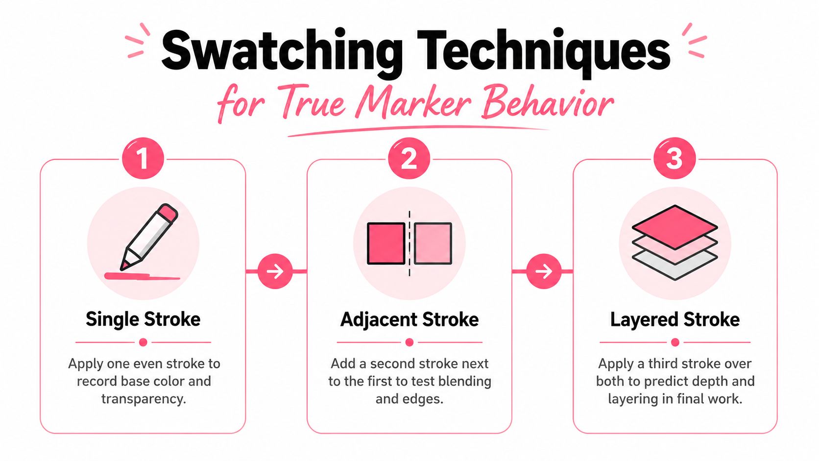
A single rectangle tells you the base color, but it doesn't tell you how that marker will behave in a finished illustration. Build each important swatch in three passes, leaving enough space to see the difference between first application, layering, and interaction with a neighbor.
Pass one records the base
Start with one even stroke from one edge to the other. Avoid going back over the wet ink. This first pass shows the marker's initial hue, undertone, transparency, and coverage without interference from extra solvent.
Write down the nib you used. A brush tip may create a different edge and pressure pattern from a bullet or chisel tip, even when they use the same ink. Add a small dry-time note if the color changes noticeably as it settles.
Pass two reveals depth
After the first area dries, apply a second coat over part of it. Keep the edge of the layered area clear so you can compare the original color with the deeper result. Look for streaks, patches, lifting, or a shift toward a warmer or cooler appearance.
Many markers separate themselves through layering. A single-pass swatch may look lovely, but the second layer can show whether the ink builds evenly or becomes blotchy. If you mostly use markers for shadows, clothing folds, or hair, the layered result matters more than the untouched base.
Pass three tests the relationship
Place a neighboring color beside the first swatch, leaving a thin gap. Then create a small transition panel where the two colors meet. The gap helps you notice reactivation bleed, while the transition shows whether the inks blend smoothly, push into one another, or muddy at the edge.
Record the drying condition beside the test. A blend that looks clean while wet may separate or darken after curing. For a practical production reference, Adobe recommends using true spot-color swatches and checking separations when preparing printed color references, because the output should be verified rather than assumed from an on-screen preview. The same principle applies here: inspect the physical result, not just the intended color name.
Labeling and Brand Mapping Across Marker Sets
A cross-brand booklet becomes useful when every swatch has a stable identity. Don't rely on cap color, memory, or a short nickname such as “peachy pink.” Write the full brand name, marker code, color family, value notes, nib used, paper, and date directly beneath the physical test.
Keep the manufacturer's original name visible. If a marker arrives from a different supplier or batch, record that information when it's available. The point isn't to create a false promise that two brands are interchangeable. It's to show what you tested and how confidently you can substitute it.
Compare behavior, not names
When you think two colors are equivalents, compare three tests:
- Single pass: Does the base hue and undertone look similar?
- Two-layer overlap: Do both colors deepen in a comparable way?
- Blended transition: Do they meet cleanly, or does one overpower the other?
A code that looks close in isolation may behave differently in a blend. Mark suspected matches as direct, close, or experimental. “Experimental” is not a failure. It tells your future self not to use the substitution in an important area without another test.
Use the marker comparison tool as a planning aid when translating palettes between popular sets. Confirm every suggested relationship on your own paper before treating it as a reliable replacement.
| Color family | Copic | Ohuhu | Prismacolor | Winsor & Newton | Spectrum Noir | Match confidence |
|---|---|---|---|---|---|---|
| Warm yellow | Record tested code | Record tested code | Record tested code | Record tested code | Record tested code | Experimental until swatched |
| Orange | Record tested code | Record tested code | Record tested code | Record tested code | Record tested code | Close if behavior agrees |
| Red | Record tested code | Record tested code | Record tested code | Record tested code | Record tested code | Compare layering |
| Blue | Record tested code | Record tested code | Record tested code | Record tested code | Record tested code | Compare undertone |
| Green | Record tested code | Record tested code | Record tested code | Record tested code | Record tested code | Compare blend result |
| Gray | Record tested code | Record tested code | Record tested code | Record tested code | Record tested code | Compare value shift |
Organize the physical pages by family first, then by value. Yellow, orange, red, pink, purple, blue, green, brown, gray, and black make a practical sequence. Add an alphabetized code directory at the front so you can find a marker even when you don't remember its family.
For multi-tip sets, name the tip in the label. A tiny mixing note, such as “softens with warm gray” or “pushes green beside cool blue,” can be more useful during an illustration than a long color description.
Portable Booklet Layouts That Survive Studio Life
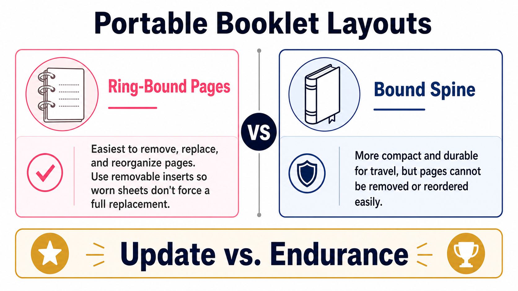
Your binding should match the way you use markers. A ring-bound booklet is the most forgiving choice for a growing collection because you can remove worn pages, insert new tests, and reorganize families without rebuilding everything. Use sturdy removable inserts and leave clear space around punched holes so the swatches don't tear during page turns.
A sewn or bound-spine booklet feels compact and protects its pages during travel. It's harder to replace a damaged sheet, though, and a new marker may force you to add an awkward page or write notes in the margin. Loose-leaf pages in clear sleeves keep bulk low and make sorting easy, but individual sheets can bend, slip out, or disappear into a supply bag.
Build around a repeatable module
A two-page module works well for daily studio use:
- Left page: Large single-pass swatches, layered areas, blend tests, and texture marks.
- Right page: Brand, code, family, value, nib, paper, drying notes, and replacement confidence.
- Contents sheet: Page or module number, family, and marker range.
- Margin space: Room for trimming, punching, and later notes.
For travel, use smaller chips with one primary swatch and a narrow overlap strip. For a studio booklet, larger panels are worth the space because they reveal streaking and blending more clearly.
Protect the finished pages with a light cover. Keep markers capped and, where your marker manufacturer recommends it, store them in the position that best protects their nibs. Don't place uncapped markers on the booklet. A small leak or wet nib can ruin several reference pages before you notice.
Test the format before committing to the whole set. Open it flat, turn pages repeatedly, put it in the bag you carry, and remove one insert. If the pages snag, the holes crack, or the booklet refuses to stay open, change the layout now rather than after a full swatching session.
Pairing Physical Swatches With Digital Previews
A digital preview is a planning clue, not proof of the final marker color. Screens, paper, lighting, ink density, and drying can all change what you see, so let the physical swatch decide whether a suggested color is safe for your actual artwork.
Start with a sketch or reference image in ColorBestie, then use the palette generator to explore a marker-friendly direction. You're looking for composition, value structure, color balance, and relationships between areas. Don't commit a whole page of coloring from the screen alone.
Create a reliable comparison image
Photograph your physical swatches under neutral daylight. Keep the camera position fixed, lock exposure and white balance, and include a simple white reference so the set remains easier to compare. Crop every swatch consistently, then label the file with:
- Brand and marker code
- Paper name
- Nib used
- Batch information, if supplied
- Test date
- Notes about feathering, blending, and dry-time
A digital suggestion may look too bright, too dark, or slightly warmer than your test. Update the booklet record first, because the physical result on your working paper is the source of truth for that marker. Keep both references, though. A hex value or digital palette helps you plan in either direction, while the manufacturer code tells you which physical tool to pick up.
Use the loop instead of guessing
The most useful workflow is circular:
- Preview a color idea digitally.
- Identify likely marker equivalents.
- Swatch the important candidates using the three-pass method.
- Compare the physical tests with the preview.
- Revise the palette notes.
- Begin the final artwork with tested expectations.
Check dark values carefully. A screen can compress subtle shifts, while alcohol ink may dry darker or warmer than it looked during application. Use the digital preview for proportions and contrast, then use the booklet for overlap, edge behavior, paper response, and real blending decisions.
Archive approved palettes with their matching swatch image and physical notes. Over time, this turns the booklet from a static list into a personal library of decisions you've already tested.
Maintaining and Trusting Your Booklet Long Term
A swatch booklet changes as your markers change. Frequent use, long periods with caps off, ink evaporation, and nib wear can affect how a marker lays down. You don't need to reswatch every page on a rigid schedule. Instead, revisit a color when its stroke looks different, when the nib feels dry, or when a familiar blend stops behaving as expected.
Store the booklet flat in a sleeve away from direct window light. Paper and ink can fade with prolonged UV exposure, and a reference page that has changed can mislead you later. Keep older pages in a labeled folder rather than throwing them away. They provide a useful history of how a marker looked when it was fresh.
Check the booklet in real viewing conditions
Compare important swatches under several lights, such as north-facing daylight, warm tungsten, and cool LED. Some colors shift noticeably between environments, and that can affect whether a blend looks balanced in your studio, at a class, or in a photographed finished piece.
When a swatch seems suspicious, compare it with your photographed record and a digital preview. The Ohuhu conversion tool can help when you're translating between marker references, but any conversion should still be checked against the physical page and your intended paper.
Studio rule: Trust the swatch for the conditions it records, not for every possible paper, light source, or marker age.
A color swatch booklet is a snapshot, not a permanent guarantee. That limitation is useful information. Write down the paper, nib, layering, light, and date, and you'll know exactly what the reference can support. Archive pages when they become unreliable, add a fresh test beside them, and keep the original for comparison rather than pretending the old result never existed.
ColorBestie can help you preview marker-style palettes, compare likely matches across familiar marker brands, and test color relationships before you put ink on paper. Build a physical swatch page for the colors that matter, then visit ColorBestie to connect that tested reference with faster digital planning.