
You're probably looking at a marker case right now, holding two greens with nearly identical caps, and wondering which one will behave on paper the way you want. Then you test one, it dries darker. You blend it with a second marker, and suddenly the color shifts again. By the time you start the main page, you already feel like you're guessing.
That's why a personal color swatches book matters so much for alcohol marker work. It gives you a reference you can trust more than the barrel, the cap, or your memory. I wish I'd treated mine as a core tool from the start instead of a side project I'd “get to later.”
Why Your Markers Need a Personal Color Swatches Book
Alcohol marker artists have a very specific problem. Most swatch-book advice online was built around watercolor, quilting, or general color theory, not around the way alcohol ink spreads, overlaps, and reacts to marker paper. Even the commonly shared tutorial “Starting My Watercolor Swatch Book” on YouTube uses watercolor paper and discusses water-based mixing instead of alcohol marker blending.
That gap matters because a lot of hobby colorists now reach for markers first. The verified data states that 78% of adult coloring enthusiasts report using alcohol markers over watercolors, yet mainstream guidance still doesn't really deal with cap inaccuracy, paper absorption, or false color expectations in alcohol swatching, as noted alongside that tutorial context in the same source.
A personal swatch book fixes the part that generic charts can't. It shows your markers, on your paper, with your hand pressure, under the lighting you use. That's the version that helps when you're deciding whether Ohuhu YG080 is too bright for a shadow leaf, or whether your Prismacolor warm gray will flatten skin tones once it dries.
Practical rule: If a marker choice feels risky, your swatch book should answer the question before your artwork has to.
I like to think of a swatch book as ground truth. Not theory. Not marketing. Not a printed chart from the box. Just a record of what really happens when ink hits the page.
For alcohol markers, that confidence changes everything. You stop testing random combinations in the margins. You start building palettes on purpose. Coloring feels calmer because you aren't making every choice from scratch.
Choosing the Right Paper and Swatch Format
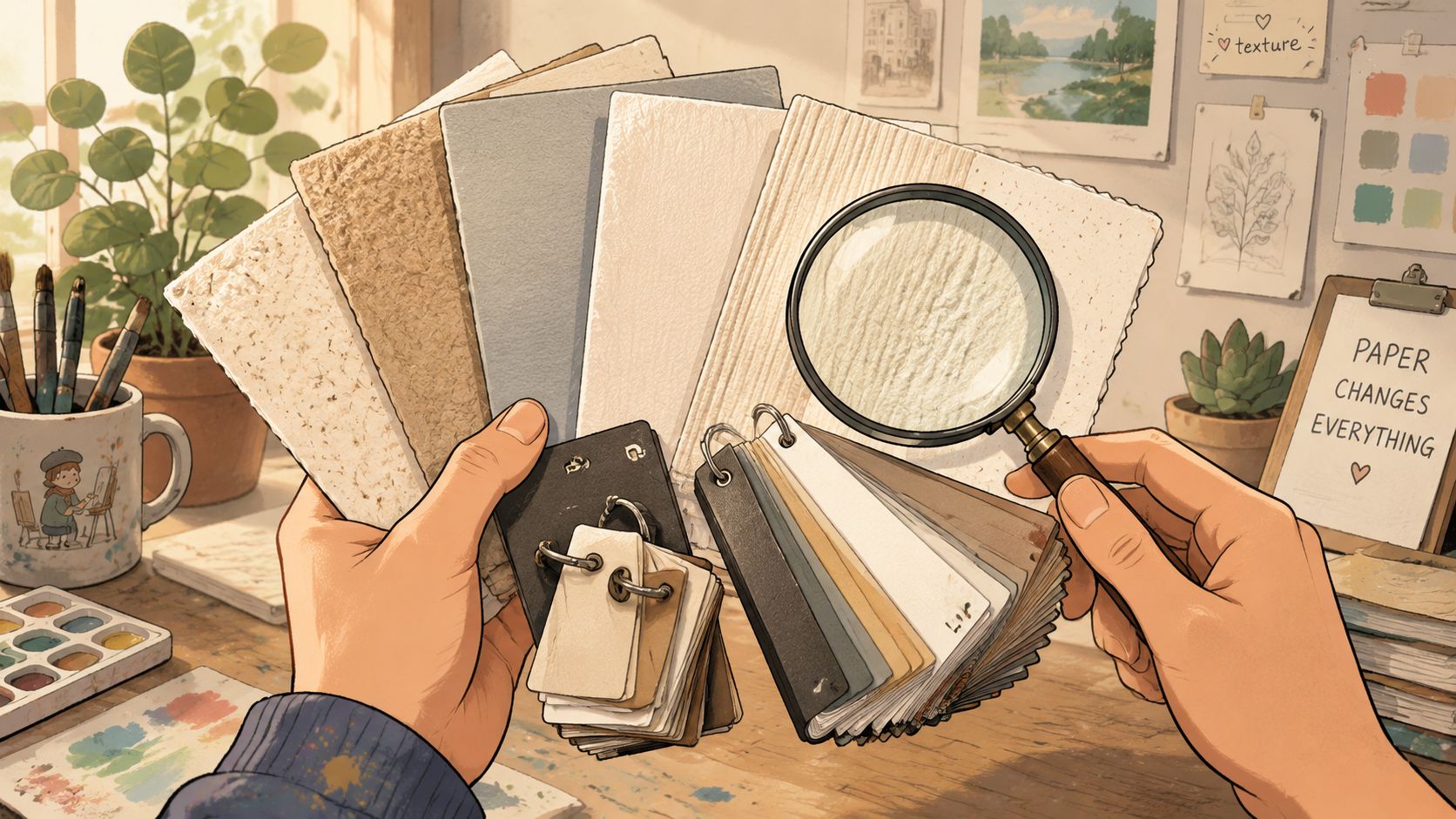
Paper is part of the color
With alcohol markers, paper doesn't just hold the ink. It changes the result. A smooth coated marker pad can keep edges crisp and blending softer, while a more textured sheet may grab pigment differently and make the same marker look flatter, darker, or rougher.
That's why I always tell beginners one thing first. Swatch on the same paper you use for finished art whenever possible. If you color in a Jade Summer book, test inside that type of paper system. If you work on separate Bristol sheets, build your swatch book from those sheets.
This isn't just artist fussiness. Verified data tied to a discussion about swatch-book recommendations notes a major blind spot in existing advice around texture and paper translation. It also cites that 63% of marker artists report consistent color mismatch between swatch books and final artwork due to paper texture differences, referenced in the same fact set and linked through the original Facebook discussion about recommended swatch books.
Here's the part readers often miss. Even if the color itself looks close, the blend behavior may not. A blue that feathers beautifully into lavender on smooth paper might streak on a fibrous page.
Formats that actually work
You don't need the perfect notebook. You need a format you'll keep updating.
Here's a simple comparison:
| Format | Best for | Tradeoff |
|---|---|---|
| Loose swatch cards on a ring | Artists who switch papers often | Easy to lose unless labeled well |
| Spiral notebook | One-paper workflow and quick flipping | Harder to rearrange later |
| Binder with removable pages | Multi-brand collections and growth | Bulkier on a small desk |
| Pre-printed swatch book | Fast setup | Often not tailored to your marker paper |
My personal preference is a binder or ring-bound card system if you use more than one brand. Rearranging matters once you start comparing Copic, Ohuhu, Prismacolor, and store-brand markers side by side.
If you're choosing supplies today, keep the list short:
- Paper first: Match your real coloring surface before buying tabs, labels, or page protectors.
- A format you can expand: A small binder, index cards, or punched sheets will age better than a fixed notebook if your collection keeps growing.
- Space for notes: Leave room for drying shift, blend partners, and “too streaky on this paper” comments.
- Simple labels: Marker code, brand, nib used, and paper name are enough to start.
Your swatch book doesn't need to look fancy. It needs to answer real questions fast.
A tiny, practical system beats a beautiful one you avoid using. If you're the type who colors on the couch, make a portable ring. If you work at a desk with several sets open, build a binder you can sort and reshelve.
Creating Accurate and Usable Color Swatches
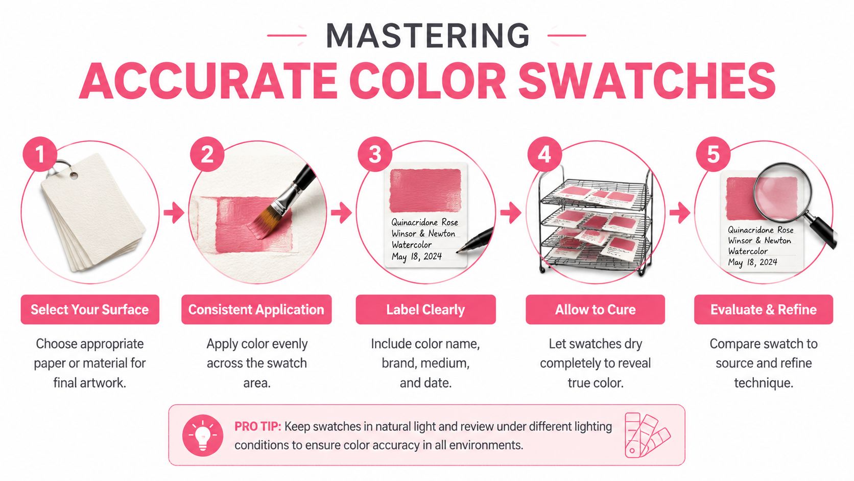
A useful swatch isn't just a filled square. It's a controlled sample. The more consistent your method, the more trustworthy your color swatches book becomes.
Verified data on professional validation methods shows that artists and product teams use a step-by-step process that includes controlled testing on multiple paper weights, including 90 to 120 gsm, and warns that inconsistent pressure can create 12% to 18% color variance, while paper incompatibility can cause 15% color lift, according to the Munsell books and sheets reference.
What to include in every swatch
I recommend giving each marker one mini record instead of one flat patch.
A practical layout looks like this:
Brand and code
Write “Ohuhu YR190” or “Copic E11” clearly. Don't trust yourself to remember later.Single-layer sample
One even pass. This shows the lightest realistic use.Double-layer sample
Let the first layer settle, then apply another pass. This reveals darkening and saturation.Small blend strip
Pair it with a neighbor color you use. For skin tones, maybe E11 with E13. For foliage, perhaps a yellow-green with a deeper olive.Tiny notes area
Add quick comments like “warmer than cap,” “blooms on thin paper,” or “great for shadow transitions.”
That last note box saves a lot of frustration. Over time, your book becomes less like a catalog and more like a field guide.
A repeatable swatching routine
When people say their swatches “don't match,” it's often because the method changed from marker to marker. The fix is boring but powerful. Repeat the same motion every time.
Try this routine:
- Use one lighting setup: A bright, neutral workspace helps you judge color more fairly.
- Fill the same size shape: If one swatch is tiny and another is wide, they won't read the same.
- Keep your pressure steady: Heavy pressure can distort what the color normally looks like.
- Let it dry fully: Alcohol ink often shifts as it settles.
- Label immediately: Waiting even a few minutes is how mystery browns are born.
A swatch made carelessly is worse than no swatch at all, because it gives you false confidence.
If you want to compare near-duplicates or search for replacements in your collection, a tool like the Marker Comparison tool can help you line up codes and likely equivalents. I still check every digital suggestion against my own physical samples, because the paper test is what decides the final answer.
How to compare brands without fooling yourself
Alcohol markers from different brands rarely line up one-to-one, even when the names sound similar. “Coral,” “salmon,” and “light peach” can land in very different places once they dry.
A better way to compare is to keep conditions fixed:
| Test element | Keep constant |
|---|---|
| Paper | Same sheet or same paper pad |
| Application | Same nib and same number of passes |
| Dry time | Compare only after drying |
| Neighbor colors | Use the same comparison markers |
| Label style | Put code and brand in the same spot every time |
This is the point where a lot of beginners overcomplicate things. You don't need lab gear. You need consistency. Make your swatches honest, and they'll stay useful for years.
Advanced Organization and Cross-Brand Mapping
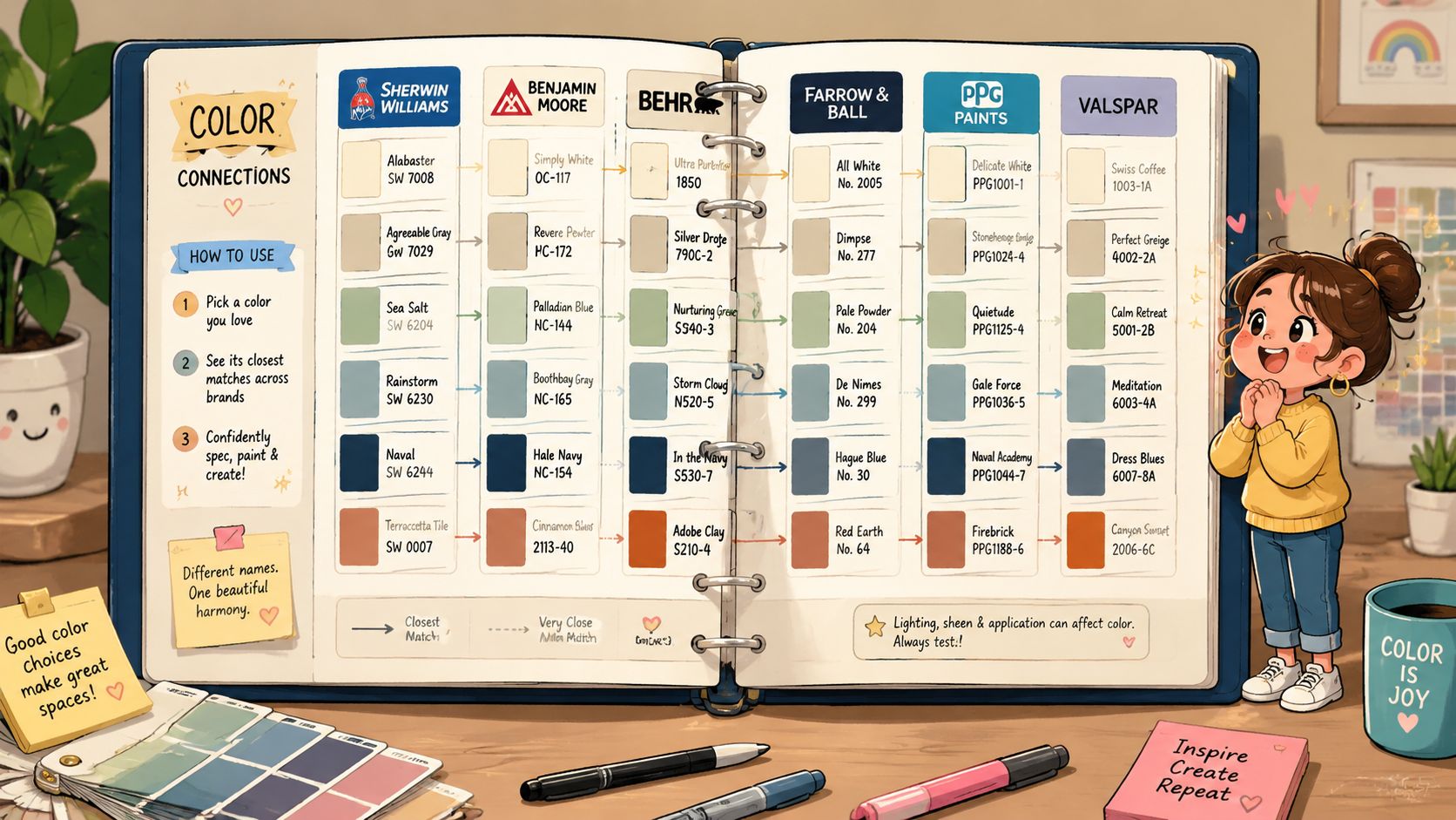
Once your swatches exist, the primary consideration is how fast you can use them. A messy stack of beautiful samples still wastes time. Good organization turns your color swatches book into a working studio tool.
Three ways to organize a swatch book
There isn't one perfect layout. There are three strong ones, and each helps with different decisions.
Color-family order works well if you build palettes by eye. Put yellows near yellow-greens, cool reds near magentas, and browns near the undertones they resemble. This is the best choice if you often ask, “What goes with this?”
Brand and code order is better if tutorials drive your coloring. If a lesson calls for specific Copic codes and you want your nearest available substitutes, brand sorting helps you locate candidates fast.
Project-based pages suit people who color books, characters, or themed illustrations repeatedly. You might keep one page for skin combinations, one for foliage, one for cozy interiors, and one for night scenes.
A lot of artists end up with a hybrid system. That's what I use. My master binder is arranged by color family, but I keep a few removable project cards for common palettes.
How ordered color systems help
Long before hobby marker books existed, people were already trying to arrange color logically. The Munsell Books of Color, first published in 1905, built a visual order around hue, value, and chroma, which became foundational to standardized swatch systems used later across industries, as described in the verified data.
That matters for hobbyists because it gives you a simple principle to borrow. Don't just sort by “looks kind of blue.” Sort by:
- Hue for the main family
- Value for how light or dark it is
- Chroma for how muted or intense it feels
When two markers seem close, value usually matters more than the cap color.
That one habit improves palette building fast. Many failed blends aren't bad color choices. They're bad value jumps.
Cross-brand mapping in real life
Cross-brand mapping sounds technical, but it's really just matching by appearance and behavior instead of by product line. It helps when you see a palette using markers you don't own.
Let's say a tutorial uses Copic skin tones, but you mostly own Ohuhu and Prismacolor. You can compare your single-layer patches, then your double-layer patches, then your blend strips. Sometimes the best substitute isn't the closest solo match. It's the marker that behaves most similarly when layered.
This gets even easier when you use a dedicated converter like the Decotime to Ohuhu converter to narrow the search before checking your physical swatches. The digital result gives you a shortlist. Your swatch book gives you the final answer.
A few cross-brand notes are worth recording right inside the book:
- Near-dupe markers: Good enough for tutorials and general palette matching.
- Behavior mismatches: Similar hue, but one blooms or streaks more.
- Better substitutes: Not visually identical alone, but stronger in blends.
- Paper-specific winners: Some markers only become close matches on one surface.
That last category surprises people. A marker can be a poor match on slick paper and a very convincing one on a more absorbent sheet. Your book should capture that reality, not fight it.
Digitize Your Swatches and Supercharge Your Workflow
A physical swatch book is still the most reliable way to judge real marker behavior. But a digital copy saves time when you're planning away from your desk, browsing references, or testing palette ideas before you pull out a single marker.
Industry swatch systems have already shown the value of linking physical standards with digital libraries. Verified data notes that integrated systems can support 98% accuracy in translating digital mockups to physical markers, according to Pantone's textile color systems overview. Hobby workflows aren't as controlled, but the idea is still useful. Use the screen for planning. Use the paper swatch for the final check.
Build a simple digital archive
You don't need a fancy setup. A phone camera works if you stay consistent.
Use this checklist:
- Photograph in one lighting condition: Keep color shifts from room to room out of your archive.
- Include labels in the frame: A swatch image without the code becomes useless later.
- Crop by page or color family: Small groups are easier to scan than one giant sheet.
- Name files clearly: “Ohuhu-greens-page-1” beats “IMG_4827.”
- Update after new purchases: Add to the archive while the markers are still on your desk.
I also like keeping a notes app entry with favorite combinations. Not every useful record has to be pretty.
Use digital planning without losing paper accuracy
A strong workflow looks like this. First, generate palette ideas digitally. Then compare those suggestions against your real swatches on the paper you color on. That keeps the speed of digital planning without trusting the screen too much.
If you want to experiment with palette ideas quickly, the Palette Generator is a practical starting point for testing combinations before you commit ink to paper. I'd still recommend checking every final choice against your swatch book, especially for skin, shadows, and muted neutrals.
Here's a visual example of how artists use digital inspiration in a marker workflow:
The screen is fast. The swatch book is honest. Put them together and you'll make better decisions with less trial and error.
Keeping Your Color Swatches Book Fresh and Accurate
A color swatches book isn't something you finish once and forget. Markers age. Collections grow. Papers change. If your book stays frozen while your tools evolve, it slowly stops being trustworthy.
When to re-swatch
Re-swatch any marker that starts behaving differently. If a favorite blender gets streakier, if a refill seems warmer than expected, or if you switch to a new paper pad, update the sample. I also re-swatch after reorganizing brands or adding a large new set, because that's when duplicate colors and missing transitions become obvious.
Keep storage simple and protective. Avoid leaving swatch pages in strong sunlight, and keep them away from heat and damp conditions. Even if you color casually, your references deserve basic care.
Quick fixes for common problems
Some frustrations show up again and again:
- Swatch doesn't match finished art: Check whether the swatch was made on different paper, with different pressure, or before the marker fully dried.
- Blends look worse in the book than in real work: Your swatch boxes may be too small. Give the ink a little room to interact.
- Everything feels hard to find: Rebuild the layout around how you choose colors, not how you think you should.
- Labels keep getting messy: Print small labels or use the same pen and placement every time.
Keep the system light enough that you'll maintain it. A perfect swatch book you never update won't help you nearly as much as a simple one you trust.
If you want a calmer way to plan marker palettes before you open your case, ColorBestie is worth a look. It helps you preview color ideas for alcohol-marker-style work, compare marker options, and build palettes you can then verify with your own physical swatch book.
