
You've got a fresh black-and-white page in front of you. Maybe it's a cozy café scene, a cute animal, or a manga panel you're excited to finish. You uncap a few markers, hold them over the page, and suddenly every color feels wrong.
That stuck feeling is common. It doesn't mean you're bad at color. It usually means no one has shown you a simple way to choose colors with confidence.
Color theory for artists sounds academic, but in real life it's much friendlier than that. It's a set of patterns artists have been building for a very long time. The history of color theory stretches back over 4,300 years, with early treatises including Aristotle's On Colors and the ancient Indian Nāṭya Shāstra, which identified four primary colors: black, blue, yellow, and red, as summarized in this history of color theory. That long history matters for one reason. Artists kept returning to these ideas because they help.
If you love Ohuhu, Copic, Prismacolor, or any other alcohol markers, this guide is for the moment when digital inspiration looks perfect on your phone but turns confusing on paper. We're going to make color theory feel usable, cozy, and practical.
Why Color Theory Is Your Best Friend Not a Scary Test
A lot of hobby artists meet color theory at the worst possible moment. You're excited to color, you search for help, and suddenly you're staring at charts, wheels, labels, and terms that feel like a school exam.
That's the wrong vibe.
Color theory for artists works better when you treat it like a toolbox sitting beside your sketchbook. You don't need to memorize every historical model or every harmony name before you begin. You just need a few reliable ideas that help you answer practical questions like these:
- What should stand out first
- Which markers belong together
- Why did this blend turn muddy
- How do I make a page feel calm instead of loud
One of the nicest things about color theory is that it reduces panic. Instead of grabbing random markers and hoping they magically cooperate, you can make a small plan. Even a tiny plan helps. Pick a mood. Choose a dominant color family. Save one stronger accent. Keep your lights and darks clear.
Friendly truth: Good color choices usually come from simple decisions repeated consistently, not from guessing perfectly.
If you've ever finished a page and thought, “The colors are nice, but it still feels flat,” that's not a talent issue. It often means the relationships between your colors need support. Color theory gives you those relationships.
It also gives you permission to stop chasing perfection. Cozy coloring isn't about proving you know fancy terms. It's about creating pages that feel warm, expressive, and satisfying to look at. A cute bookstore scene can feel sleepy and soft. The same drawing can feel festive, dramatic, or dreamy depending on your color choices.
What makes it useful for marker artists
Markers add one extra challenge. You're not mixing glowing screen light. You're working with physical ink on paper. That means your choices have to account for layering, bleeding, and how one stroke changes the next.
That's why practical color theory matters so much here. It helps you choose smarter before the ink touches the page.
The Three Building Blocks of Color
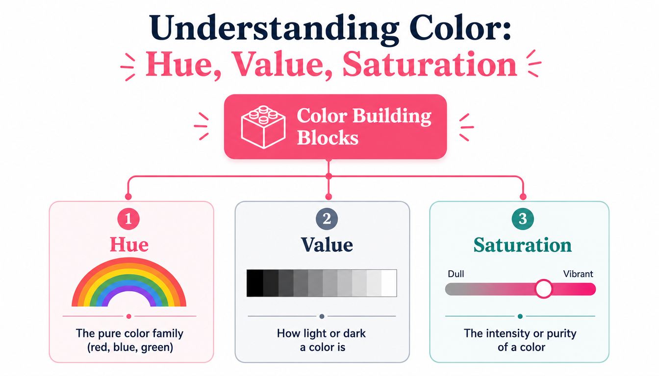
The easiest way to understand color is to stop thinking of it as one thing. Every color has a few parts you can control. A helpful modern framework came from Albert Henry Munsell, whose system described color with three exact dimensions: hue, value, and chroma in this overview of color theory history.
For everyday art, you can think of them like this:
- Hue is the color's name
- Value is how light or dark it is
- Saturation is how intense or muted it feels
Hue is the name
Hue is the part people usually notice first. Red, blue, green, orange. That's hue.
When you pick an Ohuhu brush marker for leaves, you're choosing a hue family. When you decide a sunset should lean peach instead of violet, you're shifting hue. It's the basic identity of the color.
This sounds simple, but it clears up a lot of confusion. Many artists say a color feels “off” when the problem isn't the hue at all. They may instead be unhappy with how dark it is or how strong it looks.
Value does the heavy lifting
Value is how light or dark a color appears. This is the part beginners often underestimate, even though it affects clarity more than almost anything else.
A pale pink and a deep burgundy are different in hue, but they're also very different in value. If you color hair, clothing, and background with colors that all sit at similar value levels, the page can look blurry even if the hues are pretty.
Try thinking in three simple groups:
| Value role | What it does | Marker planning idea |
|---|---|---|
| Light | keeps air and highlights | leave paper white where possible |
| Mid | builds the main forms | choose your base layer here |
| Dark | adds shape and focus | use in smaller amounts |
When your hues feel confusing, check value first. A page with strong value structure often still reads well, even when the hues are unusual.
Saturation changes the mood
Saturation tells you how clean, bright, or muted a color feels. High saturation feels punchy. Low saturation feels softer, dustier, or more relaxed.
This matters a lot in cozy coloring. If every marker on the page is bright and loud, nothing gets room to shine. A soft beige room with one coral mug often feels more pleasing than a room where every object screams for attention.
A quick way to control saturation with markers is to let some areas stay quiet. Use grayed browns, dusty greens, gentle creams, or softer violets as your supporting cast. Then save your strongest marker for a flower, a scarf, a lamp, or a character's eyes.
Why markers feel different from screens
Screens use light. Markers use pigment. That difference is why a digital palette can feel more vivid and effortless than the same idea on paper.
For marker artists, this means you usually get better results by planning value and saturation together, not by chasing the exact digital hue you saw online.
Creating Mood with Color Harmonies
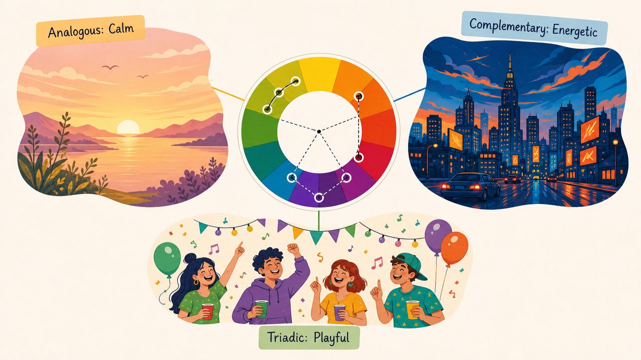
Color harmonies are simple recipes for combining hues in a way that feels intentional. They don't trap you. They just give you a starting pattern, especially when you're staring at a marker case full of choices.
Complementary for energy
Complementary colors sit opposite each other on the color wheel. Think blue and orange, red and green, or yellow and purple. These pairings create the strongest visual tension. Educational color guides describe complementary schemes as “quite vibrant” and note they can create a visual vibration effect, especially when saturation is high, as explained in this color theory guide.
That sounds dramatic, but it's useful.
If you want one object to pop, place it against its complement. A warm orange fox against a blue-gray night sky gets attention fast. A red teacup on a mint tablecloth feels lively right away.
Practical rule: If a complementary pairing feels too harsh, keep one side softer and let the other side carry the spotlight.
Analogous for calm
Analogous colors sit next to each other on the wheel, like blue, blue-green, and green. These combinations usually feel easy, peaceful, and unified.
They're great for pages where you want a gentle mood. Garden scenes, underwater themes, magical forests, rainy windows, and bedtime illustrations all work beautifully with analogous palettes.
A nice trick is to choose one main hue and let neighboring hues support it. For example, use green as the lead, blue-green as the secondary, and yellow-green in smaller accents.
Triadic for playful balance
Triadic palettes use three hues spaced around the wheel. They often feel lively, but more balanced than a direct complementary clash.
This kind of palette works well for character art, candy shops, toy scenes, or any page that needs cheerful variety without collapsing into chaos. The key is not giving all three hues equal volume. Pick one dominant family, let a second support it, and use the third as a little surprise.
Here's a simple comparison:
| Harmony | Best feeling | Easy marker use |
|---|---|---|
| Complementary | bold, energetic | one accent against a contrasting field |
| Analogous | cozy, flowing | backgrounds, nature scenes, soft pages |
| Triadic | playful, balanced | cute illustrations, décor, characters |
| Monochromatic | elegant, quiet | single-color studies, calm pages |
Monochromatic for softness
A monochromatic palette uses one hue in different values and saturations. This can look refined and surprisingly expressive.
Try a brown-only bakery scene, or a blue-only rainy alley with pale, medium, and dark blues. Because the hue family stays consistent, you can focus on value changes and small accents without the page feeling busy.
For marker artists, monochromatic pages are also excellent practice. They teach you how much shape and mood you can create without relying on lots of different marker caps.
Practical Marker Techniques for Colorists
Knowing the theory is nice. Getting it onto paper without streaks, mud, or panic is the part that matters.
Plan values before details
For marker work, value is the strongest lever for legibility. Expert color instruction emphasizes that value contrast is essential for depth, separation, and readability even when hue is ambiguous, according to this color theory reference. That's a big reason some pages look polished before any fancy blending happens.
Before you pick exact marker numbers, decide these three things:
- Where the lightest area lives. Window glow, cheeks, whipped cream, clouds, shiny fabric.
- Which zones stay in the middle. Walls, clothing, petals, wood furniture.
- Where the dark accents go. Folds, shadows under objects, lashes, corners, cast shadows.
If you make those choices early, your page will usually feel more readable.
A quick way to test this is to squint at your sketch and your chosen markers. If everything feels equally midtone, add either a lighter group or a darker group before you start.
Layer without making mud
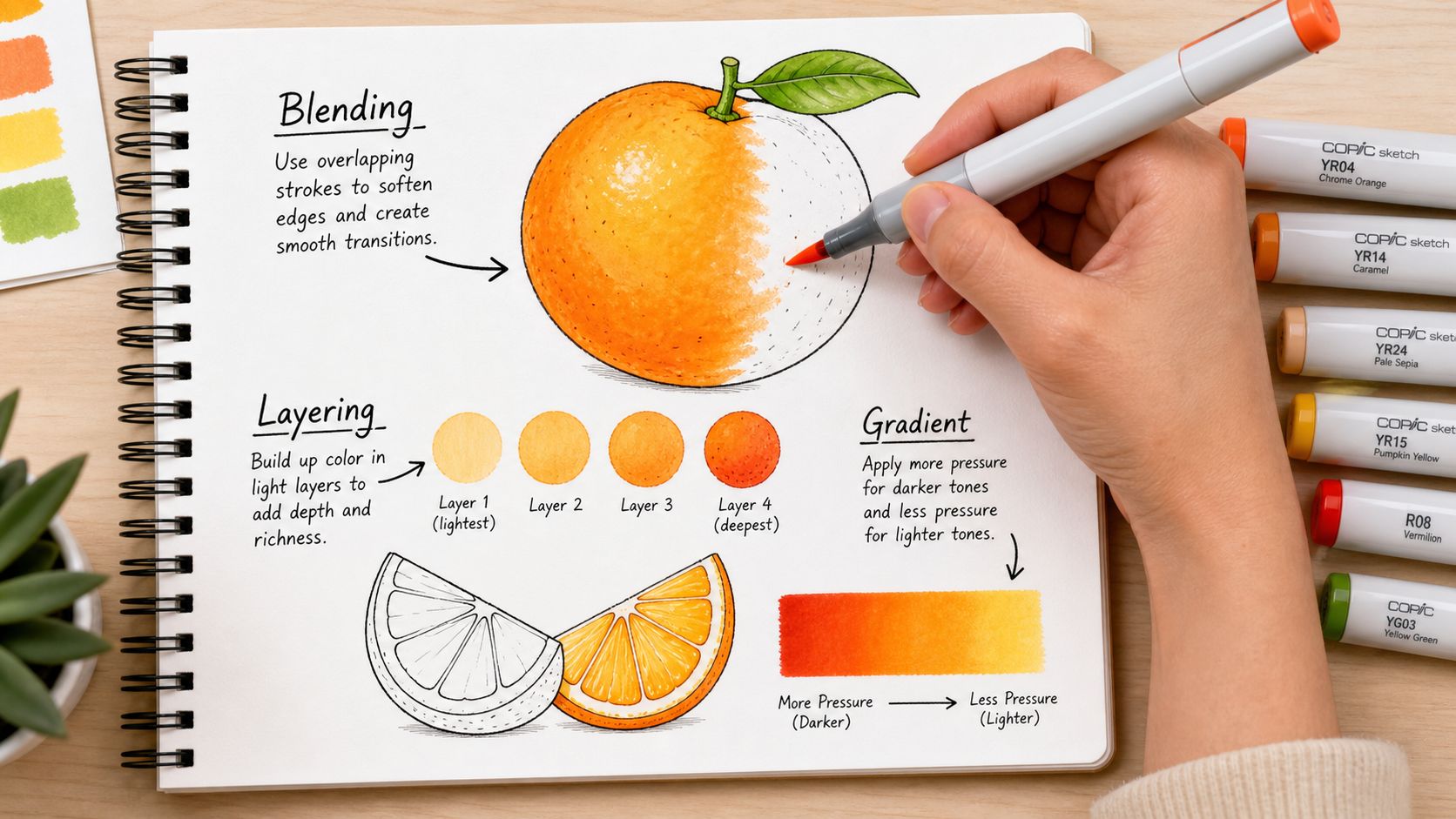
The biggest marker frustration is trying to recreate rich digital color by piling on ink until the paper gives up. That's where things turn dull fast.
A better approach is controlled layering.
- Start lighter than you think. Alcohol marker layers deepen quickly.
- Keep close neighbors together. Blend colors that share a family or sit near each other in mood.
- Let one layer settle. Going back in immediately can work, but too much scrubbing often roughens the look.
- Use contrast with intention. A muted base can make a stronger accent feel brighter without extra layering.
If you want to compare how close markers from different sets feel before you commit, a marker comparison tool for alcohol marker brands can make the planning step easier.
Darker isn't always richer. Sometimes a color looks more luminous when you stop one layer earlier.
Use your tools on purpose
Not every marker in your case should do the same job. Give them roles.
The base marker
This is your broad, middle-value fill. It establishes the local color. For example, a peach skin tone, a warm gray wall, or a leaf green.
The shadow marker
Choose a darker marker that supports the base without fighting it. You don't need the darkest option in the set. For many cozy pages, a medium shadow feels more natural than a dramatic one.
The accent marker
This is the tiny spark. A berry red bow, teal mug, golden lamp, or rosy nose. Use it sparingly.
Later in your process, it helps to watch another artist use pressure, layering, and edge control in real time:
Saving highlights
White paper is powerful. Don't rush to fill every gap.
Try leaving tiny untouched areas on glass, eyes, metal, glossy fruit, and soft fabrics. Those little whites often do more for sparkle than another marker layer ever could. A colorless blender can help soften edges or lift small areas, but it's most useful when you already planned where the light belongs.
Quick Recipes for Beautiful Color Palettes
Sometimes you don't want theory. You want a palette that already feels like a mood.
These recipes are meant to be adapted to your own marker sets. Think in color families and roles rather than exact codes. If you want help brainstorming combinations first, a palette generator for marker-friendly ideas is a nice starting point.
Café Corner
A small table by a rainy window. Steam curls up from a mug. Everything feels warm and quiet.
This palette leans analogous with soft neutrals.
- Dominant warm browns and creamy beige
- Secondary muted terracotta or cinnamon
- Accent dusty olive or muted teal
Use the browns for furniture and shadows, the cream for highlights and walls, and the terracotta for pastries, books, or textiles. Keep the accent tiny so the page stays restful.
Enchanted Forest
This one feels mossy, magical, and storybook-soft. It works well for woodland creatures, overgrown cottages, and fantasy pages.
The base harmony is analogous, centered on greens.
- Lead area sage, moss, and pine
- Supporting notes blue-green shadows
- Accent a small warm contrast like mushroom red or golden light
The trick here is restraint. Let the greens vary mostly through value. Then place the warm accent where you want the eye to land first.
A palette feels more memorable when one color family dominates and the others support the story.
Candy Window
Bright treats, striped awnings, ribbons, stickers, and cheerful packaging. This is your playful page.
This palette uses a triadic spirit.
| Role | Color family | Mood job |
|---|---|---|
| Dominant | pink | sweetness and charm |
| Secondary | aqua | freshness and contrast |
| Accent | lemon yellow | sparkle and movement |
If it starts looking too loud, mute one of the three. A dusty aqua and pale butter yellow will still support a stronger pink beautifully.
Rainy Neon
A reflective street, signs glowing through mist, maybe a late-night ramen shop or city alley.
This recipe borrows from complementary contrast.
- Main field deep blue, blue-gray, or smoky indigo
- Supporting hue cool violet or teal
- Accent pop neon orange, coral, or warm pink
Keep the dark cools broad and let the warm accent stay small. That contrast creates the neon feeling without covering the page in intense marker ink.
From Screen to Sketchbook Translating Digital Palettes
This is the part many artists struggle with. You save a beautiful palette from Pinterest, Procreate, Instagram, or a cozy wallpaper app. On screen, it looks smooth, glowing, and perfectly balanced. Then you try to match it with markers and the page turns flatter, darker, or muddier than expected.
That gap is real. Existing content often teaches color wheel harmony well, but it rarely explains how to turn those ideas into physical alcohol marker choices without losing the effect. That problem has been described as the digital-to-analog alcohol marker translation gap in this discussion of beginner color theory and marker practice.

Why screen color feels easier
A screen gives you light. Markers give you ink on absorbent paper. Those are not the same experience.
Digital colors can feel cleaner because they glow from within. Marker color has to sit on a surface, interact with paper texture, and survive layering. That means a digital teal may need to become a softer marker teal plus a darker blue shadow to create a similar impression. A digital coral may need a pale peach base with a warmer red accent instead of one exact marker.
Artists often get frustrated. They look for a one-to-one match when what usually works better is a translation.
How to translate a digital palette better
Try this approach when you're working from a phone or tablet reference:
- Identify the mood first. Ask whether the palette feels airy, moody, sweet, earthy, or bold.
- Reduce the palette. Pull the scene down to a few key families instead of chasing every tiny variation.
- Match value before exact hue. If the light-dark pattern is right, the page will already feel closer.
- Choose one saturation star. Let one color stay vivid and quiet the others a bit.
- Swatch on the actual paper. Marker paper changes everything.
If you're converting across brands, a Decotime to Ohuhu marker converter can help when you're trying to find comparable options inside a different marker system.
Here's a practical example. Say your screen reference shows a cozy bedroom with blush walls, walnut furniture, cream bedding, and a tiny teal lamp. On paper, don't start with the strongest pink and richest brown you own. Start softer. Build a pale wall, a mid-value wood, deeper shadow pockets, then save the teal lamp as the sharpest accent. That sequence usually preserves the digital feeling better than trying to force maximum saturation everywhere.
Treat the screen image like a mood map, not a strict contract. Your markers need room to interpret it.
Start Coloring with Confidence Today
Color theory for artists doesn't exist to make art feel complicated. It exists to make decisions easier.
You don't need to master every harmony, memorize every wheel, or own every marker set to color beautifully. You need a few habits that keep paying you back. Notice hue. Protect value. Control saturation. Pick a harmony when you want help. Leave room for paper white. Let one accent do the exciting work.
That's enough to start making pages feel intentional.
If you're using Ohuhu, Copic, Prismacolor, or any similar marker line, the biggest leap often comes from planning just a little before you color. A tiny value map. A three-family palette. A decision about what should stand out. Those small choices remove a lot of stress.
So pick one sketch today. Try one of the palette recipes. Keep your color family tighter than usual. Let your darkest darks stay limited. See what happens.
You'll learn faster by coloring one page thoughtfully than by reading ten more color charts.
If you want a cozy way to bridge digital inspiration and real marker choices, try ColorBestie. It's built for hobby colorists who want quick marker-style previews, guided palette ideas, and an easier path from screen to sketchbook with brands like Ohuhu, Copic, Prismacolor, and more.
