
You're sitting in front of a coloring page with markers spread across the desk, and somehow choosing three colors feels harder than coloring the entire flower. You pick a pink, add a purple, reach for blue, then pause because the palette already feels busy before the first section is finished. That moment isn't a sign that you lack artistic talent. It usually means you need a simple way to organize your choices.
Color theory for beginners becomes much more useful when you take it off the color wheel and put it onto your marker paper. With a few practical ideas, you can recognize why a palette feels calm, dramatic, playful, or muddy, then test that impression before committing ink to a page. The workflow below moves from the basic properties of color to harmonies, swatches, troubleshooting, and a complete mini project.
Why Your Marker Choices Feel Overwhelming
A beginner's marker collection can create the illusion that every color deserves equal attention. A large Ohuhu or Copic set offers many variations within the same color family, but a coloring page rarely needs all of them. The challenge is deciding which colors should lead, which should support them, and which should stay quiet.
I've watched hobbyists solve this by making one small change: they stop choosing markers by cap color and start choosing them by role. Instead of asking, “Which pink do I like?” they ask, “Do I need a light value for the petal, a middle value for its body, or a dark accent where the petals overlap?” That question turns a crowded desk into a manageable set of decisions.
Studio rule: You don't need more markers to make better palettes. You need a clearer reason for choosing each marker.
Color theory gives you that reason. It helps you describe what you're seeing, compare colors that seem similar, and predict how a group might behave together. Historical color theory moved from early symbolic ideas toward a more science-based framework with Isaac Newton's prism experiments and his 1704 Opticks, a shift documented by the University of Chicago's history of color theory. For marker artists, the practical lesson is simple: color systems help you organize what your eyes already notice.
You'll begin with hue, value, and saturation, then use those properties to build harmonies. After that, you'll make a swatch sheet, test combinations on your actual paper, correct common problems, and apply the process to a small subject. If you want a quick way to compare marker families while you practice, the ColorBestie marker comparison tool can help you examine options before you pull every marker from its case.
The Three Properties Every Color Has
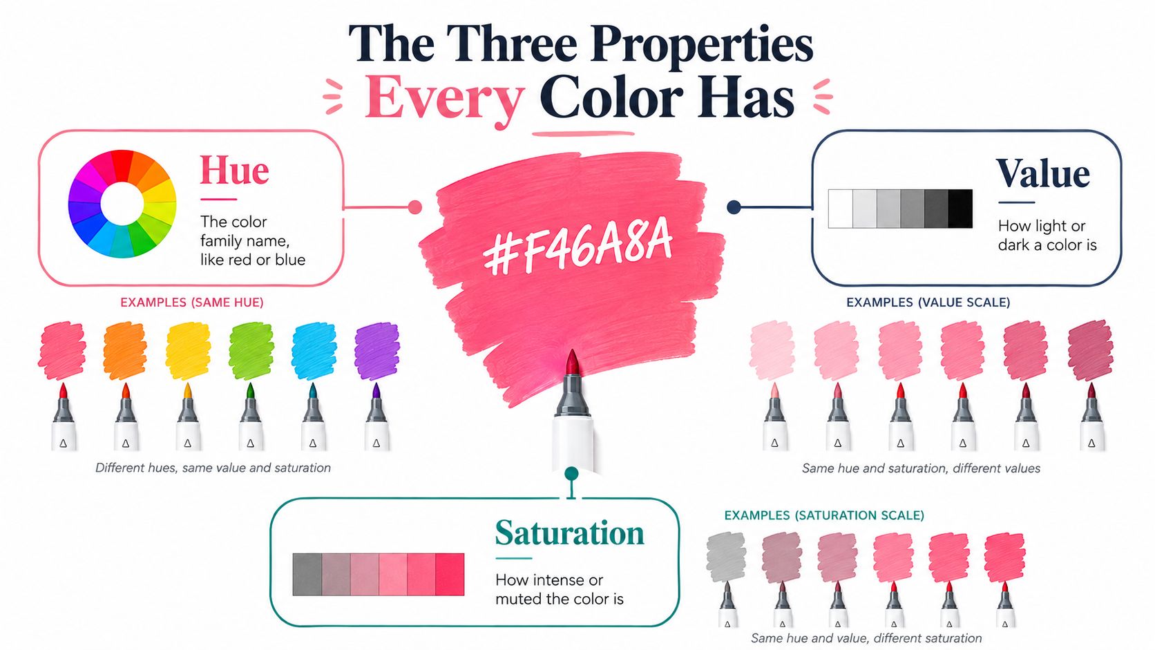
Every marker color has three useful “coordinates”: hue, value, and saturation. Think of them as a color's address. Hue tells you which neighborhood it belongs to, value tells you whether it sits high or low on a light-to-dark scale, and saturation tells you how vivid or muted it feels.
Hue names the color family
Hue is the basic color identity: red, orange, yellow, green, blue, violet, or a transition between them. A coral marker and a cherry marker both belong to the red family, but the coral may lean toward orange while the cherry may lean toward violet.
When you sort a marker collection, start by grouping hues loosely. Put the yellows near yellow-greens, the reds near red-violets, and the blues near blue-greens. Brand numbering systems in sets such as Copic and Ohuhu often cluster related colors, but the printed number isn't a substitute for a swatch. The ink on your paper is the reliable reference.
Value controls light and dark
Value describes how light or dark a color appears. A pale peach and a deep burgundy can have a related warm feeling, but they serve very different jobs. The pale color can cover a broad area, while the burgundy can define an outline, fold, crevice, or cast shadow.
You can test value without caring about hue. Squint at a row of swatches. If every color blends into one middle band, your palette may need a lighter or darker option. Value is what gives a marker drawing structure, even when the colors themselves are unusual.
Saturation measures intensity
Saturation describes how vivid or muted a color looks. A bright electric blue has strong visual intensity. A dusty blue feels quieter because it contains more grayness or softness.
Choose five markers from your collection and make a small labeled row. For each marker, write:
- Its hue, such as blue-green or red-violet.
- Its value, such as light, middle, or dark.
- Its saturation, such as vivid, moderate, or muted.
Don't worry about finding a perfect label. The exercise trains your eye to compare relationships rather than memorize terminology. A palette can contain several hues, but it becomes easier to control when you deliberately vary value and saturation instead of allowing every marker to compete.
Color systems also reflect the fact that light and pigment behave differently. Light commonly uses additive red, green, and blue relationships, while pigment workflows use subtractive principles associated with cyan, magenta, yellow, and black. The historical overview of additive and subtractive color models explains why the two systems shouldn't be treated as interchangeable. Alcohol markers belong to the pigment side, so a glowing digital palette may look more subdued once it reaches paper.
Color Harmonies That Actually Work for Markers
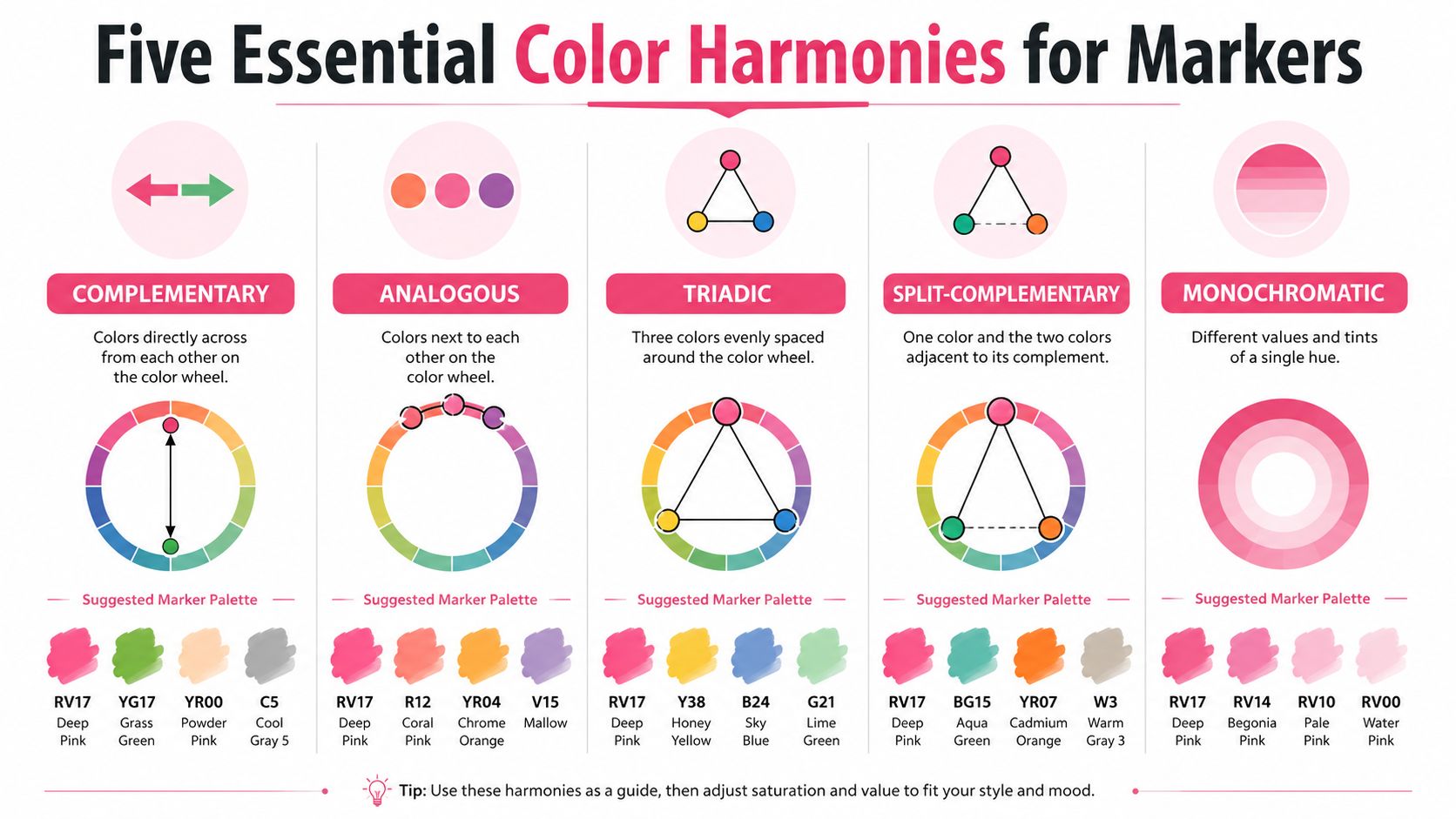
A harmony is a relationship between hues, not a strict recipe for every part of an illustration. You can use the same harmony with pale, muted markers for a gentle result or with saturated markers for a lively one. The structure stays recognizable, but value and saturation change the mood.
Complementary palettes create clear contrast
Complementary colors sit opposite each other on the color wheel. Try a warm orange with a blue or blue-violet partner. On a character illustration, the warm color can carry the clothing while the cooler opposite appears in hair, shadows, or background accents.
This pairing feels energetic because the hues contrast strongly. Keep one color dominant and use the other in smaller areas if the page starts looking noisy.
Analogous palettes feel unified
Analogous colors sit beside one another, such as yellow, yellow-green, and green, or red, red-orange, and orange. They're especially comfortable for foliage, sunsets, florals, and cozy interiors because the hues share a visual neighborhood.
An analogous palette can become flat if every marker has the same value. Add a noticeably darker version of one family for separation between overlapping forms.
Triadic palettes balance variety
A triadic scheme uses three hues spaced around the wheel. A practical marker version might combine a warm yellow, a red-violet, and a blue-green. This gives character art or decorative objects a playful, illustrated quality without relying on random color changes.
Choose one hue as the main voice. Let the other two support it through smaller objects or accents.
Split-complementary palettes soften opposition
Split-complementary color uses one main hue and the two neighboring hues beside its opposite. For example, a blue-green subject can work with red-orange and orange accents rather than one direct orange complement.
This approach keeps contrast while offering more flexibility. It's helpful when a direct complementary pair feels too sharp for a calm scene.
Monochromatic palettes keep decisions simple
A monochromatic palette stays within one hue family while varying value and saturation. You might use pale, middle, and deep violets for a flower, then add a neutral green only if the subject needs a contrasting stem.
This is a good starting point for beginners because the hue decision is already made. Your attention can stay on layering, shadows, and highlights.
You don't need to memorize every relationship. A printed brand chart, your own swatches, or the ColorBestie palette generator can give you a starting group to test. The final decision should still happen on paper, because marker overlap and paper absorbency affect the result.
Building Your First Marker Swatch Sheet
A swatch sheet is your personal color map. It shows what each marker does on the paper you use, including how it changes with layering and how it behaves beside other inks.
Start with the paper you trust
Use the same paper as your coloring pages whenever possible. Marker colors can look different on smooth marker paper, inexpensive coloring-book stock, and mixed-media paper. The cap is only an estimate, and a manufacturer's printed chart may not match your surface.
Create a simple grid with enough room for each mark. Label every swatch with the brand, color name, and marker number. If you use both Copic and Ohuhu, include the brand in the label so similar names don't become confusing later.
For each marker, draw a single even stroke. Beside it, add a second sample with another pass, then a third if the paper handles it well. You'll see how the value deepens and whether the edge becomes darker than the center.
Test blends instead of trusting guesses
Pick two colors that you think will blend. Lay down the lighter color first, then add the darker color while the first layer is still workable. Return to the lighter marker and soften the transition with gentle strokes.
Make a small two-color test box and record the order. The same pair can behave differently when you reverse the order, especially if one marker is much more saturated or darker.
Practical rule: Test the exact paper, layering order, and marker combination you plan to use. Memory is a poor substitute for a swatch.
Turn theory into a palette trial
Choose one harmony from the previous section and select four or five markers. Swatch them side by side, then place small overlapping samples beneath them. Look for three things:
- Value range: Can you identify a light, middle, and dark role?
- Visual balance: Does one marker dominate too forcefully?
- Intended mood: Does the group feel calm, cheerful, dramatic, earthy, or playful?
If a color feels wrong, don't discard the entire palette. Try replacing only the most intense marker or the one with the closest value to its neighbors. A marker conversion reference, such as the DecoTime to Ohuhu converter, can also help when you're translating a palette between collections.
Keep your sheets in a binder or beside your marker case. Over time, they'll become faster and more trustworthy than shopping by cap color.
Common Color Mistakes and How to Fix Them
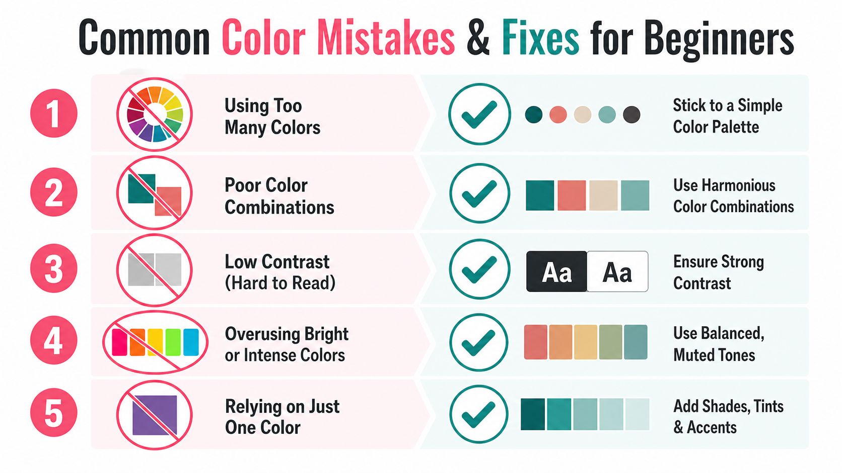
Beginners often assume a disappointing palette means they chose the wrong colors. More often, the colors are fine individually, but their roles are unclear. The same marker can look successful in one area and disruptive in another because neighboring colors, lighting, and value relationships change what your eye notices.
Using too many vivid colors
A collection of highly saturated markers can make every object demand attention. This often happens when the artist picks favorites one at a time without checking the group.
Fix: Keep one vivid color as an accent, then support it with quieter or lighter companions. If the page still feels loud, reduce saturation in the background rather than changing the main subject.
Ignoring value contrast
Two attractive hues can merge when they have a similar lightness. A blue object may disappear against a violet background even though the hues are technically different.
Fix: Make a quick grayscale-style check by squinting at your swatches or viewing them under softer light. Add a darker marker for the deepest spaces and reserve the palest areas for highlights.
Treating every contrast as harmony
Opposite colors can create excitement, but placing them in equal amounts throughout a page may produce visual tension. Beginners sometimes read “contrast” as “use more contrasting colors.”
Fix: Choose a dominant hue and limit the contrasting partner to selected objects, shadows, or accents. Let repetition create unity.
Coloring for your favorites instead of the subject
Your preferred palette may be lovely but unsuitable for the scene. A soft pastel group can weaken a dramatic night setting, while intense primaries may overpower a quiet bedroom.
Fix: Name the subject's mood before opening your marker case. Then select a harmony that supports that feeling and adjust the saturation to match.
Forgetting context and accessibility
A color doesn't appear in isolation. Surrounding hues, the room's light, and the paper itself can shift your perception, so a palette that looked balanced on a screen may feel different on the page. Guidance from Sessions College on color theory and context emphasizes that environment and lighting influence how colors are perceived.
Color choices also need to communicate through more than hue alone. The University of Reading's accessible color guidance recommends not using color as the only cue and identifies WCAG 2.1 AA contrast minimums of 4.5:1 for normal text, 3:1 for large text, and 3:1 for non-text user-interface objects. Those standards apply directly to digital accessibility, but the artistic lesson is useful too: use value, pattern, line, and shape so an image doesn't rely on color alone.
A Complete Mini Project from Palette to Paper
Let's color a simple flower with a gentle but lively mood. I'd choose an analogous foundation, perhaps coral, warm pink, and orange, then add a muted green for the stem and a deeper red-violet for the centers and overlaps. The exact marker names will vary by set, so use your swatch sheet to find close matches in a 48-marker collection.
Start by making four small test boxes. Put the lightest pink in the petal centers, the warmer coral toward the outer petals, and the orange in a few repeated accents. Add the green beside them rather than assuming it will work. If the green looks too bright, replace it with a grayer or darker option before touching the final page.
Layer from light roles to dark roles
Apply the lightest petal marker first, leaving small white areas where you want the paper to act as a highlight. Add the coral while the first layer is still slightly workable, using strokes that follow the direction of each petal.
Use the orange selectively. It can warm the petal bases or appear in the flower center, but it doesn't need to cover every section. Add the red-violet last in the deepest overlaps and around the center. Those darker marks should describe depth, not outline every edge equally.
For the stem, lay down the lighter green, then add the darker green on one side to suggest a turn in the form. Keep the highlight side lighter and avoid filling every gap with the darkest ink.
Step back after each color family. If the flower looks too warm, cool the background with a restrained blue-green or soft neutral. If the petals lack depth, add another layer to selected areas rather than darkening the entire flower.
This is the full workflow in miniature: choose a mood, select a harmony, swatch the group, adjust one color, layer from light to dark, and preserve highlights. You can repeat it for a cozy room, a character outfit, or a scene without changing the underlying method.
Your Go-To Color Planning Checklist
Keep this beside your coloring space. It's short enough to use before every project, but specific enough to prevent random marker grabbing.
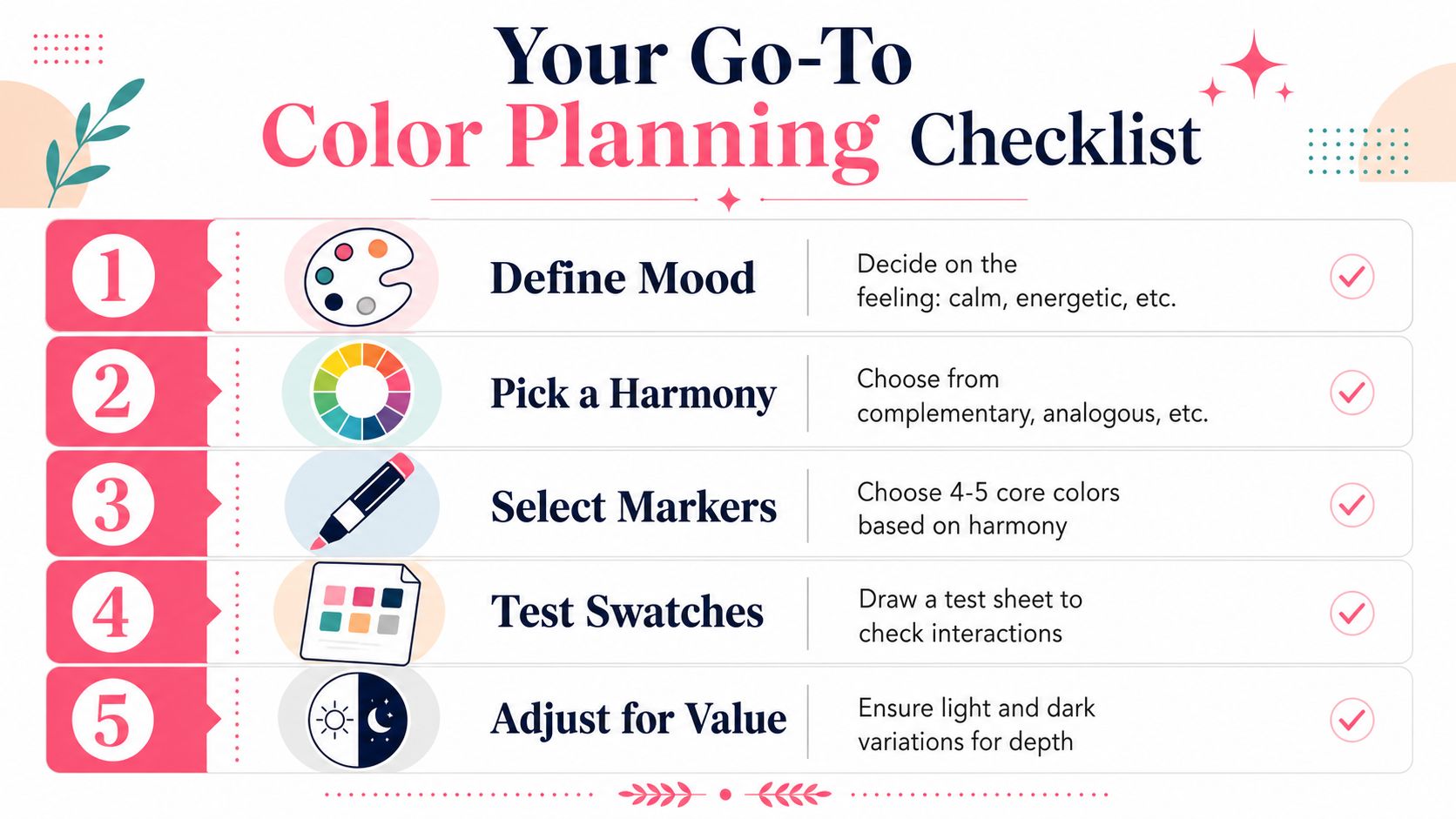
- Define the mood. Decide whether the page should feel calm, energetic, warm, mysterious, playful, or natural.
- Pick a harmony. Choose complementary for strong contrast, analogous for unity, triadic for variety, split-complementary for flexible contrast, or monochromatic for a controlled study.
- Select four or five markers. Give each one a job, such as light base, middle color, shadow, accent, or neutral support.
- Make test swatches. Use your actual coloring paper. Check single layers, additional passes, and at least one overlap between neighboring colors.
- Adjust for value. Ask whether the palette includes enough separation between light and dark areas. If not, replace one marker before starting the final piece.
- Plan the dominant color. Decide which hue will occupy the largest area and which color will appear only as an accent.
- Reserve your darkest marks. Place them where forms overlap, turn away from light, or need visual emphasis.
- Add non-color cues. Use line direction, pattern, shape, and value so the image remains readable without depending on hue alone.
Your first test may not look perfect, and it doesn't need to. Each swatch teaches you how your markers, paper, pressure, and layering interact. Confidence grows when you make those observations on purpose instead of treating every unexpected result as failure.
ColorBestie can turn a photo or line-art sketch into a marker-style color preview, with palette, mood, style, lighting, and genre options to help you test an idea before coloring. Visit ColorBestie, try a preview, and compare the suggested colors with your own swatch sheet before putting ink on the final page.
