
You've got a box of markers open on the desk, a reference image on your screen, and that familiar feeling that every swatch looks almost right until you try to commit. The caps all promise possibility, but the page still comes out muddy, too loud, or just plain flat. Color theory for artists starts to matter right there, at the desk, where you need a plan that helps you choose faster and blend with more confidence.
Why Your Marker Collection Still Feels Overwhelming
You spread out 80 swatches, maybe from Ohuhu, Copic, or Prismacolor, and the problem isn't that you lack color. The problem is that every choice seems to create five more choices. You know the pinks are different, the blues are different, and yet when the drawing needs one clean decision, the whole desk starts to feel noisy.
That freeze makes sense. A marker set looks like freedom, but without a simple filter, it becomes a pile of near-identical options. A useful way to think about color theory for artists is as a pre-selection system, not a philosophical subject. Before the cap comes off, you decide the hue family, the value range, the mood, and how many colors you need.
Practical rule: limit the decision before you limit the art. If the palette is small and purposeful, the drawing reads cleaner and the coloring process feels calmer.
That is why some artists keep reaching for the same five or six markers again and again. They are not being boring, they are building reliability. If you want a quick way to compare sets and spot near-duplicates, a tool like Marker Comparison can help you sort the almost-same swatches before you touch the page.
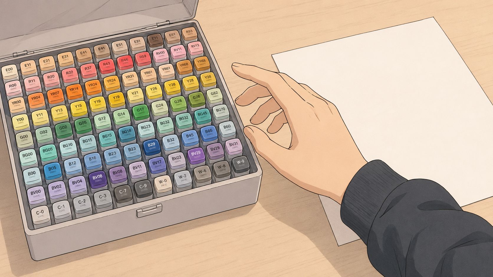
The rest of the process gets much easier once you stop asking, "Which marker is best?" and start asking, "Which job does this marker need to do?" Some colors carry the main shape, some hold the shadows, and one or two wake up the page. That's the whole game.
Reading the Color Wheel Without Falling Asleep
The color wheel isn't there to make artists memorize a circle. It exists because mixing and comparing colors needs a map. Newton's prism work in the 1600s and his later color wheel in Opticks gave artists a way to organize color as a system, and that historical structure still shapes how contemporary art education talks about mixing and harmony today (historical overview of colour theory).
Start with the loud friends
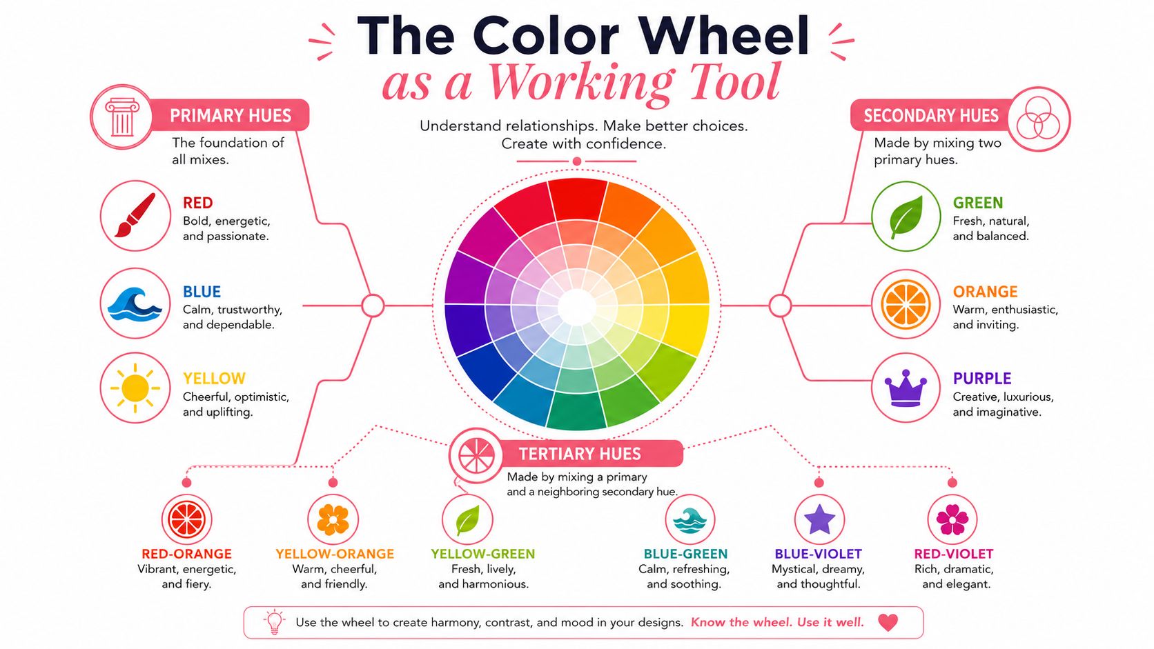
Primary hues are the ones that set the tone. Traditional art teaching uses red, blue, and yellow as the basic anchors, and secondary colors are what you get when those anchors start talking to each other. Tertiary hues sit in the in-between spaces, like red-orange or blue-green, and they're often what make a palette feel less blunt and more lived in.
A simple way to hold this in your head is to treat primaries as the loud friends, secondaries as the mixed personalities, and tertiaries as the quieter moods in between. That framing helps when you're staring at marker caps, because you can ask whether you need a clean base color or a softer bridge color. The wheel becomes a working tool instead of wall decoration.
Use harmony as a shortcut, not a rulebook
Complementary colors sit opposite each other, analogous colors sit beside each other, and triadic palettes space three hues around the wheel. A point-and-shoot approach works for complements, just choose the color across the circle. A three-step walk works for analogues, because neighboring hues naturally feel calmer and more connected.
Pick complements when you want energy, analogues when you want flow, triads when you want variety without chaos.
If you're looking at a reference photo, you can usually name its basic harmony in seconds. A sunset portrait may lean analogous because the colors stay close, while a comic cover might use a complement to make one focal point punch harder. The wheel doesn't do the art for you, but it gives you the first clean question to ask.
The Three Hidden Levers Behind Every Good Palette
Most marker confusion comes from treating hue like the only decision. It isn't. Value, temperature, and saturation decide whether a piece feels organized or messy, and value is usually the one that matters most because it controls how light or dark a color reads. Multiple teaching sources recommend learning hue, value, and chroma in that order, because good value separation preserves form even when the exact hue shifts.
Value does the structural work
If the value pattern holds, the image still reads when the colors get less exact. That matters with alcohol markers, where layering can change chroma without fixing a weak value plan. In plain terms, a beautiful blue shadow won't rescue a shadow that's too light.
Think of value as the skeleton under the clothing. If the bones are off, everything on top looks unstable. This is why a grayscale thumbnail often tells you more about whether a piece will work than a pile of polished swatches does.
Temperature and saturation steer the feeling
Temperature is the warm-versus-cool decision. Warm colors advance visually, cool colors recede, and that push-pull is one of the easiest ways to create depth without adding more markers. Saturation is the intensity dial, and high-chroma color grabs attention fast, so it needs a budget.
A practical palette usually keeps the big areas quieter and saves stronger chroma for a focal point. That fits the 60-30-10 guidance used in painting, where one color leads, one supports, and one accents the composition (60-30-10 color guidance).
| Role | What It Does | Marker Desk Use |
|---|---|---|
| Value | Sets light and dark structure | Plan your lightest and darkest swatches first |
| Temperature | Changes emotional tone | Decide whether the scene feels sunlit, cool, or mixed |
| Saturation | Controls intensity | Keep large areas muted, save vivid swatches for focal spots |
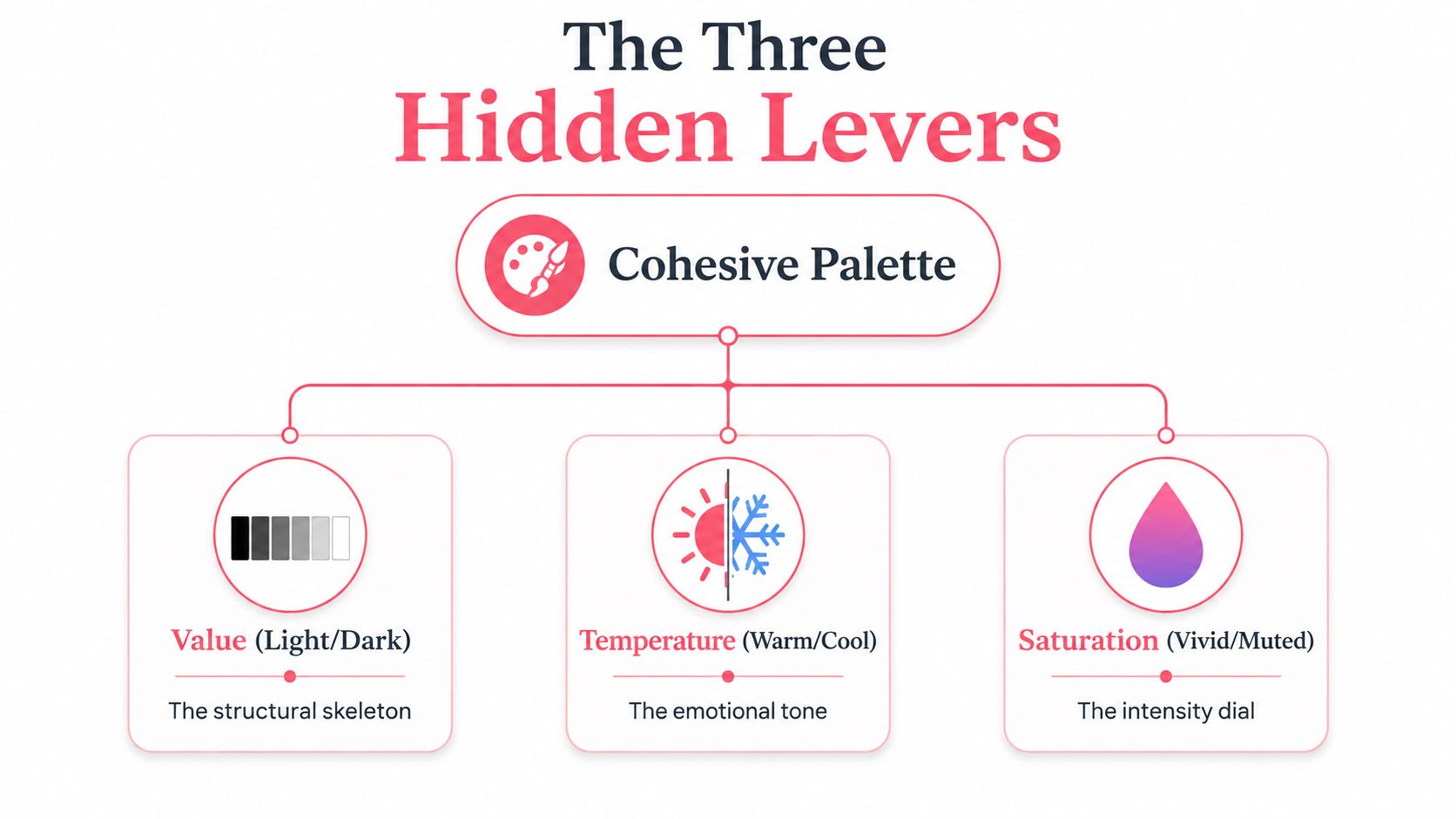
When a page feels “off,” one of these levers is usually doing too much. Check value first, then temperature, then saturation. That order saves a lot of guesswork.
How Color Quietly Sets the Mood
Color sends mood signals before the viewer notices the subject matter. Warm hues read as closer and cozier, cool hues feel farther away and quieter, and softer saturation often feels gentler or more nostalgic. That's why the same line art can become a peaceful cottage scene in one palette and a tense night scene in another.
Read the reference for atmosphere first
A cafe interior, a character portrait, and a stormy scene all ask for different temperature balances. The subject matters, but the light matters more. A Jade Summer room page, for example, often wants enough warmth in the walls and furniture to feel inhabited, while a Coco Wayo character portrait may need a cleaner temperature decision so the face stays readable.
Small complementary accents can keep the mood from going flat. A tiny touch of opposite color in hair, clothing, or background props gives the eye somewhere to land without turning the whole page into a clash. The point is not to make everything exciting, it's to decide where the tension belongs.
Mood comes from restraint
A moody comic splash page doesn't need every marker to be dramatic. It usually needs a controlled palette, clear shadows, and one place where the chroma lifts. That kind of control lets the subject feel intentional instead of overworked.
Warm light suggests comfort, cool light suggests quiet, and mixed light suggests uncertainty. Once you notice that pattern, picking colors gets less random. You stop asking what looks pretty and start asking what the scene needs to feel like.
Build a Marker-Friendly Palette in Seven Steps
A good marker palette starts with a subject, not a shopping list. A floral still life, a portrait, or a hallway scene all ask for slightly different value ranges and accent choices. The easiest way to keep the process calm is to build the palette in a narrow sequence and test it on a thumbnail before you commit to the full page.
Step by step on one subject
- Pick the subject's main mood. Cozy, bright, dramatic, or quiet. That answer decides your temperature bias.
- Choose one dominant hue family. If the flowers are peach, keep the family warm and let the greens support rather than compete.
- Set your value range early. Sketch the lightest and darkest areas before choosing midtones.
- Add one secondary color. This keeps the piece from looking one-note without overwhelming the page.
- Reserve one accent. The accent should do a job, like drawing attention to a ribbon, eye highlight, or small object.
- Test the palette in a thumbnail. A tiny version reveals problems before you sink time into the full drawing.
- Adjust before you start rendering. If the accent shouts too loudly, mute it or move it to a smaller area.
The 60-30-10 split gives that process a simple budget. One color carries the page, one supports it, and one wakes up the focal area. The same three colors can feel chaotic if they all fight for equal attention, and they can feel balanced when each one knows its role.
If you want to prototype palette order quickly, Palette Generator can help you test combinations before you ink the final version.
| Role | Coverage | Purpose | Example Use |
|---|---|---|---|
| Dominant | About 60% | Establishes the overall color family | Background walls, clothing, large foliage |
| Secondary | About 30% | Supports the main color and adds contrast | Shadows, furniture, secondary fabric, leaves |
| Accent | About 10% | Pulls attention to the focal point | Flowers, eyes, highlight object, trim |
The big win here is not perfection. It is clarity. A small, planned palette almost always feels easier to control than a full marker rainbow.
Lighting, Mood, and the Marker Reality Check
Markers never sit in a neutral vacuum. They live under a desk lamp, near a window, and on whatever paper you picked for the day. A swatch can look balanced in one light and off in another, which is the core problem of metamerism, when colors match under one light source and separate under another.
Test the swatch where you'll actually work
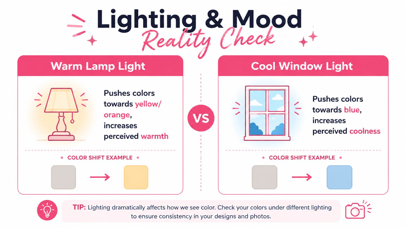
A desk test saves a lot of frustration. Put your swatches under the same lamp you plan to use for the finished piece, then move them near a window if you can. If the palette changes personality, the marker did not suddenly misbehave. The light changed the way the colors read.
Warm lamp light pushes a page toward yellow and orange. Cool window light does the opposite and brings more blue into the scene. The same beige marker can feel cozy at night and flat in daylight, so shadow choices should follow the lighting instead of treating every shadow as a generic gray-brown.
Use light to choose shadow color
Guidance on lighting and color perception notes often asks artists to consider the color of the light source, reflected light, and secondary light sources when choosing shadows, and that same logic works at the marker desk. Shadows in a warm room rarely need the same coolness as shadows in daylight. If the scene is lit by a candle or lamp, a cooler shadow can look natural. If the scene sits under cool light, the shadows often need a little warmth to keep the subject from going dead.
A marker swatch behaves a lot like a fabric sample in a store. It can look right on its own, then shift once it shares the page with neighboring colors and the light in the room. That is why a shadow choice should be tested beside the local color, not judged in isolation.
The paper matters too. A smooth sheet keeps marker color cleaner, while a rougher sheet can mute the blend and make a shadow look heavier than expected. With limited sets from Ohuhu, Copic, or Prismacolor, that difference can decide whether you reach for a cooler gray, a warmer brown, or a second pass of the same color.
When the lighting and the markers agree, the piece feels steady. When they clash, even a good palette can look uncertain. For a quick way to translate a digital plan into marker-friendly options, this DecoTime Ohuhu converter helps you compare set-friendly matches before you start rendering.
Mixing and Layering With Alcohol Markers
A marker blend starts behaving badly when you expect it to act like paint. Alcohol markers build color in thin films, so layering changes chroma, and two light passes can look different from one heavy pass even before you introduce a second color. The cap gives a useful cue, but it is not a guarantee.
Swatch first, then stack
Start on scrap paper before you touch the final drawing. Put down one pass, wait for it to settle, then add a second pass and watch how the color deepens. If the marker is already close to the target, another layer may help. If it starts to look dull or dirty, stop and reach for a neighboring marker instead of pushing the same one harder.
That matters even more inside one marker family. Ohuhu with Ohuhu, Copic with Copic, and Prismacolor with Prismacolor usually give more predictable transitions than a random mix of brands. Cross-brand combinations can still work, but the cap name does not tell you how the ink will spread on your paper or how fast it will settle.
Keep your blends close on purpose. A narrow value jump and a small hue shift are easier to control than a dramatic leap.
Paper also changes the result. A smoother sheet keeps the blend cleaner, while a rougher sheet can break up the transition and make a shadow look heavier than you planned. A swatch that looks clean on one sheet can turn softer, darker, or more streaky on another.
If you are matching a digital palette to a physical set, the DecoTime Ohuhu Converter can help you translate the plan into marker-friendly choices without guessing every step.
The goal is repeatable behavior. Once you know how your markers layer on your paper, the medium stops feeling random and starts responding the way you expect.
Three Practice Projects to Lock It All In
A cozy room scene is a good test for a warm analogous palette, because furniture, walls, and small props can all stay within one color family without looking dull. Try five markers, one dominant wall color, one wood tone, one shadow color, one fabric color, and one accent for a lamp or book cover. Keep the values simple and let the light do the storytelling.
A single character portrait is a better test for value and saturation. Use a limited set with a skin family, a hair family, a clothing color, and one accent near the face. The face should stay readable even if you simplify the background almost completely.
A small scene at golden hour is the best place to test temperature shifts. Use warm light in the sky, cooler shadows on the ground, and one muted accent for a distant object like a tree or roofline. Finish each piece as a study, not a masterpiece.
Before the next session, keep this reminder card in your sketchbook:
- Start with value. If the light and dark pattern works, the color choices get easier.
- Pick one mood. Warm, cool, calm, or energetic, then let the palette support it.
- Limit the accents. A small bright area does more than a loud page.
- Swatch under your real light. Desk lamp and window light can change the read of the same markers.
If you want a calmer way to plan marker palettes, compare sets, and preview a color direction before you commit ink to paper, try ColorBestie. It turns a sketch into a marker-style color preview, which makes this kind of planning a lot less guessy.