
You've laid down a pale blue, added a darker blue beside it, and pressed harder when the join still looks striped. The paper shows tiny white specks, the strokes refuse to disappear, and the more you work, the flatter and shinier the patch becomes. This is a familiar colored-pencil problem, and it usually isn't caused by a lack of skill.
Smooth colored pencil blending comes from managing pigment, paper tooth, color overlap, and pressure in the right order. Layering and burnishing remain the two foundational approaches described in long-standing colored-pencil instruction, while solvent blending offers another way to soften and redistribute the binder between pigment layers. You can see that continuity in the historical colored-pencil instruction reference, which documents alcohol-based blending markers, colorless blender pencils, and repeated layering as established tools.
Why Most Colored Pencil Blends Look Streaky
A student often begins with the right intention. They choose a light color, add a dark color, and try to connect them. But the light and dark areas meet like two painted walls, with a hard seam between them. More pressure seems like the obvious rescue, so the pencil gets pushed down until the surface shines.
That usually makes the problem harder. Three early mistakes create most streaky blends:
- Jumping from light to dark: Without a transition color, the eye sees two separate bands instead of a gradual change.
- Pressing heavily too soon: Strong pressure flattens the paper's tooth before later layers have somewhere to settle.
- Leaving out the middle value: The mid-tone carries the transition. Without it, even careful strokes can't make the gradient feel continuous.
A clean blend behaves differently. The light area gradually gains color, the middle zone contains some of both neighboring hues, and the dark area deepens without forming a sudden border. When you soften your eyes, you should struggle to find the exact place where one color ends.
Practical rule: If you can point to the seam immediately, don't add more pressure first. Add a bridging color or another light layer.
This is why the most reliable colored pencil blending techniques don't treat blending as a last-minute erasing trick. Layering solves weak coverage, cross-hatching reduces directional marks, burnishing compresses an established surface, and solvent blending loosens the binder so pigment can move. Each method addresses a different cause of streakiness.
What Actually Happens When Pencils Blend
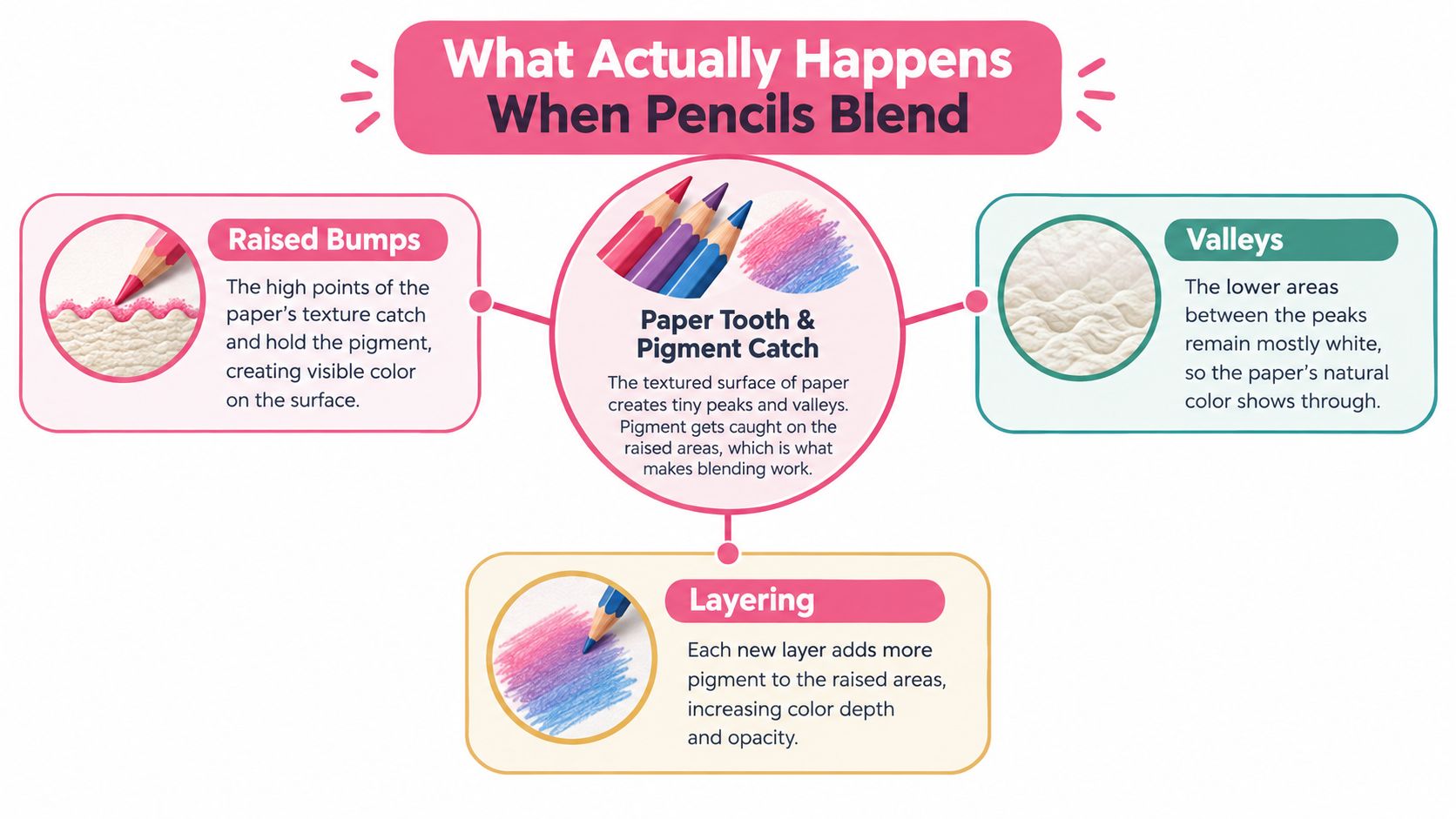
Colored pencil sits on a textured surface rather than a perfectly flat one. That texture is called the paper tooth. Raised areas catch pigment first, while tiny valleys remain partly white, especially when you use light pressure. Those unfilled valleys create the grainy appearance beginners often mistake for poor blending.
The pencil itself also matters. Pigment travels inside a wax or oil binder, and your technique changes how that binder behaves. Layering deposits more pigment gradually. Burnishing uses firm pressure to compress pigment and binder into the tooth. Solvent blending softens the binder and helps redistribute pigment across the surface. Educational guidance from the Nevada Museum of Art's colored-pencil techniques class treats blending as central to reducing the grainy look of colored-pencil work.
The role of pencil hardness
A harder pencil tends to leave a more visible stroke because its core doesn't fill the tooth as quickly. That can be useful for crisp edges, hair, fabric texture, or small details. A softer pencil fills the surface more readily, but it can also become difficult to control when you need a sharp line.
Paper changes the result just as much. A surface with more tooth accepts more layers but may need additional passes before it looks polished. A very smooth surface can produce delicate gradients, yet it gives you less room to build color without flattening the tooth.
Three ways to close the gaps
You can think of blending as choosing one of three levers:
- Add pigment gradually through overlapping layers.
- Compress pigment with a light-colored or colorless pencil.
- Soften the binder with a suitable solvent and move the pigment with a brush.
None of these methods is magic. They all work on the same physical problem, the uneven distribution of pigment across a textured surface. Once you understand that, the next techniques become practical choices rather than tricks to memorize.
Layering and Cross-Hatching for Smooth Gradients
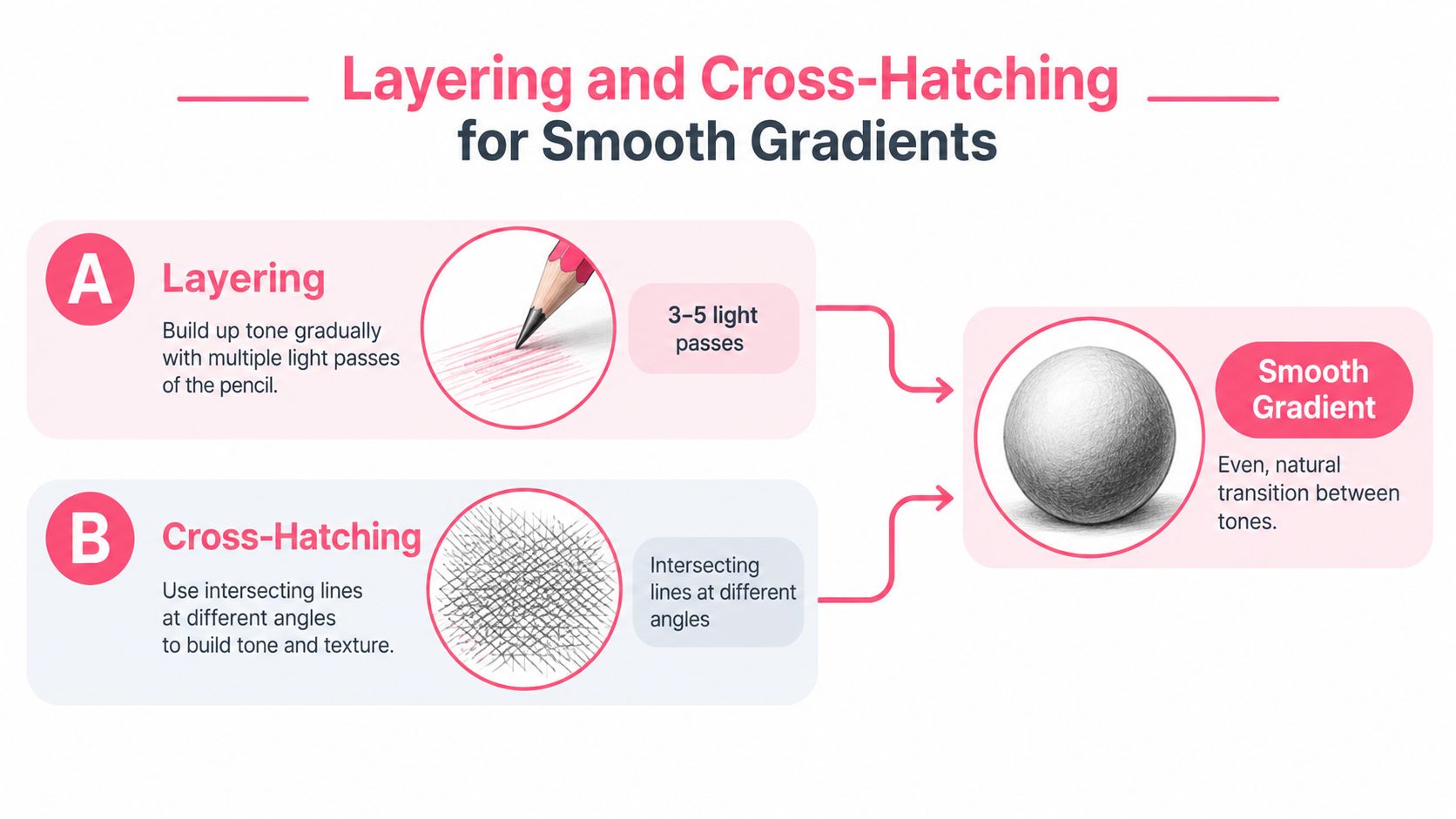
Layering is the foundation I'd teach before introducing any blender. Start with the lightest color and use a relaxed hand. Your first pass should look too pale. That's a good sign because the tooth remains open for additional pigment.
Build the passage with several light rounds instead of one forceful application. A useful working pattern is:
- Lay down the lightest hue across the full transition.
- Add the middle hue into the central area, overlapping the lighter zone.
- Place the darker hue at the shadow end.
- Repeat the sequence, increasing pressure only gradually.
- Use a final unifying color across the transition if the hues still look disconnected.
Keep your strokes consistent at first. Then rotate the direction for later layers. A diagonal pass followed by another pass crossing it helps pigment reach the tooth from different angles, reducing the impression of parallel pencil tracks.
Build the overlap, not the seam
Let each new color travel well into the neighboring area. The exact boundary shouldn't be a thin line. It should be a broad band where colors share space. Contemporary colored-pencil guidance often recommends several passes, beginning with light pressure and increasing it only after the surface has gained coverage. The Munkter Products blending workflow gives a practical sequence: map the transition, begin with the lightest tone, overlap the middle and dark tones into neighboring zones, rotate stroke direction, and wait to use the blender until the tooth is partly filled.
Cross-hatching works especially well when your first layer looks directional. Use a second angle to interrupt the rhythm of the first. You don't need to create a dense grid. The goal is to distribute pigment more evenly.
A small exercise with a useful payoff
Choose three neighboring colors, such as yellow, yellow-green, and green. Make one light pass with each color, allowing broad overlaps. Return with another pass at a changed angle, then use the middle color lightly across the full transition.
The result should feel less like three stripes and more like one surface changing color. That gradual buildup also resembles the way alcohol markers create smooth transitions through controlled overlapping applications, which makes it a helpful bridge for marker users. If you're planning a palette before you draw, try the ColorBestie palette generator to compare neighboring hues before committing them to paper.
Watch the technique in motion before practicing:
Burnishing and Solvent Blending Finish Passes
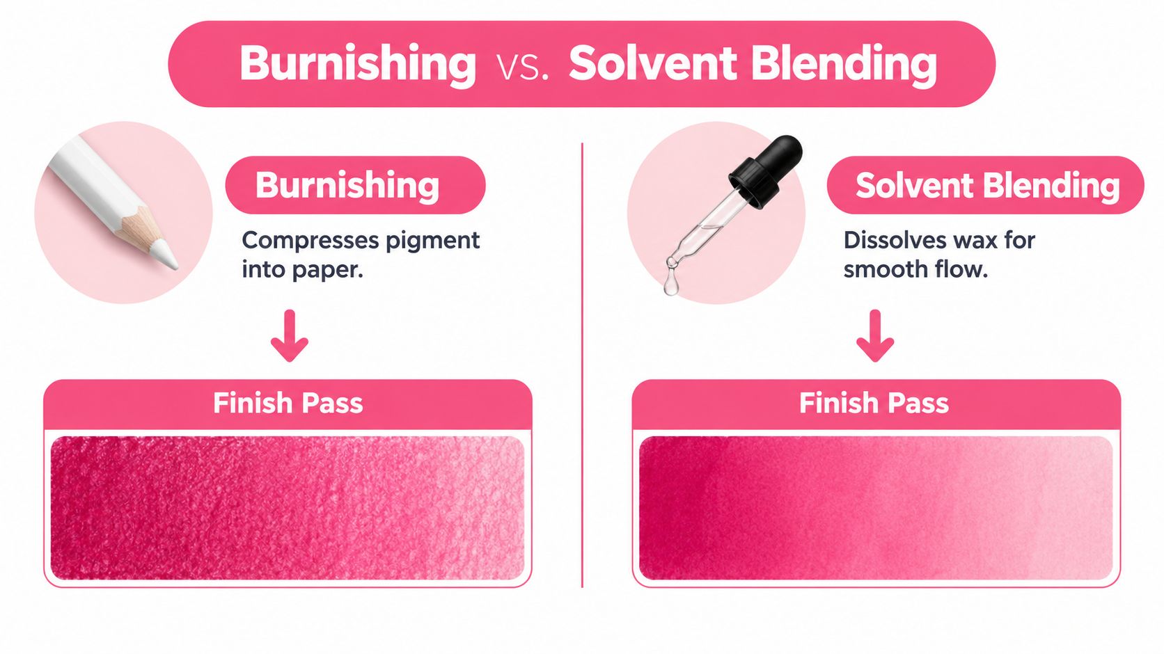
Burnishing and solvent blending work best as finish passes, not substitutes for thoughtful color placement. You'll get a smoother result when the transition already contains light, middle, and dark pigment.
Burnishing uses firm pressure with a colorless blender or a light-colored pencil. The pressure compresses pigment into the paper tooth and fills much of the remaining white speckle. As you work, the surface becomes smoother and may develop a noticeable sheen.
Use a controlled sequence:
- Check the coverage: Make sure the color structure is already correct.
- Choose the blender: A colorless pencil preserves the existing hues, while a light colored pencil can tint the passage.
- Work in short passes: Two controlled passes are easier to judge than one prolonged stroke.
- Stop when the tooth closes: A slick surface won't accept later layers easily.
Burnishing too early can flatten the surface before darker colors have enough grip. It can also make the paper feel overloaded, so save it for the end or close to the end.
When solvent is the better choice
Solvent blending changes the binder rather than relying on pressure alone. Artists commonly use rubbing alcohol or mineral spirits to dissolve enough binder for pigment to flow across the tooth. Apply a small amount with a soft brush, and work in a ventilated space while following the product's safety guidance.
This approach can be useful for broad skies, soft skin, and other areas where you want the pencil marks to settle into a more fluid surface. It may dry differently from burnishing, and you'll need to let the area settle before deciding whether more pencil is needed. Solvent can also disturb later layers if you apply it after delicate details, so plan the order before reaching for the brush.
For marker-oriented projects, solvent blending can create a softer base, while burnishing offers a more compressed, polished finish. Neither one automatically improves a weak gradient. Both reveal the importance of the layers underneath.
Surface warning: Wax-based pencils can develop wax bloom, a hazy film associated with heavy pressure and early burnishing. Use several light layers, wipe the finished surface gently with a soft cloth or tissue, and consider a suitable fixative when the artwork is complete, following the product instructions. The wax bloom guidance from Pencil Topics explains these preventive habits.
If you've made your swatch for comparison, photograph it before the surface changes. That gives you a clear record of the result and helps you judge whether the chosen finish suits your next drawing. For marker set planning, the ColorBestie Ohuhu and Décotime converter can help you compare compatible color names before you translate a digital palette into physical pencils or markers.
A Marker-Friendly Blend From Light to Dark
Alcohol-marker users usually think in connected bands rather than isolated pencil strokes. You can create that same visual logic with a combined pencil workflow.
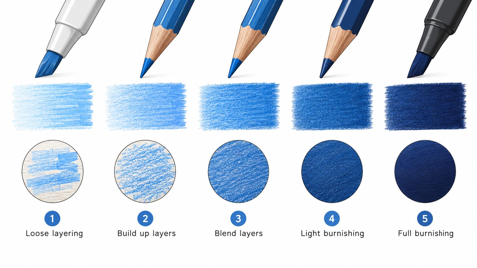
- Map the light end. Lay down the palest hue with loose diagonal strokes and almost no pressure. Extend it farther than you think you'll need.
- Place the middle hue. Work through the center band and overlap both neighboring areas. No color should end alone at a sharp edge.
- Deepen one terminus. Add the darkest hue at the shadow end with small circular strokes. Circles help distribute pigment without emphasizing one line direction.
- Compress the full band. Use a colorless blender across the transition with medium pressure, then make a very light final pass to even out the sheen.
- Spot-treat carefully. If a streak remains, use a tiny amount of odorless mineral spirits on a round brush, then allow the area to settle before judging it.
The important decision happens in step two. A middle hue isn't decoration. It gives the eye a route from light to dark and prevents the gradient from reading as stacked blocks.
Hold the finished swatch beside a real alcohol-marker swatch using similar colors. You're checking for one visual quality: does the passage read as a single soft plane, or can you still see separate bands? A digital palette can help you plan the relationship before you draw, while the ColorBestie marker comparison tool lets you inspect nearby marker options when you're matching a pencil study to an alcohol-marker set.
Troubleshooting Habits That Save Your Blends
Pressing harder feels productive, but early pressure can close the tooth before the middle and dark colors have space to settle. If the surface is already too slick, gently lift some pigment with a kneaded eraser and rebuild the light area with a lighter touch.
A missing overlap band creates another stubborn seam. Add a bridging mid-tone rather than forcing the two original colors together. A few angled cross-hatching strokes can also connect a gap without covering the entire passage again.
Paper can undermine your decisions. A surface that's too smooth may give pigment little grip, while a rough surface can make texture dominate the gradient. For a polished result, test a hot-press or mixed-media sheet, and save rougher paper for effects where visible texture is part of the design.
Before adding color, diagnose the streak. It may need pigment lifted, redistributed, or softened, not buried under another heavy layer.
ColorBestie helps you plan marker-friendly color schemes from a sketch, compare palettes with familiar Ohuhu, Copic, and Prismacolor-style options, and practice through short guided tips. Visit ColorBestie to turn your next coloring page or illustration into a calmer, more confident blending study.

