You've got a sketch you love. Maybe it started on paper, maybe it started on your phone, and now it's sitting there looking finished enough to protect but unfinished enough to haunt you until it gets onto canvas.
That moment stops a lot of people. The drawing feels clean, the canvas feels expensive, and one bad transfer seems like it could wreck the whole piece. It won't. Transferring paper to canvas is one of those studio skills that looks mysterious from the outside and becomes routine once you know where things usually go wrong.
The good news is that there isn't just one “right” method. There's a dependable line-transfer route for drawings, a more expressive gel method for prints and photos, and a smart hybrid workflow if your design lives digitally and needs to scale up without getting wobbly.
From Perfect Sketch to Final Masterpiece
A strong transfer doesn't flatten your creativity. It protects it.
Artists have always needed a reliable way to move a composition from one surface to another, especially when the final surface is larger, more textured, or less forgiving than paper. The fear usually comes from treating transfer like a shortcut. In practice, it's a bridge between design and painting. It keeps proportions steady so your energy goes into color, edges, and finish instead of redrawing the same contour three times.
That idea isn't new. The Getty Museum documents a historical transfer process called pouncing, used extensively from the 14th to 17th centuries and remaining dominant until the 18th century, where artists pricked outlines into paper and used powdered chalk or charcoal to create a dotted guide on canvas or panel through a perforated cartoon (Getty Museum documentation). If painters working at that level relied on transfer, you don't need to feel guilty about using it on your own canvas.
Transferring isn't cheating. It's studio planning.
The emotional shift matters. Once you stop expecting the transfer to be an artwork in itself, you can judge methods by what they need to do: hold proportion, stay visible, avoid smearing, and disappear under the final work when necessary.
That's especially useful if your drawing started as a polished visual concept and now needs to become a physical piece with clean structure, much like the consistency discussed in on-brand imagery and SEO. The medium changes. The visual intent shouldn't.
Setting Up for a Flawless Transfer
Most transfer problems begin before the first traced line. The canvas is too slick, too rough, or not dry enough. The paper shifts. The source image buckles. Then people blame the graphite.
Start with the surface. For a durable canvas that takes transfer lines cleanly, artists traditionally use 2–3 layers of acrylic primer, sanded between coats, and when attaching tracing paper, tape every 1 inch (2.5 cm) around the perimeter to prevent sagging (WetCanvas guidance). Those two habits solve a surprising amount of mess before it starts.
Prepare the canvas first
A transfer needs a surface with enough tooth to catch the line, but not so much texture that your tracing skips over the weave.
Use this checklist:
- Prime with intention: If you're prepping raw canvas or improving a cheap pre-primed one, add 2–3 layers of acrylic primer and sand lightly between coats for a more even drawing surface.
- Let the surface settle: Don't rush from wet prep to transfer. Even if the canvas feels dry to the touch, a tacky surface grabs stray pigment.
- Work flat when possible: An easel is fine for light tracing, but a table reduces movement and helps keep pressure consistent.
Prepare the source image like a template
Your paper drawing or print should behave like a pattern, not like a loose sheet you're wrestling into place.
A few small choices help:
- Use thin tracing paper for redraws: It lets you see the original clearly and keeps bulk down.
- Tape around the full edge: The 1-inch spacing rule matters because sagging creates gaps between the paper and canvas.
- Leave yourself registration points: A tiny hinge of tape at the top lets you lift and check the transfer without losing position.
Practical rule: If the paper can drift, it will drift. Secure it before you trace a single line.
If you're planning color right after transfer, it also helps to settle your palette before you begin. A quick pass through a marker palette generator can keep you from overworking line art while you're still deciding on color direction.
The Classic Graphite and Charcoal Methods
For most artists, this is the workhorse category. It's simple, cheap, and flexible enough for portraits, lettering, florals, comics, and full paintings. If you're transferring paper to canvas for the first time, start here.
DIY transfer paper
This method is exactly what it sounds like. You coat the back of your drawing or tracing with graphite or soft vine charcoal, place it on the canvas, and trace over the front so the pigment transfers underneath.
It's popular for a reason. It uses materials many artists already have, and it adapts well when you need to transfer only part of a drawing.
How it works in practice
- Draw or trace the final design onto thin paper.
- Cover the back with graphite or soft vine charcoal.
- Shake or wipe off excess loose dust.
- Tape the sheet securely to the canvas.
- Trace the lines with steady pressure using a stylus or pen.
A ballpoint pen works well as a stylus because it glides and leaves a visible track on the top sheet, so you can see what you've already traced. Charcoal gives a darker guide, which is helpful on toned or textured surfaces. Graphite is cleaner and easier to control.
Here's the trade-off in plain terms:
| Method | Best part | Common headache | Best for |
|---|---|---|---|
| Graphite | Cleaner lines | Can look faint | Detailed line work |
| Charcoal | Strong visibility | Smudges easily | Loose painting layouts |
| DIY carbon-style backing | Custom and cheap | Coverage can be uneven | One-off studio transfers |
Commercial graphite paper
If you want fewer variables, commercial graphite paper is the steadier option. According to artist trials summarized by Momilotta, the graphite transfer method has a success rate over 95%, and 80% of failed transfers come from insufficient taping that allows micro-shifts. The same source recommends a 5mm-wide mechanical pencil for tracing because it helps maintain more consistent pressure.
That lines up with studio experience. Most bad graphite transfers don't fail because the paper is poor. They fail because the source image creeps half a millimeter while you work, and suddenly the line looks fuzzy or doubled.
Use commercial graphite paper when:
- You need consistency: Good for clean illustration, architecture, manga line work, and repeatable motifs.
- You're working larger: Less setup than rubbing graphite across the whole back of a big sheet.
- You want less dust: Especially useful if your final painting has pale passages.
If the line looks broken, check the tape before you blame your hand pressure.
A quick note on pouncing
Before transfer paper, painters used a different kind of precision. The Getty Museum describes pouncing as a process where artists pricked holes along a paper design with a needle, then patted a sachet filled with powdered chalk or charcoal over the perforations to leave a dotted outline on the final surface. It was used across major works on wooden panels, metal plates, and canvas, and the method relied on a needle, a sachet, and blank sheets of paper rather than modern transfer materials.
That history is useful because it reminds you what transfer is really for. Not polished drawing. Placement. Accuracy. Repeatability.
If you keep that goal in mind, choosing between charcoal and graphite gets easier. Use the darkest line you can still control, and the cleanest line your painting can tolerate.
The Gel Medium Method for Photos and Prints
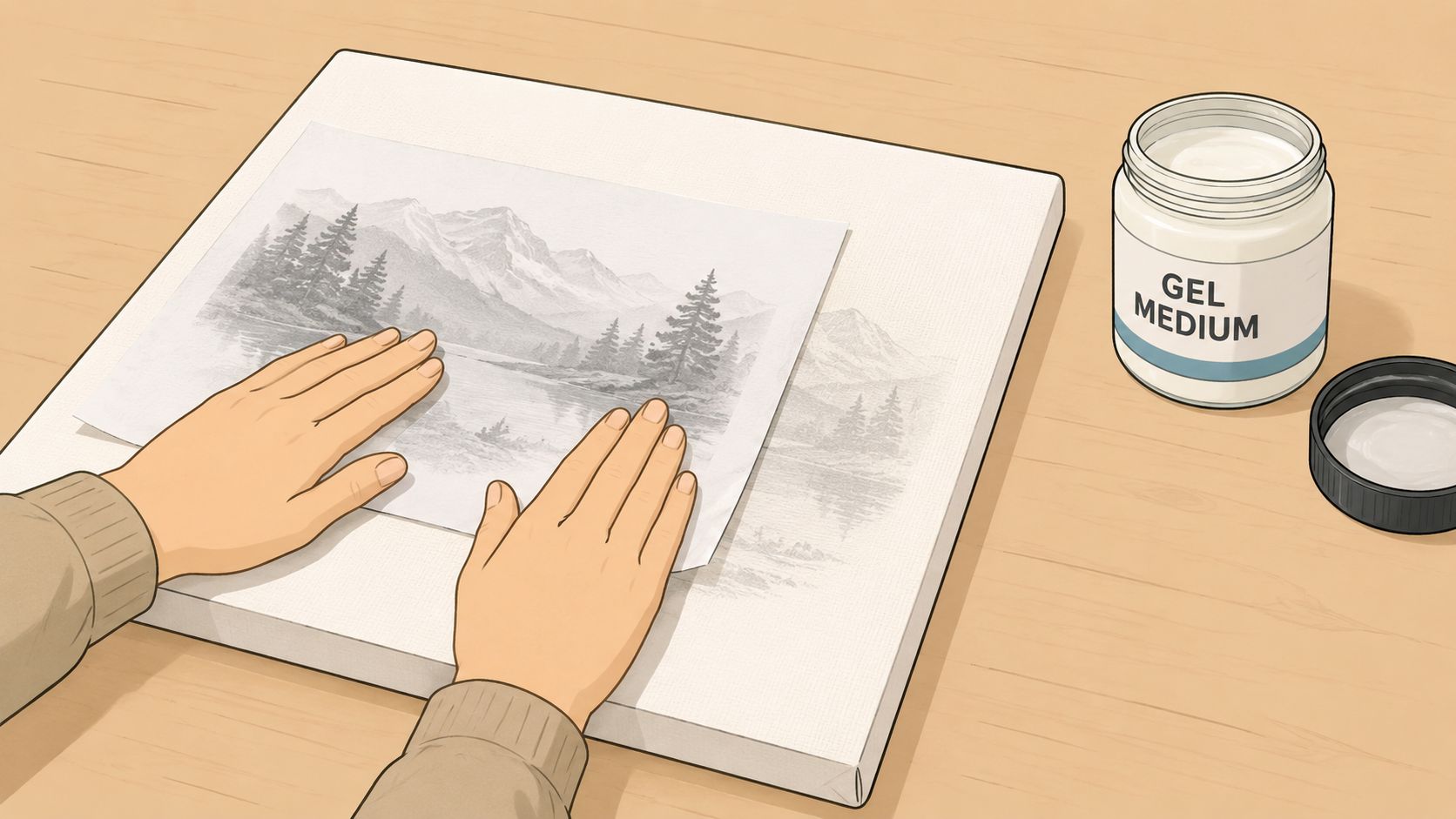
This method is less about line transfer and more about moving the image itself. If you want a distressed print, a vintage photo feel, or mixed-media texture, gel medium does something graphite never will.
When this method shines
Gel transfers are best when a little imperfection helps the piece. Portrait fragments, old signage, botanical references, collage-based painting, and layered journal-style work all benefit from the broken texture this method creates.
It is not the method I'd pick for crisp technical line art. The charm comes from partial wear, softened edges, and selective loss.
The process also has a real learning curve. The Instructables photo-to-canvas guide reports a 70% success rate for achieving a distressed look, with best results tied to plain copy paper, a 2–3 mm thick layer of gel medium, a 12-hour drying time, and 4–6 spray-peel cycles to remove paper without tearing the image.
The transfer sequence that works
The basic order matters more than fancy materials.
- Choose the right print: Plain copy paper is the reliable choice for this method.
- Apply an even coat: Aim for a 2–3 mm thick layer of gel medium on the canvas.
- Press the image down carefully: Face it the correct way for the result you want, then smooth it so the paper fully contacts the medium.
- Let it dry fully: The recommended 12-hour dry time is the part people most often cut short.
- Remove the paper slowly: Use repeated moisture and gentle rubbing instead of trying to peel the whole sheet off at once.
This kind of pacing is easier to understand when you can watch someone do it:
Where people usually lose the image
The most common mistake is impatience during paper removal. If you scrub aggressively, the transferred image comes off along with the paper fibers. If you don't use enough water, paper residue clings and turns the surface cloudy.
A few practical rules help:
- Mist, don't flood: Too much water at once can make the surface slippery and tempting to over-rub.
- Work in passes: The recommended 4–6 spray-peel cycles exist for a reason.
- Expect some texture: This method is supposed to retain a worn quality. Over-cleaning can ruin the transfer.
A gel transfer should look integrated into the canvas, not laminated onto it.
This is also the method where “perfect” can become the enemy of “good.” If your image survives intact but carries a little haze or patchiness, that's often the look people were chasing in the first place.
Pro Tips Scaling Designs and Preventing Smudges
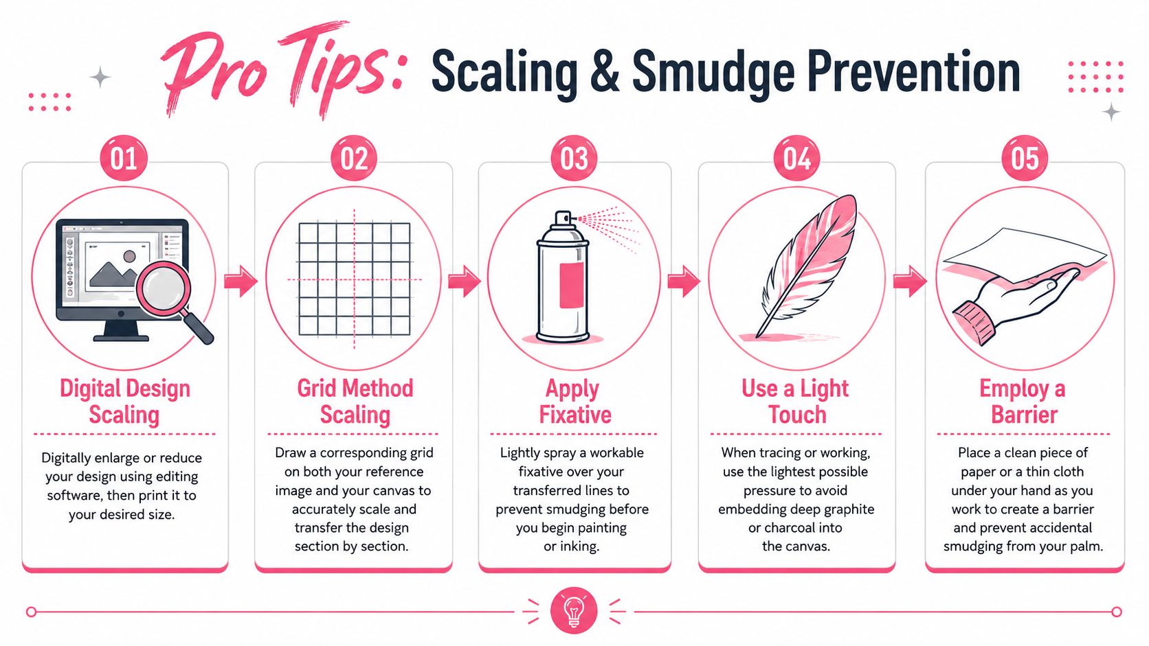
The hardest practical jump for many artists isn't tracing a small drawing. It's moving from a digital sketch on a screen to a much larger canvas without the linework going soft, stretched, or dirty.
That gets even trickier if the final piece will use markers, transparent acrylic layers, or pale passages where every leftover transfer mark wants to show through.
A better way to scale digital sketches
For digital work, the cleanest workflow is often a hybrid projection-transfer approach. Instead of forcing a scaled print to do all the work, project the digital design onto the canvas to establish placement and proportion, then use a very light graphite transfer only for the final contours you need to preserve.
That solves two problems at once. Projection handles scale. Light transfer handles precision.
This works especially well when a design began as a mobile sketch or a polished color concept and needs to stay crisp at a larger size. If you want to compare marker behavior before committing to a physical piece, a marker comparison tool can help you settle line weight and color choices before the transfer stage.
A simple decision guide:
- Use projection first when the composition is large, digital, or likely to distort when printed.
- Use transfer second for facial features, lettering, hands, or any edge you need to keep exact.
- Skip heavy full-sheet tracing when the projected design already gives you clean placement.
The cleanup step most tutorials skip
This is the part many artists learn the hard way. Transfer lines that look harmless at the drawing stage can come back later under paint.
According to the referenced YouTube source on transfer smudging, 40% of beginners report visible dark lines showing through dry paint, and the missing fix is a post-transfer solvent wipe with isopropyl alcohol, a step absent from 95% of YouTube guides. That matters most when your next layers are light-colored, transparent, or marker-based.
Less pressure during tracing helps only a little. If loose graphite or charcoal is still sitting on the surface, it can contaminate later layers anyway.
Use this sequence instead:
- Transfer the drawing lightly but clearly.
- Refine only the lines you need.
- Gently wipe excess pigment with isopropyl alcohol on a soft cloth or cotton pad.
- Let the surface dry completely.
- Start your paint or marker work on a cleaner ground.
Studio note: Don't protect every transfer line. Protect the useful ones and remove the rest.
This one habit makes light passages cleaner and keeps transparent layers from looking muddy later.
Troubleshooting Common Transfer Issues
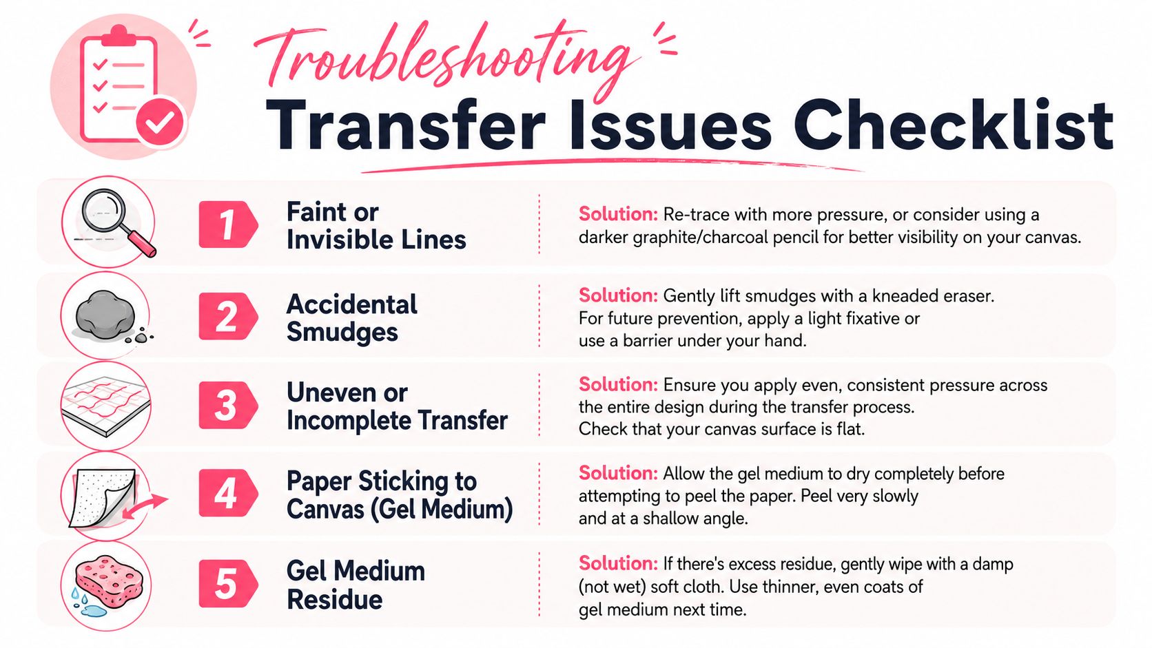
Even good setups produce the occasional ugly surprise. A line disappears. A corner shifts. Paper fuzz hangs on after a gel transfer. The fix is usually small.
Quick fixes that save the piece
- Lines are too faint: Lift one taped edge and check whether the issue is visibility or contact. If the transfer is too light, retrace the key areas with steadier pressure rather than doing the whole drawing over.
- The image shifted: Don't try to correct every doubled line. Pick the cleaner contour, erase or lift the stray mark, and resecure the sheet before continuing.
- You pressed too hard: A kneaded eraser can lift surface graphite without roughing up the canvas. For stubborn residue, reduce the line after transfer instead of trying to bury it later.
- Charcoal is smearing under your hand: Put a clean sheet of paper under your palm while you work. That small barrier prevents a lot of accidental drag.
- Gel transfer looks cloudy: Let the remaining paper dry, then dampen it again lightly and rub in another gentle pass. Rushing the cleanup usually makes the haze worse.
When to restart and when to keep going
Not every imperfect transfer needs rescue. A painting transfer is a guide, not the final artwork.
Restart only if the proportion is wrong in a way that will affect the whole piece, or if the transferred image is so dirty that it will interfere with pale or transparent passages. Keep going if the issue is minor, local, and easy to absorb into later drawing or paint handling.
Most artists get better at transferring paper to canvas by learning which flaws matter and which ones don't.
If you plan your colors digitally before you touch the canvas, ColorBestie is a helpful companion. It turns sketches into marker-style color previews, helps you compare marker families, and makes it easier to move from a small screen idea to a physical piece without guessing your palette the whole way through.