You've got the pencils, the sketchbook, maybe a set of Ohuhu or Copic markers waiting nearby, and still your drawing looks stiff once the outline is down. The shape is there, but the form isn't. Shadows look patchy. Texture feels accidental. Then color goes on top and suddenly every weak decision underneath becomes more obvious.
That's a normal place to be.
Strong drawing rarely starts with dramatic detail. It starts with a handful of repeatable pencil decisions. Line direction. Pressure. Spacing. Texture. The reason experienced artists make a sketch feel solid so quickly isn't magic. They know which marks create structure, which marks soften it, and which marks leave room for later layers.
Modern pencil practice is built on a long history. The artist's pencil took a major leap in 1795, when Nicolas-Jacques Conté combined powdered graphite with clay and fired the mixture, making hardness and darkness more controllable. That control is exactly why pencil remains such a useful planning tool today, especially when your final piece will move from graphite into alcohol marker.
These pencils drawing techniques will help you build depth, texture, and cleaner value structure first. Then, when you use a color-planning app or pick up your markers, you'll know where color should stay light, where it should deepen, and where the paper still needs to breathe.
1. Hatching and Cross-Hatching
You sketch a clean outline, then freeze for a second. The page still looks flat, and you know marker color will only look convincing if the form underneath already makes sense. Hatching solves that early problem. A set of parallel lines gives you a quick value structure. A second set crossing the first deepens the shadow and adds weight.
The main control is spacing. Lines placed close together read darker. Lines with more air between them stay lighter. Pressure still matters, but spacing does most of the work, which is good news for beginners because spacing is easier to correct than grooves pressed into the paper.
Use line direction to describe form
Line direction changes everything. On a mug, vertical hatching can make the surface feel stiff and flat. Slightly curved strokes that travel around the cylinder make it feel round, almost like wrapping ribbon around a cup. The lines are doing two jobs at once. They build value, and they explain the surface.
Start with an HB or 2B pencil and keep the first layer quiet. You want a value map, not a final statement. In mixed-media work, that light planning matters because alcohol markers darken areas fast. If the graphite underneath already shows where the form turns away from the light, your marker passes become simpler and more accurate.
A useful beginner rule is this:
If your hatching looks messy, lower your pressure and slow your spacing.
Many students try to fix uneven shading by pressing harder. That usually creates shiny graphite spots and scratchy lines. A better fix is to shorten the stroke, keep the angle consistent, and lay one pass at a time.
Here are three practical ways to use it:
- Comic line art: Place hatching under the jaw, inside hair masses, and beneath folds before adding marker skin tones or fabric color.
- Architecture studies: Keep one line direction for broad planes, then add cross-hatching only in recessed areas so windows, columns, and archways separate clearly.
- Character design: Curve your strokes around sleeves, boots, armor, or capes so later marker shading follows the same structure instead of fighting it.
If you plan colors digitally before working on paper, a quick test in the ColorBestie color planning app helps you see which hatched areas should stay open for light marker layers and which ones can carry stronger shadow colors.
Hatching works like scaffolding on a building site. The viewer may not focus on every line once color is added, but those lines hold the structure in place. That is why this technique belongs at the beginning of a digital-to-physical workflow, especially if your final goal is clean, confident marker rendering.
2. Stippling (Dotting)
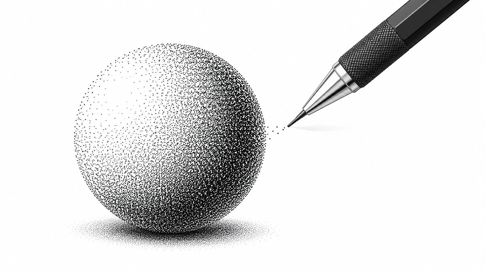
Stippling replaces lines with dots, and that one shift changes the mood of a drawing immediately. Lines suggest motion and direction. Dots feel quieter, more controlled, and often more detailed. If you've ever admired a portrait or nature illustration that looked delicate but still had strong value, stippling was probably doing a lot of the work.
The key is density. More dots create darker value. Wider spacing creates light. According to Plaid's pencil technique guide, harder leads make lighter, thinner dots in stippling, while softer leads like 6B suit more expressive hatching. That's useful because it tells you not to treat every pencil the same. Your pencil choice changes the texture before your hand even starts.
Control value with spacing, not pressure
A mechanical pencil is handy here because the point stays consistent. That's helpful for portrait pores, animal fur transitions, or fantasy costume textures where uneven dot size can distract. Still, perfectly identical dots can look sterile, so let some variation happen naturally.
Use stippling when you want marker color to sit over texture rather than replace it. For example, a mushroom cap, reptile skin, freckles, stone walls, or weathered leather all benefit from this kind of underdrawing. Once marker goes over it, the dots still whisper through the color and create character.
Work in passes. Place a light field of dots first, then return to darken only the areas that truly need it.
A practical mixed-media routine works well:
- First pass: Mark the light and shadow pattern with sparse dots.
- Second pass: Increase dot density only in the shadow core and cast shadow.
- Marker stage: Float transparent color over the texture instead of trying to bury it.
- Final check: Add a few darker graphite dots only after the marker is dry if a focal area needs extra crispness.
If you like planning color before committing to that amount of detail, previewing likely combinations in a marker-friendly app can save you from overworking areas that should stay visually quiet.
3. Blending and Smudging
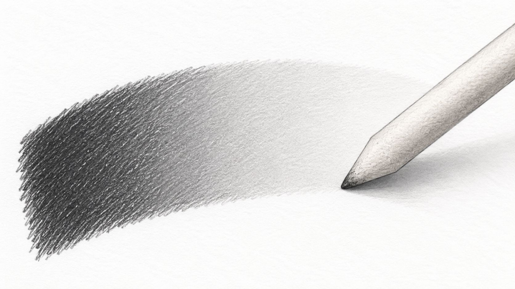
Blending gives you softness fast. A stump, tissue, or even a folded scrap of paper can merge graphite into a smoother gradient, which makes it useful for portraits, cloudy skies, still life shadows, and any drawing that needs atmosphere rather than visible line texture.
That softness can also become a trap. When everything is blended, everything starts to look equally important. You lose edge variety, and marker color placed on top can feel muddy if the value structure underneath isn't clear enough.
Keep the softness intentional
Start with soft pencils, usually in the 4B to 8B range, and lay down graphite lightly before blending. Circular motions help keep the transition even. Clean tools matter more than people expect. A dirty stump drags dark graphite into highlights and ruins the clean airiness you were trying to create.
For mixed-media work, think of blending as a value rehearsal. You're deciding where forms turn gently before choosing marker colors that match that mood. A softly blended cheek plane calls for smoother marker transitions than a sharply hatched jawline.
A few practical uses:
- Portrait studies: Blend broad planes of the forehead and neck, but keep the nostrils, eyelids, and lips sharper.
- Scenery underpainting: Smudge distant hills and skies so they recede before adding marker color to foreground trees or buildings.
- Character concept art: Establish a clean light source with graphite first, then choose marker values that respect it.
Soft blending works best when it contrasts with something firm nearby. Save some crisp edges.
If you're deciding between marker sets before adding color over a blended drawing, the ColorBestie marker comparison tool can help you think through which marker families fit the softness or saturation you want.
4. Layering and Building Values
Layering is the calm, disciplined side of drawing. Instead of trying to hit the final dark immediately, you build tone a little at a time. Light pass, another pass, then another. This is how many polished drawings stay clean while still reaching rich shadows.
It also mirrors how many artists work with alcohol markers. You don't usually get the best result by flooding an area all at once. You build. Pencil layering teaches that patience before color ever enters the picture.
Know when to stop before the paper closes up
Many beginners find this challenging. They hear “add more layers” and assume more is always better. It isn't. Independent colored-pencil guidance points out that visible paper holes are common, but the fixes all have trade-offs. More layering can help, solvent blending must be used carefully, and burnishing can make later layers difficult because it compresses the surface too much, as explained in Carrie L. Lewis's discussion of paper holes showing through colored pencil.
That idea applies to graphite too. If the paper tooth is nearly full, another heavy layer won't improve the drawing much. It may just make the surface slick and less responsive.
A steady approach works well:
- Start light: Use 2H or H for the palest structure and broad value map.
- Middle pass: Move to HB for general midtones.
- Dark accents: Bring in 2B only where shadows need weight.
- Protect highlights: Leave the paper white where possible instead of trying to erase back to it later.
For marker-based artwork, this method helps you pre-sort your color zones. A light graphite map can correspond to pale marker passages, while darker graphite notes warn you where saturation or shadow will need to increase. If you want to choose a palette before the first layer goes down, ColorBestie's palette generator is useful for matching your value plan to likely marker colors.
5. Scumbling
Scumbling is loose, irregular, and very useful when a drawing looks too polished too early. Instead of neat parallel lines, you build tone with small, broken, wandering strokes. The surface stays lively because the marks don't disappear into a perfect finish.
This makes scumbling great for natural subjects. Bark, grass, stone, hair masses, old walls, clouds, and rough clothing all benefit from this broken texture. It's also one of the easiest pencils drawing techniques to make expressive without losing control.
Use broken texture on purpose
The trick is to keep your hand relaxed. If you tighten up and try to make every stroke look “good,” scumbling turns into awkward scribbling. The marks should overlap, shift direction, and vary in pressure without becoming chaotic.
For marker work, scumbling helps in areas where smooth color alone would feel flat. Think of a grassy hill in an outdoor sketch. If you lay down a scumbled graphite base first, then pass green marker over it, the resulting color often feels more organic than a perfectly smooth underdrawing.
Good fits for scumbling include:
- Urban sketching: Sidewalk grime, old brick, weathered concrete.
- Figure studies: Hair masses, knit fabric, textured shadows.
- Nature work: Tree trunks, foliage clusters, dry earth, feathers.
Broken marks often look more believable than polished ones in natural textures.
You can also use scumbling as a planning tool. If a future marker area should feel energetic, leave the graphite texture visible. If the area should feel sleek, keep the scumbling lighter and more selective. That contrast gives the finished piece variety without requiring dozens of separate techniques.
6. Burnishing
Burnishing is where pressure becomes the main event. Instead of gently layering more texture, you press hard enough to compress the pigment into the paper surface and create a smoother, more polished area. In colored pencil work, artists often use this for saturated passages and glossy finishes. In graphite-based planning, the same principle can help you understand where a surface should feel denser and more sealed.
Used well, burnishing creates focus. Used everywhere, it chokes the drawing.
Save compression for the final moments
This technique is best treated as selective, not universal. Practitioner advice on colored-pencil decision-making makes an important point. Burnishing can lock pigment into the tooth, but that also reduces layering options later. Solvent blending, layering, and burnishing each suit different goals and papers, as discussed in Lachri's guidance on common colored-pencil mistakes. That's a useful reminder for graphite artists too. Surface decisions have consequences.
Try burnishing only in small areas such as:
- A polished eye highlight surround
- Metal jewelry reflections
- A glossy berry or ceramic pot
- A focal lock of dark hair
Use a blunt pencil, a smooth eraser, or another smooth tool with care. Test on scrap paper first, especially if you plan to bring alcohol marker over or around the area later. A compressed patch can behave differently than untouched paper.
A smart mixed-media approach is to leave most of the drawing open and breathable, then reserve burnished passages for spots where you want marker color to feel especially dense or intentionally contrasted against rougher texture. That difference can make a focal point pop without adding more detail everywhere else.
7. Dry Brush and Texture Techniques
Dry brush in pencil terms means working with a point that skips. The graphite catches the tops of the paper texture and leaves broken marks with little gaps of white showing through. Those gaps are the point. They create movement and energy that a fully blended drawing can't give you.
This is a strong choice for sketchbook work, comic art, travel drawing, and any piece that should keep some of its rawness after color is added.
Let the paper participate
A lightly sharpened or slightly blunt pencil works well here. Drag it sideways or with a quick hand motion so it doesn't settle into every tooth of the page. The result can suggest rough wood, loose hair, dry grass, old plaster, or the edge quality of a fast-moving gesture drawing.
This technique pairs beautifully with alcohol markers because the contrast is built in. Markers create relatively smooth color fields. Dry pencil texture creates interruptions. Put them together and the drawing feels layered rather than mechanically finished.
A few examples:
- Manga and comics: Leave sketch energy in hair, coats, smoke, or rubble while using markers for cleaner skin and fabric fills.
- Travel journals: Suggest brick, foliage, or street shadows quickly without over-rendering.
- Contemporary illustration: Keep construction lines and texture alive so the final art still feels hand-drawn.
Sometimes the best move is not to “fix” the gaps. Let white paper sparkle through. When you later test color themes, that visible paper can serve as built-in highlight structure and keep marker passages from becoming too heavy.
8. Directional Shading with Contour Lines
Directional shading with contour lines is one of the clearest bridges between drawing and believable form. Instead of placing strokes in a neutral pattern, you bend them around the object. The stroke itself tells the viewer whether a form bulges, turns inward, or recedes.
This is especially useful for faces, figures, muscles, animals, and rounded objects where volume matters more than surface detail.
Make every stroke follow the surface
If you shade an arm with straight lines, it may still look shaded, but it won't feel cylindrical. Curve those lines around the arm, and the structure becomes clearer immediately. This is why contour hatching is so valuable. Instructional guidance on pencil marks emphasizes that cross-hatching, contour hatching, stippling, and scribbling aren't just style choices. They are controlled systems where spacing, orientation, and pressure determine value and texture.
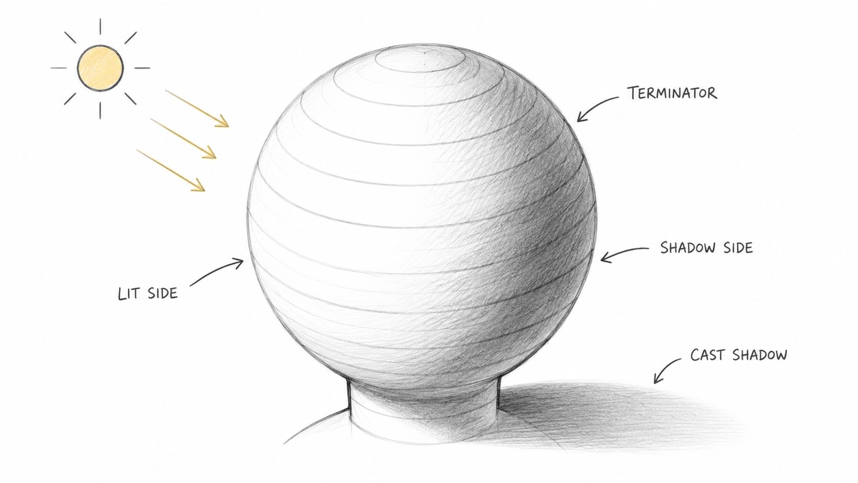
Start simple. Use spheres, cylinders, and boxes before trying portraits. When you understand how the lines wrap a sphere, you can use the same thinking for cheeks, shoulders, knees, and animal rib cages.
A reliable process looks like this:
- Locate the light source: Decide where light hits first and where the form turns away.
- Follow the turn: Curve strokes across the surface instead of filling space randomly.
- Deepen the shadow side: Increase density gradually as the form moves from light to dark.
- Match marker flow later: Let your marker strokes support the same directional movement.
This short demo helps if you want to study the basic light pattern on a sphere before applying the idea to characters or portraits.
When you use contour-driven graphite under marker, your coloring decisions get easier. Skin tones, fabric folds, and creature anatomy all have a built-in path to follow. Instead of asking where to place color, you're mostly deciding how strongly to reinforce what the drawing already says.
Comparison of 8 Pencil Drawing Techniques
| Technique | 🔄 Implementation Complexity | ⚡ Speed / Efficiency | Resources Required | ⭐📊 Expected Outcomes / Impact | 💡 Ideal Use Cases / Key Advantages |
|---|---|---|---|---|---|
| Hatching and Cross-Hatching | Moderate, requires line control and direction | Moderate, efficient for small areas, slow for large fields | HB–2B pencils, eraser; steady hand | Clear tonal maps and directional flow that guide marker placement | Planning marker values; precise shading that remains visible under color |
| Stippling (Dotting) | High, very repetitive, requires patience | Very slow, time‑intensive for coverage | Mechanical pencils (0.5–0.7mm), good lighting | Distinctive textured tonality; can be subtle under markers | Fine detail, portraits, botanical work; produces organic texture and forgiving mistakes |
| Blending and Smudging | Moderate, technique with tools to master | Moderate, faster than dotting, slower than sketchy methods | Blending stumps/tissues/soft pencils (4B–8B) | Smooth gradients and atmospheric base; polished look for markers | Portraits, landscapes; great for soft transitions and planning lighting |
| Layering and Building Values | Moderate–High, disciplined, multi-pass process | Slow, requires multiple light passes | Range of pencils (2H → 2B), eraser, time | Highly controllable, clean foundation that preserves highlights | Professional illustration and high-detail work; precise value control for marker intensity |
| Scumbling | Low–Moderate, loose, random strokes | Fast, quicker texture building than precise methods | Standard pencils, light pressure | Broken, painterly texture that enhances color depth | Landscapes, loose studies; adds spontaneous texture under markers |
| Burnishing | High, advanced, strong pressure and control needed | Slow and physically demanding for small areas | Burnishing tool/spoon/eraser, smooth paper, firm hand | Glossy, highly saturated focal areas that intensify marker color | Focal highlights in portraits, jewelry, high-end illustration; creates striking depth |
| Dry Brush / Texture Techniques | Low, confident, gestural approach | Fast, quick, energetic marks | Lightly sharpened or blunt pencils | Sketchy, dynamic marks that remain visible beneath markers | Urban sketching, comics, contemporary illustration; preserves sketch energy |
| Directional Shading with Contour Lines | High, needs anatomy/form understanding | Slow, careful, form‑following strokes | Multiple pencils, anatomy study, time | Strong three‑dimensional form and unified value flow | Portraits, figure work, realistic character design; guides accurate marker placement |
Putting Your Pencils into Practice
You finish a pencil sketch, open your marker case, and then pause. Which areas should stay light? Where should the darkest color go? Which texture will still read once the ink goes down? Good pencil work answers those questions before the first marker touches the page.
That is why practice works best when it connects drawing to your next medium. A pencil underdrawing is not just a rough start. It is the plan. It sets value, texture, edge control, and form, all of which shape how alcohol markers will behave on top. If you sketch digitally first and then move to paper, the same idea applies. Your pencil techniques become the bridge between the screen and the finished traditional piece.
You also do not need all eight techniques at once. Start with one technique and one purpose. Treat it like learning kitchen skills. You do not master every method before cooking a good meal. You learn what chopping does, what simmering does, and when each one helps. Pencil practice works the same way.
Try pairings like these:
- Hatching for comic-style shadows and clear direction before adding bold marker tones
- Stippling for skin, stone, or worn surfaces where texture needs to stay visible under color
- Blending for soft transitions in faces, clouds, or rounded objects
- Layering for controlled values that make marker placement easier
- Scumbling for broken texture in foliage, fabric, or loose studies
- Burnishing for polished focal areas you want to feel dense and finished
- Dry brush texture for energetic sketch lines that still show through transparent marker
- Contour shading for forms that need volume, such as cheeks, arms, folds, or character designs
Keep the practice small so you can see what each method does.
- Draw one sphere with hatching only, then add marker over half of it and compare the result.
- Draw one leaf with scumbling and dry texture, then test how much of that texture survives the color.
- Draw one eye or nose with blended shading, focusing on soft value shifts.
- Draw one character bust with contour lines, then color in the same direction as the form.
Small studies teach faster than ambitious finished pieces.
If you use an app like ColorBestie, this practice becomes even more useful. You can sketch your value structure first, test marker-style color ideas from that sketch, and then return to paper with a clearer plan. That saves guesswork. It also helps you notice an important mixed-media lesson: clean pencil decisions usually lead to cleaner marker decisions.
Pay attention to three things each time you practice. First, ask whether the drawing reads clearly in graphite alone. Second, check whether your highlights are still protected before color begins. Third, notice whether the texture you built with pencil helps the marker or fights it. Students often rush to color because color feels like the exciting part. In reality, the pencil stage is where many strong marker pieces are won.
The goal is confidence, not perfection. Each pencil technique gives you a different kind of control. Once you know what hatching, blending, stippling, or contour shading changes, you can choose your method on purpose instead of guessing. That makes the jump from digital planning to physical coloring feel much more direct and much less stressful.
