You finish a page with your favorite alcohol markers, lean back, and feel that small disappointment right away. The skin looks neatly blended. The hair has nice streaks. The outfit colors are pretty on their own. But the whole piece still feels flat, like every object is sitting on the same layer of paper.
That usually isn't a marker problem. It's a light problem.
A lot of hobbyists spend years choosing better palettes, buying smoother paper, and comparing Copic and Ohuhu swatches, when the missing ingredient is simpler than that. If you want depth, mood, focus, and that satisfying sense that a face is turning toward a window or a jacket is glowing in sunset light, you need to understand how light changes color.
Why Your Colors Look Flat and How Light Fixes It
Most flat-looking marker art has the same hidden issue. The artist colors the object, but not the light falling on the object.
Think about a red hoodie. If you fill it with a nice mid red, add a darker red in the folds, and stop there, you've described the fabric. You haven't described the situation. Is the person standing under a warm desk lamp? Outside on a cloudy day? Near a neon sign? Those choices change what that red should do.
That's why two artists can use similar markers and get very different results. One is coloring the local color. The other is coloring the light story.
Flat color says what something is. Light says where it is, what time it is, and how it feels.
This idea isn't just an art-school abstraction. The scientific understanding of light and color traces back to Isaac Newton's 1704 Opticks, where he showed with prisms that white light contains the seven visible colors remembered as ROYGBIV, and by bending that spectrum into a circle he helped create the first color wheel that still informs modern additive color thinking in digital art and lighting design, as described by the Smithsonian Library exhibition on color and light.
For marker artists, that matters in a very practical way. Your page doesn't come alive when you add more colors. It comes alive when your colors behave as if a believable light source is affecting all of them together.
A face under sunset light shouldn't have only orange highlights. The skin, hair, lips, shirt, and even the whites of the eyes should all shift in the same general direction. Once you start seeing that, your art gets deeper fast.
Understanding How Light Shapes Color
Marker artists often hear three words over and over: hue, value, and saturation. They can sound technical, but they're easy to understand once you connect them to what your markers do on paper.
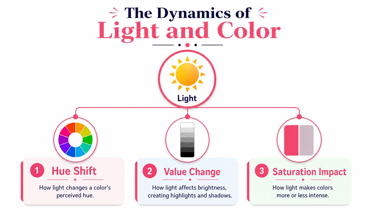
Three parts of color you can actually use
Hue is the base color name. Red, blue, green, peach, lavender. If you're choosing between a coral marker and a rose marker, you're making a hue decision.
Value is how light or dark that color appears. This is the part most marker artists already practice because alcohol markers naturally encourage layering from light to dark. Value works like a dimmer switch in a room. Same lamp, different brightness.
Saturation is the intensity or purity of the color. A highly saturated blue feels clean and vivid. A low-saturation blue feels grayer, quieter, and softer. In marker work, saturation often changes when you blend, glaze with a neutral, or place a strong color next to a soft one.
Albert Henry Munsell turned this into a clear three-part system in the early twentieth century: hue, value, and chroma. That model remains important because it mirrors how people perceive color under changing light, as explained in this history of color theory and Munsell's system.
Why marker artists need all three
A lot of hobbyists rely almost entirely on hue. They ask, “What marker matches this shirt?” That's useful, but it's only the first step.
To create convincing light, ask three better questions:
- Hue question: Has the light pushed this color warmer, cooler, or slightly sideways?
- Value question: Is this plane facing the light or turning away from it?
- Saturation question: Is this area glowing, fading, or getting muted by shadow?
Here's a simple apple example.
- In direct sunlight, the apple may keep a recognizable red hue, gain stronger value contrast, and look more saturated where the light is strongest.
- In indoor evening light, the red may lean warmer, the shadows may soften, and the whole apple may look less crisp.
- In deep shadow, it may still be “red,” but what your eye really notices is that the value drops and the saturation may change.
Practical rule: If a drawing feels wrong and you can't tell why, check value before hue and saturation. Most lighting mistakes start there.
Marker brands make this easier to test than you might think. Pull three reds from your set, one light, one middle, one dark. Then add two “temperature helpers,” maybe a warm yellow-orange and a cool violet-gray. Suddenly you're not just coloring an apple. You're controlling how that apple lives inside a specific light.
That's the heart of lighting color theory. Color isn't fixed. Light keeps reshaping it.
Translating Light Temperature into Color
Color temperature sounds scientific, but artists already understand it instinctively. You know the orange glow of a lamp at night. You know the bluish feel of overcast daylight. Color temperature gives language to that shift.
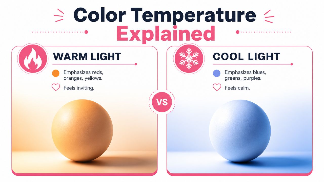
Warm light and cool light in plain language
In lighting design, Correlated Color Temperature is measured in kelvins. Common guidance places 2700 to 3000 K in the warm range, while 5000 K or higher reads as cool, according to this explanation of CCT, CRI, and how lighting changes perceived color.
You don't need to memorize kelvins to use them well. Just connect them to real experiences.
- Warm light feels like sunset, candlelight, cozy lamps, golden hallways.
- Cool light feels like cloudy daylight, winter morning light, some phone screens, moonlit scenes.
A beginner mistake is treating temperature as a highlight color only. They add yellow on the lit side and blue in the shadows. Sometimes that works, but real lighting affects the whole scene.
If a portrait is lit by warm evening sun, skin won't be the only thing that shifts. Browns can lean amber. White clothing can pick up cream or peach. Gray objects may no longer look neutral at all.
How temperature shifts your marker choices
Think about the same red apple in two places.
Under warm indoor light, the red can drift toward orange or brick. The shadow edge may still be dark, but it usually won't feel icy. Under cool outdoor light, that same red may appear less golden and can lean slightly toward berry or muted crimson.
Marker selection gets smarter. Instead of grabbing “the right red,” choose a small family:
- a base red for the object,
- a warmer helper for lit areas,
- a cooler helper for shadow transitions,
- a neutral or gray to control saturation.
If you like planning digitally before committing ink, a palette generator for lighting-based color themes can help you preview a warm or cool direction before you translate it into your Copic or Ohuhu picks.
A second point artists often miss is that white light isn't a single fixed thing. In real lighting systems, “white” can lean pale yellow or pale blue depending on the source, and LED-based setups often create color by balancing emitters rather than relying on one simple white beam. That practical overview shows up clearly in this stage-lighting primer on color, white light, and LED behavior.
That's useful for marker work because your reference photo, desk lamp, and phone screen may all be nudging your choices differently. If your colors look odd, the issue may not be your marker skill at all. It may be that you're matching a warm reference under a cool lamp, or the reverse.
Popular Lighting Setups and Their Effects
Once you understand hue, value, saturation, and temperature, the next step is thinking like a scene planner. What job is each light doing?
What each light is doing
Ambient light is the general fill light in a scene. It softens contrast and keeps shadows from turning into empty holes. In marker work, ambient light usually means your shadow areas still need color information. They're darker, not dead.
Direct light is the main actor. This is your sunbeam, desk lamp, window light, or spotlight. It creates the strongest highlights and the clearest shift in value. If you want form to read fast, direct light does the heavy lifting.
Rim light comes from behind or from the far edge of the subject. It creates that bright border on hair, shoulders, or cheeks that separates a figure from the background. Marker artists often overuse it, but when it fits the scene, it adds drama quickly.
Colored light pushes the scene into a more stylized mood. Neon signs, stage lights, fantasy magic, aquarium glow, nightclub reflections. With these applications, people get muddy mixes if they're not careful.
In additive light systems such as RGB, red, green, and blue light combine to create white, and overlapping colored lights can wash toward a desaturated white or gray instead of staying clean and distinct, as described in this stage-lighting discussion of RGB additive mixing. That's why a scene with too many colored light ideas can feel confused.
When two strong light colors overlap, don't assume the overlap should look richer. It may actually look duller.
Quick reference for planning a scene
| Lighting Type | Artistic Purpose | Effect on Color Selection |
|---|---|---|
| Ambient Light | Keeps the whole scene readable | Use softer transitions, gentler shadows, fewer extreme darks |
| Direct Light | Defines form and focus | Push value contrast, add clearer warm or cool influence |
| Rim Light | Separates subject from background | Reserve your brightest, cleanest edge color for a narrow border |
| Colored Light | Creates mood or stylization | Limit your palette so mixed areas don't turn chalky or muddy |
A good way to think about lighting setups is to assign roles.
- One light leads: This is the color story the viewer notices first.
- One light supports: This helps shape shadows or background atmosphere.
- One effect accents: Rim glow, reflected color, or a small hit of stylized color.
If everything glows, nothing stands out. Marker pages usually look stronger when one lighting idea stays clearly in charge.
Applying Lighting Theory with Alcohol Markers
Lighting color theory becomes useful when it changes what you do with the markers already on your desk. At this point, hobbyists usually make the leap from “nice coloring” to “convincing scene.”
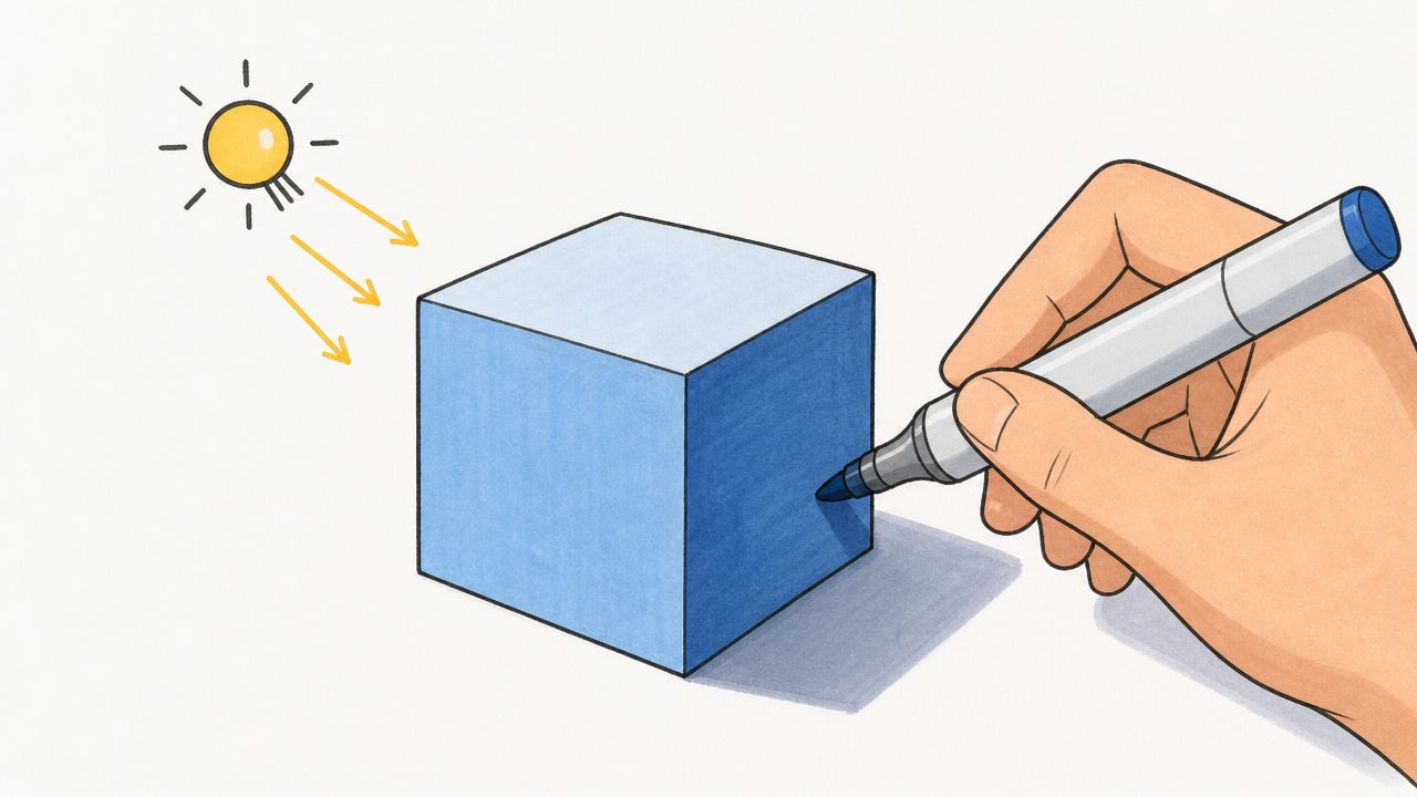
Start with a value map
Before you choose your prettiest colors, decide where the light is coming from. A quick pencil note or tiny grayscale thumbnail is enough.
Mark three zones:
- Light side: planes facing the light source
- Middle zone: turning forms and softer transitions
- Shadow side: areas facing away, cast shadows, deep folds
Confidence is rewarded when using alcohol markers. If you wait until halfway through to decide where the lamp is, you'll keep correcting with darker layers and lose freshness.
For practice, use simple forms first. A cube, a cylinder, a sphere, then a face. A blue cube teaches more about lighting than an ambitious full illustration with uncertain shadows.
Use layering to change temperature, not just darkness
Many marker artists layer only to deepen value. That's useful, but light looks more believable when layering also changes temperature.
On a warm-light portrait, you might start with a base skin tone, then glaze a warm yellow, peach, or soft orange on planes facing the light. In the shadow areas, instead of only adding a darker skin color, you could introduce a muted lavender, cool gray, or blue-violet depending on your style.
That creates temperature contrast, which is one of the quickest ways to add life.
A key lighting principle for depth is that color affects spatial perception. Warmer, less saturated colors often recede, while cooler, more saturated colors can appear to come forward. For marker artists, that means backgrounds can be pushed back with warmer, grayer tones while a foreground focal area pops with cooler, cleaner color, as discussed in this video lesson on color dominance and spatial perception.
Try this with common brands:
- For Copic users: pair a warm family with a cooler shadow helper rather than staying inside one tidy color group.
- For Ohuhu users: compare broad brush-compatible sets and pull one accent marker that changes temperature, not only value.
- For either brand: test on scrap paper first because paper coating changes how a cool glaze settles over a warm base.
If you want to compare close marker options across sets before buying or swatching, a marker comparison tool for brands like Copic and Ohuhu can help you narrow down near matches.
Build a palette for the light, not just the object
This is the shift that saves ink. Don't begin with “What colors are in this character?” Begin with “What light is hitting this character?”
A useful marker palette often includes:
- Local colors for the object itself. Skin, hair, clothing, flowers, wood.
- Light colors that reflect the source. Warm yellows for sunset, cool blue-grays for cloudy daylight.
- Shadow colors that create contrast without turning everything muddy.
- Control colors such as a neutral blender, warm gray, or cool gray to soften transitions.
Here's a practical example. Suppose you're coloring a cozy café scene.
- The table might be brown, but under warm lighting you'd favor honey, caramel, and amber pushes.
- The cup might be white, but it won't stay pure white. It may pick up cream on the lit side and a soft mauve-gray in shadow.
- The background wall can be quieter and less saturated so the figure remains the focus.
A short demo can make this feel more concrete:
When your palette is built around lighting first, blending gets easier. The colors already agree with one another before they ever touch the paper.
Your First Lighted Scene A Sunset Portrait
A sunset portrait is a strong first exercise because the lighting idea is obvious. Warm light hits one side. Cooler shadows shape the opposite side. The result feels dramatic without being too complicated.
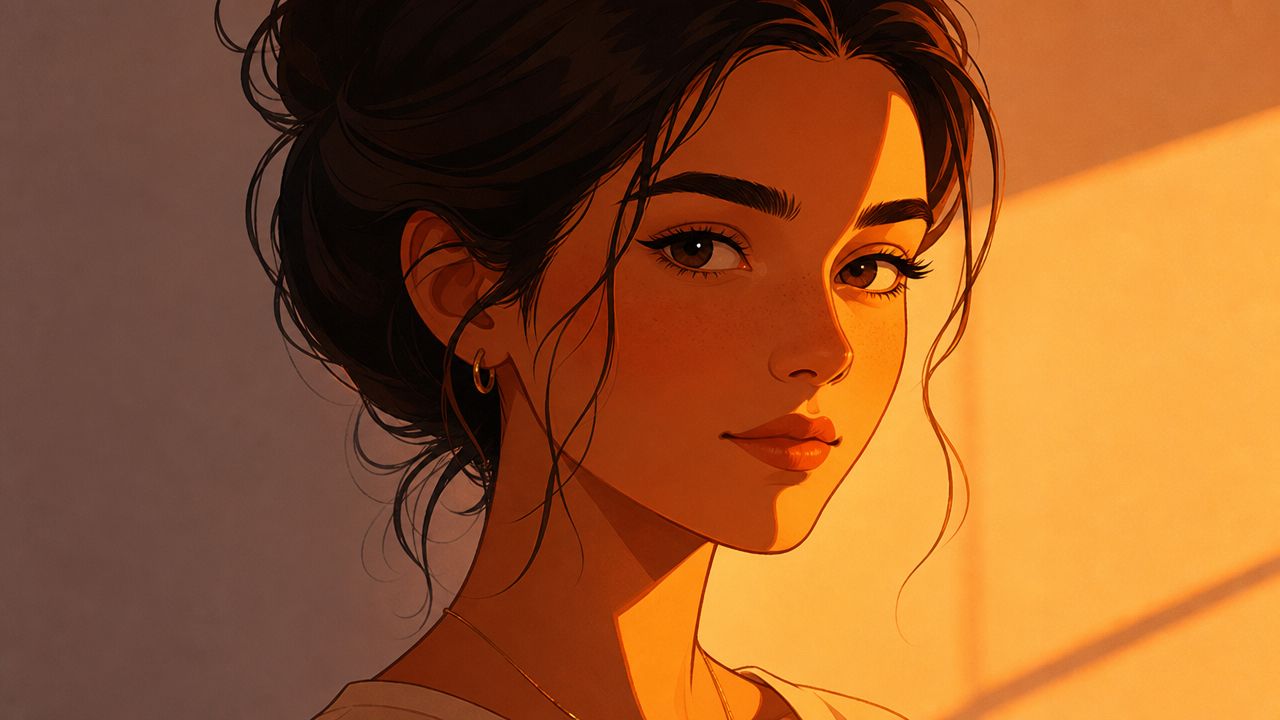
Choose a small working palette
Keep it limited. You don't need dozens of markers.
Pick:
- A skin base group with a light, mid, and shadow tone
- A warm light group such as yellow, golden peach, or orange-leaning blush
- A cool shadow helper like muted violet, blue-gray, or dusty lavender
- Hair and clothing colors that won't fight the sunset
- One bright accent for the strongest rim or cheek highlight
For planning, a theme preview tool for testing lighting directions on a sketch can help you compare a sunset idea against a cooler setup before you start layering by hand.
Keep the palette small enough that every marker has a job. If a marker doesn't help the light story, leave it capped.
Color the portrait in stages
Start with flat local colors. Don't chase perfection yet. Just establish the skin, hair, lips, and clothing in clean, simple layers.
Next, decide exactly where the sunset sits. If the light is coming from the left, the left forehead, cheekbone, nose bridge, upper lip, shoulder edge, and hairline should all feel its warmth. Glaze those areas with your warm light markers, not as stripes but as soft planes.
Then shape the shadow side with cooler notes. Use your cooler helper in the jaw shadow, under the nose, along the far cheek, below the bangs, and on the neck. The goal isn't to make those areas blue. The goal is to make the warm side feel warmer by contrast.
After that, refine edges.
- Let some transitions stay soft, especially on rounded skin.
- Keep cast shadows firmer, such as under the chin or near hair overlap.
- Save your strongest saturated edge for a narrow rim if the setting sun is directly behind part of the face.
A common mistake is over-darkening the shadows too early. Sunset scenes often look richer when the temperature contrast does the work and the values stay somewhat open. If you bury everything in dark brown or gray, you lose the glowing effect.
Finish by checking unity. Ask yourself one question: do all parts of the portrait feel like they belong to the same time of day? If the skin says sunset but the shirt says midday and the hair says indoor lamp, the page will still feel disjointed.
Making Lighting Color Theory Your Second Nature
Lighting color theory gets easier the moment you stop treating it like physics homework. It's a drawing habit. You pick a light source, decide its temperature, map the values, then let every color obey that choice.
The fastest way to improve is repetition with small changes. Color the same line art three times. Once in warm sunset light, once in cool morning light, once in soft indoor lamp light. You'll start noticing that the “right” marker isn't fixed. It changes with the scene.
That's when lighting becomes intuitive. You're no longer filling shapes. You're directing a moment.
If you want a low-pressure way to test palettes before you commit ink, ColorBestie lets you preview marker-style color ideas from a sketch using theme options that include lighting, mood, style, and palette direction.